HarmonyOS App开发——仿微信朋友圈动态展示App开发
仿微信朋友圈动态展示
1 “仿微信朋友圈动态”App概述
基于HarmonyOS 6 来实现微信朋友圈动态列表展示,以及图片预览效果的应用。
这款APP整体包含两部分:第一部分:朋友圈动态列表,朋友圈动态中可能涉及到图片;第二部分:图片预览器。这两部分以堆叠的方式布局,所以采用Stack()布局
朋友圈动态整体是通过List组件实现,以列表的方式展示,其中动态图片采用Flex弹性布局以达到图片可以自动换行排列的方式。
图片预览器部分使用Swiper布局,里面涉及到手势处理:
- 点击小图:打开图片预览
- 单指滑动:切换图片
- 双击图片:缩放图片
- 捏合图片:缩放图片
1.1“朋友圈动态列表”页面
“朋友圈动态列表”页面展示了当前用户朋友的动态信息,首先是朋友的头像,昵称后面是朋友的昵称,下面是朋友的动态文案,以及文案所涉及的图片列表。
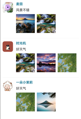
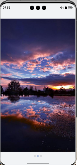
点击动态中的小图,展示其预览效果,此处单指左右滑动可切换图片,双击可放大或缩小图片,双指捏合可放大或缩小图片,且图片下方有当前图片导航点,蓝色表示当前正在预览的图片位置。
2 核心功能实现
(1)朋友圈动态列表展示: 仿照微信朋友圈动态UI界面布局,展示动态列表
(2)图片预览、手势交互:
点击小图:打开图片预览
单指滑动:切换图片
双击图片:缩放图片
捏合图片:缩放图片
2.1 数据准备
2.1.1 动态信息类TrendItem
在ets目录下面创建model目录,model目录下面创建类TrendItem用于存储每条朋友圈动态信息
|
//创建类:朋友圈动态 export default class TrendItem { //头像 avatar: Resource = $r('app.media.flower'); //昵称 name: string = ''; //朋友动态文本 message: string = ''; //动态图片 images: Resource[] = []; } |
2.1.2 朋友圈动态数据集合
在pages下创建主页面ImitateWeChatImagePreview ,准备朋友圈动态测试数据。代码如下。
|
private allTrendData: TrendItem[]=[ { avatar:$r('app.media.flower'), name:'麦田', message:'风景不错', images:[$r('app.media.0'),$r('app.media.1')] }, { avatar:$r('app.media.miao'), name:'时光机', message:'好天气', images:[$r('app.media.1'),$r('app.media.2'),$r('app.media.3')] }, { avatar:$r('app.media.lanyangyang'), name:'一朵小茉莉', message:'好天气', images:[$r('app.media.3'),$r('app.media.4')] } ] |
2.2 构建朋友圈动态列表界面
2.2 构建朋友圈动态列表界面
继续编写创建的主页面ImitateWeChatImagePreview ,代码如下。
|
@Entry @Component struct ImitateWeChatImagePreview { private allTrendData: TrendItem[]=[ { avatar:$r('app.media.flower'), name:'麦田', message:'风景不错', images:[$r('app.media.0'),$r('app.media.1')] }, { avatar:$r('app.media.miao'), name:'时光机', message:'好天气', images:[$r('app.media.1'),$r('app.media.2'),$r('app.media.3')] }, { avatar:$r('app.media.lanyangyang'), name:'一朵小茉莉', message:'好天气', images:[$r('app.media.3'),$r('app.media.4')] } ] @State isPreview:boolean = false //是否预览图片,如果预览,则显示预览界面,朋友圈列表界面被覆盖 @State currentTrendIndex:number = -1 //当前预览的图片所在动态对象的索引 @State currentImageIndex:number = -1 //当前预览的图片在对应数组中的索引 build() { //堆叠组件 Stack() { //朋友圈动态列表 List({space:30}){ ForEach(this.allTrendData,(trend:TrendItem,index:number)=>{ ListItem(){ //单条朋友动态 TrendDataItem({ trend:trend, isPreview:this.isPreview, trendIndex:index, currentTrendIndex:$currentTrendIndex, currentImageIndex:$currentImageIndex }) } .width('100%') }) } .width('100%') .height('100%') .padding(10) .divider({strokeWidth:1,color:'#f5f5f5'}) .scrollBar(BarState.Off) //预览图片:此子组件后续添加 } .height('100%') .width('100%') } } //自定义子组件:单条朋友圈动态UI @Component struct TrendDataItem{ @Prop trend:TrendItem @Link currentImageIndex:number //当前预览的图片索引 @Link isPreview:boolean //是否预览 @Link currentTrendIndex:number //当前预览图片所在的trend对象的索引 @Prop trendIndex:number //trend对象的索引 @State avatarSize: number = 50 //头像尺寸 @State imageSize:number = 100 //朋友圈列表图片尺寸 build() { Row({space:15}){ //头像 Image(this.trend.avatar) .size({width:this.avatarSize,height:this.avatarSize}) .borderRadius(10) Column({space:10}){ Text(this.trend.name) .fontWeight(FontWeight.Bold) .fontColor('#ff217b96') Text(this.trend.message) //朋友动态中的图片 Flex({direction:FlexDirection.Row,wrap:FlexWrap.Wrap}){ ForEach(this.trend.images,(img:Resource,index:number)=>{ Image(img) .size({width:this.imageSize,height:this.imageSize}) .padding({right:10,bottom:10}) .onClick(()=>{ this.currentImageIndex = index this.isPreview = true this.currentTrendIndex = this.trendIndex }) }) } .width('100%') } .width('100%') .alignItems(HorizontalAlign.Start) } .width('100%') .alignItems(VerticalAlign.Top) } } |
2.3 构建图片预览界面
预览界面因涉及到手势处理,切换图片,借用了HarmonyOS开发者官网的 “图片预览器” 案例的代码,实现步骤如下:
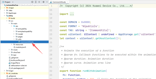
2.3.1工具类创建
此.ets文件从上述官网案例 “图片预览器” 中下载下来不用修改,直接放在自己项目中即可
2.3.2单个预览图片处理代码
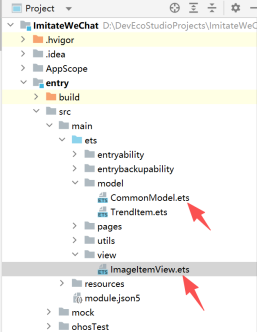
此处涉及到两个文件:CommonModel.ets 和 ImageItemView.ets
且这两个.ets文件仍从上述官网案例 “图片预览器” 中直接下载使用即可,ImageItemView.ets稍作改动,其所在目录如下:
2.3.3 EntryAbility.ets 文件修改,添加对window的处理
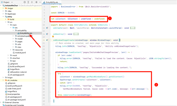
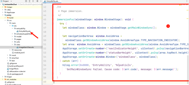
修改后EntryAbility.ets的代码如下:
|
import { AbilityConstant, ConfigurationConstant, UIAbility, Want } from '@kit.AbilityKit'; import { hilog } from '@kit.PerformanceAnalysisKit'; import { window } from '@kit.ArkUI'; import { BusinessError } from '@kit.BasicServicesKit'; const DOMAIN = 0x0000; let uiContext: UIContext | undefined = undefined; export default class EntryAbility extends UIAbility { onCreate(want: Want, launchParam: AbilityConstant.LaunchParam): void { this.context.getApplicationContext().setColorMode(ConfigurationConstant.ColorMode.COLOR_MODE_NOT_SET); hilog.info(DOMAIN, 'testTag', '%{public}s', 'Ability onCreate'); } onDestroy(): void { hilog.info(DOMAIN, 'testTag', '%{public}s', 'Ability onDestroy'); } onWindowStageCreate(windowStage: window.WindowStage): void { // Main window is created, set main page for this ability hilog.info(DOMAIN, 'testTag', '%{public}s', 'Ability onWindowStageCreate'); windowStage.loadContent('pages/ImitateWeChatImagePreview', (err) => { if (err.code) { hilog.error(DOMAIN, 'testTag', 'Failed to load the content. Cause: %{public}s', JSON.stringify(err)); return; } hilog.info(DOMAIN, 'testTag', 'Succeeded in loading the content.'); //新增代码 try { uiContext = windowStage.getMainWindowSync().getUIContext() AppStorage.setOrCreate('uiContext', uiContext); } catch (err) { hilog.error(0x0000, 'testTag', '%{public}s', `GetMainWindowSync failed. Cause code: ${err.code}, message: ${err.message}`); } this.immersionFuc(windowStage); }); } /** * 新增代码: Page immersion. */ immersionFuc(windowStage: window.WindowStage): void { try { let windowClass: window.Window = windowStage.getMainWindowSync();
let navigationBarArea: window.AvoidArea = windowClass.getWindowAvoidArea(window.AvoidAreaType.TYPE_NAVIGATION_INDICATOR); let area: window.AvoidArea = windowClass.getWindowAvoidArea(window.AvoidAreaType.TYPE_SYSTEM); AppStorage.setOrCreate<number>('naviIndicatorHeight', uiContext!.px2vp(navigationBarArea.bottomRect.height)); AppStorage.setOrCreate<number>('statusBarHeight', uiContext!.px2vp(area.topRect.height)); AppStorage.setOrCreate<window.Window>('windowClass', windowClass); } catch (err) { hilog.error(0x0000, 'EntryAbility', '%{public}s', `GetMainWindowSync failed. Cause code: ${err.code}, message: ${err.message}`); } } onWindowStageDestroy(): void { // Main window is destroyed, release UI related resources hilog.info(DOMAIN, 'testTag', '%{public}s', 'Ability onWindowStageDestroy'); } onForeground(): void { // Ability has brought to foreground hilog.info(DOMAIN, 'testTag', '%{public}s', 'Ability onForeground'); } onBackground(): void { // Ability has back to background hilog.info(DOMAIN, 'testTag', '%{public}s', 'Ability onBackground'); } } |
2.4 图片预览子组件PreviewContainer
主页面ImitateWeChatImagePreviewPage中编写图片预览子组件PreviewContainer,此处仍从官网上述案例中copy过来,稍作修改,代码如下:
|
//图片预览容器 @Component struct PreviewContainer { @Prop images: Resource[] @Link currentImageIndex: number @Link isPreview: boolean @Provide isDisableSwipe: boolean = false; @Provide isImageReset: boolean = false; // Determine whether the boundary has been reached. By default, it is assumed that the boundary has not been reached. @Provide isArriveBoundary: boolean = false; @Provide bgc: string = '#F1F3F5'; @StorageLink('isImgDefaultSize') isImgDefaultSize: boolean = true; private thumbnailSwipeController: SwiperController = new SwiperController(); private homeSwipeController: SwiperController = new SwiperController(); private windowClass: window.Window = AppStorage.get<window.Window>('windowClass')!; @Builder PhotoSwiper() { Swiper(this.homeSwipeController) { ForEach(this.images, (img: Resource) => { ImageItemView({ imageData: img, isPreview: this.isPreview }) .width('100%') .height('100%') }, (img: Resource, index: number) => JSON.stringify(img) + index) } // [StartExclude photo_swiper] .effectMode(EdgeEffect.Spring) .loop(true) .itemSpace(8) .width('100%') .height('100%') .expandSafeArea([SafeAreaType.SYSTEM], [SafeAreaEdge.TOP, SafeAreaEdge.BOTTOM]) .autoPlay(false) // [EndExclude photo_swiper] .disableSwipe(this.isDisableSwipe) // [StartExclude photo_swiper] .indicator( Indicator.dot() .itemWidth(10) .itemHeight(10) ) .cachedCount(20) .index(this.currentImageIndex) .onChange((index: number) => { this.thumbnailSwipeController.changeIndex(index); this.currentImageIndex = index }) .onGestureSwipe(() => { this.isImageReset = false; }) .onAnimationStart((index: number, targetIndex: number) => { if (index !== targetIndex) { // Switched the picture. this.isImageReset = true; } else { if (this.isImgDefaultSize) { this.isDisableSwipe = false; } else { // The picture when enlarged, If the image has not been switched, it is not allowed to switch the image after returning. this.isDisableSwipe = true; } } }) } build() { Column() { this.PhotoSwiper() } .width('100%') .height('100%') .backgroundColor('#ff393838') .justifyContent(FlexAlign.Center) } } |
父组件中调用上面子组件:
|
@Entry @Component struct ImitateWeChatImagePreview {
//省略其他代码...... build() { //堆叠组件 Stack() { //朋友圈动态列表 省略代码......
//预览图片 if (this.isPreview) { PreviewContainer({ images: this.allTrendData[this.currentTrendIndex].images, currentImageIndex: $currentImageIndex, isPreview: this.isPreview }) } } .height('100%') .width('100%') } } |
3 关键实现功能点
(1)数据部分:
TrendItem类存储单条动态信息。
TrendItem数组存储多个朋友圈动态集合。
(2)布局技巧:
Stack()堆叠组件实现两部分动态列表和图片预览部分的布局。
List布局动态列表。
Flex布局动态图片。
Swiper布局图片预览器。
(3)手势处理:
PanGesture用于左右滑动处理。
PinchGesture用于捏合缩放。
TapGesture 用于单击和双击处理。
完整代码路径:

讨论HarmonyOS开发技术,专注于API与组件、DevEco Studio、测试、元服务和应用上架分发等。
更多推荐

 16
16 0
0- 0


 已为社区贡献51条内容

所有评论(0)