HarmonyOS App开发——鸿蒙ArkTS的ibestUI在鸿蒙PC集成和应用
IBest-UI 专为 HarmonyOS Next 打造的轻量级 UI 组件库,主打易用、可定制、稳定,能大幅提升鸿蒙应用开发效率ibestui.ibestservices.com。
一、核心定位与版本
- 定位:轻量、可定制、开箱即用的鸿蒙 UI 组件库,适配 HarmonyOS Next 生态ibestui.ibestservices.com。
- 版本:提供 V1(兼容旧状态管理)与 V2(官方推荐,适配新状态管理)ibestui.ibestservices.com。
- 协议:MIT 开源协议,可免费商用。
二、核心特性
- 丰富组件:60+ 高质量组件,覆盖基础、表单、反馈、导航、数据展示等主流场景ibestui.ibestservices.com。
- 高稳定性:单元测试覆盖率 >90%,保障组件可靠性ibestui.ibestservices.com。
- 主题定制:内置 100+ 主题变量,支持一键切换浅色 / 深色模式ibestui.ibestservices.com。
- 多场景支持:适配手机应用、元服务(原子化服务)ibestui.ibestservices.com。
- 国际化:支持多语言适配ibestui.ibestservices.com。
- 中文文档:提供完整中文文档与示例,上手门槛低ibestui.ibestservices.com。
三、常用组件分类
- 基础组件:Button、Icon、Cell、Divider、Image 等。
- 表单组件:Input、Picker、Calendar、Form、Checkbox、Radio 等。
- 反馈组件:Dialog、Toast、Popup、Loading、ImageCropper 等ibestui.ibestservices.com。
- 导航组件:TabBar、Sidebar、Pagination 等。
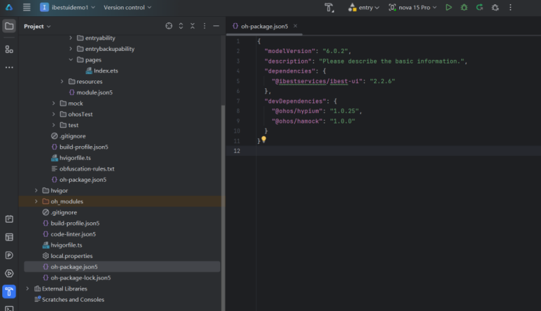
四、开发环境与安装
- 环境:DevEco Studio(建议 5.1.1+)、HarmonyOS Next 真机 / 模拟器、ohpm 包管理器。
鸿蒙 PC(鸿蒙电脑)是华为推出的、搭载自研 HarmonyOS 的 PC 产品,2025 年 5 月 19 日正式发布,首款机型为 MateBook Pro,主打全场景协同、原生 AI、安全流畅、统一生态,是面向智慧办公的新一代 PC 形态。
五、初始化
在 EntryAbility.ets 文件中导入并在指定位置执行初始化函数IBestInit。
import { IBestInit } from "@ibestservices/ibest-ui"
onWindowStageCreate(windowStage: window.WindowStage): void {
windowStage.loadContent('pages/Index', (err, data) => {
// 在此处初始化组件库!!!
// 在此处初始化组件库!!!
// 在此处初始化组件库!!!
IBestInit(windowStage, this.context)
})
}
鸿蒙 PC(鸿蒙电脑)是华为推出的、搭载自研 HarmonyOS 的 PC 产品,2025 年 5 月 19 日正式发布,首款机型为 MateBook Pro,主打全场景协同、原生 AI、安全流畅、统一生态,是面向智慧办公的新一代 PC 形态。
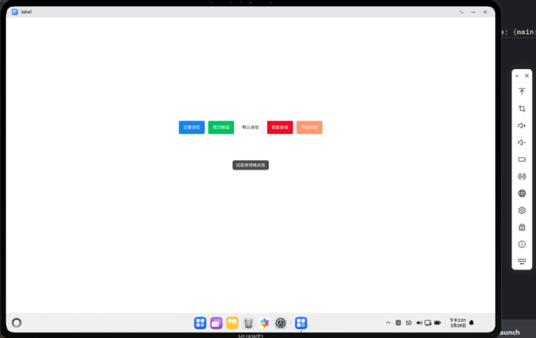
Button 按钮
介绍
按钮用于触发一个操作,如提交表单。
import { IBestButton,IBestToast } from "@ibestservices/ibest-ui";
import { LengthMetrics } from "@kit.ArkUI";
@Entry
@Component
struct DemoPage {
build() {
Column()
{
Flex({ wrap: FlexWrap.Wrap,justifyContent:FlexAlign.Center,alignItems:ItemAlign.Center, space: {main: LengthMetrics.vp(12), cross: LengthMetrics.vp(12)} }) {
IBestButton({
text: '主要按钮',
type: 'primary',
onBtnClick:()=>{
IBestToast.show({message:"这是按钮被点击"})
}
})
IBestButton({
text: '成功按钮',
type: 'success'
})
IBestButton({
text: '默认按钮',
type: 'default'
})
IBestButton({
text: '危险按钮',
type: 'danger'
})
IBestButton({
text: '警告按钮',
type: 'warning'
})
}.width("100%").height("30%")
}.width("100%").height("100%").justifyContent(FlexAlign.Center)
}
}
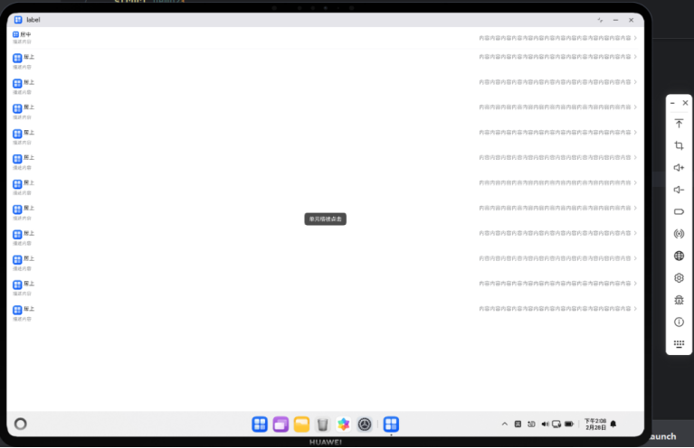
Cell 单元格
介绍
单元格为列表中的单个展示项。
import { IBestCell, IBestCellGroup, IBestToast } from "@ibestservices/ibest-ui";
@Entry
@Component
struct Demo2{
@Builder StarIcon(width = 16) {
Image($r('app.media.startIcon')).width(width)
}
build(){
Column(){
IBestCell({
title: '居中',
label: '描述内容',
value: '内容内容内容内容内容内容内容内容内容内容内容内容内容内容',
center: true,
iconBuilder: () => this.StarIcon(),
isLink: true
})
IBestCell({
title: '居上',
label: '描述内容',
value: '内容内容内容内容内容内容内容内容内容内容内容内容内容内容',
hasBorder: false,
iconBuilder: () => this.StarIcon(24),
isLink: true
})
IBestCell({
title: '居上',
label: '描述内容',
value: '内容内容内容内容内容内容内容内容内容内容内容内容内容内容',
hasBorder: false,
iconBuilder: () => this.StarIcon(24),
isLink: true
})
IBestCell({
title: '居上',
label: '描述内容',
value: '内容内容内容内容内容内容内容内容内容内容内容内容内容内容',
hasBorder: false,
iconBuilder: () => this.StarIcon(24),
isLink: true
})
IBestCell({
title: '居上',
label: '描述内容',
value: '内容内容内容内容内容内容内容内容内容内容内容内容内容内容',
hasBorder: false,
iconBuilder: () => this.StarIcon(24),
isLink: true
})
IBestCell({
title: '居上',
label: '描述内容',
value: '内容内容内容内容内容内容内容内容内容内容内容内容内容内容',
hasBorder: false,
iconBuilder: () => this.StarIcon(24),
isLink: true
})
IBestCell({
title: '居上',
label: '描述内容',
value: '内容内容内容内容内容内容内容内容内容内容内容内容内容内容',
hasBorder: false,
iconBuilder: () => this.StarIcon(24),
isLink: true
})
IBestCell({
title: '居上',
label: '描述内容',
value: '内容内容内容内容内容内容内容内容内容内容内容内容内容内容',
hasBorder: false,
iconBuilder: () => this.StarIcon(24),
isLink: true
})
IBestCell({
title: '居上',
label: '描述内容',
value: '内容内容内容内容内容内容内容内容内容内容内容内容内容内容',
hasBorder: false,
iconBuilder: () => this.StarIcon(24),
isLink: true
})
IBestCell({
title: '居上',
label: '描述内容',
value: '内容内容内容内容内容内容内容内容内容内容内容内容内容内容',
hasBorder: false,
iconBuilder: () => this.StarIcon(24),
isLink: true
})
IBestCell({
title: '居上',
label: '描述内容',
value: '内容内容内容内容内容内容内容内容内容内容内容内容内容内容',
hasBorder: false,
iconBuilder: () => this.StarIcon(24),
isLink: true
})
IBestCell({
title: '居上',
label: '描述内容',
value: '内容内容内容内容内容内容内容内容内容内容内容内容内容内容',
hasBorder: false,
iconBuilder: () => this.StarIcon(24),
isLink: true,
onCellClick:()=>{
IBestToast.show({message:"单元格被点击"})
}
})
}
}
}
CarKeyboard 车牌键盘
介绍
通常与车牌输入框组件或其它自定义输入框配合使用。
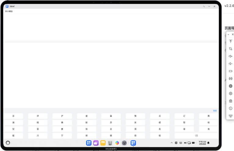
import { IBestCarKeyboard, IBestCell } from "@ibestservices/ibest-ui";
@Entry
@Component
struct Demo3 {
@State visible: boolean = false
@State value: string = ''
build() {
Column(){
IBestCell({
title: '默认键盘',
value: this.value,
clickable: true,
onCellClick: () => {
this.visible = true
}
})
IBestCarKeyboard({
visible: $visible,
value: $value
})
}
}
}
Cascader 级联选择器
介绍
级联选择框,用于多层级数据的选择,典型场景为省市区选择。
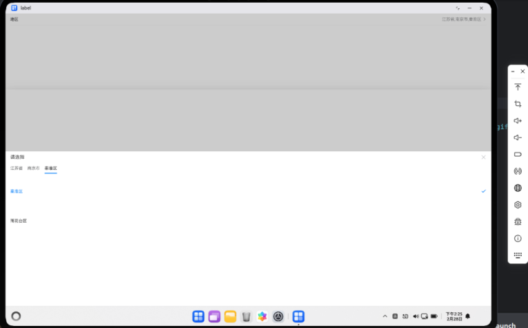
import { IBestCascader, IBestCascaderOption, IBestCell } from "@ibestservices/ibest-ui";
@Entry
@Component
struct Demo4 {
@State visible: boolean = false
@State fieldValue: string = '请选择地区'
@State selectValue: string[] = []
@State data: IBestCascaderOption[] = [
{
text: "江苏省",
value: "320000",
children: [
{
text: "南京市",
value: "320100",
children: [
{
text: "秦淮区",
value: "320104"
},
{
text: "雨花台区",
value: "320114"
}
]
},
{
text: "苏州市",
value: "320500",
children: [
{
text: "姑苏区",
value: "320508"
},
{
text: "昆山市",
value: "320583"
}
]
}
]
},
{
text: "安徽省",
value: "340000",
children: [
{
text: "合肥市",
value: "340100",
children: [
{
text: "蜀山区",
value: "340104"
},
{
text: "合肥高新技术产业开发区",
value: "340171"
}
]
},
{
text: "黄山市",
value: "341000",
children: [
{
text: "屯溪区",
value: "341002"
},
{
text: "黄山区",
value: "341003"
}
]
}
]
}
]
build() {
Column(){
IBestCell({
title: '地区',
value: this.fieldValue,
isLink: true,
onCellClick: () => {
this.visible = true
}
})
IBestCascader({
visible: $visible,
options: this.data,
value: $selectValue,
itemHeight: 100,
onConfirm: (value: IBestCascaderOption[]) => {
this.fieldValue = value.map(item => item.text).join(',')
}
})
}
}
}
Signature 签名
介绍
用于签名场景的组件,基于 Canvas 实现。
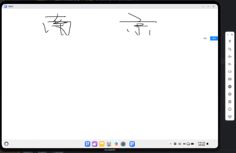
import { IBestSignature } from "@ibestservices/ibest-ui";
@Entry
@Component
struct Demo5 {
@State imgUrl: PixelMap | null = null
build() {
Column({ space: 20 }){
IBestSignature({
onConfirm: (url: PixelMap) => {
this.imgUrl = url
}
})
if(this.imgUrl){
Image(this.imgUrl)
}
}
}
}
ActionSheet 动作面板
介绍
底部弹起的模态面板,包含与当前情境相关的多个选项
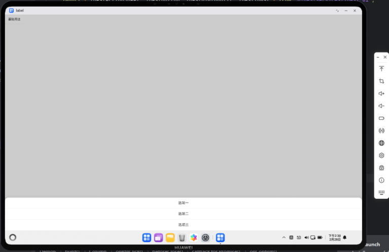
import { IBestActionSheet, IBestButton, IBestDialogUtil, IBestToast } from "@ibestservices/ibest-ui";
@Entry
@Component
struct Demo6 {
build() {
Column(){
IBestButton({
text: '基础用法',
onBtnClick: () => {
IBestActionSheet.show({
actions: ["选项一", "选项二", "选项三"],
onSelect: (index: number, name?: string | number) => {
IBestToast.show(`点击了第${index}个选项,名称为${name}`)
},
beforeClose: () => {
return new Promise((resolve, reject) => {
IBestDialogUtil.open({
title: "提示",
message: "确定关闭?",
showCancelButton: true,
onConfirm: () => {
resolve(true)
},
onCancel: () => {
reject(false)
}
})
})
}
})
}
})
}
}
}
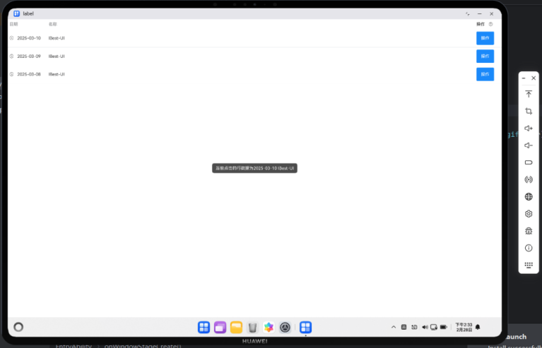
Table 表格
介绍
用于展示多条结构类似的数据。
import { IBestButton, IBestIcon, IBestTable, IBestTableColumn, IBestTableColumnData,
IBestToast } from "@ibestservices/ibest-ui";
interface TableData{
date: string
name: string
desc: string
}
@Entry
@Component
struct Demo7 {
@State tableId: string = "table"
@State data: TableData[] = [
{ date: '2025-03-10', name: 'IBest-UI', desc: '一个轻量、简单易用、可定制主题、支持深色模式和浅色模式的鸿蒙开源UI组件库。' },
{ date: '2025-03-09', name: 'IBest-UI', desc: '一个轻量、简单易用、可定制主题、支持深色模式和浅色模式的鸿蒙开源UI组件库。' },
{ date: '2025-03-08', name: 'IBest-UI', desc: '一个轻量、简单易用、可定制主题、支持深色模式和浅色模式的鸿蒙开源UI组件库。' }
]
@Builder headerBuilder(column: IBestTableColumnData, columnIndex: number){
Row({space: 12}){
Text(column.title).fontSize(14)
IBestIcon({
name: "question-o",
iconSize: 14
})
}
}
@Builder customCell(row: TableData, column: IBestTableColumnData, rowIndex: number, columnIndex: number){
if(column.prop == 'date'){
Row({space: 12}){
IBestIcon({
name: "underway-o",
iconSize: 14
})
Text(row.date).fontSize(14)
}
}else{
IBestButton({
type: "primary",
text: "操作",
onBtnClick: () => {
IBestToast.show(`当前点击的行数据为${row.date} ${row.name}`)
}
})
}
}
build() {
Column(){
IBestTable({ tableId: this.tableId, data: this.data }){
IBestTableColumn({
tableId: this.tableId,
title: "日期",
prop: "date",
cellWidth: 130,
cellBuilder: (row: TableData, column: IBestTableColumnData, rowIndex: number, columnIndex: number): void => this.customCell(row, column, rowIndex, columnIndex)
})
IBestTableColumn({ tableId: this.tableId, title: "名称", prop: "name" })
IBestTableColumn({
tableId: this.tableId,
title: "操作",
cellWidth: 90,
headerBuilder: (column: IBestTableColumnData, columnIndex: number): void => this.headerBuilder(column, columnIndex),
cellBuilder: (row: TableData, column: IBestTableColumnData, rowIndex: number, columnIndex: number): void => this.customCell(row, column, rowIndex, columnIndex)
})
}
}
}
}
鸿蒙 ArkTS 开发中,IBest-UI 组件库在鸿蒙 PC 端集成与应用的核心总结从集成要点、适配规则、应用场景、核心优势、避坑指南五个维度掌握 PC 端使用 IBest-UI 的核心逻辑。

讨论HarmonyOS开发技术,专注于API与组件、DevEco Studio、测试、元服务和应用上架分发等。
更多推荐
 17
17 0
0- 0


 已为社区贡献57条内容

所有评论(0)