HarmonyOS6 - 动画详解
HarmonyOS6 - 动画详解
文章目录
1. ArkUI动画简介
1. 使用动画原因
在ArkUI中,组件属性的变化,通常会引起UI的变化。属性会在一瞬间完成变化。往往造成突兀感,同时容易导致用户失去视觉焦点。
增加动画可在UI发生变化时,增加流畅的过渡效果,从而增强用户体验。
动画的目的包括:
- 使界面的过渡自然流畅。
- 增强用户从界面获得的反馈感和互动感。
- 在内容加载等场景中,增加用户的耐心,缓解等待带来的不适感。
- 引导用户了解和操作设备。
在需要为UI变化添加过渡的场景,都可以使用动画,如开机、应用启动退出、下拉进入控制中心等。这些动画可向用户提供关于其操作的反馈,并有助于让用户始终关注界面。
2. 动画的原理
ArkUI中提供多种动画接口(属性动画、转场动画等),用于驱动属性值按照设定的动画参数,从起始值逐渐变化到终点值。尽管变化过程中参数值并非绝对的连续,而是具有一定的离散性。但由于人眼会产生视觉暂留,所以最终看到的就是一个“连续“的动画。
- UI的一次改变称为一个动画帧,对应一次屏幕刷新。决定动画流畅度的一个重要指标就是帧率FPS(Frame Per Second),即每秒的动画帧数,帧率越高则动画就会越流畅。
- ArkUI中,动画参数包含了如动画时长、动画曲线等参数。
- 动画曲线作为主要因素,决定了属性值变化的规律。以线性动画曲线为例,在动画时长内,属性值将从起点值匀速变化到终点值。属性过快或过慢的变化,都可能带来不好的视觉感受,影响用户体验。因此动画参数特别是动画曲线,需要结合场景和曲线特点进行设计和调整。
3. 动画的分类
- 属性动画:最基础的动画类型,按照动画参数逐帧驱动属性的变化,产生一帧帧的动画效果。除其中的自定义属性动画外,动画过程的驱动由系统完成,应用侧不感知动画过程。
- 转场动画:为组件在出现和消失时添加过渡动画。为了保证动画一致性,部分接口动画曲线已内置,不支持开发者自定义。
- 不建议在应用内使用UIAbility组合所有的界面:UIAbility是一个任务,会在多任务界面独立显示为一个卡片,UIAbility之间的跳转相当于任务之间的跳转。以应用内查看大图场景为例,不建议调用图库的UIAbility来打开图片查看大图,因为这会导致任务的跳转,图库的UIAbility也会加入多任务界面中。正确的方式是应用内构建大图组件,通过模态转场去调起大图组件,一个任务内的所有的界面都在一个UIAbility内闭环。
- 导航转场中,应使用Navigation组件实现转场动画。过去的page+router方式在实现导航转场过程中,因为page和page之间相互独立,其联动动画效果受限。不仅容易导致页面之间的割裂,并且不支持一次开发多端部署。
- 粒子动画:介绍粒子动画的原理及使用方法。
- 组件动画:组件提供默认动效(如List的滑动动效)便于开发者使用,同时部分组件还支持定制化动效。
- 动画曲线:介绍传统曲线和弹簧曲线的特点和使用方式。动画曲线影响属性值的运动规律,进而决定界面的动画效果。
- 动画衔接:介绍如何实现动画与动画之间、手势与动画之间的自然过渡。
- 动画效果:介绍模糊、大阴影和颜色渐变等高阶效果接口的使用方法。
- 帧动画:系统侧提供在动画过程中的插值结果,由开发者每帧修改属性值产生动画,相比于属性动画,有可实现暂停的优点,但性能不如属性动画。
2. 属性动画
1. 属性动画简介
通过动画属性改变引起UI上产生的连续视觉效果,即为属性动画。根据变化时是否能够添加动画,可以将属性分为可动画属性和不可动画属性。
- 不可动画属性:比如用于控制组件是否可以响应点击、触摸等事件的属性enabled属性。决定当前组件是否可以获得焦点的属性focusable
- 可动画属性:布局属性中的位置、大小、内边距、外边距、对齐方式、权重。仿射变换中的平移、旋转、缩放、锚点等。背景中的背景颜色、背景模糊。内容中的字大小、文字颜色,图片对齐方式、模糊等。外观中的透明度、圆角、边框、阴影等。
2. 接口说明
ArkUI提供两种属性动画接口animateTo和animation驱动组件属性按照动画曲线等动画参数进行连续的变化,产生属性动画。它们的区别是:
- animateTo:适用对多个可动画属性配置相同动画参数的动画。
animateTo(value: AnimateParam, event: () => void): void
说明:animateTo接口参数中,value指定动画参数(包括时长、曲线等)event为动画的闭包函数,闭包内变量改变产生的属性动画将遵循相同的动画参数。
- animation:适用于对多个可动画属性配置不同参数动画的场景。
3. animateTo接口案例演示
说明
直接使用animateTo可能导致UI上下文不明确的问题,建议使用getUIContext()获取UIContext实例,并使用animateTo调用绑定实例的animateTo。
实现如下效果:
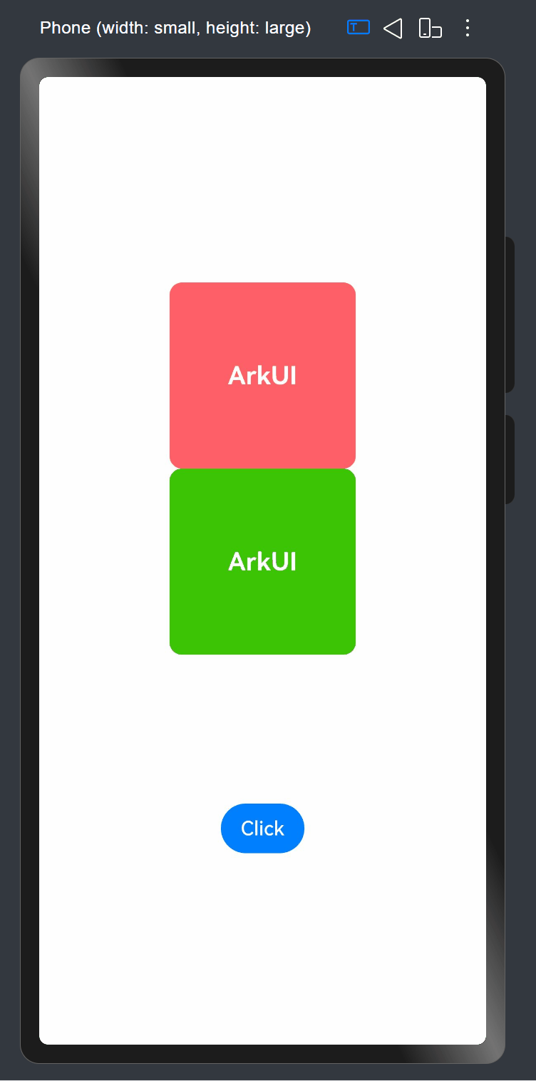
思路分析:
第1步:构建3个状态变量,分别用来保存旋转的角度、y坐标的偏移量以及透明度。
第2步:在设置属性时,对对应的Text组件设置参数。
第3步:在按钮的点击事件中,调用animateTo()接口。对对应的状态变量进行修改。
案例代码如下:
import curves from '@ohos.curves'

@Entry
@Component
struct AnimateToDemo {
  @State animate: boolean = false;
  // 第一步: 声明相关状态变量
  @State rotateValue: number = 0; // 组件一旋转角度
  @State translateY: number = 0; // 组件二偏移量
  @State opacityValue: number = 1; // 组件二透明度

  // 第二步:将状态变量设置到相关可动画属性接口
  build() {
    Column() {
      // 组件一
      Column() {
        Text('ArkUI')
          .fontWeight(FontWeight.Bold)
          .fontSize(20)
          .fontColor(Color.White)
      }
      .justifyContent(FlexAlign.Center)
      .width(150)
      .height(150)
      .borderRadius(10)
      .rotate({ angle: this.rotateValue })
      .backgroundColor(0xf56c6c)

      // 组件二
      Column() {
        Text('ArkUI')
          .fontWeight(FontWeight.Bold)
          .fontSize(20)
          .fontColor(Color.White)
      }
      .justifyContent(FlexAlign.Center)
      .width(150)
      .height(150)
      .backgroundColor(0x67C23A)
      .borderRadius(10)
      .opacity(this.opacityValue)
      .translate({ y: this.translateY })

      Button('Click')
        .margin({ top: 120 })
        .onClick(() => {
          this.animate = !this.animate;
          // 第三步:通过属性动画接口开启属性动画
          this.getUIContext().animateTo({ curve: curves.springMotion() }, () => {
            // 第四步:闭包内通过状态变量改变UI界面
            // 这里可以写任何能改变UI的逻辑比如数组添加,显隐控制,系统会检测改变后的UI界面与之前的UI界面的差异,对有差异的部分添加动画
            // 组件一的rotate属性发生变化,所以会给组件一添加rotate旋转动画
            this.rotateValue = this.animate ? 90 : 0;
            // 组件二的scale属性发生变化,所以会给组件二添加scale缩放动画
            this.opacityValue = this.animate ? 0.6 : 1;
            // 组件二的offset属性发生变化,所以会给组件二添加offset偏移动画
            this.translateY = this.animate ? 100 : 0;
          })
        })
    }
    .width('100%')
    .height('100%')
    .justifyContent(FlexAlign.Center)
  }
}
4. animation接口案例演示
效果如下:

思路分析:
第1步:构建4个状态变量,分别用来保存旋转的角度、y坐标的偏移量、字体颜色及透明度。
第2步:将状态变量设置到相关可动画属性接口。
第3步:对每个需要添加动画的组件,通过属性动画接口animation开启属性动画。需要指出的是,接口必须紧挨着设置动画属性方法后面。
第4步:在按钮的点击事件中,对对应的状态变量进行修改。
代码如下:
import curves from '@ohos.curves';

@Entry
@Component
struct AnimateToDemo {
  @State animate: boolean = false;
  // 第一步: 声明相关状态变量
  @State rotateValue: number = 0; // 组件一旋转角度
  @State translateY: number = 0; // 组件二偏移量
  @State color: Color = Color.White; // 组件二字体颜色
  @State opacityValue: number = 1; // 父组件透明度

  // 第二步:将状态变量设置到相关可动画属性接口
  build() {
    Column() {
      Column() {
        // 组件一
        Text('ArkUI')
          .fontWeight(FontWeight.Bold)
          .fontSize(20)
          .fontColor(Color.White)
          .textAlign(TextAlign.Center)
          .borderRadius(10)
          .backgroundColor(0xf56c6c)
          .rotate({ angle: this.rotateValue })
          // 第三步:通过属性动画接口开启属性动画,控件的函数调用顺序是从下往上的,这个animation会作用到上面的rotate属性
          .animation(
            {
              curve: curves.springMotion(0.3, 1.0) //创建指定response和dampingFraction、其余参数默认的弹性动画曲线
            })
          .width(150)
          .height(150)

        // 组件二
        Text('ArkUI')
          .fontWeight(FontWeight.Bold)
          .fontSize(20)
          .fontColor(this.color)
          .textAlign(TextAlign.Center)
          .borderRadius(10)
          .backgroundColor(0x67C23A)
          .width(150)
          .height(150)
          .translate({ y: this.translateY })
          // 第三步:通过属性动画接口开启属性动画,控件的函数调用顺序是从下往上的,这个animation会作用到上面的translate属性
          .animation({ curve: curves.springMotion(0.3, 0.6) })//创建指定response和dampingFraction、其余参数默认的弹性动画曲线
      }
      .justifyContent(FlexAlign.Center)
      .opacity(this.opacityValue)
      // 这个animation会作用到上面的opacity属性,父组件column的透明度变化,会导致其子节点的透明度也变化,所以这里会给column和其子节点的透明度属性都加动画
      .animation({ curve: curves.springMotion() })

      // 第四步:通过状态变量改变UI界面,系统会检测改变后的UI界面与之前的UI界面的差异,对有差异的部分添加动画
      Button('Click')
        .margin({ top: 120 })
        .onClick(() => {
          this.animate = !this.animate;
          // 组件一的rotate属性有变化,所以会给组件一加rotate动画
          this.rotateValue = this.animate ? 90 : 0;
          // 组件二的translate属性有变化,所以会给组件二加translate动画
          this.translateY = this.animate ? 100 : 0;
          // 组件二的fontColor属性有变化,所以会给组件二加fontColor动画
          this.color = this.animate ? Color.Black : Color.White;
          // 父组件column的opacity属性有变化,会导致其子节点的透明度也变化,所以这里会给column和其子节点的透明度属性都加动画
          this.opacityValue = this.animate ? 0.6 : 1;
        })

    }
    .width('100%')
    .height('100%')
    .justifyContent(FlexAlign.Center)
  }
}
3. 转场动画
1. 转场动画概述
转场动画是指对将要出现或消失的组件做动画,对始终出现的组件做动画应使用属性动画。如果技术选择上使用属性动画,会面临编码麻烦。
2. 转场动画分类
转场动画有如下几类:
- 出现/消失转场:对新增、消失的控件实现动画效果,是通用的基础转场效果。
- 模态转场:新的界面覆盖在旧的界面之上的动画,旧的界面不消失,新的界面出现,如弹框就是典型的模态转场动画。
- 共享元素转场 (一镜到底):共享元素转场是一种界面切换时对相同或者相似的元素做的一种位置和大小匹配的过渡动画效果。
- 旋转屏动画:旋转屏动画主要分为布局切换的旋转屏动画和透明度变化的旋转屏动画,旨在实现屏幕显示方向变化时的自然过渡。
- 页面转场动画:页面的路由转场方式,可以通过在pageTransition函数中自定义页面入场和页面退场的转场动效。为了实现更好的转场效果,推荐使用导航转场和模态转场。
- 导航转场:页面的路由转场方式,对应一个界面消失,另外一个界面出现的动画效果,如设置应用一级菜单切换到二级界面。
3. 出现/消失接口说明
transition是基础的组件转场接口,用于实现一个组件出现或者消失时的动画效果。可以通过TransitionEffect对象的组合使用,定义出各式效果。
转场效果接口如下:
| 转场效果 | 说明 | 动画 |
|---|---|---|
| IDENTITY | 禁用转场效果。 | 无。 |
| OPACITY | 默认的转场效果,透明度转场。 | 出现时透明度从0到1,消失时透明度从1到0。 |
| SLIDE | 滑动转场效果。 | 出现时从窗口左侧滑入,消失时从窗口右侧滑出。 |
| translate | 通过设置组件平移创建转场效果。 | 出现时,平移参数的值从translate接口设置的值变化为默认值0,消失时从默认值0变化为translate接口设置的值。 |
| rotate | 通过设置组件旋转创建转场效果。 | 出现时,旋转参数的值从rotate接口设置的值变化为默认值0,消失时从默认值0变化为rotate接口设置的值。 |
| opacity | 通过设置透明度参数创建转场效果。 | 出现时,透明度参数的值从opacity设置的值变化为透明度默认值1,消失时从透明度默认值1变化为opacity设置的值。 |
| move | 通过TransitionEdge创建从窗口哪条边缘出来的效果。 | 出现时从TransitionEdge方向滑入,消失时滑出到TransitionEdge方向。 |
| asymmetric | 通过此方法组合非对称的出现消失转场效果。- appear:出现转场的效果。- disappear:消失转场的效果。 | 出现时采用appear设置的TransitionEffect出现效果,消失时采用disappear设置的TransitionEffect消失效果。 |
| combine | 组合其他TransitionEffect。 | 组合其他TransitionEffect,一起生效。 |
| animation | 定义转场效果的动画参数:- 如果不定义会跟随animateTo的动画参数。- 不支持通过控件的animation接口配置动画参数。- TransitionEffect中animation的onFinish不生效。 | 调用顺序是从上往下,上面TransitionEffect的animation也会作用到下面TransitionEffect。 |
案例效果如下:
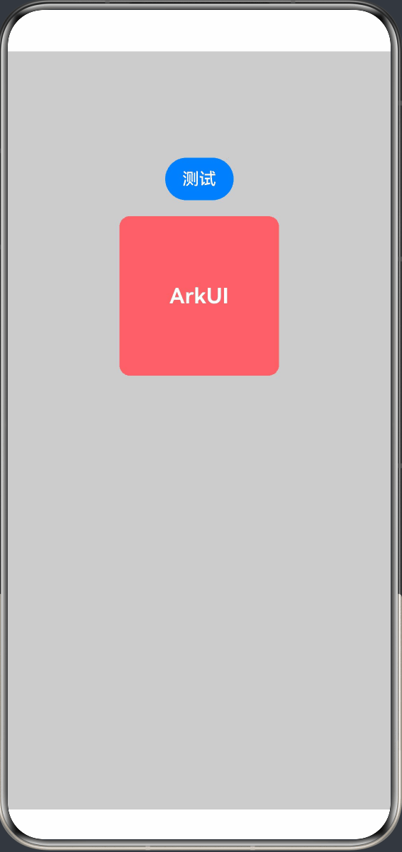
代码如下:
@Entry
@Component
struct TransitionPage {
  @State isPresent: boolean = true;
  private effect: TransitionEffect =
    // 使用asymmetric实现非对称转场(出现和消失效果不同)
    TransitionEffect.asymmetric(
      // 出现转场效果:从坐标(200, -200)位置平移到原位
      TransitionEffect.translate({ x: 200, y: -200 })
        .animation({ duration: 1000, curve: Curve.EaseOut }),
      // 消失转场效果:透明度归零 + 缩放到0
      TransitionEffect.OPACITY
        .combine(TransitionEffect.scale({ x: 0, y: 0 }))
        .animation({ duration: 1000, curve: Curve.EaseIn })
    );

  build() {
    Column({ space: 15 }) {
      Button('测试')
        .onClick(() => {
          this.getUIContext().animateTo({ duration: 1000 }, () => {
            // 动画闭包内控制Image组件的出现和消失
            this.isPresent = !this.isPresent;
          })
        })

      if (this.isPresent) {
        Column() {
          Text('ArkUI')
            .fontWeight(FontWeight.Bold)
            .fontSize(20)
            .fontColor(Color.White)
        }
        .justifyContent(FlexAlign.Center)
        .width(150)
        .height(150)
        .borderRadius(10)
        .backgroundColor(0xf56c6c)
        .transition(this.effect)
      }
    }
    .height('100%')
    .width('100%')
    .padding({ top: 100 })
    .backgroundColor('#ccc')
  }
}
使用 transition 实现相同效果代码如下:
@Entry
@Component
struct Page1 {
  @State isPresent: boolean = true;

  build() {
    Column({ space: 15 }) {
      Button('测试')
        .onClick(() => {
          this.getUIContext().animateTo({ duration: 1000 }, () => {
            // 动画闭包内控制Image组件的出现和消失
            this.isPresent = !this.isPresent;
          })
        })

      if (this.isPresent) {
        Column() {
          Text('ArkUI')
            .fontWeight(FontWeight.Bold)
            .fontSize(20)
            .fontColor(Color.White)
        }
        .justifyContent(FlexAlign.Center)
        .width(150)
        .height(150)
        .borderRadius(10)
        .backgroundColor(0xf56c6c)
        .transition({ type: TransitionType.Insert, translate: { x: 200, y: -200 } })
        .transition({ type: TransitionType.Delete, opacity: 0, scale: { x: 0, y: 0 } })
      }
    }
    .height('100%')
    .width('100%')
    .padding({ top: 100 })
    .backgroundColor('#ccc')

  }
}
4. 动画效果
动画效果可以丰富界面的细节,提升UI界面的真实感和品质感。例如,模糊和阴影效果可以让物体看起来更加立体,使得动画更加生动。ArkUI提供了丰富的效果接口,开发者可快速打造出精致、个性化的效果。本章中主要对常用的模糊、阴影和色彩效果等效果接口进行了介绍。
1. 模糊
1. 概述
模糊可以用来体现界面空间的纵深感,区分前后元素的层级关系
| 接口 | 说明 |
|---|---|
| backdropBlur | 为当前组件添加背景模糊效果,入参为模糊半径。 |
| blur | 为当前组件添加内容模糊效果,入参为模糊半径。 |
| backgroundBlurStyle | 为当前组件添加背景模糊效果,入参为模糊样式。 |
| foregroundBlurStyle | 为当前组件添加内容模糊效果,入参为模糊样式。 |
| motionBlur | 为当前组件添加由缩放大小或位移变化引起的运动过程中的动态模糊效果,入参为模糊半径和锚点坐标。 |
说明:以上接口是实时模糊接口,会每帧进行实时渲染,性能负载较高。当模糊内容和模糊半径都不需要变化时,建议使用静态模糊接口blur。
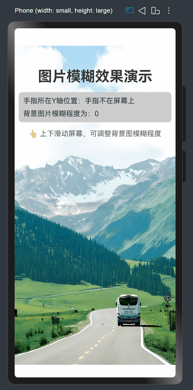
2. 案例
需求说明:
使用blur为组件添加内容模糊。这是一个图片模糊度交互演示应用,用户通过在屏幕上下滑动手指来实时调节背景图片的模糊程度。当手指在屏幕上移动时,根据手指的垂直位置计算模糊值;手指离开屏幕后,图片恢复清晰状态。应用实时显示当前手指位置和模糊度数值,为用户提供直观的视觉反馈。
思路分析:
- 创建父组件 Blur 并添加状态变量
- 实现aboutToAppear 生命周期函数,初始化显示文本
- 创建页面布局结构
- 实现触摸事件处理
效果:
代码如下:
@Entry
@Component
struct BlurTest {
  @State radius: number = 0; // 背景图片的模糊值
  @State y: string = '手指不在屏幕上';

  build() {
    Stack({ alignContent: Alignment.Center }) {
      // 背景图片
      Image($r("app.media.bg"))
        .blur(this.radius)
        .width('100%')
        .height('100%')
        .objectFit(ImageFit.Cover)
        .position({ x: 0, y: 0 })

      // 内容区域
      Column({ space: 16 }) {
        // 标题
        Text("图片模糊效果演示")
          .fontSize(32)
          .fontWeight(FontWeight.Bold)
          .margin({ top: 50 })
          .fontColor('#333')

        Column({ space: 10 }) {
          Text('手指所在Y轴位置:' + this.y)
          Text('背景图片模糊程度为:' + this.radius)
        }
        .width('95%')
        .backgroundColor('#ccc')
        .borderRadius(8)
        .padding(10)
        .alignItems(HorizontalAlign.Start)

        // 提示信息
        Text("👆 上下滑动屏幕,可调整背景图模糊程度")
          .fontSize(16)
          .fontColor('#333')
          .opacity(0.8)
      }
      .width('100%')
      .height('100%')
      .alignItems(HorizontalAlign.Center)
    }
    .width('100%')
    .height('100%')
    .layoutWeight(1)
    .onTouch((event?: TouchEvent) => {
      if (event) {
        if (event.type === TouchType.Move) {
          this.y = Number(event.touches[0].y.toString()).toString();
          this.radius = Number(this.y) / 10;
        }
        if (event.type === TouchType.Up) {
          this.radius = 0;
          this.y = '手指不在屏幕上';
        }
      }
    })
  }
}
2. 阴影
1. 概述
阴影接口shadow可以为当前组件添加阴影效果,该接口支持两种类型参数,开发者可配置ShadowOptions自定义阴影效果。ShadowOptions模式下,当radius = 0 或者 color 的透明度为0时,无阴影效果。
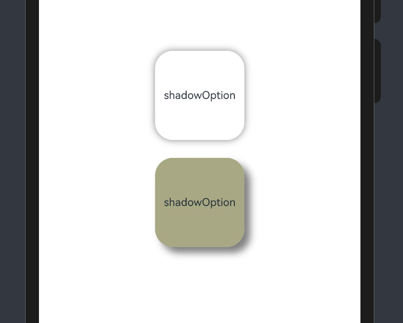
2. 案例
编码思路:
- 创建父组件 ShadowOptionDemo
- 创建基础布局结构
- 实现第一个基础阴影效果卡片
- 实现第二个带偏移的阴影效果卡片
效果图如下:
代码如下:
@Entry
@Component
struct ShadowOptionDemo {
  build() {
    Row() {
      Column() {
        // 第一个演示卡片 - 基础阴影效果
        Column() {
          Text('shadowOption').fontSize(12)
        }
        .width(100)
        .aspectRatio(1)
        .margin(10)
        .justifyContent(FlexAlign.Center)
        .backgroundColor(Color.White)
        .borderRadius(20)
        .shadow({ radius: 20, color: Color.Gray }) // 基础阴影效果

        // 第二个演示卡片 - 带偏移的阴影效果
        Column() {
          Text('shadowOption').fontSize(12)
        }
        .width(100)
        .aspectRatio(1)
        .margin(10)
        .justifyContent(FlexAlign.Center)
        .backgroundColor('#a8a888')
        .borderRadius(20)
        .shadow({
          radius: 20,
          color: Color.Gray,
          offsetX: 20,
          offsetY: 20
        }) // 带偏移的阴影效果
      }
      .width('100%')
      .height('100%')
      .justifyContent(FlexAlign.Center)
    }
    .height('100%')
    .backgroundColor('#fff')
  }
}
3. 色彩
1. 概述
通过颜色渐变接口,可以设置组件的背景颜色渐变效果,实现在两个或多个指定的颜色之间进行平稳的过渡。
| *接口* | *说明* |
|---|---|
| linearGradient | 为当前组件添加线性渐变的颜色渐变效果。 |
| sweepGradient | 为当前组件添加角度渐变的颜色渐变效果。 |
| radialGradient | 为当前组件添加径向渐变的颜色渐变效果。 |
2. 案例
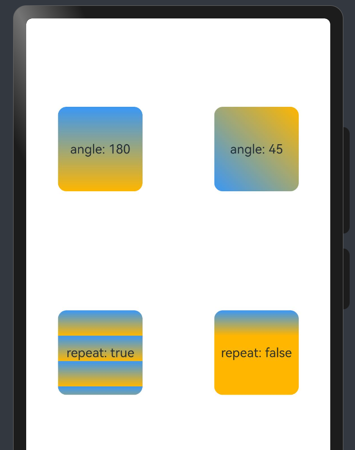
效果:
代码:
@Entry
@Component
struct LinearGradientDemo {

  build() {
    Grid() {
      // 这里将放置四个渐变效果卡片
      //第一个默认角度渐变卡片
      GridItem() {
        Column() {
          Text('angle: 180').fontSize(15)
        }
        .width(100)
        .height(100)
        .justifyContent(FlexAlign.Center)
        .borderRadius(10)
        .linearGradient({
          colors: [
            ['#ff3a97f5', 0.0],
            ['#ffffb600', 1.0],
          ]
        })
      }

      //第二个45度角渐变卡片
      GridItem() {
        Column() {
          Text('angle: 45').fontSize(15)
        }
        .width(100)
        .height(100)
        .justifyContent(FlexAlign.Center)
        .borderRadius(10)
        .linearGradient({
          angle: 45,
          colors: [
            ['#ff3a97f5', 0.0],
            ['#ffffb600', 1.0],
          ]
        })
      }

      //第三个重复渐变卡片
      GridItem() {
        Column() {
          Text('repeat: true').fontSize(15)
        }
        .width(100)
        .height(100)
        .justifyContent(FlexAlign.Center)
        .borderRadius(10)
        .linearGradient({
          repeating: true,
          colors: [
            ['#ff3a97f5', 0.0],
            ['#ffffb600', 0.3],
          ]
        })
      }

      //第四个非重复渐变卡片
      GridItem() {
        Column() {
          Text('repeat: false').fontSize(15)
        }
        .width(100)
        .height(100)
        .justifyContent(FlexAlign.Center)
        .borderRadius(10)
        .linearGradient({
          colors: [
            ['#ff3a97f5', 0.0],
            ['#ffffb600', 0.3],
          ]
        })
      }
    }
    .columnsGap(10)
    .rowsGap(10)
    .columnsTemplate('1fr 1fr')
    .rowsTemplate('1fr 1fr 1fr')
    .width('100%')
    .height('100%')
  }
}
5. 帧动画
1. 概述
通过返回应用onFrame逐帧回调的方式,让开发者在应用侧的每一帧都可以设置属性值,从而实现设置了该属性值对应组件的动画效果。
相比于属性动画,开发者可感知动画的过程,实时修改UI侧的值,具有事件可实时响应、可暂停的优点,但性能上不如属性动画。
在属性动画符合要求时更推荐使用属性动画的接口实现,可参照实现属性动画。
2. 使用animator实现动画效果
效果:
代码:
import { AnimatorResult } from '@kit.ArkUI';

@Entry
@Component
struct AnimatorTest {
  private TAG: string = '[AnimatorTest]'
  private backAnimator: AnimatorResult | undefined = undefined
  @State columnWidth: number = 100
  @State columnHeight: number = 100

  create() {
    this.backAnimator = this.getUIContext().createAnimator({
      // 建议使用 this.getUIContext().createAnimator()接口
      duration: 2000,
      easing: "ease",
      delay: 0,
      fill: "forwards",
      direction: "normal",
      iterations: 1,
      begin: 100, //动画插值起点
      end: 200 //动画插值终点
    })
    this.backAnimator.onFinish = () => {
      console.info(this.TAG, 'backAnimator onFinish')
    }
    this.backAnimator.onRepeat = () => {
      console.info(this.TAG, 'backAnimator repeat')
    }
    this.backAnimator.onCancel = () => {
      console.info(this.TAG, 'backAnimator cancel')
    }
    this.backAnimator.onFrame = (value: number) => {
      this.columnWidth = value
      this.columnHeight = value
    }
    console.info(this.TAG, 'create finish')
  }

  aboutToDisappear() {
    // 自定义组件消失时调用finish使未完成的动画结束,避免动画继续运行。
    // 由于backAnimator在onframe中引用了this, this中保存了backAnimator,
    // 在自定义组件消失时应该将保存在组件中的backAnimator置空,避免内存泄漏
    this.backAnimator?.finish();
    this.backAnimator = undefined;
  }

  build() {
    Column() {
      Column() {
        Column()
          .width(this.columnWidth)
          .height(this.columnHeight)
          .backgroundColor(Color.Red)
      }
      .width('100%')
      .height(300)

      Column() {
        Row() {
          Button('create')
            .fontSize(30)
            .fontColor(Color.Black)
            .onClick(() => {
              this.create()
            })
        }
        .padding(10)

        Row() {
          Button('play')
            .fontSize(30)
            .fontColor(Color.Black)
            .onClick(() => {
              if (this.backAnimator) {
                this.backAnimator.play()
              }
            })
        }
        .padding(10)
      }
    }
  }
}
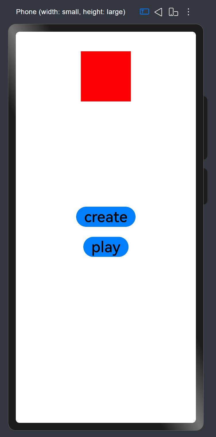
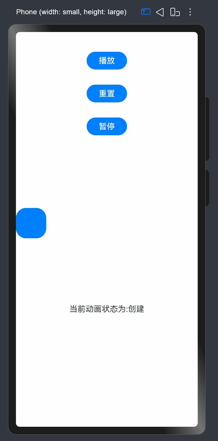
3. 使用animator实现小球抛物运动
效果如下:
代码如下:
import { AnimatorOptions, AnimatorResult } from '@kit.ArkUI';

@Entry
@Component
struct Page014 {
  @State animatorOptions: AnimatorResult | undefined = undefined;
  @State animatorStatus: string = '创建';
  @State translateX: number = 0;
  @State translateY: number = 0;
  // 动画相关配置参数
  begin: number = 0;
  end: number = 300;
  topWidth: number = 150;
  bottomHeight: number = 100;
  g: number = 0.18;
  // 动画配置选项
  animatorOption: AnimatorOptions = {
    duration: 4000,
    delay: 0,
    easing: 'linear',
    iterations: 1,
    fill: "forwards",
    direction: 'normal',
    begin: this.begin,
    end: this.end
  };

  onPageShow(): void {
    this.animatorOptions = this.getUIContext().createAnimator(this.animatorOption)

    // 动画帧回调
    this.animatorOptions.onFrame = (progress: number) => {
      this.translateX = progress;
      if (progress > this.topWidth && this.translateY < this.bottomHeight) {
        this.translateY = Math.pow(progress - this.topWidth, 2) * this.g;
      }
    }

    // 各种状态回调
    this.animatorOptions.onCancel = () => {
      this.animatorStatus = '取消';
    }
    this.animatorOptions.onFinish = () => {
      this.animatorStatus = '完成';
    }
    this.animatorOptions.onRepeat = () => {
      console.log("动画重复播放");
    }
  }

  onPageHide(): void {
    this.animatorOptions = undefined;
  }

  build() {
    Column() {
      Column({ space: 30 }) {
        Button('播放').onClick(() => {
          this.animatorOptions?.play();
          this.animatorStatus = '播放中';
        }).width(80).height(35)

        Button("重置").onClick(() => {
          this.translateX = 0;
          this.translateY = 0;
        }).width(80).height(35)

        Button("暂停").onClick(() => {
          this.animatorOptions?.pause();
          this.animatorStatus = '暂停';
        }).width(80).height(35)
      }.width("100%").height('25%')


      Stack() {
        Button()
          .width(60)
          .height(60)
          .translate({ x: this.translateX, y: this.translateY })
      }
      .width("100%")
      .height('45%')
      .align(Alignment.Start)

      Text("当前动画状态为:" + this.animatorStatus)
    }
  }
}
6. 案例
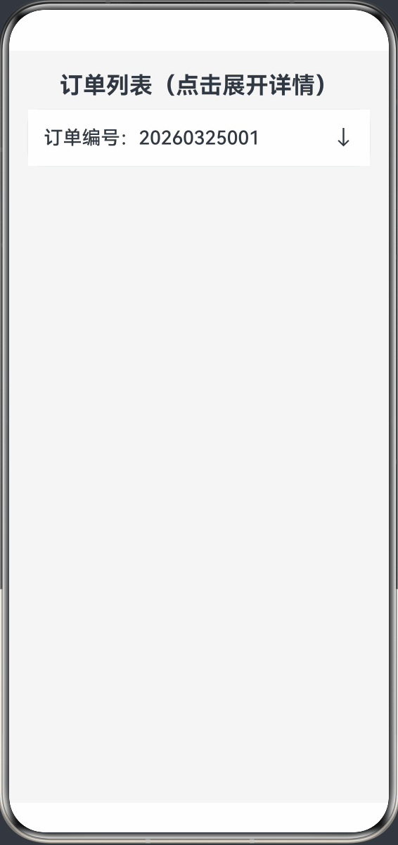
1. 展开订单详情
页面效果图下:
页面代码如下:
@Entry
@Component
struct Test01 {
  @State isExpand: boolean = false

  build() {
    Column({ space: 10 }) {
      Text("订单列表(点击展开详情)")
        .fontSize(22)
        .fontWeight(FontWeight.Bold)
        .margin({ top: 20 })

      Column() {
        Row() {
          Text("订单编号:20260325001")
            .fontSize(18)
            .fontWeight(FontWeight.Medium)

          // 用 margin 替代 Spacer,彻底不报错
          Text(this.isExpand ? "↑" : "↓")
            .fontSize(20)
        }
        .width('100%')
        .padding(15)
        .backgroundColor(Color.White)
        .justifyContent(FlexAlign.SpaceBetween)
        .onClick(() => {
          //animateTo接口,用于为闭包代码中的状态变化添加过渡动画效果
          this.getUIContext().animateTo({
            //动画持续时间,单位为毫秒。默认值:1000
            duration: 500,
            //动画曲线。推荐以Curve或ICurve形式指定。
            curve: Curve.Ease
          }, () => {
            this.isExpand = !this.isExpand
          })
        })

        if (this.isExpand) {
          Column({ space: 8 }) {
            Text("商品:鸿蒙开发实战教程")
            Text("价格:¥89.00")
            Text("状态:已支付")
            Text("时间:2026-03-25 14:30")
          }
          .width('100%')
          .padding(15)
          .backgroundColor('#FAFAFA')
        }
      }
      .width('90%')
      .borderRadius(12)
      .shadow({ radius: 3, color: '#E0E0E0' })
    }
    .width('100%')
    .height('100%')
    .backgroundColor('#F5F5F5')
  }
}
2. 打开侧边栏
效果如下:
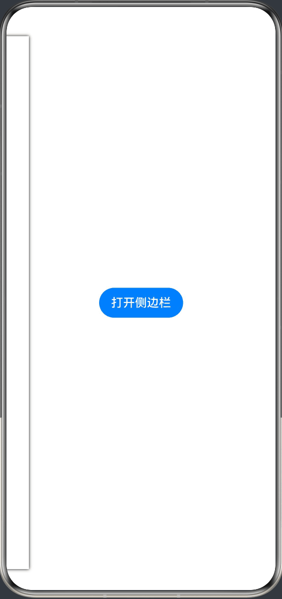
代码如下:
@Entry
@Component
struct Test02 {
  @State isShow: boolean = false;

  build() {
    Stack() {
      // 主内容
      Column() {
        Button("打开侧边栏")
          .onClick(() => {
            this.getUIContext().animateTo({
              duration: 300,
              curve: Curve.Ease
            }, () => {
              this.isShow = true;
            });
          })
      }
      .width('100%')
      .height('100%')
      .justifyContent(FlexAlign.Center)

      // 侧边栏
      Row() {
        Column() {
          Text("侧边菜单")
            .fontSize(22)
            .margin(20)
          Button("关闭")
            .onClick(() => {
              this.getUIContext().animateTo({
                duration: 300,
                curve: Curve.Ease
              }, () => {
                this.isShow = false;
              });
            })
        }
        .width(200)
        .height('100%')
        .backgroundColor(Color.White)
        .shadow({ radius: 10 })
      }
      // 核心:根据状态偏移显示/隐藏
      .translate({ x: this.isShow ? 0 : -250 })
    }
  }
}
3. 输入框聚焦动画
效果如下:
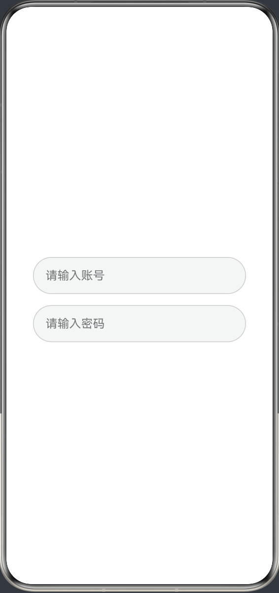
代码如下:
@Entry
@Component
struct InputFocusAnimation {
  @State isFocus1: boolean = false;
  @State isFocus2: boolean = false;

  build() {
    Column({ space: 15 }) {
      TextInput({ placeholder: "请输入账号" })
        .width('80%')
        .height(50)
        .borderWidth(1)
        .borderRadius(25)
        .borderColor(this.isFocus1 ? "#3A6FFA" : "#ccc")
        .scale({ x: this.isFocus1 ? 1.13 : 1, y: this.isFocus1 ? 1.13 : 1 })
        .onFocus(() => {
          this.getUIContext().animateTo({ duration: 200 }, () => {
            this.isFocus1 = true;
          });
        })
        .onBlur(() => {
          this.getUIContext().animateTo({ duration: 200 }, () => {
            this.isFocus1 = false;
          });
        })
      TextInput({ placeholder: "请输入密码" })
        .width('80%')
        .height(50)
        .borderWidth(1)
        .borderRadius(25)
        .borderColor(this.isFocus2 ? "#3A6FFA" : "#ccc")
        .scale({ x: this.isFocus2 ? 1.13 : 1, y: this.isFocus2 ? 1.13 : 1 })
        .onFocus(() => {
          this.getUIContext().animateTo({ duration: 200 }, () => {
            this.isFocus2 = true;
          });
        })
        .onBlur(() => {
          this.getUIContext().animateTo({ duration: 200 }, () => {
            this.isFocus2 = false;
          });
        })
    }
    .height('100%')
    .width('100%')
    .justifyContent(FlexAlign.Center)
  }
}

讨论HarmonyOS开发技术,专注于API与组件、DevEco Studio、测试、元服务和应用上架分发等。
更多推荐

 10
10 0
0- 0


 已为社区贡献21条内容

所有评论(0)