HarmonyOS 组件封装与复用最佳实践(中篇)
有时候不只是样式要复用,布局、逻辑也要复用。比如一个图片加文字的组件,图片在上,文字在下,这个结构在很多地方都要用。
写给那些在 ArkUI 里摸爬滚打的开发者们
二、组件封装的三种方式
封装这事儿,说白了就是把重复的代码抽出来,下次直接用。ArkUI 里主要有三种封装方式:公共样式封装、自定义组件封装、组件工厂类封装。
2.1 组件公共样式封装
场景
你有个按钮,在登录页面要用,在结算页面也要用。这两个按钮长得一样,操作也一样。那你没必要写两遍,把样式抽出来封装一下就行。
实现原理
用 AttributeModifier 属性修改器。这是个接口,你实现它,把公共样式写在里面,然后在组件上应用这个实例。
代码示例
先定义一个实现 AttributeModifier 接口的类:
export class MyButtonModifier implements AttributeModifier<ButtonAttribute> {
  private buttonType: ButtonType = ButtonType.Normal;

  constructor() {
  }

  applyNormalAttribute(instance: ButtonAttribute): void {
    instance.type(this.buttonType);
    instance.width(200);
    instance.height(50);
    instance.fontSize(20);
    instance.fontColor('#0A59F7')
    instance.backgroundColor('#0D000000')
  }

  applyPressedAttribute(instance: ButtonAttribute): void {
    instance.fontColor('#0A59F7')
    instance.backgroundColor('#26000000')
  }

  type(type: ButtonType): MyButtonModifier {
    this.buttonType = type;
    return this;
  }
}
使用的时候,创建实例,传给 attributeModifier() 方法:
@Entry
@Component
struct AttributeStylePage {
  modifier = new MyButtonModifier()
    .type(ButtonType.Capsule)

  build() {
    NavDestination() {
      Column() {
        Button('Capsule Button')
          .attributeModifier(this.modifier)
      }
      .margin({ top: $r('app.float.margin_top') })
      .justifyContent(FlexAlign.Start)
      .alignItems(HorizontalAlign.Center)
      .width('100%')
      .height('100%')
    }
  }
}
注意事项
AttributeModifier只能用在系统组件上,不支持修改自定义组件的属性- 实例可以跨文件导出复用
- 支持多态样式下的属性和事件修改
2.2 自定义组件封装
场景
有时候不只是样式要复用,布局、逻辑也要复用。比如一个图片加文字的组件,图片在上,文字在下,这个结构在很多地方都要用。
实现原理
用 @Component 封装自定义组件,把不变的部分写在组件内部,把可能变化的部分用参数变量暴露出去。
代码示例
先定义子组件的样式修改器:
// Image 组件的 AttributeModifier
export class CustomImageModifier implements AttributeModifier<ImageAttribute> {
  private imageWidth: Length = 0;
  private imageHeight: Length = 0;

  constructor(width: Length, height: Length) {
    this.imageWidth = width;
    this.imageHeight = height;
  }

  width(width: Length) {
    this.imageWidth = width;
    return this;
  }

  height(height: Length) {
    this.imageHeight = height;
    return this;
  }

  applyNormalAttribute(instance: ImageAttribute): void {
    instance.width(this.imageWidth);
    instance.height(this.imageHeight);
    instance.borderRadius($r('app.float.border_radius'))
  }
}

// Text 组件的 AttributeModifier
export class CustomTextModifier implements AttributeModifier<TextAttribute> {
  constructor() {
  }

  applyNormalAttribute(instance: TextAttribute): void {
    instance.fontSize($r('app.float.font_size_l'));
  }
}
然后封装自定义组件:
@Component
export struct CustomImageText {
  @Prop imageAttribute: AttributeModifier<ImageAttribute> = new CustomImageModifier(100, 100);
  @Prop textAttribute: AttributeModifier<TextAttribute> = new CustomTextModifier();
  @Prop imageSrc: PixelMap | ResourceStr | DrawableDescriptor;
  @Prop text: string;
  onClickEvent?: () => void;

  build() {
    Column({ space: 12 }) {
      Image(this.imageSrc)
        .attributeModifier(this.imageAttribute)
      Text(this.text)
        .attributeModifier(this.textAttribute)
    }.onClick(() => {
      if (this.onClickEvent !== undefined) {
        this.onClickEvent();
      }
    })
  }
}
使用的时候,可以传入自定义的样式:
@Component
struct CommonComponent {
  imageAttribute: CustomImageModifier = new CustomImageModifier(330, 330);

  build() {
    NavDestination() {
      Column() {
        CustomImageText({
          imageAttribute: this.imageAttribute,
          imageSrc: $r('app.media.image'),
          text: 'Scenery',
          onClickEvent: () => {
            this.getUIContext().getPromptAction().showToast({ message: 'Clicked' })
          }
        })
      }
    }
  }
}
2.3 组件工厂类封装
场景
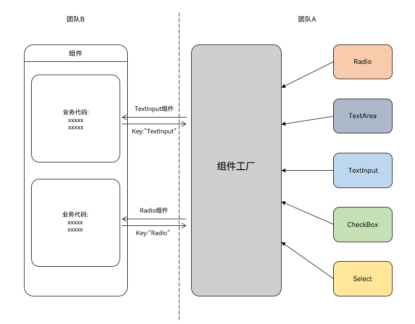
团队 A 封装了一堆组件,团队 B 想用的时候,希望能通过组件名直接获取。比如传入"TextInput"就拿到 TextInput 组件,传入"Radio"就拿到 Radio 组件。
实现原理
用 @Builder 装饰器装饰方法,然后用 wrapBuilder 函数包裹,返回 WrappedBuilder 对象。用 Map 结构存储各种组件,key 是组件名,value 是 WrappedBuilder 对象。
代码示例
先定义全局的 @Builder 方法:
@Builder
function myRadio() {
  Text($r('app.string.radio'))
    .width('100%')
    .fontColor($r('sys.color.mask_secondary'))
  Row() {
    Radio({ value: '1', group: 'radioGroup' })
      .margin({ right: $r('app.float.margin_right') })
    Text('man')
  }
  .width('100%')

  Row() {
    Radio({ value: '0', group: 'radioGroup' })
      .margin({ right: $r('app.float.margin_right') })
    Text('woman')
  }
  .width('100%')
}

@Builder
function myCheckBox() {
  Text($r('app.string.checkbox'))
    .width('100%')
    .fontColor($r('sys.color.mask_secondary'))
  Row() {
    CheckboxGroup({ group: 'checkboxGroup' })
      .checkboxShape(CheckBoxShape.ROUNDED_SQUARE)
    Text('all')
      .margin({ left: $r('app.float.margin_right') })
  }
  .width('100%')

  Row() {
    Checkbox({ name: '1', group: 'checkboxGroup' })
      .shape(CheckBoxShape.ROUNDED_SQUARE)
      .margin({ right: $r('app.float.margin_right') })
    Text('text1')
  }
  .width('100%')

  Row() {
    Checkbox({ name: '0', group: 'checkboxGroup' })
      .shape(CheckBoxShape.ROUNDED_SQUARE)
      .margin({ right: $r('app.float.margin_right') })
    Text('text2')
  }
  .width('100%')
}
然后用 Map 存储:
let factoryMap: Map<string, object> = new Map();

factoryMap.set('Radio', wrapBuilder(myRadio));
factoryMap.set('Checkbox', wrapBuilder(myCheckBox));

export { factoryMap };
使用的时候,通过 key 获取:
import { factoryMap } from '../view/FactoryMap';

@Component
struct ComponentFactory {
  build() {
    NavDestination() {
      Column({ space: 12 }) {
        let myRadio: WrappedBuilder<[]> = factoryMap.get('Radio') as WrappedBuilder<[]>;
        let myCheckbox: WrappedBuilder<[]> = factoryMap.get('Checkbox') as WrappedBuilder<[]>;

        myRadio.builder();
        myCheckbox.builder();
      }
      .width('100%')
      .padding($r('app.float.padding'))
    }
  }
}
限制
wrapBuilder 方法有几个限制:
- 只能传入全局
@Builder方法 - 返回的
WrappedBuilder对象的builder()方法只能在 struct 内部使用
2.4 常见问题
问题一:如何调用子组件中的方法
有三种方法。
方法一:使用 Controller 类
export class Controller {
  action = () => {
  };
}

@Component
export struct ChildComponent {
  @State bgColor: ResourceColor = Color.White;
  controller: Controller | undefined = undefined;

  private switchColor = () => {
    if (this.bgColor === Color.White) {
      this.bgColor = Color.Red;
    } else {
      this.bgColor = Color.White;
    }
  }

  aboutToAppear(): void {
    if (this.controller) {
      this.controller.action = this.switchColor;
    }
  }

  build() {
    Column() {
      Text('Child Component')
    }.backgroundColor(this.bgColor).borderWidth(1)
  }
}

@Entry
@Component
struct Index {
  private childRef = new Controller();

  build() {
    Column() {
      ChildComponent({ controller: this.childRef })

      Button('Switch Color')
        .onClick(() => {
          this.childRef.action();
        })
        .margin({ top: 16 })
    }
    .width('100%')
    .alignItems(HorizontalAlign.Center)
  }
}
方法二:使用@Watch
@Component
export struct ChildComponent {
  @State bgColor: ResourceColor = Color.White;
  @Link @Watch('switchColor') checkFlag: boolean;

  private switchColor() {
    if (this.checkFlag) {
      this.bgColor = Color.Red;
    } else {
      this.bgColor = Color.White;
    }
  }

  build() {
    Column() {
      Text('Child Component')
    }.backgroundColor(this.bgColor).borderWidth(1)
  }
}

@Entry
@Component
struct Index {
  @State childCheckFlag: boolean = false;

  build() {
    Column() {
      ChildComponent({ checkFlag: this.childCheckFlag })

      Button('Switch Color')
        .onClick(() => {
          this.childCheckFlag = !this.childCheckFlag;
        })
        .margin({ top: 16 })
    }
    .width('100%')
    .alignItems(HorizontalAlign.Center)
  }
}
方法三:使用事件通信
@Component
export struct ChildComponent {
  public static readonly EVENT_ID_SWITCH_COLOR = 'SWITCH_COLOR';
  @State bgColor: ResourceColor = Color.White;

  private switchColor = () => {
    if (this.bgColor === Color.White) {
      this.bgColor = Color.Red;
    } else {
      this.bgColor = Color.White;
    }
  }

  aboutToAppear(): void {
    emitter.on(ChildComponent.EVENT_ID_SWITCH_COLOR, this.switchColor);
  }

  aboutToDisappear(): void {
    emitter.off(ChildComponent.EVENT_ID_SWITCH_COLOR, this.switchColor);
  }

  build() {
    Column() {
      Text('Child Component')
    }.backgroundColor(this.bgColor).borderWidth(1)
  }
}

@Entry
@Component
struct Index {
  build() {
    Column() {
      ChildComponent()

      Button('Switch Color')
        .onClick(() => {
          emitter.emit(ChildComponent.EVENT_ID_SWITCH_COLOR);
        })
        .margin({ top: 16 })
    }
    .width('100%')
    .alignItems(HorizontalAlign.Center)
  }
}
问题二:如何调用父组件中的方法
在子组件中添加一个回调方法,父组件使用时把方法传进去:
@Component
export struct ChildComponent {
  call = () => {
  };

  build() {
    Column() {
      Button('Child Component')
        .onClick(() => {
          this.call();
        })
    }
  }
}

@Entry
@Component
struct Index {
  parentAction() {
    this.getUIContext().getPromptAction().showToast({ message: 'Parent Action' });
  }

  build() {
    Column() {
      ChildComponent({ call: this.parentAction })
    }
    .width('100%')
    .alignItems(HorizontalAlign.Center)
  }
}
问题三:如何实现类似插槽的功能
用 @BuilderParam 参数或尾随闭包:
@Component
export struct ChildComponent {
  @Builder
  customBuilder() {
  }

  @BuilderParam customBuilderParam: () => void = this.customBuilder;

  build() {
    Column() {
      Text('Text in Child')
      this.customBuilderParam();
    }
  }
}

@Entry
@Component
struct Index {
  @Builder
  componentBuilder() {
    Text(`Parent builder`)
  }

  build() {
    Column() {
      ChildComponent() {
        this.componentBuilder();
      }
    }
    .width('100%')
    .alignItems(HorizontalAlign.Center)
  }
}
问题四:如何传递 UI 组件数组实现 ForEach 循环渲染
先把 UI 组件包装成全局 @Builder,然后用 wrapBuilder 封装:
// 定义多个@Builder
@Builder
function builder1() {
  Text('Item 1')
}

@Builder
function builder2() {
  Text('Item 2')
}

// 用 wrapBuilder 封装
let wrappedBuilder1 = wrapBuilder(builder1);
let wrappedBuilder2 = wrapBuilder(builder2);

// 传递数组
let builders: WrappedBuilder<[]>[] = [wrappedBuilder1, wrappedBuilder2];

// 在子组件中渲染
ForEach(builders, (builder: WrappedBuilder<[]>) => {
  builder.builder();
})
我们这篇也讲完了。下篇将讲解组件复用、问题诊断与分析、避坑指南等内容。

讨论HarmonyOS开发技术,专注于API与组件、DevEco Studio、测试、元服务和应用上架分发等。
更多推荐

 3
3 0
0- 0


 已为社区贡献74条内容

所有评论(0)