鸿蒙应用开发UI基础第三十五节:栅格布局多设备响应式布局标准化方案
本文系统介绍鸿蒙响应式布局核心组件GridRow/GridCol,通过栅格布局实现多设备适配。主要内容包括:1) GridRow四大核心配置:断点规则、总列数、排列方向和子组件间距;2) GridCol三大能力:span占用列数、offset偏移列数和order排序规则;3) 实现手机/平板/折叠屏等全场景自适应布局;4) 栅格嵌套用法结合媒体查询完成复杂页面开发。通过行列划分和断点监听,动态调整
承接上一节媒体查询的核心能力,本节我们将系统学习鸿蒙官方响应式布局核心组件GridRow/GridCol,搞定「一套代码,多设备适配」的标准化解决方案。
【学习目标】
- 掌握
GridRow/GridCol核心能力,理解栅格断点与媒体查询的联动逻辑 - 吃透
GridRow四大核心配置:断点规则、总列数、排列方向、子组件间距的完整用法 - 掌握
GridCol三大核心能力:span占用列数、offset偏移列数、order排序规则 - 实现 手机/平板/折叠屏/横竖屏 全场景自适应布局,一套代码适配全尺寸设备
- 理解栅格嵌套用法,结合媒体查询工具类,完成复杂页面的响应式开发
一、工程目录结构
复用上一节MediaQueryDemo工程,目录结构如下:
MediaQueryDemo/
├── entry/src/main/ets/
│   ├── utils/
│   │   └── MediaQueryUtil.ets      // 上一节封装的媒体查询工具类
│   └── pages/
│       ├── Index.ets               // 本节:3个示例导航入口(新)
│       ├── GridRowBaseDemo.ets     // 本节:栅格基础示例(新)
│       ├── GridRowNestDemo.ets     // 本节:栅格嵌套示例(新)
│       └── GridRowDemo.ets         // 本节:电商首页综合实战(新)
└── resources/                      // 工程资源目录
二、栅格布局核心基础
2.1 什么是栅格布局
栅格布局是鸿蒙官方提供的响应式布局标准化组件,以「行(GridRow)+ 列(GridCol)」为核心,将页面划分为等宽的列数,通过断点规则监听设备宽度变化,动态修改子组件的占位、偏移、排序,彻底解决多尺寸多设备的动态布局问题。
核心规则:
GridRow为栅格容器组件,必须与栅格子组件GridCol联合使用,单独使用不生效。
2.2 栅格布局核心适配逻辑
- 容器
GridRow监听设备/窗口宽度变化,触发断点切换 - 断点切换后,子组件
GridCol自动更新占位、偏移、排序规则 - 子组件超出一行总列数时,自动换行适配,无需手动处理布局逻辑
三、栅格容器 GridRow详解
GridRow 是栅格布局的核心容器,负责定义全局布局规则、断点规则、列数规则,所有配置均支持断点差异化设置。
3.1 构造函数语法
GridRow(option?: {
  breakpoints?: BreakpointsOptions;  // 断点规则配置
  columns?: number | GridRowColumnOption;  // 布局总列数
  direction?: GridRowDirection;  // 子组件排列方向
  gutter?: number | GutterOption;  // 子组件间距
})
3.2 断点规则 breakpoints
栅格布局以设备水平宽度(单位vp) 作为断点依据,将设备宽度划分为不同区间,可针对不同区间设置差异化布局规则,与上一节媒体查询断点完全同源。
3.2.1 默认断点规则
鸿蒙栅格默认提供4个断点,将设备宽度分为4类,无需额外配置即可使用:
| 断点名称 | 取值范围(vp) | 设备描述 |
|---|---|---|
| xs | [0, 320) | 最小宽度类型设备 |
| sm | [320, 600) | 小宽度类型设备(手机竖屏) |
| md | [600, 840) | 中等宽度类型设备(折叠屏、平板竖屏) |
| lg | [840, +∞) | 大宽度类型设备(平板横屏、车机) |
3.2.2 自定义断点规则
支持最多6个断点(xs、sm、md、lg、xl、xxl),通过单调递增数组设置断点位置,数组长度最大为5,对应6个断点区间,规则如下:
| 传入数组 | 断点区间划分 |
|---|---|
| [n0, n1, n2, n3, n4] | xs: [0, n0)、sm: [n0, n1)、md: [n1, n2)、lg: [n2, n3)、xl: [n3, n4)、xxl: [n4, +∞) |
核心配置项:
value:断点数值数组,必须单调递增,单位必须加vp,否则不生效reference:断点切换参照物,可选BreakpointsReference.WindowSize(应用窗口宽度,推荐)、BreakpointsReference.ComponentSize(组件自身宽度)
代码示例:
// 自定义断点,覆盖手机、折叠屏、平板、大屏设备
GridRow({
  breakpoints: {
    value: ['320vp', '600vp', '840vp', '1440vp', '1600vp'],
    reference: BreakpointsReference.WindowSize
  }
}) {
  // 栅格子组件GridCol
}
3.2.3 断点变化监听事件
通过 onBreakpointChange 监听断点切换,可联动页面样式、逻辑更新,与上一节媒体查询工具类完美配合:
GridRow() {
  // 子组件内容
}
.onBreakpointChange((breakpoint: string) => {
  console.info(`当前断点切换为:${breakpoint}`);
  // 断点切换后联动更新页面逻辑
})
3.3 布局总列数 columns
定义栅格容器在不同断点下的总列数,是栅格布局的核心基准。
- API 20之前:columns默认值为12,即在未设置columns时,任何断点下,栅格布局均被分成12列。
- API 20及以后:columns默认值为{ xs: 2, sm: 4, md: 8, lg: 12, xl: 12, xxl: 12 }。
3.3.1 固定列数配置
所有断点下使用统一的总列数,适用于简单布局场景:
// 所有设备均分为8列
GridRow({ columns: 8 }) {}
3.3.2 断点差异化列数配置
针对不同断点设置不同总列数,未设置的断点遵循继承规则:
- 小于已设置的最小断点:使用默认值12列
- 大于已设置的最大断点:继承前一个断点的列数值
代码示例:
GridRow({
  // 小屏4列、中屏8列、大屏12列
  columns: { sm: 4, md: 8, lg: 12 },
  breakpoints: {
    value: ['320vp', '600vp', '840vp']
  }
}) {
  // 子组件内容
}
继承规则说明:上述配置中,xs断点不配置API20会签默认12列,API20之后默认继承sm栅格数量。
3.4 排列方向 direction
定义栅格子组件在容器中的排列方向,默认从左到右排列:
| 枚举值 | 说明 |
|---|---|
| GridRowDirection.Row | 默认值,子组件从左往右排列 |
| GridRowDirection.RowReverse | 子组件从右往左反向排列 |
代码示例:
// 反向排列
GridRow({ direction: GridRowDirection.RowReverse }) {}
3.5 子组件间距 gutter
定义栅格子组件之间的水平、垂直间距,避免子组件紧贴在一起,提升布局美观度。
3.5.1 统一间距配置
水平、垂直方向使用相同间距:
// 子组件水平、垂直间距均为10vp
GridRow({ gutter: 10 }) {}
3.5.2 差异化间距配置
单独设置水平、垂直方向的间距:
// 水平间距20vp,垂直间距15vp
GridRow({ gutter: { x: 20, y: 15 } }) {}
四、栅格子组件 GridCol
GridCol 是栅格布局的子组件,必须作为 GridRow 的直接子组件使用,负责定义单个元素在不同断点下的占位、偏移、排序规则。
4.1 构造函数语法
GridCol(option?: {
  span?: number | GridColColumnOption;  // 占用列数
  offset?: number | GridColColumnOption;  // 偏移列数
  order?: number | GridColColumnOption;  // 排序序号
})
4.2 span 占用列数
定义子组件在栅格容器中占用的列数,默认值为1,决定了子组件的宽度,是栅格布局最核心的属性。
4.2.1 固定占用列数
所有断点下占用相同列数:
GridRow({ columns: 12 }) {
  // 所有设备均占用2列
  GridCol({ span: 2 }) {
    Text('固定占位')
  }
}
4.2.2 断点差异化占用列数
针对不同断点设置不同占用列数,实现响应式适配,一行内子组件span总和超过容器总列数时,自动换行。
4.3 offset 偏移列数
定义子组件相对于前一个子组件的偏移列数,默认值为0,用于实现留白、居中、两端对齐等布局效果。
4.3.1 固定偏移列数
所有断点下偏移相同列数:
GridRow({ columns: 12 }) {
  // 前一个子组件
  GridCol({ span: 4 }) {
    Text('左侧')
  }
  // 偏移2列,再占用4列,实现左右留白
  GridCol({ span: 4, offset: 2 }) {
    Text('右侧')
  }
}
4.3.2 断点差异化偏移列数
针对不同断点设置不同偏移量,适配不同设备的布局留白:
GridRow({ columns: 12 }) {
  GridCol({
    // 手机端占10列、左右各偏移1列居中;平板端占8列、左右各偏移2列居中
    span: { sm: 10, md: 8 },
    offset: { sm: 1, md: 2 }
  }) {
    Text('居中内容')
      .width('100%')
      .height(100)
      .textAlign(TextAlign.Center)
      .backgroundColor('#FFFFFF')
  }
}
关键注意点:offset是累计偏移,会占用栅格总列数,需保证「前一个子组件span + 当前offset + 当前span ≤ 总列数」,否则会自动换行。
4.4 order 排序序号
定义子组件的排列次序,默认按代码书写顺序排列,order数值越小,组件排列越靠前,可实现不同设备下的元素顺序重排。
4.4.1 排序规则
- 子组件未设置order或设置相同order,按代码书写顺序排列
- 子组件设置不同order,按数值从小到大排列
- 部分设置order、部分未设置,未设置order的组件按代码顺序排在最前面,设置了order的组件再按数值排序
4.5 基础示例代码
代码示例:
import { GridBreakpointType, MediaQueryUtil } from '../utils/MediaQueryUtil';

@Entry
@Component
struct GridRowBaseDemo {
  @State currentBreakpoint: string = 'xs';
  private mediaUtil = MediaQueryUtil.getInstance();

  aboutToAppear(): void {
    this.initMediaQuery();
  }

  private initMediaQuery(): void {
    this.mediaUtil.init(this.getUIContext());
    this.mediaUtil.onBreakpointChange((breakpoint: GridBreakpointType) => {
      this.currentBreakpoint = breakpoint;
    });
  }

  aboutToDisappear(): void {
    this.mediaUtil.offBreakpointChange();
  }

  // order 排序演示
  @Builder
  orderDemoBuilder() {
    Text("1. order 排序演示(小屏正序 / 大屏倒序)")
      .fontSize(18)
      .fontWeight(FontWeight.Bold)
      .margin({ bottom: 10 });

    GridRow({ columns: 12, gutter: 10 }) {
      GridCol({ span: 3, order: { sm: 1, lg: 4 } }) {
        Text('1')
          .width('100%')
          .height(50)
          .textAlign(TextAlign.Center)
          .backgroundColor('#FF3B30')
      }
      GridCol({ span: 3, order: { sm: 2, lg: 3 } }) {
        Text('2')
          .width('100%')
          .height(50)
          .textAlign(TextAlign.Center)
          .backgroundColor('#FF9500')
      }
      GridCol({ span: 3, order: { sm: 3, lg: 2 } }) {
        Text('3')
          .width('100%')
          .height(50)
          .textAlign(TextAlign.Center)
          .backgroundColor('#34C759')
      }
      GridCol({ span: 3, order: { sm: 4, lg: 1 } }) {
        Text('4')
          .width('100%')
          .height(50)
          .textAlign(TextAlign.Center)
          .backgroundColor('#007AFF')
      }
    }
    .margin({ bottom: 20 });
  }

  // 商品栅格演示
  @Builder
  goodsGridBuilder() {
    Text("2. 多设备响应式栅格演示")
      .fontSize(18)
      .fontWeight(FontWeight.Bold)
      .margin({ top: 10, bottom: 10 });

    GridRow({
      columns: 12,
      breakpoints: {
        value: ['320vp', '600vp', '840vp', '1440vp'],
        reference: BreakpointsReference.WindowSize
      },
      gutter: { x: 15, y: 15 }
    }) {
      ForEach([1, 2, 3, 4, 5, 6, 7, 8, 9, 10, 11, 12], (index: number) => {
        GridCol({
          span: {
            xs: 12,
            sm: 6,
            md: 4,
            lg: 3,
            xl: 2,
            xxl: 2
          }
        }) {
          Row() {
            Text(`商品${index}`)
              .fontSize(16)
              .fontWeight(FontWeight.Medium)
              .fontColor($r('sys.color.ohos_id_color_text_primary'))
          }
          .width('100%')
          .height(100)
          .justifyContent(FlexAlign.Center)
          .backgroundColor($r('sys.color.ohos_id_color_sub_background'))
          .borderRadius(12)
          .shadow({ radius: 3, color: '#00000010' })
        }
      })
    }
  }

  build() {
    Column() {
      // 当前断点
      Text("当前设备规格:" + this.currentBreakpoint)
        .fontSize(20)
        .fontWeight(FontWeight.Medium)
        .fontColor($r('sys.color.ohos_id_color_text_primary'))
        .margin({ bottom: 15 });

      // 调用自定义构造函数
      this.orderDemoBuilder();
      this.goodsGridBuilder();
    }
    .padding(20)
    .width('100%')
    .height('100%')
    .backgroundColor($r('sys.color.ohos_id_color_background'))
  }
}
运行效果
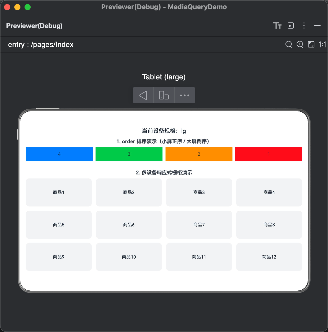
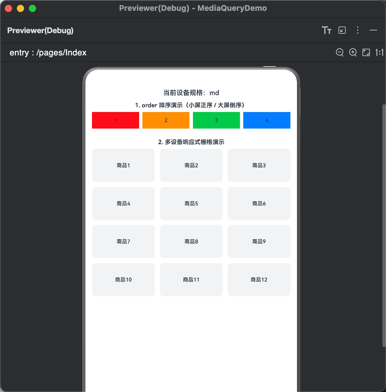
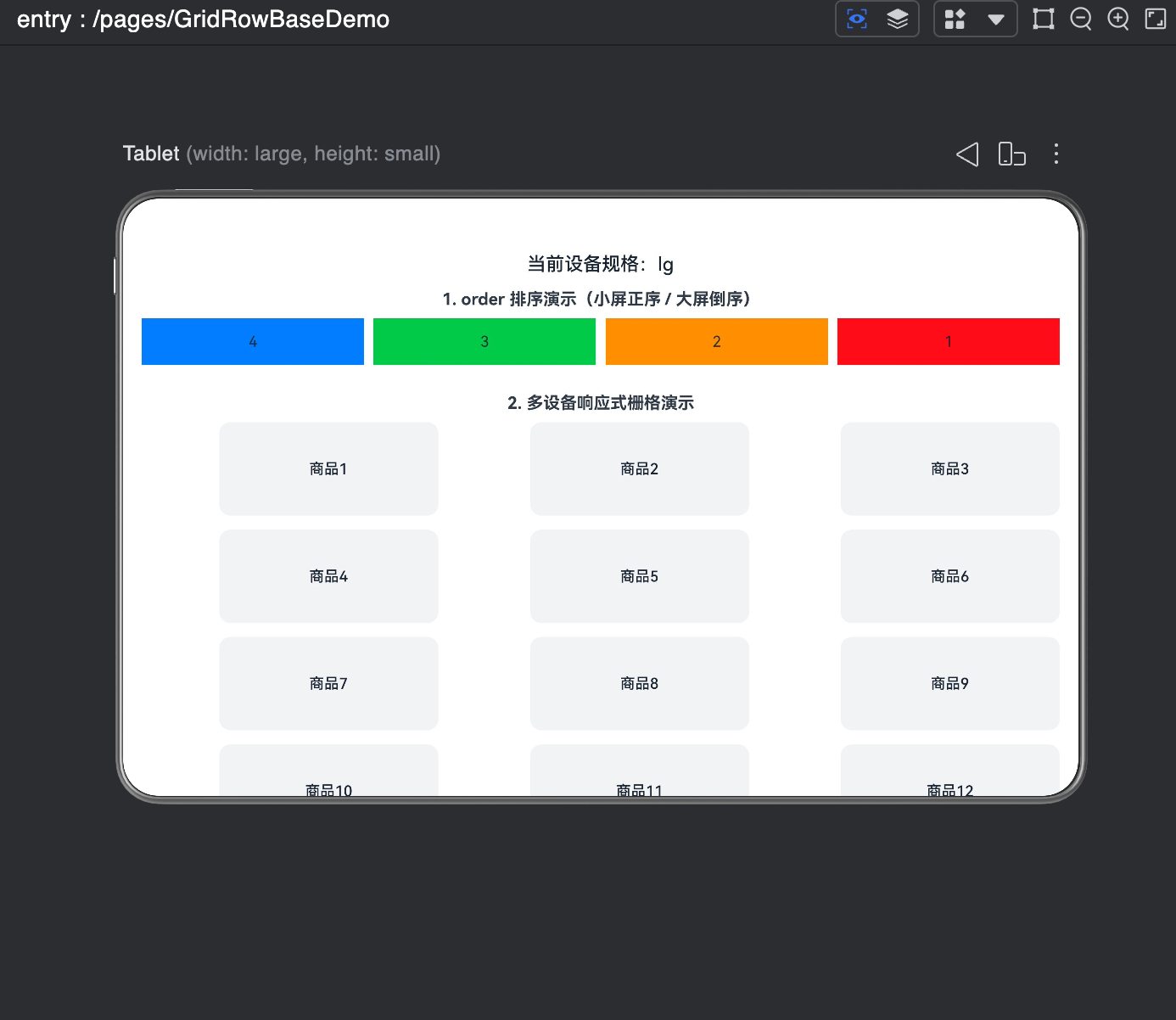
-
order 排序演示效果
- 小屏(sm 断点):组件按代码顺序显示:1 → 2 → 3 → 4
- 大屏(lg 断点):组件按 order 配置倒序显示:4 → 3 → 2 → 1
- 无需修改页面结构,仅通过属性配置即可实现不同设备下的显示顺序动态调整
-
多设备响应式商品栅格效果
- xs 超小屏:一行显示 1 个商品,宽度占满整行
- sm 手机竖屏:一行显示 2 个商品,均匀分布
- md 平板竖屏:一行显示 3 个商品,布局规整
- lg 平板横屏:一行显示 4 个商品,充分利用大屏空间
- xl/xxl 超大屏:一行显示 6 个商品,高密度布局
- 所有设备下卡片间距统一、宽高比一致,自动适配无变形、无溢出
-
offset 偏移演示效果
- 为 GridCol 设置
span: 3+offset: 1,单个组件实际占用 4 列 - 在 12 列栅格中一行可整齐排列 3 个组件
- 组件自动留白错位排列,布局层次清晰,无重叠、无截断
- 可快速实现居中布局、间隔布局等常见排版效果
- 为 GridCol 设置
效果展示
| order 排序演示效果 | 多设备响应式商品栅格效果 | offset 偏移演示效果 |
|---|---|---|
 |
 |
 |
五、栅格组件的嵌套使用
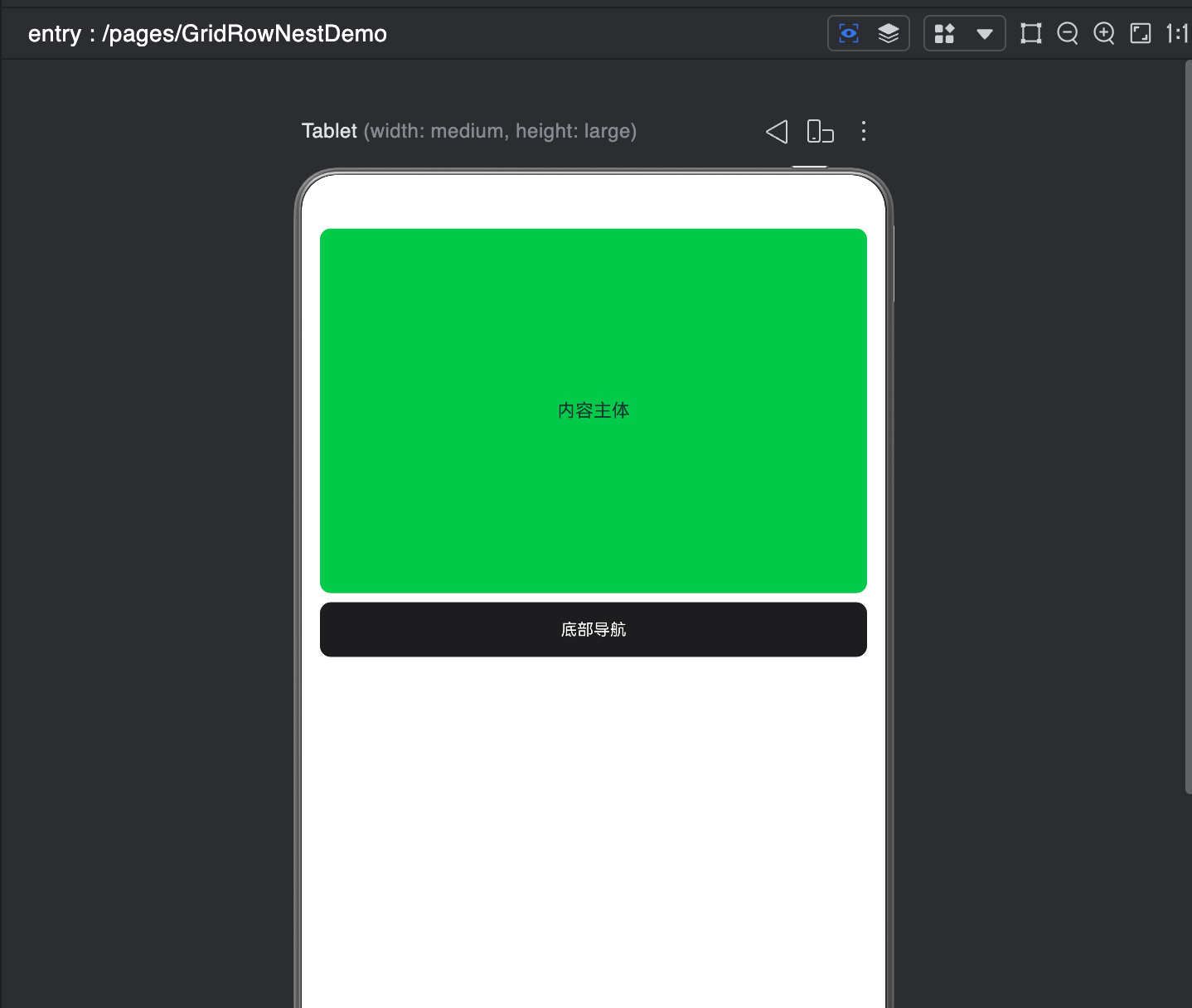
栅格组件支持嵌套使用,用于实现复杂页面的精细化布局,核心规则:嵌套的子GridRow的列数基准,是父GridCol的宽度,而非全局屏幕宽度。
嵌套示例
@Entry
@Component
struct GridRowNestDemo {

  build() {
    // 最外层:全局栅格布局
    GridRow({ columns: 12, gutter: { x: 10, y: 10 } }) {
      // 1. 主体内容区域(嵌套栅格)
      GridCol({ span: 12 }) {
        this.MainContentArea();
      }

      // 2. 底部导航区域
      GridCol({ span: 12 }) {
        this.FooterArea();
      }
    }
    .width('100%')
    .height('100%')
    .padding(20)
    .backgroundColor('#FFFFFF')
  }

  /**
   * 主体内容区域(内部嵌套第二层栅格)
   * 包含:侧边栏 + 内容区
   */
  @Builder
  MainContentArea() {
    GridRow({ columns: 12, gutter: 10 })
    {
      // 小于 lg 时 span: 0 → 隐藏
      // 大于等于 lg 时 span: 2 → 显示
      GridCol({
        span: { xs: 0, md: 0, lg: 2 }
      }) {
        this.Sidebar();
      }

      // 内容区:小屏占满12列,大屏占10列
      GridCol({
        span: { xs: 12, md: 12, lg: 10 }
      }) {
        this.ContentBody();
      }
    }.width('100%')
    .height(400)
    .backgroundColor('#F5F5F5')
    .borderRadius(12)
  }

  /** 侧边栏 */
  @Builder
  Sidebar() {
    Row() {
      Text('侧边栏')
        .fontSize(20)
        .fontColor('#FFFFFF')
    }
    .width('100%')
    .height('100%')
    .justifyContent(FlexAlign.Center)
    .backgroundColor('#007AFF')
    .borderRadius(12)
  }

  /** 内容主体 */
  @Builder
  ContentBody() {
    Row() {
      Text('内容主体')
        .fontSize(20)
    }
    .width('100%')
    .height('100%')
    .justifyContent(FlexAlign.Center)
    .backgroundColor('#34C759')
    .borderRadius(12)
  }

  /** 底部导航 */
  @Builder
  FooterArea() {
    Row() {
      Text('底部导航')
        .fontSize(18)
        .fontColor('#FFFFFF')
    }
    .width('100%')
    .height(60)
    .justifyContent(FlexAlign.Center)
    .backgroundColor('#1D1D1F')
    .borderRadius(12)
  }
}
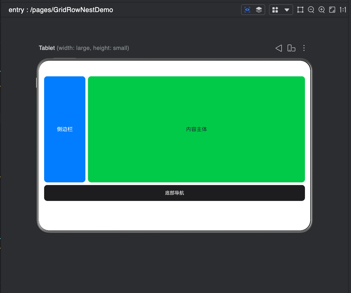
运行效果
- 小屏/中屏(xs/md):侧边栏隐藏(span:0),内容区域占满全部宽度,页面简洁适配手机
- 大屏(lg 及以上):侧边栏显示(span:2),内容区域自适应占 10 列,呈现 PC 端经典布局
- 嵌套栅格以父容器宽度为 12 列基准,布局层级清晰,内外栅格互不干扰
- 底部导航固定占满整行,视觉统一,适配全尺寸设备
效果展示
| 侧边栏显示 | 侧边栏隐藏 |
|---|---|
 |
 |
六、电商首页全场景响应式开发
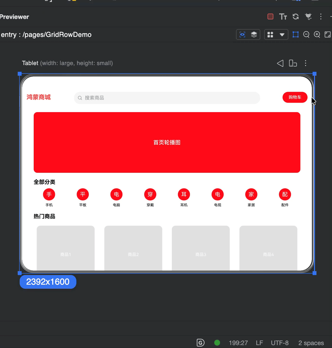
结合上一节的MediaQueryUtil媒体查询工具类,实现一个完整的电商首页,支持横竖屏切换、深浅色模式适配、手机/平板/折叠屏全设备适配,可直接复制运行。
完整代码(pages/GridRowDemo.ets)
import { MediaQueryUtil, MediaFullState } from '../utils/MediaQueryUtil';

@Entry
@Component
struct GridRowDemo {
  // 响应式状态(复用媒体查询工具类)
  @State isDarkMode: boolean = false;
  @State currentBreakpoint: string = 'sm';

  // 主题配色
  @State pageBgColor: string = '#F5F5F5';
  @State cardBgColor: string = '#FFFFFF';
  @State textColor: string = '#000000';
  @State primaryColor: string = '#FF3B30';

  // 模拟分类数据
  private categoryList: string[] = ['手机', '平板', '电脑', '穿戴', '耳机', '电视', '家居', '配件'];
  // 模拟商品数据
  private goodsList: number[] = [1, 2, 3, 4, 5, 6, 7, 8, 9, 10, 11, 12];

  aboutToAppear(): void {
    // 初始化媒体查询工具类,联动栅格断点
    const mediaUtil = MediaQueryUtil.getInstance();
    mediaUtil.init(this.getUIContext());

    mediaUtil.onFullStateChange((state: MediaFullState) => {
      this.isDarkMode = state.isDarkMode;
      this.currentBreakpoint = state.breakpoint;
      this.updateTheme(state.isDarkMode);
    });
  }

  // 导航栏(修复水平对齐 + 保留原有样式)
  @Builder
  navigationBarBuilder() {
    GridRow({
      columns: 12,
      gutter: { x: 10, y: 12 },
      breakpoints: { reference: BreakpointsReference.WindowSize },
    }) {
      // ========== 第一行 ==========
      // 商城标题:sm占6列,md/lg占2列
      GridCol({ span: { sm: 6, md: 2, lg: 2 } }) {
        Row(){
          Text('鸿蒙商城')
            .fontSize(20)
            .height(36)
            .fontWeight(FontWeight.Bold)
            .fontColor(this.primaryColor)
        }
        .width('100%')
        .justifyContent(FlexAlign.Start)
      }
      // 购物车sm小屏
      GridCol({ span: { sm: 6, md: 0, lg: 0 } }) {
        Row() {
          Button('购物车',{buttonStyle:ButtonStyleMode.NORMAL})
            .fontSize(14)
            .height(36) // 固定按钮高度
            .fontColor(this.cardBgColor)
            .backgroundColor(this.primaryColor)
        }
        .justifyContent(FlexAlign.End)
        .width('100%')
      }

      // ========== 第二行(sm占12列,md/lg拆分) ==========
      GridCol({ span: { sm: 12, md: 6, lg: 8 } }) {
         Row(){
           Search({placeholder:'搜索商品'})
             .width('100%')
             .backgroundColor(this.pageBgColor)
             .placeholderColor('#999999')
             .margin(0)
         }.width('100%')
      }

      // 购物车(大屏)
      GridCol({ span: { sm: 0, md: 4, lg: 2 } }) {
        Row() {
          Button('购物车',{stateEffect:true,buttonStyle:ButtonStyleMode.NORMAL})
            .fontSize(14)
            .height(36) // 固定按钮高度
            .padding({left:20,right:20})
            .fontColor(this.cardBgColor)
            .backgroundColor(this.primaryColor)
        }
        .justifyContent(FlexAlign.End)
        .width('100%')
      }
    }
    .width('100%')
    .padding({ left: 15, right: 15, top: 12, bottom: 12 })
    .backgroundColor(this.cardBgColor)
  }

  // 轮播
  @Builder
  bannerBuilder() {
    // 2. 轮播Banner区域
    GridRow({ columns: 12 }) {
      GridCol({ span: 12 }) {
        Row() {
          Text('首页轮播图')
            .fontSize(18)
            .fontColor($r('sys.color.comp_background_list_card'))
            .fontWeight(FontWeight.Medium)
        }
        .width('100%')
        .height(this.currentBreakpoint === 'sm' ? 150 : 200)
        .justifyContent(FlexAlign.Center)
        .backgroundColor(this.primaryColor)
        .borderRadius(12)
      }
    }
    .width('92%')
    .margin({ top: 15 })

  }
  // 分类
  @Builder
  categorySectionBuilder() {
    // 3. 分类入口区域
    Text('全部分类')
      .fontSize(18)
      .fontWeight(FontWeight.Bold)
      .fontColor(this.textColor)
      .alignSelf(ItemAlign.Start)
      .margin({ left: '4%', top: 20, bottom: 10 })

    GridRow({
      columns: 8,
      gutter: { x: 10, y: 15 },
      breakpoints: { reference: BreakpointsReference.WindowSize }
    }) {
      ForEach(this.categoryList, (item: string) => {
        GridCol({ span: { sm: 2, md: 1 } }) {
          Column({ space: 8 }) {
            Row() {
              Text(item[0])
                .fontSize(18)
                .fontColor($r('sys.color.comp_background_list_card'))
            }
            .width(40)
            .height(40)
            .borderRadius(20)
            .backgroundColor(this.primaryColor)
            .justifyContent(FlexAlign.Center)

            Text(item)
              .fontSize(12)
              .fontColor(this.textColor)
          }
          .width('100%')
        }
      })
    }
    .width('92%')
  }
  // 商品列表
  @Builder
  goodsListBuilder() {

    // 4. 商品网格区域
    Text('热门商品')
      .fontSize(18)
      .fontWeight(FontWeight.Bold)
      .fontColor(this.textColor)
      .alignSelf(ItemAlign.Start)
      .margin({ left: '4%', top: 20, bottom: 10 })

    GridRow({
      columns: 12,
      gutter: { x: 12, y: 12 },
      breakpoints: { reference: BreakpointsReference.WindowSize }
    }) {
      ForEach(this.goodsList, (index: number) => {
        GridCol({
          // 手机竖屏2列、平板竖屏3列、平板横屏4列、大屏6列
          span: { sm: 6, md: 4, lg: 3, xl: 2 }
        }) {
          Column({ space: 8 }) {
            // 商品图片
            Row() {
              Text(`商品${index}`)
                .fontSize(14)
                .fontColor($r('sys.color.comp_background_list_card'))
            }
            .width('100%')
            .aspectRatio(1)
            .backgroundColor('#E0E0E0')
            .borderRadius(12)
            .justifyContent(FlexAlign.Center)

            // 商品名称
            Text(`鸿蒙旗舰商品${index}`)
              .fontSize(14)
              .fontColor(this.textColor)
              .maxLines(1)
              .textOverflow({ overflow: TextOverflow.Ellipsis })
              .width('100%')

            // 商品价格
            Text(`¥${99 + index * 10}.00`)
              .fontSize(16)
              .fontColor(this.primaryColor)
              .fontWeight(FontWeight.Bold)
              .width('100%')
          }
          .width('100%')
          .padding(10)
          .backgroundColor(this.cardBgColor)
          .borderRadius(12)
        }
      })
    }
    .width('92%')
    .margin({ bottom: 20 })
  }
  build() {
    Column(){
      this.navigationBarBuilder()
      Scroll() {
        Column(){
          this.bannerBuilder()
          this.categorySectionBuilder()
          this.goodsListBuilder()
        } .width('100%')
        .layoutWeight(1)
       .backgroundColor(this.cardBgColor)
      }
      .width('100%')
      .height('100%')
    }
  }

  // 更新深浅色主题
  private updateTheme(isDark: boolean): void {
    if (isDark) {
      this.pageBgColor = '#121212';
      this.cardBgColor = '#1E1E1E';
      this.textColor = '#FFFFFF';
    } else {
      this.pageBgColor = '#F5F5F5';
      this.cardBgColor = '#FFFFFF';
      this.textColor = '#000000';
    }
  }

  // 页面销毁时解绑监听,避免内存泄漏
  aboutToDisappear(): void {
    MediaQueryUtil.getInstance().removeAllListeners();
  }
}
运行效果
-
顶部导航栏
- 小屏:购物车、Logo一行,搜索单独一行。
- 大屏:Logo、购物车、搜索条一行布局。
- 深浅色模式下导航栏背景、文字颜色自动切换
-
轮播Banner
- 手机竖屏高度自动压缩为 150vp
- 平板/大屏高度自动扩展为 200vp
- 圆角、配色统一,视觉效果一致
-
分类图标区
- 小屏一行显示 4 个分类
- 大屏一行显示 8 个分类
- 图标+文字垂直居中,布局整齐
-
商品网格
- 手机竖屏:一行 2 列
- 平板竖屏:一行 3 列
- 平板横屏:一行 4 列
- 超大屏设备:一行 6 列
- 商品卡片自适应缩放,图片区域等比例展示,价格文字突出显示
-
深浅色模式
- 浅色模式:白底+浅灰背景,清爽明亮
- 深色模式:深灰+黑底,护眼高对比
- 系统主题切换时页面样式实时同步
效果展示
七、最佳实践与常见坑点
7.1 开发最佳实践
- 断点统一规范:栅格断点与媒体查询断点保持一致,推荐使用官方默认断点+扩展xl/xxl,避免多套规则混乱
- 列数规范:优先使用默认12列,12列可被2/3/4/6整除,适配性最强,无特殊需求不自定义列数
- 间距规范:水平间距
gutter.x推荐使用10-20vp,垂直间距gutter.y推荐使用15-30vp,保证视觉一致性 - 参照物规范:断点
reference优先使用WindowSize,适配分屏、自由窗口、横屏切换等场景 - 嵌套规范:嵌套层级不超过3层,避免布局性能损耗与逻辑混乱
7.2 适用场景
- 适用于需要一套代码实现多设备自适应的页面开发,可根据手机、平板、折叠屏及横竖屏状态自动调整布局结构。
- 常用于首页模块化布局,如轮播区、分类金刚区、商品宫格、功能入口卡片等规整排列的场景。
- 适用于需要严格按照列数划分宽度、统一页面视觉规范的项目。
- 适用于页面模块需要动态调整**占位宽度(span)、偏移距离(offset)、显示顺序(order)**的响应式场景。
- 配合 Scroll 组件可实现整页滚动,适合用于内容条数有限、结构清晰的首页、运营活动页、个人中心等页面。
注意:不适合场景
- 不适合数据量较大的长列表场景,如聊天列表、订单列表、无限加载列表等。
GridRow 会一次性渲染所有子组件,无列表复用机制,数据过多时容易出现卡顿、掉帧、内存占用过高问题,长列表优先使用 List 组件、瀑布流(WaterFlow)、网格 (Grid/GridItem)等组件。
7.3 高频踩坑避坑指南
-
错误写法:断点数组未加
vp单位,导致断点不生效
正确写法:value: ['320vp', '600vp', '840vp'] -
错误写法:断点数组非单调递增,导致布局异常
正确规则:数组必须从小到大依次递增,不可出现降序、相等数值 -
错误写法:单独使用
GridRow不搭配GridCol,导致布局不生效
正确规则:GridRow必须与GridCol联合使用,单独使用无布局效果 -
错误认知:嵌套栅格的列数基准 = 全局屏幕宽度
正确规则:嵌套GridRow的列数基准是父级GridCol的宽度,而非全局屏幕 -
错误布局:一行内
span + offset总和超过总列数,导致意外换行
正确规则:布局前计算好总列数,保证子组件span总数 + 偏移offset总数 ≤ 容器总列数 -
内存泄漏:页面销毁时未解绑媒体查询监听
正确规则:在aboutToDisappear生命周期中必须调用removeAllListeners() -
滚动失效:直接使用
GridRow希望实现内容滚动
正确规则:GridRow不支持滚动,真实开发必须使用Scroll + GridRow组合实现滚动布局 -
高度异常:给
GridRow设置固定高度导致内容被截断
正确规则:GridRow高度由内容自动撑开,不手动写死高度,滚动交给Scroll
八、内容总结
- 核心定位:
GridRow/GridCol是鸿蒙官方响应式布局标准化方案,基于媒体查询能力封装,解决多设备适配痛点 - 核心架构:
GridRow负责定义全局规则(断点、列数、间距、方向),GridCol负责定义单个元素的响应式规则(span、offset、order) - 核心能力:通过断点规则实现不同设备下的布局动态调整,支持列数、占位、偏移、排序的断点差异化配置
- 工程落地:与媒体查询工具类配合使用,可实现布局+样式+主题的全维度响应式,一套代码适配全场景
九、下节预告
下一节我们将进入*Grid网格布局与不规则宫格实战**。
- 掌握
Grid/GridItem基础用法、行列模板、间距、对齐方式 - 实现不规则宫格布局(跨行、跨列、阶梯布局、首页金刚区)
- 完成常见的九宫格、功能入口、卡片组合实战案例

讨论HarmonyOS开发技术,专注于API与组件、DevEco Studio、测试、元服务和应用上架分发等。
更多推荐

 47
47 0
0- 0


 已为社区贡献80条内容

所有评论(0)