HarmonyOS 列表流场景实现:从入门到实战
List 组件是容器ListItem 和 ListItemGroup 是子项配合 Refresh 做下拉刷新用 onReachEnd() 做上滑加载sticky 属性实现吸顶nestedScroll 实现嵌套滚动onScrollIndex() 实现列表联动记住啊,列表项多了就用 LazyForEach,别一股脑全渲染,不然卡到你怀疑人生。
一、列表流这玩意儿有多常用
列表流,说白了就是按"行"排列内容的布局。
每行列表项通过文本、图片等不同形式组合,高效显示结构化信息。内容超过屏幕了还能滚动。
这玩意儿特点:排版整齐、重点突出、对比方便、浏览速度快。
使用场景贼多:应用首页、通讯录、音乐列表、购物清单…你随便想个 APP,基本都有列表流。
今天就把几个常见列表流场景的实现给你讲明白。
二、核心组件:List
列表流主要用 List 组件,按垂直方向线性排列子组件 ListItemGroup 或 ListItem,混合渲染任意数量的图文视图。
实际场景中,一般会结合其它基础组件,形成相对复杂的交互功能。
三、多类型列表项场景
场景描述
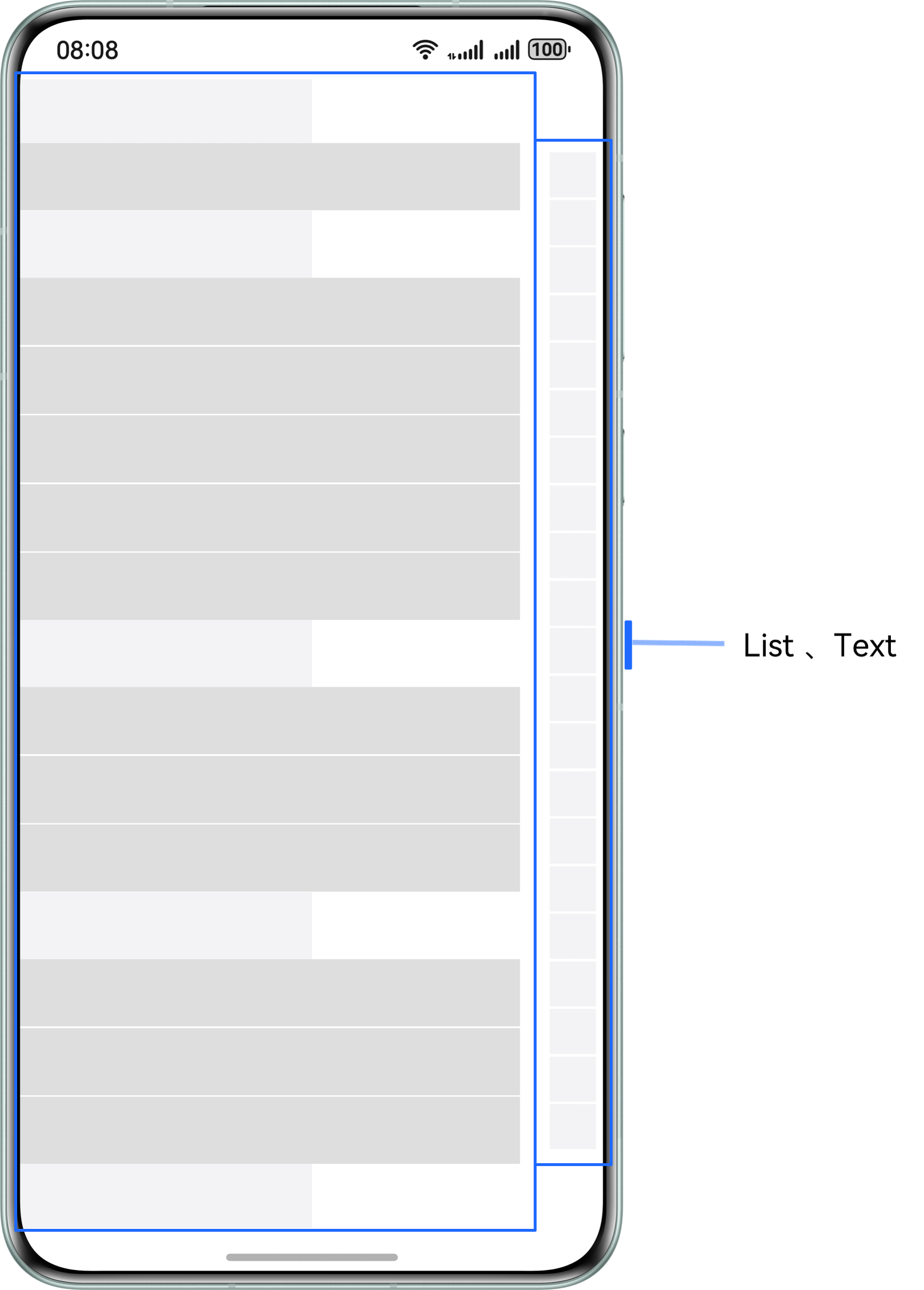
List 组件作为整个首页长列表的容器,通过 ListItem 对不同模块进行视图界面定制。
常用于门户首页、商城首页等多类型视图展示的列表信息流场景。
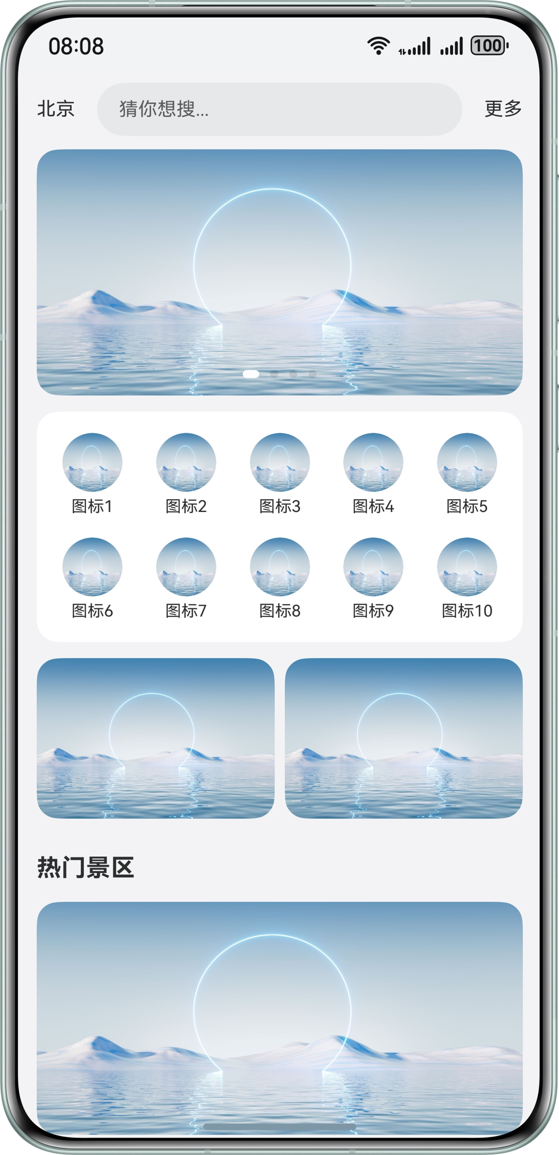
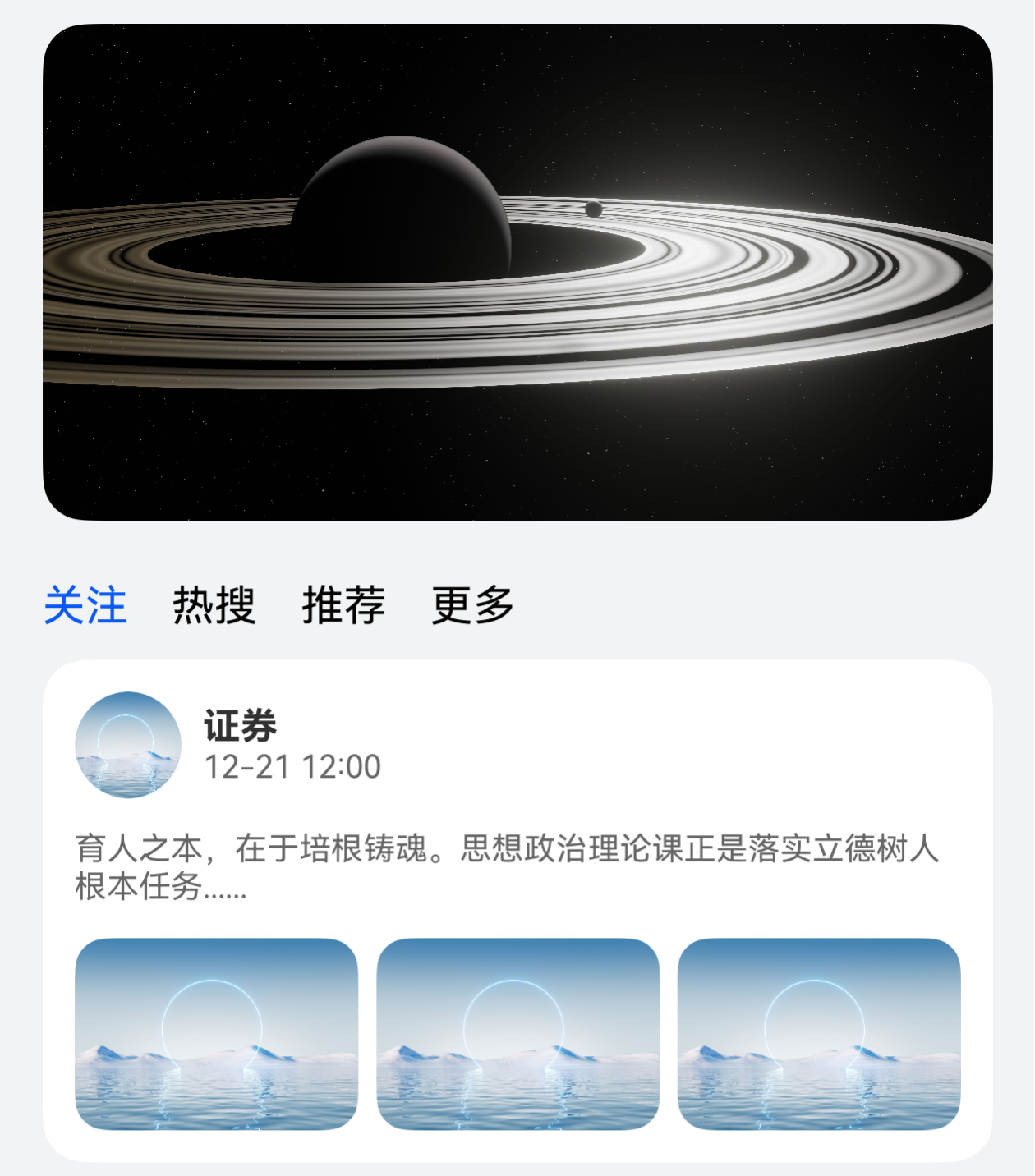
以应用首页为例:
- 页面顶部搜索框区域
- 下滑刷新模拟网络请求
- 滑动页面列表内容,景区标题吸顶
- 滑动到页面底部,上滑模拟请求添加数据
页面结构
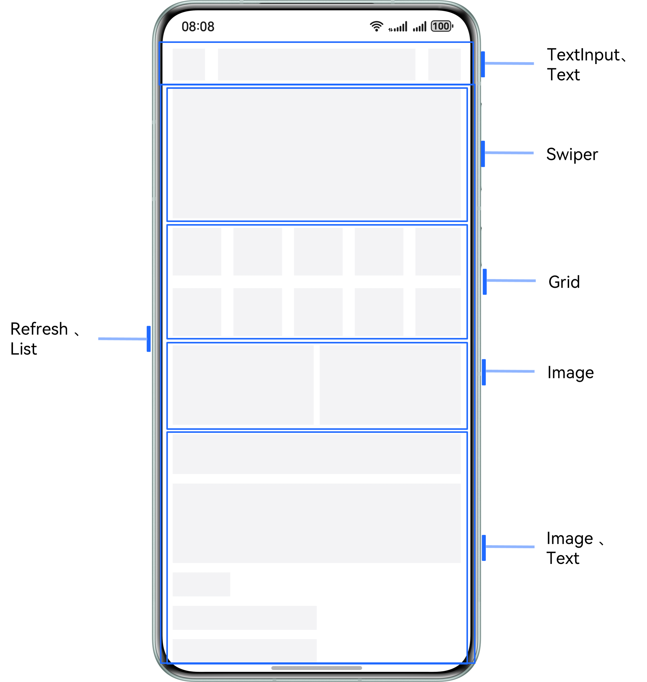
实现原理
根据列表内部各部分视图对应数据类型的区别,渲染不同的 ListItem 子组件。
Refresh 组件可以进行页面下拉操作并显示刷新动效,List 组件配合使用 Swiper、Grid 等基础组件用于页面的整体构建。
再通过 List 组件的 sticky 属性、onReachEnd() 事件和 Refresh 组件的 onRefreshing() 事件,实现下滑模拟刷新、上滑模拟添加数据及列表标题吸顶的效果。
开发步骤
第一步:顶部搜索框区域
Row() {
  Text($r('app.string.beijing'))
  TextInput({ placeholder: $r('app.string.want_search')})
  Text($r('app.string.more'))
}
实现效果:

第二步:轮播图
在 List 的第一个 ListItem 分组中,使用 Swiper 组件构建页面轮播图:
List({ space: 12 }) {
  ListItem() {
    Swiper() {
      ForEach(this.swiperContent, (item: SwiperType) => {
        Stack({ alignContent: Alignment.BottomStart }) {
          Image($r(item.pic))
        }
      }, (item: SwiperType) => JSON.stringify(item))
    }
    .autoPlay(true)
    .duration(1000)
    .curve(Curve.Linear)
    .indicator(new DotIndicator().selectedColor(Color.White))
    .itemSpace(10)
  }
}
实现效果:

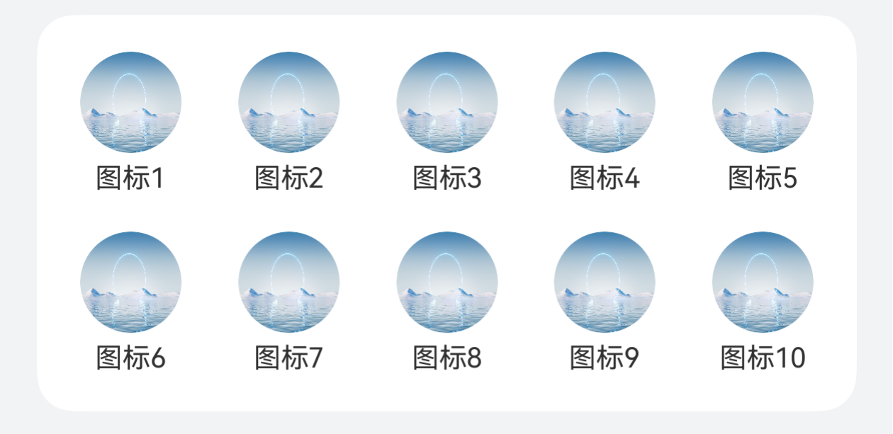
第三步:网格区域
在 List 的第二个 ListItem 分组中,使用 Grid 组件构建页面网格:
ListItem() {
  Grid() {
    ForEach(this.gridTitle, (item: Resource) => {
      GridItem() {
        Column() {
          Image($r('app.media.pic1'))
          Text(item)
        }
      }
    }, (item: Resource) => JSON.stringify(item))
  }
  .rowsGap(16)
  .columnsGap(19)
  .columnsTemplate('1fr 1fr 1fr 1fr 1fr')
}
实现效果:
第四步:推荐内容及列表内容
@Builder
scenicSpotDetailBuilder(title: Resource) {
  Column() {
    Image($r('app.media.pic1'))
    Column() {
      Text(title)
      Text() {
        Span($r('app.string.group_discount'))
        Span('999¥')
      }
    }
  }
}

List({ space: 12 }) {
  ListItem() { /* Swiper */ }
  ListItem() { /* Grid */ }
  ListItem() { /* 自定义展示区域 */ }

  ForEach(this.scenicSpotTitle, (item: Resource) => {
    ListItemGroup({ header: this.scenicSpotHeader(item) }) {
      ForEach(this.scenicSpotArray, (scenicSpotItem: Resource) => {
        ListItem() {
          this.scenicSpotDetailBuilder(scenicSpotItem);
        }
      })
    }
  })
}
第五步:下拉刷新和上滑加载
Refresh({ refreshing: $$this.isRefreshing }) {
  List({ space: 12 }) {
    // 各种 ListItem
  }
  .onReachEnd(() => {
    if (this.scenicSpotArray.length >= 20) {
      this.noMoreData = true;
      return;
    }
    setTimeout(() => {
      this.scenicSpotArray.push('scenic area' + (this.scenicSpotArray.length + 1));
    }, 500)
  })
  .onRefreshing(() => {
    this.isRefreshing = true;
    setTimeout(() => {
      this.scenicSpotArray = ['scenic area 1', 'scenic area 2', 'scenic area 3'];
      this.isRefreshing = false;
    }, 2000)
  })
}
四、Tabs 吸顶场景
场景描述
Tabs 嵌套 List 的吸顶效果,常用于新闻、资讯类应用的首页。
在首页 TabContent 的内容区域使用 List 组件配合其它组件,构建下方列表数据内容。进入页面后,向上滑动内容,中间 Tabs 页签区域实现吸顶展示的效果。
页面结构
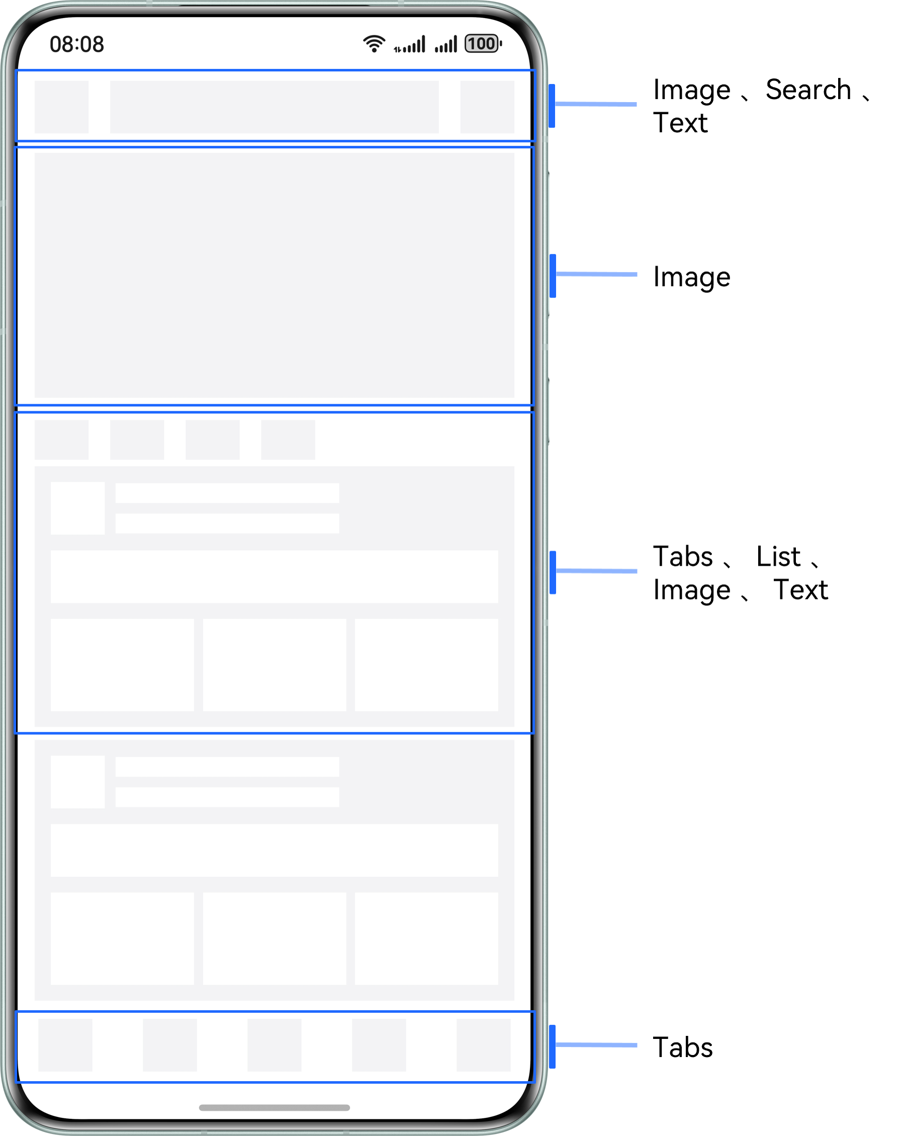
实现原理
Tabs 组件可以在页面内快速实现视图内容的切换,让用户能够聚焦于当前显示的内容,并对页面内容进行分类,提高页面空间利用率。
通过 Tabs 组件,配合使用 Stack、Scroll、Search 以及 List 等基础组件构建完整页面,再使用 List 组件的 nestedScroll 属性,结合 calc 计算高度,实现中间 Tabs 页签区域吸顶展示的效果。
开发步骤
第一步:构建 Tabs 的自定义 tabBar 内容
@Builder
tabBuilder(img: Resource, title: Resource, index: number) {
  Column() {
    Image(img)
      .fillColor(this.currentIndex === index ? '#0a59f7' : '#66000000')
    Text(title)
      .fontColor(this.currentIndex === index ? '#0a59f7' : '#66000000')
  }
  .onClick(() => {
    this.currentIndex = index;
    this.tabsController.changeIndex(this.currentIndex);
  })
}

Tabs({ barPosition: BarPosition.End, controller: this.tabsController }) {
  TabContent() { /* 内容 */ }
    .tabBar(this.tabBuilder($r('app.media.mine'), $r('app.string.tabBar1'), 0))
}
.onChange((index: number) => {
  this.currentIndex = index;
})
实现效果:
第二步:构建顶部搜索区域
Row() {
  Image($r('app.media.app_icon'))
  Search({
    placeholder: $r('app.string.want_search'),
  })
  .searchButton('search', { fontSize: 14 })
  Text($r('app.string.search'))
}
实现效果:
第三步:图片占位区域、自定义导航内容及列表内容构建
Scroll(this.scrollController) {
  Column() {
    // 图片占位区域
    Image($r('app.media.pic5'))

    // 自定义 tabBar
    Column() {
      Row({ space: 16 }) {
        ForEach(this.tabArray, (item: string, index: number) => {
          Text(item)
            .fontColor(this.currentTabIndex === index ? '#0a59f7' : Color.Black)
            .onClick(() => {
              this.contentTabController.changeIndex(index);
              this.currentTabIndex = index;
            })
        })
      }

      // Tabs
      Tabs({ barPosition: BarPosition.Start, controller: this.contentTabController }) {
        TabContent() {
          List({ space: 10, scroller: this.listScroller }) {
            CustomListItem({
              imgUrl: $r('app.media.pic1'),
              title: $r('app.string.manager_content')
            })
          }
        }
        .tabBar('follow')
      }
    }
  }
}
.scrollBar(BarState.Off)
实现效果:
第四步:给 List 组件添加 nestedScroll 属性
Tabs({ barPosition: BarPosition.Start, controller: this.contentTabController }) {
  TabContent() {
    List({ space: 10, scroller: this.listScroller }) {
      // 列表内容
    }
    .nestedScroll({
      scrollForward: NestedScrollMode.PARENT_FIRST,
      scrollBackward: NestedScrollMode.SELF_FIRST
    })
  }
  .tabBar('follow')
}
.barHeight(0)
.height('calc(100% - 100vp)')
.onChange((index: number) => {
  this.currentTabIndex = index;
})
五、分组吸顶场景
场景描述
双列表同向联动,右边字母列表用于快速索引,内容列表根据首字母进行分组。
常用于通讯录、城市选择、分组选择等页面。
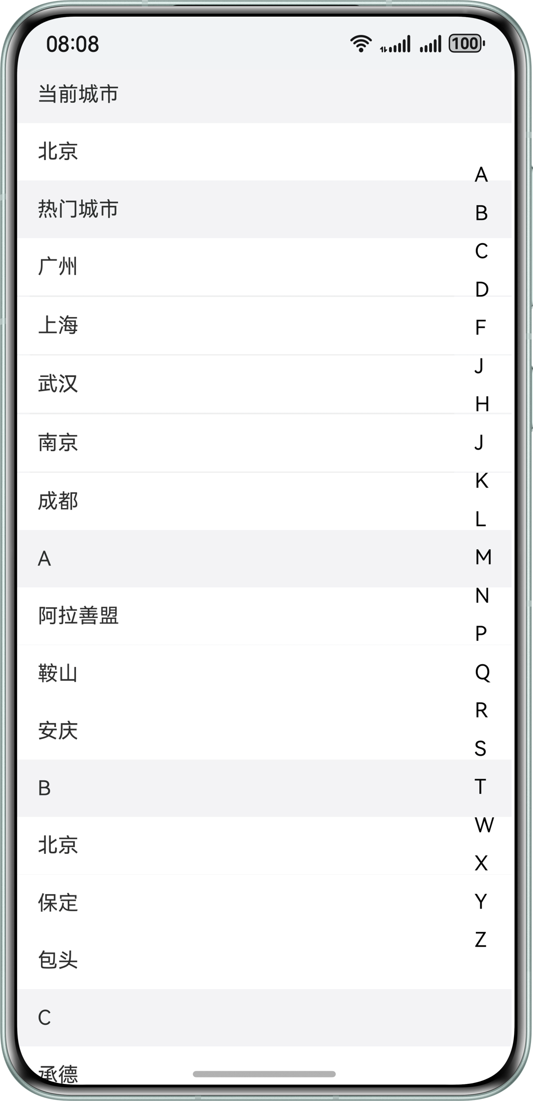
以城市列表页面为例:
- 左侧城市列表数据和右侧字母导航数据通过 List 组件展示
- 通过 Stack 组件使两个列表数据分层显示
- 滑动左侧城市列表数据,列表字母标题吸顶展示,对应右侧字母导航内容高亮显示
- 点击右侧字母导航内容,左侧城市列表展示对应内容
页面结构
实现原理
左侧 List 作为城市列表,右侧 List 为城市首字母快捷导航列表,通过 ListItem 对对应数据进行渲染展示。
使用 Stack 堆叠容器组件,字母导航列表覆盖城市列表上方,再给对应 List 添加 sticky 属性和 onScrollIndex() 方法,实现两个列表数据间的联动效果。
开发步骤
第一步:城市列表使用 ListItemGroup 分组
@Builder
textContent(content: string) {
  Text(content)
    .width('100%')
    .height(45)
    .fontSize(16)
    .padding({ left: 16, top: 12, bottom: 12 })
    .textAlign(TextAlign.Start)
    .backgroundColor(Color.White)
}

List({ scroller: this.cityScroller }) {
  // 当前城市
  ListItemGroup({ header: this.itemHead($r('app.string.current_city')) }) {
    ListItem() {
      Text(this.currentCity)
        .width('100%')
        .height(45)
    }
  }

  // 热门城市
  ListItemGroup({ header: this.itemHead($r('app.string.popular_cities')) }) {
    ForEach(this.hotCities, (item: string) => {
      ListItem() {
        this.textContent(item);
      }
    })
  }
  .divider({
    strokeWidth: 1,
    color: '#EDEDED',
    startMargin: 10,
    endMargin: 45
  })

  // 城市数据
  ForEach(this.groupWorldList, (item: string) => {
    ListItemGroup({ header: this.itemHead(item) }) {
      ForEach(this.getCitiesWithGroupName(item), (cityItem: City) => {
        ListItem() {
          this.textContent(cityItem.city);
        }
      })
    }
  })
}
第二步:右侧字母导航列表
Column() {
  List({ scroller: this.navListScroller }) {
    ForEach(this.groupWorldList, (item: string, index: number) => {
      ListItem() {
        Text(item)
          .fontColor(this.selectNavIndex === index ? '#0a59f7' : Color.Black)
          .onClick(() => {
            this.selectNavIndex = index;
            this.isClickScroll = true;
            this.cityScroller.scrollToIndex(index + 2, false, ScrollAlign.START);
          })
      }
    })
  }
}
第三步:使用 Stack 堆叠容器
Stack({ alignContent: Alignment.End }) {
  // 城市列表数据
  List({ scroller: this.cityScroller }) {
    // 各种 ListItem
  }
  .onScrollIndex((index: number) => {
    this.selectNavIndex = index - 2;
  })

  // 字母导航数据
  Column() {
    List({ scroller: this.navListScroller }) {
      // 字母导航内容
    }
  }
}
六、二级联动场景
场景描述
通过左边一级列表的选择,联动更新右边二级列表的数据。
常用于商品分类选择、编辑风格等二级类别选择页面。
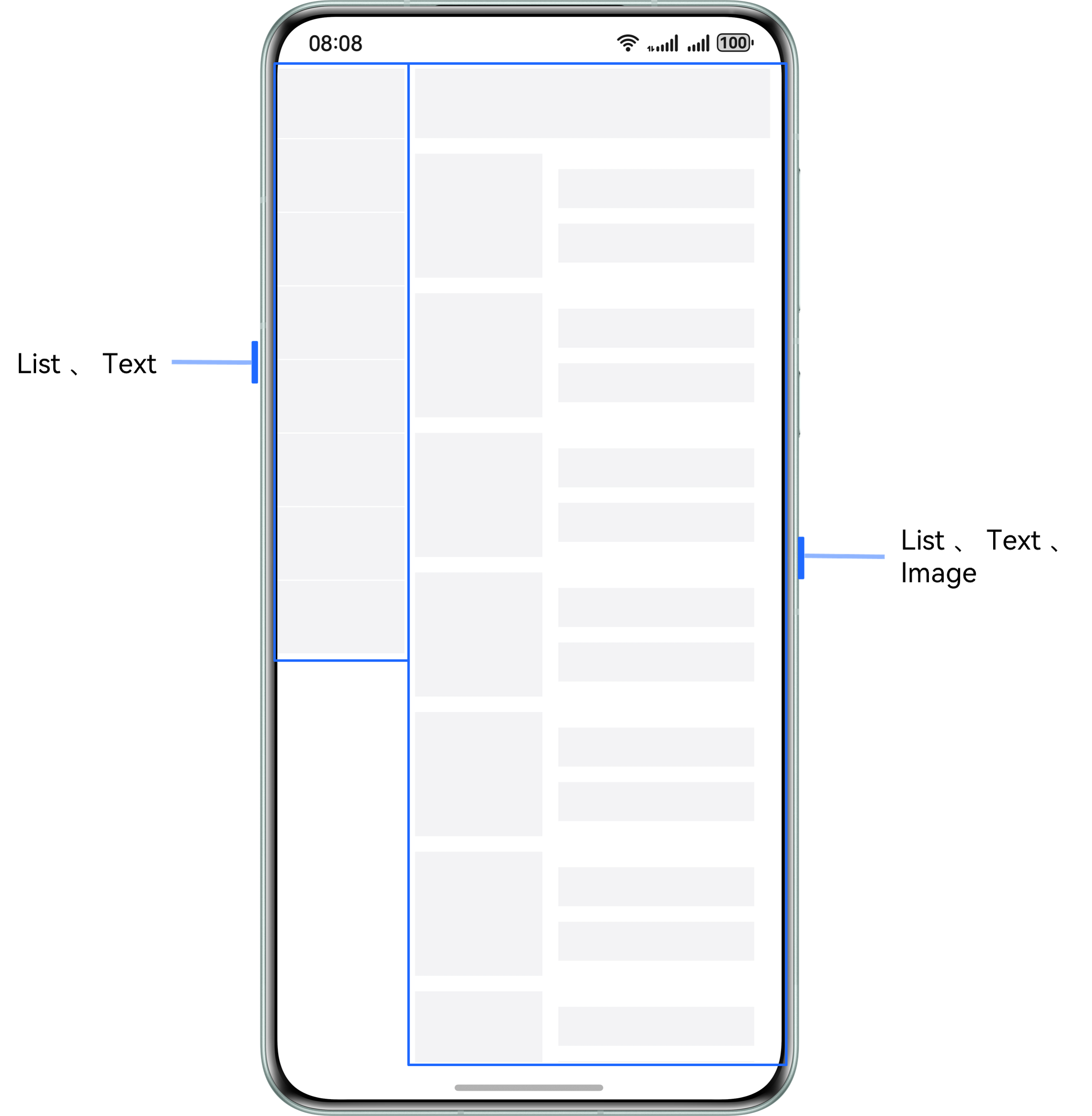
以商品分类列表页面为例:
- 分别通过 List 组件,对左侧分类导航和右侧导航内容进行展示
- 点击左侧分类导航,右侧展示对应导航分类详情列表数据
- 滑动右侧列表内容,列表标题吸顶展示,左侧对应导航内容则高亮显示
页面结构
实现原理
左右各用一个 List 实现,分别设置其 onScrollIndex() 事件。
左侧 List 在回调中判断数据项切换时,调用右侧 List 滚动到相应类别的对应位置,右侧同理。
开发步骤
第一步:构建左右两个 List
// 左侧分类导航数据
List({ scroller: this.navTitleScroller }) {
  ForEach(this.categoryList, (item: NavTitleModel, index: number) => {
    ListItem() {
      Text(item.titleName)
        .fontColor(this.currentTitleId === index ? '#0a59f7' : Color.Black)
        .onClick(() => {
          this.listChange(index, true);
        })
    }
  })
}

// 右侧分类内容数据
List({ scroller: this.goodsListScroller }) {
  ForEach(this.categoryList, (item: NavTitleModel) => {
    ListItemGroup({ space: 12, header: this.goodsHeaderBuilder(item.titleName) }) {
      ForEach(item.goodsList, (goodsItem: GoodsDataModel) => {
        ListItem() {
          Row() {
            Image(goodsItem.imgUrl)
            Column() {
              Text(goodsItem.goodsName)
              Text('¥' + goodsItem.price)
            }
          }
        }
      })
    }
  })
}
第二步:实现联动效果
// 列表滑动事件
listChange(index: number, isGoods: boolean) {
  if (this.currentTitleId !== index) {
    this.currentTitleId = index;
    if (isGoods) {
      // 控制右侧列表滑动到指定 index
      this.goodsListScroller.scrollToIndex(index);
    } else {
      // 控制左侧列表滑动到指定 index
      this.navTitleScroller.scrollToIndex(index);
    }
  }
}

// 左侧列表添加点击事件
ListItem() {
  Text(item.titleName)
    .onClick(() => {
      this.listChange(index, true);
    })
}

// 右侧列表添加 onScrollIndex 事件
List({ scroller: this.goodsListScroller }) {
  // 内容
}
.onScrollIndex((index: number) => {
  this.listChange(index, false)
})
七、总结一下
列表流场景就这几个核心:
- List 组件是容器
- ListItem 和 ListItemGroup 是子项
- 配合 Refresh 做下拉刷新
- 用 onReachEnd() 做上滑加载
- sticky 属性实现吸顶
- nestedScroll 实现嵌套滚动
- onScrollIndex() 实现列表联动
记住啊,列表项多了就用 LazyForEach,别一股脑全渲染,不然卡到你怀疑人生。

讨论HarmonyOS开发技术,专注于API与组件、DevEco Studio、测试、元服务和应用上架分发等。
更多推荐

 2
2 0
0- 0


 已为社区贡献82条内容

所有评论(0)