【Flutter x HarmonyOS 6】魔方计时APP——记录页面的UI设计
,圆角背景(半透明填充色(主色边框。这种设计让选中态非常醒目,同时保持了整体的轻盈感。页面布局:使用Stack,Tab 切换 + 悬浮按钮。Tab 切换栏:包裹在卡片中,自定义指示器样式,支持显示/隐藏动画。分组记录视图:水平滚动的分组选择器 + 统计信息 + 记录列表。项目统计视图:项目选择器 + 多种统计卡片。通用卡片组件提供统一的视觉风格。记录列表项:罚时标记、水波纹点击效果。下一篇我们可以
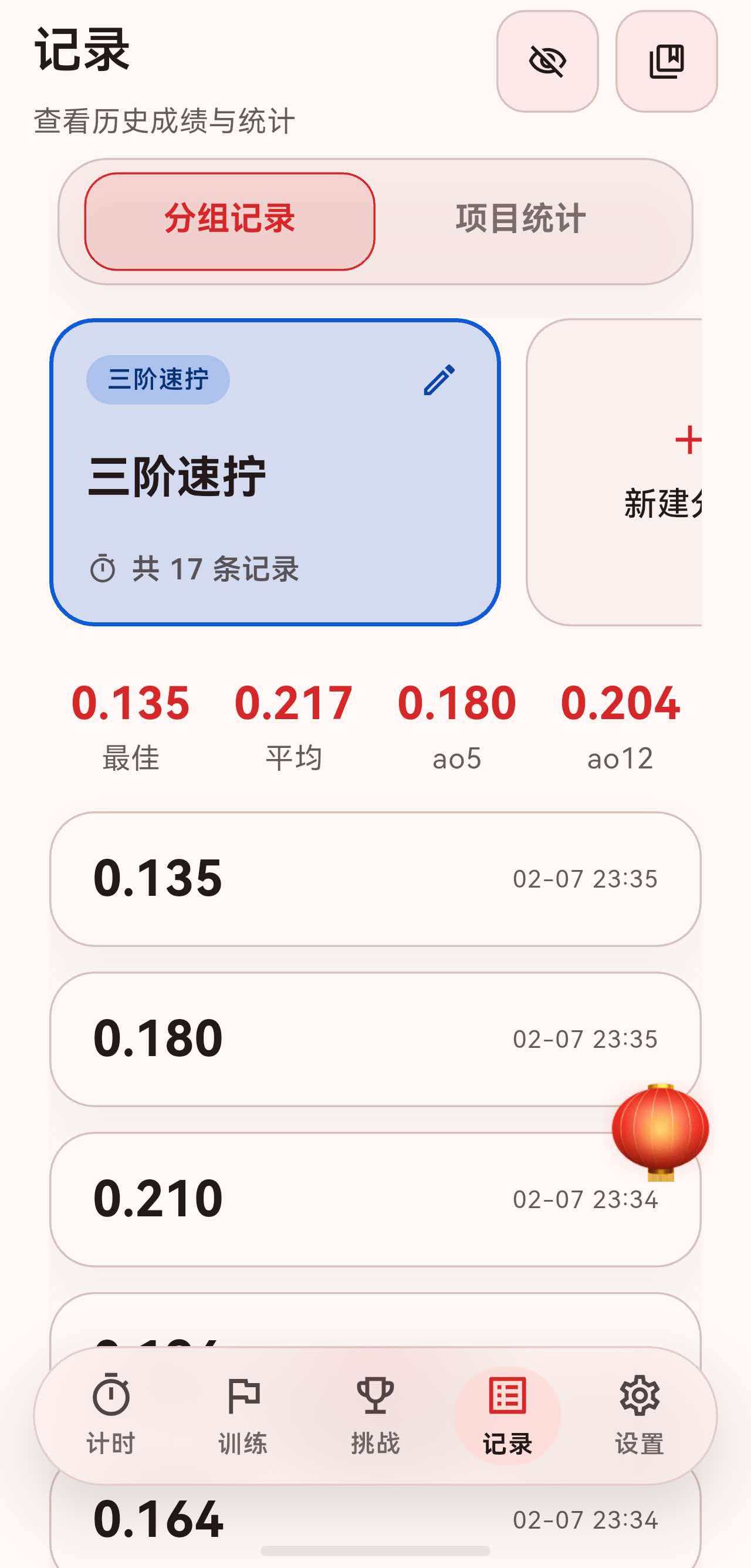
这篇我们把视角移到魔方计时APP的一个核心页面——记录页面。
对于一个计时器应用来说,记录页面是用户查看历史成绩、分析训练数据的重要入口。这篇我们先从 UI 设计的角度,看看这个页面是怎么组织的。
一、页面整体结构
记录页面作为底部导航的一个 Tab,整体采用 SectionedPage 包裹,包含标题栏、Tab 切换和内容区域。
return Stack(
  children: [
    SectionedPage(
      title: '记录',
      subtitle: const Text('查看历史成绩与统计'),
      actions: [
        // 右上角操作按钮
      ],
      child: Column(
        children: [
          // Tab 切换栏
          // 内容区域
        ],
      ),
    ),
    // 悬浮按钮
    GripAwareNewFab(...),
  ],
);
页面分为两个主要区域:
- 分组记录:按分组查看历史成绩。
- 项目统计:跨分组的统计分析。
二、Tab 切换栏设计
Tab 切换栏使用了 AnimatedCrossFade 实现显示/隐藏动画,用户可以通过右上角的眼睛图标切换。
AnimatedCrossFade(
  duration: const Duration(milliseconds: 300),
  crossFadeState: isTabBarVisible
      ? CrossFadeState.showFirst
      : CrossFadeState.showSecond,
  firstChild: Column(
    children: [
      Padding(
        padding: const EdgeInsets.symmetric(horizontal: 4),
        child: _RecordsCard(
          padding: const EdgeInsets.symmetric(horizontal: 12, vertical: 6),
          borderRadius: 24,
          backgroundColor: theme.colorScheme.surfaceVariant.withOpacity(0.45),
          child: TabBar(
            controller: _tabController,
            indicatorSize: TabBarIndicatorSize.tab,
            dividerColor: Colors.transparent,
            padding: EdgeInsets.zero,
            indicator: BoxDecoration(
              borderRadius: BorderRadius.circular(16),
              color: theme.colorScheme.primary.withOpacity(0.12),
              border: Border.all(color: theme.colorScheme.primary),
            ),
            labelStyle: theme.textTheme.titleMedium?.copyWith(fontWeight: FontWeight.w700),
            labelColor: theme.colorScheme.primary,
            unselectedLabelColor: theme.colorScheme.onSurfaceVariant.withOpacity(0.75),
            tabs: const [
              Tab(text: '分组记录'),
              Tab(text: '项目统计'),
            ],
          ),
        ),
      ),
      const SizedBox(height: 16),
    ],
  ),
  secondChild: const SizedBox.shrink(),
),
这里有几个设计细节:
2.1 TabBar 包裹在卡片中
TabBar 没有直接放在页面上,而是包裹在一个 _RecordsCard 中:
_RecordsCard(
  padding: const EdgeInsets.symmetric(horizontal: 12, vertical: 6),
  borderRadius: 24,
  backgroundColor: theme.colorScheme.surfaceVariant.withOpacity(0.45),
  child: TabBar(...),
)
这样 TabBar 有了圆角背景和内边距,视觉上更像一个"胶囊"选择器,而不是传统的 Tab 样式。
2.2 自定义指示器样式
indicator: BoxDecoration(
  borderRadius: BorderRadius.circular(16),
  color: theme.colorScheme.primary.withOpacity(0.12),
  border: Border.all(color: theme.colorScheme.primary),
),
选中态的 Tab 有:
- 圆角背景(
borderRadius: 16)。 - 半透明填充色(
withOpacity(0.12))。 - 主色边框。
这种设计让选中态非常醒目,同时保持了整体的轻盈感。
三、分组记录视图
分组记录视图 _GroupRecordsView 是默认显示的第一个 Tab,采用 CustomScrollView + Sliver 的布局方式。
return CustomScrollView(
  slivers: [
    SliverToBoxAdapter(
      child: _GroupSelector(...),  // 分组选择器
    ),
    const SliverToBoxAdapter(child: SizedBox(height: 16)),
    SliverToBoxAdapter(
      child: Row(...),  // 统计信息
    ),
    if (entries.isEmpty)
      SliverFillRemaining(
        hasScrollBody: false,
        child: _EmptyState(...),  // 空状态
      )
    else
      SliverList(...),  // 记录列表
    SliverToBoxAdapter(child: SizedBox(height: bottomSpacer)),
  ],
);
3.1 分组选择器
分组选择器是一个水平滚动的列表,每个分组显示为一个卡片:
class _GroupSelector extends StatelessWidget {
Widget build(BuildContext context) {
return SizedBox(
height: 150,
child: ListView.separated(
scrollDirection: Axis.horizontal,
itemCount: groups.length + 1, // +1 是新增分组按钮
separatorBuilder: (_, __) => const SizedBox(width: 12),
itemBuilder: (context, index) {
if (index == groups.length) {
return _AddGroupCard(...); // 新增分组按钮
}
final group = groups[index];
return _GroupCard(
group: group,
count: counts[group.id] ?? 0,
isSelected: group.id == selectedGroupId,
onTap: () => onSelect(group.id),
onEdit: () => onEdit(group),
onLongPress: () => onEdit(group),
);
},
),
);
}
}
每个分组卡片 _GroupCard 显示:
- 分组名称。
- 该分组的记录数量。
- 选中态有边框高亮。
3.2 统计信息行
统计信息以横向排列的方式展示:
Row(
  mainAxisAlignment: MainAxisAlignment.spaceAround,
  children: [
    _CompactStatItem(label: '最佳', value: stats.best),
    _CompactStatItem(label: '平均', value: stats.average),
    _CompactStatItem(label: 'ao5', value: stats.ao5),
    _CompactStatItem(label: 'ao12', value: stats.ao12),
  ],
)
每个统计项 _CompactStatItem 显示标签和数值,简洁明了。
3.3 记录列表
记录列表使用 SliverList 实现,每条记录是一个 _SolveTile:
SliverList(
  delegate: SliverChildBuilderDelegate(
    (context, index) {
      final itemIndex = index ~/ 2;
      if (index.isEven) {
        final entry = entries[itemIndex];
        return _SolveTile(
          entry: entry,
          onTap: () => _showSolveDetailSheet(context, entry),
        );
      }
      return const SizedBox(height: 12);  // 间隔
    },
    childCount: entries.isEmpty ? 0 : entries.length * 2 - 1,
  ),
),
这里用了一个技巧:index ~/ 2 来区分记录项和间隔,让列表项之间有统一的间距。
3.4 空状态
当分组没有记录时,显示空状态提示:
class _EmptyState extends StatelessWidget {
Widget build(BuildContext context) {
return _RecordsCard(
padding: const EdgeInsets.symmetric(horizontal: 32, vertical: 48),
borderRadius: 28,
child: Column(
mainAxisAlignment: MainAxisAlignment.center,
children: [
Icon(Icons.layers_outlined, size: 48, color: theme.colorScheme.primary),
const SizedBox(height: 16),
Text(
'$groupName 暂无成绩',
style: theme.textTheme.titleLarge?.copyWith(fontWeight: FontWeight.w600),
),
const SizedBox(height: 8),
Text(
'完成一次计时后,这里会展示该分组的记录和统计',
style: theme.textTheme.bodyMedium?.copyWith(
color: theme.textTheme.bodyMedium?.color?.withOpacity(0.7),
),
textAlign: TextAlign.center,
),
],
),
);
}
}
空状态同样包裹在 _RecordsCard 中,保持视觉一致性。
四、项目统计视图
项目统计视图 _ProjectStatsView 提供跨分组的统计分析,内容更加丰富。
4.1 项目选择器
项目选择器是一个水平滚动的卡片列表,每个卡片代表一个魔方项目:
class _EventSelector extends StatelessWidget {
Widget build(BuildContext context) {
return SizedBox(
height: 100,
child: ListView.separated(
scrollDirection: Axis.horizontal,
itemCount: events.length,
separatorBuilder: (_, __) => const SizedBox(width: 12),
itemBuilder: (context, index) {
final event = events[index];
final count = controller.countForEvent(event);
final isSelected = event == selectedEvent;
return _EventCard(
event: event,
count: count,
isSelected: isSelected,
onTap: () => onEventSelected(event),
);
},
),
);
}
}
每个项目卡片 _EventCard 使用 AnimatedContainer 实现选中态的动画过渡:
AnimatedContainer(
  duration: const Duration(milliseconds: 200),
  width: 160,
  padding: const EdgeInsets.all(16),
  decoration: BoxDecoration(
    borderRadius: BorderRadius.circular(18),
    color: isSelected
        ? color.withOpacity(0.15)
        : theme.colorScheme.surfaceVariant.withOpacity(0.4),
    border: Border.all(
      color: isSelected ? color : theme.colorScheme.outlineVariant,
      width: isSelected ? 2 : 1,
    ),
  ),
  child: Column(
    crossAxisAlignment: CrossAxisAlignment.start,
    mainAxisAlignment: MainAxisAlignment.spaceBetween,
    children: [
      Text(
        event.shortName,
        style: theme.textTheme.titleMedium?.copyWith(
          fontWeight: FontWeight.w700,
          color: isSelected ? color : null,
        ),
      ),
      Text(
        '$count 次',
        style: theme.textTheme.bodyMedium?.copyWith(
          color: theme.textTheme.bodyMedium?.color?.withOpacity(0.7),
        ),
      ),
    ],
  ),
),
4.2 汇总统计卡片
汇总统计卡片使用 primaryContainer 作为背景色,视觉上更加突出:
_RecordsCard(
  padding: const EdgeInsets.all(24),
  borderRadius: 28,
  backgroundColor: theme.colorScheme.primaryContainer,
  borderColor: theme.colorScheme.primary.withOpacity(0.35),
  child: Column(
    crossAxisAlignment: CrossAxisAlignment.start,
    children: [
      Row(
        children: [
          Icon(Icons.analytics_outlined, color: onPrimaryContainer.withOpacity(0.8)),
          const SizedBox(width: 8),
          Text(
            '${event.chineseName} 汇总',
            style: theme.textTheme.titleLarge?.copyWith(
              color: onPrimaryContainer,
              fontWeight: FontWeight.w700,
            ),
          ),
        ],
      ),
      const SizedBox(height: 6),
      Text(
        '跨所有分组统计 · 共 $totalCount 次',
        style: theme.textTheme.bodyMedium?.copyWith(
          color: onPrimaryContainer.withOpacity(0.75),
        ),
      ),
      const SizedBox(height: 20),
      // 统计数据...
    ],
  ),
)
4.3 其他统计卡片
项目统计视图还包含多种统计卡片:
- 个人最佳卡片:展示各项目的 PB 记录。
- 处罚分析卡片:统计 +2 和 DNF 的比例。
- 成绩趋势图:使用
fl_chart绘制折线图。 - 成绩分布直方图:展示成绩分布情况。
- 训练热力图:展示训练频率。
这些卡片都遵循统一的设计规范,使用 _RecordsCard 包裹,保持视觉一致性。
五、通用卡片组件
整个记录页面大量使用 _RecordsCard 作为基础容器:
class _RecordsCard extends StatelessWidget {
const _RecordsCard({
required this.child,
this.padding = const EdgeInsets.all(20),
this.borderRadius = 24,
this.backgroundColor,
this.borderColor,
this.shadowOpacity = 0.04,
});
final Widget child;
final EdgeInsetsGeometry padding;
final double borderRadius;
final Color? backgroundColor;
final Color? borderColor;
final double shadowOpacity;
Widget build(BuildContext context) {
final colorScheme = Theme.of(context).colorScheme;
return Container(
decoration: BoxDecoration(
borderRadius: BorderRadius.circular(borderRadius),
color: backgroundColor ?? colorScheme.surface,
border: Border.all(color: borderColor ?? colorScheme.outlineVariant),
boxShadow: [
BoxShadow(
blurRadius: 20,
offset: const Offset(0, 12),
color: Colors.black.withOpacity(shadowOpacity),
),
],
),
padding: padding,
child: child,
);
}
}
这个组件的特点:
- 圆角:默认
borderRadius: 24,视觉柔和。 - 边框:使用
outlineVariant颜色,与主题协调。 - 阴影:微妙的阴影(
shadowOpacity: 0.04),增加层次感。 - 可定制:支持自定义背景色、边框色、内边距等。
六、记录列表项设计
每条记录 _SolveTile 是一个可点击的卡片:
class _SolveTile extends StatelessWidget {
Widget build(BuildContext context) {
final theme = Theme.of(context);
final isDNF = entry.isDNF;
final hasPlusTwo = entry.hasPlusTwo;
final resultText = isDNF ? 'DNF' : _formatDuration(entry.effectiveDuration);
return InkWell(
onTap: onTap,
borderRadius: BorderRadius.circular(22),
child: _RecordsCard(
padding: const EdgeInsets.symmetric(horizontal: 20, vertical: 16),
borderRadius: 22,
child: Column(
crossAxisAlignment: CrossAxisAlignment.start,
children: [
Row(
mainAxisAlignment: MainAxisAlignment.spaceBetween,
children: [
Row(
children: [
Text(
resultText,
style: theme.textTheme.headlineSmall?.copyWith(
fontWeight: FontWeight.w700,
),
),
if (hasPlusTwo)
Padding(
padding: const EdgeInsets.only(left: 8),
child: Container(
padding: const EdgeInsets.symmetric(horizontal: 8, vertical: 4),
decoration: BoxDecoration(
borderRadius: BorderRadius.circular(12),
color: theme.colorScheme.primary.withOpacity(0.12),
),
child: Text(
'+2',
style: theme.textTheme.bodySmall?.copyWith(
color: theme.colorScheme.primary,
fontWeight: FontWeight.w600,
),
),
),
),
if (isDNF)
Padding(
padding: const EdgeInsets.only(left: 8),
child: Container(
padding: const EdgeInsets.symmetric(horizontal: 8, vertical: 4),
decoration: BoxDecoration(
borderRadius: BorderRadius.circular(12),
color: theme.colorScheme.error.withOpacity(0.12),
),
child: Text(
'DNF',
style: theme.textTheme.bodySmall?.copyWith(
color: theme.colorScheme.error,
fontWeight: FontWeight.w600,
),
),
),
),
],
),
Text(
_formatDate(entry.recordedAt),
style: theme.textTheme.bodySmall?.copyWith(
color: theme.textTheme.bodySmall?.color?.withOpacity(0.7),
),
),
],
),
// 打乱序列、备注等...
],
),
),
);
}
}
这里有几个设计亮点:
6.1 罚时标记
+2 和 DNF 使用小标签形式展示:
Container(
  padding: const EdgeInsets.symmetric(horizontal: 8, vertical: 4),
  decoration: BoxDecoration(
    borderRadius: BorderRadius.circular(12),
    color: theme.colorScheme.primary.withOpacity(0.12),  // +2 用主色
    // 或 color: theme.colorScheme.error.withOpacity(0.12),  // DNF 用错误色
  ),
  child: Text(
    '+2',  // 或 'DNF'
    style: theme.textTheme.bodySmall?.copyWith(
      color: theme.colorScheme.primary,  // 或 error
      fontWeight: FontWeight.w600,
    ),
  ),
),
6.2 InkWell 包裹
整个记录项用 InkWell 包裹,点击时有水波纹效果:
InkWell(
  onTap: onTap,
  borderRadius: BorderRadius.circular(22),  // 与卡片圆角一致
  child: _RecordsCard(...),
)
七、总结
这篇我们从 UI 设计的角度,梳理了记录页面的整体结构:
- 页面布局:使用
SectionedPage+Stack,Tab 切换 + 悬浮按钮。 - Tab 切换栏:包裹在卡片中,自定义指示器样式,支持显示/隐藏动画。
- 分组记录视图:水平滚动的分组选择器 + 统计信息 + 记录列表。
- 项目统计视图:项目选择器 + 多种统计卡片。
- 通用卡片组件:
_RecordsCard提供统一的视觉风格。 - 记录列表项:罚时标记、水波纹点击效果。
下一篇我们可以深入聊聊数据层的设计,以及如何实现这些统计功能。

讨论HarmonyOS开发技术,专注于API与组件、DevEco Studio、测试、元服务和应用上架分发等。
更多推荐


 26
26 0
0- 0


 已为社区贡献17条内容

所有评论(0)