HarmonyOS三方库:lv-markdown-in 技术解析与自定义语法扩展实战
本文深入解析了HarmonyOS下的Markdown渲染库lv-markdown-in的实现原理,重点介绍了其双架构设计:基础版采用正则表达式驱动,适合简单场景;增强版基于AST解析,支持复杂嵌套结构。文章通过实战案例演示了如何扩展自定义语法,包括圆圈描边和波浪下划线效果,并分析了技术难点及解决方案。该库采用轻量高效的ArkUI原生渲染,支持动态样式配置和语法扩展,为HarmonyOS开发者提供了
前言
在 HarmonyOS 应用开发中,Markdown 渲染是一个常见需求。本文将深入剖析 lv-markdown-in 这个鸿蒙 Markdown 渲染库的实现原理,并通过实战案例演示如何扩展自定义语法——为文本添加圆圈描边和波浪下划线效果。
适合人群: HarmonyOS 开发者、对 Markdown 解析感兴趣的前端工程师
技术栈: ArkTS、ArkUI、JavaScript AST 解析
一、lv-markdown-in 项目架构解析
1.1 项目定位
lv-markdown-in 是一个专为 HarmonyOS Next 设计的 Markdown 渲染库,以 HAR 包形式发布。它的核心目标是:
- 轻量高效:无需 WebView,纯原生 ArkUI 渲染
- 样式可控:所有样式通过 Controller 动态配置
- 扩展性强:支持自定义语法和渲染逻辑
![> **[配图建议]** 这里可以放一张 lv-markdown-in 渲染效果的对比图,展示标题、列表、代码块、表格等常见元素](https://i-blog.csdnimg.cn/direct/62ce673016fb4fdf8109993a99633586.png)
1.2 双架构设计
项目采用双版本并存的设计:
基础版(lib/)
lib/
├── domain/          # 数据模型(LvText、LvTitle、LvCode...)
├── utils/
│   ├── determine/   # 块级内容判断(标题、代码块、表格...)
│   ├── handle/      # 文本处理逻辑
│   └── lv*Component.ets  # 各类型渲染组件
└── Index.ets        # 主入口
特点:
- 正则表达式驱动
- 逐行解析,按类型分发到对应组件
- 适合简单场景,性能开销小
增强版(enhance/)
enhance/
├── utils/
│   └── ast.js       # JavaScript AST 解析器
├── model/
│   └── TreeNode.ets # 树形节点类型定义
├── builders/
│   └── SpanRenderBuilder.ets  # 内联元素渲染
└── components/      # 块级组件(段落、表格、列表...)
特点:
- AST(抽象语法树)解析
- Worker 线程处理,主线程渲染
- 支持复杂嵌套结构(列表嵌套、表格内 Markdown)
- 基础版:Markdown 文本 → 正则分割 → 组件数组 → ForEach 渲染
- 增强版:Markdown 文本 → AST 解析 → TreeNode[] → 递归渲染
二、核心实现原理
2.1 基础版:正则驱动的解析流程
以内联样式解析为例,看 handleTextType.ets 的实现:
const regex = /(\*\*\*[^(\*\*\*)]+\*\*\*|\_\_\_[^(\_\_\_)]+\_\_\_|...)/g;
const match = text.split(regex);
这个正则将文本按内联标记分割成数组:
输入: "hello **world**"
输出: ["hello ", "**world**"]
然后在 lvCompositeComponent.ets 中遍历数组,用 isXxxText() 函数识别类型:
if (isBoldText(item)) {
  Span(item.slice(2, -2))
    .fontWeight(FontWeight.Bold)
}
优点: 实现简单,代码量少
缺点: 难以处理嵌套结构(如表格内的粗体文本)
2.2 增强版:AST 解析的优势
增强版使用 ast.js 构建抽象语法树。以解析链接为例:
// 识别 [text](url "title")
if (ch === '[') {
  const close = findMatchingBracket(text, p);
  if (close !== -1) {
    const linkText = text.slice(p + 1, close);
    // 递归解析 linkText,支持嵌套
    const children = parseInline(linkText);
    nodes.push({ type: 'link', url, children });
  }
}
生成的 TreeNode 结构:
{
  type: 'paragraph',
  children: [
    { type: 'text', text: 'hello ' },
    {
      type: 'link',
      url: 'https://example.com',
      children: [
        { type: 'bold', children: [{ type: 'text', text: 'world' }] }
      ]
    }
  ]
}
渲染时递归遍历树节点,每个节点对应一个 Span 或组件。
三、实战:扩展自定义语法
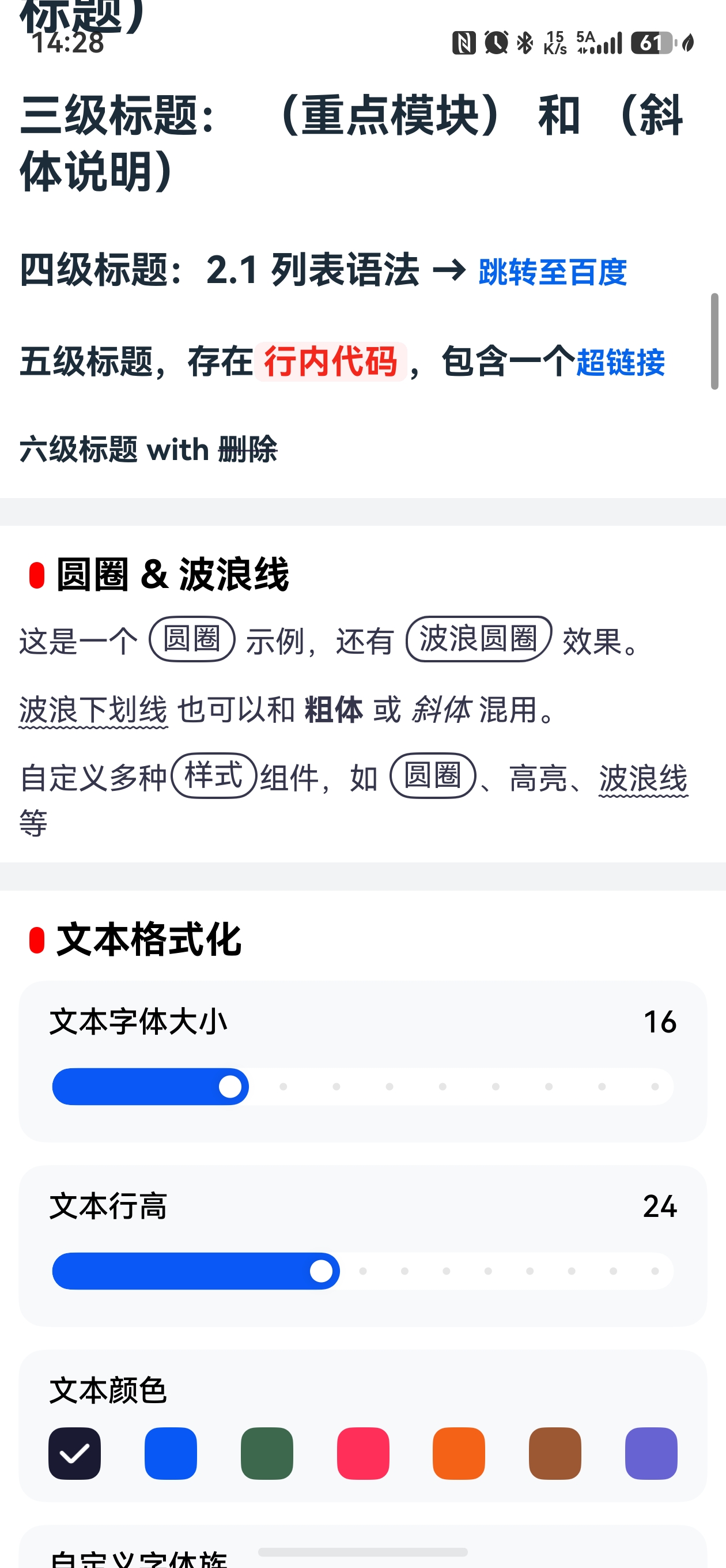
现在进入实战环节,我们要实现三种新语法:
| 语法 | 效果 | 示例 |
|---|---|---|
~text~ |
波浪下划线 | 波浪线 |
{text} |
圆圈描边(椭圆) | {圆圈} |
{~text~} |
波浪圆圈 | {波浪圆圈} |
3.1 技术难点分析
难点 1:ArkUI 的 Span 限制
ArkUI 的 Text 组件内部只能放 Span、ContainerSpan、ImageSpan,而 Span 不支持 border 属性。
这意味着圆圈效果无法用 Span 实现,必须用独立的 Text 组件 + border。
难点 2:Text 内不能嵌套 Text
// ❌ 错误:Text 内不能放 Text
Text() {
  Span("hello")
  Text("world").border({ width: 1 })  // 编译报错
}
解决方案: 当段落包含圆圈节点时,整个段落从 Text+Span 切换为 Flex 布局,每个片段用独立组件渲染。
难点 3:波浪下划线的 API 版本要求
TextDecorationStyle.WAVY 需要 API 12+,项目需确保 compileSdkVersion 满足要求。
3.2 增强版实现步骤
增强版是主流使用方式,我们重点讲解它的实现。
步骤 1:扩展 AST 解析器
打开 markdown/src/main/ets/enhance/utils/ast.js,在 parseInline 函数中添加新语法的解析逻辑。
关键点: 解析顺序很重要,~text~ 要在 ~~text~~(删除线)之前判断。
// 在 parseInline 函数的 while 循环中添加

// 圆圈语法:{text} 或 {~text~}
if (ch === '{') {
  const close = text.indexOf('}', p + 1);
  if (close !== -1) {
    const inner = text.slice(p + 1, close);
    if (inner.startsWith('~') && inner.endsWith('~') && inner.length > 2) {
      // {~text~} 波浪圆圈
      nodes.push({ type: 'waveCircle', text: inner.slice(1, -1) });
    } else {
      // {text} 普通圆圈
      nodes.push({ type: 'circle', text: inner });
    }
    p = close + 1;
    continue;
  }
}

// 波浪下划线:~text~(单波浪)
if (ch === '~' && text[p + 1] !== '~') {
  const end = text.indexOf('~', p + 1);
  if (end !== -1) {
    const inner = text.slice(p + 1, end);
    nodes.push({ type: 'wave', text: inner });
    p = end + 1;
    continue;
  }
}

// 删除线:~~text~~(双波浪)
if (ch === '~' && text[p + 1] === '~') {
  // ... 原有逻辑
}
注意: 还需要把 { 加入 plainTextMatch 的排除字符集:
const plainTextMatch = text.slice(p).match(/^[^`$!\[\\\]~*_{]+/);
步骤 2:定义 TreeNode 类型
打开 markdown/src/main/ets/enhance/model/TreeNode.ets,添加三个新节点接口:
// 波浪下划线
interface WaveNode extends BaseNode {
  type: "wave";
  text: string;
}

// 圆圈描边
interface CircleNode extends BaseNode {
  type: "circle";
  text: string;
}

// 波浪圆圈
interface WaveCircleNode extends BaseNode {
  type: "waveCircle";
  text: string;
}

// 更新联合类型
export type TreeNode =
  | TextNode
  | BoldNode
  // ... 其他类型
  | WaveNode
  | CircleNode
  | WaveCircleNode;
步骤 3:实现渲染逻辑
打开 markdown/src/main/ets/enhance/builders/SpanRenderBuilder.ets。
关键设计: 波浪线用 Span 渲染(在 Text 内部),圆圈用独立 Text 渲染(在 Flex 内部)。
// 在 SpanRenderBuilder 中添加波浪线分支
@Builder
export function SpanRenderBuilder(markdownUnion: string, data: ESObject) {
  if (data?.type == "wave") {
    Span(data.text)
      .decoration({
        type: TextDecorationType.Underline,
        style: TextDecorationStyle.WAVY,
        color: MDBaseController.getMarkdownController(markdownUnion).getTextColor()
      })
      .fontSize(MDBaseController.getMarkdownController(markdownUnion).getTextSize())
      .fontColor(MDBaseController.getMarkdownController(markdownUnion).getTextColor())
  }
  // ... 其他分支
}

// 新增 InlineFlexItemBuilder,用于 Flex 模式
@Builder
export function InlineFlexItemBuilder(markdownUnion: string, data: ESObject) {
  if (data?.type == "circle") {
    InlineCircleBuilder(data.text,
      MDBaseController.getMarkdownController(markdownUnion).getTextColor(),
      MDBaseController.getMarkdownController(markdownUnion).getTextSize(), 999)
  } else if (data?.type == "waveCircle") {
    InlineCircleBuilder(data.text,
      MDBaseController.getMarkdownController(markdownUnion).getTextColor(),
      MDBaseController.getMarkdownController(markdownUnion).getTextSize(), -1)
  } else {
    // 其他节点包在 Text 中
    Text() {
      SpanRenderBuilder(markdownUnion, data)
    }
    .fontSize(MDBaseController.getMarkdownController(markdownUnion).getTextSize())
  }
}

// 圆圈渲染辅助函数
@Builder
function InlineCircleBuilder(text: string, color: ResourceColor,
                              fontSize: number | string | Resource, radiusType: number) {
  Text(text)
    .fontSize(fontSize)
    .fontColor(color)
    .border({ width: 1.5, color: color })
    .borderRadius(radiusType === 999 ? 999 :
      { topLeft: '50%', topRight: '30%', bottomRight: '70%', bottomLeft: '40%' })
    .padding({ left: 6, right: 6, top: 2, bottom: 2 })
    .margin({ left: 1, right: 1 })
}
技术细节:
borderRadius: 999实现椭圆效果(类似 CSS 的border-radius: 999px)borderRadius: { topLeft: '50%', ... }实现波浪圆圈(模拟border-radius: 50% 30% 70% 40%)
步骤 4:改造段落渲染组件
打开 markdown/src/main/ets/enhance/components/ParagraphRender.ets,添加布局切换逻辑:
function hasBlockInlineNode(children: ESObject[] | undefined): boolean {
  return (children ?? []).some((n: ESObject) =>
    n.type === 'circle' || n.type === 'waveCircle')
}

@Component
export struct ParagraphRender {
  @Consume markdownUnion: string
  @State base: TreeNode | undefined = undefined

  build() {
    Column({ space: 10 }) {
      if (hasBlockInlineNode(this.base?.children)) {
        // 含圆圈节点 → Flex 布局
        Flex({ wrap: FlexWrap.Wrap, alignItems: ItemAlign.Center }) {
          ForEach(this.base?.children, (item: TreeNode) => {
            if (item.type == "image") {
              ImageBuilder(this.markdownUnion, item)
            } else {
              InlineFlexItemBuilder(this.markdownUnion, item)
            }
          })
        }
        .width('100%')
      } else {
        // 无圆圈节点 → Text+Span 布局(保持原有性能)
        Text() {
          ForEach(this.base?.children, (item: TreeNode) => {
            if (item.type == "image") {
              ImageBuilder(this.markdownUnion, item)
            } else {
              SpanRenderBuilder(this.markdownUnion, item)
            }
          })
        }
        .lineHeight(TextImpl.handleLineHeight(this.markdownUnion))
        .fontSize(TextImpl.handleFontSize(this.markdownUnion))
      }
    }
    .alignItems(HorizontalAlign.Start)
  }
}
设计思路:
- 检测段落是否包含圆圈节点
- 包含 → 切换为
Flex布局,支持独立Text组件 - 不包含 → 保持
Text+Span布局,性能更优
3.3 基础版实现(可选)
如果项目使用基础版,需要修改以下文件:
handleTextType.ets— 正则中加入新语法lvCompositeComponent.ets— 检测到新语法时切换到lvInlineComponent- 新建
lvInlineComponent.ets— 用Flex渲染混合内容
具体代码参考增强版的思路,这里不再赘述。
四、使用示例
4.1 创建测试文件
在 entry/src/main/resources/rawfile/ 下新建 inline.md:
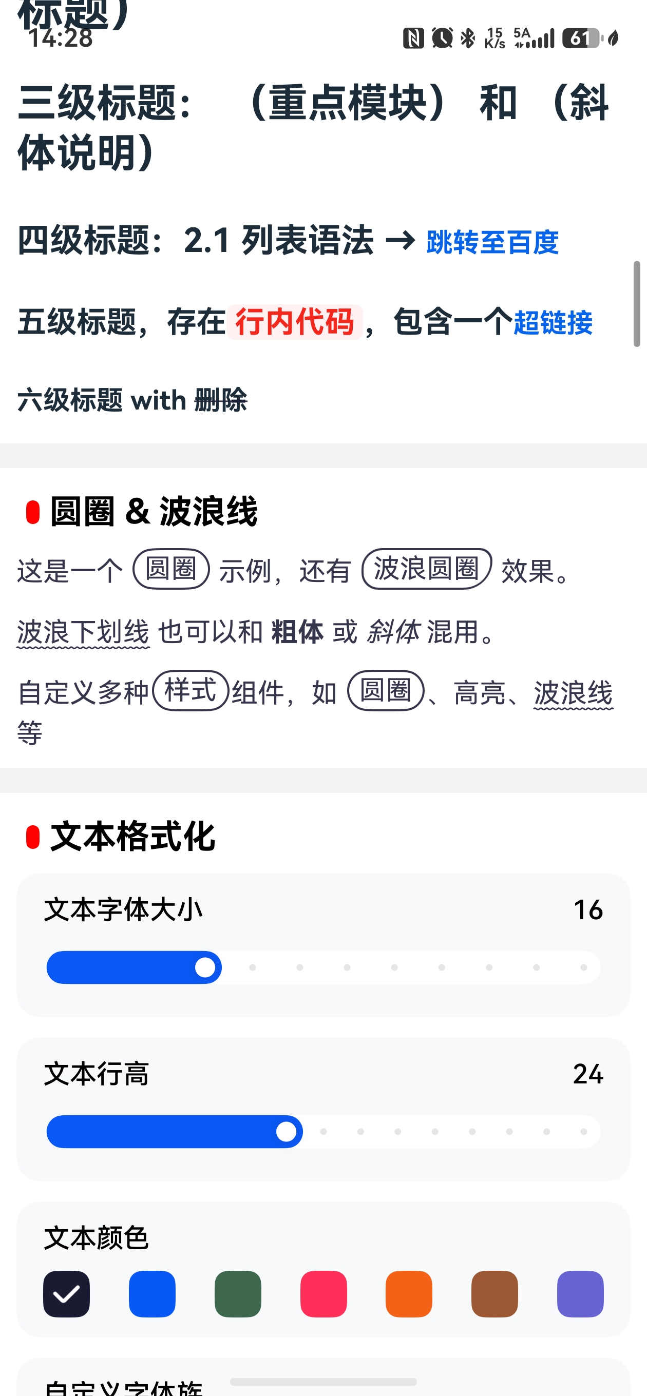
这是一个 {圆圈} 示例,还有 {~波浪圆圈~} 效果。

~波浪下划线~ 也可以和 **粗体** 或 *斜体* 混用。

自定义多种{样式}组件,如 {圆圈}、高亮、~波浪线~等
4.2 在页面中使用
打开 entry/src/main/ets/pages/Index.ets,添加示例块:
MDItem({ title: "圆圈 & 波浪线" }) {
  Markdown({
    controller: this.controller,
    context: getContext(),
    mode: "rawfile",
    rawfilePath: "inline.md",
  })
}
4.3 运行效果
编译运行后,在首页列表中可以看到新增的示例块,展示三种自定义语法的渲染效果。
五、技术总结与扩展思路
5.1 核心要点回顾
- 双架构设计:基础版适合简单场景,增强版支持复杂嵌套
- AST 解析优势:递归处理嵌套结构,扩展性强
- ArkUI 限制应对:
Span不支持border→ 用Flex+ 独立Text绕过 - 性能优化:按需切换布局,无圆圈节点时保持
Text+Span高性能
5.2 扩展思路
基于本文的实现思路,你还可以扩展:
- 彩色文本:
<color=#FF0000>红色文字</color> - 上标/下标:
H~2~O(下标)、x^2^(上标) - 自定义容器:
::: warning警告框 - Emoji 短代码:
:smile:→ 😊
扩展步骤:
- 在
ast.js的parseInline中添加解析逻辑 - 在
TreeNode.ets中定义新节点类型 - 在
SpanRenderBuilder.ets中实现渲染 - 如需特殊布局,修改
ParagraphRender.ets
5.3 注意事项
- API 版本兼容:
TextDecorationStyle.WAVY需 API 12+ - 性能考量:
Flex布局比Text+Span性能略低,按需使用 - 类型安全:增强版使用 TypeScript,修改
TreeNode后需更新所有相关类型
六、参考资料
结语
通过本文,我们深入剖析了 lv-markdown-in 的双架构设计,并通过实战演示了如何扩展自定义 Markdown 语法。这套方法论不仅适用于圆圈和波浪线,还可以推广到任何自定义语法的实现。
希望这篇文章能帮助你更好地理解 HarmonyOS 的 Markdown 渲染机制,并在实际项目中灵活运用。如果有任何问题,欢迎在评论区交流!

讨论HarmonyOS开发技术,专注于API与组件、DevEco Studio、测试、元服务和应用上架分发等。
更多推荐

 8
8 0
0- 0


 已为社区贡献26条内容

所有评论(0)