【HarmonyOS 6】底部导航实战:Tabs 与玻璃导航栏联动
·
一、案例背景
在健康管理 APP 的多模块场景中,首页、打卡、饮水、运动、睡眠、我的等页面需要快速切换。底部导航是移动端最常见的入口形式,配合 Tabs 可以实现“内容区切换 + 导航高亮同步”的完整体验。
本案例面向 HarmonyOS 6 初学者,聚焦一个小而完整的 UI 功能:玻璃拟态底部导航栏 + Tabs 内容联动。

你将学到:
- 如何用 Tabs 承载多页面内容
- 如何自定义 TabBar 文本样式
- 如何构建玻璃拟态底部导航栏
- 如何通过状态联动保证导航高亮一致
二、完整代码实现
本功能涉及三部分:状态切换、导航栏构建、Tabs 联动。下面代码为项目原始实现。
2.1 切换 Tab 的核心方法
  private switchToTab(index: number): void {
    this.currentTabIndex = index;
    if (!this.isDesktopMode()) {
      this.tabController.changeIndex(index);
    }
    if (index === 0) {
      this.refreshHomeData();
    }
  }
2.2 TabBar 与底部导航项
@Builder
TabBuilder(title: string, index: number) {
Column() {
Text(title)
.fontSize(getValueByBreakpoint(this.currentBreakpoint, new BreakpointValue<number>(12, 14, 16)))
.fontWeight(this.currentTabIndex === index ? FontWeight.Medium : FontWeight.Normal)
.fontColor(this.currentTabIndex === index ? $r('app.color.primary_color') : $r('app.color.inactive_color'))
}
.width('100%')
.height('100%')
.justifyContent(FlexAlign.Center)
}
@Builder
MobileNavItem(title: string, index: number) {
Column() {
Text(title)
.fontSize(this.getMobileNavTextSize())
.fontWeight(this.currentTabIndex === index ? FontWeight.Medium : FontWeight.Normal)
.fontColor(this.currentTabIndex === index ? $r('app.color.primary_dark') : $r('app.color.text_secondary'))
}
.padding({ left: 12, right: 12, top: 8, bottom: 8 } as Padding)
.borderRadius(this.getMobileNavItemRadius())
.backgroundColor(this.currentTabIndex === index ? $r('app.color.glass_nav_active') : Color.Transparent)
.onClick(() => {
this.switchToTab(index);
})
}
@Builder
MobileNavBar() {
Row() {
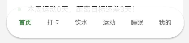
this.MobileNavItem('首页', 0)
this.MobileNavItem('打卡', 1)
this.MobileNavItem('饮水', 2)
this.MobileNavItem('运动', 3)
this.MobileNavItem('睡眠', 4)
this.MobileNavItem('我的', 5)
}
.width('92%')
.height(this.getMobileNavHeight())
.padding({ left: 8, right: 8 } as Padding)
.justifyContent(FlexAlign.SpaceAround)
.alignItems(VerticalAlign.Center)
.backgroundColor($r('app.color.glass_nav_background'))
.border({ width: 1, color: $r('app.color.glass_nav_border') })
.borderRadius(this.getMobileNavRadius())
.shadow({ radius: 12, color: $r('app.color.shadow_color'), offsetY: 6 })
.margin({ bottom: 16 } as Padding)
}
2.3 Tabs 与底部导航联动
    } else {
      Stack({ alignContent: Alignment.Bottom }) {
        Tabs({ barPosition: BarPosition.End, controller: this.tabController }) {
          TabContent() {
            this.HomeContent()
          }
          .tabBar(this.TabBuilder('首页', 0))

          TabContent() {
            CheckInTabContent()
          }
          .tabBar(this.TabBuilder('打卡', 1))

          TabContent() {
            WaterTabContent({ currentTab: this.currentTabIndex })
          }
          .tabBar(this.TabBuilder('饮水', 2))

          TabContent() {
            ExerciseTabContent()
          }
          .tabBar(this.TabBuilder('运动', 3))

          TabContent() {
            SleepTabContent()
          }
          .tabBar(this.TabBuilder('睡眠', 4))

          TabContent() {
            ProfileTabContent({ currentTab: this.currentTabIndex })
          }
          .tabBar(this.TabBuilder('我的', 5))
        }
        .width('100%')
        .height('100%')
        .barHeight(0)
        .edgeEffect(EdgeEffect.Spring)
        .onChange((index: number) => {
          this.currentTabIndex = index;
          if (index === 0) {
            this.refreshHomeData();
          }
        })

        this.MobileNavBar()
      }
      .width('100%')
      .height('100%')
    }
三、UI 结构拆解
移动端的整体结构可以理解为“内容区在下,导航栏浮在最底部”:
Stack
├── Tabs(页面内容)
└── MobileNavBar(底部导航)
这样做有两个好处:
- Tabs 负责页面切换逻辑
- 底部导航负责视觉入口与交互
四、Tabs 与导航联动机制
联动的关键在于 currentTabIndex:
- 点击底部导航 → 调用
switchToTab()→ 同步更新 Tabs - 手势切换 Tabs → 触发
onChange()→ 更新导航高亮
核心逻辑就在以下两处:
switchToTab里同步tabControllerTabs.onChange里更新currentTabIndex
这样不管用户是点底部导航还是滑动 Tabs,UI 状态都能保持一致。
五、玻璃拟态导航栏的样式要点
玻璃拟态的视觉来自三组样式:
- 半透明背景
- 轻微描边
- 柔和阴影
在项目中,对应的样式配置如下:
.backgroundColor($r('app.color.glass_nav_background')).border({ width: 1, color: $r('app.color.glass_nav_border') }).shadow({ radius: 12, color: $r('app.color.shadow_color'), offsetY: 6 })
六、总结
本文基于实际项目演示了一个完整的移动端底部导航方案,核心要点包括:
- Tabs 作为内容容器
- 自定义 TabBar 文本样式
- 玻璃拟态底部导航栏
- 使用状态联动保证导航高亮一致
掌握这个案例后,你可以轻松扩展为电商首页、课程导航、任务面板等场景。

讨论HarmonyOS开发技术,专注于API与组件、DevEco Studio、测试、元服务和应用上架分发等。
更多推荐

 50
50 0
0- 0


 已为社区贡献28条内容

所有评论(0)