跟着寒假训练营打造一款用于学习跨平台框架Flutter开发鸿蒙应用案例集的应用程序
前言
1月17日,在AtomGit&HCDE广州站的活动中,白老师的分享为我打开了跨平台框架开发鸿蒙应用程序的全新视野。此前深耕Flutter技术栈的积累,让我对跨平台开发有着基础认知,而这场分享则精准解答了我对“跨平台框架适配鸿蒙生态”的诸多困惑,更让我明确了将技术落地、完成一款实操性应用的目标。恰逢AtomGit推出寒假训练营打卡活动,这无疑是帮我巩固跨平台开发框架Flutter、深耕鸿蒙应用开发提供了绝佳的实践契机。由此,我确立了核心目标:基于现有Flutter技术栈,扎实攻克跨平台开发关键要点,最终完成一款跨平台开发鸿蒙应用程序案例的离线版App,并实现上架部署。
为稳步推进目标落地,我制定了循序渐进的学习与开发计划。首要任务是夯实基础,重温并深化Dart语言与Flutter核心知识,重点突破鸿蒙设备运行应用,确保能将基础应用顺利在鸿蒙设备上运行调试。在这一过程中,我将以技术积累与经验沉淀为核心,把组件调用技巧、接口适配方法、三方库使用和适配心得等关键内容,通过Markdown格式系统记录,逐步整理成结构化的案例集。这份案例集不仅是我学习历程的具象沉淀,更将集成至离线版App中,形成“理论+实操”的一体化工具,既便于自身复盘回顾,也希望能为同样深耕跨平台鸿蒙开发的学习者提供些许参考。
从技术认知的启蒙到实践目标的确立,从基础学习的深耕到案例成果的落地,这段旅程既是对现有技术栈的拓展,也是对鸿蒙生态跨平台开发能力的全新探索。我始终坚信,每一次代码调试、每一个案例积累,都将成为实现最终目标的坚实基石。本App及配套案例集的创作,既是对本次学习之旅的总结,也是我迈入鸿蒙跨平台开发领域的起点,愿以笔墨与代码为媒,记录成长,沉淀价值。
本应用采用了数字未来主义设计美学,融合了悬浮液晶面板、柔和漫射光、景深模糊效果、优雅渐变过渡和动态环境反射等高级UI特效,打造出具有高级感和科技感的视觉体验!✨
工欲善其事必先利其器
参考白老师保姆级教程,搭建完整开发环境。
- ✅ Windows 11 安装 Visual Studio Code 完整指南/Windows 11 安装 Android Studio 完整指南 - 用来编写Flutter代码的工具
- ✅ Windows 11 安装 Git 完整指南 - 用于向AtomGit提交代码的版本控制工具
- ✅ Windows 11 安装 DevEco Studio 完整指南 - HarmonyOS/OpenHarmony开发工具,可以用于创建模拟器和安装运行项目
- ✅ Windows 11 安装 Java 17 完整指南 - Android需要的Java开发环境
- ✅ Windows 11 OpenHarmony 版 Flutter 开发环境搭建完整指南 - 保姆级开发环境搭建教程,按部就班不会出问题
- ✅ Windows 11 OpenHarmony 版 Flutter 开发环境搭建常见问题解决方法 - 当然有问题也可以在这里找
注意:每次引入新的三方库需要在工程根目录下执行
flutter pub get同步依赖。
创建工程
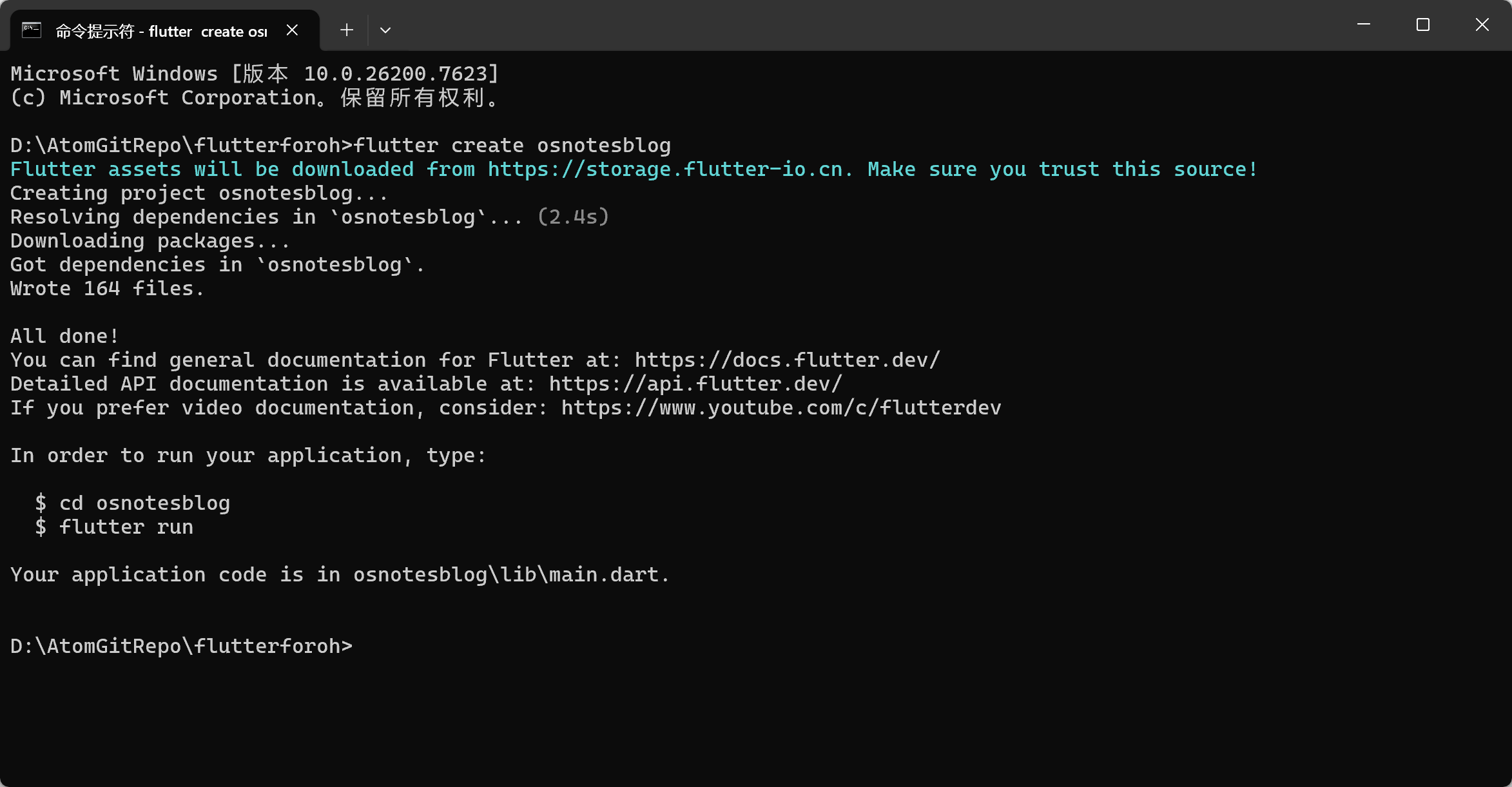
在具体的文件夹下右键打开“命令提示符”,输入flutter create osnotesblog创建跨平台工程,该方式可创建运行在Android、iOS、HarmonyOS、Web、Desktop的应用。
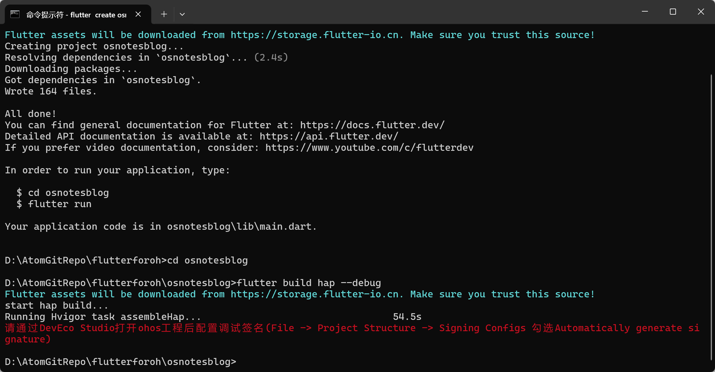
工程创建完成后,通过cd osnotesblog进入到工程根目录,执行编译命令flutter build hap --debug,等待工程编译完成。
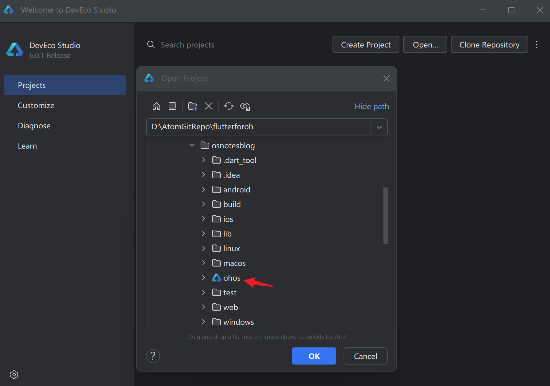
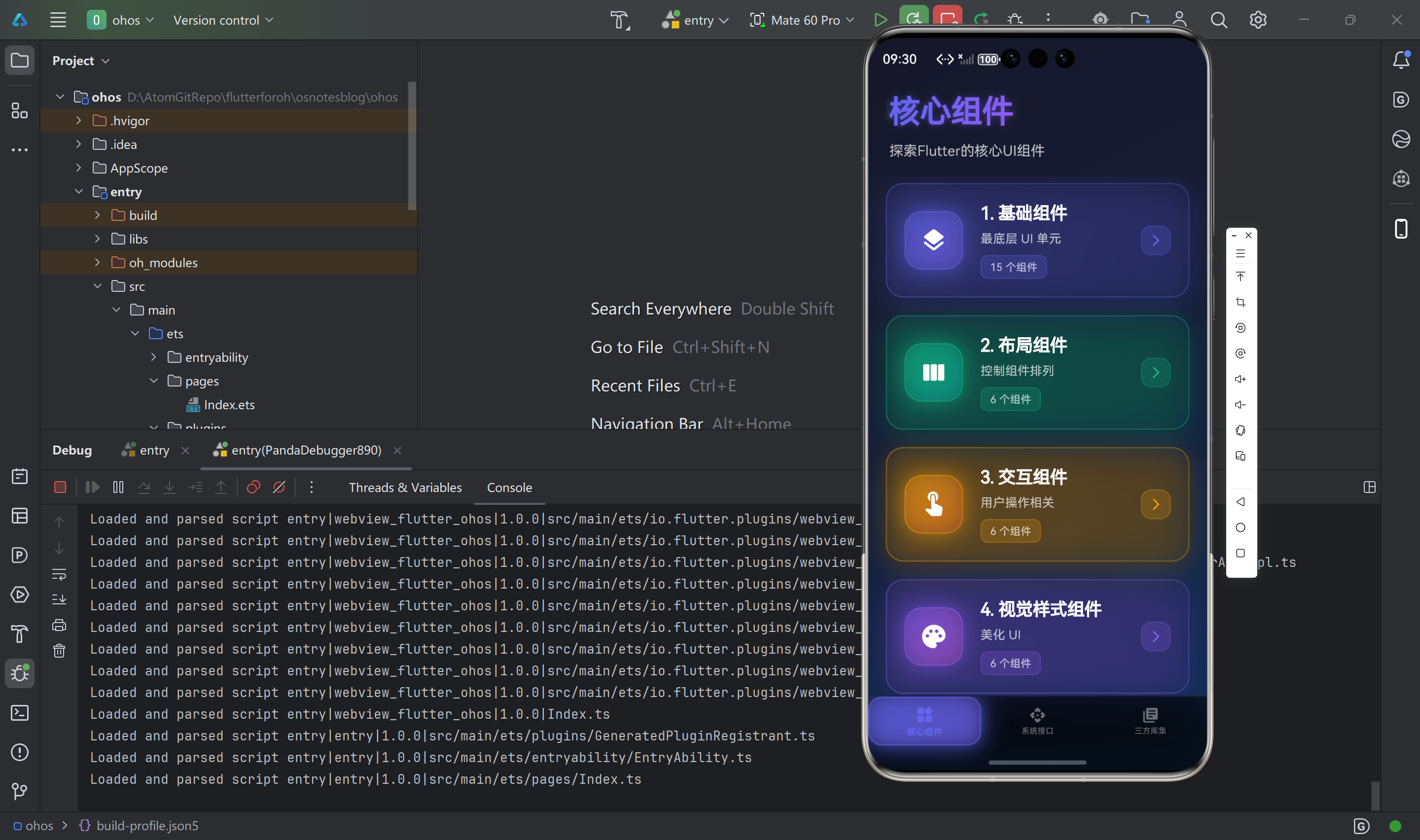
使用DevEco Studio鸿蒙一站式集成工具打开工程osnotesblog工程下的ohos鸿蒙工程。
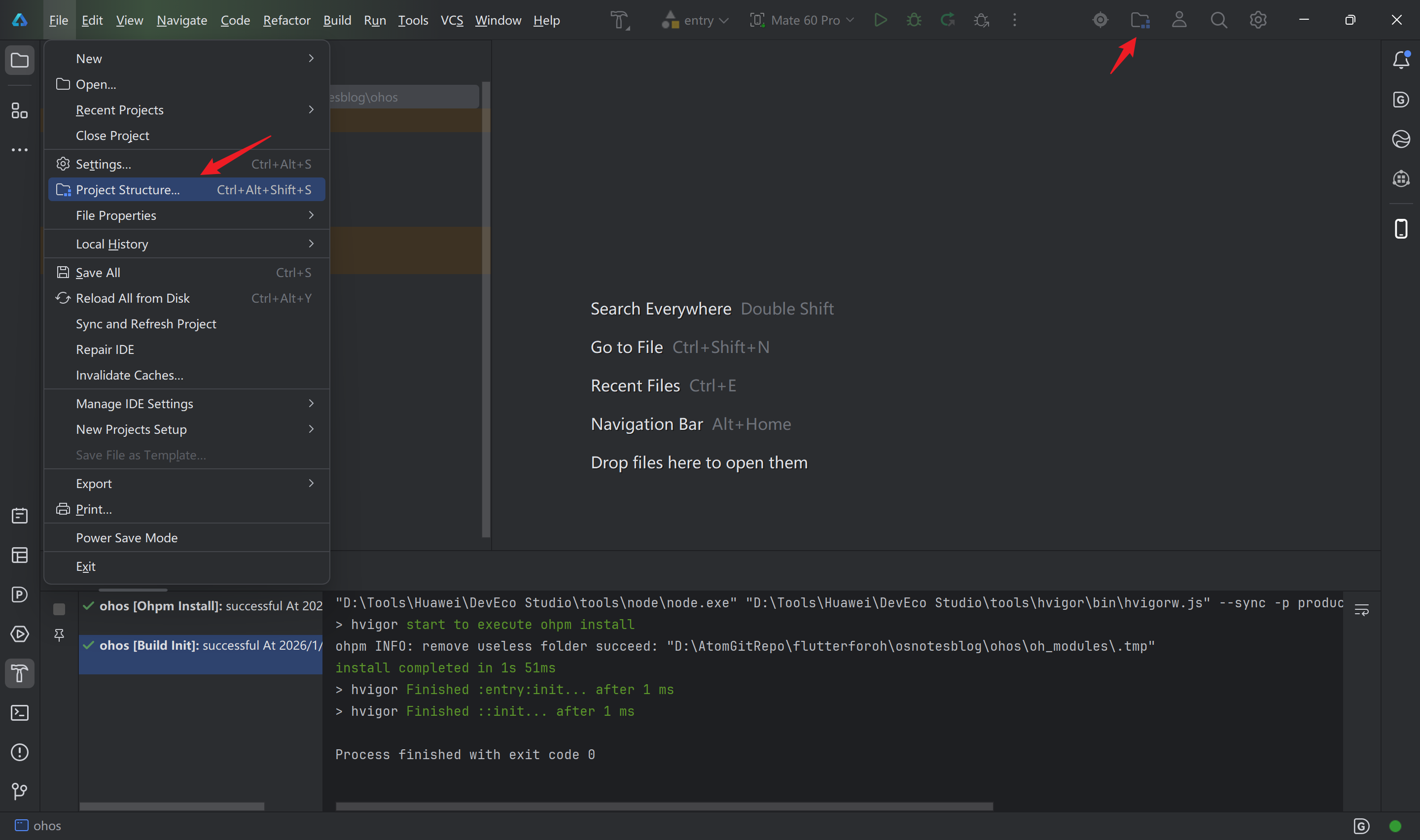
点击菜单栏File > Project Structure...或者工具栏中的文件图标,打开项目结构窗口。
点击Project > Signing configs切换到签名配置页签,点击Sign In登录实名认证的华为开发者账号。
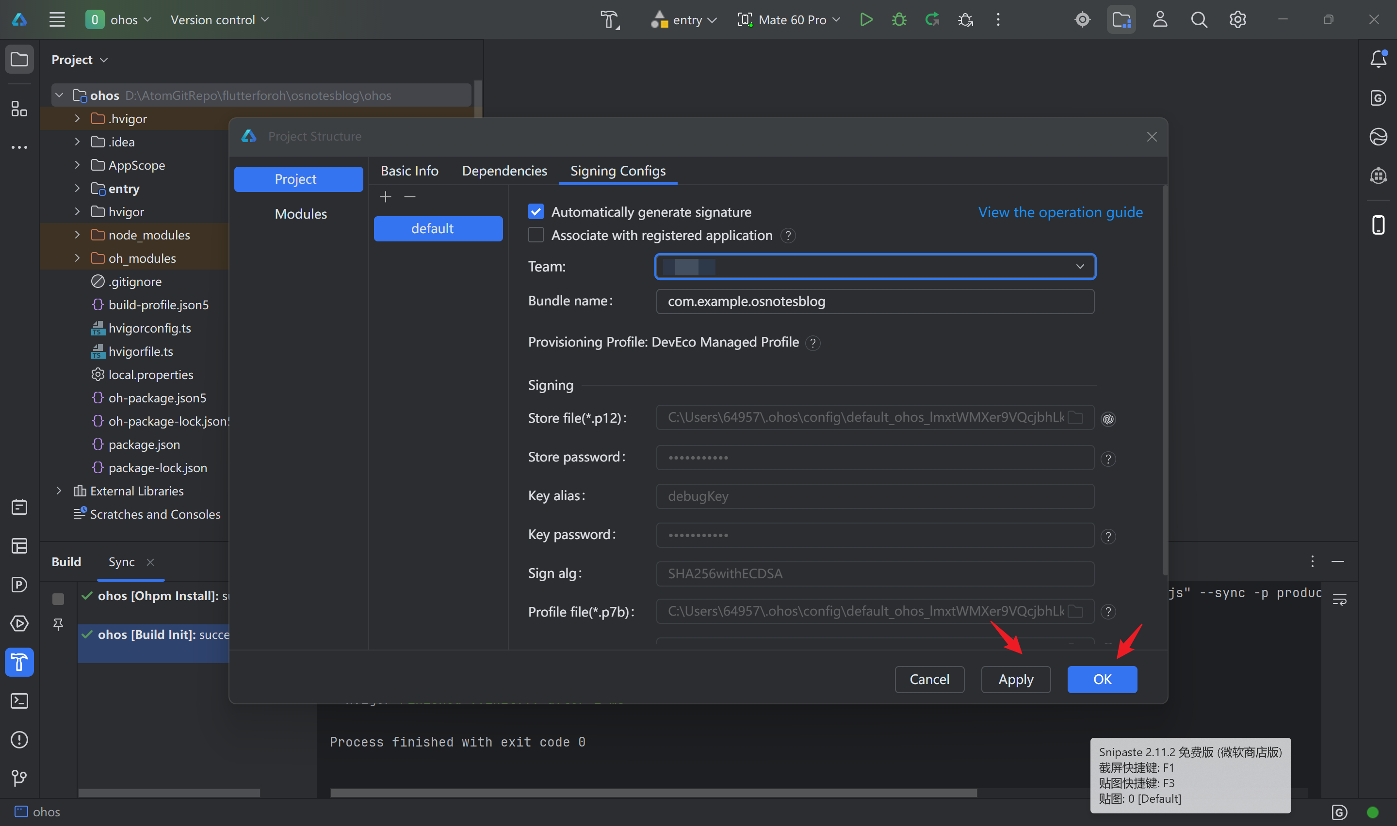
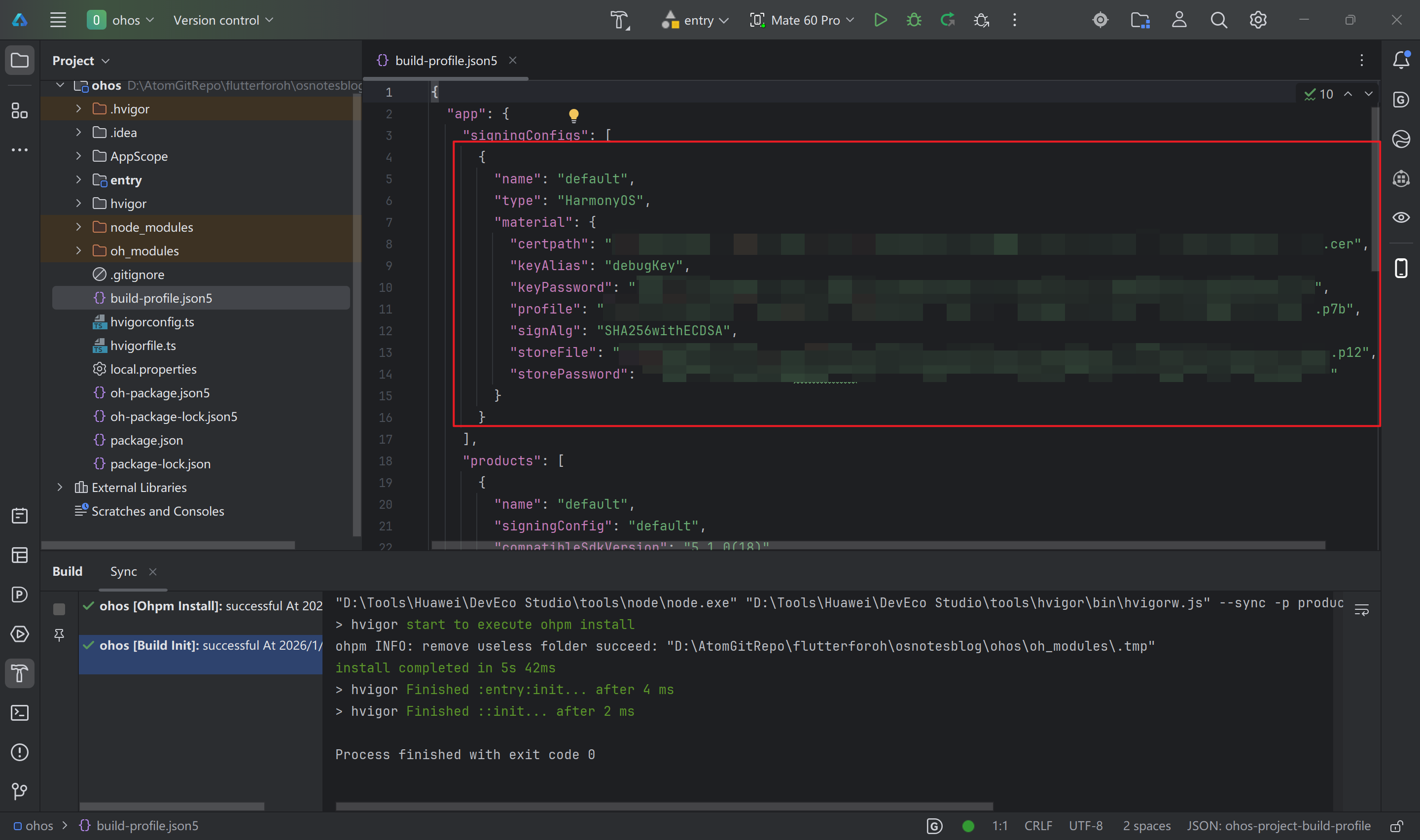
登录成功后,会自动进行签名。点击Apply或者OK按钮,会自动将签名信息写入到工程级build-profile.json5配置文件中。
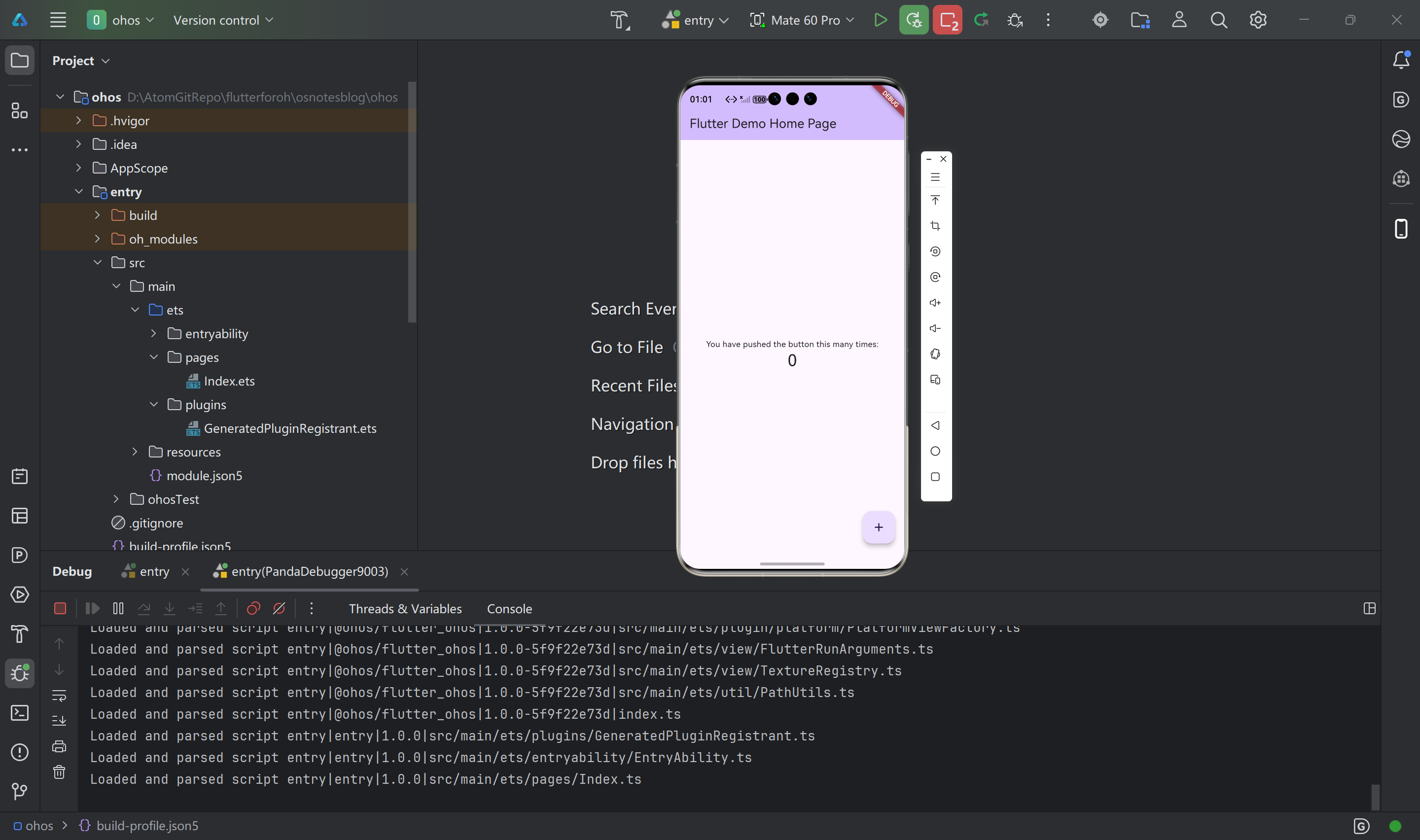
启动模拟器或者连接真机设备(创建模拟器建议选择Mate60 Pro),点击菜单栏中的调试或者运行按钮,编译构建安装包并安装到设备上。

使用VSCode/Android Studio/其他工具打开osnotesblog工程
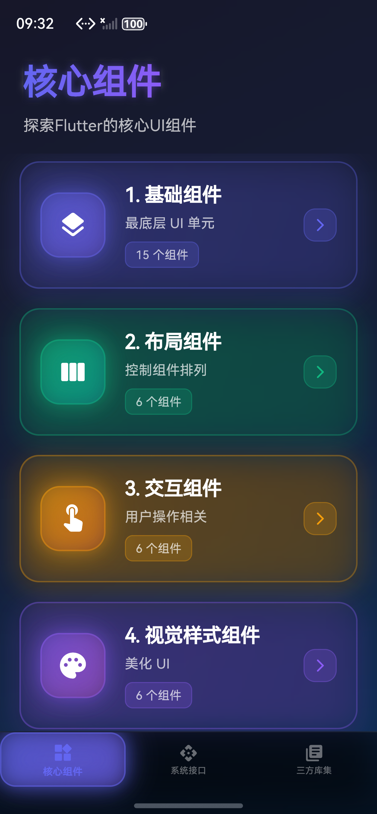
在移动应用开发中,底部导航栏(Bottom Navigation Bar)是最常见的导航模式之一。Flutter 虽然提供了原生的 BottomNavigationBar,但如果你想要更丰富的动画效果和更灵活的定制能力,animated_bottom_navigation_bar 绝对是一个不错的选择!使用animated_bottom_navigation_bar三方库为应用添加核心组件、系统接口、三方库集底部选项卡。
📦 第一步:添加依赖
首先,我们需要在项目的 pubspec.yaml 文件中添加 animated_bottom_navigation_bar 依赖。
打开 pubspec.yaml 文件,在 dependencies 部分添加:
dependencies:
  flutter:
    sdk: flutter
  cupertino_icons: ^1.0.8
  animated_bottom_navigation_bar: ^1.3.3  # 👈 添加这一行
保存文件后,在终端运行:
flutter pub get
等待依赖安装完成,我们就可以开始使用了!🚀
🏗️ 第二步:创建页面组件
在开始集成底部导航栏之前,我们需要先创建三个页面组件。这样可以让代码结构更清晰,也方便后续维护。
创建页面目录
在 lib 目录下创建一个 pages 文件夹(如果还没有的话):
lib/
  └── pages/
      ├── core_components_page.dart
      ├── system_interface_page.dart
      └── third_party_libs_page.dart
核心组件页面
创建 lib/pages/core_components_page.dart:
import 'package:flutter/material.dart';
class CoreComponentsPage extends StatelessWidget {
const CoreComponentsPage({super.key});
Widget build(BuildContext context) {
return Scaffold(
body: Container(
decoration: BoxDecoration(
gradient: LinearGradient(
begin: Alignment.topLeft,
end: Alignment.bottomRight,
colors: [
Colors.blue.shade50,
Colors.purple.shade50,
],
),
),
child: SafeArea(
child: Padding(
padding: const EdgeInsets.all(20.0),
child: Column(
crossAxisAlignment: CrossAxisAlignment.start,
children: [
Text(
'核心组件',
style: Theme.of(context).textTheme.headlineLarge?.copyWith(
fontWeight: FontWeight.bold,
color: Colors.deepPurple,
),
),
const SizedBox(height: 8),
Text(
'探索Flutter的核心UI组件',
style: Theme.of(context).textTheme.bodyLarge?.copyWith(
color: Colors.grey[700],
),
),
// 这里可以添加你的内容组件
],
),
),
),
),
);
}
}
系统接口页面
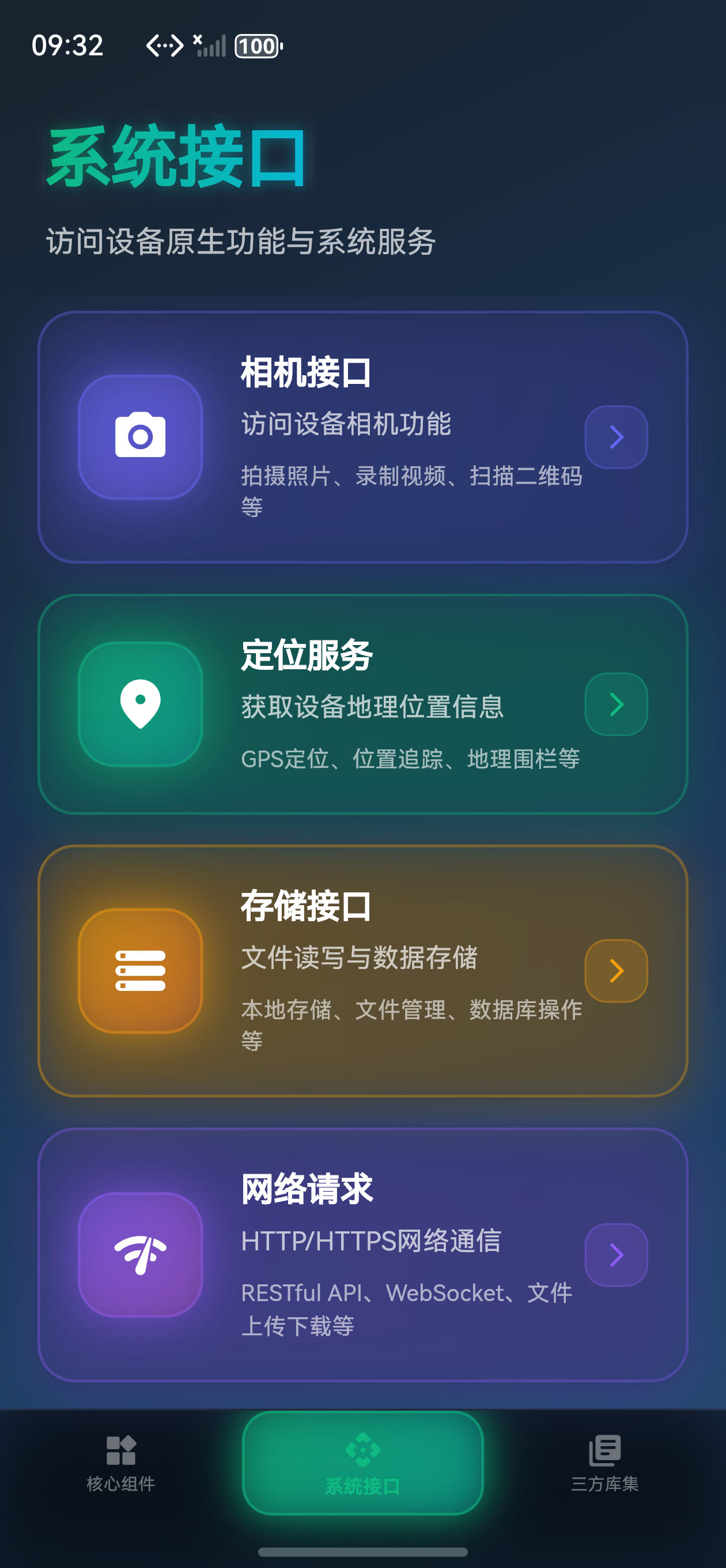
创建 lib/pages/system_interface_page.dart:
import 'package:flutter/material.dart';
class SystemInterfacePage extends StatelessWidget {
const SystemInterfacePage({super.key});
Widget build(BuildContext context) {
return Scaffold(
body: Container(
decoration: BoxDecoration(
gradient: LinearGradient(
begin: Alignment.topLeft,
end: Alignment.bottomRight,
colors: [
Colors.green.shade50,
Colors.cyan.shade50,
],
),
),
child: SafeArea(
child: Padding(
padding: const EdgeInsets.all(20.0),
child: Column(
crossAxisAlignment: CrossAxisAlignment.start,
children: [
Text(
'系统接口',
style: Theme.of(context).textTheme.headlineLarge?.copyWith(
fontWeight: FontWeight.bold,
color: Colors.teal,
),
),
const SizedBox(height: 8),
Text(
'访问设备原生功能与系统服务',
style: Theme.of(context).textTheme.bodyLarge?.copyWith(
color: Colors.grey[700],
),
),
// 这里可以添加你的内容组件
],
),
),
),
),
);
}
}
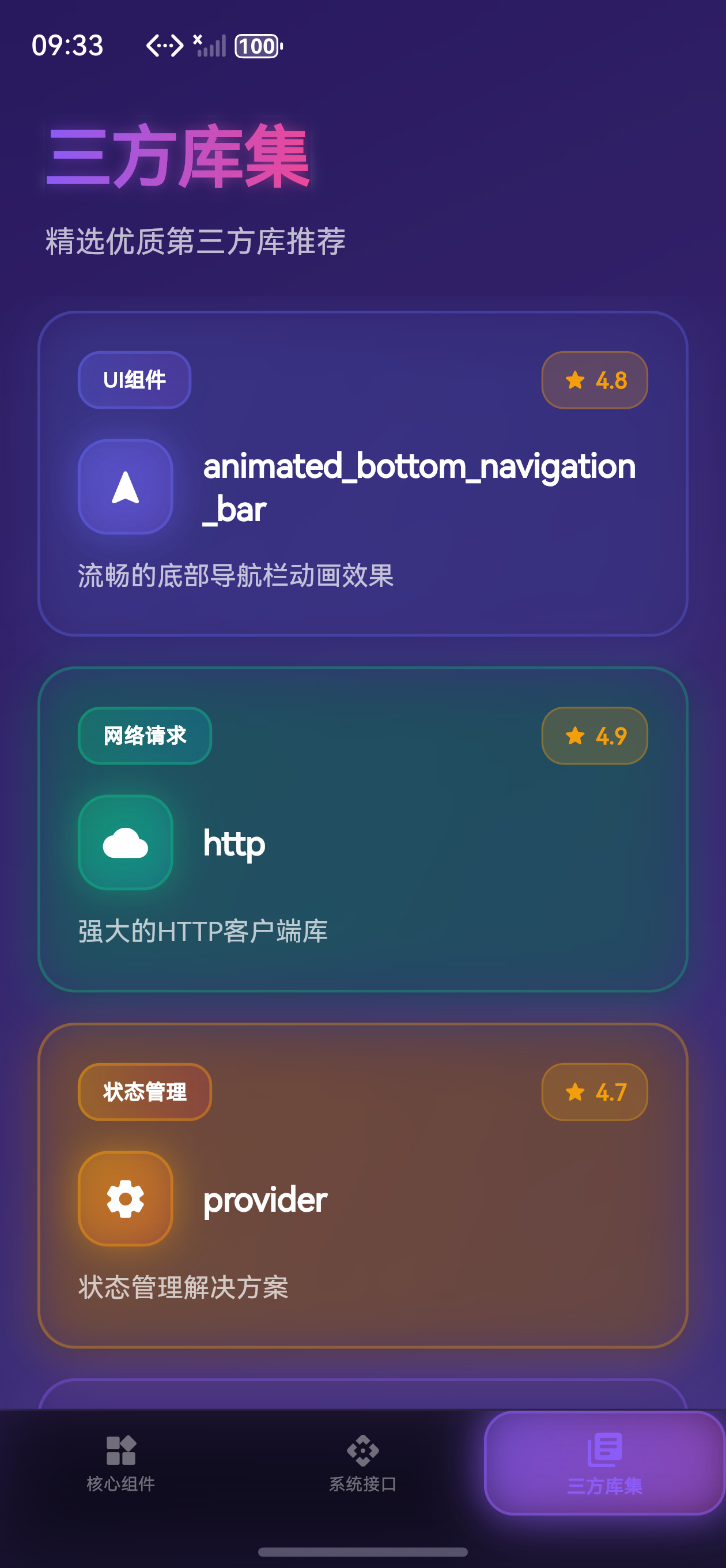
三方库集页面
创建 lib/pages/third_party_libs_page.dart:
import 'package:flutter/material.dart';
class ThirdPartyLibsPage extends StatelessWidget {
const ThirdPartyLibsPage({super.key});
Widget build(BuildContext context) {
return Scaffold(
body: Container(
decoration: BoxDecoration(
gradient: LinearGradient(
begin: Alignment.topLeft,
end: Alignment.bottomRight,
colors: [
Colors.purple.shade50,
Colors.pink.shade50,
],
),
),
child: SafeArea(
child: Padding(
padding: const EdgeInsets.all(20.0),
child: Column(
crossAxisAlignment: CrossAxisAlignment.start,
children: [
Text(
'三方库集',
style: Theme.of(context).textTheme.headlineLarge?.copyWith(
fontWeight: FontWeight.bold,
color: Colors.deepPurple,
),
),
const SizedBox(height: 8),
Text(
'精选优质第三方库推荐',
style: Theme.of(context).textTheme.bodyLarge?.copyWith(
color: Colors.grey[700],
),
),
// 这里可以添加你的内容组件
],
),
),
),
),
);
}
}
🎨 第三步:实现主页面和底部导航栏
现在到了最关键的一步!我们要在 main.dart 中集成底部导航栏。
导入必要的包
首先,在文件顶部添加导入:
import 'dart:ui';
import 'package:flutter/material.dart';
import 'package:animated_bottom_navigation_bar/animated_bottom_navigation_bar.dart';
import 'pages/core_components_page.dart';
import 'pages/system_interface_page.dart';
import 'pages/third_party_libs_page.dart';
import 'utils/ui_effects.dart';
创建主页面 StatefulWidget
我们需要一个 StatefulWidget 来管理当前选中的选项卡索引和动画控制器:
class MainPage extends StatefulWidget {
const MainPage({super.key});
State<MainPage> createState() => _MainPageState();
}
class _MainPageState extends State<MainPage> with TickerProviderStateMixin {
int _currentIndex = 0;
final _pageController = PageController();
late AnimationController _glowController; // 用于动态背景光效
// 所有页面列表
final List<Widget> _pages = const [
CoreComponentsPage(),
SystemInterfacePage(),
ThirdPartyLibsPage(),
];
// 图标列表
final List<IconData> _icons = [
Icons.widgets_rounded,
Icons.api_rounded,
Icons.library_books_rounded,
];
// 标签列表
final List<String> _labels = [
'核心组件',
'系统接口',
'三方库集',
];
// 每个选项卡的渐变配色
final List<List<Color>> _gradientColors = [
[const Color(0xFF6366F1), const Color(0xFF8B5CF6)],
[const Color(0xFF10B981), const Color(0xFF06B6D4)],
[const Color(0xFF8B5CF6), const Color(0xFFEC4899)],
];
void initState() {
super.initState();
// 初始化动态光效控制器
_glowController = AnimationController(
vsync: this,
duration: const Duration(seconds: 2),
)..repeat(reverse: true);
}
void dispose() {
_pageController.dispose();
_glowController.dispose();
super.dispose();
}
void _onTabTapped(int index) {
setState(() {
_currentIndex = index;
});
_pageController.animateToPage(
index,
duration: const Duration(milliseconds: 400),
curve: Curves.easeInOutCubic,
);
}
}
构建 UI
现在我们来构建完整的 UI,包含动态背景光效和优化的底部导航栏:
Widget build(BuildContext context) {
return Scaffold(
backgroundColor: Colors.transparent,
extendBody: true, // 允许内容延伸到导航栏下方
body: Container(
decoration: BoxDecoration(
gradient: LinearGradient(
begin: Alignment.topLeft,
end: Alignment.bottomRight,
colors: UIEffects.primaryGradient,
),
),
child: Stack(
children: [
// 动态背景光效
AnimatedBuilder(
animation: _glowController,
builder: (context, child) {
return Positioned.fill(
child: Container(
decoration: BoxDecoration(
gradient: RadialGradient(
center: Alignment(
-0.5 + _glowController.value * 0.5,
-0.5 + _glowController.value * 0.5,
),
radius: 1.5,
colors: [
_gradientColors[_currentIndex][0]
.withOpacity(0.2 * (0.5 + _glowController.value * 0.5)),
Colors.transparent,
],
),
),
),
);
},
),
// 页面内容
PageView(
controller: _pageController,
onPageChanged: (index) {
setState(() {
_currentIndex = index;
});
},
children: _pages,
),
],
),
),
// 底部导航栏 - 毛玻璃效果
bottomNavigationBar: ClipRRect(
child: BackdropFilter(
filter: ImageFilter.blur(sigmaX: 20, sigmaY: 20),
child: Container(
decoration: BoxDecoration(
gradient: LinearGradient(
begin: Alignment.topCenter,
end: Alignment.bottomCenter,
colors: [
Colors.black.withOpacity(0.4),
Colors.black.withOpacity(0.6),
],
),
border: Border(
top: BorderSide(
color: Colors.white.withOpacity(0.1),
width: 1,
),
),
),
child: AnimatedBottomNavigationBar.builder(
itemCount: _icons.length,
// 自定义选项卡构建器 - 优化文字溢出问题
tabBuilder: (int index, bool isActive) {
final colors = _gradientColors[index];
final color = isActive ? colors[0] : Colors.white.withOpacity(0.4);
return AnimatedContainer(
duration: const Duration(milliseconds: 300),
curve: Curves.easeOutCubic,
padding: EdgeInsets.symmetric(
horizontal: 12,
vertical: isActive ? 6 : 5, // 优化内边距,防止溢出
),
decoration: BoxDecoration(
gradient: isActive
? LinearGradient(
begin: Alignment.topLeft,
end: Alignment.bottomRight,
colors: [
colors[0].withOpacity(0.3),
colors[1].withOpacity(0.2),
],
)
: null,
borderRadius: BorderRadius.circular(16),
border: isActive
? Border.all(
color: colors[0].withOpacity(0.5),
width: 1.5,
)
: null,
boxShadow: isActive
? UIEffects.neonGlow(
color: colors[0],
intensity: 0.6,
blurRadius: 15,
)
: null,
),
child: Column(
mainAxisSize: MainAxisSize.min,
mainAxisAlignment: MainAxisAlignment.center,
crossAxisAlignment: CrossAxisAlignment.center,
children: [
Icon(
_icons[index],
size: isActive ? 22 : 20, // 优化图标大小
color: color,
),
const SizedBox(height: 3), // 优化间距
Text(
_labels[index],
style: TextStyle(
fontSize: isActive ? 10 : 9, // 优化字体大小
fontWeight: isActive ? FontWeight.w700 : FontWeight.w500,
color: color,
letterSpacing: 0.2,
height: 1.1, // 优化行高,防止溢出
),
maxLines: 1,
overflow: TextOverflow.ellipsis,
textAlign: TextAlign.center,
),
],
),
);
},
backgroundColor: Colors.transparent,
activeIndex: _currentIndex,
splashColor: _gradientColors[_currentIndex][0].withOpacity(0.3),
splashRadius: 35,
notchAndCornersAnimation: const AlwaysStoppedAnimation(1.0),
splashSpeedInMilliseconds: 400,
notchSmoothness: NotchSmoothness.defaultEdge,
gapLocation: GapLocation.none,
leftCornerRadius: 0,
rightCornerRadius: 0,
onTap: _onTabTapped,
shadow: BoxShadow(
color: Colors.black.withOpacity(0.5),
blurRadius: 30,
offset: const Offset(0, -10),
),
elevation: 0,
),
),
),
),
);
}
🎯 完整代码示例
以下是 main.dart 的完整代码(包含数字未来主义UI设计):
import 'dart:ui';
import 'package:flutter/material.dart';
import 'package:animated_bottom_navigation_bar/animated_bottom_navigation_bar.dart';
import 'pages/core_components_page.dart';
import 'pages/system_interface_page.dart';
import 'pages/third_party_libs_page.dart';
import 'utils/ui_effects.dart';
void main() {
runApp(const MyApp());
}
class MyApp extends StatelessWidget {
const MyApp({super.key});
Widget build(BuildContext context) {
return MaterialApp(
title: 'Flutter鸿蒙开发学习',
debugShowCheckedModeBanner: false,
theme: ThemeData(
colorScheme: ColorScheme.dark(
primary: const Color(0xFF6366F1),
secondary: const Color(0xFF8B5CF6),
surface: const Color(0xFF1E293B),
background: const Color(0xFF0F172A),
brightness: Brightness.dark,
),
useMaterial3: true,
fontFamily: 'SF Pro Display',
),
home: const MainPage(),
);
}
}
class MainPage extends StatefulWidget {
const MainPage({super.key});
State<MainPage> createState() => _MainPageState();
}
class _MainPageState extends State<MainPage> with TickerProviderStateMixin {
int _currentIndex = 0;
final _pageController = PageController();
late AnimationController _glowController;
final List<Widget> _pages = const [
CoreComponentsPage(),
SystemInterfacePage(),
ThirdPartyLibsPage(),
];
final List<IconData> _icons = [
Icons.widgets_rounded,
Icons.api_rounded,
Icons.library_books_rounded,
];
final List<String> _labels = [
'核心组件',
'系统接口',
'三方库集',
];
final List<List<Color>> _gradientColors = [
[const Color(0xFF6366F1), const Color(0xFF8B5CF6)],
[const Color(0xFF10B981), const Color(0xFF06B6D4)],
[const Color(0xFF8B5CF6), const Color(0xFFEC4899)],
];
void initState() {
super.initState();
_glowController = AnimationController(
vsync: this,
duration: const Duration(seconds: 2),
)..repeat(reverse: true);
}
void dispose() {
_pageController.dispose();
_glowController.dispose();
super.dispose();
}
void _onTabTapped(int index) {
setState(() {
_currentIndex = index;
});
_pageController.animateToPage(
index,
duration: const Duration(milliseconds: 400),
curve: Curves.easeInOutCubic,
);
}
Widget build(BuildContext context) {
return Scaffold(
backgroundColor: Colors.transparent,
extendBody: true,
body: Container(
decoration: BoxDecoration(
gradient: LinearGradient(
begin: Alignment.topLeft,
end: Alignment.bottomRight,
colors: UIEffects.primaryGradient,
),
),
child: Stack(
children: [
AnimatedBuilder(
animation: _glowController,
builder: (context, child) {
return Positioned.fill(
child: Container(
decoration: BoxDecoration(
gradient: RadialGradient(
center: Alignment(
-0.5 + _glowController.value * 0.5,
-0.5 + _glowController.value * 0.5,
),
radius: 1.5,
colors: [
_gradientColors[_currentIndex][0]
.withOpacity(0.2 * (0.5 + _glowController.value * 0.5)),
Colors.transparent,
],
),
),
),
);
},
),
PageView(
controller: _pageController,
onPageChanged: (index) {
setState(() {
_currentIndex = index;
});
},
children: _pages,
),
],
),
),
bottomNavigationBar: ClipRRect(
child: BackdropFilter(
filter: ImageFilter.blur(sigmaX: 20, sigmaY: 20),
child: Container(
decoration: BoxDecoration(
gradient: LinearGradient(
begin: Alignment.topCenter,
end: Alignment.bottomCenter,
colors: [
Colors.black.withOpacity(0.4),
Colors.black.withOpacity(0.6),
],
),
border: Border(
top: BorderSide(
color: Colors.white.withOpacity(0.1),
width: 1,
),
),
),
child: AnimatedBottomNavigationBar.builder(
itemCount: _icons.length,
tabBuilder: (int index, bool isActive) {
final colors = _gradientColors[index];
final color = isActive ? colors[0] : Colors.white.withOpacity(0.4);
return AnimatedContainer(
duration: const Duration(milliseconds: 300),
curve: Curves.easeOutCubic,
padding: EdgeInsets.symmetric(
horizontal: 12,
vertical: isActive ? 6 : 5,
),
decoration: BoxDecoration(
gradient: isActive
? LinearGradient(
begin: Alignment.topLeft,
end: Alignment.bottomRight,
colors: [
colors[0].withOpacity(0.3),
colors[1].withOpacity(0.2),
],
)
: null,
borderRadius: BorderRadius.circular(16),
border: isActive
? Border.all(
color: colors[0].withOpacity(0.5),
width: 1.5,
)
: null,
boxShadow: isActive
? UIEffects.neonGlow(
color: colors[0],
intensity: 0.6,
blurRadius: 15,
)
: null,
),
child: Column(
mainAxisSize: MainAxisSize.min,
mainAxisAlignment: MainAxisAlignment.center,
crossAxisAlignment: CrossAxisAlignment.center,
children: [
Icon(
_icons[index],
size: isActive ? 22 : 20,
color: color,
),
const SizedBox(height: 3),
Text(
_labels[index],
style: TextStyle(
fontSize: isActive ? 10 : 9,
fontWeight: isActive ? FontWeight.w700 : FontWeight.w500,
color: color,
letterSpacing: 0.2,
height: 1.1,
),
maxLines: 1,
overflow: TextOverflow.ellipsis,
textAlign: TextAlign.center,
),
],
),
);
},
backgroundColor: Colors.transparent,
activeIndex: _currentIndex,
splashColor: _gradientColors[_currentIndex][0].withOpacity(0.3),
splashRadius: 35,
notchAndCornersAnimation: const AlwaysStoppedAnimation(1.0),
splashSpeedInMilliseconds: 400,
notchSmoothness: NotchSmoothness.defaultEdge,
gapLocation: GapLocation.none,
leftCornerRadius: 0,
rightCornerRadius: 0,
onTap: _onTabTapped,
shadow: BoxShadow(
color: Colors.black.withOpacity(0.5),
blurRadius: 30,
offset: const Offset(0, -10),
),
elevation: 0,
),
),
),
),
);
}
}
🎨 自定义配置说明
animated_bottom_navigation_bar 提供了丰富的配置选项,让我们来了解一下常用的参数:
🎯 基础配置
itemCount: 选项卡数量activeIndex: 当前激活的选项卡索引backgroundColor: 导航栏背景色onTap: 点击选项卡的回调函数
✨ 动画配置
splashColor: 点击时的水波纹颜色splashRadius: 水波纹半径splashSpeedInMilliseconds: 水波纹动画时长notchAndCornersAnimation: 是否启用缺口和圆角动画notchSmoothness: 缺口平滑度(NotchSmoothness.verySmooth/defaultSmoothness/rough)
🎨 样式配置
gapLocation: 缺口位置(GapLocation.none/GapLocation.center/GapLocation.end)leftCornerRadius: 左下角圆角半径rightCornerRadius: 右下角圆角半径shadow: 阴影效果elevation: 阴影高度
💡 常见问题解答
Q1: 如何添加更多选项卡?
A: 只需要在 _pages、_icons 和 _labels 列表中添加对应的元素即可:
final List<Widget> _pages = const [
  CoreComponentsPage(),
  SystemInterfacePage(),
  ThirdPartyLibsPage(),
  NewPage(),  // 👈 添加新页面
];

final List<IconData> _icons = [
  Icons.widgets_rounded,
  Icons.api_rounded,
  Icons.library_books_rounded,
  Icons.settings_rounded,  // 👈 添加新图标
];

final List<String> _labels = [
  '核心组件',
  '系统接口',
  '三方库集',
  '设置',  // 👈 添加新标签
];

// 同时添加对应的渐变配色
final List<List<Color>> _gradientColors = [
  [const Color(0xFF6366F1), const Color(0xFF8B5CF6)],
  [const Color(0xFF10B981), const Color(0xFF06B6D4)],
  [const Color(0xFF8B5CF6), const Color(0xFFEC4899)],
  [const Color(0xFFF59E0B), const Color(0xFFEF4444)],  // 👈 添加新配色
];
Q2: 如何修复底部导航栏文字溢出问题?
A: 优化 tabBuilder 中的内边距和字体设置:
tabBuilder: (int index, bool isActive) {
  return AnimatedContainer(
    padding: EdgeInsets.symmetric(
      horizontal: 12,
      vertical: isActive ? 6 : 5,  // 👈 减少垂直内边距
    ),
    child: Column(
      mainAxisSize: MainAxisSize.min,
      children: [
        Icon(
          _icons[index],
          size: isActive ? 22 : 20,  // 👈 优化图标大小
        ),
        const SizedBox(height: 3),  // 👈 减少间距
        Text(
          _labels[index],
          style: TextStyle(
            fontSize: isActive ? 10 : 9,  // 👈 优化字体大小
            height: 1.1,  // 👈 设置行高,防止溢出
          ),
          maxLines: 1,
          overflow: TextOverflow.ellipsis,
        ),
      ],
    ),
  );
}
Q3: 如何自定义选项卡的样式?
A: 在 tabBuilder 回调中,你可以完全自定义每个选项卡的外观:
tabBuilder: (int index, bool isActive) {
  final colors = _gradientColors[index];
  final color = isActive ? colors[0] : Colors.white.withOpacity(0.4);

  return AnimatedContainer(
    // 你的自定义装饰和动画
    decoration: BoxDecoration(
      gradient: isActive ? LinearGradient(...) : null,
      borderRadius: BorderRadius.circular(16),
      border: isActive ? Border.all(...) : null,
      boxShadow: isActive ? UIEffects.neonGlow(...) : null,
    ),
    child: // 你的自定义内容
  );
}
Q4: 如何禁用页面滑动切换?
A: 设置 PageView 的 physics 属性:
PageView(
  controller: _pageController,
  physics: const NeverScrollableScrollPhysics(),  // 👈 禁用滑动
  onPageChanged: (index) {
    setState(() {
      _currentIndex = index;
    });
  },
  children: _pages,
)
Q5: 如何优化详情页面的性能?
A: 使用列表布局和懒加载:
// ✅ 推荐:使用 ListView.builder(懒加载)
ListView.builder(
  itemCount: items.length,
  itemBuilder: (context, index) {
    return ListItemWidget(item: items[index]);
  },
)

// ❌ 不推荐:一次性渲染所有项目(性能差)
Column(
  children: items.map((item) => ListItemWidget(item: item)).toList(),
)
🚀 运行项目
完成所有代码后,运行以下命令启动应用:
flutter run
如果一切正常,你应该能看到一个带有流畅动画效果的底部导航栏!🎉
Happy Coding! 🎨✨
欢迎加入开源鸿蒙跨平台社区

讨论HarmonyOS开发技术,专注于API与组件、DevEco Studio、测试、元服务和应用上架分发等。
更多推荐


 23
23 0
0- 0


 已为社区贡献3条内容

所有评论(0)