高级进阶 ReactNative for Harmony 项目鸿蒙化三方库集成实战:rn-placeholder
·
欢迎加入开源鸿蒙跨平台社区:https://openharmonycrossplatform.csdn.net
📋 前言
rn-placeholder 是一个优雅的骨架屏加载占位符库,用于在数据加载时显示占位内容,提供流畅的用户体验。它支持多种动画效果,包括淡入淡出、闪光、渐进式加载等,可以自定义占位符的样式和布局,完全兼容 Android、iOS、Web 和 HarmonyOS 多平台。
🎯 库简介
基本信息
- 库名称: rn-placeholder
- 版本信息:
3.0.3: 支持 RN 0.72/0.77 版本
- 官方仓库: https://github.com/mfrachet/rn-placeholder
- 主要功能:
- 多种动画效果(Fade、Shine、ShineOverlay、Loader、Progressive)
- 自定义占位符布局
- 占位线条和媒体组件
- 左右媒体占位
- 完全可自定义样式
- 支持嵌套布局
- 轻量级,无额外依赖
- 兼容性验证:
- RNOH: 0.72.27; SDK: HarmonyOS-Next-DB1 5.0.0.29(SP1); IDE: DevEco Studio 5.0.3.400; ROM: 3.0.0.25;
- RNOH: 0.77.18; SDK: HarmonyOS 5.1.1.208 (API Version 19 Release); IDE: DevEco Studio 5.1.1.830; ROM: HarmonyOS 6.0.0.112 SP12;
为什么需要这个库?
- 用户体验: 提供优雅的加载占位符,避免白屏
- 视觉连贯: 占位符与实际内容布局一致,减少视觉跳跃
- 性能优化: 轻量级实现,不影响应用性能
- 易于使用: API 简单直观,集成快速
- 高度可定制: 支持自定义样式和动画效果
- 专业级: 数据密集型应用必备优化方案
📦 安装步骤
1. 使用 npm 安装
npm install rn-placeholder@3.0.3 --legacy-peer-deps
2. 验证安装
安装完成后,检查 package.json 文件,应该能看到新增的依赖:
{
  "dependencies": {
    "rn-placeholder": "^3.0.3",
    // ... 其他依赖
  }
}
🔧 HarmonyOS 平台配置 ⭐
重要说明
rn-placeholder 是纯 JavaScript 实现,无需任何原生配置,安装后即可直接使用。
配置步骤
无需配置!安装完成后即可直接使用。
注意: 由于 rn-placeholder 是纯 JavaScript 实现,不需要进行 CMakeLists.txt、PackageProvider.cpp、RNPackagesFactory.ts 等原生配置。
💻 完整代码示例
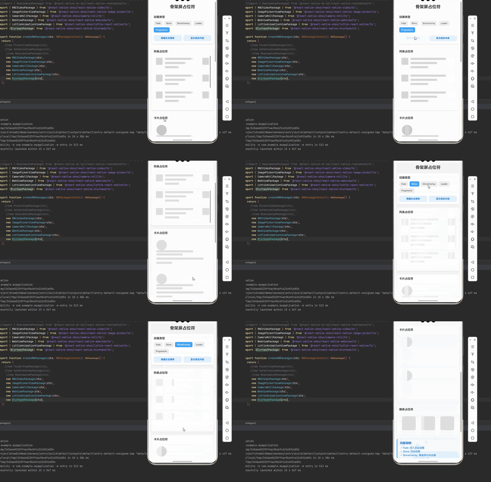
下面是一个完整的示例,展示了 rn-placeholder 的各种使用场景:
import React, { useState } from 'react';
import {
  View,
  Text,
  StyleSheet,
  ScrollView,
  TouchableOpacity,
  SafeAreaView,
  FlatList,
} from 'react-native';
import {
  Placeholder,
  PlaceholderMedia,
  PlaceholderLine,
  Fade,
  Shine,
  ShineOverlay,
  Loader,
  Progressive,
} from 'rn-placeholder';

function PlaceholderDemo(): JSX.Element {
  const [loading, setLoading] = useState(true);
  const [animationType, setAnimationType] = useState<'Fade' | 'Shine' | 'ShineOverlay' | 'Loader' | 'Progressive'>('Fade');
  const [hasLeftRight, setHasLeftRight] = useState(false);

  const getAnimation = () => {
    switch (animationType) {
      case 'Fade':
        return Fade as React.ComponentType<any>;
      case 'Shine':
        return Shine as React.ComponentType<any>;
      case 'ShineOverlay':
        return ShineOverlay as React.ComponentType<any>;
      case 'Loader':
        return Loader as React.ComponentType<any>;
      case 'Progressive':
        return Progressive as React.ComponentType<any>;
      default:
        return Fade as React.ComponentType<any>;
    }
  };

  const toggleLoading = () => {
    setLoading(!loading);
  };

  const renderListItem = ({ item, index }: { item: any; index: number }) => {
    if (loading) {
      return (
        <View style={styles.listItem}>
          <Placeholder
            Animation={getAnimation()}
            Left={PlaceholderMedia}
            Right={hasLeftRight ? PlaceholderMedia : undefined}
            style={styles.listItemPlaceholder}
          >
            <PlaceholderLine width={80} />
            <PlaceholderLine width={60} />
            <PlaceholderLine width={40} />
          </Placeholder>
        </View>
      );
    }

    return (
      <View style={styles.listItem}>
        <View style={styles.listItemContent}>
          <Text style={styles.listItemTitle}>列表项 {index + 1}</Text>
          <Text style={styles.listItemSubtitle}>这是列表项的描述内容</Text>
          <Text style={styles.listItemText}>更多详细信息...</Text>
        </View>
        {hasLeftRight && (
          <View style={styles.listItemRight}>
            <View style={styles.listItemImage} />
          </View>
        )}
      </View>
    );
  };

  const renderCardItem = () => {
    if (loading) {
      return (
        <View style={styles.card}>
          <Placeholder Animation={getAnimation()} style={styles.cardPlaceholder}>
            <PlaceholderMedia isRound={true} size={60} style={styles.cardAvatar} />
            <View style={styles.cardContent}>
              <PlaceholderLine width={70} style={styles.cardTitle} />
              <PlaceholderLine width={50} />
              <PlaceholderLine width={90} />
              <PlaceholderLine width={30} />
            </View>
          </Placeholder>
        </View>
      );
    }

    return (
      <View style={styles.card}>
        <View style={styles.cardAvatar} />
        <View style={styles.cardContent}>
          <Text style={styles.cardTitle}>用户名称</Text>
          <Text style={styles.cardText}>这是用户的简介信息</Text>
          <Text style={styles.cardText}>更多详细信息可以在这里展示</Text>
          <Text style={styles.cardText}>点击查看更多</Text>
        </View>
      </View>
    );
  };

  const data = Array.from({ length: 5 }, (_, i) => ({ id: i }));

  return (
    <SafeAreaView style={styles.container}>
      <ScrollView style={styles.content} contentContainerStyle={styles.scrollContent}>
        <Text style={styles.title}>骨架屏占位符</Text>

        {/* 控制面板 */}
        <View style={styles.controlPanel}>
          <Text style={styles.controlTitle}>动画类型</Text>
          <View style={styles.animationButtons}>
            <TouchableOpacity
              style={[
                styles.animationButton,
                animationType === 'Fade' && styles.activeButton,
              ]}
              onPress={() => setAnimationType('Fade')}
            >
              <Text
                style={[
                  styles.animationButtonText,
                  animationType === 'Fade' && styles.activeButtonText,
                ]}
              >
                Fade
              </Text>
            </TouchableOpacity>
            <TouchableOpacity
              style={[
                styles.animationButton,
                animationType === 'Shine' && styles.activeButton,
              ]}
              onPress={() => setAnimationType('Shine')}
            >
              <Text
                style={[
                  styles.animationButtonText,
                  animationType === 'Shine' && styles.activeButtonText,
                ]}
              >
                Shine
              </Text>
            </TouchableOpacity>
            <TouchableOpacity
              style={[
                styles.animationButton,
                animationType === 'ShineOverlay' && styles.activeButton,
              ]}
              onPress={() => setAnimationType('ShineOverlay')}
            >
              <Text
                style={[
                  styles.animationButtonText,
                  animationType === 'ShineOverlay' && styles.activeButtonText,
                ]}
              >
                ShineOverlay
              </Text>
            </TouchableOpacity>
            <TouchableOpacity
              style={[
                styles.animationButton,
                animationType === 'Loader' && styles.activeButton,
              ]}
              onPress={() => setAnimationType('Loader')}
            >
              <Text
                style={[
                  styles.animationButtonText,
                  animationType === 'Loader' && styles.activeButtonText,
                ]}
              >
                Loader
              </Text>
            </TouchableOpacity>
            <TouchableOpacity
              style={[
                styles.animationButton,
                animationType === 'Progressive' && styles.activeButton,
              ]}
              onPress={() => setAnimationType('Progressive')}
            >
              <Text
                style={[
                  styles.animationButtonText,
                  animationType === 'Progressive' && styles.activeButtonText,
                ]}
              >
                Progressive
              </Text>
            </TouchableOpacity>
          </View>

          <View style={styles.toggleRow}>
            <TouchableOpacity
              style={styles.toggleButton}
              onPress={() => setHasLeftRight(!hasLeftRight)}
            >
              <Text style={styles.toggleButtonText}>
                {hasLeftRight ? '隐藏左右媒体' : '显示左右媒体'}
              </Text>
            </TouchableOpacity>
            <TouchableOpacity style={styles.toggleButton} onPress={toggleLoading}>
              <Text style={styles.toggleButtonText}>
                {loading ? '显示真实内容' : '显示骨架屏'}
              </Text>
            </TouchableOpacity>
          </View>
        </View>

        {/* 列表演示 */}
        <View style={styles.section}>
          <Text style={styles.sectionTitle}>列表占位符</Text>
          <FlatList
            data={data}
            renderItem={renderListItem}
            keyExtractor={(item) => String(item.id)}
            style={styles.list}
          />
        </View>

        {/* 卡片演示 */}
        <View style={styles.section}>
          <Text style={styles.sectionTitle}>卡片占位符</Text>
          <View style={styles.cardContainer}>
            {renderCardItem()}
            {renderCardItem()}
          </View>
        </View>

        {/* 媒体占位符 */}
        <View style={styles.section}>
          <Text style={styles.sectionTitle}>媒体占位符</Text>
          <Placeholder Animation={getAnimation()} style={styles.mediaPlaceholder}>
            <View style={styles.mediaRow}>
              <PlaceholderMedia size={80} style={styles.mediaLeft} />
              <PlaceholderMedia size={80} style={styles.mediaRight} />
              <PlaceholderMedia size={80} style={styles.mediaCenter} />
            </View>
          </Placeholder>
        </View>

        {/* 功能说明 */}
        <View style={styles.infoSection}>
          <Text style={styles.infoTitle}>功能说明:</Text>
          <Text style={styles.infoText}>• Fade: 淡入淡出动画</Text>
          <Text style={styles.infoText}>• Shine: 闪光动画</Text>
          <Text style={styles.infoText}>• ShineOverlay: 覆盖层闪光动画</Text>
          <Text style={styles.infoText}>• Loader: 加载指示器动画</Text>
          <Text style={styles.infoText}>• Progressive: 渐进式加载动画</Text>
          <Text style={styles.infoText}>• PlaceholderLine: 占位线条</Text>
          <Text style={styles.infoText}>• PlaceholderMedia: 占位媒体</Text>
          <Text style={styles.infoText}>• 支持左右媒体占位</Text>
          <Text style={styles.infoText}>• 完全可自定义样式</Text>
        </View>

        {/* 注意事项 */}
        <View style={styles.noteSection}>
          <Text style={styles.noteTitle}>注意事项:</Text>
          <Text style={styles.noteText}>• 无需原生配置</Text>
          <Text style={styles.noteText}>• 纯 JavaScript 实现</Text>
          <Text style={styles.noteText}>• 支持嵌套布局</Text>
          <Text style={styles.noteText}>• 建议与实际内容布局保持一致</Text>
        </View>
      </ScrollView>
    </SafeAreaView>
  );
}

const styles = StyleSheet.create({
  container: {
    flex: 1,
    backgroundColor: '#f5f5f5',
  },
  content: {
    flex: 1,
  },
  scrollContent: {
    padding: 15,
  },
  title: {
    fontSize: 24,
    fontWeight: 'bold',
    marginBottom: 20,
    textAlign: 'center',
    color: '#333',
  },
  controlPanel: {
    backgroundColor: '#fff',
    borderRadius: 10,
    padding: 15,
    marginBottom: 20,
    shadowColor: '#000',
    shadowOffset: { width: 0, height: 2 },
    shadowOpacity: 0.1,
    shadowRadius: 4,
    elevation: 3,
  },
  controlTitle: {
    fontSize: 16,
    fontWeight: 'bold',
    marginBottom: 12,
    color: '#333',
  },
  animationButtons: {
    flexDirection: 'row',
    flexWrap: 'wrap',
    gap: 8,
    marginBottom: 15,
  },
  animationButton: {
    paddingHorizontal: 12,
    paddingVertical: 8,
    backgroundColor: '#f0f0f0',
    borderRadius: 6,
  },
  activeButton: {
    backgroundColor: '#42a5f5',
  },
  animationButtonText: {
    fontSize: 12,
    color: '#333',
  },
  activeButtonText: {
    color: '#fff',
    fontWeight: 'bold',
  },
  toggleRow: {
    flexDirection: 'row',
    gap: 10,
  },
  toggleButton: {
    flex: 1,
    paddingVertical: 10,
    backgroundColor: '#e3f2fd',
    borderRadius: 8,
    alignItems: 'center',
  },
  toggleButtonText: {
    fontSize: 13,
    color: '#1976d2',
    fontWeight: 'bold',
  },
  section: {
    backgroundColor: '#fff',
    borderRadius: 10,
    padding: 15,
    marginBottom: 20,
    shadowColor: '#000',
    shadowOffset: { width: 0, height: 2 },
    shadowOpacity: 0.1,
    shadowRadius: 4,
    elevation: 3,
  },
  sectionTitle: {
    fontSize: 16,
    fontWeight: 'bold',
    marginBottom: 15,
    color: '#333',
  },
  list: {
    maxHeight: 300,
  },
  listItem: {
    flexDirection: 'row',
    padding: 12,
    borderBottomWidth: 1,
    borderBottomColor: '#f0f0f0',
  },
  listItemPlaceholder: {
    flex: 1,
  },
  listItemContent: {
    flex: 1,
    justifyContent: 'center',
  },
  listItemTitle: {
    fontSize: 16,
    fontWeight: 'bold',
    marginBottom: 4,
    color: '#333',
  },
  listItemSubtitle: {
    fontSize: 14,
    color: '#666',
    marginBottom: 2,
  },
  listItemText: {
    fontSize: 12,
    color: '#999',
  },
  listItemRight: {
    marginLeft: 10,
  },
  listItemImage: {
    width: 60,
    height: 60,
    borderRadius: 8,
    backgroundColor: '#e0e0e0',
  },
  cardContainer: {
    gap: 15,
  },
  card: {
    flexDirection: 'row',
    padding: 15,
    backgroundColor: '#f9f9f9',
    borderRadius: 10,
  },
  cardPlaceholder: {
    flexDirection: 'row',
  },
  cardAvatar: {
    width: 60,
    height: 60,
    borderRadius: 30,
    backgroundColor: '#e0e0e0',
    marginRight: 15,
  },
  cardContent: {
    flex: 1,
    justifyContent: 'center',
  },
  cardTitle: {
    fontSize: 16,
    fontWeight: 'bold',
    marginBottom: 6,
    color: '#333',
  },
  cardText: {
    fontSize: 14,
    color: '#666',
    marginBottom: 2,
  },
  mediaPlaceholder: {
    padding: 15,
  },
  mediaRow: {
    flexDirection: 'row',
    justifyContent: 'space-between',
    alignItems: 'center',
  },
  mediaLeft: {
    backgroundColor: '#e0e0e0',
    borderRadius: 8,
  },
  mediaRight: {
    backgroundColor: '#e0e0e0',
    borderRadius: 8,
  },
  mediaCenter: {
    backgroundColor: '#e0e0e0',
    borderRadius: 8,
  },
  infoSection: {
    padding: 15,
    backgroundColor: '#e3f2fd',
    borderRadius: 8,
    borderLeftWidth: 4,
    borderLeftColor: '#42a5f5',
    marginBottom: 20,
  },
  infoTitle: {
    fontSize: 16,
    fontWeight: 'bold',
    marginBottom: 10,
    color: '#1565c0',
  },
  infoText: {
    fontSize: 14,
    color: '#1976d2',
    marginBottom: 5,
  },
  noteSection: {
    padding: 15,
    backgroundColor: '#fff3cd',
    borderRadius: 8,
    borderLeftWidth: 4,
    borderLeftColor: '#ffc107',
    marginBottom: 20,
  },
  noteTitle: {
    fontSize: 16,
    fontWeight: 'bold',
    marginBottom: 10,
    color: '#856404',
  },
  noteText: {
    fontSize: 14,
    color: '#856404',
    marginBottom: 5,
  },
});

export default PlaceholderDemo;
🎨 实际应用场景
rn-placeholder 可以应用于以下实际场景:
- 用户列表: 用户信息加载、联系人列表等
- 商品列表: 商品信息加载、购物车列表等
- 新闻列表: 新闻标题加载、文章列表等
- 图片列表: 图片加载、相册列表等
- 社交应用: 动态加载、朋友圈列表等
- 电商应用: 商品详情加载、订单列表等
- 视频应用: 视频列表加载、播放列表等
- 音乐应用: 歌曲列表加载、播放列表等
⚠️ 注意事项与最佳实践
1. 动画选择
// ✅ 推荐:根据场景选择合适的动画
// Fade: 适用于大多数场景,性能好
<Placeholder Animation={Fade} />

// Shine: 适用于需要强调加载的场景
<Placeholder Animation={Shine} />

// ShineOverlay: 适用于白色背景的场景
<Placeholder Animation={ShineOverlay} />

// Loader: 适用于需要明确加载指示的场景
<Placeholder Animation={Loader} />

// Progressive: 适用于需要渐进式显示的场景
<Placeholder Animation={Progressive} />
2. 占位符布局
// ✅ 推荐:占位符布局与实际内容保持一致
<Placeholder Animation={Fade} Left={PlaceholderMedia}>
  <PlaceholderLine width={80} />
  <PlaceholderLine width={60} />
  <PlaceholderLine width={40} />
</Placeholder>
3. 自定义样式
// ✅ 推荐:自定义占位符样式
<PlaceholderLine
  width={80}
  height={15}
  color="#e0e0e0"
  noMargin={false}
  style={{ marginTop: 8 }}
/>
4. 媒体占位符
// ✅ 推荐:使用媒体占位符
<PlaceholderMedia
  size={60}
  isRound={true}
  color="#e0e0e0"
  style={{ borderRadius: 30 }}
/>
5. 左右媒体占位
// ✅ 推荐:使用左右媒体占位
<Placeholder
  Animation={Fade}
  Left={PlaceholderMedia}
  Right={PlaceholderMedia}
>
  <PlaceholderLine width={80} />
  <PlaceholderLine width={60} />
</Placeholder>
6. HarmonyOS 特殊处理
在 HarmonyOS 上,需要注意:
- 性能: 纯 JavaScript 实现,性能优秀
- 动画: 所有动画效果完全支持
- 样式: 样式与实际内容保持一致
7. 最佳实践
// ✅ 推荐:封装骨架屏组件
interface SkeletonProps {
  loading: boolean;
  type?: 'list' | 'card' | 'media';
  animation?: any;
}

const Skeleton: React.FC<SkeletonProps> = ({
  loading,
  type = 'list',
  animation = Fade,
}) => {
  if (!loading) return null;

  if (type === 'list') {
    return (
      <Placeholder Animation={animation} Left={PlaceholderMedia}>
        <PlaceholderLine width={80} />
        <PlaceholderLine width={60} />
        <PlaceholderLine width={40} />
      </Placeholder>
    );
  }

  if (type === 'card') {
    return (
      <Placeholder Animation={animation}>
        <PlaceholderMedia isRound={true} size={60} />
        <PlaceholderLine width={70} />
        <PlaceholderLine width={50} />
      </Placeholder>
    );
  }

  return null;
};
🧪 测试验证
1. Android 平台测试
npm run android
测试要点:
- 测试不同动画效果
- 验证占位符布局
- 测试加载状态切换
- 检查性能表现
2. iOS 平台测试
npm run ios
测试要点:
- 测试动画流畅度
- 验证样式一致性
- 测试内存使用
- 检查渲染性能
3. HarmonyOS 平台测试
npm run harmony
测试要点:
- 验证占位符渲染
- 测试动画效果
- 检查性能表现
- 验证样式一致性
4. 常见问题排查
问题 1: 占位符不显示
- 检查 loading 状态
- 确认 Animation 组件正确
- 验证占位符布局
问题 2: 动画不流畅
- 减少同时渲染的占位符数量
- 使用简单的动画(Fade)
- 优化组件渲染
问题 3: 占位符与实际内容不一致
- 调整占位符布局
- 修改占位符尺寸
- 保持样式一致
📊 API 参考
Placeholder 组件属性
| 属性 | 类型 | 必填 | 说明 |
|---|---|---|---|
| Animation | Component | 否 | 动画组件 |
| Left | Component | 否 | 左侧媒体组件 |
| Right | Component | 否 | 右侧媒体组件 |
| style | any | 否 | 自定义样式 |
PlaceholderLine 组件属性
| 属性 | 类型 | 必填 | 说明 |
|---|---|---|---|
| width | number | 否 | 宽度,默认 100 |
| height | number | 否 | 高度,默认 12 |
| color | string | 否 | 颜色,默认 #efefef |
| noMargin | boolean | 否 | 无边距,默认 false |
| style | any | 否 | 自定义样式 |
PlaceholderMedia 组件属性
| 属性 | 类型 | 必填 | 说明 |
|---|---|---|---|
| size | number | 否 | 尺寸,默认 40 |
| isRound | boolean | 否 | 圆角,默认 false |
| color | string | 否 | 颜色,默认 #efefef |
| style | any | 否 | 自定义样式 |
动画组件
| 组件 | 说明 |
|---|---|
| Fade | 淡入淡出动画 |
| Shine | 闪光动画 |
| ShineOverlay | 覆盖层闪光动画 |
| Loader | 加载指示器动画 |
| Progressive | 渐进式加载动画 |
📊 对比:骨架屏方案对比
| 特性 | 传统加载状态 | rn-placeholder |
|---|---|---|
| 视觉体验 | ⚠️ 单调 | ✅ 优雅 |
| 布局一致性 | ⚠️ 差异大 | ✅ 完全一致 |
| 动画效果 | ⚠️ 简单 | ✅ 多种动画 |
| 性能影响 | ⚠️ 中等 | ✅ 轻量级 |
| 跨平台一致性 | ⚠️ 一般 | ✅ 完全一致 |
| 可定制性 | ⚠️ 有限 | ✅ 高度可定制 |
📝 总结
通过集成 rn-placeholder,我们为项目添加了优雅的骨架屏加载占位符功能。这个库支持多种动画效果,可以自定义占位符的样式和布局,完全跨平台兼容,无需任何原生配置。
关键要点回顾
- ✅ 安装依赖:
npm install rn-placeholder@3.0.3 --legacy-peer-deps - ✅ 配置平台: 无需原生配置,纯 JavaScript 实现
- ✅ 集成代码: 使用
Placeholder、PlaceholderLine、PlaceholderMedia组件 - ✅ 支持功能: 多种动画、自定义样式、左右媒体占位等
- ✅ 重要: 占位符布局与实际内容保持一致
实际效果
- Android: 流畅的骨架屏动画
- iOS: 高质量的占位符效果
- HarmonyOS: 一致的加载体验

讨论HarmonyOS开发技术,专注于API与组件、DevEco Studio、测试、元服务和应用上架分发等。
更多推荐


 18
18 0
0- 0


 已为社区贡献8条内容

所有评论(0)