【ArkTS-布局】
ArkTS-布局
■ 布局与边框
■ 1. 尺寸设置
| 属性 | 描述 |
|---|---|
| width | |
| height | |
| size | |
| padding | |
| margin | |
| safeAreaPadding | |
| layoutWeight | |
| constraintSize | 设置约束尺寸,组件布局时,进行尺寸范围限制。 |
| LayoutPolicy | 用于组件宽度和高度的布局策略。 |
■ 2. 位置设置
| 属性 | 描述 |
|---|---|
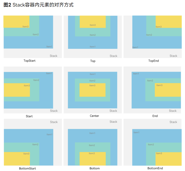
| align | 设置容器元素绘制区域内的子元素的对齐方式 |
| direction | 设置容器元素内主轴方向上的布局,支持attributeModifier动态设置属性方法。 |
| position | |
| markAnchor | 设置元素在位置定位时的锚点 |
| offset | 相对偏移,组件相对原本的布局位置进行偏移。和position一起使用时,position生效,offset不生效,支持attributeModifier动态设置属性方法。 |
| alignRules | 指定设置在相对容器中子组件的对齐规则,仅当父容器为RelativeContainer时生效,支持attributeModifier动态设置属性方法。 |
| AlignRuleOption |
■ 3. 布局约束
| 属性 | 描述 |
|---|---|
| aspectRatio | 指定当前组件的宽高比,aspectRatio=width/height。 |
| displayPriority | 设置当前组件在布局容器中显示的优先级。 |
■ 4. Flex布局
| 属性 | 描述 |
|---|---|
| flexBasis | 设置组件的基准尺寸。 |
| flexGrow | 设置组件在父容器的剩余空间所占比例。 |
| flexShrink | 设置父容器压缩尺寸分配给此属性所在组件的比例。当父容器为Column、Row时,需设置主轴方向的尺寸。 |
| alignSelf | 子组件在父容器交叉轴的对齐格式。 |
■ 5. 安全区域
| 属性 | 描述 |
|---|---|
| expandSafeArea | 控制组件扩展其安全区域。 |
| SafeAreaType | 扩展安全区域的枚举类型。 |
| SafeAreaEdge | 扩展安全区域的边缘。 |
■ 6. 组件级像素取整
| 属性 | 描述 |
|---|---|
| pixelRound | 指定当前组件在指定方向上的像素取整对齐方式,某方向不设置时默认在该方向进行四舍五入取整。 |
| PixelRoundPolicy | 指定组件级像素取整的方向 |
■ 7. 页面级像素取整
| 属性 | 描述 |
|---|---|
| setPixelRoundMode | 设置当前页面的像素取整模式。 |
| getPixelRoundMode | 获取当前页面的像素取整模式。 |
■ 8. 边框设置
| 属性 | 描述 |
|---|---|
| border | 设置边框样式。 |
| borderStyle | 设置元素的边框线条样式。 |
| borderWidth | 设置边框的宽度。 |
| borderColor | 设置边框的颜色。 |
| borderRadius | 设置边框的圆角半径。圆角大小受组件尺寸限制,最大值为组件宽或高的一半。 |
■ 9. 图片边框设置
| 属性 | 描述 |
|---|---|
| borderImage | 设置组件的图片边框。 |
■ 布局元素的组成
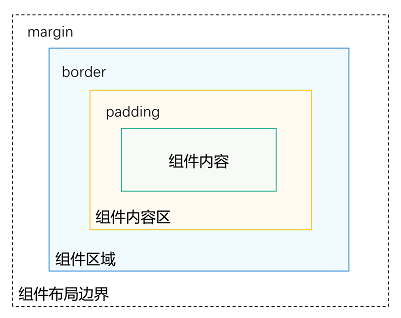
■ 1. margin(外边距)
// .margin(20)// 四周 20vp
// .margin({ top: 10, bottom: 30 }) //外边距
.margin({ left: 100, right: 40 })   //外边距
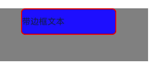
■ 2. border(边框)
 Text("带边框文本")
   // .padding(20)
   .borderWidth(2)                 // 边框宽度
   .borderColor(Color.Red)         // 边框颜色
   .borderStyle(BorderStyle.Solid) // 边框样式:Solid/Dashed/Dotted
   .borderRadius(8)                // 圆角

   .backgroundColor(Color.Blue)
   .height(50)
   .width(180)
■ 3. padding(内边距)组件内容区
 Text("Hello")
   // .margin(200)// 四周 20vp
   // .margin({ top: 10, bottom: 30 })// 外边距
   // .margin({ left: 100, right: 40 })  //外边距
   .padding(15)                       // 组件内容区-四周 15vp
   .padding({ left: 40, right: 20 })  // 组件内容区-左右内边距

   .backgroundColor(Color.Blue)
   // .borderWidth(2) // 边框宽度
   .height(50)
   .width(100)
==例如:Hello 在组件中的位置偏移。 ==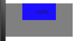
■ 4. position / alignRules —— 绝对定位
@Entry
@Component
struct  HuiLeWeiRemoteControl{
  build() {
    RelativeContainer() {
      Text("主内容")
        .width('50%')
        .height(200)
        .backgroundColor(Color.Blue)
        .alignRules({
          top: {anchor: "__container__", align: VerticalAlign.Top},
          left: {anchor: "__container__", align: HorizontalAlign.Start}
        })

      // 浮动按钮:右上角
      Button("✕")
        .size({width:100,height:40})
        .backgroundColor(Color.Red)

        .alignRules({
          top: {anchor: "__container__", align: VerticalAlign.Top},
          left: {anchor: "__container__", align: HorizontalAlign.Start}
          //   top: {anchor: "row3", align: VerticalAlign.Bottom},
          //   left: {anchor: "row1", align: HorizontalAlign.Center},
          //   right: {anchor: "row2", align: HorizontalAlign.End},
          //   bottom: {anchor: "__container__", align: VerticalAlign.Bottom}
        })
    }
    .width('100%')
    .height('100%')
  }
}
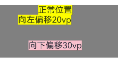
■ 5. offset 视觉偏移(不影响布局)
Column() {
    Text("正常位置")
      .backgroundColor(Color.Yellow)

    Text("向左偏移20vp")
      .backgroundColor(Color.Yellow)
      .offset({ x: -20 })

    Text("向下偏移30vp")
      .backgroundColor(Color.Pink)
      .offset({ y: 30 })  // 向下移动 30vp
    }
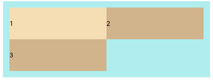
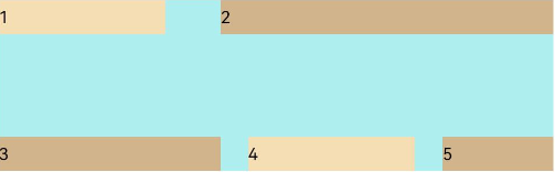
■ 6. justifyContent 子元素在容器排列方式–主轴上
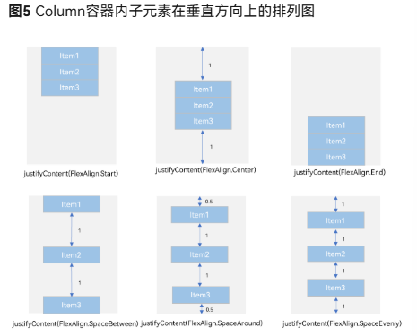
Column({}) {
  Column() {
  }.width('80%').height(50).backgroundColor(0xF5DEB3)
  Column() {
  }.width('80%').height(50).backgroundColor(0xD2B48C)
  Column() {
  }.width('80%').height(50).backgroundColor(0xF5DEB3)
}.width('100%')
.height(300)
.backgroundColor('rgb(242,242,242)')
.justifyContent(FlexAlign.Start)
在这里插入代码片
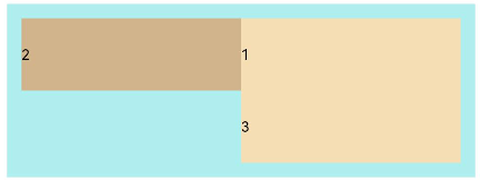
Row({}) {
  Column() {
  }.width('20%').height(30).backgroundColor(0xF5DEB3)
  Column() {
  }.width('20%').height(30).backgroundColor(0xD2B48C)
  Column() {
  }.width('20%').height(30).backgroundColor(0xF5DEB3)
}
.width('100%')
.height(200)
.backgroundColor('rgb(242,242,242)')
.justifyContent(FlexAlign.Start)
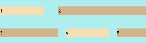
■ 7. alignItems 子元素在容器排列方式–交叉轴
在这里插入代码片
Column({}) {
  Column() {
  }.width('80%').height(50).backgroundColor(0xF5DEB3)
  Column() {
  }.width('80%').height(50).backgroundColor(0xD2B48C)
  Column() {
  }.width('80%').height(50).backgroundColor(0xF5DEB3)
}.width('100%')
.alignItems(HorizontalAlign.Start)
.backgroundColor('rgb(242,242,242)')
Row({}) {
  Column() {
  }.width('20%').height(30).backgroundColor(0xF5DEB3)

  Column() {
  }.width('20%').height(30).backgroundColor(0xD2B48C)

  Column() {
  }.width('20%').height(30).backgroundColor(0xF5DEB3)
}
.width('100%')
.height(200)
.alignItems(VerticalAlign.Top)
.backgroundColor('rgb(242,242,242)')
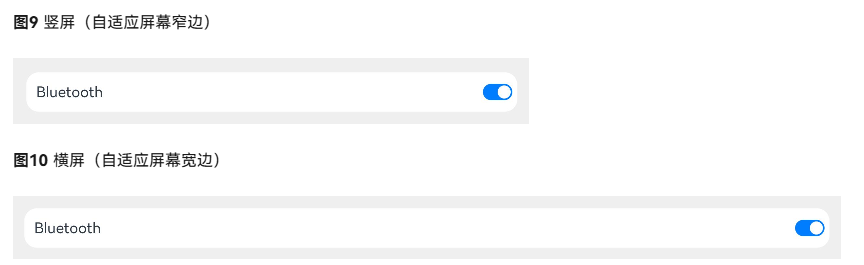
■ 8. Blank (自适应拉伸)
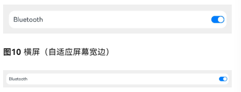
@Entry
@Component
struct BlankExample {
  build() {
    Column() {
      Row() {
        Text('Bluetooth').fontSize(18)
        Blank()
        Toggle({ type: ToggleType.Switch, isOn: true })
      }.backgroundColor(0xFFFFFF).borderRadius(15).padding({ left: 12 }).width('100%')
    }.backgroundColor(0xEFEFEF).padding(20).width('100%')
  }
}
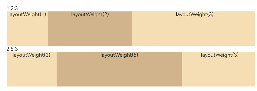
■ 9. layoutWeight 自适应缩放
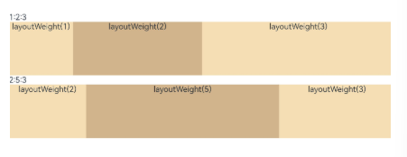
@Entry
@Component
struct Index {
  build() {
    Row() {
      Column() {
        Text('layoutWeight(2)')
          .textAlign(TextAlign.Center)
      }
      .layoutWeight(2)  //占比权重
      .backgroundColor(0xF5DEB3).height('100%')

      Column() {
        Text('layoutWeight(5)')
          .textAlign(TextAlign.Center)
      }
      .layoutWeight(5)
      .backgroundColor(0xD2B48C)
      .height('100%')

      Column() {
        Text('layoutWeight(3)')
          .textAlign(TextAlign.Center)
      }
      .layoutWeight(3)
      .backgroundColor(0xF5DEB3)
      .height('100%')
    }
    .backgroundColor(0xffd306)
    .height('30%')
  }
}
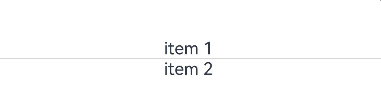
■ 10. Divider() 分隔线
Column() {
  Text('item 1')
  Divider()
  Text('item 2')
}
■ RelativeContainer 相对布局
■ 1. left, middle,right,top,center,bottom
在水平方向上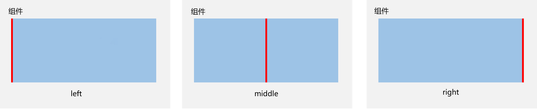
在垂直方向上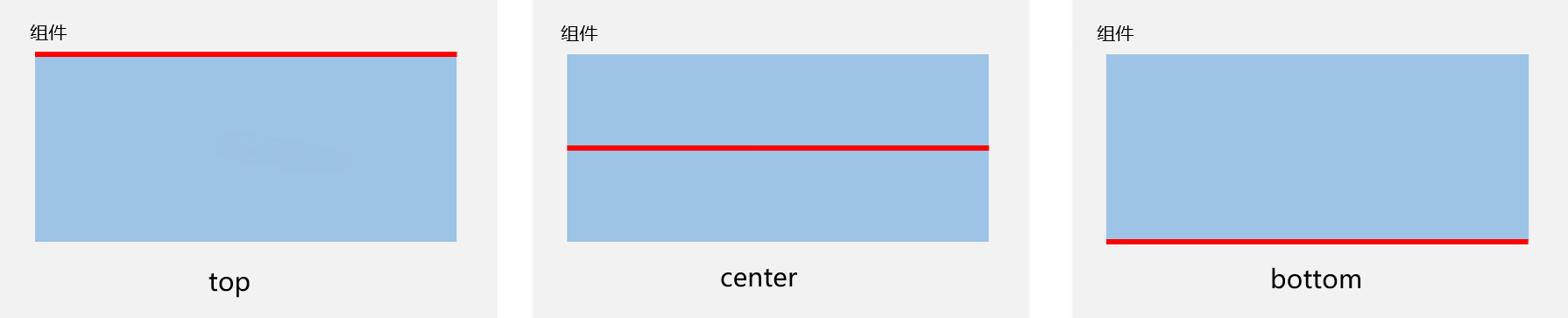
■ 2. alignRules 对齐规则
在水平方向上,对齐位置可以设置为
HorizontalAlign.Start
HorizontalAlign.Center
HorizontalAlign.End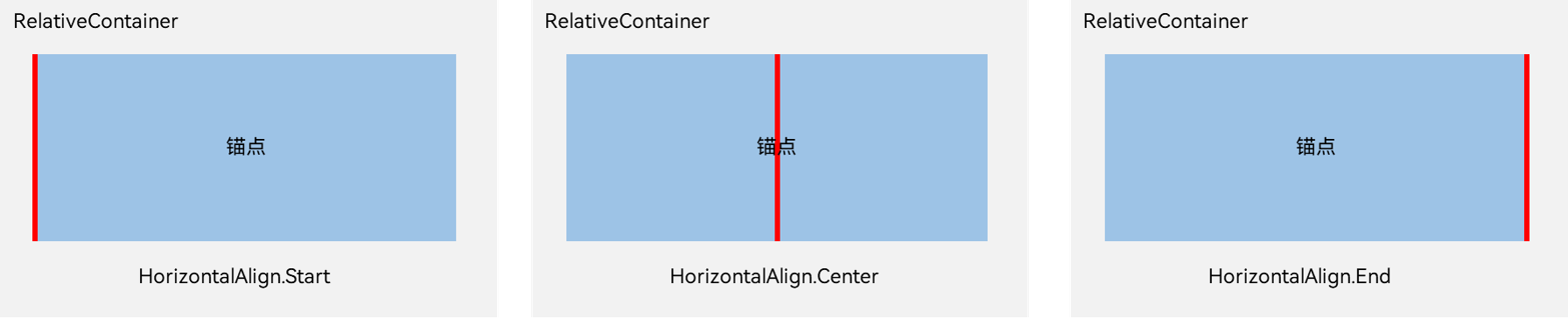
在垂直方向上,对齐位置可以设置为
VerticalAlign.Top
VerticalAlign.Center
VerticalAlign.Bottom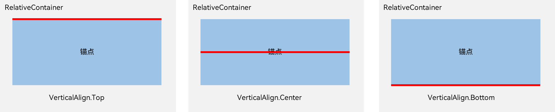
 .alignRules({
   top: {anchor: "__container__", align: VerticalAlign.Top},
   left: {anchor: "__container__", align: HorizontalAlign.Start}

   top: {anchor: "row3", align: VerticalAlign.Bottom},
   left: {anchor: "row1", align: HorizontalAlign.Center},
   right: {anchor: "row2", align: HorizontalAlign.End},
   bottom: {anchor: "__container__", align: VerticalAlign.Bottom}
 })
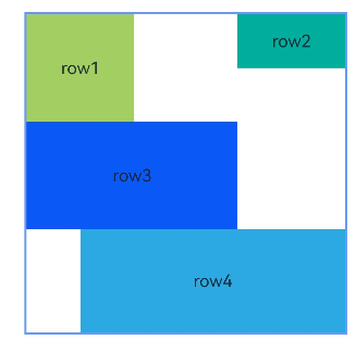
■ 3. 示例
@Entry
@Component
struct Index {
  build() {
    Row() {
      RelativeContainer() {
        Row(){Text('row1')}.justifyContent(FlexAlign.Center).width(100).height(100)
        .backgroundColor('#a3cf62')
        .alignRules({
          top: {anchor: "__container__", align: VerticalAlign.Top},
          left: {anchor: "__container__", align: HorizontalAlign.Start}
        })
        .id("row1")

        Row(){Text('row2')}.justifyContent(FlexAlign.Center).width(100)
        .backgroundColor('#00ae9d')
        .alignRules({
          top: {anchor: "__container__", align: VerticalAlign.Top},
          right: {anchor: "__container__", align: HorizontalAlign.End},
          bottom: {anchor: "row1", align: VerticalAlign.Center},
        })
        .id("row2")

        Row(){Text('row3')}.justifyContent(FlexAlign.Center).height(100)
        .backgroundColor('#0a59f7')
        .alignRules({
          top: {anchor: "row1", align: VerticalAlign.Bottom},
          left: {anchor: "row1", align: HorizontalAlign.Start},
          right: {anchor: "row2", align: HorizontalAlign.Start}
        })
        .id("row3")

        Row(){Text('row4')}.justifyContent(FlexAlign.Center)
        .backgroundColor('#2ca9e0')
        .alignRules({
          top: {anchor: "row3", align: VerticalAlign.Bottom},
          left: {anchor: "row1", align: HorizontalAlign.Center},
          right: {anchor: "row2", align: HorizontalAlign.End},
          bottom: {anchor: "__container__", align: VerticalAlign.Bottom}
        })
        .id("row4")
      }
      .width(300).height(300)
      .margin({left: 50})
      .border({width:2, color: "#6699FF"})
    }
    .height('100%')
  }
}
■ 4. 位置偏移 offset
      .offset({
        x: -15,
        y: 10
      })
■ 5. 注意点
- __container__代表父容器的组件标识(id)。
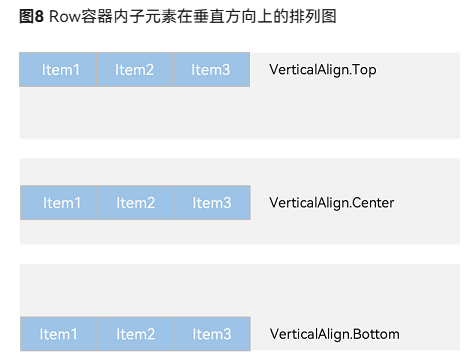
■ 线性布局- Row
■ 1. Row介绍
■ space
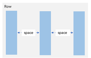
Row({ space: '10vp' }) {
  // 子组件
  Text('Item 1')
  Text('Item 2')
  Text('Item 3')
}
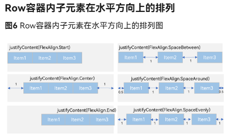
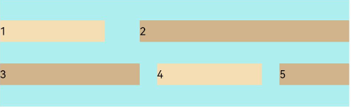
■ VerticalAlign
Row容器内子元素在垂直方向上的排列图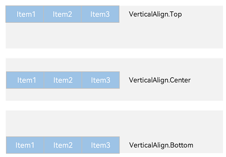
Row({}) {
  Column() {
  }.width('20%').height(30).backgroundColor(0xF5DEB3)
  Column() {
  }.width('20%').height(30).backgroundColor(0xD2B48C)
  Column() {
  }.width('20%').height(30).backgroundColor(0xF5DEB3)
}
.width('100%')
.height(200)
.alignItems(VerticalAlign.Top)
.backgroundColor('rgb(242,242,242)')
/*
"__container__"  //表示父组件
justifyContent  // 设置子组件在垂直方向上的对齐方式(即主轴对齐)。

*/
Row(){
	Row(){
		Text('row1')
	}
	.alignItems(HorizontalAlign.Start)   //元素对齐,子元素在水平方向左对齐。
	.alignItems(HorizontalAlign.Center)  //元素对齐,子元素在水平方向居中对齐。
	.alignItems(HorizontalAlign.End)     //元素对齐,子元素在水平方向右对齐。

	.alignItems(VerticalAlign.Top)    //元素对齐,子元素在垂直方向顶部对齐。
	.alignItems(VerticalAlign.Center) //元素对齐,子元素在垂直方向居中对齐。
	.alignItems(VerticalAlign.Bottom) //元素对齐,子元素在垂直方向底部对齐。

	.justifyContent(FlexAlign.Start)  	//子元素在主轴上的排列方式,内容对齐(默认)
	.justifyContent(FlexAlign.Center) 	//子元素在主轴上的排列方式,垂直居中
	.justifyContent(FlexAlign.End)    	//子元素在主轴上的排列方式,底部对齐
	.justifyContent(FlexAlign.SpaceBetween) //子元素在主轴上的排列方式,两端对齐,中间间距相等
	.justifyContent(FlexAlign.SpaceAround)  //子元素在主轴上的排列方式,间距在项目周围平均分布
	.justifyContent(FlexAlign.SpaceEvenly)  //子元素在主轴上的排列方式,所有间距完全相等

	.width(100)
	.height(100)
	.backgroundColor(Color.Red)

	.padding(20)                      //设置内边距 四周 20vp
	.padding({ top: 10, bottom: 30 }) //设置内边距 仅设置上下

	.margin(10)  //设置外边距。  //margin(Edge | number | string)
	.margin({ left: 20, right: 20 })

	.borderRadius(15) // 圆角 15vp // borderRadius(number | string)
	.alignRules({  //对alignRules 用于定义一个组件在其父容器中的“对齐规则”,可以指定它相对于父容器的上、下、左、右、居中等位置。齐规则
	/*
		left	距父容器左侧的距离(单位:vp/px/%)
		top	距父容器顶部的距离
		right	距父容器右侧的距离
		bottom	距父容器底部的距离
		horizontalCenter	水平居中(可设偏移量)
		verticalCenter	垂直居中(可设偏移量)
		margin	外边距(可选)
		*/
		top: {anchor: "__container__", align: VerticalAlign.Top},      //自己的top 父对象 垂直方式为水平顶部
		left: {anchor: "__container__", align: HorizontalAlign.Start}
	 })
}


```c
Row({}) {
  Column() {
  }.width('20%')
  .height(30)
  .backgroundColor(0xF5DEB3)

  Column() {
  }
  .width('20%')
  .height(30)
  .backgroundColor(0xD2B48C)

  Column() {
  }
  .width('20%')
  .height(30)
  .backgroundColor(0xF5DEB3)
}.width('100%')
.height(200)

.backgroundColor('rgb(242,242,242)')
■ 5. Blank() 自适应拉伸
@Entry
@Component
struct BlankExample {
  build() {
    Column() {
      Row() {
        Text('Bluetooth').fontSize(18)
        Blank()
        Toggle({ type: ToggleType.Switch, isOn: true })
      }.backgroundColor(0xFFFFFF).borderRadius(15).padding({ left: 12 }).width('100%')
    }.backgroundColor(0xEFEFEF).padding(20).width('100%')
  }
}
■ 6. layoutWeight属性 设置子元素和兄弟元素在主轴上的权重
@Entry
@Component
struct layoutWeightExample {
  build() {
    Column() {
      Text('1:2:3').width('100%')
      Row() {
        Column() {
          Text('layoutWeight(1)')
            .textAlign(TextAlign.Center)
        }.layoutWeight(1).backgroundColor(0xF5DEB3).height('100%')

        Column() {
          Text('layoutWeight(2)')
            .textAlign(TextAlign.Center)
        }.layoutWeight(2).backgroundColor(0xD2B48C).height('100%')

        Column() {
          Text('layoutWeight(3)')
            .textAlign(TextAlign.Center)
        }.layoutWeight(3).backgroundColor(0xF5DEB3).height('100%')

      }.backgroundColor(0xffd306).height('30%')

      Text('2:5:3').width('100%')
      Row() {
        Column() {
          Text('layoutWeight(2)')
            .textAlign(TextAlign.Center)
        }.layoutWeight(2).backgroundColor(0xF5DEB3).height('100%')

        Column() {
          Text('layoutWeight(5)')
            .textAlign(TextAlign.Center)
        }.layoutWeight(5).backgroundColor(0xD2B48C).height('100%')

        Column() {
          Text('layoutWeight(3)')
            .textAlign(TextAlign.Center)
        }.layoutWeight(3).backgroundColor(0xF5DEB3).height('100%')
      }.backgroundColor(0xffd306).height('30%')
    }
  }
}
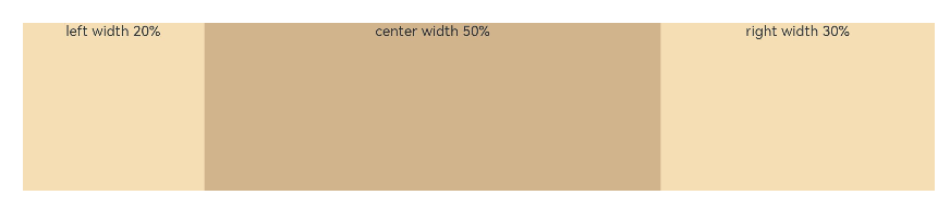
■ 7. width(‘20%’) 父容器尺寸确定时,使用百分比设置子元素和兄弟元素的宽度,使他们在任意尺寸的设备下保持固定的自适应占比
@Entry
@Component
struct WidthExample {
  build() {
    Column() {
      Row() {
        Column() {
          Text('left width 20%')
            .textAlign(TextAlign.Center)
        }.width('20%').backgroundColor(0xF5DEB3).height('100%')

        Column() {
          Text('center width 50%')
            .textAlign(TextAlign.Center)
        }.width('50%').backgroundColor(0xD2B48C).height('100%')

        Column() {
          Text('right width 30%')
            .textAlign(TextAlign.Center)
        }.width('30%').backgroundColor(0xF5DEB3).height('100%')
      }.backgroundColor(0xffd306).height('30%')
    }
  }
}
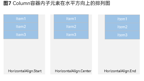
■ 线性布局- Column 列
space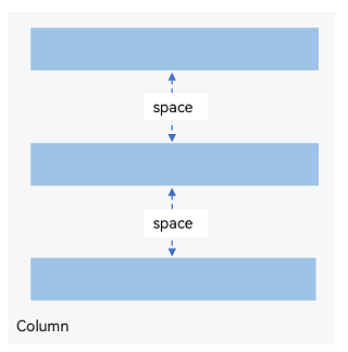
Column容器内子元素在水平方向上的排列图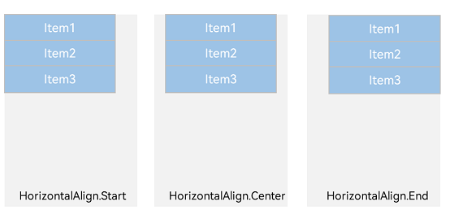
/*
justifyContent(FlexAlign.Start): // 元素在垂直方向首端对齐,第一个元素与行首对齐,同时后续的元素与前一个对齐。
justifyContent(FlexAlign.Center): // 元素在垂直方向中心对齐,第一个元素与行首的距离与最后一个元素与行尾距离相同。
justifyContent(FlexAlign.End): // 元素在垂直方向尾部对齐,最后一个元素与行尾对齐,其他元素与后一个对齐。
justifyContent(FlexAlign.SpaceBetween): // 垂直方向均匀分配元素,相邻元素之间距离相同。第一个元素与行首对齐,最后一个元素与行尾对齐。
justifyContent(FlexAlign.SpaceAround): // 垂直方向均匀分配元素,相邻元素之间距离相同。第一个元素到行首的距离和最后一个元素到行尾的距离是相邻元素之间距离的一半。
justifyContent(FlexAlign.SpaceEvenly): // 垂直方向均匀分配元素,相邻元素之间的距离、第一个元素与行首的间距、最后一个元素到行尾的间距都完全一样。
*/
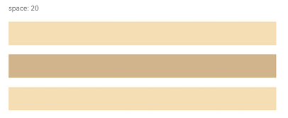
Column({ space: 20 }) {
Text('space: 20').fontSize(15).fontColor(Color.Gray).width('90%')
Row().width('90%').height(50).backgroundColor(0xF5DEB3)
Row().width('90%').height(50).backgroundColor(0xD2B48C)
Row().width('90%').height(50).backgroundColor(0xF5DEB3)
}.width('100%')
■ 层叠布局(Stack)
■ 1. alignContent: Alignment.TopStart
// xxx.ets
@Entry
@Component
struct StackExample {
  build() {
    Stack({ alignContent: Alignment.TopStart }) {
      Text('Stack').width('90%').height('100%').backgroundColor('#e1dede').align(Alignment.BottomEnd)
      Text('Item 1').width('70%').height('80%').backgroundColor(0xd2cab3).align(Alignment.BottomEnd)
      Text('Item 2').width('50%').height('60%').backgroundColor(0xc1cbac).align(Alignment.BottomEnd)
    }.width('100%').height(150).margin({ top: 5 })
  }
}
■ 2. Z序控制 zIndex值越大,显示层级越高
Stack({ alignContent: Alignment.BottomStart }) {
  Column() {
    Text('Stack子元素1').fontSize(20)
  }.width(100).height(100).backgroundColor(0xffd306).zIndex(2)

  Column() {
    Text('Stack子元素2').fontSize(20)
  }.width(150).height(150).backgroundColor(Color.Pink).zIndex(1)

  Column() {
    Text('Stack子元素3').fontSize(20)
  }.width(200).height(200).backgroundColor(Color.Grey)
}.width(350).height(350).backgroundColor(0xe0e0e0)
■ 弹性布局(Flex)
■ 1. 基本概念
图1 主轴为水平方向的Flex容器示意图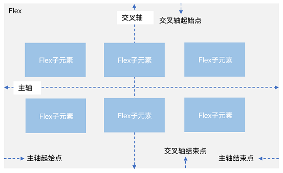
- 主轴:Flex组件布局方向的轴线,子元素默认沿着主轴排列。主轴开始的位置称为主轴起始点,结束位置称为主轴结束点。
- 交叉轴:垂直于主轴方向的轴线。交叉轴开始的位置称为交叉轴起始点,结束位置称为交叉轴结束点。
■ 2. 弹性布局方向 (FlexDirection)
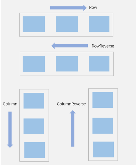
- FlexDirection.Row(默认值):主轴为水平方向,子元素从起始端沿着水平方向开始排布。
- FlexDirection.RowReverse:主轴为水平方向,子元素从终点端沿着FlexDirection.Row相反的方向开始排布。
- FlexDirection.Column:主轴为垂直方向,子元素从起始端沿着垂直方向开始排布。
- FlexDirection.ColumnReverse:主轴为垂直方向,子元素从终点端沿着FlexDirection.Column相反的方向开始排布。
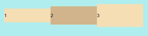
Flex({ direction: FlexDirection.Row }) {
//Flex({ direction: FlexDirection.RowReverse }) {
//Flex({ direction: FlexDirection.Column }) {
//Flex({ direction: FlexDirection.ColumnReverse }) {
  Text('1').width('100%').height(50).backgroundColor('#F5DEB3')
  Text('2').width('100%').height(50).backgroundColor('#D2B48C')
  Text('3').width('100%').height(50).backgroundColor('#F5DEB3')
}
.height(70)
.width('90%')
.padding(10)
.backgroundColor('#AFEEEE')
■ 3. 布局换行 (FlexWrap)
wrap属性控制当子元素主轴尺寸之和大于容器主轴尺寸时,Flex是单行布局还是多行布局。在多行布局时,通过交叉轴方向,确认新行排列方向。
-
FlexWrap.NoWrap(默认值):不换行。如果子元素的宽度总和大于父元素的宽度,则子元素会被压缩宽度。
-
FlexWrap. Wrap:换行,每一行子元素按照主轴方向排列。
-
FlexWrap. WrapReverse:换行,每一行子元素按照主轴反方向排列。
//Flex({ wrap: FlexWrap.NoWrap }) {
//Flex({ wrap: FlexWrap.Wrap }) {
Flex({ wrap: FlexWrap.WrapReverse}) {
  Text('1').width('50%').height(50).backgroundColor('#F5DEB3')
  Text('2').width('50%').height(50).backgroundColor('#D2B48C')
  Text('3').width('50%').height(50).backgroundColor('#F5DEB3')
}
.width('90%')
.padding(10)
.backgroundColor('#AFEEEE')
■ 4. 主轴对齐方式 (justifyContent)
justifyContent 参数设置子元素在主轴方向的对齐方式。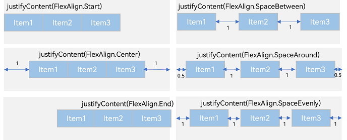
- FlexAlign.Start(默认值):子元素在主轴方向起始端对齐, 第一个子元素与父元素边沿对齐,其他元素与前一个元素对齐。
- FlexAlign.Center:子元素在主轴方向居中对齐。
- FlexAlign.End:子元素在主轴方向终点端对齐,最后一个子元素与父元素边沿对齐,其他元素与后一个元素对齐。
- FlexAlign.SpaceBetween:Flex主轴方向均匀分配弹性元素,相邻子元素之间距离相同。第一个子元素和最后一个子元素与父元素边沿对齐。
- FlexAlign.SpaceAround:Flex主轴方向均匀分配弹性元素,相邻子元素之间距离相同。第一个子元素到主轴起始端的距离和最后一个子元素到主轴终点端的距离是相邻元素之间距离的一半。
- FlexAlign.SpaceEvenly:Flex主轴方向元素等间距布局,相邻子元素之间的间距、第一个子元素与主轴起始端的间距、最后一个子元素到主轴终点端的间距均相等。
//Flex({ justifyContent: FlexAlign.Start }) {
//Flex({ justifyContent: FlexAlign.Center }) {
//Flex({ justifyContent: FlexAlign.End }) {
//Flex({ justifyContent: FlexAlign.SpaceBetween }) {
//Flex({ justifyContent: FlexAlign.SpaceAround }) {
Flex({ justifyContent: FlexAlign.SpaceEvenly }) {

  Text('1').width('20%').height(50).backgroundColor('#F5DEB3')
  Text('2').width('20%').height(50).backgroundColor('#D2B48C')
  Text('3').width('20%').height(50).backgroundColor('#F5DEB3')
}
.width('90%')
.padding({ top: 10, bottom: 10 })
.backgroundColor('#AFEEEE')
■ 5. 交叉轴对齐 (alignItems)
可以通过Flex组件的alignItems参数设置子元素在交叉轴的对齐方式。
- ItemAlign.Auto:使用Flex容器中默认配置。
- ItemAlign.Start:交叉轴方向首部对齐
- ItemAlign.Center:交叉轴方向居中对齐。
- ItemAlign.End:交叉轴方向底部对齐。
- ItemAlign.Stretch:交叉轴方向拉伸填充,在未设置尺寸时,拉伸到容器尺寸。
- ItemAlign.Baseline:交叉轴方向文本基线对齐。
Flex({ alignItems: ItemAlign.Auto }) {
Flex({ alignItems: ItemAlign.Start }) {
Flex({ alignItems: ItemAlign.Center }) {
Flex({ alignItems: ItemAlign.End }) {
Flex({ alignItems: ItemAlign.Stretch }) {
Flex({ alignItems: ItemAlign.Baseline }) {
  Text('1').width('33%').height(30).backgroundColor('#F5DEB3')
  Text('2').width('33%').height(40).backgroundColor('#D2B48C')
  Text('3').width('33%').height(50).backgroundColor('#F5DEB3')
}
.size({ width: '90%', height: 80 })
.padding(10)
.backgroundColor('#AFEEEE')
■ 6. 子元素设置交叉轴对齐 (alignSelf)
子元素的alignSelf属性也可以设置子元素在父容器交叉轴的对齐方式,且会覆盖Flex布局容器中alignItems配置。
Flex({ direction: FlexDirection.Row, alignItems: ItemAlign.Center }) { // 容器组件设置子元素居中
  Text('alignSelf Start').width('25%').height(80)
    .alignSelf(ItemAlign.Start)
    .backgroundColor('#F5DEB3')
  Text('alignSelf Baseline')
    .alignSelf(ItemAlign.Baseline)
    .width('25%')
    .height(80)
    .backgroundColor('#D2B48C')
  Text('alignSelf Baseline').width('25%').height(100)
    .backgroundColor('#F5DEB3')
    .alignSelf(ItemAlign.Baseline)
  Text('no alignSelf').width('25%').height(100)
    .backgroundColor('#D2B48C')
  Text('no alignSelf').width('25%').height(100)
    .backgroundColor('#F5DEB3')

}.width('90%').height(220).backgroundColor('#AFEEEE')
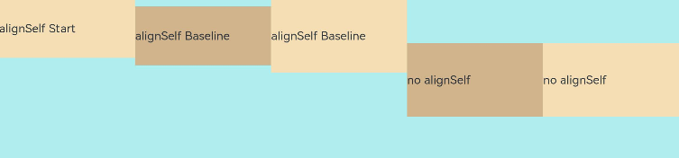
上例中,Flex容器中alignItems设置交叉轴子元素的对齐方式为居中,子元素自身设置了alignSelf属性的情况,覆盖父组件的alignItems值,表现为alignSelf的定义。
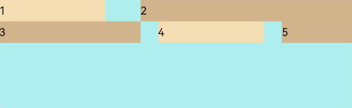
■ 7. 内容对齐 (alignContent)
通过alignContent参数设置子元素各行在交叉轴剩余空间内的对齐方式,只在多行的Flex布局中生效,可选值有:
- FlexAlign.Start:子元素各行与交叉轴起点对齐。
Flex({ justifyContent: FlexAlign.SpaceBetween, wrap: FlexWrap.Wrap, alignContent: FlexAlign.Start }) {
  Text('1').width('30%').height(20).backgroundColor('#F5DEB3')
  Text('2').width('60%').height(20).backgroundColor('#D2B48C')
  Text('3').width('40%').height(20).backgroundColor('#D2B48C')
  Text('4').width('30%').height(20).backgroundColor('#F5DEB3')
  Text('5').width('20%').height(20).backgroundColor('#D2B48C')
}
.width('90%')
.height(100)
.backgroundColor('#AFEEEE')
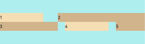
- FlexAlign.Center:子元素各行在交叉轴方向居中对齐。
Flex({ justifyContent: FlexAlign.SpaceBetween, wrap: FlexWrap.Wrap, alignContent: FlexAlign.Center }) {
  Text('1').width('30%').height(20).backgroundColor('#F5DEB3')
  Text('2').width('60%').height(20).backgroundColor('#D2B48C')
  Text('3').width('40%').height(20).backgroundColor('#D2B48C')
  Text('4').width('30%').height(20).backgroundColor('#F5DEB3')
  Text('5').width('20%').height(20).backgroundColor('#D2B48C')
}
.width('90%')
.height(100)
.backgroundColor('#AFEEEE')
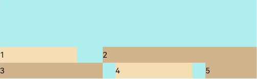
- FlexAlign.End:子元素各行与交叉轴终点对齐。
Flex({ justifyContent: FlexAlign.SpaceBetween, wrap: FlexWrap.Wrap, alignContent: FlexAlign.End }) {
  Text('1').width('30%').height(20).backgroundColor('#F5DEB3')
  Text('2').width('60%').height(20).backgroundColor('#D2B48C')
  Text('3').width('40%').height(20).backgroundColor('#D2B48C')
  Text('4').width('30%').height(20).backgroundColor('#F5DEB3')
  Text('5').width('20%').height(20).backgroundColor('#D2B48C')
}
.width('90%')
.height(100)
.backgroundColor('#AFEEEE')
- FlexAlign.SpaceBetween:子元素各行与交叉轴两端对齐,各行间垂直间距平均分布
Flex({ justifyContent: FlexAlign.SpaceBetween, wrap: FlexWrap.Wrap, alignContent: FlexAlign.SpaceBetween }) {
  Text('1').width('30%').height(20).backgroundColor('#F5DEB3')
  Text('2').width('60%').height(20).backgroundColor('#D2B48C')
  Text('3').width('40%').height(20).backgroundColor('#D2B48C')
  Text('4').width('30%').height(20).backgroundColor('#F5DEB3')
  Text('5').width('20%').height(20).backgroundColor('#D2B48C')
}
.width('90%')
.height(100)
.backgroundColor('#AFEEEE')
- FlexAlign.SpaceAround:子元素各行间距相等,是元素首尾行与交叉轴两端距离的两倍。
Flex({ justifyContent: FlexAlign.SpaceBetween, wrap: FlexWrap.Wrap, alignContent: FlexAlign.SpaceAround }) {
  Text('1').width('30%').height(20).backgroundColor('#F5DEB3')
  Text('2').width('60%').height(20).backgroundColor('#D2B48C')
  Text('3').width('40%').height(20).backgroundColor('#D2B48C')
  Text('4').width('30%').height(20).backgroundColor('#F5DEB3')
  Text('5').width('20%').height(20).backgroundColor('#D2B48C')
}
.width('90%')
.height(100)
.backgroundColor('#AFEEEE')
- FlexAlign.SpaceEvenly: 子元素各行间距,子元素首尾行与交叉轴两端距离都相等。
Flex({ justifyContent: FlexAlign.SpaceBetween, wrap: FlexWrap.Wrap, alignContent: FlexAlign.SpaceEvenly }) {
  Text('1').width('30%').height(20).backgroundColor('#F5DEB3')
  Text('2').width('60%').height(20).backgroundColor('#D2B48C')
  Text('3').width('40%').height(20).backgroundColor('#D2B48C')
  Text('4').width('30%').height(20).backgroundColor('#F5DEB3')
  Text('5').width('20%').height(20).backgroundColor('#D2B48C')
}
.width('90%')
.height(100)
.backgroundColor('#AFEEEE')
■ 8. 自适应拉伸 (flexBasis)
-
flexBasis:设置子元素在父容器主轴方向上的基准尺寸。如果设置了该属性,则子项占用的空间为该属性所设置的值;如果没设置该属性,那子项的空间为width/height的值。
-
flexGrow:设置父容器的剩余空间分配给此属性所在组件的比例。用于分配父组件的剩余空间
Flex() {
  Text('flexGrow(2)')
    .flexGrow(2)
    .width(100)
    .height(100)
    .backgroundColor('#F5DEB3')
  Text('flexGrow(3)')
    .flexGrow(3)
    .width(100)
    .height(100)
    .backgroundColor('#D2B48C')

  Text('no flexGrow')
    .width(100)
    .height(100)
    .backgroundColor('#F5DEB3')
}.width(420).height(120).padding(10).backgroundColor('#AFEEEE')
- flexShrink: 当父容器空间不足时,子元素的压缩比例。
Flex({ direction: FlexDirection.Row }) {
  Text('flexShrink(3)')
    .flexShrink(3)
    .width(200)
    .height(100)
    .backgroundColor('#F5DEB3')

  Text('no flexShrink')
    .width(200)
    .height(100)
    .backgroundColor('#D2B48C')

  Text('flexShrink(2)')
    .flexShrink(2)
    .width(200)
    .height(100)
    .backgroundColor('#F5DEB3')
}.width(400).height(120).padding(10).backgroundColor('#AFEEEE')
■ 栅格布局-GridRow
栅格容器默认断点将设备宽度分为xs、sm、md、lg四类,尺寸范围如下:
■ 1. 栅格容器断点
■ 2. BreakPoints自定义修改断点的取值范围
breakpoints: {value: ['100vp', '200vp']} // 表示xs、sm、md共3个断点被使用,小于100vp为xs,100vp-200vp为sm,大于200vp为md。
breakpoints: {value: ['320vp', '600vp']} // 表示xs、sm、md共3个断点被使用,小于320vp为xs,320vp-600vp为sm,大于600vp为md。
breakpoints: {value: ['320vp', '600vp', '840vp', '1440vp']} // 表示xs、sm、md、lg、xl共5个断点被使用,小于320vp为xs,320vp-600vp为sm,  600vp-840vp为md,840vp-1440vp为lg,大于1440vp为xl。
■ 3. columns设置栅格布局的总列数
 GridRow({ columns: 8 }) {
        ForEach(this.bgColors, (item: ResourceColor, index?: number | undefined) => {
          GridCol({ span: 1 }) {
            Row() {
              Text(`${index}`)
            }.width('100%').height('50')
          }.backgroundColor(item)
        })
      }
      .width('100%').height('100%')
■ 4. 排列方向 (direction)
GridRow({ direction: GridRowDirection.Row }){ /* ... */ }         //子组件默认从左往右排列。
GridRow({ direction: GridRowDirection.RowReverse }){ /* ... */ }  //子组件从右往左排列
■ 5. 子组件间距 (gutter)
GridRow({ gutter: 10 }){ /* ... */ }             //当gutter类型为number时,同时设置栅格子组件间水平和垂直方向边距且相等。下例中,设置子组件水平与垂直方向距离相邻元素的间距为10
GridRow({ gutter: { x: 20, y: 50 } }){ /* ... */ }       //gutter类型为GutterOption时,单独设置栅格子组件水平垂直边距,x属性为水平方向间距,y为垂直方向间距。
■ 栅格布局-GridCol
GridCol组件作为GridRow组件的子组件,通过给GridCol传参或者设置属性两种方式,设置span(占用列数),offset(偏移列数),order(元素序号)的值。
■ 1. span(占用列数)
span支持number和GridColColumnOption两种类型, 可按两种方式设置栅格子组件占栅格容器的列数。
let Gspan:Record<string,number> = { 'xs': 1, 'sm': 2, 'md': 3, 'lg': 4 }
GridCol({ span: 2 }){}
GridCol({ span: { xs: 1, sm: 2, md: 3, lg: 4 } }){}
GridCol(){}.span(2)
GridCol(){}.span(Gspan)
■ 2. offset(偏移列数)
当offset类型为number时,子组件偏移相同列数。
当offset类型为GridColColumnOption时,支持6种不同尺寸(xs,sm,md,lg,xl,xxl)设备中子组件所占列数设置,各个尺寸下数值可不同。
let Goffset:Record<string,number> = { 'xs': 1, 'sm': 2, 'md': 3, 'lg': 4 }
GridCol({ offset: 2, span: 1 }){}
GridCol({ offset: { xs: 2, sm: 2, md: 2, lg: 2 }, span: 1 }){}
GridCol({ span: 1 }){}.offset(Goffset)
■ 3. order(元素序号)
let Gorder:Record<string,number> = { 'xs': 1, 'sm': 2, 'md': 3, 'lg': 4 }
GridCol({ order: 2, span: 1 }){}
GridCol({ order: { xs: 1, sm: 2, md: 3, lg: 4 }, span: 1 }){}
GridCol({ span: 1 }){}.order(2)
GridCol({ span: 1 }){}.order(Gorder)
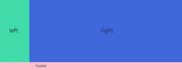
@Entry
@Component
struct GridRowExample {
  build() {
    GridRow({ columns: 12 }) {
      GridCol({ span: 12 }) {
        GridRow({ columns: 12 }) {
          GridCol({ span: 2 }) {
            Row() {
              Text('left').fontSize(24)
            }
            .justifyContent(FlexAlign.Center)
            .height('90%')
          }.backgroundColor('#ff41dbaa')

          GridCol({ span: 10 }) {
            Row() {
              Text('right').fontSize(24)
            }
            .justifyContent(FlexAlign.Center)
            .height('90%')
          }.backgroundColor('#ff4168db')
        }
        .backgroundColor('#19000000')
      }

      GridCol({ span: 12 }) {
        Row() {
          Text('footer').width('100%').textAlign(TextAlign.Center)
        }.width('100%').height('10%').backgroundColor(Color.Pink)
      }
    }.width('100%').height(300)
  }
}
■ 选项卡(Tabs)
■ 1. 基本布局
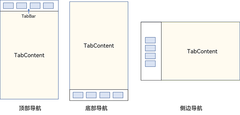
■ 2. 底部导航
Tabs({ barPosition: BarPosition.End }) {
  // TabContent的内容:首页、发现、推荐、我的
  // ...
}
■ 3. 顶部导航
Tabs({ barPosition: BarPosition.Start }) {
  // TabContent的内容:关注、视频、游戏、数码、科技、体育、影视
  // ...
}
■ 4. 侧边导航
Tabs({ barPosition: BarPosition.Start }) {
  // TabContent的内容:首页、发现、推荐、我的
  // ...
}
.vertical(true)
.barWidth(100)
.barHeight(200)
■ 3. BarMode.Fixed 属性用于控制导航栏是否可以滚动,默认值为BarMode.Fixed。
Tabs({ barPosition: BarPosition.End }) {
  // TabContent的内容:首页、发现、推荐、我的
  // ...
}
.barMode(BarMode.Fixed)
■ 4. BarMode.Scrollable表示可滚动导航栏。
Tabs({ barPosition: BarPosition.Start }) {
  // TabContent的内容:关注、视频、游戏、数码、科技、体育、影视、人文、艺术、自然、军事
  // ...
}
.barMode(BarMode.Scrollable)
■ 5. 自定义导航栏
@State currentIndex: number = 0;

@Builder tabBuilder(title: string, targetIndex: number, selectedImg: Resource, normalImg: Resource) {
  Column() {
    Image(this.currentIndex === targetIndex ? selectedImg : normalImg)
      .size({ width: 25, height: 25 })
    Text(title)
      .fontColor(this.currentIndex === targetIndex ? '#1698CE' : '#6B6B6B')
  }
  .width('100%')
  .height(50)
  .justifyContent(FlexAlign.Center)
}
TabContent对应tabBar属性中传入自定义函数组件,并传递相应的参数。
TabContent() {
  Column(){
    Text('我的内容')
  }
  .width('100%')
  .height('100%')
  .backgroundColor('#007DFF')
}
.tabBar(this.tabBuilder('我的', 0, $r('app.media.mine_selected'), $r('app.media.mine_normal')))
■ 5. 自定义导航栏2(线条版本)
  // 自定义 TabBar 样式
  @Builder
  tabBuilder(index: number, name: string) {
    Column() {
      // Text(name)
      //   .fontSize(16)
        // .fontWeight(this.selectedIndex === index ? 500 : 400)
      // 添加下划线样式
      Divider()
        .strokeWidth(3)
        .color('#007DFF')
        .margin({left: this.selectedIndex === 0 ? 20:0, right: this.selectedIndex === 2 ? 20:0})
        .opacity(this.selectedIndex === index ? 1 : 0) // 仅选中时显示
    }
    .width('100%')
  }

 Tabs({ barPosition: BarPosition.End } ) {
        TabContent() {
          this.ControlPage1()
        }
        .tabBar(this.tabBuilder(0,'1111'))

        TabContent() {
          this.ControlPage2()
        }
        .tabBar(this.tabBuilder(1,'2222'))

        TabContent() {
          this.ControlPage3()
        }
        .tabBar(this.tabBuilder(2,'3333'))
      }
      .width('100%')
      .height('55%')
      .backgroundColor('#f9f9f9')
      .onChange((Index:number)=>{
        this.selectedIndex = Index
        // console.log(this.selectedIndex)
      })
    }
    .width('100%')
    .height('100%')
    .backgroundColor('#f8f8f8')
  }
绿色线条
■ Scroll组件:
■ 1.
■ 2.

讨论HarmonyOS开发技术,专注于API与组件、DevEco Studio、测试、元服务和应用上架分发等。
更多推荐

 9
9 0
0- 0


 已为社区贡献7条内容

所有评论(0)