HarmonyOS系统开发ArkTS常用组件进度条及参数(九)
Progress为进度条组件,用于显示各种进度。
1、Progress组件的参数
Progress(options: {value: number, total?: number, type?: ProgressType})
- value属性用于设置当前进度值。
- total属性用于设置总值。
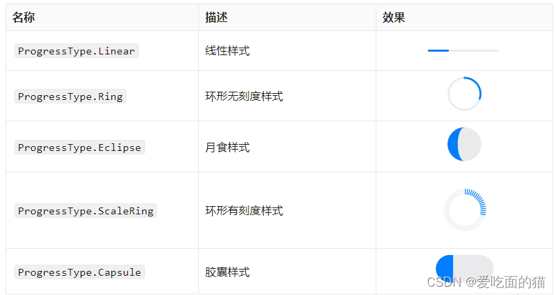
- type属性用于设置进度条类型,可通过ProgressType枚举类型进行设置,可选的枚举值如下
ProgressType.Linear 线性样式
ProgressType.Ring 环形无刻度样式
ProgressType.Eclipse 月食样式
ProgressType.ScaleRing 环形有刻度样式
ProgressType.Capsule 胶囊样式 只有增加witdh 和 height属性才会显示,否则为圆形
@Entry
@Component
struct ProgressText {
  @State value: number = 1;

  build() {
    Column({ space: 10 }) {
      Text('Progress 进度条').fontSize(25)
      Progress({ value: this.value, total: 100, type: ProgressType.Linear })
      Progress({ value: this.value, total: 100, type: ProgressType.Ring })
      Progress({ value: this.value, total: 100, type: ProgressType.Eclipse })
      Progress({ value: this.value, total: 100, type: ProgressType.ScaleRing })
      Progress({ value: this.value, total: 100, type: ProgressType.Capsule }).width(100)

      // 分隔线
      Divider()

      Row({ space: 10 }) {
        Button('+ 加快进度')
          .onClick(() => {
            if (this.value >= 100) {
              this.value = 100
            }
            this.value++
          })
        Button('- 减缓进度')
          .onClick(() => {
            if (this.value <= 0) {
              this.value = 0
            }
            this.value--
          })
      }
    }
    .width('100%')
    .height("100%")
    .justifyContent(FlexAlign.Center)
  }
}
2、常用属性
进度条样式通过style()设置,该方法的参数类型定义
style({strokeWidth?: string|number|Resource,scaleCount?: number,scaleWidth?: string|number|Resource})
● strokeWidth:属性用于设置进度条的宽度,默认值为4vp。该属性可用于Linear、Ring、ScaleRing三种类型类型的进度条

● scaleCount属性用于设置ScaleRing的刻度数,默认值为120。

● scaleCount属性用于设置ScaleRing的刻度线的宽度,默认值为2vp。

● 进度条颜色:进度条的颜色可通过color()和backgroundColor()方法进行设置,其中color()用于设置前景色,backgroundColor()用于设置背景色。

@Entry
@Component
struct ProgressText {
  @State value: number = 30;

  build() {
    Column({ space: 10 }) {
      Text('Progress 进度条').fontSize(25)
      Progress({ value: this.value, total: 100, type: ProgressType.Linear })
        .style({
          strokeWidth:20
        })
        .color(Color.Green)
        .backgroundColor(Color.Gray)
      Progress({ value: this.value, total: 100, type: ProgressType.Ring })
        .style({
          strokeWidth:15
        })
        .color(Color.Green)
        .backgroundColor(Color.Gray)
      Progress({ value: this.value, total: 100, type: ProgressType.ScaleRing })
        .style({
          strokeWidth:15,
          scaleCount:30,
          scaleWidth:5
        })
        .color(Color.Green)
        .backgroundColor(Color.Gray)
      Progress({ value: this.value, total: 100, type: ProgressType.Eclipse })
        .color(Color.Green)
        .backgroundColor(Color.Gray)
      Progress({ value: this.value, total: 100, type: ProgressType.Capsule }).width(100)
        .color(Color.Green)
        .backgroundColor(Color.Gray)


      // 分隔线
      Divider()

      Row({ space: 10 }) {
        Button('+ 加快进度')
          .onClick(() => {
            if (this.value >= 100) {
              this.value = 100
            }
            this.value++
          })
        Button('- 减缓进度')
          .onClick(() => {
            if (this.value <= 0) {
              this.value = 0
            }
            this.value--
          })
      }
    }
    .width('100%')
    .height("100%")
    .justifyContent(FlexAlign.Center)
  }
}

讨论HarmonyOS开发技术,专注于API与组件、DevEco Studio、测试、元服务和应用上架分发等。
更多推荐


 5
5 0
0- 0


 已为社区贡献7条内容

所有评论(0)