harmonyOs: 滚动条组件ScrollBar
·
滚动条组件ScrollBar,用于配合可滚动组件使用,如List、Grid、Scroll。
说明
该组件从API Version 8开始支持
子组件
可以包含单个子组件。
接口
ScrollBar(value: { scroller: Scroller, direction?: ScrollBarDirection, state?: BarState })
参数:
|
参数名 |
参数类型 |
必填 |
参数描述 |
|---|---|---|---|
|
scroller |
是 |
可滚动组件的控制器。用于与可滚动组件进行绑定。 |
|
|
direction |
否 |
滚动条的方向,控制可滚动组件对应方向的滚动。 默认值:ScrollBarDirection.Vertical |
|
|
state |
否 |
滚动条状态。 默认值:BarState.Auto |
说明
ScrollBar组件负责定义可滚动区域的行为样式,ScrollBar的子节点负责定义滚动条的行为样式。
滚动条组件与可滚动组件通过Scroller进行绑定,且只有当两者方向相同时,才能联动,ScrollBar与可滚动组件仅支持一对一绑定。
ScrollBarDirection枚举说明
|
名称 |
描述 |
|---|---|
|
Vertical |
纵向滚动条。 |
|
Horizontal |
横向滚动条。 |
示例
// xxx.ets
@Entry
@Component
struct ScrollBarExample {
private scroller: Scroller = new Scroller()
private arr: number[] = [0, 1, 2, 3, 4, 5, 6, 7, 8, 9, 10, 11, 12, 13, 14, 15]

build() {
Column() {
Stack({ alignContent: Alignment.End }) {
Scroll(this.scroller) {
Flex({ direction: FlexDirection.Column }) {
ForEach(this.arr, (item) => {
Row() {
Text(item.toString())
.width('80%')
.height(60)
.backgroundColor('#3366CC')
.borderRadius(15)
.fontSize(16)
.textAlign(TextAlign.Center)
.margin({ top: 5 })
}
}, item => item)
}.margin({ right: 15 })
}
.width('90%')
.scrollBar(BarState.Off)
.scrollable(ScrollDirection.Vertical)
ScrollBar({ scroller: this.scroller, direction: ScrollBarDirection.Vertical,state: BarState.Auto }) {
Text()
.width(20)
.height(100)
.borderRadius(10)
.backgroundColor('#C0C0C0')
}.width(20).backgroundColor('#ededed')
}
}
}
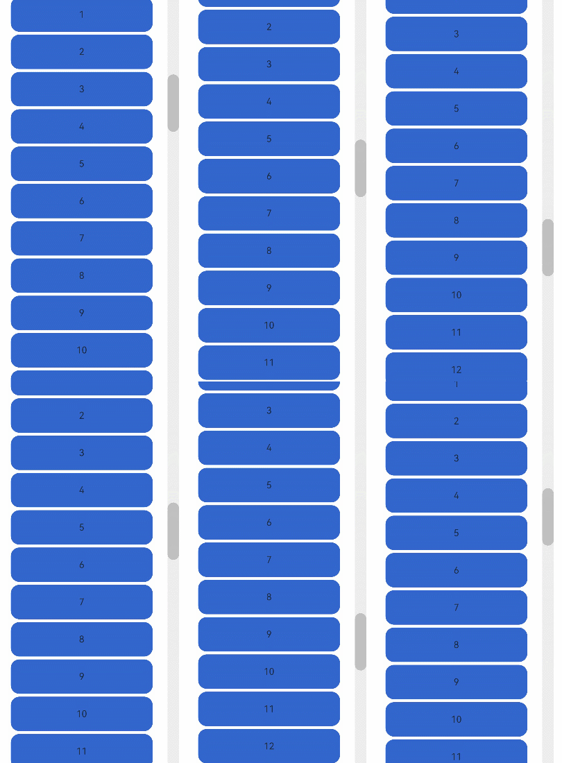
}

讨论HarmonyOS开发技术,专注于API与组件、DevEco Studio、测试、元服务和应用上架分发等。
更多推荐


 5
5 0
0- 0


 已为社区贡献16条内容

所有评论(0)