鸿蒙开发系列教程(二十五)--样式处理(一)
·
1、样式属性
参考网址:https://developer.harmonyos.com/cn/docs/documentation/doc-references-V3/ts-universal-attributes-text-style-0000001427902436-V3
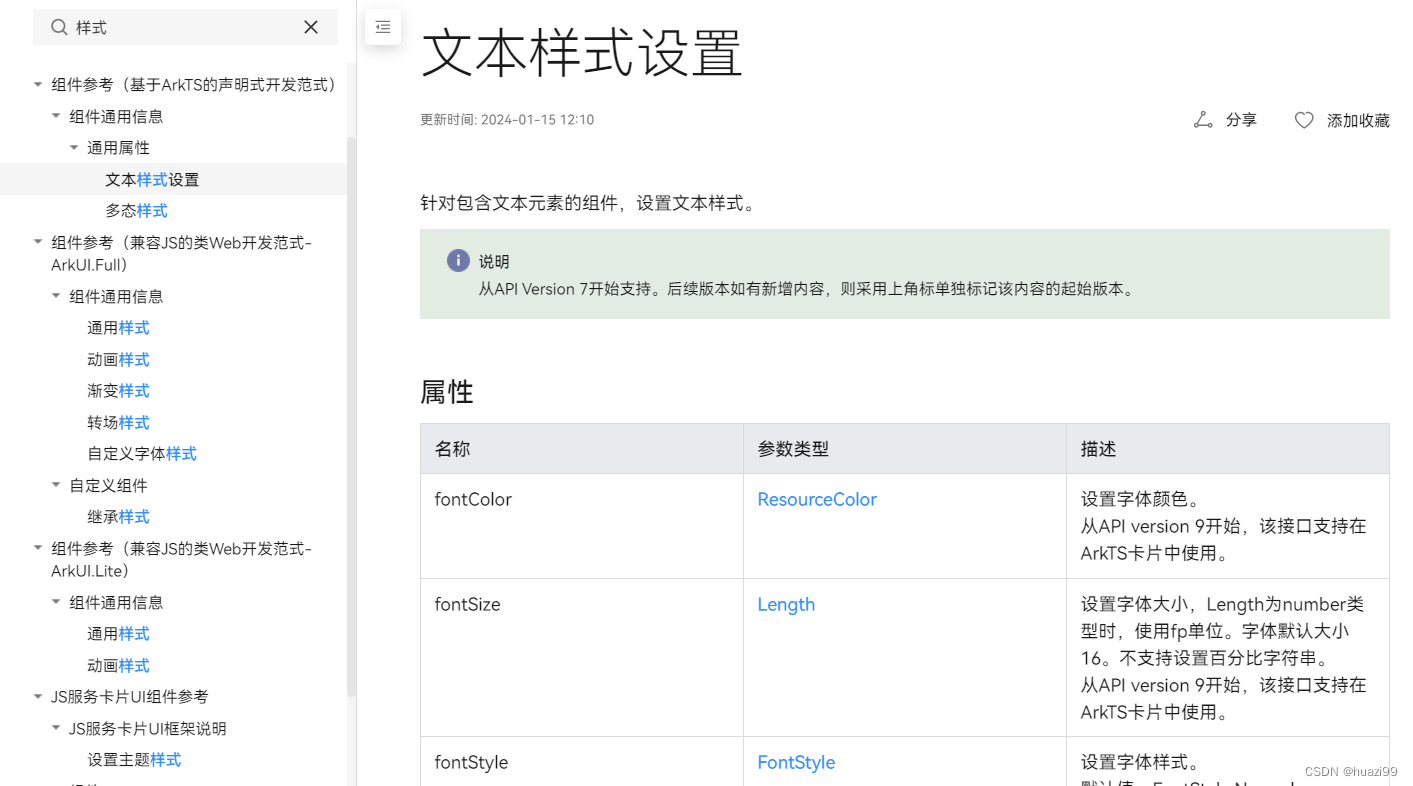
属性方法以 . 链式调用的方式配置系统组件的样式和其他属性
@Entry
@Component
struct Index {
  build() {
    Text('测试')
      .backgroundColor('red')
      .fontSize(50)
      .width('100%')
      .height(100)
  }
}
2、预设枚举值
参考官方网址:https://developer.harmonyos.com/cn/docs/documentation/doc-references-V3/ts-appendix-enums-0000001478061741-V3
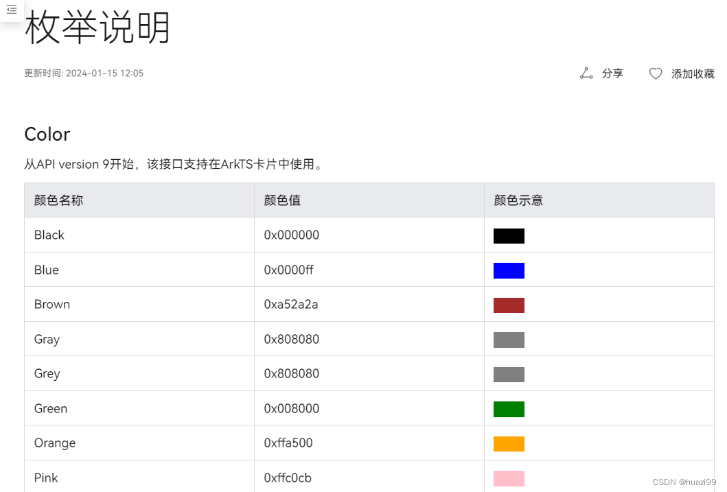
@Entry
@Component
struct Index {
  build() {
    Text('测试')
      .fontSize(50)
      .width('100%')
      .height(100)
      .backgroundColor(**Color.Blue**)
      .textAlign(**TextAlign.Center**)
      .fontColor(**Color.White**)
  }
}
3、样式适配
- vp :鸿蒙默认单位,和屏幕像素有关,最终表现视觉大小在任何设备一致
- 鸿蒙以伸缩 、网格、栅格进行布局适配,如要等比例缩放可以设置高宽比
aspectRatio
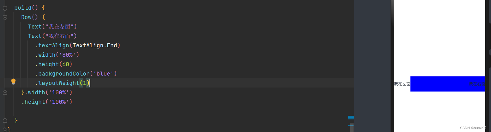
(1)伸缩: layoutWeight(flex: number) 占剩余空间多少份
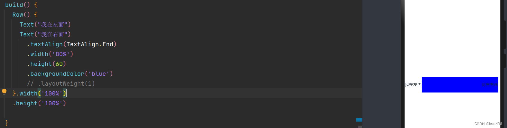
加入`layoutWeight参数后,使用layoutWeight属性,让右侧内容去占满剩余宽度:
(2)内容等比例缩放:可以使用aspectRatio属性设置宽高比
aspectRatio(ratio: number)
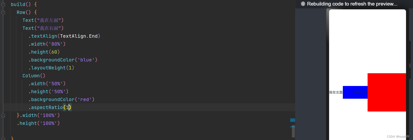
调整aspectRatio值

参考代码:
@Entry
@Component
struct StyleCase {
  @State message: string = 'Hello World'

  build() {
    Row() {
      Text("我在左面")
      Text("我在右面")
        .textAlign(TextAlign.End)
        .width('80%')
        .height(60)
        .backgroundColor('blue')
        .layoutWeight(1)
      Column()
        .width('50%')
        .height('50%')
        .backgroundColor('red')
        .aspectRatio(1)
    }.width('100%')
    .height('100%')

  }
}

讨论HarmonyOS开发技术,专注于API与组件、DevEco Studio、测试、元服务和应用上架分发等。
更多推荐


 8
8 0
0- 0


 已为社区贡献9条内容

所有评论(0)