HarmonyOS系统开发ArkTS常用组件按钮及参数(六)
·
Button组件有两种使用方式,分别是不包含子组件和包含子组件两种方式。不同方式Button 组件所需的参数有所不同。
1、不包含子组件
Button(label?: string, options?: { type?: ButtonType, stateEffect?: boolean })
- label为按钮上显示的文字内容
- options.type为按钮形状,该属性的类型ButtonType,可选的枚举值
ButtonType.Capsule 胶囊形状
ButtonType.Circle 圆形
ButtonType.Normal 普通形状
- options.stateEffect表示是否开启点击效果
@Entry
@Component
struct ButtonTest {
  @State isOn: boolean = false;
  @State isDel: boolean = false;

  build() {
    Column({ space: 10 }) {
      Button('按钮', { type: ButtonType.Capsule, stateEffect: true })
        .fontSize(25)
        .width(150)
        .height(65)
    }
    .width('100%')
    .height("100%")
    .justifyContent(FlexAlign.Center)

  }
}
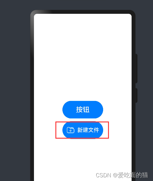
2、包含子组件
子组件会作为按钮上显示的内容,可以是图片、文字等。这种方式下,Button组件就不在需要label参数了,具体如下
Button(options?: {type?: ButtonType, stateEffect?: boolean})
@Entry
@Component
struct ButtonTest {
  @State isOn: boolean = false;
  @State isDel: boolean = false;

  build() {
    Column({ space: 10 }) {
      Button({ type: ButtonType.Capsule, stateEffect: true }){
        Row({ space: 10 }){
          Image($r('app.media.icon_new_folder'))
            .width(30)
            .height(30)
          Text('新建文件')
            .fontSize(20)
            .fontColor(Color.White)
            .fontWeight(500)
        }
      }
        .fontSize(25)
        .width(150)
        .height(65)
      .onClick(()=>{
        console.log('我准备开始建立文件夹');
      })
    }
    .width('100%')
    .height("100%")
    .justifyContent(FlexAlign.Center)

  }
}
3、常用属性
- 背景颜色:使用backgroundColor()方法进行设置,例如 Button('绿色按钮').backgroundColor(Color.Green)
- 边框圆角:使用borderRadius()方法进行设置,例如Button('圆角按钮', { type: ButtonType.Normal }).borderRadius(10)
- 点击事件:使用onClick()方法为按钮绑定点击事件,该方法的参数为一个回调函数,当按钮被点击时,就会触发该回调函数,例如Button('点击事件').onClick(() => { console.log('我被点击了')})

讨论HarmonyOS开发技术,专注于API与组件、DevEco Studio、测试、元服务和应用上架分发等。
更多推荐


 4
4 0
0- 0


 已为社区贡献7条内容

所有评论(0)