ArkTS语言的自定义组件的学习
【代码】ArkTS语言的自定义组件的学习。
·
上篇回顾 ArkTS言语基本组成的学习
本篇内容 ArkTS语言的自定义组件的学习
一、知识储备
- 自定义组件的生命周期
- 被创建时 aboutToAppear
- 被销毁时 aboutToDisappear
- 可见时 onPageShow
- 不可见时 onPageHide
- 触发返回时 onBackPress
- 自定义组件常用手法
- 自定义构建函数 @Build
//此构建函数为全局构建,不放在组件内
@Build function buildFun($$: { args: string }) {
  Row() {
    Text(`myBuild ${$$.args}`)
      .fontColor(Color.Green)
      .fontSize(40)
      .backgroundColor(Color.Grey)
  }
}
- 自定义无参和有参 @BuildParma
@Component
struct Child {
  @State args: string = 'chile'

  @Builder childBuild() {

  }

  @BuilderParam hasNoParam: () => void;  //此为无参构建函数
  @BuilderParam hasParams: ($$: { args: string }) => void; //此为有参构建函数

  build() {
    Row() {
      this.hasNoParam()
      this.hasParams({ args: '我是有参' })
    }
  }
}
- 自定义组件样式 @Styles
@Styles function global() { //定义在全局的样式
  .height('10%')
}

@Component
struct ChildStyles {
  @State h: number = 100;
  @State msg: string = '样式'

  @Styles setHeight(){
    .height(this.h) //定义在组件内的样式,支持调用组件内的变量
    .backgroundColor(Color.Blue)
    .onClick(() => {
      this.h += 2;
    })
  }

  build() {
    Row(){
      Column(){
        Text(this.msg){
          .setHeight()
      }
    }
  }
}
- 自定义扩展组件样式 @Extend
//注意此样式只被允许定义在当前页面的全局的位置,不可被定义在组件内
@Extend(Text) function initText() { //初始化Text的字体颜色等专有属性
  .fontColor(Color.Red)
  .fontSize(66)
  .fontWeight(FontWeight.Bolder)
}
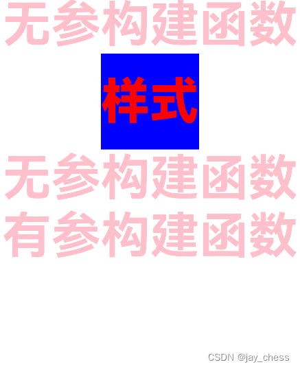
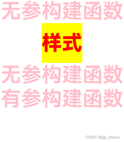
- 自定义组件复杂样式 stateStyles
首先我们要知道组件有四种状态:
focused:获焦态。
normal:正常态。
pressed:按压态。
disabled:不可用态。
//注意:此处只以按压状态举例
...
  @Styles pressed(){
    .backgroundColor(Color.Yellow)
  }

  @Styles unpressed(){
    .backgroundColor(Color.Blue)
  }
  ...
 build() {
    Row() {
      Column() {
        Text(this.msg)
          .setHeight()
          .initText()
          .stateStyles({
            normal: this.unpressed,
            pressed: this.pressed,
          })
      }
    }
  }
  ...
二、代码编写
import font from '@ohos.font';

@Styles function global() { //定义在全局的样式
  .height('10%')
}

@Extend(Text) function initText() { //初始化Text的字体颜色等专有属性
  .fontColor(Color.Red)
  .fontSize(66)
  .fontWeight(FontWeight.Bolder)
}

@Entry
@Component
struct ChildStyles {
  @State h: number = 100;
  @State msg: string = '样式'

  @Styles setHeight(){
    .height(this.h) //定义在组件内的样式,支持调用组件内的变量
    .backgroundColor(Color.Blue)
    .onClick(() => {
      this.h += 2;
    })
  }

  @Styles pressed(){
    .backgroundColor(Color.Yellow)
  }

  @Styles unpressed(){
    .backgroundColor(Color.Blue)
  }

  build() {
    Row() {
      Column() {
        Text(this.msg)
          .setHeight()
          .initText()
          .stateStyles({
            normal: this.unpressed,
            pressed: this.pressed,
          })
      }
    }
  }
}
三、效果一览

讨论HarmonyOS开发技术,专注于API与组件、DevEco Studio、测试、元服务和应用上架分发等。
更多推荐


 1
1 0
0- 0


 已为社区贡献17条内容

所有评论(0)