HarmonyOS Developer之进度条-Progress
·
创建进度条
接口调用形式:
Progress(options: {value: number, total?: number, type?: ProgressType})
示例:
// 创建一个进度总长为100,初始进度值为24的线性进度条
Progress({ value: 24, total: 100, type: ProgressType.Linear })

进度条样式
- ProgressType.Linear(线性样式 – 默认)
- ProgressType.Ring(环形无刻度样式)
- ProgressType.ScaleRing(环形有刻度样式)
- ProgressType.Eclipse(圆形样式)
- ProgressType.Capsule(胶囊样式)
注:从API version9开始,组件高度大于宽度时,自适应垂直显示;组件高度等于宽度时,保持水平显示。
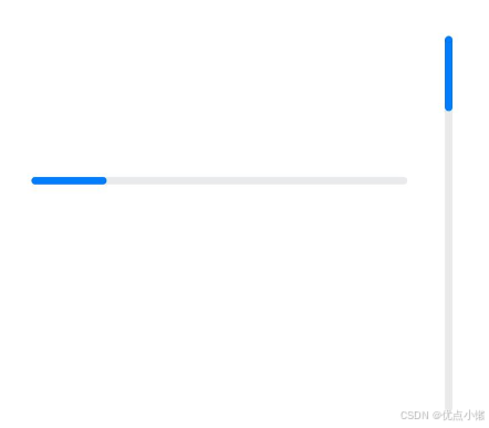
线性样式进度条:
Progress({ value: 20, total: 100, type: ProgressType.Linear }).width(200).height(50)
Progress({ value: 20, total: 100, type: ProgressType.Linear }).width(50).height(200)
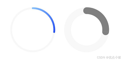
环形无刻度样式进度条:
// 从左往右,1号环形进度条,默认前景色为蓝色渐变,默认strokeWidth进度条宽度为2.0vp
Progress({ value: 40, total: 150, type: ProgressType.Ring }).width(100).height(100)
// 从左往右,2号环形进度条
Progress({ value: 40, total: 150, type: ProgressType.Ring }).width(100).height(100)
    .color(Color.Grey)    // 进度条前景色为灰色
    .style({ strokeWidth: 15})    // 设置strokeWidth进度条宽度为15.0vp
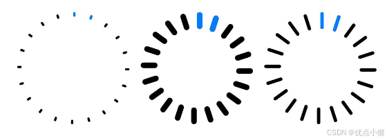
环形有刻度样式进度条:
Progress({ value: 20, total: 150, type: ProgressType.ScaleRing }).width(100).height(100)
    .backgroundColor(Color.Black)
    .style({ scaleCount: 20, scaleWidth: 5 })    // 设置环形有刻度进度条总刻度数为20,刻度宽度为5vp
Progress({ value: 20, total: 150, type: ProgressType.ScaleRing }).width(100).height(100)
    .backgroundColor(Color.Black)
    .style({ strokeWidth: 15, scaleCount: 20, scaleWidth: 5 })    // 设置环形有刻度进度条宽度15,总刻度数为20,刻度宽度为5vp
Progress({ value: 20, total: 150, type: ProgressType.ScaleRing }).width(100).height(100)
    .backgroundColor(Color.Black)
    .style({ strokeWidth: 15, scaleCount: 20, scaleWidth: 3 })    // 设置环形有刻度进度条宽度15,总刻度数为20,刻度宽度为3vp
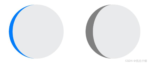
圆形样式进度条:
// 从左往右,1号圆形进度条,默认前景色为蓝色
Progress({ value: 10, total: 150, type: ProgressType.Eclipse }).width(100).height(100)
// 从左往右,2号圆形进度条,指定前景色为灰色
Progress({ value: 20, total: 150, type: ProgressType.Eclipse }).color(Color.Grey).width(100).height(100)
胶囊样式进度条:
Progress({ value: 10, total: 150, type: ProgressType.Capsule }).width(100).height(50)
Progress({ value: 20, total: 150, type: ProgressType.Capsule }).width(50).height(100).color(Color.Grey)
Progress({ value: 50, total: 150, type: ProgressType.Capsule }).width(50).height(100).color(Color.Blue).backgroundColor(Color.Black)
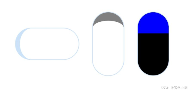
注:
头尾两端圆弧处的进度展示效果与ProgressType.Eclipse样式相同;
中段处的进度展示效果为矩形状长条,与ProgressType.Linear线性样式相似;
组件高度大于宽度的时候自适应垂直显示。

讨论HarmonyOS开发技术,专注于API与组件、DevEco Studio、测试、元服务和应用上架分发等。
更多推荐


 7
7 0
0- 0


 已为社区贡献15条内容

所有评论(0)