鸿蒙HarmonyOS常用开发组件:菜单弹出窗口-menu
提供菜单组件,作为临时性弹出窗口,用于展示用户可执行的操作
提供菜单组件,作为临时性弹出窗口,用于展示用户可执行的操作
创建menu组件
在pages/index目录下的hml文件中创建一个menu组件,添加target、type、title属性。
<!-- xxx.hml-->
<div class="container">
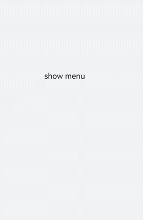
<text class="title-text" id="textId">show menu</text>
<menu target="textId" type="click" title="title">
<option value="Item 1">Item 1</option>
<option value="Item 2">Item 2</option>
<option value="Item 3">Item 3</option>
</menu>
</div>/* xxx.css */
.container{
width: 100%;
height: 100%;
flex-direction: column;
background-color: #F1F3F5;
align-items: center;
justify-content: center;
width: 100%;
}
.title-text{
font-size: 35px;
}
说明
设置样式
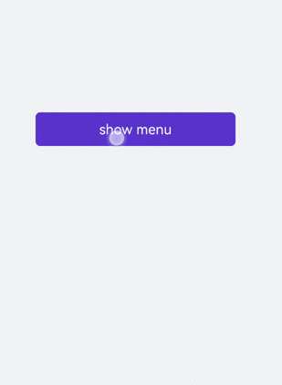
为menu组件设置样式,例如字体颜色、大小、字符间距等。
<!-- xxx.hml-->
<div class="container">
  <text class="title-text" id="textId">show menu</text>
  <menu target="textId" type="click" title="title">
    <option value="Item 1">Item 1</option>
    <option value="Item 2">Item 2</option>
    <option value="Item 3">Item 3</option>
  </menu>
</div>
/* xxx.css */
.container{
width: 100%;
height: 100%;
flex-direction: column;
background-color: #F1F3F5;
align-items: center;
justify-content: center;
width: 100%;
}
.title-text{
font-size: 35px;
background-color: #5a5aee;
color: white;
width: 70%;
text-align: center;
height: 85px;
border-radius: 12px;
}
menu{
text-color: blue;
font-size: 35px;
letter-spacing: 2px;
}
option{
color: #6a6aef;
font-size: 30px;
}
绑定事件
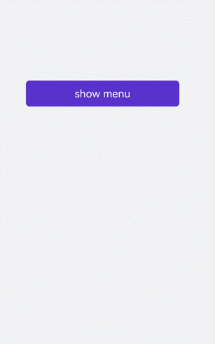
为menu组件绑定onselected事件(菜单中某个值被点击选中时触发)和oncancel事件(取消操作时触发),点击text组件调用show方法可设置menu组件的坐标。
<!-- xxx.hml-->
<div class="container">
  <text  class="title-text" id="textId" onclick="textClick">show menu</text>
  <menu  title="title" onselected="select" oncancel="cancel" id="menuId">
    <option value="Item 1">Item 1</option>
    <option value="Item 2">Item 2</option>
    <option value="Item 3">Item 3</option>
  </menu>
</div>
/* xxx.css */
.container{
width: 100%;
height: 100%;
flex-direction: column;
background-color: #F1F3F5;
width: 100%;
}
.title-text{
font-size: 35px;
background-color: #5a5aee;
color: white;
width: 70%;
text-align: center;
height: 85px;
border-radius: 12px;
margin-top: 500px;
margin-left: 15%;
}
menu{
text-color: blue;
font-size: 35px;
letter-spacing: 2px;
}
option{
color: #6a6aef;
font-size: 30px;
}// xxx.js
import promptAction from '@ohos.promptAction';
export default {
select(e) {
promptAction.showToast({
message: e.value
})
},
cancel(){
promptAction.showToast({
message: "cancel"
})
},
textClick() {
this.$element("menuId").show({x:175,y:590});
},
}
场景示例
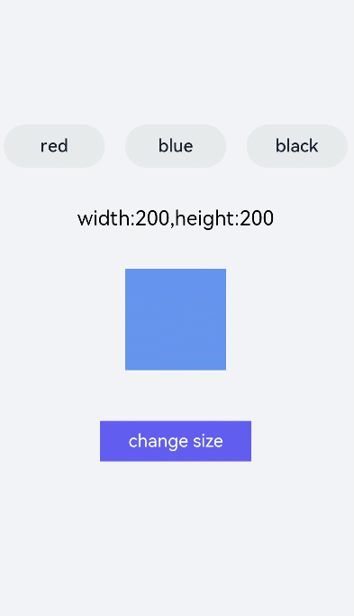
本场景中开发者可点击toggle组件修改文字颜色,选择menu组件修改渐变色块大小。
<!-- xxx.hml-->
<div class="container">
    <div class="contentToggle">
        <toggle class="toggle" for="{{item in togglesList}}" onclick="toggleClick({{$idx}})" checked="{{item.checked}}">{{item.name}}</toggle>
    </div>
    <text class="size" style="color: {{color}};">width:{{width}},height:{{height}}</text>
    <div style="width: {{width}}px;height: {{height}}px; background-color: cornflowerblue;"></div>
    <text id="menuId" class="text">change size</text>
    <menu onselected="select" oncancel="cancel" target="menuId">
        <option value="{{item.value}}" for="item in optionList">{{item.text}}</option>
    </menu>
</div>
/* xxx.css */
.container{
flex-direction: column;
background-color: #F1F3F5;
width: 100%;
justify-content: center;
align-items: center;
}
.contentToggle{
width: 100%;
justify-content: space-around;
}
.toggle{
padding: 10px;
height:80px;
font-size: 35px;
width: 200px;
height: 85px;
}
.size{
width: 100%;
height: 200px;
text-align: center;
font-size: 40px;
text-align: center;
}
.text{
width: 300px;
height: 80px;
background-color: #615def;
color: white;
font-size: 35px;
text-align: center;
margin-top: 100px;
}
menu{
text-color: blue;
font-size: 35px;
letter-spacing: 2px;
}
option{
color: #6a6aef;
font-size: 30px;
}// xxx.js
export default {
data:{
fresh: false,
width: 200,
height: 200,
color: '',
optionList:[
{text:'200 x 200',value:2},
{text:'300 x 300',value:3},
{text:'500 x 500',value:5},
],
togglesList:[
{name:"red", checked:false},
{name:"blue", checked:false},
{name: "black", checked:false},
],
},
toggleClick(index) {
for(let i=0;i<this.togglesList.length;i++) {
if (i == index) {
this.color = this.togglesList[index].name;
this.togglesList[i].checked = true;
}else {
this.togglesList[i].checked = false;
}
}
},
select(e) {
this.width = e.value * 100;
this.height = e.value * 100;
}
}
最后
小编在之前的鸿蒙系统扫盲中,有很多朋友给我留言,不同的角度的问了一些问题,我明显感觉到一点,那就是许多人参与鸿蒙开发,但是又不知道从哪里下手,因为资料太多,太杂,教授的人也多,无从选择。有很多小伙伴不知道学习哪些鸿蒙开发技术?不知道需要重点掌握哪些鸿蒙应用开发知识点?而且学习时频繁踩坑,最终浪费大量时间。所以有一份实用的鸿蒙(HarmonyOS NEXT)资料用来跟着学习是非常有必要的。
为了确保高效学习,建议规划清晰的学习路线,涵盖以下关键阶段:
点击→【纯血版鸿蒙全套最新学习资料】希望这一份鸿蒙学习资料能够给大家带来帮助~
鸿蒙(HarmonyOS NEXT)最新学习路线

该路线图包含基础技能、就业必备技能、多媒体技术、六大电商APP、进阶高级技能、实战就业级设备开发,不仅补充了华为官网未涉及的解决方案
路线图适合人群:
IT开发人员:想要拓展职业边界
零基础小白:鸿蒙爱好者,希望从0到1学习,增加一项技能。
技术提升/进阶跳槽:发展瓶颈期,提升职场竞争力,快速掌握鸿蒙技术
2.视频学习资料+学习PDF文档
这份鸿蒙(HarmonyOS NEXT)资料包含了鸿蒙开发必掌握的核心知识要点,内容包含了(ArkTS、ArkUI开发组件、Stage模型、多端部署、分布式应用开发、音频、视频、WebGL、OpenHarmony多媒体技术、Napi组件、OpenHarmony内核、(南向驱动、嵌入式等)鸿蒙项目实战等等)鸿蒙(HarmonyOS NEXT)技术知识点。
HarmonyOS Next 最新全套视频教程

(鸿蒙语法ArkTS、TypeScript、ArkUI教程……)

纯血版鸿蒙全套学习资料(面试、文档、全套视频等)

鸿蒙南向开发技术

鸿蒙APP开发必备

《鸿蒙 (OpenHarmony)开发基础到实战手册》
OpenHarmony北向、南向开发环境搭建

《鸿蒙开发基础》

总结
总的来说,华为鸿蒙不再兼容安卓,对程序员来说是一个挑战,也是一个机会。只有积极应对变化,不断学习和提升自己,才能在这个变革的时代中立于不败之地。

讨论HarmonyOS开发技术,专注于API与组件、DevEco Studio、测试、元服务和应用上架分发等。
更多推荐

 10
10 0
0- 0


 已为社区贡献10条内容

所有评论(0)