华为 HarmonyOS NEXT 原生应用开发:原生鸿蒙中弹框的使用(轻提示弹框、系统弹框、日期弹框、自定义弹框)& 通过 @CustomDialog自定义弹框选择身高案例
·
2024年11月5日 LiuJinTao
常用弹框的使用
一、promptAction弹框
代码示例:
import { promptAction } from '@kit.ArkUI'
@Entry
@Component
struct Index {
build () {
Column() {
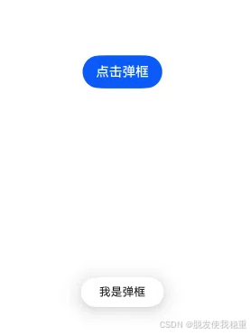
// TODO 演示 promptAction.showToast 弹框
Button("点击弹框")
.onClick(() => {
promptAction.showToast({
message: "我是弹框",
duration: 2000, // 1500 - 10000 ms 之间
bottom: 100
})
})
}
.width('100%')
.height('100%')
.justifyContent(FlexAlign.Center)
}
}
二、AlertDialog弹框
代码示例
@Entry
@Component
struct Index1 {
build () {
Column() {
// TODO 演示 AlertDialog.show 弹框
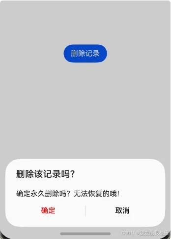
Button("删除记录")
.onClick(() => {
AlertDialog.show({
title: '删除该记录吗?', // 弹窗的标题
message: '确定永久删除吗?无法恢复的哦!', // 弹窗的内容信息
alignment: DialogAlignment.Bottom, // 弹窗位置控制
offset: { dx: 0, dy: 0}, // 相对弹框位置的偏移量
// 确定按钮处理逻辑
primaryButton: { // 左侧按钮为主要按钮
value: '确定', // 按钮文字
fontColor: Color.Red, // 按钮文字颜色
action: () => { // 确定按钮被点击的回调
console.log("AlertDialog:", "确定删除!")
}
},
// 取消按钮处理逻辑
secondaryButton: { // 右侧按钮为次要按钮
value: '取消',
fontColor: Color.Black,
action: () => { // 取消按钮被点击的回调
console.log("AlertDialog:", "取消删除!")
}
},
cancel: () => {
console.log("AlertDialog:", "点击遮罩层取消弹窗")
}
})
})
}
.width('100%')
.height('100%')
.justifyContent(FlexAlign.Center)
}
}
三、ActionSheet弹框
代码示例:
@Entry
@Component
struct Index {
  build () {
    Column() {
      // TODO:  ActionSheet 列表弹窗
      Button('文件操作')
        .onClick(() => {
          ActionSheet.show({
            title: '文件操作',
            message: "您需要对文件怎么处理呢?",
            autoCancel: true,  // 点击遮罩层是否关闭?
            alignment: DialogAlignment.Bottom,  // 弹窗位置
            offset: { dx: 0, dy: 0},  // 弹窗偏移量
            // 底部按钮配置
            confirm: {
              value: "取消操作",
              action: () => {
                console.log("ActionSheet:", "取消操作!")
              }
            },
            // 点击遮罩层触发
            cancel: () => {
              console.log("ActionSheet:", "点击遮罩层取消操作!")
            },
            // 操作选项列表 (数组包对象)
            sheets: [
              {
                icon: $r("app.media.copy"),
                title: "复制",
                action: () => {
                  console.log("ActionSheet:", "用户选择了复制操作!")
                }
              },
              {
                icon: $r("app.media.cut"),
                title: "剪切",
                action: () => {
                  console.log("ActionSheet:", "用户选择了剪切操作!")
                }
              },
              {
                icon: $r("app.media.delete"),
                title: "删除",
                action: () => {
                  console.log("ActionSheet,", "用户选择了删除操作!")
                }
              }
            ]
          })
        })
    }
    .width('100%')
    .height('100%')
    .justifyContent(FlexAlign.Center)
  }
}
四、TextPickerDialog 弹框
代码示例:
@Entry
@Component
struct Index {
// 文本列表数组
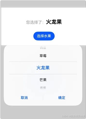
@State fruit: string[] = ["火龙果", "芒果", "香蕉", "苹果", "榴莲", "西瓜", "草莓" ]
// 选中的索引
@State selectedIndex: number = 0
build() {
Column({ space: 30 }) {
Text()
{
Span("您选择了:").fontSize(18).fontColor("#999").margin({ left: 10})
Span(this.fruit[this.selectedIndex]).fontSize(24).fontColor(Color.Black).fontWeight(FontWeight.Bold)
}
Button('选择水果')
.onClick(() => {
// TODO TextPickerDialog 列表弹框
TextPickerDialog.show({
range: this.fruit, // 列表内容的数组
selected: this.selectedIndex, // 默认选中的索引
// 确定按钮触发的回调函数 (参数为当前选中的文字索引)
onAccept: (value: TextPickerResult) => { // TextPickerResult就是一个接口(包含选中的索引和内容)
this.selectedIndex = value.index as number // 将选择的结果索引
console.log("Text PickerDialog:", `用户选择了(${value.value})`)
},
// 取消按钮触发的回调函数
onCancel: () => {
console.log("TextPickerDialog:", "用户取消选择")
},
// 弹框列表中的高亮所选元素变化,实时获取,有变化就触发
onChange: (value: TextPickerResult) => {
console.log("TextPickerDialog:", `用户选择了(${value.value})`)
}
})
})
}
.width("100%")
.height("100%")
.justifyContent(FlexAlign.Center)
}
}
五、DatePickerDialog弹框
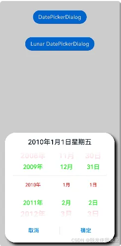
代码示例:
// xxx.ets
@Entry
@Component
struct DatePickerDialogExample {
  selectedDate: Date = new Date("2010-1-1")

  build() {
    Column() {
      Button("DatePickerDialog")
        .margin(20)
        .onClick(() => {
          // TODO 时间弹框  DataPickerDialog
          DatePickerDialog.show({
            // 设置弹框位置
            alignment: DialogAlignment.Bottom,
            // 设置弹框的x y 轴偏移量
            offset: {dx: 0, dy: 0},
            // 设置弹框的阴影
            shadow: { radius: 20, offsetX: 20, offsetY: 20},
            start: new Date("2000-1-1"),  // 起始时间
            end: new Date("2100-12-31"),  // 最大可选时间

            selected: this.selectedDate,
            // 是否展示时间 时、分、秒
            showTime: false,
            // 展示时间是否为24小时制
            useMilitaryTime: true,
            // 设置所有选项中最上和最下两个选项的文本颜色、字号、字体粗细
            disappearTextStyle: {color: Color.Pink, font: {size: '22fp', weight: FontWeight.Bold}},
            // 设置所有选项中[除了]最上、最下及选中项以外的文本颜色、字号、字体粗细。
            textStyle: {color: '#ff00ff00', font: {size: '18fp', weight: FontWeight.Normal}},
            // 设置选中项的文本颜色、字号、字体粗细。
            selectedTextStyle: {color: '#ff0000', font: {size: '14fp', weight: FontWeight.Regular}},
            // 点击弹窗中的“确定”按钮时触发该回调。
            onDateAccept: (value: Date) => {
              this.selectedDate = value
              console.info("DatePickerDialog:onDateAccept()", "点击了确定按钮!" + `选中的时间:${value.toString()}`)
            },
            // 点击弹窗中的“取消”按钮时触发该回调。
            onCancel: () => {
              console.info("DatePickerDialog:onCancel()", "点击了取消按钮!")
            },
            // 滑动弹窗中的滑动选择器使当前选中项改变时触发该回调。
            onDateChange: (value: Date) => {
              console.info("DatePickerDialog:onDateChange():" + "当前滑动到时间:" + value.toString())
            },
            // 弹窗弹出时的事件回调。
            onDidAppear: () => {
              console.info("DatePickerDialog:onDidAppear():", "弹窗出现")
            },
            // 弹窗消失时的事件回调。
            onDidDisappear: () => {
              console.info("DatePickerDialog:onDidDisappear():", "弹窗消失")
            },
            // 弹窗显示动效前的事件回调。
            onWillAppear: () => {
              console.info("DatePickerDialog:onWillAppear():", "弹窗显示动效前")
            },
            // 弹窗退出动效前的事件回调。
            onWillDisappear: () => {
              console.info("DatePickerDialog:onWillDisappear():", "弹窗退出动效前")
            }
          })
        })

        // 农历的弹框,其上面差不多,就是添加了连个农历的属性!
      Button("Lunar DatePickerDialog")
        .margin(20)
        .onClick(() => {
          DatePickerDialog.show({
            start: new Date("2024-10-1"),
            end: new Date("2024-10-2"),
            selected: this.selectedDate,
            lunar: true,  // 是否展示为农历
            disappearTextStyle: {color: Color.Pink, font: {size: '22fp', weight: FontWeight.Bold}},
            textStyle: {color: '#ff00ff00', font: {size: '18fp', weight: FontWeight.Normal}},
            selectedTextStyle: {color: '#ff182431', font: {size: '14fp', weight: FontWeight.Regular}},
            onDateAccept: (value: Date) => {
              this.selectedDate = value
              console.info("DatePickerDialog:onDateAccept()" + value.toString())
            },
            onCancel: () => {
              console.info("DatePickerDialog:onCancel()")
            },
            onDateChange: (value: Date) => {
              console.info("DatePickerDialog:onDateChange()" + value.toString())
            },
            onDidAppear: () => {
              console.info("DatePickerDialog:onDidAppear()")
            },
            onDidDisappear: () => {
              console.info("DatePickerDialog:onDidDisappear()")
            },
            onWillAppear: () => {
              console.info("DatePickerDialog:onWillAppear()")
            },
            onWillDisappear: () => {
              console.info("DatePickerDialog:onWillDisappear()")
            }
          })
        })
    }.width('100%')
  }
}
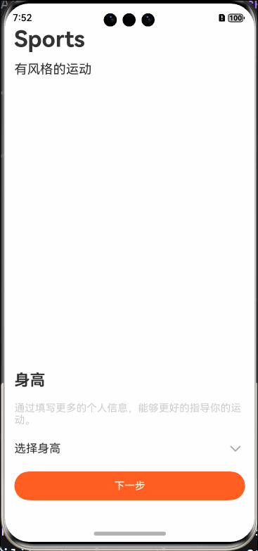
六、自定义弹框 - @CustomDialog
-
这里直接使用自定义弹框实现选择身高的案例来演示 如何使用 @CustomDialog
-
首先我们封装好自定义弹框,里面自定义结构(这里可以使用我们上面介绍的文本选择器弹框完成这个案例)
1. 封装自定义弹框代码
import { promptAction } from '@kit.ArkUI'
import { PreferencesDataClass } from '../../PreferencesData/PreferencesDataClass'

@Preview
@CustomDialog
export struct CustomDialog_UserInfor {
  userInforController: CustomDialogController = new CustomDialogController({
    builder: CustomDialog_UserInfor({
      heiNum: this.heiNum,
    })
  })
  @State heightList: string[] = ['155', '160', '165', '170', '175', '180']
  // 用户选择的数据
  @Link heiNum: string

  aboutToAppear(): void {
    PreferencesDataClass.context = getContext()
  }
  build() {
    Column() {
      Column({space: 20}) {
        Text("身高")
          .fontSize(24)
          .fontWeight(FontWeight.Bold)
        Row() {
          TextPicker({ range: this.heightList,selected: this.heightList.length / 2 })
            .onChange((value: string | string[] , index: number | number[]) => {
              this.heiNum = value as string
              promptAction.showToast({message: this.heiNum})
            })
            .canLoop(true)
            .selectedTextStyle({
              color: "#fe5b1e",
              font: {
                size: 20,
                weight: FontWeight.Bold
              }
            })
          Text("CM")
        }
        .width('100%')
        .justifyContent(FlexAlign.SpaceEvenly)
        .alignItems(VerticalAlign.Center)
        .padding(20)
        Row({space: 15}) {
          Button("完成")
            .width("40%")
            .height(45)
            .fontColor("#FFF")
            .backgroundColor("#fa5f1a")
            .onClick(() => {
              // todo (将用户选择的数据 持久化存储到本地)
              PreferencesDataClass.setData("User_Info", "height", this.heiNum)
              this.userInforController.close()
            })
        }
        .width("100%")
        .justifyContent(FlexAlign.End)
      }
      .width("100%")
      .height(400)
      .backgroundColor("#FFF")
      .borderRadius(15)
      .padding(15)
    }
    .width("100%")
    .height("100%")
    .justifyContent(FlexAlign.Center)
    .padding(15)
  }
}
- 使用的时候我们需要使用弹框控制器进行操作,下面代码中可以详细看出来
2.使用自定义弹框代码
import  { CustomDialog_UserInfor } from "../../CustomDialog/userInfor/CustomDialog_UserInfor"
import { promptAction, router } from '@kit.ArkUI'

@Entry
@Component
struct UserInformation2 {

  @State heiNum: string = ""

  // 获取弹框控制器
  heightSelectedDialogController: CustomDialogController = new CustomDialogController({
    builder: CustomDialog_UserInfor({
      heiNum: this.heiNum
    }),
    customStyle: true
  })
  build() {
    Column() {
      Column({ space: 15}) {
        Text("Sports")
          .fontSize(35)
          .fontWeight(FontWeight.Bold)
        Text("有风格的运动")
          .fontSize(20)
      }
      .width("100%")
      .alignItems(HorizontalAlign.Start)
      // 性别
      Column({space: 20 }) {
        Text("身高")
          .fontSize(24)
          .fontWeight(FontWeight.Bold)
        Text("通过填写更多的个人信息,能够更好的指导你的运动。")
          .fontSize(16)
          .fontColor("#CCC")

        // 选择身高弹框触发
        Row() {
          Text("选择身高")
            .fontSize(18)
          Image($r("app.media.down_pull_user_infor"))
            .width(30)
            .aspectRatio(1)
        }
        .width("100%")
        .justifyContent(FlexAlign.SpaceBetween)
        .onClick(() => {
          // todo 开启弹框
          this.heightSelectedDialogController.open()
        })
        // 下一步
        Button("下一步")
          .fontColor("#FFF")
          .backgroundColor("#ff5e20")
          .width("100%")
          .height(45)
          .onClick(() => {
            router.pushUrl({
              url: "pages/UserInfor/UserInformation4"
            })
          })
      }
      .width("100%")
      .alignItems(HorizontalAlign.Start)
      .margin({top: 50, bottom: 50})
    }
    .justifyContent(FlexAlign.SpaceBetween)
    .height('100%')
    .width('100%')
    .padding({top: 35, bottom: 15, left: 15, right: 15})
  }
}

讨论HarmonyOS开发技术,专注于API与组件、DevEco Studio、测试、元服务和应用上架分发等。
更多推荐
 9
9 0
0- 0


 已为社区贡献21条内容

所有评论(0)