AlphabetIndexer组件,HarmonyOS NEXT开发
通过 AlphabetIndexer 组件可以与容器组件结合,实现导航联动,以及快速定位的效果。
·
前言:
通过 AlphabetIndexer 组件可以与容器组件结合,实现导航联动,以及快速定位的效果
基本用法:
AlphabetIndexer不是容器组件,属于功能类的组件,使用时,需要设置如下 2 个参数
|
参数名 |
参数类型 |
必填 |
参数描述 |
|
arrayValue |
Array<string> |
是 |
字母索引字符串数组,不可设置为空。 |
|
selected |
number |
是 |
初始选中项索引值,若超出索引值范围,则取默认值0。 从API version 10开始,该参数支持$$双向绑定变量。 |
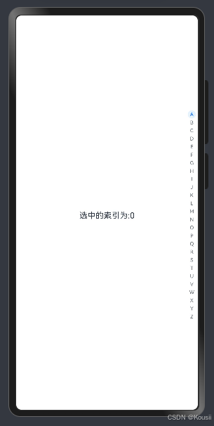
@Entry
@Component
struct Page08_AlphabetIndexer {
  alphabets: string[] = ['A', 'B', 'C', 'D', 'E', 'F', 'G', 'H', 'I', 'J', 'K',
    'L', 'M', 'N', 'O', 'P', 'Q', 'R', 'S', 'T', 'U', 'V', 'W', 'X', 'Y', 'Z']
  @State selectedIndex: number = 0

  build() {
    Stack({ alignContent: Alignment.End }) {
      Text('选中的索引为:' + this.selectedIndex)
        .width('100%')
        .textAlign(TextAlign.Center)
        .onClick(() => {
          this.selectedIndex = 10
        })
      // 字母表索引组件
      // arrayValue 索引项
      // selected 选中索引 ,支持双向绑定
      AlphabetIndexer({ arrayValue: this.alphabets, selected: $$this.selectedIndex })

    }
    .width('100%')
    .height('100%')
  }
}
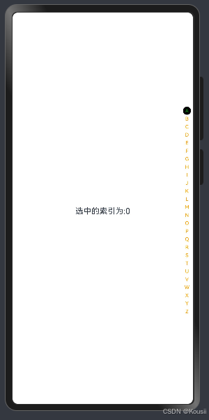
文字设置:
|
名称 |
参数类型 |
描述 |
|
color |
设置文字颜色。 |
|
|
itemSize |
number |
设置每个字母的区域大小 |
|
font |
Font |
设置每个字母的字体样式 |
|
selectedFont |
Font |
设置选中字母的字体样式 |
|
selectedColor |
设置选中项文字颜色。 |
|
|
selectedBackgroundColor |
设置选中项背景颜色。 |
@Entry
@Component
struct Page08_AlphabetIndexer {
  alphabets: string[] = ['A', 'B', 'C', 'D', 'E', 'F', 'G', 'H', 'I', 'J', 'K',
    'L', 'M', 'N', 'O', 'P', 'Q', 'R', 'S', 'T', 'U', 'V', 'W', 'X', 'Y', 'Z']
  @State selecteIndex: number = 0

  build() {
    Stack({ alignContent: Alignment.End }) {
      Text('选中的索引为:' + this.selecteIndex)
        .width('100%')
        .textAlign(TextAlign.Center)
        .onClick(() => {
          this.selecteIndex = 10
        })
      // 字母表索引组件
      // arrayValue 索引项
      // selected 选中索引 ,支持双向绑定
      AlphabetIndexer({ arrayValue: this.alphabets, selected: $$this.selecteIndex })
        .color(Color.Orange)// 文字颜色
        .selectedColor(Color.Green)// 选中文字颜色
        .selectedBackgroundColor(Color.Black) // 选中背景颜色

    }
    .width('100%')
    .height('100%')
  }
}
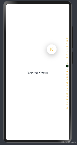
弹窗提示:
|
名称 |
参数类型 |
描述 |
|
usingPopup |
boolean |
设置是否使用提示弹窗。 默认值:false。 |
|
popupBackground |
ResourceColor |
设置提示弹窗背景色。 默认值:0xFFFFFFFF。 |
|
popupColor |
ResourceColor |
设置提示弹窗文字颜色。 默认值:0xFF254FF7。 |
@Entry
@Component
struct Page08_AlphabetIndexer {
  alphabets: string[] = ['A', 'B', 'C', 'D', 'E', 'F', 'G', 'H', 'I', 'J', 'K',
    'L', 'M', 'N', 'O', 'P', 'Q', 'R', 'S', 'T', 'U', 'V', 'W', 'X', 'Y', 'Z']
  @State selecteIndex: number = 0

  build() {
    Stack({ alignContent: Alignment.End }) {
      Text('选中的索引为:' + this.selecteIndex)
        .width('100%')
        .textAlign(TextAlign.Center)
        .onClick(() => {
          this.selecteIndex = 10
        })
      // 字母表索引组件
      // arrayValue 索引项
      // selected 选中索引 ,支持双向绑定
      AlphabetIndexer({ arrayValue: this.alphabets, selected: $$this.selecteIndex })
        .color(Color.Orange)// 文字颜色
        .selectedColor(Color.Green)// 选中文字颜色
        .selectedBackgroundColor(Color.Black)// 选中背景颜色
        .usingPopup(true)// 显示弹窗
        .popupColor(Color.Orange)// 弹窗文字颜色
        .popupBackground(Color.Pink) // 弹窗背景色

    }
    .width('100%')
    .height('100%')
  }
}

讨论HarmonyOS开发技术,专注于API与组件、DevEco Studio、测试、元服务和应用上架分发等。
更多推荐

 28
28 0
0- 0


 已为社区贡献15条内容

所有评论(0)