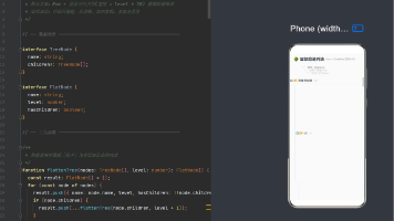
【HarmonyOS开发实战】使用animation 和 animateTo来制作按钮动画(实现点击按钮释出更多小按钮)
如果你想在页面中添加按钮来实现页面跳转或者其他操作,又觉得过多的按钮太占地方,造成界面不美观。
那么我们可以将多个按钮“压缩”到一个按钮中,如下
在开始开发前,我们先了解一下animation和animateTo的区别。
animation(属性动画)
属性动画是用于在组件的某些通用属性变化时实现渐变过渡效果的动画。支持的属性包括:width,height,backgroundColor,opacity,scale(缩放),rotate(旋转),translate(移动)等。
布局类改变宽高的动画,内容都是直接到终点状态,例如文字、Canvas的内容等,如果要内容跟随宽高变化,可以使用renderFit属性(组件内容填充方式)配置。
animation(value: AnimateParam)
使用方法
/属性参数
  ...
  ...
  ...
/

.animation({
    duration:2000,
    curve:Curve.EaseOut
    ...
    ...
})
当在animation前面的属性发生变化时,组件便会按照animation中的配置进行动画演出。
注意:属性动画只对写在animation前面的属性生效,且对组件构造器的属性不生效
Column({space:..}) <-此为组件构造器,animation对其不生效
当需要对单一或多个属性进行独立动画片配置,属性动画(animation更好一些),这样每个属性可以有不同的动画参数,适合精细化控制界面元素的动画效果。
animateTo(显式动画)
显式动画是通过在代码中显式地定义动画效果来实现视图的动态变化。其用法与animation大体相似,多了闭包代码以实现由于闭包代码导致的状态变化插入过渡动效。
animateTo(value: AnimateParam, event: () => void): void
使用方法
animateTo({
    duration: 2000,
    curve: Curve.EaseOut,
    iterations: 3,
    playMode: PlayMode.Normal,
    onFinish: () => {
        console.info('play end')
        }
        }, () => { //在这里修改组件属性,来形成动画效果
              this.widthSize = 150
              this.heightSize = 60
            })
常用参数配置一览(animateTo和animation共享):
- duration(动画持续时间)
- tempo(动画播放速度)
- curve(动画曲线)
- delay(动画延迟播放时间)
- iterations(动画播放次数)
- playMode(动画播放模式)
- onFinish(动画播放完成回调)
当需要对一系列界面变化进行统一动画处理时,特别是涉及条件判断、数组元素的动态增删等非直接属性变更的情况,使用显示动画(animateTo)更好一些。
总得来说,属性动画(animation)更适用于简单的属性变化动画,而显式动画(animateTo)则适用于更复杂的动画场景,包括组件的增删和属性的批量变化。开发者可以根据具体的动画需求和场景选择适合的动画实现方式。
实战开发

开发所需文件一览
viewModel层
首先我们先从viewModel层开始做起,定义动画元件的各项属性
Point——坐标类
//设置坐标位置

export class Point {
  public x: number = 0
  public y: number = 0

  constructor(x:number,y:number) {
    this.x = x
    this.y = y
  }
}
这里不用多说了,就是简单的xy坐标定义
IconItem——单个元件类
import {Point} from './Point'

//设定图标属性

export class IconItem {
//这里可以根据需要定义多个属性
  index: number = 0  //下标
  clicked: boolean = false   //是否被点击
  image: Resource = $r('app.media.testicon')
  point: Point = new Point(0,0)   //坐标
  name: string = ''  //自定义属性

  constructor(index: number,image:Resource,clicked: boolean,point: Point,name:string) {
    this.index = index
    this.image = image
    this.clicked = clicked
    this.point = point
    this.name = name
在该类中我们定义单个动画元件的属性,其中最重要的就是坐标,因为我们做的是一个移动图标显示的动画,而实现这个效果就需要坐标改变来实现。
IconModel_——核心元件类,定义元件集及其配置方法
import {IconItem} from './IconItem'
import {Point} from './Point
import Constant from '../Constant/Constant'


export class IconModel {
  public imagerArr: Array<IconItem> = [];
  private num: number = 1;
  private radius: number;   //半径,因为是按圆周展开
  private nameList: Array<string>  //这里定义数组,方便元件创建时加入

  constructor(num: number, radius: number,nameList:Array<string>) {
    this.radius = radius;
    this.addImage(num,nameList);  //相当于创建元件
    this.nameList = nameList ;
  }

//添加元件
  public addImage(num: number,nameList: Array<string>) {
    this.num = num;
    if (this.imagerArr.length === num) {
      return;
    }
    if (this.imagerArr.length > num) {
      this.imagerArr.splice(num, this.imagerArr.length - num);
    } else {
      for (let i = this.imagerArr.length; i < num; i++) {
        const point = this.genPointByIndex(i);
        this.imagerArr.push(new IconItem(i, Constant.IMAGE_RESOURCE[i], false, point,nameList[i]));
      }
    }

    this.refreshPoint(num);
  }

//刷新坐标
  public refreshPoint(num: number) {
    for (let i = 0; i < num; i++) {
      this.imagerArr[i].point = this.genPointByIndex(i);
    }
  }

//根据元件下标确定位置
  public genPointByIndex(index: number): Point {
    const angle =  -Math.PI*5/6+Math.PI * index / this.num;
    const x = this.radius * Math.cos(angle);
    const y = this.radius * Math.sin(angle);
    return new Point(x, y);
  }

  public reset() {
    for (let i = 0; i < this.num; i++) {
      if (this.imagerArr[i].clicked) {
        this.imagerArr[i].clicked = false;
      }
    }
  }
}
在IconsModel类中我们设定了元件集的属性,还有内置的方法用于创建元件集。
创建元件集的基本逻辑就是:
-
在Constant中设定统一的元件图像(我这里放了png图片,大家可以根据个人喜好放置喜欢的图标)
const IMAGE_ARR = [ $r('app.media.testicon'), $r('app.media.testicon'), $r('app.media.testicon'), $r('app.media.testicon'), ...放多少都可以 ] export default class Constant { static readonly IMAGE_RESOURCE: Resource[] = IMAGE_ARR } -
在IconsModel接口中构造了三个参数,num,radius,nameList,其中num就是点击释出的元件数,(nameList是每个元件在定义时的标记,看个人需求添加),在addImage方法中根据num和nameLIst来创建对应数量的元件并加入到元件集中。
public addImage(num: number,nameList: Array<string>) { this.num = num; if (this.imagerArr.length === num) { return; } if (this.imagerArr.length > num) { this.imagerArr.splice(num, this.imagerArr.length - num); } else { for (let i = this.imagerArr.length; i < num; i++) { const point = this.genPointByIndex(i); this.imagerArr.push(new IconItem(i, Constant.IMAGE_RESOURCE[i], false, point,nameList[i])); } } this.refreshPoint(num); } -
在addImage方法中调用genPointByIndex方法,确定每个元件释出后的坐标值
  public genPointByIndex(index: number): Point {
    const angle =  -Math.PI*5/6+Math.PI * index / this.num;
    const x = this.radius * Math.cos(angle);
    const y = this.radius * Math.sin(angle);
    return new Point(x, y);
  }
这里的计算式生成的是点击处正上方均匀分布三个元件的计算式,如果需要调整位置可以在这里更改计算式。
以上,动画元件集就定义好了。
component层
属性动画——IconAnimation
在这一部分我们做单个元件的动画行为,因为是根据单个元件的位置属性进行移动动画的播放,所以我们使用属性动画animation来制作。
import {IconItem} from '../viewmodel/IconItem'
import Constants from '../Constant/Constant'
import {Point} from '../viewmodel/Point'

@Component

export struct IconAnimation {
  @Link mainFlag: boolean;     //我们根据这个来判断元件是否释出
  @State PointTest :Point = new Point(0,0)
  @State item: IconItem = new IconItem(1, $r('app.media.testicon'),false,this.PointTest,"测试");


  build() {
    Stack(){

      Image(this.item.image)
        .width(58)
        .height(58)
        .objectFit(ImageFit.Contain)
        //移动元件位置(使用条件判断语句根据mainflag状态来控制移动)
        .translate(this.mainFlag ? { x: this.item.point.x, y: this.item.point.y } : { x: 0, y: 0 })
        .onClick(() => {
        //这里可以设计点击事件,根据个人需要是否要定义点击状态
          this.item.clicked = !this.item.clicked;
          console.log("名字是"+this.item.name)
        })

    }
    .animation(
      {
          delay: 10,
          duration: 1000,
          iterations: 1,
          curve: Curve.Smooth,
          playMode: PlayMode.Normal
      })
      //参数设置
  }
}
因为这个动画要实现按钮的出现与消失,也就是我们要控制每次点击时按的钮释出与放回。因此我们定义一个变量mainflag来实现该功能。
显式动画——AnimationWidgets
做完了单个元件的动画,我们现在开始整合多个元件。由于是控制多个元件,所以这里我们用到了animateTo
import {IconItem} from '../viewmodel/IconItem'
import {IconModel} from '../viewmodel/IconModel'
import {IconAnimation} from '../components/IconAnimation'

@Component
export struct AnimationWidgets{
  @State mainFlag: boolean = false;  //是否完成360度旋转
  @State private ButtonImage: Resource = $r('app.media.testicon')

  @State private iconModel: IconModel = new IconModel(1,2,['']);

  animate() {
    //动画属性
    animateTo(
      {
        delay: 10,
        tempo: 0.68,
        iterations: 1,
        duration: 500,
        curve: Curve.Smooth,
        playMode: PlayMode.Normal
      }, () => {
      //动画执行完成后修改点击状态
      this.mainFlag = !this.mainFlag;
    })
  }

  build() {
  //这里我们要隐藏未点击的按钮,所以选择了层叠模式来让最后出现的总控制按钮盖住它们,当然也可以修改元件大小为最小来隐藏,这里不过多展示。
    Stack() {
      Stack() {
        ForEach(this.iconModel.imagerArr, (item: IconItem) => {
          IconAnimation({
          //传入元件以及点击状态
            item: item,
            mainFlag: $mainFlag
          })

        }, (item: IconItem) => JSON.stringify(item.index))
      }
      .width("100%")
      .height("100%")

      Image(this.ButtonImage)
        .width(64)
        .height(64)
        .objectFit(ImageFit.Contain)

        .onClick(() => {
          this.animate();
          console.log("已播放动画")
        })

      Text('点击按钮')
        .fontSize( 16)
        .opacity(6)
        .fontWeight(FontWeight.Medium)
        .margin({
          top: 100
        })
    }
    .width("100%")
    .layoutWeight(1)
  }

}
调用方法
import {IconModel} from '../viewmodel/IconModel'
import {AnimationWidgets} from "../components/AnimationWidgets"

@Preview
@Component
export struct MainPage {

  @State
  private IconNum : number = 3
  @State
  PageNameList: Array<string> = ["测试","测试","测试"]


  IconList: IconModel = new IconModel(this.IconNum,45,this.PageNameList)

  build() {
    Column(){
      AnimationWidgets({iconModel:this.IconList})
    }
    .width("100%")
    .height("100%")
    .backgroundColor(Color.White)
  }

}
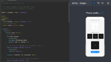
这样我们就实现了点击按钮进行小按钮的释出。

讨论HarmonyOS开发技术,专注于API与组件、DevEco Studio、测试、元服务和应用上架分发等。
更多推荐

 11
11 0
0- 0


 已为社区贡献13条内容

所有评论(0)