HarmonyOS应用开发-自定义组件中装饰器都有哪些?_harmony os 装饰器
// 在MyComponent中直接使用
@Entry
@Component
struct MyComponent {
build() {
Row() {
MyComponent2()
.width(200)
.height(300)
.backgroundColor(Color.Red)
}
}
}
## 3 @Builder


将重复使用的UI元素抽象成一个方法,使用@Builder修饰,在build方法里调用。


按引用传递参数时,传递的参数可为状态变量,且状态变量的改变会引起@Builder方法内的UI刷新。ArkUI提供$$作为按引用传递参数的范式。
// 定义ABuilder,并接收一个参数
@Builder function ABuilder(KaTeX parse error: Can't use function '$' in math mode at position 70: …arByReference: $̲{.paramA1} `)
}
}
@Entry
@Component
struct Parent {
@State label: string = ‘Hello’;
build() {
Column() {
// 在Parent组件中调用ABuilder的时候,将this.label引用传递给ABuilder
ABuilder({ paramA1: this.label })
Button(‘Click me’).onClick(() => {
// 点击“Click me”后,UI从“Hello”刷新为“ArkUI”
this.label = ‘ArkUI’;
})
}
}
}
## 4 @BuilderParam


>
> ArkUI引入了@BuilderParam装饰器,@BuilderParam用来装饰指向@Builder方法的变量,开发者可在初始化自定义组件时对此属性进行赋值,为自定义组件增加特定的功能。该装饰器用于声明任意UI描述的一个元素,类似slot占位符。
>
>
>


我理解在自定义组件A中可以定义一个变量,使用@BuilderParam装饰器修饰,在调用自定义组件A的时候,可传递一个@Builder修饰的变量。如下代码:


1. 定义自定义组件Child,该组件中aBuilder0使用@BuilderParam修饰
2. 在自定义组件Child的build()中构建aBuilder0
3. 在Parent中定义componentBuilder,并使用@Builder修饰
4. 在Parent调用Child时,传递一个参数,该参数为componentBuilder
@Component
struct Child {
@BuilderParam aBuilder0: () => void;
build() {
Column() {
this.aBuilder0()
}
}
}
@Entry
@Component
struct Parent {
@Builder componentBuilder() {
Text(Parent builder )
}
build() {
Column() {
Child({ aBuilder0: this.componentBuilder })
}
}
}
## 5 @Styles


@Styles装饰器可以将多条样式设置提炼成一个方法,直接在组件声明的位置调用。


通过@Styles装饰器可以快速定义并复用自定义样式。用于快速定义并复用自定义样式。
// 定义在全局的@Styles封装的样式
@Styles function globalFancy () {
.width(150)
.height(100)
.backgroundColor(Color.Pink)
}
@Entry
@Component
struct FancyUse {
@State heightValue: number = 100
// 定义在组件内的@Styles封装的样式
@Styles fancy() {
.width(200)
.height(this.heightValue)
.backgroundColor(Color.Yellow)
.onClick(() => {
this.heightValue = 200
})
}
build() {
Column({ space: 10 }) {
// 使用全局的@Styles封装的样式
Text(‘FancyA’)
.globalFancy ()
.fontSize(30)
// 使用组件内的@Styles封装的样式
Text(‘FancyB’)
.fancy()
.fontSize(30)
}
}
}
## 6 @Extend


在@Styles的基础上,提供了@Extend,用于扩展原生组件样式。


@Styles不同,@Extend装饰的方法支持参数
// xxx.ets
@Extend(Text) function fancy (fontSize: number) {
.fontColor(Color.Red)
.fontSize(fontSize)
}
@Entry
@Component
struct FancyUse {
build() {
Row({ space: 10 }) {
Text(‘Fancy’)
.fancy(16)
Text(‘Fancy’)
.fancy(24)
}
}
}
## 7 stateStyles
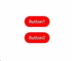
@Styles和@Extend仅仅应用于静态页面的样式复用,stateStyles可以依据组件的内部状态的不同,快速设置不同样式。stateStyles是属性方法,可以根据UI内部状态来设置样式,类似于css伪类,但语法不同。ArkUI提供以下四种状态:
* focused:获焦态。
* normal:正常态。
* pressed:按压态。
* disabled:不可用态。
Button1处于第一个组件,Button2处于第二个组件。按压时显示为pressed态指定的黑色。使用Tab键走焦,先是Button1获焦并显示为focus态指定的粉色。当Button2获焦的时候,Button2显示为focus态指定的粉色,Button1失焦显示normal态指定的红色。
@Entry
@Component
struct StateStylesSample {
build() {
Column() {
Button(‘Button1’)
.stateStyles({
focused: {
.backgroundColor(Color.Pink)
},
pressed: {
.backgroundColor(Color.Black)
},
normal: {
.backgroundColor(Color.Red)
}
})
.margin(20)
Button(‘Button2’)
.stateStyles({
focused: {
.backgroundColor(Color.Pink)
},
pressed: {
.backgroundColor(Color.Black)
},
normal: {
.backgroundColor(Color.Red)
}
})
}.margin(‘30%’)
}
}
运行效果:
最后,为了能够让大家跟上互联网时代的技术迭代,赶上互联网开发人员寒冬期间一波红利,在这里跟大家分享一下我自己近期学习心得以及参考网上资料整理出的一份最新版的鸿蒙学习提升资料,有需要的小伙伴自行领取,限时开源,先到先得~无套路领取!!!

### 🚀写在最后
* 如果你觉得这篇内容对你还蛮有帮助,我想邀请你帮我三个小忙:
* 点赞,转发,有你们的 『点赞和评论』,才是我创造的动力。

讨论HarmonyOS开发技术,专注于API与组件、DevEco Studio、测试、元服务和应用上架分发等。
更多推荐


 5
5 0
0- 0


 已为社区贡献2条内容

所有评论(0)