Harmony NEXT开发之ArkUI线性布局
·
目录
线性布局(LinearLayout)
线性布局是其他布局的基础,Column容器内子元素按照垂直方向排列,Row容器内子元素按照水平方向排列
布局容器:具有布局能力的容器组件,可以承载其他元素作为其子元素,布局容器会对其子元素进行尺寸计算和布局排列。
语法:容器组件(){}
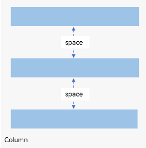
布局子元素在排列方向上的间距
在布局容器内,可以通过space属性设置排列方向上子元素的间距,使各子元素在排列方向上有等间距效果。
Column({ space: 20 }) {
  Text('space: 20').fontSize(15).fontColor(Color.Gray).width('90%')
  Row().width('90%').height(50).backgroundColor(0xF5DEB3)
  Row().width('90%').height(50).backgroundColor(0xD2B48C)
  Row().width('90%').height(50).backgroundColor(0xF5DEB3)

  Row({ space: 35 }) {
  Text('space: 35').fontSize(15).fontColor(Color.Gray)
  Row().width('10%').height(150).backgroundColor(0xF5DEB3)
  Row().width('10%').height(150).backgroundColor(0xD2B48C)
  Row().width('10%').height(150).backgroundColor(0xF5DEB3)
}.width('90%')
}.width('100%')
需要注意的是布局组件常常和内容组件结合使用。这里我们也介绍下Text组件
Text('内容').属性
在布局中自适应拉伸使用Blank(),自适应缩放使用layoutWeight属性,自适应延伸使用1、Scroll组件2、scrollBar属性设置滚动条与edgeEffect属性设置拖动到内容最末端的回弹效果两种形式。
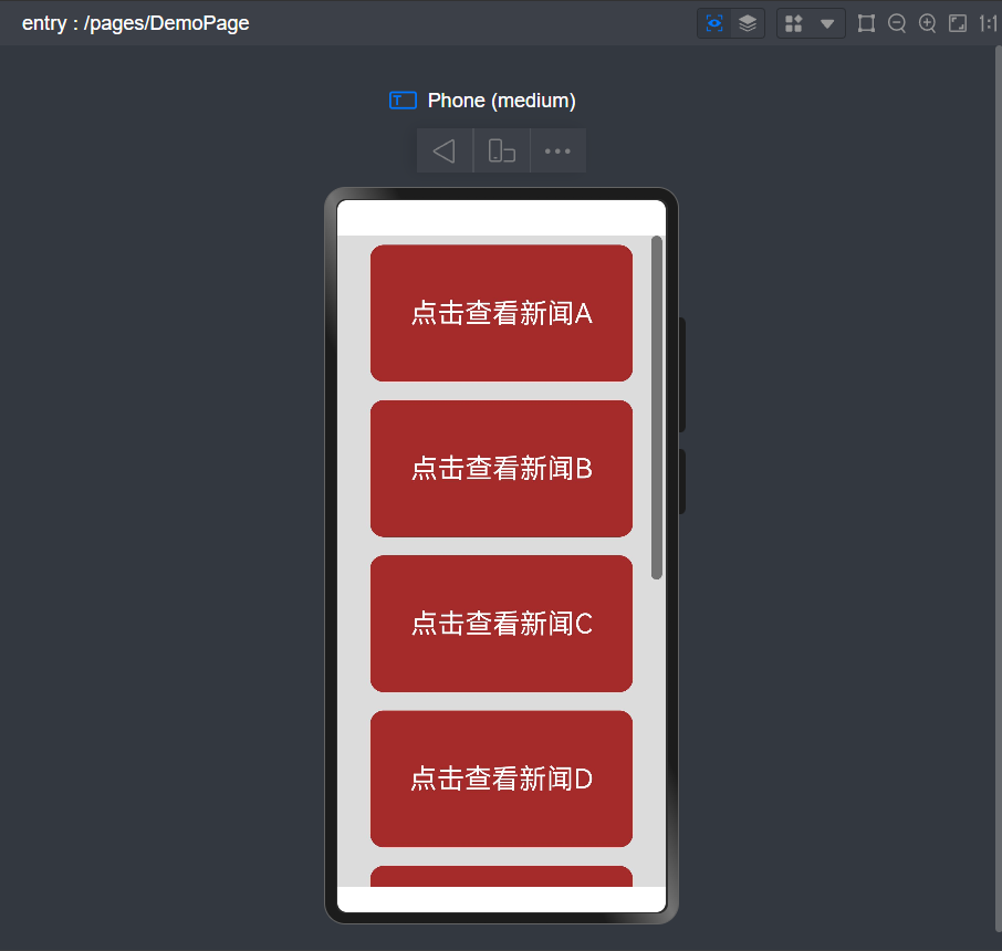
实例代码
@Entry
@Component
struct DemoPage {
  @State message: string = '点击查看新闻';
  scroller: Scroller = new Scroller();
  private str: string[] = ['A', 'B', 'C', 'D', 'E', 'F', 'G', 'H'];

  build() {
    Scroll(this.scroller) {
      Column({ space: 10 }) {
        ForEach(this.str, (item?: string | undefined) => {
          if (item) {
            Text(this.message + item)
              .width('80%')
              .height(150)
              .backgroundColor(Color.Brown)
              .borderRadius(15)
              .fontSize(30)
              .fontColor(Color.White)
              .textAlign(TextAlign.Center)
              .margin({ top: 10 })
          }
        }, (item: number) => item.toString())
      }.width('100%')

    }
    .backgroundColor(0xDCDCDC)
    .scrollable(ScrollDirection.Vertical) // 滚动方向为垂直方向
    .scrollBar(BarState.On) // 滚动条常驻显示
    .scrollBarColor(Color.Gray) // 滚动条颜色
    .scrollBarWidth(12) // 滚动条宽度
    .edgeEffect(EdgeEffect.Spring) // 滚动到边沿后回弹


  }
}

讨论HarmonyOS开发技术,专注于API与组件、DevEco Studio、测试、元服务和应用上架分发等。
更多推荐


 6
6 0
0- 0


 已为社区贡献35条内容

所有评论(0)