HarmonyOS Next-界面级一多开发之栅格布局GridRow&GridCol
·
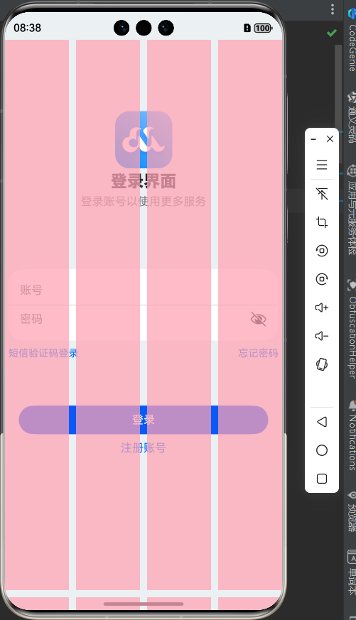
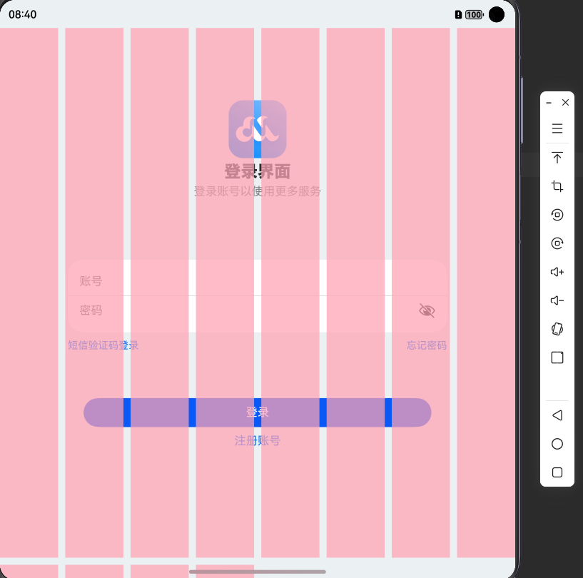
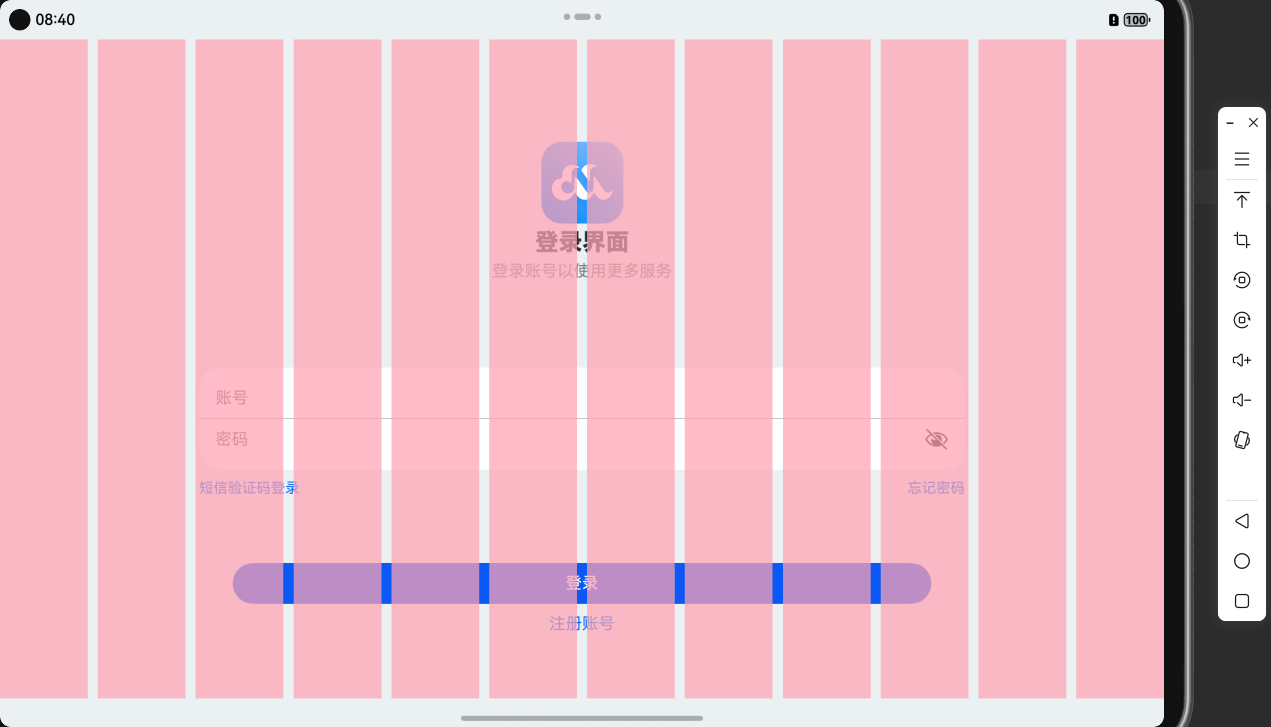
效果:
手机/折叠:
平板:
栅格容器GridRow:
// 行
GridRow(属性){
  // 列
  GridCol(属性){

  }
}
栅格系统断点:
栅格系统以设备的水平宽度(屏幕密度像素值,单位vp)作为断点依据,定义设备的宽度类型,形成了一套断点规则。开发者可根据需求在不同的断点区间实现不同的页面布局效果。
栅格系统默认断点将设备宽度分为xs、sm、md、lg四类,尺寸范围如下:
| 断点名称 | 取值范围(vp) | 设备描述 |
|---|---|---|
| xs | [0, 320) | 最小宽度类型设备。 手表 |
| sm | [320, 520) | 小宽度类型设备。手机 |
| md | [520, 840) | 中等宽度类型设备。折叠 |
| lg | [840, +∞) | 大宽度类型设备。平板 |
GridRow中通过columns设置栅格布局的总列数。
GridCol中通过span设置子组件占栅格布局的列数。offset栅格子组件相对于前一个子组件的偏移列数。
快来试试吧:
@Entry
@Component
struct Demo11_login {
  build() {
    Stack() {
      // 辅助用的栅格(顶层粉色区域)
      GridRow({ gutter: 10, columns: { sm: 4, md: 8, lg: 12 } }) {
        ForEach(Array.from({ length: 12 }), () => {
          GridCol()
            .width('100%')
            .height('100%')
            .backgroundColor('#baffa2b4')
        })
      }
      .zIndex(2)
      .height('100%')

      //  内容区域
      GridRow({
        // TODO 分别设置不同断点的 列数
        columns: {
          sm: 4,
          md: 8,
          lg: 12
        }
      }) {
        // 列
        GridCol({
          // TODO 分别设置不同断点的 所占列数
          span: {
            sm: 4,
            md: 6,
            lg: 8
          },
          // TODO 分别设置不同断点的 偏移
          offset: {
            md: 1,
            lg: 2
          }

        }) {
          Column() {
            // logo+文字
            LogoCom()

            // 输入框 + 底部提示文本
            InputCom()

            // 登录+注册账号按钮
            ButtonCom()

          }
        }
      }
      .width('100%')
      .height('100%')
      .backgroundColor('#ebf0f2')
      .expandSafeArea([SafeAreaType.SYSTEM], [SafeAreaEdge.TOP, SafeAreaEdge.BOTTOM])
    }
  }
}

@Component
struct LogoCom {
  build() {
    Column({ space: 5 }) {
      Image($r('app.media.ic_logo'))
        .width(80)
      Text('登录界面')
        .fontSize(23)
        .fontWeight(900)
      Text('登录账号以使用更多服务')
        .fontColor(Color.Gray)
    }
    .margin({ top: 100 })
  }
}

@Component
struct InputCom {
  build() {
    Column() {
      Column() {
        TextInput({ placeholder: '账号' })
          .backgroundColor(Color.Transparent)
        Divider()
          .color(Color.Gray)
        TextInput({ placeholder: '密码' })
          .type(InputType.Password)
          .backgroundColor(Color.Transparent)

      }
      .backgroundColor(Color.White)
      .borderRadius(20)
      .padding({ top: 10, bottom: 10 })

      Row() {
        Text('短信验证码登录')
          .fontColor('#006af7')
          .fontSize(14)
        Text('忘记密码')
          .fontColor('#006af7')
          .fontSize(14)
      }
      .width('100%')
      .justifyContent(FlexAlign.SpaceBetween)
      .margin({ top: 10 })

    }
    .padding(5)
    .margin({ top: 80 })

  }
}

@Component
struct ButtonCom {
  build() {
    Column({ space: 10 }) {
      Button('登录')
        .width('90%')
      Text('注册账号')
        .fontColor('#006af7')
        .fontSize(16)
    }
    .margin({ top: 60 })
  }
}
讨论HarmonyOS开发技术,专注于API与组件、DevEco Studio、测试、元服务和应用上架分发等。
更多推荐

 6
6 0
0- 0


 已为社区贡献10条内容

所有评论(0)