ArkTS高效开发实战:手把手教你打造高复用性下拉菜单列表组件库
·
📌 导语
“在ArkTS应用开发中,你是否遇到过这些痛点?传统下拉列表难以适配动态数据、缺乏多选能力、无法联动筛选… 我通过构建组件字典中的下拉模块,创新性地实现了可配置化下拉系统。本文将通过组件字典完整解密架构设计的全流程方案,让你的开发效率提升300%!”
快捷到达想看的地方
一、开发特点
目前官方arkUI没有提供与下拉菜单有关的方法,我们无法通过arkts提供的基本UI来实现这个效果,但可以通过ForEach,if 语法等动态UI操作来模拟生成下拉列表。
该项目通过汲取社区的一些优秀精华,模拟构建一个适合新手入门和学习的下拉菜单组件字典。自定义增加了软件可拓展性,非常具有学习的必要。
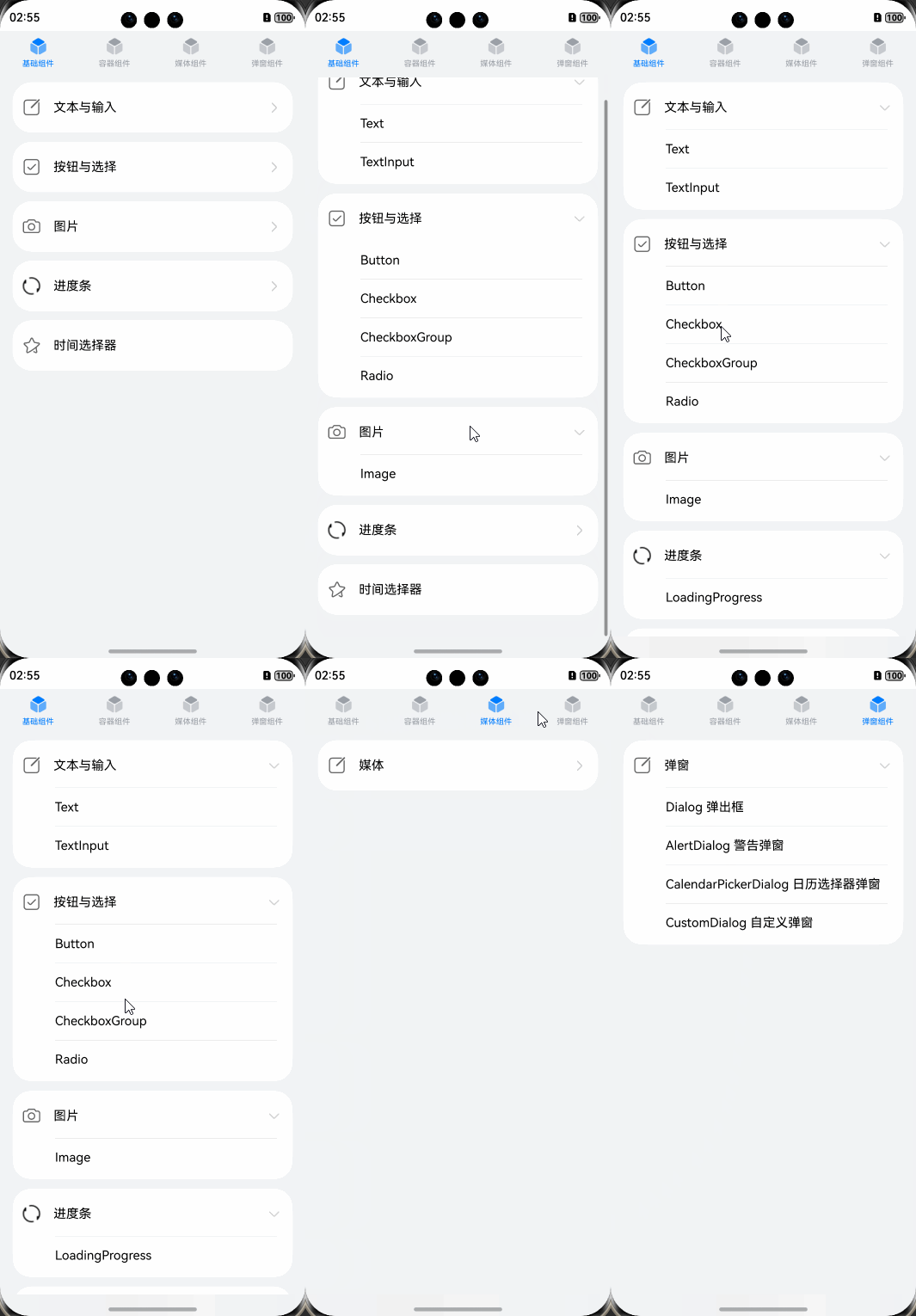
二、成品展示
这里展示组件下拉菜单的基本效果,上端使用了tabs组件编写导航栏,下方则为下拉列表,
三、项目结构说明
src/  //存放所有与项目逻辑相关的代码文件
├── main/ 	//包含应用程序的核心模块和组件。
│   ├── ets/	//用于存放与 ArkTS(或类似框架)相关的代码。
│   │   ├── common/	//存放可复用的工具类、辅助函数等。
│   │   ├── data/ 	//存放数据,这里的data层是不必要的,由于组件数据较多。写在文件里有点乱,这里分了一层
│   │   ├── entryability/ 	//存放与应用入口相关的逻辑,例如启动时的初始化逻辑。
│   │   ├── entrybackupability/	//存放备用入口逻辑,可能用于异常情况下的备份入口。
│   │   ├── models/ //存放与数据结构相关的类或接口定义
│   │   ├── pages/ //存放各个页面的逻辑、UI 组件等。
│   │   └── util/ //存放通用工具函数、辅助方法等。
│   └── module.json5 //项目配置文件
└── resources/ //存放静态资源文件,如图片、字体、样式文件等。
1. Model层代码说明
DataType.ets
/**
 * 一级分类数据结构
 *
 * @property childNodes - 子节点数组,可包含二级或三级分类数据
 * @property selectedImage - 选中状态图标资源
 * @property unselectedImage - 未选中状态图标资源
 * @property tabBarName - 标签栏显示名称,支持资源引用或直接字符串
 */
export interface FirstLevelCategory {
  childNodes: SecondLevelCategory[] | ThirdLevelCategory[],
  selectedImage: Resource,
  unselectedImage: Resource,
  tabBarName: Resource | string
}

/**
 * 二级分类数据结构
 *
 * @property title - 分类标题资源引用
 * @property childNodes - 子节点数组,仅包含三级分类数据
 */
export interface SecondLevelCategory {
  title: Resource,
  childNodes: ThirdLevelCategory[]
}

/**
 * 三级分类数据结构
 *
 * @property image - 分类图标资源
 * @property title - 显示标题,支持资源引用或直接字符串
 * @property url - 可选字段,关联的跳转链接
 * @property childNodes - 可选子节点数组,包含四级分类数据
 */
export interface ThirdLevelCategory {
  image: Resource,
  title: Resource | string,
  url?: string,
  childNodes?: FourthLevelCategory[]
}

/**
 * 四级分类数据结构
 *
 * @property title - 显示标题,支持资源引用或直接字符串
 * @property url - 关联的跳转链接
 */
export interface FourthLevelCategory {
  title: Resource | string,
  url: string
}
四、核心代码实现
1. tabs导航栏的实现
import { COLLECTION_CATEGORIES } from '../data/data';
import { TabContentNavigation } from '../common/TabContentNavigation';
import { FirstLevelCategory } from '../models/DataType';

@Entry
@Component
struct Index {
  @State tabsIndex: number = 0; //判断当前选中的导航栏下标,控制选中变色

  build() {
    //导航栏
    Tabs() {
    //COLLECTION_CATEGORIES数组是一个分类数组,内部存储了四种容器的图片,描述,和子分类信息
      ForEach(COLLECTION_CATEGORIES, (item: FirstLevelCategory, index: number) => {
        TabContent() {
          //内容区传入自定义组件下拉列表
          TabContentNavigation({ categories: item.childNodes }) //下拉菜单核心构造组件,下方详细介绍
        }
        .tabBar(this.TabBarBuilder(index, item.selectedImage, item.unselectedImage, item.tabBarName))
        //这里调用下方TabBar构造器,传入item中的图片和描述构造导航栏
      })
    }
    .barWidth('100%')
    .vertical(false)
    .backgroundColor($r('app.color.background_shallow_grey'))
    .onChange((index: number) => {
      this.tabsIndex = index;
    })
  }

  //导航栏构造器,构造上组件下描述的容器
  @Builder
  TabBarBuilder(index: number, selectedImage: Resource, unselectedImage: Resource, tabBarName: Resource | string) {
    Column() {
      Image(this.tabsIndex === index ? selectedImage : unselectedImage)
        .width(24)
        .height(24)
        .margin({ bottom: 4 })

      Text(tabBarName)
        .fontSize(10)
        .fontFamily('HarmonyHeiTi-Medium')
        .fontColor(this.tabsIndex === index ? $r('app.color.tab_bar_select') : $r('app.color.tab_bar_unselect'))
    }
    .width('100%')
    .padding({ top: 6, bottom: 6 })
    .alignItems(HorizontalAlign.Center)
    .id(`tabBar${index}`)
  }
}
2. TabContentNavigation 下拉菜单及跳转的实现
import { router } from '@kit.ArkUI';
import { FourthLevelCategory, SecondLevelCategory, ThirdLevelCategory } from '../models/DataType';

/**
 * 扩展Column组件的样式函数
 *
 * 该函数通过@Extend装饰器为Column组件添加通用样式配置,包含以下属性设置:
 * - 宽度设置为父容器的100%
 * - 圆角半径设置为24单位
 * - 背景颜色设置为白色
 * - 内边距设置:左右边距12单位,上下边距4单位
 *
 * @无显式参数 通过链式调用直接配置组件属性
 * @无返回值 通过装饰器机制直接修改组件样式
 */
@Extend(Column)
function ColumnStyle() {
  .width('100%')
  .borderRadius(24)
  .backgroundColor(Color.White)
  .padding({ left: 12, right: 12, bottom: 4, top: 4 })
}

//根据分类层级动态渲染不同的导航结构
@Component
export struct TabContentNavigation {
  // 存储二/三级分类数据的数组
  private categories: ThirdLevelCategory[] | SecondLevelCategory[] = new Array;
  // 判断是否是二级分类
  /*
  我自己学习的时候在这里看不明白,为什么把三级导航栏传进去判断,那category不一定有image属性了吗?

	正解如下:
	该方法通过类型断言接收参数后,实际运行时仍依赖动态属性检查。虽然参数被强制转换为
	ThirdLevelCategory类型,但若实际传入的是SecondLevelCategory对象(无image属性),
	category.image将返回undefined,此时仍能正确识别为二级分类,类型断言不会影响实际对象属性结构。
	*/
  hasSecondLevelCategory(category: ThirdLevelCategory) {
    return category && category.image ? false : true;
  }

  build() {
    Column() {
      List() {
        if (this.hasSecondLevelCategory(this.categories[0] as ThirdLevelCategory)) {
          ForEach(this.categories, (secondLevelCategory: SecondLevelCategory, secondLevelCategoryIndex: number) => {
            ListItem() {
              Column() {
                Text(secondLevelCategory.title)
                  .height(48)
                  .fontSize(14)
                  .width('100%')
                  .textAlign(TextAlign.Start)
                  .fontFamily('HarmonyHeiTi-Medium')
                  .fontColor($r('app.color.font_color_shallow'))
                  .padding({ bottom: 4, top: 4, left: 24 })

                Column() {
                  ForEach(secondLevelCategory.childNodes, (thirdLevelCategory: ThirdLevelCategory,
                                                           thirdLevelCategoryIndex: number) => {
                    ThirdLevelNavigation({
                      thirdLevelCategory: thirdLevelCategory,
                      secondLevelCategoryIndex: secondLevelCategoryIndex,
                      ThirdLevelNavigationIndex: thirdLevelCategoryIndex
                    })
                  })
                }
                .ColumnStyle()
              }
            }
            .id('ListItem' + secondLevelCategoryIndex)
          })
        } else {
          ForEach(this.categories, (thirdLevelCategory: ThirdLevelCategory) => {
            ListItem() {
              Column() {
                ThirdLevelNavigation({ thirdLevelCategory: thirdLevelCategory })
              }
              .ColumnStyle()
            }
            .margin({ top: 6, bottom: 6 })
          })
        }
      }
      .width('100%')
      .layoutWeight(1)
      .padding({ left: 16, right: 16, top: 4 })
      .id('list_001')

      Blank()
    }
    .height('100%')
  }
}

/**
 * 三级导航菜单组件
 *
 * @Component 标识为自定义组件
 *
 * @prop {boolean} isUnfold - 控制当前三级菜单是否展开
 * @prop {ThirdLevelCategory | null} thirdLevelCategory - 当前三级分类数据
 * @prop {number} ThirdLevelNavigationIndex - 当前三级导航在二级分类中的索引位置
 * @prop {number} secondLevelCategoryIndex - 对应的二级分类索引
 */
@Component
struct ThirdLevelNavigation {
  @State isUnfold: boolean = false;
  private thirdLevelCategory: ThirdLevelCategory | null = null;
  private ThirdLevelNavigationIndex: number = 0;
  private secondLevelCategoryIndex: number = 0;

  /**
   * 组件构建函数
   * 根据三级分类数据渲染可折叠的导航菜单项
   * 包含图标、标题和展开指示器
   */
  build() {
    if (this.thirdLevelCategory) {
      Column() {
        /* 三级菜单主行:包含图标、标题和展开指示箭头 */
        Row() {
          // 左侧分类图标
          Image(this.thirdLevelCategory.image)
            .width(24)
            .height(24)
            .objectFit(ImageFit.Fill)

          // 分类标题文本
          Text(this.thirdLevelCategory.title)
            .fontSize(16)
            .margin({ left: 16 })
            .fontFamily('HarmonyHeiTi-Medium')
            .fontColor($r('app.color.font_color_dark'))

          Blank()

          /* 动态展开指示器:根据是否展开显示不同图标 */
          if (this.thirdLevelCategory.childNodes) {
            Image(this.isUnfold ? $r('app.media.ic_down_arrow') : $r('app.media.ic_right_arrow'))
              .width(this.isUnfold ? 24 : 12)
              .height(this.isUnfold ? 12 : 24)
              .margin({ right: this.isUnfold ? 0 : 6 })
          }
        }
        .height(56)
        .width('100%')
        /* 点击事件处理:无子节点时跳转页面,有子节点时切换展开状态 */
        .onClick(() => {
          if (this.thirdLevelCategory) {
            if (this.thirdLevelCategory.childNodes === undefined) {
              router.pushUrl({
                url: this.thirdLevelCategory.url as string
              })
            } else {
              this.isUnfold = !this.isUnfold;
            }
          }
        })

        /* 展开时显示的四级分类内容区域 */
        if (this.isUnfold) {
          ForEach(this.thirdLevelCategory.childNodes, (fourthLevelCategory: FourthLevelCategory) => {
            Column() {
              // 子菜单项之间的分割线
              Divider()
                .height(1)
                .opacity(0.2)
                .margin({ left: 42, right: 8 })
                .color($r('app.color.font_color_dark'))

              // 递归渲染四级导航组件
              FourthLevelNavigation({ fourthLevelCategory: fourthLevelCategory })
            }
          })
        }
      }
      // The whole string will be recognized as line break, causing malfunction. It can only be placed in a single line. 1 and 0 are the index of the home page title level.
      .id(`secondLevelMenu${this.secondLevelCategoryIndex}${this.secondLevelCategoryIndex === 1 ? 0 : this.ThirdLevelNavigationIndex}`)
    }
  }
}

/**
 * 四级导航项自定义组件
 *
 * @struct FourthLevelNavigation - 定义四级导航项组件结构
 * @param {FourthLevelCategory | null} fourthLevelCategory - 四级分类数据对象(可选),包含标题和跳转URL
 */
@Component
struct FourthLevelNavigation {
  private fourthLevelCategory: FourthLevelCategory | null = null;

  /**
   * 构建组件布局
   *
   * 1. 创建横向布局容器
   * 2. 当有分类数据时显示标题文本
   * 3. 设置点击跳转逻辑
   */
  buil
  d() {
    Row() {
      if (this.fourthLevelCategory) {
        Text(this.fourthLevelCategory.title)
          .fontSize(16)
          .layoutWeight(1)
          .margin({ left: 42 })
          .align(Alignment.Start)
          .fontFamily('HarmonyHeiTi-Medium')
          .fontColor($r('app.color.font_color_dark'))
      }
      Blank()
    }
    .height(48)
    .width('100%')
    .onClick(() => {
      if (this.fourthLevelCategory) {
        // 检查有无分类数据,有则跳转至对应页面
        router.pushUrl({
          url: this.fourthLevelCategory.url
        })
      }
    })
  }
}
3. 部分组件页面实现
TextPage.ets 的实现
// 引入必要模块
import { TitleBar } from '../../common/TitleBar';

interface GeneratedTypeLiteralInterface_1 {
  width?: number;
  height?: number;
}

@Entry
@Component
struct TextExample {
  // 状态管理
  @State fontSize: number = 20;          // 字体大小
  @State fontColor: Color = Color.Black; // 字体颜色
  @State lineHeight: number = 30;        // 行高
  @State textAlign: TextAlign = TextAlign.Start; // 对齐方式
  @State maxLines: number = 2;           // 最大行数
  @State textDecoration: TextDecorationType = TextDecorationType.None; // 装饰线
  @State letterSpacing: number = 2;      // 字符间距
  @State textSize: GeneratedTypeLiteralInterface_1 = {}; // 文本尺寸

  build() {
    Column({ space: 5 }) {
      TitleBar({title: "Text"})
      // 标题文本
      Text('ArkTS文本组件演示')
        .fontSize(24)
        .fontColor(Color.Blue)
        .margin({ bottom: 20 })

      // 主内容区域
      Scroll() {
        Column({ space: 15 }) {
          // 动态文本展示区
          Column() {
            Text('这是一个可交互的文本示例:\nHello ArkTS!')
              .fontSize(this.fontSize)
              .fontColor(this.fontColor)
              .textAlign(this.textAlign)
              .lineHeight(this.lineHeight)
              .maxLines(this.maxLines)
              .decoration({ type: this.textDecoration })
              .letterSpacing(this.letterSpacing)
              .textOverflow({ overflow: TextOverflow.Ellipsis })
              .onAreaChange((_, newValue) => {
                // 获取文本渲染尺寸
                this.textSize = {
                  width: Math.floor(vp2px(parseFloat(newValue.width.toString()))),
                  height: Math.floor(vp2px(parseFloat(newValue.height.toString())))
                }
              })
              .border({ width: 1, color: Color.Grey }) // 调试边框
              .padding(10)
              .width('90%')

            // 尺寸显示
            Row({ space: 20 }) {
              Text(`宽度:${this.textSize.width ?? 0}px`)
              Text(`高度:${this.textSize.height ?? 0}px`)
            }
            .margin({ top: 10 })
          }
          .padding(15)
          .backgroundColor(Color.White)
          .borderRadius(12)

          // 控制面板
          Column({ space: 10 }) {
            // 字号控制
            Row({ space: 10 }) {
              Button('增大字号 +')
                .onClick(() => this.fontSize = Math.min(40, this.fontSize + 2))

              Button('减小字号 -')
                .onClick(() => this.fontSize = Math.max(12, this.fontSize - 2))
            }

            // 颜色切换
            Button('切换颜色')
              .onClick(() => {
                this.fontColor = this.fontColor === Color.Black
                  ? Color.Red : Color.Black
              })

            // 对齐方式切换
            Button('切换对齐')
              .onClick(() => {
                this.textAlign = this.textAlign === TextAlign.Start
                  ? TextAlign.Center : TextAlign.Start
              })

            // 装饰线切换
            Button('切换装饰线')
              .onClick(() => {
                this.textDecoration = this.textDecoration === TextDecorationType.None
                  ? TextDecorationType.Underline : TextDecorationType.None
              })
          }
          .padding(15)
          .backgroundColor(Color.White)
          .borderRadius(12)
        }
      }
      .width('100%')
    }
    .width('100%')
    .justifyContent(FlexAlign.Start)
    .backgroundColor('#F5F5F5')
  }
}
RowPage.ets的实现
import { TitleBar } from '../../common/TitleBar'

// xxx.ets
@Entry
@Component
struct RowExample {
  build() {
    Column({ space: 5 }) {
      TitleBar({title: 'Row'})
      // 设置子组件水平方向的间距为5
      Text('space').width('90%')
      Row({ space: 5 }) {
        Row().width('30%').height(50).backgroundColor(0xAFEEEE)
        Row().width('30%').height(50).backgroundColor(0x00FFFF)
      }.width('90%').height(107).border({ width: 1 })

      // 设置子元素垂直方向对齐方式
      Text('alignItems(Bottom)').width('90%')
      Row() {
        Row().width('30%').height(50).backgroundColor(0xAFEEEE)
        Row().width('30%').height(50).backgroundColor(0x00FFFF)
      }.width('90%').alignItems(VerticalAlign.Bottom).height('15%').border({ width: 1 })

      Text('alignItems(Center)').width('90%')
      Row() {
        Row().width('30%').height(50).backgroundColor(0xAFEEEE)
        Row().width('30%').height(50).backgroundColor(0x00FFFF)
      }.width('90%').alignItems(VerticalAlign.Center).height('15%').border({ width: 1 })

      // 设置子元素水平方向对齐方式
      Text('justifyContent(End)').width('90%')
      Row() {
        Row().width('30%').height(50).backgroundColor(0xAFEEEE)
        Row().width('30%').height(50).backgroundColor(0x00FFFF)
      }.width('90%').border({ width: 1 }).justifyContent(FlexAlign.End)

      Text('justifyContent(Center)').width('90%')
      Row() {
        Row().width('30%').height(50).backgroundColor(0xAFEEEE)
        Row().width('30%').height(50).backgroundColor(0x00FFFF)
      }.width('90%').border({ width: 1 }).justifyContent(FlexAlign.Center)
    }.width('100%')
  }
}
五.由于项目比较多的东西,在这里就不多赘述了,点赞收藏,私信可以给源码

讨论HarmonyOS开发技术,专注于API与组件、DevEco Studio、测试、元服务和应用上架分发等。
更多推荐



 5
5 0
0- 0


 已为社区贡献7条内容

所有评论(0)