鸿蒙开发ArkTS组件之Tabs( )篇
·
简介
Tabs( )组件是鸿蒙开发中常用的一种容器组件,通过页签进行内容视图的切换,每个页签对应一个内容视图。完整使用可查看官方文档Tabs( )
使用方法
Tabs( )的子组件仅可包含 TabContent( ),而且TabContent( )的子组件只能有一个,比如:
// 错误示范 1
Tabs() {
TabContent() {
}
// Tabs()组件的子组件仅可包含 TabContent()
Column() {
}
}
// 错误示范 2
Tabs() {
// TabContent()的子组件只能有一个
TabContent() {
Column() {}
Column() {}
}
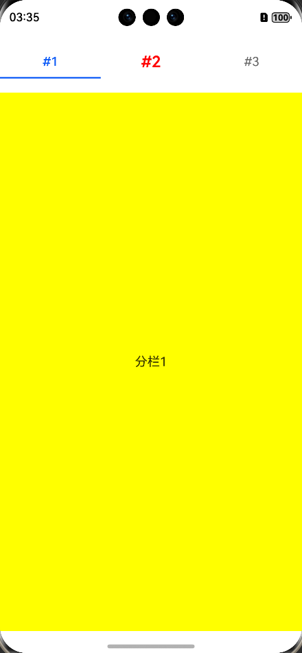
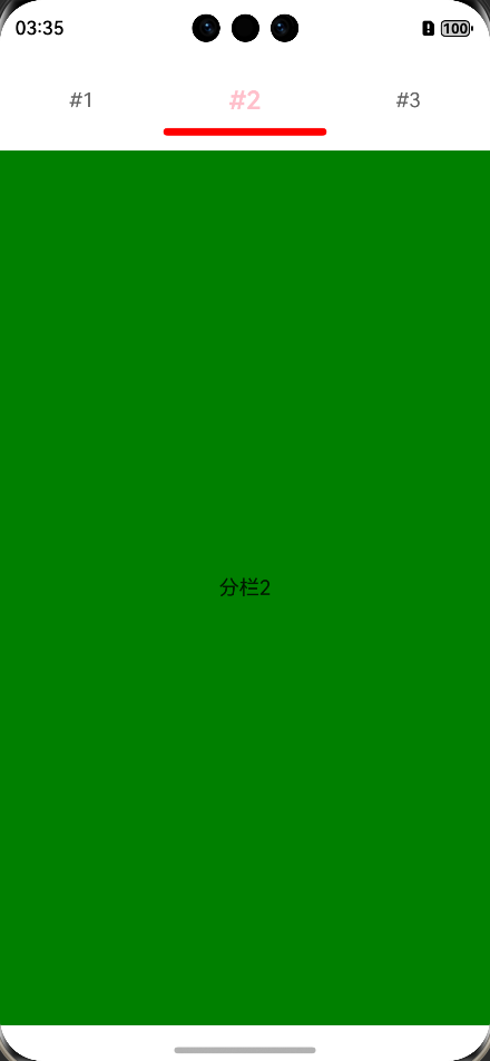
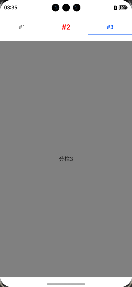
}我们可以在 tabBar( )属性中,通过 indicator 和 labelStyle 来设置下划线和文本字体的样式,以下列出常用的,仅供参考(仅为部分代码,完整代码请从文档最后的git仓库链接中下载)。
Tabs() {
  TabContent() {
    Text("分栏2")
  }
  .backgroundColor(Color.Green)
  .tabBar(SubTabBarStyle.of("#2")
    .indicator({
      color: Color.Red, // 下划线颜色
      height: 6, // 下划线高度(不支持百分比),默认是2
      width: this.screenWidth / 3, // 下划线宽度(不支持百分比)
      marginTop: 10, // 下划线与文字的间距(不支持百分比设置)
      borderRadius: 3  // 下划线的圆角半径(不支持百分比设置)
    })
    .labelStyle({
      font: { size: 20, weight: 600 }, // 设置字体样式:大小、粗细……
      selectedColor: Color.Pink, // 选中时的字体颜色
      unselectedColor: Color.Red  // 未选中时的字体颜色
    })
  )
}
效果图如下:
 |
 |
 |
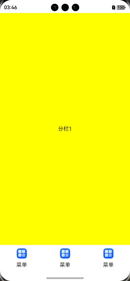
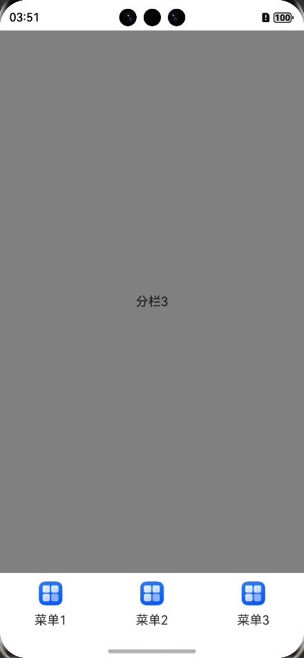
此外, tabBar( )的参数还可以通过自己传入Builder构造函数来自定义导航栏,而且一般会通过参数 barPosition 把导航栏的位置放在页面下方,这种也是实际开发中较为常用的方法。但如果自定义导航栏,就没有下划线的效果了,示例如下:
// 自定义导航栏样式
@Builder
tabBarBuilder() {
  Column({ space: 10 }) {
    Image($r('app.media.startIcon'))
      .width(30)
    Text("菜单")
  }
}

// barPosition 参数可修改导航栏的位置,仅支持 Start 和 End
Tabs({ barPosition: BarPosition.End }) {
  TabContent() {
    Text("分栏1")
  }
  .backgroundColor(Color.Yellow)
  .tabBar(this.tabBarBuilder()) // 如果自定义导航栏,则没有下划线效果

  TabContent() {
    Text("分栏2")
  }
  .backgroundColor(Color.Green)
  .tabBar(this.tabBarBuilder())
}
效果如图:
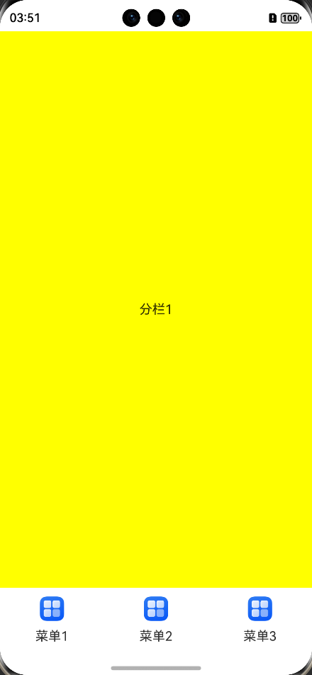
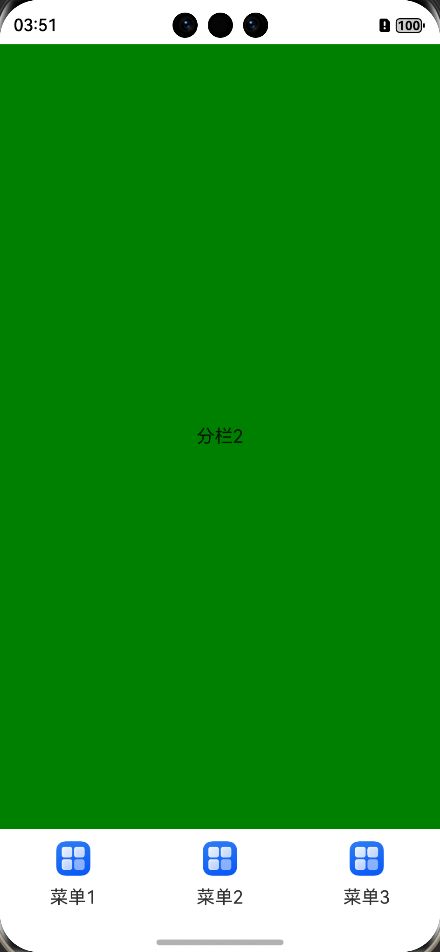
当然,使用自定义导航栏时,也支持自己传入图标及文本,示例如下:
// 自定义导航栏样式
@Builder
tabBarBuilder(icon: ResourceStr, txt: string) {
  Column({ space: 10 }) {
    Image(icon)
      .width(30)
    Text(txt)
  }
}

Tabs({ barPosition: BarPosition.End }) {
  TabContent() {
    Text("分栏1")
  }
  .backgroundColor(Color.Yellow)
  .tabBar(this.tabBarBuilder($r("app.media.startIcon"), "菜单1"))

  TabContent() {
    Text("分栏2")
  }
  .backgroundColor(Color.Green)
  .tabBar(this.tabBarBuilder($r("app.media.startIcon"), "菜单2"))
}
效果如图:
 |
 |
 |
详细代码可通过点击ArkTS组件之Tabs( )篇下载。

讨论HarmonyOS开发技术,专注于API与组件、DevEco Studio、测试、元服务和应用上架分发等。
更多推荐


 7
7 0
0- 0


 已为社区贡献9条内容

所有评论(0)