#跟着若城学鸿蒙# UI组件篇-Blank及其属性
其中,用于的initialize接口的入参,入参为Blank组件的构造函数类型;用于的attribute接口的返回值,返回Blank组件的属性设置对象。不允许添加子组件。仅当父组件为Row、Column或Flex时生效。在容器主轴方向上自动填充空余部分。Blank组件是ArkUI中一个非常有用的布局组件,主要用于在容器主轴方向上自动填充空余部分。通过合理使用Blank组件,可以实现自适应拉伸效果,
ArkUI中的Blank组件是一个非常实用的布局组件,主要用于在容器主轴方向上自动填充空余部分。它在ArkUI的布局体系中扮演着重要的角色,特别是在需要实现自适应拉伸效果的场景中。本文将详细介绍Blank组件的定义、属性、使用场景以及与其他组件的配合使用。
一、Blank组件的定义
Blank组件属于ArkUI中的FrameNode节点类型,其定义如下:
type Blank = TypedFrameNode<BlankInterface, BlankAttribute> 其中,BlankInterface用于TypedFrameNode的initialize接口的入参,入参为Blank组件的构造函数类型;BlankAttribute用于TypedFrameNode的attribute接口的返回值,返回Blank组件的属性设置对象。
Blank组件的主要特点是:
- 不允许添加子组件。
- 仅当父组件为Row、Column或Flex时生效。
- 在容器主轴方向上自动填充空余部分。
二、Blank组件的属性
Blank组件支持以下属性:
1. min
min属性用于设置Blank组件在容器主轴上的最小大小。默认值为0,可以是number或string类型。number类型单位为vp,string类型可以显式指定像素单位,如'10px'。不指定像素单位时,默认单位为vp,如'10',等同于10vp。不支持设置百分比。负值使用默认值。当最小值大于容器可用空间时,使用最小值作为自身大小并超出容器。
| 参数名 | 类型 | 必填 | 说明 |
|---|---|---|---|
| min | number | string | 否 |
2. color
color属性用于设置Blank组件的填充颜色。
| 参数名 | 类型 | 必填 | 说明 |
|---|---|---|---|
| value | ResourceColor | 是 | 空白填充的填充颜色。默认值:Color.Transparent |
三、Blank组件的使用场景
Blank组件主要用于以下场景:
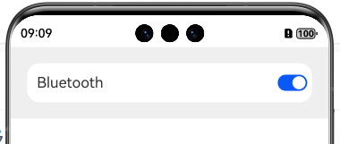
1. 自适应拉伸
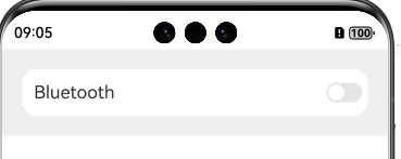
在容器主轴方向上,Blank组件可以自动填充空余部分,实现自适应拉伸效果。例如,在Row或Column容器中,通过添加Blank组件,可以使其他组件在容器大小变化时自动调整位置和大小。
@Entry
@Component
struct BlankExample {
  build() {
    Column() {
      Row() {
        Text('Bluetooth').fontSize(18)
        Blank()
        Toggle({ type: ToggleType.Switch })
          .margin({
            top: 14,
            bottom: 14,
            left: 6,
            right: 6
          })
      }.width('100%').backgroundColor(0xFFFFFF).borderRadius(15).padding({ left: 12 })
    }.backgroundColor(0xEFEFEF).padding(20)
  }
}
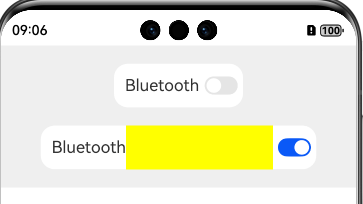
2. 填充固定宽度
当父组件未设置宽度时,可以通过设置Blank组件的min属性来填充固定宽度。
@Entry
@Component
struct BlankExample {
  build() {
    Column({
      space: 20
    }) {
      // blank父组件不设置宽度时,Blank失效,可以通过设置min最小宽度填充固定宽度
      Row() {
        Text('Bluetooth').fontSize(18)
        Blank().color(Color.Yellow)
        Toggle({ type: ToggleType.Switch })
          .margin({
            top: 14,
            bottom: 14,
            left: 6,
            right: 6
          })
      }.backgroundColor(0xFFFFFF).borderRadius(15).padding({ left: 12 })

      Row() {
        Text('Bluetooth')
          .fontSize(18)
        // 设置最小宽度为160
        Blank('160').color(Color.Yellow)
        Toggle({ type: ToggleType.Switch })
          .margin({
            top: 14,
            bottom: 14,
            left: 6,
            right: 6
          })
      }.backgroundColor(0xFFFFFF).borderRadius(15).padding({ left: 12 })
    }.backgroundColor(0xEFEFEF).padding(20).width('100%')
  }
}
四、Blank组件与其他组件的配合使用
Blank组件通常与其他布局组件(如Row、Column、Flex)配合使用,以实现复杂的布局效果。
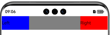
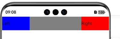
1. 与Row组件配合
在Row组件中,Blank组件可以用于在水平方向上填充空余空间。
@Entry
@Component
struct RowBlankExample {
  build() {
    Row() {
      Text('Left').width(100).height(50).backgroundColor(Color.Blue)
      Blank()
      Text('Right').width(100).height(50).backgroundColor(Color.Red)
    }.width('100%').height(50).backgroundColor(Color.Gray)
  }
} 
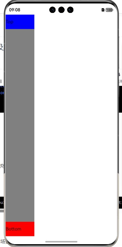
2. 与Column组件配合
在Column组件中,Blank组件可以用于在垂直方向上填充空余空间。
@Entry
@Component
struct ColumnBlankExample {
  build() {
    Column() {
      Text('Top').width(100).height(50).backgroundColor(Color.Blue)
      Blank()
      Text('Bottom').width(100).height(50).backgroundColor(Color.Red)
    }.width(100).height('100%').backgroundColor(Color.Gray)
  }
} 
3. 与Flex组件配合
在Flex组件中,Blank组件可以用于在主轴方向上填充空余空间。
@Entry
@Component
struct FlexBlankExample {
  build() {
    Flex({ direction: FlexDirection.Row, justifyContent: FlexAlign.SpaceBetween }) {
      Text('Left').width(100).height(50).backgroundColor(Color.Blue)
      Blank()
      Text('Right').width(100).height(50).backgroundColor(Color.Red)
    }.width('100%').height(50).backgroundColor(Color.Gray)
  }
} 
五、Blank组件的示例
以下是一些Blank组件的使用示例,展示了其在不同场景下的应用效果。
示例1:占满空余空间
@Entry
@Component
struct BlankExample {
  build() {
    Column() {
      Row() {
        Text('Bluetooth').fontSize(18)
        Blank()
        Toggle({ type: ToggleType.Switch })
          .margin({
            top: 14,
            bottom: 14,
            left: 6,
            right: 6
          })
      }.width('100%').backgroundColor(0xFFFFFF).borderRadius(15).padding({ left: 12 })
    }.backgroundColor(0xEFEFEF).padding(20)
  }
} 
示例2:填充固定宽度
@Entry
@Component
struct BlankExample {
  build() {
    Column({
      space: 20
    }) {
      // blank父组件不设置宽度时,Blank失效,可以通过设置min最小宽度填充固定宽度
      Row() {
        Text('Bluetooth').fontSize(18)
        Blank().color(Color.Yellow)
        Toggle({ type: ToggleType.Switch })
          .margin({
            top: 14,
            bottom: 14,
            left: 6,
            right: 6
          })
      }.backgroundColor(0xFFFFFF).borderRadius(15).padding({ left: 12 })

      Row() {
        Text('Bluetooth')
          .fontSize(18)
        // 设置最小宽度为160
        Blank('160').color(Color.Yellow)
        Toggle({ type: ToggleType.Switch })
          .margin({
            top: 14,
            bottom: 14,
            left: 6,
            right: 6
          })
      }.backgroundColor(0xFFFFFF).borderRadius(15).padding({ left: 12 })
    }.backgroundColor(0xEFEFEF).padding(20).width('100%')
  }
} 
六、Blank组件的注意事项
在使用Blank组件时,需要注意以下几点:
- Blank组件不允许添加子组件。
- Blank组件仅当父组件为Row、Column或Flex时生效。
- Blank组件的
min属性用于设置最小大小,不支持百分比。 - Blank组件的
color属性用于设置填充颜色,默认值为透明。
七、总结
Blank组件是ArkUI中一个非常有用的布局组件,主要用于在容器主轴方向上自动填充空余部分。通过合理使用Blank组件,可以实现自适应拉伸效果,使界面在不同设备和屏幕尺寸下都能保持良好的显示效果。结合其他布局组件(如Row、Column、Flex),Blank组件可以构建出复杂而灵活的布局结构,满足各种应用场景的需求。
----
以上

讨论HarmonyOS开发技术,专注于API与组件、DevEco Studio、测试、元服务和应用上架分发等。
更多推荐


 24
24 0
0- 0


 已为社区贡献255条内容

所有评论(0)