HarmonyOS应用基础阶段- 06、ArkUI框架—基础布局
文章目录
1、设计资源-图标库
HarmonyOS 图标库为 HarmonyOS 开发者提供丰富的在线图标资源,涵盖多种使用场景以及风格分类,提供灵活的颜色、大小和格式定义,满足不同角色的下载需求

使用步骤:设计师提供图标/下载图标 → 使用图标
1.1下载图标
● HarmonyOS 图标库
● IconFont 图标库
进入图标库网站,下载 SVG 格式,存储到工程目录:resources/base/media/
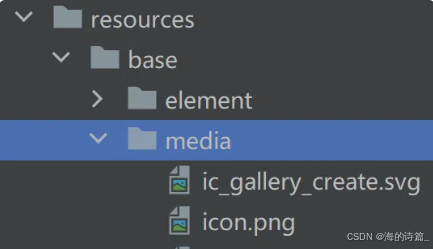
HarmonyOS 图标默认命名以 ic_ 开头,其他图标库下载的图标素材建议修改为与 HarmonyOS 命名规则相同。
1.2使用图标
使用 Image 组件显示图标,添加 fillColor() 属性修改图标颜色
@Entry
@Component
struct Index {

  build() {
    Column() {
      Image($r('app.media.ic_gallery_create'))
        .width(30)
        .aspectRatio(1)
        .fillColor('#f60')
    }
      .padding(20)
  }
}
2、布局属性
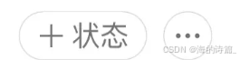
微信个人中心部分区域
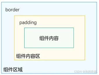
组件布局
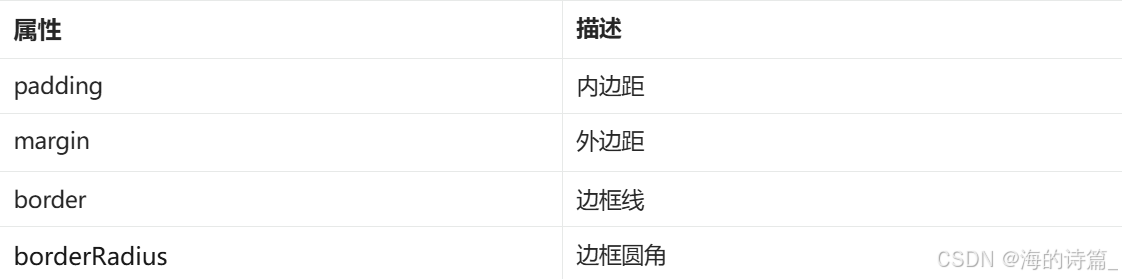
2.1内边距 padding
作用:在组件内添加间距,拉开内容与组件边缘之间的距离

属性:数字 或 对象{}
● 数字:上下左右内边距相同
● 对象{}:配合 left、right、top、bottom 单独设置某个方向内边距
内边距
@Entry
@Component
struct Index {
  build() {
    Column() {
      Text('文字')
        .backgroundColor(Color.Pink)
        // 单值:四个方向padding相同
        .padding(20)
        // 对象:单独设置某个方向
        .padding({
          top: 10,
          right: 20,
          bottom: 40,
          left: 80
        })
    }
  }
}
2.2外边距 margin
作用:在组件外面添加间距,拉开两个组件之间的距离
属性:margin
属性:数字 或 对象{}
● 数字:上下左右内边距相同
● 对象{}:配合 left、right、top、bottom 单独设置某个方向内边距
@Entry
@Component
struct Index {
  build() {
    Column() {
      Row() {
        Text('文字1')
          .backgroundColor(Color.Pink)
          .margin(20)
        Text('文字2')
          .backgroundColor(Color.Orange)
          .margin({
            top: 10,
            right: 20,
            bottom: 40,
            left: 80
          })
      }
    }
  }
}
2.3案例-QQ音乐登录

@Entry
@Component
struct Index {
  build() {
    Column() {
      Image($r('app.media.ic_user'))
        .width(100)
        .margin({ bottom: 10 })

      Text('大王叫我来巡山')
        .fontWeight(700)
        .margin({ bottom: 40})

      Button('QQ登录')
        .width('100%')
        .backgroundColor('#367bf6')
      Button('微信登录')
        .width('100%')
        .fontColor('#000')
        .backgroundColor('#ddd')
        .margin({ top: 10 })
    }
    .padding(20)
  }
}
2.4边框属性
2.4.1四个方向边框相同
属性:border()
参数:{width?: 数字, color?: ‘’, style?: BorderStyle},
● width:边框宽度,边框宽度默认值为0,即不显示边框
● color:边框颜色
● style:边框样式,BorderStyle为枚举类型
○ Solid:实线(默认)
○ Dashed:虚线
○ Dotted:点线
@Entry
@Component
struct Index {
  build() {
    Column() {
      Text('边框线')
        .width(100)
        .height(40)
        .textAlign(TextAlign.Center)
        // 黑色 实线 边框
        .border({width: 1})
        // 红色 实线 边框
        .border({width: 1, color: 'red'})
        // 红色 虚线 边框
        .border({width: 1, color: 'red', style: BorderStyle.Dashed})
    }
      .padding(20)
  }
}
2.4.2四个方向边框不同
书写方法
.border({
  width: {},
  color: {},
  style: {}
})
width、color、style 均可以通过top、right、bottom、left设置各个方向边框外观
示例代码
@Entry
@Component
struct Index {
  build() {
    Column() {
      Text('边框线')
        .width(100)
        .height(40)
        .textAlign(TextAlign.Center)
          // 边框 - 四个方向效果不同
        .border({
          width: {left: 1, top: 3, right: 5, bottom: 7},
          color: {left: 'red', top: '#ff0', right: '#f60', bottom: '#ccc'},
          style: {top: BorderStyle.Dashed, right: BorderStyle.Dotted}
        })
    }
    .padding(20)
  }
}
2.5边框圆角

属性:borderRadius(圆角半径)
参数:数值 或 { }
topLeft:左上角
topRight:右上角
bottomLeft:左下角
bottomRight:右下角
@Entry
@Component
struct Index {
  build() {
    Column({space: 20}) {
      Text('圆角1')
        .width(100)
        .height(40)
        .backgroundColor('#f60')
        .borderRadius(5)

      // 胶囊状 圆角半径 = 高度 / 2
      Text('圆角2')
        .width(100)
        .height(40)
        .backgroundColor('#fc0')
        .borderRadius(20)

      // 正圆 圆角半径 = 正方形尺寸 / 2
      Image($r('app.media.avatar'))
        .width(100)
        .aspectRatio(1)
        .borderRadius(50)

      // 四个角半径不同写法
      Text('圆角3')
        .width(100)
        .height(40)
        .backgroundColor('#fc0')
        .borderRadius({
          topLeft: 5,
          topRight: 10,
          bottomRight: 20,
          bottomLeft: 40
        })

    }
    .padding(20)
  }
}
3、案例小红书商品
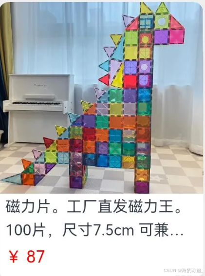
@Entry
@Component
struct Index {

  build() {
    Column() {
      Column() {
        Image($r('app.media.pics'))
          .width('100%')
          .height(150)
          .borderRadius({topLeft: 8, topRight: 8})
        Text('磁力片。工厂直发磁力王。100片,尺寸7.5cm 可兼容其他品牌')
          .width('100%')
          .padding({left: 5, right: 5})
          .fontSize(12)
          .lineHeight(18)
          .maxLines(2)
          .textOverflow({overflow: TextOverflow.Ellipsis})
        Text('¥ 87')
          .width('100%')
          .padding({left: 5, right: 5})
          .fontSize(13)
          .fontColor('#f00')
          .margin({top: 5})
      }
        .width('50%')
        .padding({bottom:10})
        .backgroundColor('#fff')
        .borderRadius(8)
    }
      .width('100%')
      .height('100%')
      .backgroundColor('#eee')
      .padding(20)
  }
}
4、背景属性
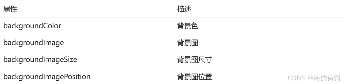
4.1backgroundColor
设置组件的背景色
背景色
@Entry
@Component
struct Index {
  build() {
    Column() {
      Text('组件')
        .width(300)
        .height(100)
        .backgroundColor(Color.Pink)
    }
    .padding(20)
  }
}
组件添加宽高属性或有内容才能观察到背景色
4.2backgroundImage
属性:backgroundImage(背景图地址, 背景图平铺方式 ImageRepeat)
背景图平铺方式:(可省略)
● NoRepeat:不平铺,默认值
● X:水平平铺
● Y:垂直平铺
● XY:水平垂直均平铺
背景图
@Entry
@Component
struct Index {
  build() {
    Column() {
      Text('组件')
        .width(300)
        .height(100)
        .backgroundColor(Color.Pink)
        .backgroundImage($r('app.media.flower'))
        .backgroundImage($r('app.media.flower'), ImageRepeat.X)
    }
    .padding(20)
  }
}
4.3backgroundImageSize
作用:背景图缩放
属性:backgroundImageSize
参数:
● 设置背景图宽高尺寸:{width: 数值, height: 数值}(只设置宽或高,另一个尺寸等比例缩放)
● 枚举 ImageSize:
○ Cover:等比例缩放背景图至图片完全覆盖组件范围
○ Contain:等比例缩放背景图,当宽或高与组件尺寸相同则停止缩放
○ Auto:默认,原图尺寸
背景图缩放
@Entry
@Component
struct Index {
  build() {
    Column() {
      Text('组件')
        .width(300)
        .height(100)
        .backgroundColor(Color.Pink)
        .backgroundImage($r('app.media.flower'))
        .backgroundImageSize({width: 100})
        .backgroundImageSize(ImageSize.Cover)
        .backgroundImageSize(ImageSize.Contain)
    }
    .padding(20)
  }
}
4.4backgroundImagePosition
作用:调整背景图在组件内的显示位置,默认显示位置为组件左上角
属性:backgroundImagePosition()
参数:
● 位置坐标: {x: 位置, y: 位置}
● 枚举 Alignment
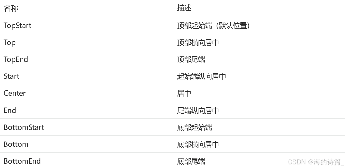
背景图位置
@Entry
@Component
struct Index {
  build() {
    Column() {
      Text('组件')
        .width(300)
        .height(100)
        .backgroundColor(Color.Pink)
        .backgroundImage($r('app.media.flower'))
        .backgroundImagePosition({x: 100, y: 50})
        .backgroundImagePosition(Alignment.Center)
    }
    .padding(20)
  }
}

讨论HarmonyOS开发技术,专注于API与组件、DevEco Studio、测试、元服务和应用上架分发等。
更多推荐



 24
24 0
0- 0


 已为社区贡献5条内容

所有评论(0)