HarmonyOS-ArkUI固定样式弹窗(1)
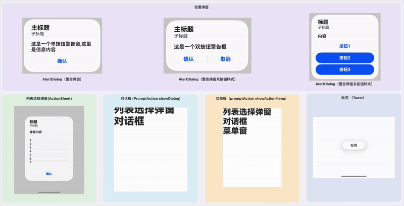
固定样式弹窗指的就是ArkUI中为我们提供的一些具备界面模板性质的弹窗。样式是固定的,我们可以决定在这些模板里输入什么样的内容。常见的有,警告弹窗, 列表选择弹窗, 选择器弹窗,对话框,操作菜单。下图是本文中要讲到的基类固定样式弹窗,其中选择器弹窗没有包含在内,需要开一篇新的文章专门描述。
·
固定样式弹窗指的就是ArkUI中为我们提供的一些具备界面模板性质的弹窗。样式是固定的,我们可以决定在这些模板里输入什么样的内容。常见的有,警告弹窗, 列表选择弹窗, 选择器弹窗,对话框,操作菜单。
下图是本文中要讲到的基类固定样式弹窗,其中选择器弹窗没有包含在内,需要开一篇新的文章专门描述。
警告弹窗
需要向用户提问或者得到用户许可的时候,可以使用警告弹窗。
- 警告弹窗用于提示重要信息,但会中断当前用户对界面的点击操作。尽量提必要的信息和有用的操作。
- 避免仅使用警告弹窗提供信息,用户不喜欢被信息丰富但不可操作的警告打断。
API
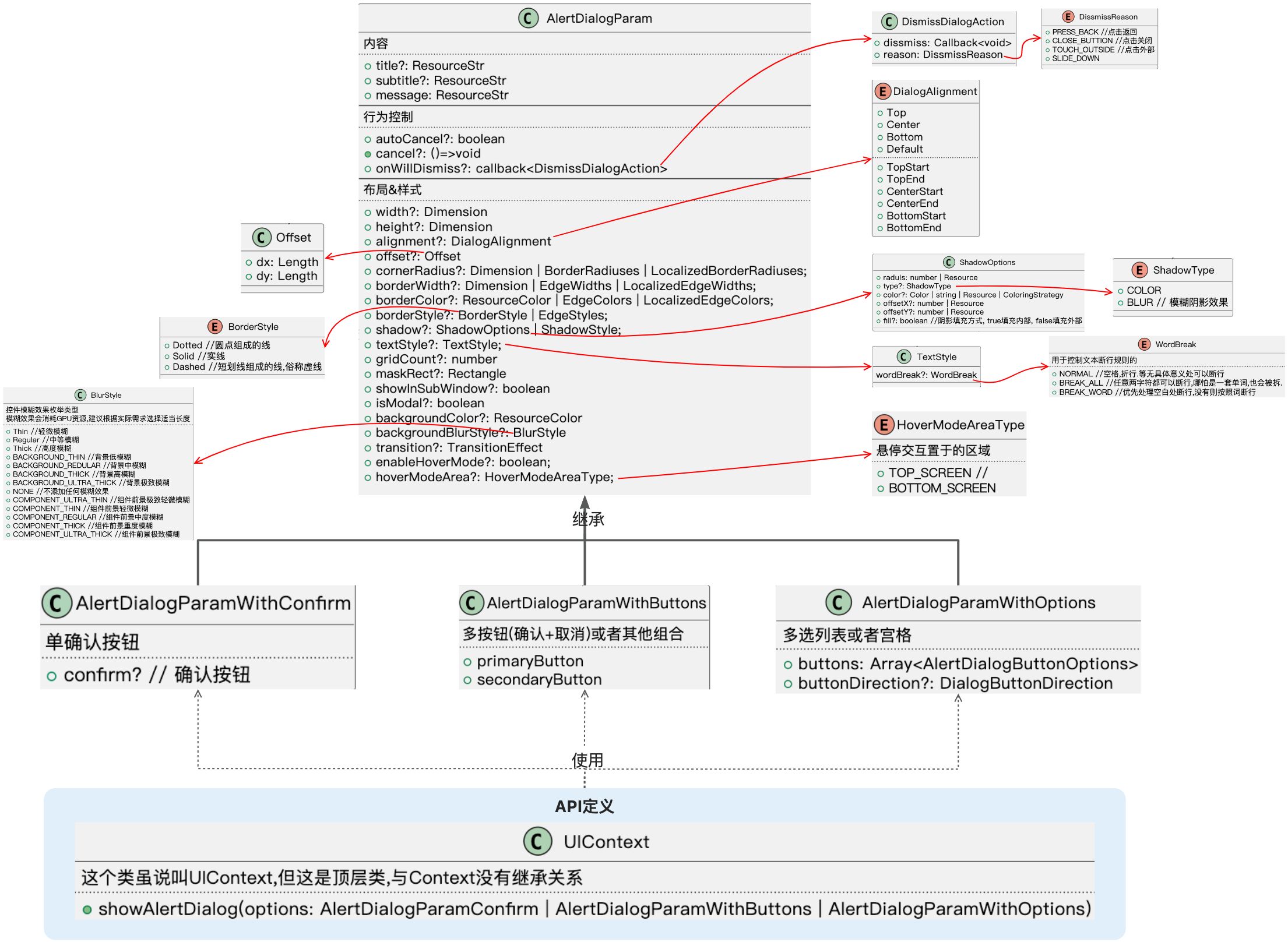
通过 UIContext中的showAlertDialog接口来实现。 详情请参考下方代码!
API图示
代码案例
@Entry
@Component
struct DialogsTest1 {
@State time:string = '记时'
alertDialog:string = '告警弹窗'
second: number = 0
aboutToAppear(): void {
setInterval(()=>{
this.time = `记时: ${this.convertSeconds(this.second++)}`
}, 1000)
}
/**
* 获取累计时长
* @param seconds 累计的秒数
* @returns
*/
convertSeconds(seconds: number) : string {
if (typeof this.second !== 'number' || this.second < 0) {
return 'error'
}
const h = Math.floor(this.second / 3600)
const m = Math.floor((this.second % 3600) / 60)
const s = Math.floor(this.second % 60)
return `${h} : ${m} : ${s}`
}
build() {
RelativeContainer() {
Text(this.time)
.id('time')
.fontSize($r('app.float.page_text_font_size'))
.fontWeight(FontWeight.Bold)
.alignRules({
top: { anchor: '__container__', align: VerticalAlign.Top},
start: {anchor: '__container__', align: HorizontalAlign.Start},
end: {anchor: '__container__', align: HorizontalAlign.End},
})
Text(this.alertDialog)
.id('DialogsTest1HelloWorld')
.fontSize($r('app.float.page_text_font_size'))
.fontWeight(FontWeight.Bold)
.alignRules({
top: { anchor: 'time', align: VerticalAlign.Bottom},
start: {anchor: '__container__', align: HorizontalAlign.Start}
})
.margin({top: 20})
.onClick(() => {
//Show AlertDialog
this.getUIContext().showAlertDialog(
//单选项弹窗
{
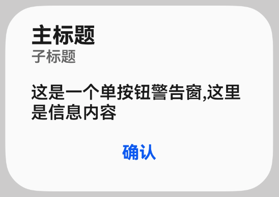
message: '这是一个单按钮警告窗,这里是信息内容',
title: '主标题',
subtitle : '子标题',
width: 250,
autoCancel: true, //点击外部,触发弹窗消失
confirm: {
value: '确认',
action : ()=>{
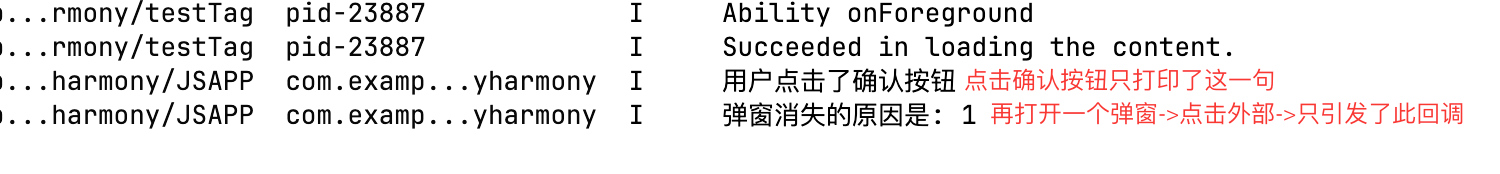
console.log('用户点击了确认按钮')
}
},
cancel: ()=>{
console.log('取消了,尽管我不知道是怎么触发这个取消的')
},
onWillDismiss : (reason: DismissDialogAction) => {
console.log(`弹窗消失的原因是: ${reason.reason}` ) //用户点击的确认后,不回调这个函数,只有点击外部回调.
}
}
)})
}
.height('100%')
.width('100%')
}
}
缺陷
- 回调尽管只有一次,但是行为分配给的回调函数逻辑混乱,不容易记清楚
- 标题,子标题,内容,连居中方式都没有办法调整,是相当不灵活的!
- 弹窗并没有提供hide操作,管出不管消失,不可控,比较鸡肋。
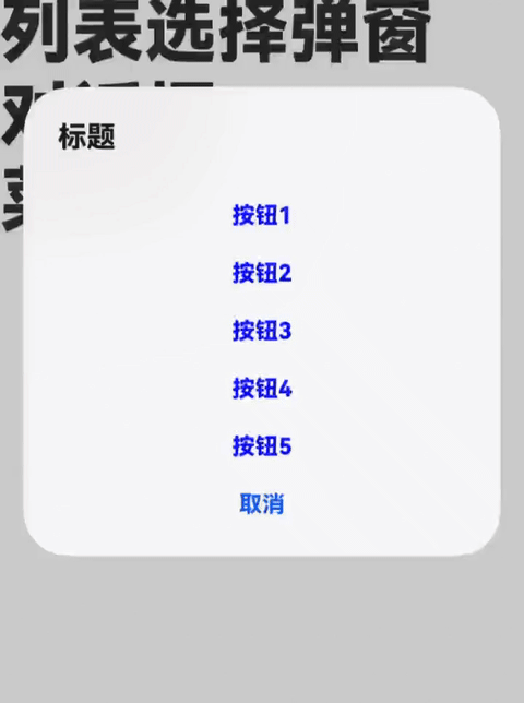
列表选择弹窗(ActionSheet)
列表选择弹窗适用于呈现多个操作选项
API
API图示
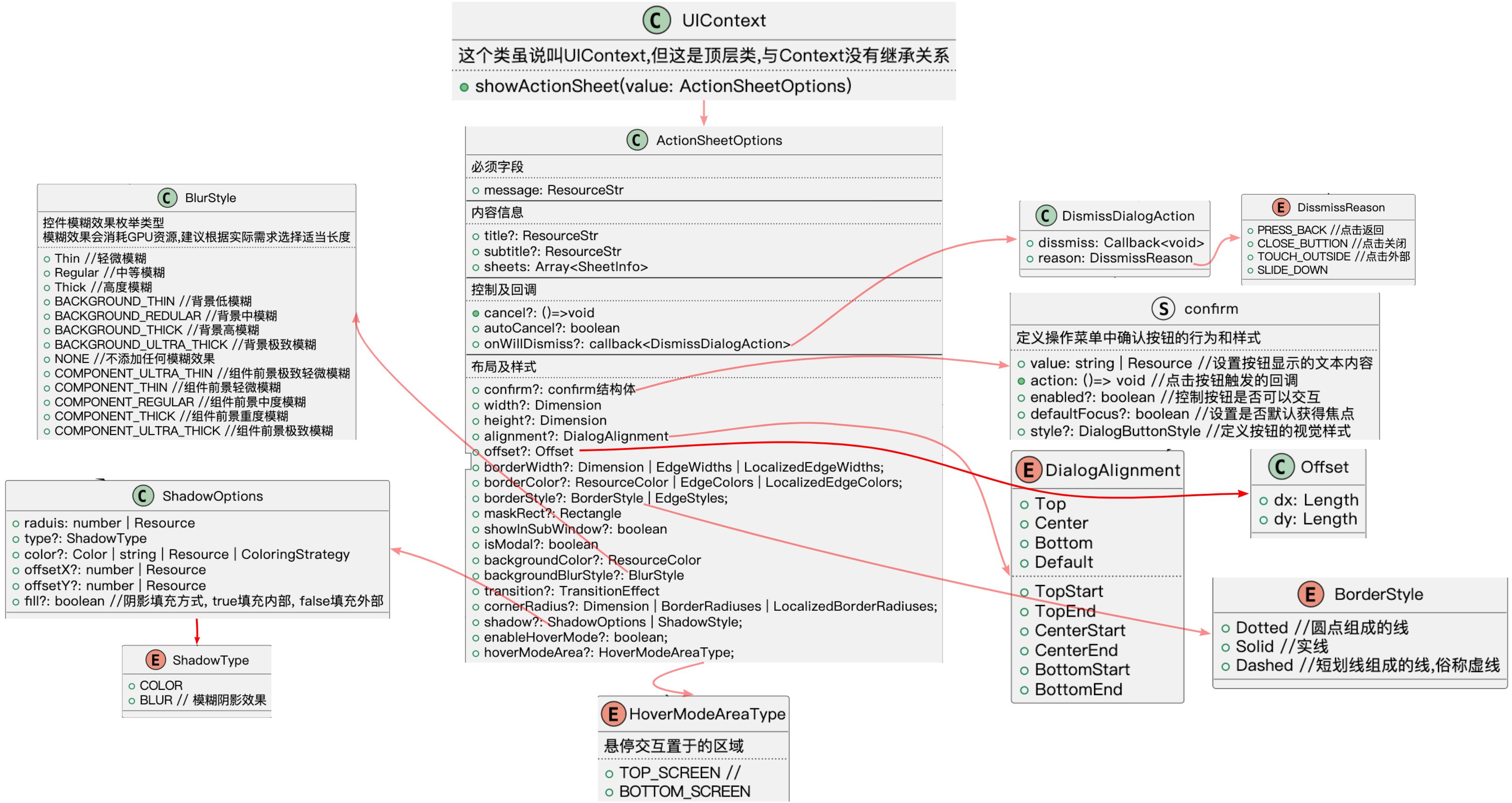
代码案例
@Entry
@Component
struct DialogsTest1 {
 ...

  build() {
    RelativeContainer() {
      Text(this.actionSheetDialog)
        .id('actionSheetDialog')
        .fontSize($r('app.float.page_text_font_size'))
        .fontWeight(FontWeight.Bold)
        .alignRules({
          top : {anchor : 'DialogsTest1HelloWorld', align : VerticalAlign.Bottom},
          start : {anchor : '__container__', align : HorizontalAlign.Start}
        })
        .onClick(()=>{
          this.getUIContext().showActionSheet(
            {
              message : '弹窗内容',
              title : '标题',
              subtitle: '子标题',
              sheets : [
                {
                  title: '1',
                  action : ()=>{
                    console.log('回调了1')
                  }
                },
                {
                  title: '2',
                  action : ()=>{
                    console.log('回调了2')
                  }
                },
                {
                  title: '3',
                  action : ()=>{
                    console.log('回调了3')
                  }
                },
                {
                  title: '4',
                  action : ()=>{
                    console.log('回调了4')
                  }
                },
                {
                  title: '5',
                  action : ()=>{
                    console.log('回调了5')
                  }
                },
                {
                  title: '6',
                  action : ()=>{
                    console.log('回调了6')
                  }
                },
                {
                  title: '7',
                  action : ()=>{
                    console.log('回调了7')
                  }
                },
              ],
              confirm: {
                enabled: true,
                value : '确认',
                action : ()=>{
                  console.log('触发了confirm action字段对应的回调')
                }
              },
              cancel : ()=>{
                console.log('回调cancel!')
              },
              width : 250
            }
          )
        })
    }
    .height('100%')
    .width('100%')
  }
}
缺陷
- 没办法调整内容的居中方式,看起来比较丑
- 对于选项内容的样式,间隔线的样式。没有办法完全接管,不是很灵活。
- 弹窗并没有提供hide操作,管出不管消失,不可控,比较鸡肋。
对话框
API

API图示
代码案例
 // 1 获取PromptAction对象
 // 2 调用PromptAction的showDialog接口
          let proAction: PromptAction = this.getUIContext().getPromptAction()
          proAction.showDialog({
            title: '弹窗',
            message: '弹窗message',
            backgroundColor : 'yellow',
            backgroundBlurStyle : BlurStyle.Thin,
            isModal : true,
            buttons: [
              { text: '按钮1', color: 'black', primary : true},
              { text: '按钮2', color: 'black', primary : false },
              { text: '按钮3', color: 'black', primary : false }
            ]
          }, (err, showDialogResponse) => {
            // 当弹窗消失的时候会调用,并将用户点击的按钮值给出
            console.log(`number = ${showDialogResponse.index}`)
          })
缺陷
- 从API看得出,界面只支持很简单的界面。复杂的搞不定。顶多就是可以设置按钮。至于按钮的颜色,背景颜色,形状全都不能设置。
- 消失逻辑回调是混乱的, 如果弹窗上只有一个确认按钮,你是无法确认回调是用户点击确认来的,还是点击了弹窗外部而导致弹窗消失的。鸡肋!
- 并没有找到代码让弹窗消失的api!
- 这个对话框,在实际的需求中,只能满足很少量的场景, 搁我是不会用这种难用的弹窗的!
操作菜单(showActionMenu)
API
API图示
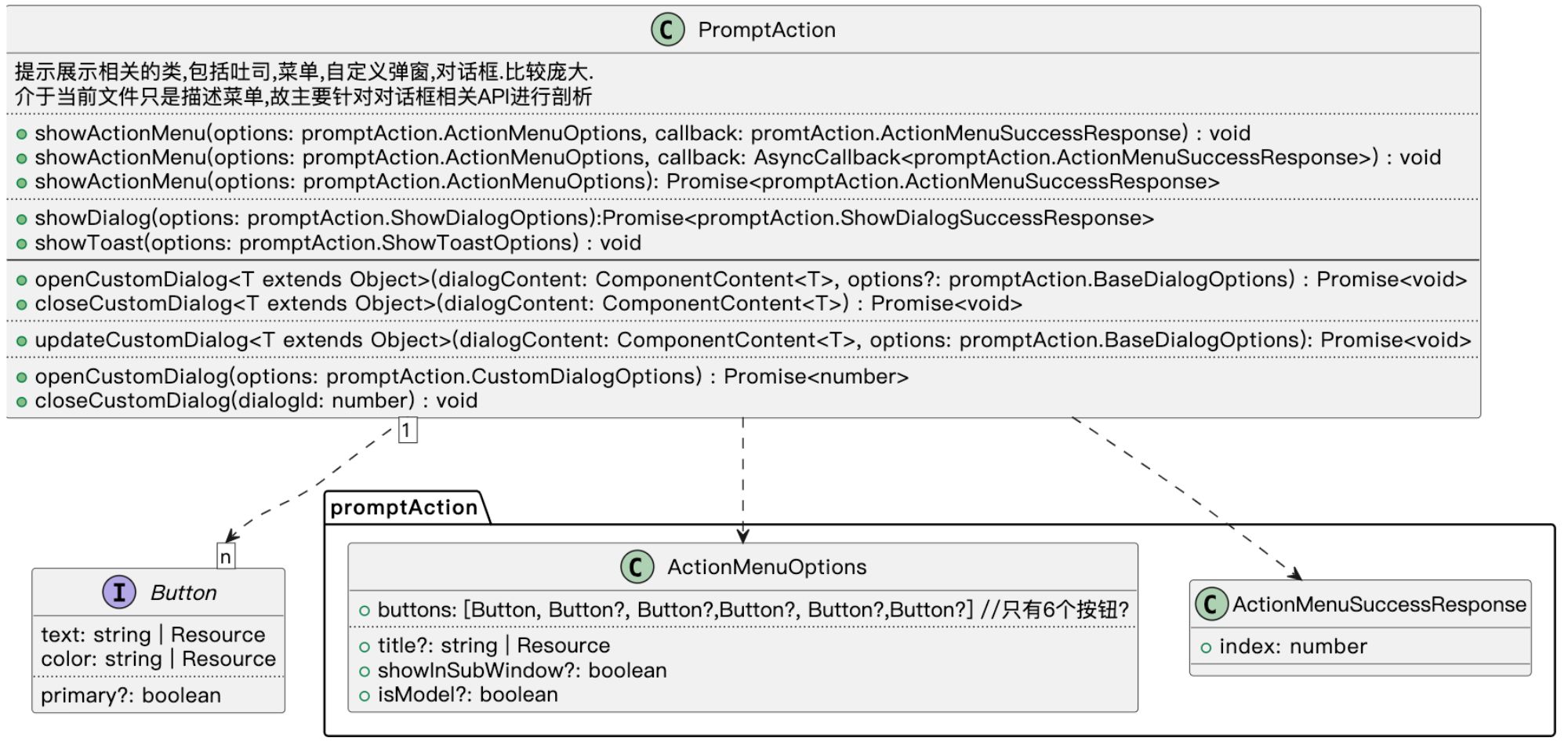
代码案例
// 1 获取PromptAction对象
// 2 调用PromptAction的showActionMenug接口
          let proAction: PromptAction = this.getUIContext().getPromptAction()
          proAction.showActionMenu({
            buttons : [
              {text: '按钮1', color : 'blue'},
              {text: '按钮2', color : 'blue'},
              {text: '按钮3', color : 'blue'},
              {text: '按钮4', color : 'blue'},
              {text: '按钮5', color : 'blue'},
            ],
            title : '标题',
          }, (err, resp)=>{
            console.log(`弹窗因点击了 ${resp.index} 而消失`)
          })
缺陷
- 难用!很难用!甚至没法用!原因如下:
- 从API看得出,界面只支持很简单的界面。复杂的搞不定。顶多就是可以设置按钮。至于按钮的颜色,背景颜色,形状全都不能设置。
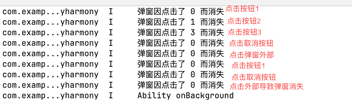
- 消失逻辑回调是混乱的, 如上图日志打印, 一旦回调的index是0,实际上您是无法得知用户是基于哪种情况导致弹窗消失的。
- 并没有找到代码让弹窗消失的api!
- 从API里能看出来,至多支持6个Button项目,而且Button里面描述很简单,对于复杂的界面无法支持!从量上还是界面的丰富度上都不行!
- 这个对话框,在实际的需求中,只能满足很少量的场景, 搁我是不会用这种难用的弹窗的!
吐司

API
API图示
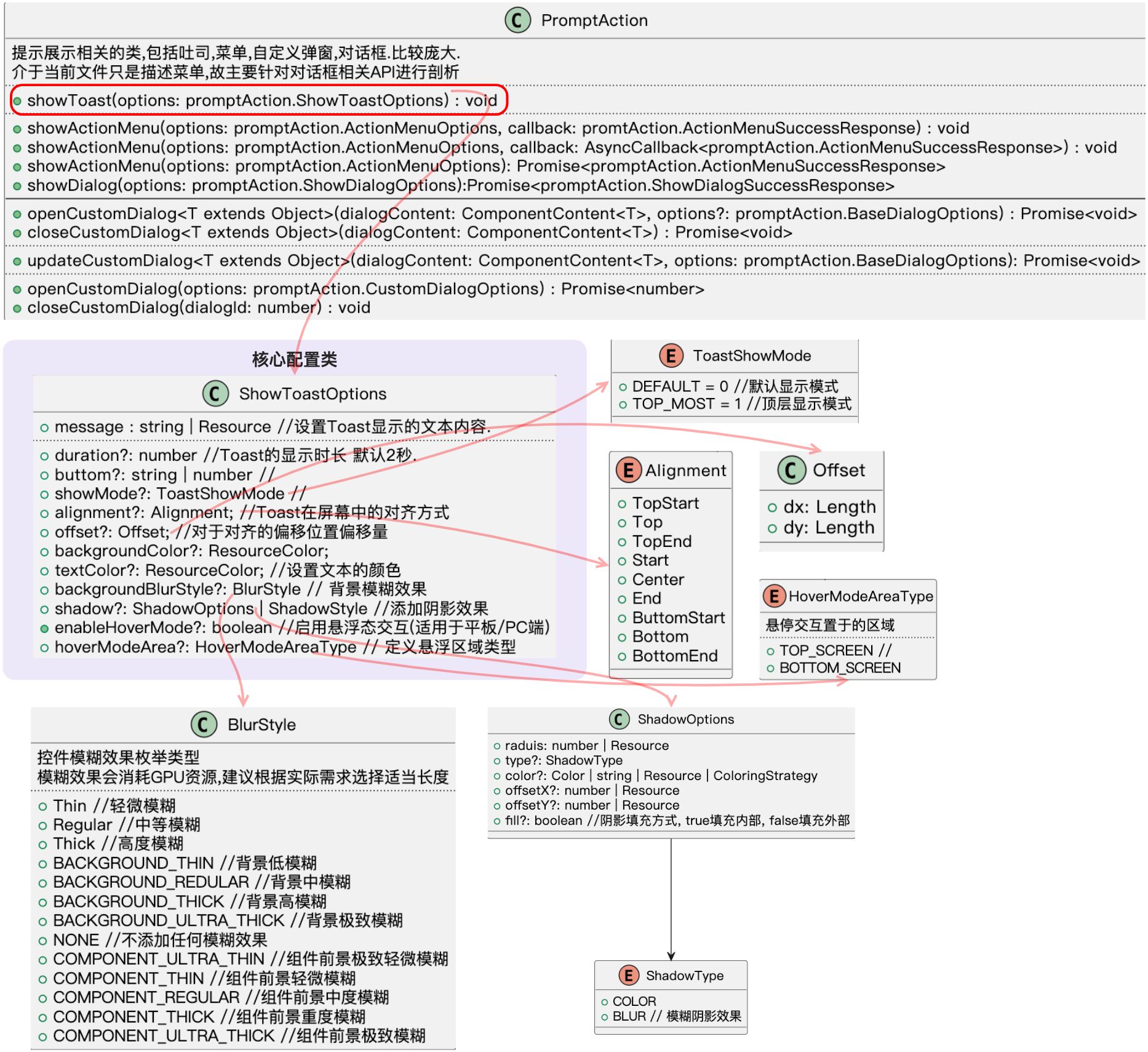
代码案例
// 1 获取PromptAction对象
          // 2 调用PromptAction的 showToast 接口
          let proAction: PromptAction = this.getUIContext().getPromptAction()
          proAction.showToast({
            message : '吐司',
            bottom : 100
          })
气泡
API
气泡弹出的API,声名于CommonMethod类中的 bindPopup(show: boolean, popUp: PopUpOptions | CustomPopupOptions)方法中,这就意味着, 任何一个UI组件都可以调用这个方法。都具备绑定一个气泡弹出气泡的能力。
API图示
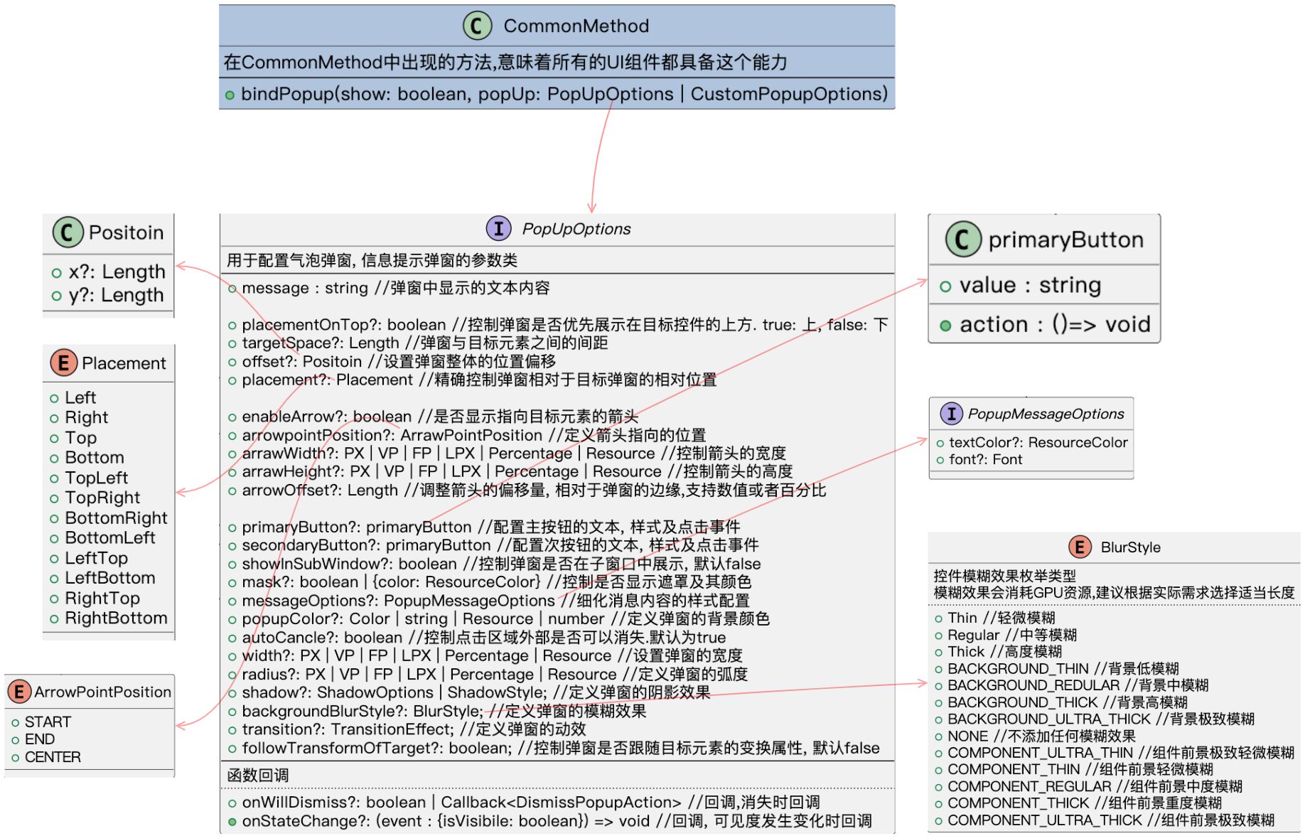
代码案例
Text('点击弹出气泡')
        .id('popup')
        .fontSize($r('app.float.page_text_font_size'))
        .fontWeight(FontWeight.Bold)
        .alignRules({
          top: { anchor: 'customDialog', align: VerticalAlign.Bottom },
          start: { anchor: '__container__', align: HorizontalAlign.Start }
        })
        .onClick(() => {
          this.mShowPopUp = true
        })
        .bindPopup(this.mShowPopUp,
          {
            message : "这是一个弹出的气泡",
            placement : Placement.Right,
            autoCancel : false, //点击外部是否自动消失

            // 没有按键出现, 箭头也不会出现
            enableArrow : true,
            arrowPointPosition : ArrowPointPosition.START,
            arrowWidth : 60,
            arrowHeight : 30,
            primaryButton : {
              value : "主按键",
              action : ()=>{
                console.log("用户点击了主按键")
                this.mShowPopUp = false
              }
            },
            secondaryButton : {
              value : "次按键",
              action : ()=> {
                console.log('这是一个次按键')
                this.mShowPopUp = false
              }
            },
          })
效果展示

讨论HarmonyOS开发技术,专注于API与组件、DevEco Studio、测试、元服务和应用上架分发等。
更多推荐
 24
24 0
0- 0


 已为社区贡献17条内容

所有评论(0)