鸿蒙API14开发【文本滑动选择器弹窗 (TextPickerDialog)】ArkTS组件
根据指定的选择范围创建文本选择器,展示在弹窗上。
说明:
该组件从API Version 8开始支持。后续版本如有新增内容,则采用上角标单独标记该内容的起始版本。
本模块功能依赖UI的执行上下文,不可在UI上下文不明确的地方使用,参见[UIContext]说明。
从API version 10开始,可以通过使用[UIContext]中的[showTextPickerDialog]来明确UI的执行上下文。
TextPickerDialog
show
static show(options?: TextPickerDialogOptions)
定义文本滑动选择器弹窗并弹出。
原子化服务API: 从API version 11开始,该接口支持在原子化服务中使用。
系统能力: SystemCapability.ArkUI.ArkUI.Full
参数:
| 参数名 | 类型 | 必填 | 说明 |
|---|---|---|---|
| options | [TextPickerDialogOptions] | 否 | 配置文本选择器弹窗的参数。 |
TextPickerDialogOptions对象说明
文本选择器弹窗的参数继承自[TextPickerOptions]。
系统能力: SystemCapability.ArkUI.ArkUI.Full
| 名称 | 类型 | 必填 | 说明 |
|---|---|---|---|
| defaultPickerItemHeight | number | string | 否 |
| disappearTextStyle10+ | [PickerTextStyle] | 否 | 设置所有选项中最上和最下两个选项的文本颜色、字号、字体粗细。 默认值: { color: ‘#ff182431’, font: { size: ‘14fp’, weight: FontWeight.Regular } } 原子化服务API: 从API version 11开始,该接口支持在原子化服务中使用。 |
| textStyle10+ | [PickerTextStyle] | 否 | 设置所有选项中除了最上、最下及选中项以外的文本颜色、字号、字体粗细。 默认值: { color: ‘#ff182431’, font: { size: ‘16fp’, weight: FontWeight.Regular } } 原子化服务API: 从API version 11开始,该接口支持在原子化服务中使用。 |
| selectedTextStyle10+ | [PickerTextStyle] | 否 | 设置选中项的文本颜色、字号、字体粗细。 默认值: { color: ‘#ff007dff’, font: { size: ‘20fp’, weight: FontWeight.Medium } } 原子化服务API: 从API version 11开始,该接口支持在原子化服务中使用。 |
| acceptButtonStyle12+ | [PickerDialogButtonStyle] | 否 | 设置确认按钮显示样式、样式和重要程度、角色、背景色、圆角、文本颜色、字号、字体粗细、字体样式、字体列表、按钮是否默认响应Enter键。 说明: 1.acceptButtonStyle与cancelButtonStyle中最多只能有一个primary字段配置为true,如果同时设置为true,则primary字段不生效,保持默认值false。 2.按钮高度默认40vp,在关怀模式-大字体场景下高度不变,即使按钮样式设置为圆角矩形[ROUNDED_RECTANGLE],呈现效果依然是胶囊型按钮[Capsule]。 原子化服务API: 从API version 12开始,该接口支持在原子化服务中使用。 |
| cancelButtonStyle12+ | [PickerDialogButtonStyle] | 否 | 设置取消按钮显示样式、样式和重要程度、角色、背景色、圆角、文本颜色、字号、字体粗细、字体样式、字体列表、按钮是否默认响应Enter键。 说明: 1.acceptButtonStyle与cancelButtonStyle中最多只能有一个primary字段配置为true,如果同时设置为true,则primary字段不生效,保持默认值false。 2.按钮高度默认40vp,在关怀模式-大字体场景下高度不变,即使按钮样式设置为圆角矩形[ROUNDED_RECTANGLE],呈现效果依然是胶囊型按钮[Capsule]。 原子化服务API: 从API version 12开始,该接口支持在原子化服务中使用。 |
| canLoop10+ | boolean | 否 | 设置是否可循环滚动,true:可循环,false:不可循环,默认值:true。 原子化服务API: 从API version 11开始,该接口支持在原子化服务中使用。 |
| alignment10+ | [DialogAlignment] | 否 | 弹窗在竖直方向上的对齐方式。 默认值:DialogAlignment.Default 原子化服务API: 从API version 11开始,该接口支持在原子化服务中使用。 |
| offset10+ | [Offset] | 否 | 弹窗相对alignment所在位置的偏移量。 默认值:{ dx: 0 , dy: 0 } 原子化服务API: 从API version 11开始,该接口支持在原子化服务中使用。 |
| maskRect10+ | [Rectangle] | 否 | 弹窗遮蔽层区域,在遮蔽层区域内的事件不透传,在遮蔽层区域外的事件透传。 默认值:{ x: 0, y: 0, width: ‘100%’, height: ‘100%’ } 原子化服务API: 从API version 11开始,该接口支持在原子化服务中使用。 |
| onAccept | (value: [TextPickerResult]) => void | 否 | 点击弹窗中的“确定”按钮时触发该回调。 原子化服务API: 从API version 11开始,该接口支持在原子化服务中使用。 |
| onCancel | () => void | 否 | 点击弹窗中的“取消”按钮时触发该回调。 原子化服务API: 从API version 11开始,该接口支持在原子化服务中使用。 |
| onChange | (value: [TextPickerResult]) => void | 否 | 滑动弹窗中的选择器使当前选中项改变时触发该回调。 原子化服务API: 从API version 11开始,该接口支持在原子化服务中使用。 |
| onScrollStop14+ | (value: [TextPickerResult]) => void | 否 | 滑动弹窗中的选择器的选择列停止触发该回调。 原子化服务API: 从API version 14开始,该接口支持在原子化服务中使用。 |
| backgroundColor11+ | [ResourceColor] | 否 | 弹窗背板颜色。 默认值:Color.Transparent 说明: 当设置了backgroundColor为非透明色时,backgroundBlurStyle需要设置为BlurStyle.NONE,否则颜色显示将不符合预期效果。 原子化服务API: 从API version 12开始,该接口支持在原子化服务中使用。 |
| backgroundBlurStyle11+ | [BlurStyle] | 否 | 弹窗背板模糊材质。 默认值:BlurStyle.COMPONENT_ULTRA_THICK 说明: 设置为BlurStyle.NONE即可关闭背景虚化。当设置了backgroundBlurStyle为非NONE值时,则不要设置backgroundColor,否则颜色显示将不符合预期效果。 原子化服务API: 从API version 12开始,该接口支持在原子化服务中使用。 |
| onDidAppear12+ | () => void | 否 | 弹窗弹出时的事件回调。 说明: 1.正常时序依次为:onWillAppear>>onDidAppear>>(onAccept/onCancel/onChange/onScrollStop)>>onWillDisappear>>onDidDisappear。 2.在onDidAppear内设置改变弹窗显示效果的回调事件,二次弹出生效。 3.快速点击弹出,消失弹窗时,存在onWillDisappear在onDidAppear前生效。 4. 当弹窗入场动效未完成时关闭弹窗,该回调不会触发。 原子化服务API: 从API version 12开始,该接口支持在原子化服务中使用。 |
| onDidDisappear12+ | () => void | 否 | 弹窗消失时的事件回调。 说明: 1.正常时序依次为:onWillAppear>>onDidAppear>>(onAccept/onCancel/onChange/onScrollStop)>>onWillDisappear>>onDidDisappear。 原子化服务API: 从API version 12开始,该接口支持在原子化服务中使用。 |
| onWillAppear12+ | () => void | 否 | 弹窗显示动效前的事件回调。 说明: 1.正常时序依次为:onWillAppear>>onDidAppear>>(onAccept/onCancel/onChange/onScrollStop)>>onWillDisappear>>onDidDisappear。 2.在onWillAppear内设置改变弹窗显示效果的回调事件,二次弹出生效。 原子化服务API: 从API version 12开始,该接口支持在原子化服务中使用。 |
| onWillDisappear12+ | () => void | 否 | 弹窗退出动效前的事件回调。 说明: 1.正常时序依次为:onWillAppear>>onDidAppear>>(onAccept/onCancel/onChange/onScrollStop)>>onWillDisappear>>onDidDisappear。 2.快速点击弹出,消失弹窗时,存在onWillDisappear在onDidAppear前生效。 原子化服务API: 从API version 12开始,该接口支持在原子化服务中使用。 |
| shadow12+ | [ShadowOptions] | [ShadowStyle] | 否 |
| enableHoverMode14+ | boolean | 否 | 是否响应悬停态。 默认值:false,默认不响应。 原子化服务API: 从API version 14开始,该接口支持在原子化服务中使用。 |
| hoverModeArea14+ | [HoverModeAreaType] | 否 | 悬停态下弹窗默认展示区域。 默认值:HoverModeAreaType.BOTTOM_SCREEN。 原子化服务API: 从API version 14开始,该接口支持在原子化服务中使用。 |
| disableTextStyleAnimation15+ | boolean | 否 | 设置滑动过程中是否有文本样式变化动效。 true:无文本样式变化动效,false:有文本样式变化动效。 默认值:false |
| defaultTextStyle15+ | [TextPickerTextStyle] | 否 | 设置关闭滑动过程中文本样式变化动效时的各个选项文本的样式,仅当disableTextStyleAnimation为true时生效。 默认值:与[Text]组件默认值相同。 |
TextPickerResult对象说明
原子化服务API: 从API version 11开始,该接口支持在原子化服务中使用。
系统能力: SystemCapability.ArkUI.ArkUI.Full
| 名称 | 类型 | 只读 | 可选 | 说明 |
|---|---|---|---|---|
| value | string | string []10+ | 否 | 否 |
| index | number | number []10+ | 否 | 否 |
示例
说明:
推荐通过使用[UIContext]中的[showTextPickerDialog]来明确UI的执行上下文。
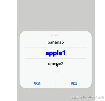
示例1(弹出文本选择弹窗)
该示例通过点击按钮弹出文本选择弹窗。
// xxx.ets
@Entry
@Component
struct TextPickerDialogExample {
  private select: number | number[] = 0
  private fruits: string[] = ['apple1', 'orange2', 'peach3', 'grape4', 'banana5']
  @State v:string = '';

  build() {
    Row() {
      Column() {
        Button("TextPickerDialog:" + this.v)
          .margin(20)
          .onClick(() => {
            TextPickerDialog.show({ // 建议使用 this.getUIContext().showTextPickerDialog()接口
              range: this.fruits,
              selected: this.select,
              disappearTextStyle: {color: Color.Red, font: {size: 15, weight: FontWeight.Lighter}},
              textStyle: {color: Color.Black, font: {size: 20, weight: FontWeight.Normal}},
              selectedTextStyle: {color: Color.Blue, font: {size: 30, weight: FontWeight.Bolder}},
              onAccept: (value: TextPickerResult) => {
                // 设置select为按下确定按钮时候的选中项index,这样当弹窗再次弹出时显示选中的是上一次确定的选项
                this.select = value.index
                console.log(this.select + '')
                // 点击确定后,被选到的文本数据展示到页面
                this.v = value.value as string
                console.info("TextPickerDialog:onAccept()" + JSON.stringify(value))
              },
              onCancel: () => {
                console.info("TextPickerDialog:onCancel()")
              },
              onChange: (value: TextPickerResult) => {
                console.info("TextPickerDialog:onChange()" + JSON.stringify(value))
              },
              onScrollStop: (value: TextPickerResult) => {
                console.info("TextPickerDialog:onScrollStop()" + JSON.stringify(value))
              },
              onDidAppear: () => {
                console.info("TextPickerDialog:onDidAppear()")
              },
              onDidDisappear: () => {
                console.info("TextPickerDialog:onDidDisappear()")
              },
              onWillAppear: () => {
                console.info("TextPickerDialog:onWillAppear()")
              },
              onWillDisappear: () => {
                console.info("TextPickerDialog:onWillDisappear()")
              }
            })
          })
      }.width('100%')
    }.height('100%')
  }
}
ts
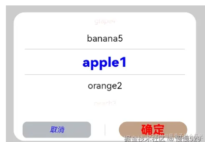
示例2(自定义样式)
该示例通过配置disappearTextStyle、textStyle、selectedTextStyle、acceptButtonStyle、cancelButtonStyle实现了自定义文本以及按钮样式。
// xxx.ets
@Entry
@Component
struct TextPickerDialogExample {
  private select: number | number[] = 0
  private fruits: string[] = ['apple1', 'orange2', 'peach3', 'grape4', 'banana5']
  @State v:string = '';

  build() {
    Row() {
      Column() {
        Button("TextPickerDialog:" + this.v)
          .margin(20)
          .onClick(() => {
            TextPickerDialog.show({ // 建议使用 this.getUIContext().showTextPickerDialog()接口
              range: this.fruits,
              selected: this.select,
              disappearTextStyle: {color: Color.Red, font: {size: 15, weight: FontWeight.Lighter}},
              textStyle: {color: Color.Black, font: {size: 20, weight: FontWeight.Normal}},
              selectedTextStyle: {color: Color.Blue, font: {size: 30, weight: FontWeight.Bolder}},
              acceptButtonStyle: { type: ButtonType.Normal, style: ButtonStyleMode.NORMAL, role: ButtonRole.NORMAL, fontColor: Color.Red,
                fontSize: '26fp', fontWeight: FontWeight.Bolder, fontStyle: FontStyle.Normal, fontFamily: 'sans-serif', backgroundColor:'#80834511',
                borderRadius: 20 },
              cancelButtonStyle: { type: ButtonType.Normal, style: ButtonStyleMode.NORMAL, role: ButtonRole.NORMAL, fontColor: Color.Blue,
                fontSize: '16fp', fontWeight: FontWeight.Normal, fontStyle: FontStyle.Italic, fontFamily: 'sans-serif', backgroundColor:'#50182431',
                borderRadius: 10 },
              onAccept: (value: TextPickerResult) => {
                // 设置select为按下确定按钮时候的选中项index,这样当弹窗再次弹出时显示选中的是上一次确定的选项
                this.select = value.index
                console.log(this.select + '')
                // 点击确定后,被选到的文本数据展示到页面
                this.v = value.value as string
                console.info("TextPickerDialog:onAccept()" + JSON.stringify(value))
              },
              onCancel: () => {
                console.info("TextPickerDialog:onCancel()")
              },
              onChange: (value: TextPickerResult) => {
                console.info("TextPickerDialog:onChange()" + JSON.stringify(value))
              },
              onScrollStop: (value: TextPickerResult) => {
                console.info("TextPickerDialog:onScrollStop()" + JSON.stringify(value))
              },
              onDidAppear: () => {
                console.info("TextPickerDialog:onDidAppear()")
              },
              onDidDisappear: () => {
                console.info("TextPickerDialog:onDidDisappear()")
              },
              onWillAppear: () => {
                console.info("TextPickerDialog:onWillAppear()")
              },
              onWillDisappear: () => {
                console.info("TextPickerDialog:onWillDisappear()")
              }
            })
          })
      }.width('100%')
    }.height('100%')
  }
}
ts
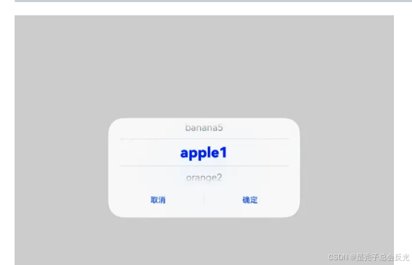
示例3(悬停态弹窗)
该示例展示了在折叠屏悬停态下设置dialog布局区域的效果。
@Entry
@Component
struct TextPickerDialogExample {
  private select: number | number[] = 0;
  private fruits: string[] = ['apple1', 'orange2', 'peach3', 'grape4', 'banana5'];
  @State v: string = '';

  build() {
    Row() {
      Column() {
        Button("TextPickerDialog:" + this.v)
          .margin(20)
          .onClick(() => {
            TextPickerDialog.show({ // 建议使用 this.getUIContext().showTextPickerDialog()接口
              range: this.fruits,
              selected: this.select,
              disappearTextStyle: { color: Color.Red, font: { size: 15, weight: FontWeight.Lighter }},
              textStyle: { color: Color.Black, font: { size: 20, weight: FontWeight.Normal }},
              selectedTextStyle: { color: Color.Blue, font: { size: 30, weight: FontWeight.Bolder }},
              onAccept: (value: TextPickerResult) => {
                // 设置select为按下确定按钮时候的选中项index,这样当弹窗再次弹出时显示选中的是上一次确定的选项
                this.select = value.index;
                console.log(this.select + '');
                // 点击确定后,被选到的文本数据展示到页面
                this.v = value.value as string;
                console.info("TextPickerDialog:onAccept()" + JSON.stringify(value));
              },
              onCancel: () => {
                console.info("TextPickerDialog:onCancel()");
              },
              onChange: (value: TextPickerResult) => {
                console.info("TextPickerDialog:onChange()" + JSON.stringify(value));
              },
              onScrollStop: (value: TextPickerResult) => {
                console.info("TextPickerDialog:onScrollStop()" + JSON.stringify(value))
              },
              onDidAppear: () => {
                console.info("TextPickerDialog:onDidAppear()");
              },
              onDidDisappear: () => {
                console.info("TextPickerDialog:onDidDisappear()");
              },
              onWillAppear: () => {
                console.info("TextPickerDialog:onWillAppear()");
              },
              onWillDisappear: () => {
                console.info("TextPickerDialog:onWillDisappear()");
              },
              enableHoverMode: true,
              hoverModeArea: HoverModeAreaType.TOP_SCREEN
            })
          })
      }.width('100%')
    }.height('100%')
  }
}
ts
更多内容:
在↓

讨论HarmonyOS开发技术,专注于API与组件、DevEco Studio、测试、元服务和应用上架分发等。
更多推荐
 14
14 0
0- 0


 已为社区贡献483条内容

所有评论(0)