使用鸿蒙Flutter实现个人中心顶部信息栏 - Row与Column布局实战
摘要 本文介绍了使用Flutter实现鸿蒙风格个人中心顶部信息栏的开发过程。主要内容包括: 项目概述:个人中心是移动应用常见模块,需展示用户信息和快捷入口。项目采用Flutter实现,重点讲解Row和Column线性布局组件。 技术栈:使用Row水平布局、Column垂直布局,配合MainAxisAlignment和CrossAxisAlignment控制排列方式,采用Material Desig
实践效果
一、项目概述
1.1 应用背景
个人中心是移动应用中非常常见的一个模块,几乎每个APP都会有这个功能。一个设计良好的个人中心页面,不仅要展示用户的基本信息,还要提供快捷操作入口和账号管理功能。
这次我们用Flutter来实现一个鸿蒙风格的个人中心顶部信息栏,重点讲解Row和Column这两个最基础的线性布局组件的使用。
1.2 技术栈
| 技术点 | 说明 |
|---|---|
| Row | 水平线性布局,类似于Android的LinearLayout(horizontal) |
| Column | 垂直线性布局,类似于Android的LinearLayout(vertical) |
| MainAxisAlignment | 主轴对齐方式,控制子组件在主轴方向的排列 |
| CrossAxisAlignment | 交叉轴对齐方式,控制子组件在交叉轴方向的排列 |
| Material Design 3 | 鸿蒙风格设计语言 |
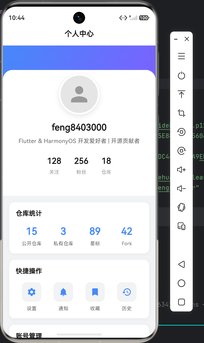
1.3 界面效果
┌─────────────────────────────────────────┐
│  渐变蓝色背景 (从 #4688FA 到 #7B61FF)     │
│                                         │
│           ┌─────────┐                   │
│           │  头像   │  ← 圆形头像       │
│           │ 100x100 │                   │
│           └─────────┘                   │
│              用户名                      │
│      Flutter & HarmonyOS 开发爱好者       │
│                                         │
│       关注(128)  粉丝(256)  仓库(18)    │
└─────────────────────────────────────────┘
二、核心代码解析
2.1 ProfileHeader组件 - 头部信息栏
这是整个页面的核心组件,负责展示用户头像、名称和简介:
class ProfileHeader extends StatelessWidget {
final String avatarUrl;
final String userName;
final String bio;
final int followers;
final int following;
final int repos;
const ProfileHeader({
super.key,
required this.avatarUrl,
required this.userName,
required this.bio,
required this.followers,
required this.following,
required this.repos,
});
Widget build(BuildContext context) {
return Container(
color: Colors.white,
child: Column(
children: [
// 渐变背景头部
Container(
height: 120,
decoration: const BoxDecoration(
gradient: LinearGradient(
begin: Alignment.topLeft,
end: Alignment.bottomRight,
colors: [
Color(0xFF4688FA),
Color(0xFF7B61FF),
],
),
),
child: Stack(
children: [
Positioned(
left: 0,
right: 0,
bottom: 0,
child: Container(
height: 60,
decoration: const BoxDecoration(
color: Colors.white,
borderRadius: BorderRadius.only(
topLeft: Radius.circular(24),
topRight: Radius.circular(24),
),
),
),
),
],
),
),
// 用户信息区域
Transform.translate(
offset: const Offset(0, -50),
child: Column(
children: [
// 头像行
Row(
mainAxisAlignment: MainAxisAlignment.center,
crossAxisAlignment: CrossAxisAlignment.end,
children: [
Container(
width: 100,
height: 100,
decoration: BoxDecoration(
shape: BoxShape.circle,
border: Border.all(
color: Colors.white,
width: 4,
),
boxShadow: [
BoxShadow(
color: Colors.black.withOpacity(0.1),
blurRadius: 10,
offset: const Offset(0, 4),
),
],
),
child: ClipOval(
child: Image.network(avatarUrl),
),
),
],
),
// 用户名
Text(userName),
// 简介
Text(bio),
// 统计数据行
Row(
mainAxisAlignment: MainAxisAlignment.center,
children: [
_StatChip(label: '关注', count: followers),
_StatChip(label: '粉丝', count: following),
_StatChip(label: '仓库', count: repos),
],
),
],
),
),
],
),
);
}
}
代码要点:
- Column嵌套:最外层用一个Column包裹整个头部,里面又嵌套了多个Row
- 负偏移定位:使用
Transform.translate(offset: Offset(0, -50))让头像与渐变背景重叠 - Stack层叠:使用Stack实现白色圆角卡片覆盖渐变背景的底部
- CircleAvatar替代方案:这里用Container+ClipOval实现圆形头像,比CircleAvatar更灵活
2.2 MainAxisAlignment主轴对齐详解
MainAxisAlignment控制子组件在主轴方向的排列方式。主轴取决于Row或Column的方向:
| 对齐方式 | Row主轴(水平) | Column主轴(垂直) |
|---|---|---|
| start | 左对齐 | 顶部对齐 |
| center | 水平居中 | 垂直居中 |
| end | 右对齐 | 底部对齐 |
| spaceBetween | 两端对齐,中间等间距 | - |
| spaceAround | 左右间距是中间间距的一半 | - |
| spaceEvenly | 所有间距相等 | - |
实际应用场景:
// 场景1:居中对齐 - 用于统计数据
Row(
  mainAxisAlignment: MainAxisAlignment.center,
  children: [
    _StatChip(label: '关注', count: followers),
    const SizedBox(width: 32),
    _StatChip(label: '粉丝', count: following),
    const SizedBox(width: 32),
    _StatChip(label: '仓库', count: repos),
  ],
)

// 场景2:等间距分布 - 用于快捷操作按钮
Row(
  mainAxisAlignment: MainAxisAlignment.spaceAround,
  children: [
    ActionButton(icon: Icons.settings, label: '设置'),
    ActionButton(icon: Icons.notifications, label: '通知'),
    ActionButton(icon: Icons.bookmark, label: '收藏'),
    ActionButton(icon: Icons.history, label: '历史'),
  ],
)

// 场景3:分散对齐 - 用于菜单项
Row(
  mainAxisAlignment: MainAxisAlignment.spaceBetween,
  children: [
    Text('编辑资料'),
    Icon(Icons.chevron_right),
  ],
)
2.3 CrossAxisAlignment交叉轴对齐详解
CrossAxisAlignment控制子组件在交叉轴方向的排列。交叉轴垂直于主轴:
| 对齐方式 | Row交叉轴(垂直) | Column交叉轴(水平) |
|---|---|---|
| start | 顶部对齐 | 左对齐 |
| center | 垂直居中 | 水平居中 |
| end | 底部对齐 | 右对齐 |
| stretch | 拉伸到最大 | 拉伸到最大 |
| baseline | 文本基线对齐 | 文本基线对齐 |
实际应用场景:
// 场景1:底部对齐 - 头像与底部文字对齐
Row(
  mainAxisAlignment: MainAxisAlignment.center,
  crossAxisAlignment: CrossAxisAlignment.end,  // 头像底部与文字底部对齐
  children: [
    CircleAvatar(radius: 30),
    Text('用户名'),
  ],
)

// 场景2:居中对齐 - 常见于列表项
Row(
  crossAxisAlignment: CrossAxisAlignment.center,
  children: [
    Icon(Icons.person),
    Text('用户名称'),
    Spacer(),
    Icon(Icons.chevron_right),
  ],
)

// 场景3:stretch拉伸 - 让子组件填满交叉轴
Column(
  crossAxisAlignment: CrossAxisAlignment.stretch,
  children: [
    Container(height: 50, child: Text('拉伸填满')),
    Container(height: 50, child: Text('也拉伸填满')),
  ],
)
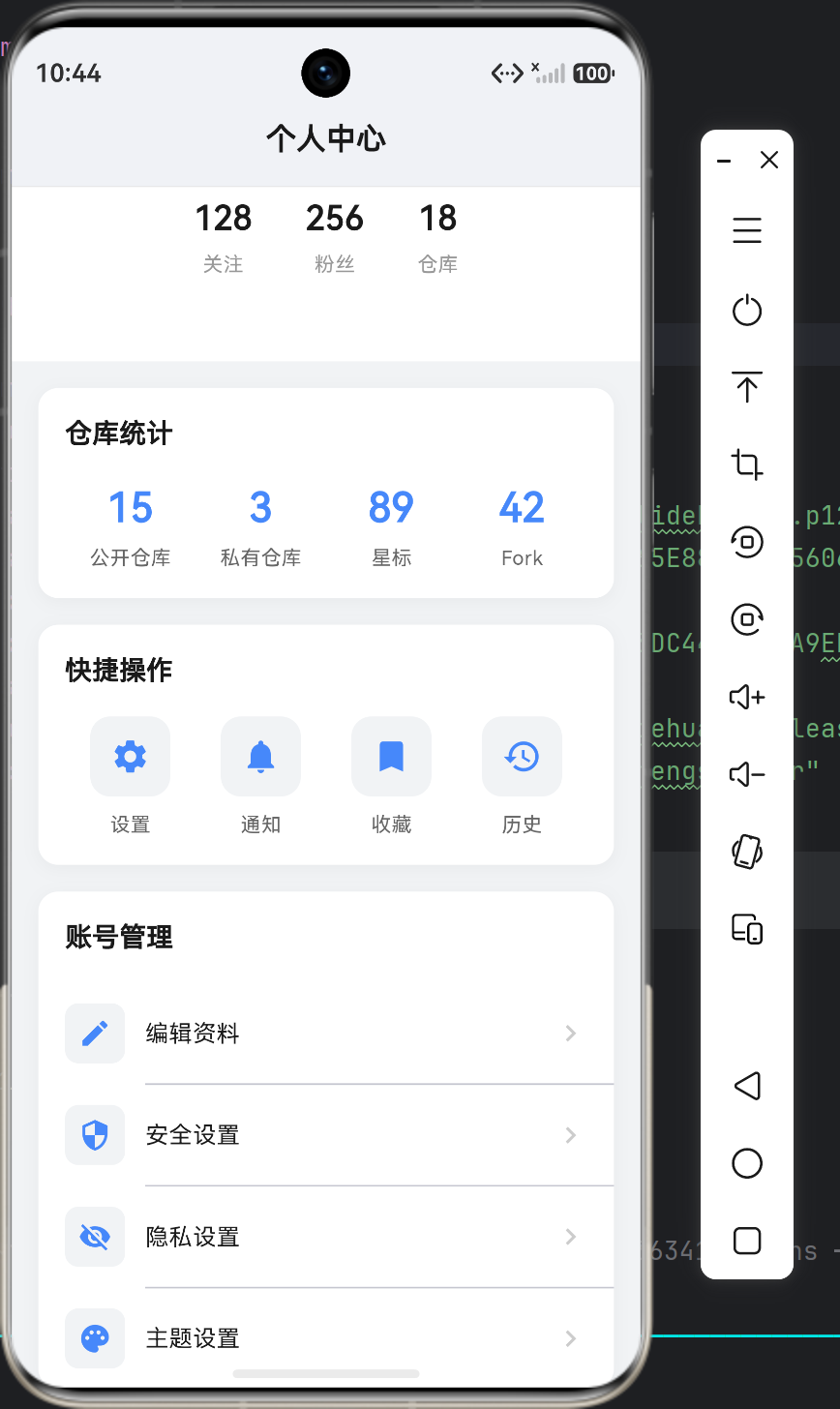
2.4 ProfileStatsCard统计卡片组件
这个组件展示用户的仓库统计数据,使用Row实现了四列等宽布局:
class ProfileStatsCard extends StatelessWidget {
final String title;
final List<StatItem> items;
Widget build(BuildContext context) {
return Container(
margin: const EdgeInsets.symmetric(horizontal: 16),
padding: const EdgeInsets.all(16),
decoration: BoxDecoration(
color: Colors.white,
borderRadius: BorderRadius.circular(12),
boxShadow: [
BoxShadow(
color: Colors.black.withOpacity(0.04),
blurRadius: 8,
offset: const Offset(0, 2),
),
],
),
child: Column(
crossAxisAlignment: CrossAxisAlignment.start,
children: [
Text(title),
const SizedBox(height: 16),
// 统计项行
Row(
children: items.map((item) {
return Expanded(
child: Column(
children: [
Text(
item.value,
style: const TextStyle(
fontSize: 24,
fontWeight: FontWeight.w600,
color: Color(0xFF4688FA),
),
),
const SizedBox(height: 4),
Text(
item.label,
style: const TextStyle(
fontSize: 12,
color: Color(0xFF666666),
),
),
],
),
);
}).toList(),
),
],
),
);
}
}
代码要点:
- Expanded自适应:每个统计项用Expanded包裹,实现四列等宽效果
- map遍历:使用map函数遍历数据列表,比for循环更简洁
- const优化:静态文本使用const声明,编译期确定值
三、布局嵌套技巧
3.1 常见布局模式
Flutter的Row和Column可以无限嵌套,常见的布局模式:
┌─────────────────────────────────────────┐
│              Column (主布局)              │
│  ┌─────────────────────────────────────┐│
│  │  Column (渐变背景+头像区域)           ││
│  │    Row (头像居中)                    ││
│  │    Row (统计数据)                    ││
│  └─────────────────────────────────────┘│
│  ┌─────────────────────────────────────┐│
│  │  Column (统计卡片)                   ││
│  │    Text (标题)                       ││
│  │    Row (四个统计项)                  ││
│  └─────────────────────────────────────┘│
│  ┌─────────────────────────────────────┐│
│  │  Column (菜单列表)                   ││
│  │    Row (菜单项1)                     ││
│  │    Row (菜单项2)                     ││
│  │    Row (菜单项3)                     ││
│  └─────────────────────────────────────┘│
└─────────────────────────────────────────┘
3.2 Stack层叠布局
渐变背景和头像的层叠效果使用了Stack组件:
Container(
  height: 120,
  decoration: const BoxDecoration(
    gradient: LinearGradient(...),
  ),
  child: Stack(
    children: [
      // 渐变背景
      Container(),
      // 白色圆角卡片压在底部
      Positioned(
        left: 0,
        right: 0,
        bottom: 0,
        child: Container(
          height: 60,
          decoration: const BoxDecoration(
            color: Colors.white,
            borderRadius: BorderRadius.only(
              topLeft: Radius.circular(24),
              topRight: Radius.circular(24),
            ),
          ),
        ),
      ),
    ],
  ),
)
四、鸿蒙风格设计要点
4.1 配色方案
鸿蒙风格主打蓝色系配色,这里使用:
| 用途 | 色值 | 说明 |
|---|---|---|
| 主色调 | #4688FA | 华为蓝 |
| 渐变结束色 | #7B61FF | 紫色渐变 |
| 标题文字 | #1A1A1A | 深黑色 |
| 正文文字 | #666666 | 中灰色 |
| 次要文字 | #999999 | 浅灰色 |
| 背景色 | #F1F3F5 | 浅灰背景 |
4.2 圆角规范
鸿蒙设计语言中,圆角是非常重要的视觉元素:
| 元素 | 圆角值 | 说明 |
|---|---|---|
| 卡片容器 | 12px | 中等圆角 |
| 头像容器 | 50px | 全圆 |
| 图标容器 | 8px | 小圆角 |
| 按钮 | 8px | 小圆角 |
| 大面积覆盖层 | 24px | 大圆角 |
4.3 阴影规范
阴影能增加界面的层次感:
BoxShadow(
  color: Colors.black.withOpacity(0.04),  // 极淡的黑色
  blurRadius: 8,                          // 模糊半径
  offset: const Offset(0, 2),              // 向下偏移2px
)
阴影级别:
| 级别 | 模糊半径 | 透明度 | 使用场景 |
|---|---|---|---|
| 轻阴影 | 4-8px | 0.04 | 卡片底部 |
| 中阴影 | 8-16px | 0.08 | 浮层 |
| 重阴影 | 16-24px | 0.12 | 弹窗 |
五、响应式适配
5.1 鸿蒙PC适配
为了同时适配手机和平板,需要考虑以下几点:
// 使用LayoutBuilder获取可用空间
LayoutBuilder(
  builder: (context, constraints) {
    // 手机竖屏:constraints.maxWidth < 600
    // 平板横屏:constraints.maxWidth >= 600

    if (constraints.maxWidth < 600) {
      return _buildPhoneLayout();
    } else {
      return _buildTabletLayout();
    }
  },
)

// 使用MediaQuery获取屏幕信息
final screenWidth = MediaQuery.of(context).size.width;
final screenHeight = MediaQuery.of(context).size.height;
5.2 暗黑模式支持
ThemeData(
  colorScheme: ColorScheme.fromSeed(
    seedColor: const Color(0xFF4688FA),
    brightness: Brightness.light,  // 或 Brightness.dark
  ),
)
六、完整组件清单
| 组件名 | 类型 | 用途 |
|---|---|---|
| HarmonyOSProfileApp | StatelessWidget | 应用根组件 |
| ProfilePage | StatelessWidget | 页面主组件 |
| ProfileHeader | StatelessWidget | 头部信息组件 |
| ProfileStatsCard | StatelessWidget | 统计卡片组件 |
| ProfileActionCard | StatelessWidget | 快捷操作组件 |
| ProfileMenuCard | StatelessWidget | 菜单列表组件 |
| _StatChip | StatelessWidget | 统计数字组件(私有) |
七、总结
本文详细讲解了Flutter中Row和Column这两个基础布局组件的使用:
- MainAxisAlignment 控制主轴对齐,Row是水平方向,Column是垂直方向
- CrossAxisAlignment 控制交叉轴对齐,是主轴的垂直方向
- Expanded 让子组件自动填充剩余空间
- Stack 实现层叠效果,如渐变背景和头像的叠加
- 负偏移定位 使用Transform.translate实现元素重叠效果
通过这些基础组件的组合,我们可以构建出各种复杂的界面。关键是理解主轴和交叉轴的概念,以及不同对齐方式的视觉效果。

讨论HarmonyOS开发技术,专注于API与组件、DevEco Studio、测试、元服务和应用上架分发等。
更多推荐
 5
5 0
0- 0


 已为社区贡献314条内容

所有评论(0)