鸿蒙 ArkTS 极简入门:相对布局 + 轮播 + Tab 导航(学生博客版)
·
一、本篇核心知识点(博客标题)
鸿蒙 ArkTS 最常用三大基础组件:相对布局 + Swiper 轮播 + Tabs 底部导航 适用场景:学生作业、简单 APP 首页、宿舍信息展示、课程设计。
二、核心知识点(简洁版)
1. 相对布局(Column / Row)
ArkTS 最基础布局,相当于 Android 相对布局 + 线性布局。
- Column:垂直排列(上下)
- Row:水平排列(左右)
- 常用属性:
.width('100%')宽度铺满.height('100%')高度铺满.margin(10)外边距.backgroundColor('#fff')背景色.justifyContent(FlexAlign.Center)居中
2. Swiper 轮播组件(自动滚动)
鸿蒙自带轮播,无需第三方库。
.autoPlay(true)自动播放.interval(3000)3 秒切换.indicator(true)显示小圆点- 内部直接写多个组件即可滑动
3. Tabs 底部导航
最常用首页结构,多页面切换。
TabContent()每个页面.tabBar('名称')底部按钮文字.barPosition(BarPosition.End)导航固定底部
例子:
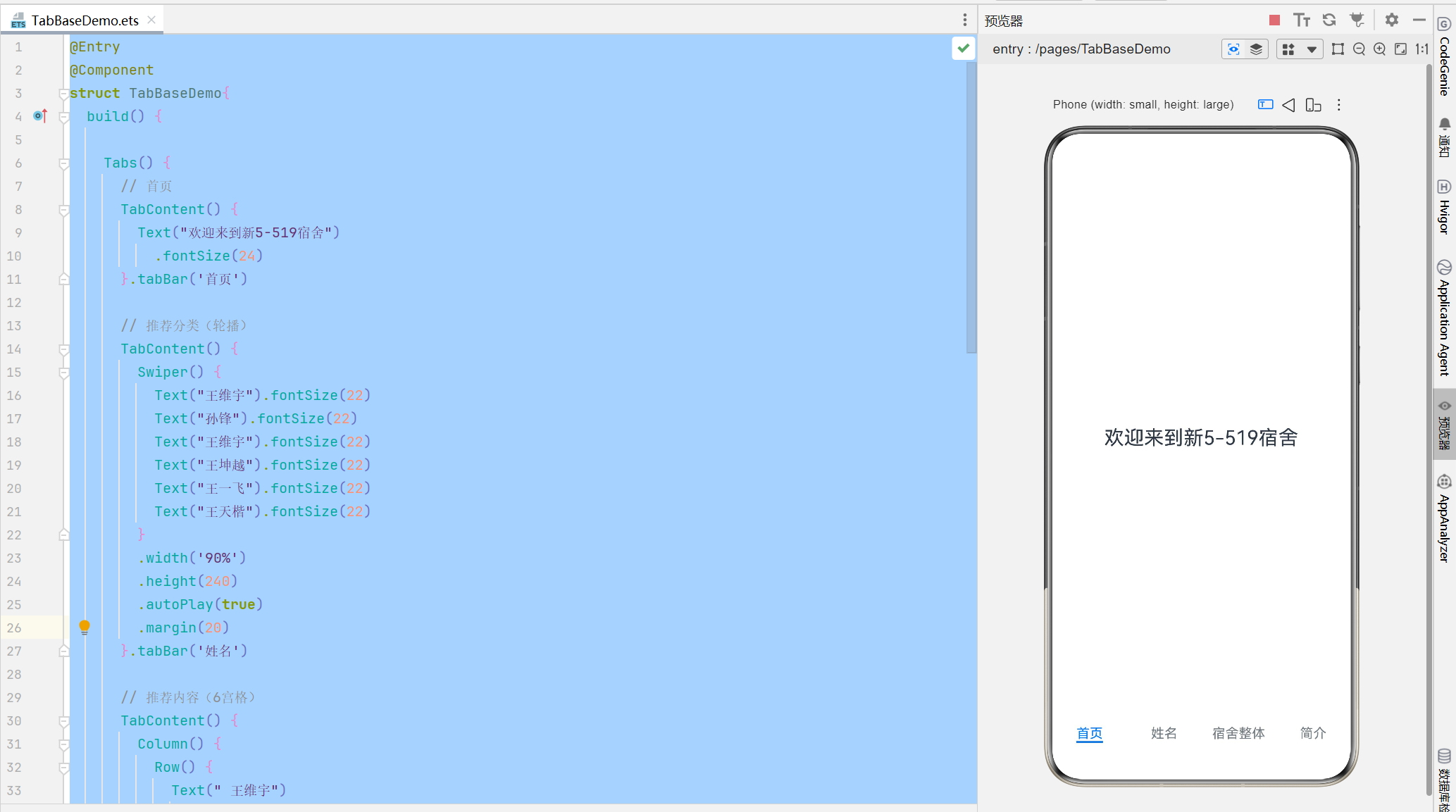
学生宿舍页面:
@Entry
@Component
struct TabBaseDemo{
  build() {

    Tabs() {
      // 首页
      TabContent() {
        Text("欢迎来到新5-519宿舍")
          .fontSize(24)
      }.tabBar('首页')

      // 推荐分类(轮播)
      TabContent() {
        Swiper() {
          Text("王维宇").fontSize(22)
          Text("孙锋").fontSize(22)
          Text("王维宇").fontSize(22)
          Text("王坤越").fontSize(22)
          Text("王一飞").fontSize(22)
          Text("王天楷").fontSize(22)
        }
        .width('90%')
        .height(240)
        .autoPlay(true)
        .margin(20)
      }.tabBar('姓名')

      // 推荐内容(6宫格)
      TabContent() {
        Column() {
          Row() {
            Text(" 王维宇")
              .width(150)
              .height(100)
              .backgroundColor(Color.White)
              .margin(5)
            Text(" 孙峰 ")
              .width(150)
              .height(100)
              .backgroundColor(Color.White)
              .margin(5)
          }
          Row() {
            Text(" 田传程 ")
              .width(150)
              .height(100)
              .backgroundColor(Color.White)
              .margin(5)
            Text(" 王坤越")
              .width(150)
              .height(100)
              .backgroundColor(Color.White)
              .margin(5)
          }
          Row() {
            Text(" 孙锋")
              .width(150)
              .height(100)
              .backgroundColor(Color.White)
              .margin(5)
            Text(" 王天凯 ")
              .width(150)
              .height(100)
              .backgroundColor(Color.White)
              .margin(5)
          }
        }
        .margin(20)
      }.tabBar('宿舍整体')

      // 个人中心页面
      TabContent() {
        Text('具有氛围宿舍').fontSize(24)
      }.tabBar('简介')
    }
    .barPosition(BarPosition.End)
  }
}
四、运行效果(对应博客图片说明)
效果 1:首页(居中文字欢迎语)
垂直布局居中,简洁干净。
效果 2:轮播页面(Swiper)
自动滚动,展示学生姓名 + 学号。
效果 3:6 宫格布局(Row+Column 实现)
手写 3 行 2 列,白色卡片格子,学生信息清晰展示。
效果 4:底部导航栏
首页 / 推荐分类 / 推荐内容 / 我的 固定底部,可左右滑动切换。

讨论HarmonyOS开发技术,专注于API与组件、DevEco Studio、测试、元服务和应用上架分发等。
更多推荐

 6
6 0
0- 0


 已为社区贡献2条内容

所有评论(0)