HarmonyOS ArkUI 组件通用属性全面解析与实战演示
文章目录
一、通用属性概览
1.1 什么是通用属性?
通用属性是 ArkUI 框架中所有组件共同支持的一组属性,通过链式调用方式挂载在组件上。与组件专属属性(如 Text 的 fontSize)不同,通用属性适用于任意组件,极大减少了重复学习成本。
通用属性主要涵盖以下几大类别:
- 尺寸约束:
width、height、minWidth、maxWidth等 - 外观样式:
backgroundColor、opacity、border、borderRadius等 - 布局位置:
margin、padding、position、offset等 - 显示控制:
visibility、displayPriority、zIndex等 - 交互行为:
enabled、focusable、defaultFocus等 - 变换动效:
rotate、scale、translate、transform等
1.2 属性分类总览
| 分类 | 代表属性 | 说明 |
|---|---|---|
| 尺寸 | width / height / size |
控制组件宽高 |
| 间距 | margin / padding |
控制外边距和内边距 |
| 背景 | backgroundColor / backgroundImage |
设置背景色或背景图 |
| 边框 | border / borderRadius |
边框样式和圆角 |
| 透明度 | opacity |
0.0(全透明)~ 1.0(不透明) |
| 显隐 | visibility |
visible / hidden / None |
| 焦点 | focusable / defaultFocus |
键盘导航与无障碍 |
| 变换 | rotate / scale / translate |
2D/3D 变换效果 |
提示:ArkUI 的通用属性均通过链式调用方式使用,即在组件后面直接
.属性名(参数)连续调用,无需额外导入,非常简洁。
二、尺寸与间距属性
2.1 width / height / size
width 和 height 是最基础的尺寸属性,支持 number(vp 单位)、百分比字符串 '50%' 两种形式。
// entry/src/main/ets/pages/Index.ets
@Entry
@Component
struct SizeDemo {
  build() {
    Column({ space: 16 }) {
      // 固定尺寸(单位:vp)
      Text('固定尺寸 200×60')
        .width(200)
        .height(60)
        .backgroundColor('#1976D2')
        .fontColor(Color.White)
        .textAlign(TextAlign.Center)

      // 百分比宽度
      Text('宽度 90%')
        .width('90%')
        .height(50)
        .backgroundColor('#388E3C')
        .fontColor(Color.White)
        .textAlign(TextAlign.Center)

      // 使用 size 一次性设置
      Text('size({width:150, height:80})')
        .size({ width: 150, height: 80 })
        .backgroundColor('#F57C00')
        .fontColor(Color.White)
        .textAlign(TextAlign.Center)
    }
    .width('100%')
    .padding(20)
  }
}
运行效果如下图所示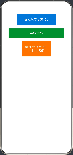
2.2 margin 与 padding
外边距(margin) 控制组件与外部元素的间距,内边距(padding) 控制组件内容与边框的间距。两者均支持统一值或分方向设置。
Text('margin & padding 演示')
  .width(200)
  .height(60)
  .backgroundColor('#7B1FA2')
  .fontColor(Color.White)
  .textAlign(TextAlign.Center)
  // 统一内边距
  .padding(12)
  // 分方向外边距
  .margin({ top: 10, bottom: 10, left: 20, right: 20 })
| 属性 | 类型 | 示例 |
|---|---|---|
margin(value) |
number | Margin |
.margin(16) 或 .margin({top:8, left:16}) |
padding(value) |
number | Padding |
.padding(12) 或 .padding({top:4, bottom:4}) |
margin({top,bottom,left,right}) |
Margin 对象 |
分方向设置 |
padding({top,bottom,left,right}) |
Padding 对象 |
分方向设置 |
三、背景与外观属性
3.1 backgroundColor 背景颜色
backgroundColor 是最常用的外观属性,支持 ArkUI 内置 Color 枚举、十六进制颜色字符串和 0xAARRGGBB 格式。
Column({ space: 12 }) {
  // 使用内置 Color 枚举
  Text('Color.Blue').width(160).height(44)
    .backgroundColor(Color.Blue).fontColor(Color.White).textAlign(TextAlign.Center)

  // 使用十六进制字符串
  Text('#FF5722').width(160).height(44)
    .backgroundColor('#FF5722').fontColor(Color.White).textAlign(TextAlign.Center)

  // 使用 rgba 字符串
  Text('半透明背景').width(160).height(44)
    .backgroundColor('rgba(33,150,243,0.4)').textAlign(TextAlign.Center)

  // 使用 0xAARRGGBB 格式
  Text('0xFF4CAF50').width(160).height(44)
    .backgroundColor(0xFF4CAF50).fontColor(Color.White).textAlign(TextAlign.Center)
}
3.2 opacity 透明度
opacity 控制组件及其所有子组件的整体透明度,取值范围 0.0(全透明)~ 1.0(完全不透明)。
Row({ space: 16 }) {
  Text('opacity: 1.0').width(100).height(60)
    .backgroundColor('#E53935').fontColor(Color.White).textAlign(TextAlign.Center)
    .opacity(1.0)

  Text('opacity: 0.6').width(100).height(60)
    .backgroundColor('#E53935').fontColor(Color.White).textAlign(TextAlign.Center)
    .opacity(0.6)

  Text('opacity: 0.2').width(100).height(60)
    .backgroundColor('#E53935').fontColor(Color.White).textAlign(TextAlign.Center)
    .opacity(0.2)
}
注意:
opacity会同时影响子组件,若只需背景半透明而文字不透明,建议使用backgroundColor('rgba(r,g,b,alpha)')方式代替。
四、边框与圆角属性
4.1 border 边框
ArkUI 提供灵活的边框设置方式,可统一设置也可分四个方向单独配置。
| 属性 | 类型 | 说明 |
|---|---|---|
border({width, color, style, radius}) |
BorderOptions |
统一设置边框 |
borderWidth(value) |
number | EdgeWidths |
边框宽度 |
borderColor(value) |
ResourceColor | EdgeColors |
边框颜色 |
borderStyle(value) |
BorderStyle |
solid / dashed / dotted |
borderRadius(value) |
number | BorderRadiuses |
圆角半径 |
Column({ space: 16 }) {
  // 统一边框
  Text('实线边框')
    .width(200).height(50).textAlign(TextAlign.Center)
    .border({ width: 2, color: '#1976D2', style: BorderStyle.Solid })

  // 虚线边框 + 圆角
  Text('虚线圆角边框')
    .width(200).height(50).textAlign(TextAlign.Center)
    .border({ width: 2, color: '#E91E63', style: BorderStyle.Dashed })
    .borderRadius(25)

  // 分四角不同圆角
  Text('不对称圆角')
    .width(200).height(50).textAlign(TextAlign.Center)
    .backgroundColor('#FFF9C4')
    .borderRadius({ topLeft: 20, topRight: 0, bottomLeft: 0, bottomRight: 20 })
    .border({ width: 1, color: '#FBC02D', style: BorderStyle.Solid })

  // 点状边框
  Text('点状边框')
    .width(200).height(50).textAlign(TextAlign.Center)
    .border({ width: 3, color: '#4CAF50', style: BorderStyle.Dotted })
    .borderRadius(8)
}
运行效果如下图所示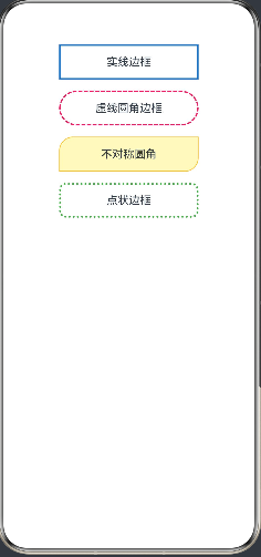
五、显示与可见性属性
5.1 visibility 可见性
visibility 控制组件的显示状态,与 if/else 条件渲染的区别在于:隐藏的组件依然占据布局空间。
// Visibility 三种状态
Text('Visibility.Visible(可见)').visibility(Visibility.Visible)
Text('Visibility.Hidden(隐藏但占位)').visibility(Visibility.Hidden)
Text('Visibility.None(隐藏不占位)').visibility(Visibility.None)
5.2 displayPriority 显示优先级
当父容器空间不足时,displayPriority 数值越小的组件越先被隐藏,用于响应式布局中的优先级控制。
Row() {
  Text('主要内容').displayPriority(2).layoutWeight(1)
  Text('次要内容').displayPriority(1)
  Text('可省略内容').displayPriority(0)
}
.width('100%')
5.3 zIndex 层叠顺序
zIndex 控制组件在 Z 轴方向的叠放顺序,数值越大越靠前显示。
Stack() {
  Text('底层 zIndex:0').width(150).height(150)
    .backgroundColor('#BBDEFB').zIndex(0)
  Text('中层 zIndex:1').width(120).height(120)
    .backgroundColor('#90CAF9').zIndex(1).offset({ x: 20, y: 20 })
  Text('顶层 zIndex:2').width(90).height(90)
    .backgroundColor('#1565C0').fontColor(Color.White).zIndex(2).offset({ x: 40, y: 40 })
}
.width(200).height(200)
六、位置与偏移属性
6.1 position 绝对定位
position 使组件相对于父容器左上角进行绝对定位,脱离正常文档流。
Stack() {
  // 背景容器
  Column().width('100%').height(200).backgroundColor('#F5F5F5')

  // 绝对定位的徽标
  Text('NEW')
    .width(48).height(24)
    .backgroundColor('#F44336')
    .fontColor(Color.White)
    .fontSize(12)
    .textAlign(TextAlign.Center)
    .borderRadius(4)
    .position({ x: 10, y: 10 })  // 距父容器左上角 (10, 10)
}
6.2 offset 相对偏移
offset 在组件原始位置基础上进行相对偏移,不影响其他组件的布局。
Row({ space: 10 }) {
  Text('正常').width(60).height(40).backgroundColor('#E0E0E0').textAlign(TextAlign.Center)
  Text('向下偏移').width(60).height(40).backgroundColor('#FFCC80').textAlign(TextAlign.Center)
    .offset({ x: 0, y: 10 })  // 向下偏移 10vp
  Text('正常').width(60).height(40).backgroundColor('#E0E0E0').textAlign(TextAlign.Center)
}
七、变换属性
7.1 rotate / scale / translate
ArkUI 提供原生的 2D/3D 变换属性,无需额外动画框架即可实现旋转、缩放、位移效果。
| 属性 | 参数类型 | 说明 |
|---|---|---|
rotate({x,y,z,angle}) |
RotateOptions |
绕指定轴旋转,angle 为度数 |
scale({x,y,z,centerX,centerY}) |
ScaleOptions |
X/Y/Z 轴缩放比例 |
translate({x,y,z}) |
TranslateOptions |
X/Y/Z 轴平移(vp 或百分比) |
Column({ space: 24 }) {
  // 旋转 45 度
  Text('rotate 45°')
    .width(120).height(50).backgroundColor('#7C4DFF')
    .fontColor(Color.White).textAlign(TextAlign.Center)
    .rotate({ x: 0, y: 0, z: 1, angle: 45 })

  // 缩放 1.3 倍
  Text('scale 1.3x')
    .width(120).height(50).backgroundColor('#00BCD4')
    .fontColor(Color.White).textAlign(TextAlign.Center)
    .scale({ x: 1.3, y: 1.3 })

  // X 轴平移 30vp
  Text('translate X+30')
    .width(120).height(50).backgroundColor('#8BC34A')
    .fontColor(Color.White).textAlign(TextAlign.Center)
    .translate({ x: 30, y: 0 })
}
.padding({ top: 40 })
运行效果如下图所示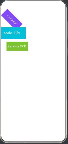
八、焦点与交互属性
8.1 focusable / defaultFocus
focusable 控制组件是否可接受键盘/遥控器焦点,defaultFocus 使组件在页面加载时自动获得焦点,这两个属性在 TV 端和车机场景尤为重要。
Column({ space: 16 }) {
  Button('默认聚焦按钮')
    .width(200)
    .focusable(true)
    .defaultFocus(true)   // 页面打开自动聚焦

  Button('可聚焦按钮')
    .width(200)
    .focusable(true)

  Button('不可聚焦按钮')
    .width(200)
    .focusable(false)     // Tab 键不会聚焦到此按钮
}
8.2 enabled 启用/禁用
enabled 控制组件是否响应用户交互,禁用后组件呈现灰色半透明效果,点击、按键事件均不触发。
Column({ space: 12 }) {
  Button('正常按钮(可点击)').width(200).enabled(true)
  Button('禁用按钮(不可点击)').width(200).enabled(false)
}
九、综合实战:通用属性演示页面
以下是一个完整的可运行页面,整合了本文所有主要通用属性。
// entry/src/main/ets/pages/Index.ets

@Entry
@Component
struct GeneralAttributesDemo {
  @State opacityVal: number = 1.0
  @State isVisible: boolean = true
  @State rotateAngle: number = 0
  @State scaleVal: number = 1.0
  @State isEnabled: boolean = true
  @State bgColor: string = '#1976D2'
  @State borderRadiusVal: number = 8

  build() {
    Scroll() {
      Column({ space: 20 }) {

        // ── 标题 ──────────────────────────────
        Text('ArkUI 通用属性演示')
          .fontSize(22)
          .fontWeight(FontWeight.Bold)
          .margin({ top: 16, bottom: 4 })

        // ── 尺寸与背景 ────────────────────────
        Text('① 尺寸 & 背景色')
          .fontSize(16).fontWeight(FontWeight.Medium).alignSelf(ItemAlign.Start)

        Row({ space: 12 }) {
          Text('200×60')
            .width(200).height(60)
            .backgroundColor(this.bgColor)
            .fontColor(Color.White).textAlign(TextAlign.Center)
            .borderRadius(this.borderRadiusVal)

          Column({ space: 8 }) {
            Button('切换颜色').width(100)
              .onClick(() => {
                this.bgColor = this.bgColor === '#1976D2' ? '#E91E63' : '#1976D2'
              })
            Button('增大圆角').width(100)
              .onClick(() => {
                this.borderRadiusVal = (this.borderRadiusVal + 8) % 40
              })
          }
        }

        // ── 透明度 ────────────────────────────
        Text('② 透明度 opacity: ' + this.opacityVal.toFixed(1))
          .fontSize(16).fontWeight(FontWeight.Medium).alignSelf(ItemAlign.Start)

        Column({ space: 8 }) {
          Text('透明度变化演示')
            .width(200).height(60)
            .backgroundColor('#9C27B0')
            .fontColor(Color.White).textAlign(TextAlign.Center)
            .borderRadius(8)
            .opacity(this.opacityVal)

          Row({ space: 12 }) {
            Button('变透明').onClick(() => {
              this.opacityVal = Math.max(0.1, this.opacityVal - 0.2)
            })
            Button('变不透明').onClick(() => {
              this.opacityVal = Math.min(1.0, this.opacityVal + 0.2)
            })
          }
        }

        // ── 边框 ──────────────────────────────
        Text('③ 边框样式')
          .fontSize(16).fontWeight(FontWeight.Medium).alignSelf(ItemAlign.Start)

        Row({ space: 12 }) {
          Text('实线').width(80).height(50).textAlign(TextAlign.Center)
            .border({ width: 2, color: '#1976D2', style: BorderStyle.Solid })
          Text('虚线').width(80).height(50).textAlign(TextAlign.Center)
            .border({ width: 2, color: '#E91E63', style: BorderStyle.Dashed })
          Text('点线').width(80).height(50).textAlign(TextAlign.Center)
            .border({ width: 3, color: '#4CAF50', style: BorderStyle.Dotted })
        }

        // ── 可见性 ────────────────────────────
        Text('④ 可见性 visibility')
          .fontSize(16).fontWeight(FontWeight.Medium).alignSelf(ItemAlign.Start)

        Column({ space: 8 }) {
          Row({ space: 8 }) {
            Text('我始终可见').height(40).padding({ left: 12, right: 12 })
              .backgroundColor('#E8F5E9').borderRadius(4)
              .visibility(Visibility.Visible)
            Text('我被隐藏了').height(40).padding({ left: 12, right: 12 })
              .backgroundColor('#FFEBEE').borderRadius(4)
              .visibility(this.isVisible ? Visibility.Visible : Visibility.Hidden)
            Text('占位标记').height(40).padding({ left: 12, right: 12 })
              .backgroundColor('#E3F2FD').borderRadius(4)
          }
          Button(this.isVisible ? '隐藏中间块' : '显示中间块').width(160)
            .onClick(() => { this.isVisible = !this.isVisible })
        }

        // ── 变换 ──────────────────────────────
        Text('⑤ 变换 rotate / scale')
          .fontSize(16).fontWeight(FontWeight.Medium).alignSelf(ItemAlign.Start)

        Column({ space: 8 }) {
          Text('变换演示')
            .width(140).height(56)
            .backgroundColor('#FF6F00')
            .fontColor(Color.White).textAlign(TextAlign.Center)
            .borderRadius(8)
            .rotate({ x: 0, y: 0, z: 1, angle: this.rotateAngle })
            .scale({ x: this.scaleVal, y: this.scaleVal })

          Row({ space: 12 }) {
            Button('旋转+30°').onClick(() => {
              this.rotateAngle = (this.rotateAngle + 30) % 360
            })
            Button('放大').onClick(() => {
              this.scaleVal = Math.min(1.8, this.scaleVal + 0.1)
            })
            Button('缩小').onClick(() => {
              this.scaleVal = Math.max(0.5, this.scaleVal - 0.1)
            })
          }
        }

        // ── 启用/禁用 ─────────────────────────
        Text('⑥ 启用 / 禁用 enabled')
          .fontSize(16).fontWeight(FontWeight.Medium).alignSelf(ItemAlign.Start)

        Row({ space: 12 }) {
          Button('功能按钮').width(120)
            .enabled(this.isEnabled)
            .onClick(() => { console.info('功能按钮被点击') })

          Button(this.isEnabled ? '点击禁用' : '点击启用').width(120)
            .onClick(() => { this.isEnabled = !this.isEnabled })
        }

        Blank().height(30)
      }
      .width('100%')
      .padding({ left: 16, right: 16 })
      .alignItems(HorizontalAlign.Center)
    }
    .width('100%')
    .height('100%')
  }
}
运行效果如下图所示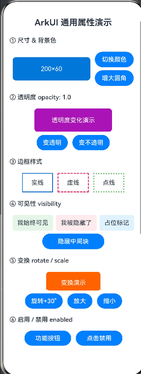
十、注意事项与最佳实践
10.1 单位选择规范
- 推荐使用 vp(虚拟像素) 作为默认尺寸单位,ArkUI 会自动按屏幕密度换算为物理像素
- 字体大小使用 fp(字体像素),可随系统字体大小设置自动缩放
- 百分比
'50%'相对于父容器,适合自适应布局
10.2 链式调用顺序说明
ArkUI 属性链式调用时,部分属性有依赖关系,建议遵循以下顺序:
- 先设置尺寸(
width/height),再设置边距(margin/padding) position绝对定位通常配合Stack容器使用rotate/scale等变换属性不影响组件的布局位置,仅影响视觉呈现
10.3 常见误区
以下是开发过程中容易混淆的属性对比:
| 易混点 | 说明 |
|---|---|
visibility(Visibility.Hidden) vs if(false) |
前者保留布局空间,后者完全从树中移除 |
opacity(0) vs visibility(Visibility.None) |
前者透明但仍响应事件,后者不占位不响应事件 |
position vs offset |
前者绝对定位脱离文档流,后者相对当前位置偏移不影响其他组件 |
enabled(false) vs focusable(false) |
前者禁用全部交互,后者仅取消键盘焦点 |
最佳实践:尽量使用 ArkUI 内置的
Color枚举(如Color.Blue)而非硬编码颜色字符串,这样在深色模式下系统可自动适配颜色反转。
总结
本文系统梳理了 HarmonyOS ArkUI 组件通用属性 的完整知识体系,涵盖以下核心要点:
主要内容回顾:
- 尺寸与间距:
width/height/margin/padding构成布局基础 - 外观样式:
backgroundColor/opacity/border/borderRadius打造精美 UI - 显示控制:
visibility/zIndex/displayPriority灵活管理组件层次 - 变换效果:
rotate/scale/translate无需动画框架即可实现变换 - 交互行为:
enabled/focusable/defaultFocus完善跨设备交互体验
掌握通用属性是 HarmonyOS UI 开发的必备基础,下一篇将深入探讨 ArkUI 动画系统,基于本文的 rotate/scale 属性实现流畅的过渡动画效果,敬请期待。
如果这篇文章对你有帮助,欢迎点赞👍、收藏⭐、关注🔔,你的支持是我持续创作的动力!

讨论HarmonyOS开发技术,专注于API与组件、DevEco Studio、测试、元服务和应用上架分发等。
更多推荐
 59
59 0
0- 0


 已为社区贡献544条内容

所有评论(0)