【HarmonyOS实战】 沉浸式全屏布局:状态栏和导航栏那些坑
文章目录
前言
现在几乎所有优秀的移动 App 都是沉浸式的——UI 内容延伸到状态栏下面,视觉上更整洁、更有代入感。
但实现沉浸式有一个最大的坑:内容可能被状态栏或导航条遮挡。这篇文章讲清楚:加油站项目是怎么实现沉浸式的,以及怎么优雅地处理安全区域问题。
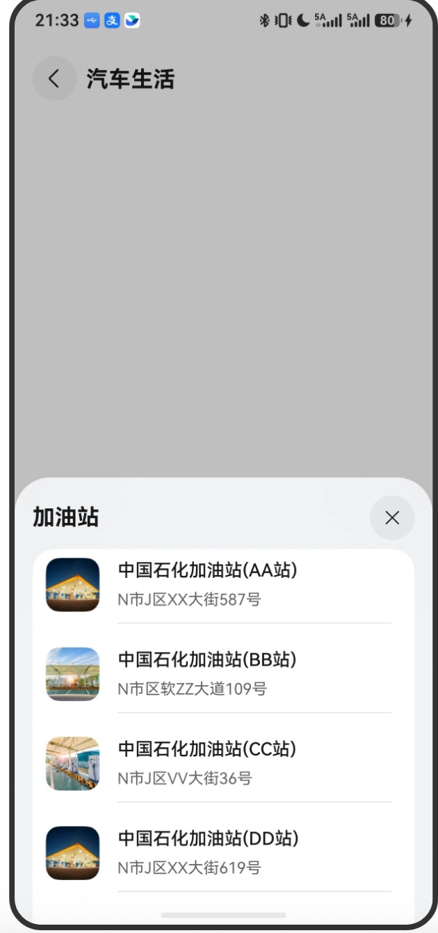
项目预览

一、什么是沉浸式布局?
默认情况下,HarmonyOS 应用的内容区域是这样的:
┌──────────────────────┐
│  状态栏(系统)       │  ← 高度约 40-50px,不属于应用
├──────────────────────┤
│                      │
│   应用内容区域        │  ← 应用可用区域
│                      │
├──────────────────────┤
│  导航栏(系统)       │  ← 高度约 34px(有导航条的机型)
└──────────────────────┘
开启沉浸式后:
┌──────────────────────┐
│  状态栏(系统)       │  ← 状态栏变透明,内容延伸到这里
│  ─────────────────── │
│                      │
│   应用内容区域        │  ← 应用内容占满整个屏幕
│   (占满全屏)        │
│                      │
│  ─────────────────── │
│  导航栏(系统)       │  ← 导航条变透明,内容延伸到这里
└──────────────────────┘
好看是好看了,但有个问题:如果不做处理,你的文字/按钮可能会被状态栏或导航条遮住。
二、开启沉浸式的代码
// EntryAbility.ets → onWindowStageCreate()
let isLayoutFullScreen = true;
let windowClass: window.Window = windowStage.getMainWindowSync();
windowClass.setWindowLayoutFullScreen(isLayoutFullScreen).then(() => {
  hilog.info(0x0000, 'testTag', 'Succeeded in setting the window layout to full-screen mode.');
}).catch((err: BusinessError) => {
  hilog.error(0x0000, 'testTag',
    'Failed to set the window layout to full-screen mode. Cause:' + JSON.stringify(err));
});
setWindowLayoutFullScreen(true) 这一行就搞定了沉浸式布局,之后应用内容会铺满整个屏幕(包括状态栏和导航栏区域)。
三、获取安全区域高度
沉浸式开启后,下一步是获取状态栏和导航条的实际高度,这样我们才能给内容设置合适的 padding,避免遮挡:
// 获取底部导航条高度(导航指示器区域)
let type = window.AvoidAreaType.TYPE_NAVIGATION_INDICATOR;
let avoidArea = windowClass.getWindowAvoidArea(type);
let bottomRectHeight = avoidArea.bottomRect.height;
AppStorage.setOrCreate('bottomRectHeight', bottomRectHeight);

// 获取顶部状态栏高度(系统状态栏区域)
type = window.AvoidAreaType.TYPE_SYSTEM;
avoidArea = windowClass.getWindowAvoidArea(type);
let topRectHeight = avoidArea.topRect.height;
AppStorage.setOrCreate('topRectHeight', topRectHeight);
3.1 AvoidAreaType 有哪些类型?
| 类型 | 描述 | 典型场景 |
|---|---|---|
TYPE_SYSTEM |
系统状态栏 | 顶部显示时间、电量等 |
TYPE_NAVIGATION_INDICATOR |
底部导航指示器(Home键条) | iPhone 底部小横条、HarmonyOS 导航条 |
TYPE_CUTOUT |
刘海/挖孔区域 | 异形屏手机 |
TYPE_KEYBOARD |
软键盘 | 输入法弹出时 |
3.2 avoidArea 的结构
interface AvoidArea {
  topRect: Rect;      // 上方避让矩形
  leftRect: Rect;     // 左方避让矩形
  rightRect: Rect;    // 右方避让矩形
  bottomRect: Rect;   // 下方避让矩形
}

interface Rect {
  left: number;    // 矩形左边x坐标
  top: number;     // 矩形顶部y坐标
  width: number;   // 矩形宽度
  height: number;  // 矩形高度(我们需要的就是这个)
}
所以:
- 状态栏高度 =
avoidArea.topRect.height(TYPE_SYSTEM) - 导航条高度 =
avoidArea.bottomRect.height(TYPE_NAVIGATION_INDICATOR)
四、动态监听安全区域变化
仅在 onWindowStageCreate 里读一次高度是不够的——手机竖横屏切换、折叠屏展开/折叠时,高度都会变化:
// 注册监听器
windowClass.on('avoidAreaChange', (data) => {
  if (data.type === window.AvoidAreaType.TYPE_SYSTEM) {
    let topRectHeight = data.area.topRect.height;
    AppStorage.setOrCreate('topRectHeight', topRectHeight);
  } else if (data.type === window.AvoidAreaType.TYPE_NAVIGATION_INDICATOR) {
    let bottomRectHeight = data.area.bottomRect.height;
    AppStorage.setOrCreate('bottomRectHeight', bottomRectHeight);
  }
});
当安全区域变化时,这个回调会自动触发,更新 AppStorage 里的值。由于页面用 @StorageProp 绑定了这些值,UI 会自动重新渲染,安全区域适配是实时的。
五、在页面中消费安全区域高度
EntryAbility 把高度存入 AppStorage,页面用 @StorageProp 取出来:
// GasStationPage.ets
@Component
struct GasStationPage {
  @StorageProp('bottomRectHeight')
  bottomRectHeight: number = 0;    // 底部导航条高度(px)

  @StorageProp('topRectHeight')
  topRectHeight: number = 0;       // 顶部状态栏高度(px)

  // ...
}
5.1 换算单位:px → vp
getWindowAvoidArea 返回的高度单位是 px(物理像素),但布局属性通常用 vp(虚拟像素)。不过在这个项目里,这个值直接用在了 padding 中,HarmonyOS 的部分属性接受 px 值,这里需要注意实际使用时可能需要换算:
// 如果需要换算
import { display } from '@kit.ArkUI';
let density = display.getDefaultDisplaySync().densityDPI / 160; // 获取屏幕密度
let topRectHeightVp = topRectHeight / density;
实际项目中,由于 topRectHeight 和 bottomRectHeight 主要用于在特定场景下作为组件的 padding 偏移,这种简单用法一般能正常工作。
六、地图页的实际效果
GasStationPage.ets 使用了 NavDestination + Stack 的结构:
build() {
  NavDestination() {
    Stack() {
      // 底层:全屏地图(自动铺满整个屏幕,包括状态栏区域)
      MapComponent({
        mapOptions: this.mapOptions,
        mapCallback: this.callback,
      });

      // 上层:标题栏,固定在顶部
      this.titleBuilder();
    }
    .width('100%')
    .height('100%')
    // 底部弹窗配置...
    .bindSheet(...)
  }
  .hideToolBar(true)     // 隐藏系统工具栏
  .hideTitleBar(true)    // 隐藏系统标题栏
  .height('100%')
  .width('100%')
}
hideTitleBar(true) 和 hideToolBar(true) 配合沉浸式,把系统自带的标题栏和工具栏都隐藏,让地图真正铺满全屏。
标题栏的位置处理
@Builder
titleBuilder() {
  Row({ space: Constants.SPACE_8 }) {
    Image($r('app.media.back'))
      .width(40).height(40)
      .onClick(() => { this.pageInfos.pop(); });
    Text($r('app.string.car_life'))
      .fontWeight(700).fontSize(20);
  }
  .width('100%')
  .padding({ left: 16 })
  .position({
    top: Constants.POSITION_TOP    // 固定在距顶部 50px 的位置
  });
}
标题栏用 .position({ top: 50 }) 固定在距顶部 50px 的地方,避开了状态栏。
提示:这里直接用了固定的 50px,更精确的做法是用
topRectHeight动态计算:.position({ top: this.topRectHeight + 8 }),这样在不同机型上都能正确避开状态栏。
七、主页的状态栏适配
主页 MainPage 使用 Navigation 组件,它有内置的标题栏,标题栏会自动处理状态栏的避让:
build() {
  Navigation(this.pageInfos) {
    this.pageBuilder();
  }
  .title($r('app.string.car_life'))    // Navigation 的标题
  .width('100%')
  .height('100%')
  .backgroundColor($r('app.color.page_background'));
}
Navigation 的标题栏会自动出现在状态栏下方,不需要手动计算高度。这是 Navigation 组件的一大优点——系统帮你处理好了安全区域。
八、不同机型的差异
| 机型 | 状态栏高度 | 导航条高度 |
|---|---|---|
| 有实体Home键的旧机型 | ~72px | 0(无虚拟导航条) |
| 全面屏(有导航条) | ~100px | ~68px |
| 折叠屏展开 | ~40px | ~34px |
| 折叠屏折叠 | ~100px | ~68px |
正因为差异大,才需要动态获取而不是写死。
总结
沉浸式布局分三步走:
- 开启全屏:
setWindowLayoutFullScreen(true) - 读取高度:
getWindowAvoidArea()获取状态栏和导航条高度,存入AppStorage - 动态更新:
on('avoidAreaChange')监听变化,实时更新
页面用 @StorageProp 取出高度,在需要避让的地方设置对应的 padding。搞定这三步,沉浸式体验就稳了。
下一篇讲 AppStorage 全局状态共享——为什么高度要存在 AppStorage 里,AppStorage 到底是什么东西?

讨论HarmonyOS开发技术,专注于API与组件、DevEco Studio、测试、元服务和应用上架分发等。
更多推荐

 9
9 0
0- 0


 已为社区贡献317条内容

所有评论(0)