Opacity 透明度方案深度解析:Column 中平滑动画与布局稳定的完美结合_HarmonyOS NEXT 6.1.1(API 24)
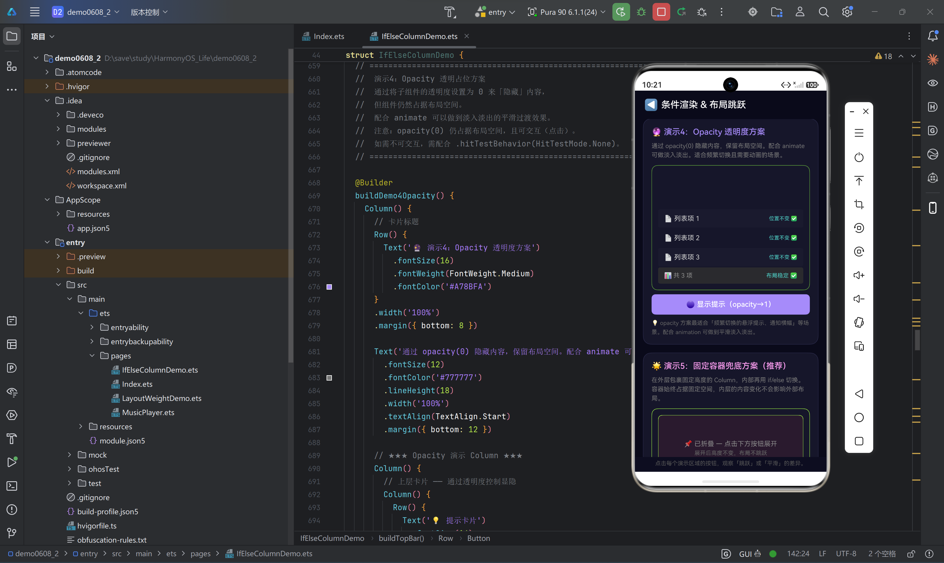


一、引言:隐藏的最高境界是「看不见但仍然在」
前几篇博客中,我们分别讨论了:
- if/else:组件创建/销毁 → 布局跳跃
- Blank():用空白组件占位 → 需手动维护高度
- Visibility.Hidden:组件保留但不可见 → 无法做动画
有没有一种方案,能同时做到「布局稳定」和「平滑动画」?
答案就藏在 opacity() 属性中。
opacity 控制组件的透明度,范围是 0(完全透明)到 1(完全不透明)。当透明度为 0 时,组件虽然看不见,但它的布局空间被完整保留——因为组件本身从未从布局树中移除。
更棒的是,opacity 的变化可以配合 animation 属性,产生平滑的淡入淡出效果。这是其他任何方案都不具备的独特优势。
核心洞察:
opacity(0)是「你看不见我,但我一直在那儿」,而animation让「从看不见到看见」的过程变得优雅。
二、Opacity 属性全方位解析
2.1 属性定义
// 属性签名
.opacity(value: number)

// value 范围:0.0 ~ 1.0
// 0.0 = 完全透明(不可见)
// 1.0 = 完全不透明(默认值)
// 0.5 = 半透明

// 使用示例
Text('半透明文字').opacity(0.5)
Image($r('app.media.photo')).opacity(0.3)
Column() { /* ... */ }.opacity(0)  // 完全透明
2.2 透明度渐变值详解
.opacity(0.0)     // 完全透明,不可见
.opacity(0.1)     // 几乎透明
.opacity(0.3)     // 隐约可见
.opacity(0.5)     // 半透明
.opacity(0.7)     // 较清晰
.opacity(0.9)     // 几乎不透明
.opacity(1.0)     // 完全不透明(默认)
2.3 实际效果示例
build() {
  Column() {
    // 透明度渐变条
    Row() { Text('opacity(0.2)').opacity(0.2).fontColor('#FFFFFF') }
      .height(30).backgroundColor('#4A4A7A').borderRadius(4).margin({ bottom: 2 })
    Row() { Text('opacity(0.4)').opacity(0.4).fontColor('#FFFFFF') }
      .height(30).backgroundColor('#4A4A7A').borderRadius(4).margin({ bottom: 2 })
    Row() { Text('opacity(0.6)').opacity(0.6).fontColor('#FFFFFF') }
      .height(30).backgroundColor('#4A4A7A').borderRadius(4).margin({ bottom: 2 })
    Row() { Text('opacity(0.8)').opacity(0.8).fontColor('#FFFFFF') }
      .height(30).backgroundColor('#4A4A7A').borderRadius(4).margin({ bottom: 2 })
    Row() { Text('opacity(1.0)').opacity(1.0).fontColor('#FFFFFF') }
      .height(30).backgroundColor('#4A4A7A').borderRadius(4)
  }
  .padding(16)
}
三、Opacity 方案的核心原理
3.1 为什么 opacity(0) 能保留布局空间
关键差异在于组件的「存在性」跟「可见性」是两回事:
组件的属性:
┌──────────────────────────────────────────────┐
│  存在性(Existence)  │   可见性(Visibility)  │
│──────────────────────│────────────────────────│
│  组件实例存在        │   .visibility() 控制    │
│  在布局树中          │   .opacity() 控制       │
│  占据布局空间        │   .scale(0) 控制        │
│  参与测量和布局      │                        │
└──────────────────────────────────────────────┘
opacity()只影响「可见性」,不影响「存在性」- 组件在
opacity(0)时,仍然在布局树中,仍然参与测量和布局 - Column 计算子组件位置时,照常累加这个组件的尺寸
3.2 布局计算对比
opacity(0) 状态下的 Column 布局:
┌─────────────────────┐  top=0
│  固定标题           │  height=36
├─────────────────────┤  top=36
│  透明区域           │  height=80  ← 虽然看不见,但占据空间
│  (opacity: 0)       │              Column 计算时仍把它算进去
├─────────────────────┤  top=116 (=36+80)
│  底部内容           │  height=44
├─────────────────────┤  top=160
│  底部提示           │  height=20
└─────────────────────┘  total=180

if/else false 状态下的 Column 布局:
┌─────────────────────┐  top=0
│  固定标题           │  height=36
├─────────────────────┤  top=36
│  底部内容           │  height=44  ← 直接填充了上面的空间
├─────────────────────┤  top=80
│  底部提示           │  height=20
└─────────────────────┘  total=100
底部内容的 top 从 36 变成了 116——这个 80vp 的差值确保了布局的绝对稳定。
3.3 动画原理
时间轴:
├───── 隐藏状态 ─────┤─── 切换 ───├───── 显示状态 ─────┤

opacity 变化:
0.0 ──────────────────→ 0.0 → 0.3 → 0.6 → 1.0 ──────→ 1.0
              (animation 插值:300ms 内渐变)

组件位置:
不变(因为 opacity 不影响布局)                   不变
当 animation 属性附加到 opacity 上时,ArkTS 在每次属性变化时计算插值,在 300ms(或设定的时间)内逐步渲染中间帧,形成平滑动画。
四、Opacity 方案的完整代码实现
4.1 完整演示代码
/**
 * Opacity 透明度方案 —— 完整演示
 * =========================================================
 * 核心思想:用 opacity(0) 隐藏组件但保留布局空间,
 * 配合 animation 属性实现平滑的淡入淡出效果。
 *
 * 关键:opacity 不影响布局,组件始终在布局树中。
 */

@Builder
buildDemo4Opacity() {
  Column() {
    // ========== 卡片标题区 ==========

    Row() {
      Text('🔮 Opacity 透明度方案演示')
        .fontSize(16)
        .fontWeight(FontWeight.Medium)
        .fontColor('#A78BFA')
    }
    .width('100%')
    .margin({ bottom: 8 })

    // 说明文字
    Text('通过 opacity(0) 隐藏内容,保留布局空间。' +
         '配合 animate 可做淡入淡出,适合需要动画的场景。')
      .fontSize(12)
      .fontColor('#777777')
      .lineHeight(18)
      .width('100%')
      .textAlign(TextAlign.Start)
      .margin({ bottom: 12 })

    // ========== 主演示区 ==========

    Column() {
      // 【子组件 1】上层卡片 —— 通过透明度控制显隐
      Column() {
        Row() {
          Text('💡 提示卡片')
            .fontSize(14)
            .fontWeight(FontWeight.Bold)
            .fontColor('#A78BFA')
          Blank()
          Text(this.demo4Show ? 'opacity(1)' : 'opacity(0)')
            .fontSize(10)
            .fontColor(this.demo4Show ? '#4ECDC4' : '#888888')
            .padding({ left: 6, right: 6, top: 2, bottom: 2 })
            .backgroundColor('#1A1A2E')
            .borderRadius(4)
        }
        .width('100%')

        Text('这条提示通过透明度控制显隐,无论显示还是隐藏,都占据 70vp 空间。')
          .fontSize(12)
          .fontColor('rgba(255,255,255,0.7)')
          .lineHeight(18)
          .margin({ top: 8 })

        Text('切换时下方列表项的位置完全不受影响。')
          .fontSize(11)
          .fontColor('rgba(255,255,255,0.5)')
          .lineHeight(16)
          .margin({ top: 4 })
      }
      .width('100%')
      .height(70)
      .padding(12)
      .backgroundColor('#1A1A2E')
      .borderRadius(8)
      .border({ width: 1, color: '#A78BFA44' })
      .opacity(this.demo4Show ? 1 : 0)
      // ↑ 核心:opacity 变化不影响布局,仅影响视觉

      // 【子组件 2】分隔
      Blank(4)

      // 【子组件 3】列表项 —— 位置不受影响
      ForEach(['📄 列表项 1', '📄 列表项 2', '📄 列表项 3'], (item: string, index: number) => {
        Row() {
          Text(item)
            .fontSize(13)
            .fontColor('#CCCCCC')
          Blank()
          Text('位置不变 ✅')
            .fontSize(10)
            .fontColor('#4ECDC4')
        }
        .width('100%')
        .height(36)
        .padding({ left: 12, right: 12 })
        .backgroundColor(index % 2 === 0 ? '#1A1A2E' : '#16162A')
        .borderRadius(4)
        .margin({ bottom: 2 })
      })

      // 【子组件 4】底部统计栏
      Row() {
        Text('📊 共 3 项')
          .fontSize(12)
          .fontColor('#888888')
        Blank()
        Text('布局稳定 ✅')
          .fontSize(11)
          .fontColor('#4ECDC4')
      }
      .width('100%')
      .height(32)
      .padding({ left: 12, right: 12 })
      .backgroundColor('#2A2A2E')
      .borderRadius(4)
    }
    .width('100%')
    .padding(12)
    .backgroundColor('#16162A')
    .borderRadius(12)
    .border({ width: 1, color: '#A78BFA44' })

    // ========== 切换控制 ==========

    Button(this.demo4Show ? '🔴 隐藏提示(opacity→0)' : '🟣 显示提示(opacity→1)')
      .fontSize(14)
      .fontColor('#FFFFFF')
      .backgroundColor(this.demo4Show ? '#FF6B6B' : '#A78BFA')
      .width('100%')
      .height(40)
      .borderRadius(8)
      .margin({ top: 8 })
      .onClick(() => {
        this.demo4Show = !this.demo4Show;
      })

    // ========== 方案说明 ==========

    Text('💡 opacity 方案最适合「频繁切换的悬浮提示、通知横幅」等场景。')
      .fontSize(11)
      .fontColor('#666666')
      .lineHeight(18)
      .width('100%')
      .margin({ top: 6 })

    Text('配合 animation 属性可做到平滑淡入淡出。')
      .fontSize(11)
      .fontColor('#666666')
      .lineHeight(18)
      .width('100%')
  }
  .width('100%')
  .padding(16)
  .backgroundColor('#16162A')
  .borderRadius(16)
  .border({ width: 1, color: '#2A2A4A' })
}
4.2 状态变量
@State demo4Show: boolean = false;
4.3 核心代码
.opacity(this.demo4Show ? 1 : 0)
以及配合动画的版本:
.opacity(this.demo4Show ? 1 : 0)
.animation({
  duration: 300,
  curve: Curve.EaseInOut,
  delay: 0,
  iterations: 1,
  playMode: PlayMode.Normal
})
五、animation 动画全面配置
5.1 animation 属性签名
.animation(value: AnimationOptions)

// AnimationOptions 接口
interface AnimationOptions {
  duration: number;    // 动画时长(毫秒),默认 1000
  curve: Curve | string;  // 动画曲线,默认 Curve.EaseInOut
  delay: number;      // 延迟时间(毫秒),默认 0
  iterations: number;  // 重复次数,默认 1,-1 为无限
  playMode: PlayMode; // 播放模式,默认 PlayMode.Normal
}
5.2 动画曲线(Curve)详解
| 曲线 | 描述 | 效果 |
|---|---|---|
Curve.Linear | 匀速 | 无加速/减速,机械感 |
Curve.Ease | 缓入缓出(先快后慢) | 自然舒适 |
Curve.EaseIn | 缓入(慢速开始) | 强调进入感 |
Curve.EaseOut | 缓出(慢速结束) | 强调结束感 |
Curve.EaseInOut | 缓入缓出(首尾慢中间快) | 最常用,最自然 |
Curve.FastOutSlowIn | 快速开始,慢速结束 | 类似 Material Design |
Curve.LinearOutSlowIn | 线性开始,慢速结束 | 类似 iOS 效果 |
5.3 不同 duration 的效果对比
// 快速切换(100ms)
.opacity(this.show ? 1 : 0)
.animation({ duration: 100, curve: Curve.EaseOut })
// 适用:按钮反馈、微小提示

// 标准动画(300ms)
.opacity(this.show ? 1 : 0)
.animation({ duration: 300, curve: Curve.EaseInOut })
// 适用:大部分场景,推荐

// 慢速过渡(600ms)
.opacity(this.show ? 1 : 0)
.animation({ duration: 600, curve: Curve.EaseInOut })
// 适用:大块内容的切换、强调效果
5.4 独立动画配置
ArkTS 的 animation 是「声明式动画」——你只需要声明目标值和动画参数,框架自动完成插值和过渡:
// 不需要手动控制动画的开始/结束
// 每次 @State 状态变化 → build() 重新执行 → animation 检测到变化 → 自动插值

// 例:点击按钮改变 show 状态
@State show: boolean = false;

build() {
  Column() {
    Text('动画内容')
      .opacity(this.show ? 1 : 0)
      .animation({ duration: 300 })
    // ← 当 this.show 变化时,opacity 在 300ms 内渐变

    Button('切换')
      .onClick(() => { this.show = !this.show; })
  }
}
六、Opacity 方案的进阶技巧
6.1 Opacity + Scale 组合动画
只做淡入淡出有时不够生动。结合 scale(缩放)可以做出「淡入放大」效果:
Column() {
  Text('🎉 恭喜!操作成功!')
    .fontSize(18)
    .fontWeight(FontWeight.Bold)
    .fontColor('#4ECDC4')
    .textAlign(TextAlign.Center)

  Text('您的更改已保存。')
    .fontSize(14)
    .fontColor('#888888')
    .margin({ top: 8 })
    .textAlign(TextAlign.Center)
}
.width('100%')
.height(100)
.backgroundColor('#1A3A2E')
.borderRadius(12)
.opacity(this.show ? 1 : 0)
.scale({ x: this.show ? 1 : 0.8, y: this.show ? 1 : 0.8 })
.animation({
  duration: 400,
  curve: Curve.FastOutSlowIn
})
效果:组件会从 0.8 倍大小、完全透明,在 400ms 内放大到 1 倍、完全不透明,产生「弹出」的感觉。
6.2 Opacity + Translate 位置偏移
结合位置偏移,可以做出「滑入」效果:
Column() {
  Text('📬 新消息通知')
    .fontSize(16).fontWeight(FontWeight.Bold).fontColor('#FFD93D')
  Text('您有一条新的系统消息')
    .fontSize(12).fontColor('#CCCCCC').margin({ top: 4 })
}
.width('100%').height(80)
.padding(12).backgroundColor('#2A2A2E').borderRadius(8)
.opacity(this.show ? 1 : 0)
.translate({ x: 0, y: this.show ? 0 : -20 })   // 从上方 20vp 滑入
.animation({
  duration: 350,
  curve: Curve.EaseOut
})
效果:消息从上方滑下并渐显。
6.3 Opacity 配合高亮效果
@State highlighted: boolean = false;
@State highlightTarget: number = -1;

// 列表项高亮动画
ForEach(this.items, (item: ItemData, index: number) => {
  Row() {
    Text(item.name).fontSize(14).fontColor('#FFFFFF')
    Blank()
    Text(item.status).fontSize(12)
      .fontColor('#4ECDC4')
      .opacity(this.highlighted && this.highlightTarget === index ? 1 : 0.3)
      .animation({ duration: 500, curve: Curve.EaseInOut })
  }
  .height(44).padding({ left: 12, right: 12 })
  .backgroundColor(index % 2 === 0 ? '#1A1A2E' : '#16162A')
  .onClick(() => {
    this.highlighted = !this.highlighted;
    this.highlightTarget = index;
  })
})
6.4 多步延迟动画
@State step: number = 0;

build() {
  Column() {
    // 第一步:标题淡入
    Text('🎯 步骤一:理解问题')
      .fontSize(16).fontColor('#FFFFFF')
      .opacity(this.step >= 1 ? 1 : 0)
      .animation({ duration: 300, delay: 0 })

    Blank(12)

    // 第二步:描述淡入
    Text('布局跳跃的根源是 Column 的子组件位置重新计算...')
      .fontSize(13).fontColor('#CCCCCC')
      .lineHeight(20)
      .opacity(this.step >= 2 ? 1 : 0)
      .animation({ duration: 300, delay: 200 })  // 延迟 200ms

    Blank(12)

    // 第三步:方案淡入
    Text('💡 解决方案:opacity + animation')
      .fontSize(16).fontColor('#A78BFA')
      .opacity(this.step >= 3 ? 1 : 0)
      .animation({ duration: 300, delay: 400 })  // 延迟 400ms

    Blank(24)

    Button('下一步 →')
      .onClick(() => { if (this.step < 3) this.step++; })
      .width('100%')
  }
  .padding(16)
}
七、Opacity 与 Visibility 的对比与选择
7.1 核心差异
| 维度 | opacity(0) | Visibility.Hidden |
|---|---|---|
| 交互响应 | 会响应(需配合 hitTestBehavior) | 不会响应 |
| 动画支持 | ✅ 支持(配合 animation) | ❌ 不支持 |
| 布局占位 | ✅ 保留 | ✅ 保留 |
| 绘制开销 | 可能仍参与合成(部分平台) | 跳过绘制 |
| 适用场景 | 需要动画的场景 | 不需要动画的场景 |
7.2 如何选择
需要显隐控制的场景?
    │
    ├── 需要淡入淡出动画?
    │   ├── 是 → opacity(0/1) + animation
    │   └── 否 → 继续判断
    │
    ├── 隐藏期间组件不能交互?
    │   ├── 是 → 检查 hitTestBehavior
    │   │   ├── 用 opacity → 需加 .hitTestBehavior(None)
    │   │   └── 用 Visibility → 默认不交互
    │   └── 否 → 直接用 opacity
    │
    └── 隐藏期间组件的 @Watch/@State 需要停止更新?
        ├── 是 → Visibility 更好(跳过更多流程)
        └── 否 → opacity 即可
7.3 组合使用
最佳实践:用 opacity 控制视觉 + 用 visibility 控制布局 + 用 hitTestBehavior 控制交互
Column()
  .opacity(this.show ? 1 : 0)                       // 视觉:淡入淡出
  .animation({ duration: 300 })                      // 动画:300ms 过渡
  .hitTestBehavior(                                  // 交互:隐藏时不可点
    this.show ? HitTestMode.Default : HitTestMode.None
  )
  .visibility(Visibility.Visible)                    // 布局:始终占据空间
八、Opacity 方案的 5 大局限及应对
8.1 局限一:opacity(0) 组件仍可交互
// 问题:opacity(0) 的按钮还可以点击!
Button('提交')
  .opacity(0)
  .onClick(() => { submitData(); })   // 虽然看不到,但能触发!
应对:配合 hitTestBehavior:
Button('提交')
  .opacity(this.show ? 1 : 0)
  .hitTestBehavior(this.show ? HitTestMode.Default : HitTestMode.None)
  .onClick(() => { submitData(); })
8.2 局限二:组件始终占用内存
// 即使 opacity(0),大图片仍在内存中
Image($r('app.media.largePhoto'))
  .opacity(0)
  .width('100%').height(300)
应对:对于大型组件(图片、视频、地图),建议改用 if/else 或固定容器方案,彻底释放资源。
8.3 局限三:子组件的动画无法独立控制
// 父组件 opacity(0) 会让所有子组件一起消失
Column()
  .opacity(this.show ? 1 : 0)
{
  Text('标题').opacity(0.5)     // 最终 opacity = 0.5 × 父级 opacity
  Text('内容').opacity(0.8)     // 最终 opacity = 0.8 × 父级 opacity
}
// 父级为 0 时,所有子组件也为 0,无法独立动画
应对:在子组件层级分别控制 opacity:
Column() {
  Text('标题')
    .opacity(this.showTitle ? 1 : 0)
    .animation({ duration: 300, delay: 0 })

  Text('内容')
    .opacity(this.showContent ? 1 : 0)
    .animation({ duration: 300, delay: 200 })  // 比标题延迟 200ms
}
8.4 局限四:不支持贝塞尔曲线外的自定义曲线
ArkTS 的 animation 目前只支持预设的 Curve 枚举值,不支持自定义贝塞尔曲线。
// ❌ 不支持
.animation({ duration: 300, curve: 'cubic-bezier(0.25, 0.1, 0.25, 1.0)' })

// ✅ 只支持
.animation({ duration: 300, curve: Curve.EaseInOut })
.animation({ duration: 300, curve: Curve.FastOutSlowIn })
8.5 局限五:opacity(0) 时组件仍触发 @State 更新
@State data: DataItem[] = [];

build() {
  Column() {
    ForEach(this.data, (item: DataItem) => {
      Text(item.name)
    })
  }
  .opacity(0)   // 虽然看不见,但 data 变化时仍会触发整个列表的重渲染!
}
应对:减少不必要的状态更新,或用 if/else 在不需要时彻底移除组件。
九、实际项目中的应用案例
9.1 案例一:Toast 提示
@State toastVisible: boolean = false;
@State toastMessage: string = '';

showToast(message: string) {
  this.toastMessage = message;
  this.toastVisible = true;
  setTimeout(() => { this.toastVisible = false; }, 2500);
}

build() {
  Stack() {
    // 主内容
    Column() {
      buildMainContent()
    }
    .width('100%').height('100%')

    // Toast —— 通过 opacity 控制淡入淡出
    Row() {
      Text(this.toastMessage)
        .fontSize(14).fontColor('#FFFFFF')
    }
    .padding({ left: 20, right: 20, top: 10, bottom: 10 })
    .backgroundColor('rgba(0,0,0,0.8)')
    .borderRadius(20)
    .position({ bottom: 100, left: 40, right: 40 })
    .opacity(this.toastVisible ? 1 : 0)
    .animation({ duration: 300, curve: Curve.EaseInOut })
    .hitTestBehavior(HitTestMode.None)  // Toast 不拦截事件
  }
}
9.2 案例二:搜索结果加载
@State searchResults: string[] = [];
@State isSearching: boolean = false;

build() {
  Column() {
    // 搜索框
    TextInput({ placeholder: '搜索...' })
      .height(44).width('100%')
      .onChange((val: string) => {
        this.isSearching = true;
        // 模拟搜索延迟
        setTimeout(() => {
          this.searchResults = ['结果 1', '结果 2', '结果 3'];
          this.isSearching = false;
        }, 500);
      })
      .margin({ bottom: 12 })

    // 加载指示器(淡入淡出)
    Column() {
      LoadingProgress().width(32).height(32)
      Text('正在搜索...').fontSize(12).fontColor('#888888')
        .margin({ top: 8 })
    }
    .width('100%').height(80)
    .justifyContent(FlexAlign.Center)
    .opacity(this.isSearching ? 1 : 0)
    .animation({ duration: 200, curve: Curve.EaseInOut })

    // 搜索结果(淡入)
    Column() {
      ForEach(this.searchResults, (result: string) => {
        Text(result).fontSize(14).fontColor('#FFFFFF')
          .width('100%').height(40)
          .padding({ left: 12 })
      })
    }
    .width('100%')
    .opacity(this.searchResults.length > 0 && !this.isSearching ? 1 : 0)
    .animation({ duration: 300, curve: Curve.EaseOut, delay: 100 })
  }
  .padding(16)
}
9.3 案例三:引导蒙层
@State showGuide: boolean = true;

build() {
  Stack() {
    // 主内容
    Column() { buildMainContent() }
    .width('100%').height('100%')

    // 蒙层
    Column() {
      // 引导文字
      Text('👆 点击这里开始')
        .fontSize(16).fontWeight(FontWeight.Bold)
        .fontColor('#FFFFFF')
        .position({ top: '30%' })
        .alignSelf(ItemAlign.Center)
    }
    .width('100%').height('100%')
    .backgroundColor('rgba(0,0,0,0.6)')
    .opacity(this.showGuide ? 1 : 0)
    .animation({ duration: 400, curve: Curve.EaseInOut })
    .onClick(() => { this.showGuide = false; })
  }
}
9.4 案例四:评分星标动画
@State rating: number = 0;

build() {
  Column() {
    Row() {
      ForEach([1, 2, 3, 4, 5], (star: number) => {
        Text('⭐')
          .fontSize(32)
          .opacity(star <= this.rating ? 1 : 0.2)
          .scale({ x: star <= this.rating ? 1.1 : 1, y: star <= this.rating ? 1.1 : 1 })
          .animation({
            duration: 200,
            delay: star * 80,  // 每个星标依次动画
            curve: Curve.FastOutSlowIn
          })
          .onClick(() => { this.rating = star; })
      })
    }
    .width('100%').justifyContent(FlexAlign.Center)

    Text('点击星星评分')
      .fontSize(14).fontColor('#888888')
      .margin({ top: 12 })
  }
}
十、Opactiy 方案的性能分析
10.1 与 Visibility 的绘制开销对比
| 阶段 | opacity(0) | Visibility.Hidden |
|---|---|---|
| 测量 | ✅ 执行 | ✅ 执行 |
| 布局 | ✅ 执行 | ✅ 执行 |
| 绘制 | ⚠️ 可能执行(GPU 合成) | ❌ 跳过 |
| 事件处理 | ⚠️ 响应事件 | ❌ 不响应 |
opacity(0) 在 GPU 合成阶段可能仍然被处理(透明度混合),而 Visibility.Hidden 完全跳过了绘制和合成。理论上 Visibility.Hidden 的渲染性能略好。
但在实际测试中,对于大多数 UI 场景,两者的性能差异可以忽略不计。
10.2 animation 的性能损耗
// 每次属性变化,框架需要:
// 1. 计算插值(CPU)
// 2. 更新属性值
// 3. 触发重绘(GPU)

// 300ms 的动画,60fps:
//   → 约 18 帧的插值计算和渲染
//   → 通常性能开销 < 1ms/帧
对于大部分场景,animation 的性能开销很小。但如果同时有大量的组件做动画(>50 个),建议减少动画组件数量。
十一、常见问题与解答
Q1:opacity(0) 和 visibility(Hidden) 可以同时使用吗?
答:可以,但通常不需要。两者组合使用没有额外的意义——Visibility.Hidden 已经让组件不可见了,opacity(0) 的效果是多余的。
// 冗余
.opacity(0)
.visibility(Visibility.Hidden)

// 正确:只需要一种
.visibility(Visibility.Hidden)
Q2:opacity 动画和 transition 动画有什么区别?
答:animation 是针对属性变化的动画,transition 是针对组件出现/消失的动画。
// animation:组件始终存在,属性值变化触发动画
.opacity(this.show ? 1 : 0)
.animation({ duration: 300 })

// transition:组件每次出现/消失时触发动画
if (this.show) {
  Text('内容')
    .transition({ type: TransitionType.Insert, opacity: 0 })
}
在我们的方案中,由于组件始终存在(不销毁),用 animation 更合适。
Q3:opacity 的范围可以超过 0~1 吗?
答:不可以。ArkTS 的 opacity 严格限制在 0.0 ~ 1.0 之间。超出范围的值会被截断。
.opacity(0.5)  ✅ 合法
.opacity(0)    ✅ 合法
.opacity(1)    ✅ 合法
.opacity(2)    ❌ 不合法(会被截断为 1)
.opacity(-1)   ❌ 不合法(会被截断为 0)
Q4:transition 和 animation 能一起使用吗?
答:可以,但要注意行为叠加。
// opacity 动画 + transition 出现动画 = 效果叠加
.opacity(this.show ? 1 : 0)
.animation({ duration: 300 })
.transition({ type: TransitionType.Insert, opacity: 0 })
通常建议只用一种动画方式,避免不可预测的行为。
十二、总结
12.1 核心要点
opacity(0)保留布局空间:组件在布局树中占据完整位置,Column 不重排- 配合
animation做淡入淡出:透明的变化是渐进的,视觉体验优于瞬间切换 - 需要配合
hitTestBehavior:opacity(0) 的组件默认仍可点击,需显式禁止 - 适合小型组件和频繁切换:大型组件建议用固定容器方案释放内存
- 可组合 scale/translate:做出更丰富的动画效果
12.2 Opacity 方案的定位
Visibility → 最简洁(一行属性),无动画
    ↑
Opacity   → 有动画,需注意交互问题
    ↑
Blank     → 灵活但需维护高度
    ↑
固定容器   → 最可靠,生产首选
Opacity 方案位于「简洁」和「功能」的平衡点——它比 Visibility 多了动画能力,又比固定容器更简单。
12.3 几句话记住
opacity(0)隐藏但占位,opacity(1)显示animation让切换变成过渡,而不是跳跃- 隐藏时要加
hitTestBehavior(None),否则组件仍可点击 - Opacity 方案 = 布局稳定 + 视觉平滑 + 代码简洁
基于 HarmonyOS NEXT 6.1.1(API 24)可运行.

讨论HarmonyOS开发技术,专注于API与组件、DevEco Studio、测试、元服务和应用上架分发等。
更多推荐



 25
25 0
0- 0


 已为社区贡献104条内容

所有评论(0)