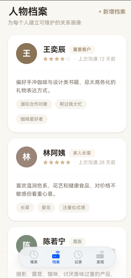
【HarmonyOS 6】“档案“页面的UI布局拆解
上一篇我们拆解了"维系"首页的布局。这篇继续看第二个 Tab——档案。
“维系"页解决的是"我现在该做什么”,“档案"页解决的是"我关心的人是谁”。两个页面的布局思路完全不同:维系页是多种卡片的混合拼图,档案页则是同一种卡片的纵向重复。
布局越单一,反而越考验单张卡片的设计。
一、页面全貌
对应代码骨架:
@Builder
PeopleTab() {
  Scroll() {
    Column() {
      Row() { Text('人物档案')  Blank()  Text('+ 新增档案') }
      Text('为每个人建立可维护的关系画像')
      this.PersonDetailCard(...)
      this.PersonDetailCard(...)
      this.PersonDetailCard(...)
    }
    .width('100%')
    .padding({ left: 24, right: 24, top: 0, bottom: 140 })
  }
  .scrollBar(BarState.Off)
  .height('100%')
  .width('100%')
  .backgroundColor('#F9F7F2')
}
和"维系"页一样,外层是 Scroll + Column,左右 24vp 内边距,底部 140vp 给导航栏留白。这些不再重复,这篇的重点是 PersonDetailCard 这张卡片。
二、标题行:左标题右操作
Row() {
  Text('人物档案')
    .fontSize(26)
    .fontWeight(FontWeight.Bold)
    .fontColor('#2C2723')
  Blank()
  Text('+ 新增档案')
    .fontSize(15)
    .fontColor('#8B7355')
}
.width('100%')
.alignItems(VerticalAlign.Center)
.margin({ top: 20, bottom: 6 })
.padding({ left: 2, right: 2 })
和"维系"页的问候区域一样,Row + Blank() 实现左右分布。但这里有一个额外细节:
2.1 alignItems(VerticalAlign.Center)
.alignItems(VerticalAlign.Center)
标题是 26 号字,操作按钮是 15 号字,高度差很大。如果不设居中对齐,按钮会贴着标题底部,视觉上偏下。VerticalAlign.Center 让两者垂直居中,看起来更平衡。
2.2 微调 padding
.padding({ left: 2, right: 2 })
2vp 的左右内边距,让标题行和下方副标题有微小的错位。这种"不完美对齐"反而让页面不那么机械。
三、副标题:一句话说明页面用途
Text('为每个人建立可维护的关系画像')
  .fontSize(14)
  .fontColor('#A0988C')
  .width('100%')
  .margin({ bottom: 24 })
14 号字、灰色 #A0988C,视觉上退到最远处。它的作用不是被阅读,而是让用户第一次进入页面时,花 0.5 秒理解"这个页面是干什么的"。
四、PersonDetailCard:整页的核心
从上到下三个区域:头部信息、分隔线、备注与标签。
@Builder
PersonDetailCard(
  initial: string,
  name: string,
  relation: string,
  intimacy: number,
  note: string,
  tags: string[],
  lastContactDays: number,
  accentColor: string
) {
  Column() {
    // 头部:头像 + 姓名/关系/亲密度
    Row() { ... }
    .width('100%')

    // 分隔线
    Divider().color('#F0EBE3').margin({ top: 18, bottom: 18 })

    // 备注
    Text(note)
      .fontSize(14)
      .lineHeight(22)
      .fontColor('#7A7066')
      .width('100%')

    // 标签
    Flex({ wrap: FlexWrap.Wrap }) { ... }
    .width('100%')
  }
  .alignItems(HorizontalAlign.Start)
  .padding(22)
  .borderRadius(22)
  .backgroundColor('#FFFFFF')
  .shadow({ radius: 14, color: '#1A000007', offsetY: 4 })
  .margin({ bottom: 16 })
}
接下来逐层拆开。
五、头部:头像 + 右侧信息
头部是一个 Row,左侧头像、右侧文字信息:
Row() {
  // 头像
  Column() {
    Text(initial)
      .fontSize(22)
      .fontWeight(FontWeight.Bold)
      .fontColor('#FFFFFF')
  }
  .width(56)
  .height(56)
  .borderRadius(28)
  .justifyContent(FlexAlign.Center)
  .backgroundColor(accentColor)

  // 右侧信息
  Column() {
    Row() { ... }   // 第一行:姓名 + 关系标签
    Row() { ... }   // 第二行:亲密度 + 上次沟通
  }
  .alignItems(HorizontalAlign.Start)
  .layoutWeight(1)
  .margin({ left: 16 })
}
.width('100%')
5.1 头像:56×56 圆形
.width(56)
.height(56)
.borderRadius(28)
比"维系"页的头像(40×40 和 50×50)都大。因为"档案"页的人物信息更详细,头像作为视觉锚点需要更大更醒目。
borderRadius 设为宽度的一半(28),形成正圆。
5.2 头像背景色由外部传入
.backgroundColor(accentColor)
accentColor 是卡片的参数之一,不同人物用不同颜色:
| 人物 | accentColor | 视觉感受 |
|---|---|---|
| 王奕辰 | #8B7355 |
经典棕 |
| 林阿姨 | #9B8578 |
温暖棕 |
| 陈若宁 | #7A8B7A |
沉稳绿 |
这个颜色不仅用在头像上,还用在关系标签和亲密度星标上,形成一张卡片一个主色调的效果。
5.3 右侧 Column 用 layoutWeight(1)
.layoutWeight(1)
.margin({ left: 16 })
头像固定 56vp,右侧文字用 layoutWeight(1) 填满剩余宽度。margin({ left: 16 }) 控制头像和文字之间的间距,比"维系"页的 12-14vp 稍大,因为这张卡片整体尺寸更大,间距也要相应放大。
六、第一行:姓名 + 关系标签
Row() {
  Text(name)
    .fontSize(20)
    .fontWeight(FontWeight.Bold)
    .fontColor('#2C2723')
  Text(relation)
    .fontSize(12)
    .fontColor(accentColor)
    .padding({ left: 10, right: 10, top: 4, bottom: 4 })
    .borderRadius(8)
    .backgroundColor('#FAF6EF')
    .margin({ left: 10 })
}
6.1 关系标签的配色
.fontColor(accentColor)
.backgroundColor('#FAF6EF')
文字颜色用 accentColor(和头像同色),背景用 #FAF6EF(极浅的暖色)。这样标签和头像形成色彩呼应,同时浅底保证文字可读性。
6.2 药丸标签的 padding
.padding({ left: 10, right: 10, top: 4, bottom: 4 })
.borderRadius(8)
上下 4、左右 10 的内边距,配合 8vp 圆角,形成一个小药丸形状。字号 12 配合这个尺寸,视觉上紧凑但不拥挤。
七、第二行:亲密度星标 + 上次沟通
Row() {
  ForEach([1, 2, 3, 4, 5], (star: number) => {
    Text(star <= intimacy ? '★' : '☆')
      .fontSize(13)
      .fontColor(star <= intimacy ? '#D4B896' : '#E0D8CC')
      .margin({ right: 2 })
  })
  Text(`· 上次沟通 ${lastContactDays} 天前`)
    .fontSize(13)
    .fontColor('#B5ADA2')
    .margin({ left: 8 })
}
.margin({ top: 6 })
★★★★☆ · 上次沟通 12 天前
7.1 用 ForEach 渲染星标
ForEach([1, 2, 3, 4, 5], (star: number) => {
  Text(star <= intimacy ? '★' : '☆')
})
5 颗星,intimacy 是几就亮几颗。ForEach 遍历 [1,2,3,4,5],每次判断当前星星是否应该亮起。
7.2 两色区分亮暗星
.fontColor(star <= intimacy ? '#D4B896' : '#E0D8CC')
亮星用金色 #D4B896,暗星用浅灰 #E0D8CC。两种颜色饱和度都不高,不会抢夺姓名的视觉焦点。
7.3 星标和文字之间用 · 分隔
Text(`· 上次沟通 ${lastContactDays} 天前`)
  .margin({ left: 8 })
中圆点 · 作为星标和文字的分隔符,比竖线 | 更柔和。margin({ left: 8 }) 让分隔符和星标之间有 8vp 的间距。
八、分隔线
Divider().color('#F0EBE3').margin({ top: 18, bottom: 18 })
头部信息和备注之间用一条浅色分隔线隔开。#F0EBE3 是暖灰色,和页面整体色调一致。
上下各 18vp 的间距,让分隔线两侧都有足够的呼吸空间。
九、备注文字
Text(note)
  .fontSize(14)
  .lineHeight(22)
  .fontColor('#7A7066')
  .width('100%')
14 号字、22 行高,行间距约 8vp,阅读舒适。#7A7066 是中灰色,比主文字 #2C2723 浅,比辅助文字 #B5ADA2 深,适合这种"重要但不是最醒目"的信息。
十、标签区:Flex 自动换行
Flex({ wrap: FlexWrap.Wrap }) {
  ForEach(tags, (tag: string) => {
    Text(tag)
      .fontSize(12)
      .fontColor('#9A8E82')
      .padding({ left: 12, right: 12, top: 6, bottom: 6 })
      .borderRadius(14)
      .backgroundColor('#F7F4EE')
      .margin({ top: 14, right: 8 })
  })
}
.width('100%')
10.1 为什么用 Flex 而不是 Row
Row 不会自动换行。如果标签太多,会超出屏幕宽度。
Flex({ wrap: FlexWrap.Wrap }) 会在空间不足时自动换行,标签数量从 1 到 N 都能正常展示。
10.2 标签的间距控制
.margin({ top: 14, right: 8 })
只设了 top 和 right,没有设 bottom 和 left。这样:
- 水平方向:标签之间靠
right: 8分隔。 - 垂直方向:换行后靠
top: 14分隔。 - 第一行顶部不需要额外间距,因为备注文字已经提供了空间。
10.3 标签样式
.fontSize(12)
.fontColor('#9A8E82')
.padding({ left: 12, right: 12, top: 6, bottom: 6 })
.borderRadius(14)
.backgroundColor('#F7F4EE')
和关系标签不同,这里的标签用灰色 #9A8E82 + 浅底 #F7F4EE,视觉上更轻。因为一张卡片只有一个关系标签(重要),但可能有多个特征标签(咖啡爱好者、帮过我大忙…),特征标签不应该太抢眼。
borderRadius(14) 配合 padding 形成圆角药丸,和关系标签风格统一。
十一、卡片外壳
.alignItems(HorizontalAlign.Start)
.padding(22)
.borderRadius(22)
.backgroundColor('#FFFFFF')
.shadow({ radius: 14, color: '#1A000007', offsetY: 4 })
.margin({ bottom: 16 })
11.1 padding 22
比"维系"页的提醒卡片(padding 18)和久未联系卡片(padding 18)都大。因为这张卡片信息量更大,需要更多内边距让内容不显得拥挤。
11.2 borderRadius 22
圆角也更大(提醒卡片 20、久未联系卡片 18)。卡片越大,圆角也应该越大,否则会显得生硬。
11.3 阴影最轻
.shadow({ radius: 14, color: '#1A000007', offsetY: 4 })
#1A000007 的最后两位 07 表示约 3% 不透明度,是整页最轻的阴影。因为档案页只有一种卡片,不需要通过阴影强弱来区分层级——所有卡片地位平等。
十二、和"维系"页的对比
两个页面用了相同的外层结构(Scroll + Column),但卡片设计思路完全不同:
| 对比项 | 维系页 | 档案页 |
|---|---|---|
| 卡片种类 | 3 种(提醒、久未联系、统计) | 1 种(PersonDetailCard) |
| 卡片方向 | 提醒横向、久未联系横向 | 全部纵向 |
| 信息密度 | 提醒卡片高、久未联系低 | 统一中等密度 |
| 头像尺寸 | 40 / 50 | 56 |
| 卡片圆角 | 20 / 18 / 24 | 22 |
| 卡片内边距 | 18 / 18 / 26 | 22 |
| 分隔线 | 无 | 有(头部和备注之间) |
核心区别:维系页用不同卡片表达不同优先级,档案页用同一卡片表达平等关系。
十三、总结
这篇我们拆解了"档案"页面的 UI 布局,核心要点:
- 单一卡片纵向重复:页面结构极简,重点全在卡片设计上。
- 头像 + layoutWeight:固定头像宽度,右侧信息弹性填充。
- accentColor 贯穿卡片:头像、关系标签、星标共用一个主色,一张卡片一个色调。
- ForEach 渲染星标:5 颗星根据亲密度动态亮灭,两色区分。
- Flex 自动换行标签:标签数量不确定时,
Flex({ wrap: FlexWrap.Wrap })是最稳妥的方案。 - 分隔线划分区域:头部信息和备注之间用浅色 Divider 隔开,比留白更有结构感。
- 尺寸随卡片放大:头像 56、padding 22、borderRadius 22,比小卡片都大一圈。

讨论HarmonyOS开发技术,专注于API与组件、DevEco Studio、测试、元服务和应用上架分发等。
更多推荐
 44
44 0
0- 0


 已为社区贡献3条内容

所有评论(0)