HarmonyOS6 LED实战案例之ContentConfig 配置面板:@Link 双向绑定 + CustomDialogController 实战
文章目录
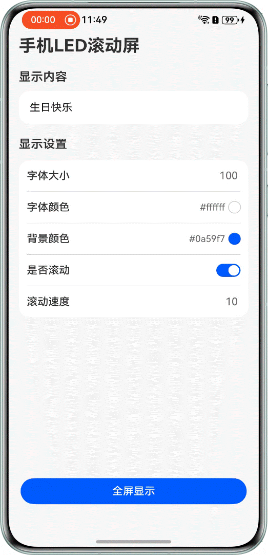
ContentConfig 是用户看到的第一个界面,输入文字、调字号、选颜色、设置滚动速度都在这里完成。代码结构不复杂,但有几个地方挺值得看的:@Link 怎么做双向绑定、CustomDialogController 怎么接颜色选择器、列表项之间用 Divider 分隔的布局套路。
组件签名和 @Link


// ContentConfig.ets
@Component
export struct ContentConfig {
@Link contentStr: ResourceStr;
@Link contentFontSize: number;
@Link contentFontColor: string;
@Link contentBackGroundColor: string;
@Link whetherScroll: boolean;
@Link scrollSpeed: number;
...
}
六个 @Link,全部来自父组件 MainPage 的 @State。@Link 是双向的:子组件修改这些值,父组件状态同步变更,不需要任何回调函数。这是 ArkUI 里跨组件通信最简洁的方式。
对比一下如果不用 @Link 该怎么做:要定义事件回调,子组件 emit,父组件监听,代码量至少翻倍。@Link 直接省掉这一套。
CustomDialogController 怎么接颜色弹窗
fontColorPickDialogController: CustomDialogController | null = new CustomDialogController({
builder: ColorSelector({ color: this.contentFontColor }),
alignment: DialogAlignment.Bottom,
offset: {dx: 0, dy: $r('app.float.color_selector_offset')},
width: Constants.NINETY_PERCENT,

cornerRadius: Constants.BORDER_RADIUS,
backgroundColor: $r('sys.color.background_primary')
})

backgroundColorPickDialogController: CustomDialogController | null = new CustomDialogController({
builder: ColorSelector({ color: this.contentBackGroundColor }),
alignment: DialogAlignment.Bottom,
offset: {dx: 0, dy: $r('app.float.color_selector_offset')},
width: Constants.NINETY_PERCENT,
cornerRadius: Constants.BORDER_RADIUS,
backgroundColor: $r('sys.color.background_primary')
})
两个 CustomDialogController,分别对应字体颜色和背景颜色。builder 就是弹出的内容——ColorSelector 组件,并且直接把 this.contentFontColor 传进去。
alignment: DialogAlignment.Bottom 让弹窗从底部弹出,offset.dy 是 -90vp(资源里配置的 color_selector_offset),弹窗向上偏移一点,不会完全贴底。

点击颜色行时调 open():
Row() {
Text($r('app.string.font_color'))
Row() {
Text(this.contentFontColor)
Circle()
.fill(this.contentFontColor)
}
}
.onClick(() => {
this.fontColorPickDialogController?.open()
})
用可选链 ?.open() 调用,因为 fontColorPickDialogController 类型是 CustomDialogController | null。
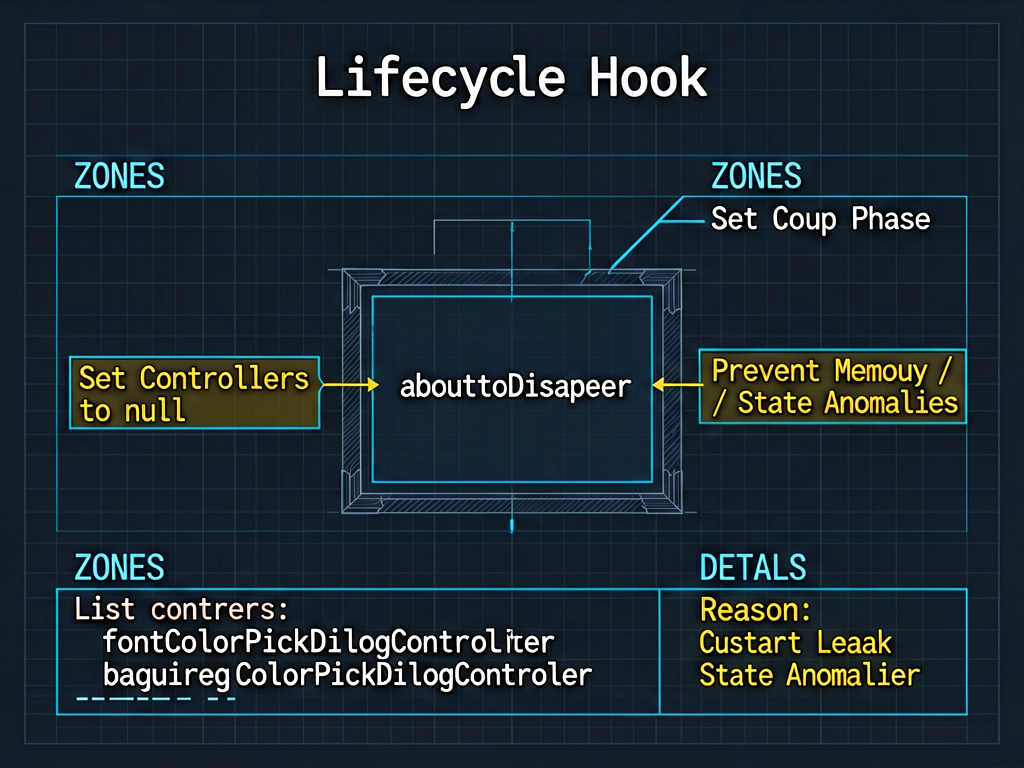
组件销毁时要清空 controller
aboutToDisappear(): void {
  this.fontColorPickDialogController = null
  this.backgroundColorPickDialogController = null;
}
这里有个容易漏的点:CustomDialogController 在组件销毁时需要手动设为 null,否则可能因为引用没释放导致内存泄漏或者弹窗状态异常。aboutToDisappear 生命周期钩子就是专门干这个的。
配置列表的布局结构
配置项用 Column 包着,每一行是一个 Row,行与行之间用 Divider 分隔:
Column() {
  // 字号行
  Row() {
    Text($r('app.string.font_size'))
    TextInput({ text: this.contentFontSize.toString() })
      .type(InputType.Number)
      .onChange((value: string) => {
        this.contentFontSize = Number(value);
      })
  }
  .justifyContent(FlexAlign.SpaceBetween)

  Divider()
    .margin({ left: $r('app.float.margin_12'), right: $r('app.float.margin_12') })
    .backgroundColor(Constants.LIGHT_DARK_COLOR)

  // 字体颜色行
  Row() {
    Text($r('app.string.font_color'))
    Row() {
      Text(this.contentFontColor)
      Circle().fill(this.contentFontColor)
    }
  }
  ...
}
.backgroundColor(Color.White)
.borderRadius(Constants.BORDER_RADIUS)
这个布局模式在 iOS 和 HarmonyOS 应用里很常见:白色圆角卡片,内部列表项用细线分隔,每行左边是标签右边是值/操作。justifyContent(FlexAlign.SpaceBetween) 让标签和值分别靠左靠右对齐。
颜色行右侧同时显示颜色的 HEX 字符串和一个填充对应颜色的圆形色块:
Row() {
  Text(this.contentFontColor)        // 显示 "#ffffff" 这样的字符串
    .fontColor($r('app.color.font_color_gray'))
    .margin({ right: $r('app.float.margin_5') })

  Circle()
    .width($r('app.float.width_18'))
    .height($r('app.float.height_18'))
    .fill(this.contentFontColor)     // 直接用颜色字符串填充
    .stroke(Constants.LIGHT_DARK_COLOR)
}
Circle().fill(this.contentFontColor) 这里 fill 接受颜色字符串,contentFontColor 本来就是 #rrggbb 格式,直接用没有问题。
滚动开关与速度输入的联动
Row() {
  Text($r('app.string.whether_scroll'))
  Image(this.whetherScroll ? $r('app.media.enable') : $r('app.media.disable'))
    .onClick(() => {
      this.whetherScroll = !this.whetherScroll;
    })
}

Divider()

if (this.whetherScroll) {
  Row() {
    Text($r('app.string.scroll_speed'))
    TextInput({ text: this.scrollSpeed.toString() })
      .type(InputType.Number)
      .onChange((value: string) => {
        this.scrollSpeed = Number(value);
      })
  }
}
这段代码有个简单但有效的 UI 联动:当 whetherScroll = false 时,速度输入行直接不渲染(if 判断为 false)。
开关图片用了三元表达式在 enable 和 disable 两张图之间切换,点击时 whetherScroll = !whetherScroll 取反。简单直接。
文字输入框的处理
TextInput({ text: this.contentStr })
  .height($r('app.float.height_51'))
  .borderRadius(Constants.BORDER_RADIUS)
  .fontSize($r('app.float.font_size_16'))
  .backgroundColor(Color.White)
  .onChange((value: string) => {
    this.contentStr = value;
  })
TextInput 初始值绑定 this.contentStr,onChange 里更新 contentStr。因为 contentStr 是 @Link,父组件 MainPage 的状态会同步更新。
字号输入框稍微有点不同,因为是数字:
TextInput({ text: this.contentFontSize.toString() })
  .type(InputType.Number)
  .onChange((value: string) => {
    this.contentFontSize = Number(value);
  })
type(InputType.Number) 限制键盘类型,onChange 里用 Number() 把字符串转成数字。注意显示时要 .toString(),因为 TextInput 的 text 参数是字符串类型,contentFontSize 是 number,不转会报类型错误。
expandSafeArea 的位置
Column()
  ...
  .expandSafeArea([SafeAreaType.SYSTEM], [SafeAreaEdge.TOP, SafeAreaEdge.BOTTOM])
ContentConfig 自己也加了 expandSafeArea,让背景色延伸到安全区域。否则状态栏和导航栏区域会显示默认背景,和配置界面的灰色背景 (#fff7f7f7) 对不上。
写在最后
ContentConfig 的代码逻辑很清晰,主要就是 @Link 双向绑定 + 列表式布局。CustomDialogController 接颜色弹窗那块是最值得学的——声明在外部、传参用绑定、销毁时清空,这个模式可以复用到任何需要弹出自定义对话框的场景。
下一篇专门讲 ColorSelector,Canvas 绘制颜色盘和颜色条的细节比较多。

讨论HarmonyOS开发技术,专注于API与组件、DevEco Studio、测试、元服务和应用上架分发等。
更多推荐

 0
0 0
0- 0


 已为社区贡献150条内容

所有评论(0)