鸿蒙 ArkTS 布局深度解析:Column 嵌套弹性布局 — 以武侠沙盘为例
一、引言
在移动端应用开发中,很少有界面能真正称为"简单布局"。绝大多数真实场景——无论是电商详情页、社交个人主页、数据分析仪表盘,还是游戏经营面板——都呈现出一个共同特征:复杂的纵向分层内容。
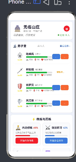
以本文的武侠沙盘为例,一个门派经营面板需要同时展示:
- 牌匾区:门派名称、等级、品级、座右铭
- 弟子区:多名弟子的头像、属性、状态、操作按钮
- 修炼区:内功、剑法、采集、阵法等并行活动的进度面板
- 资源区:银两、声望、灵石等资源的实时数值
- 事件区:时间线日志
- 行动区:多个沙盘操作入口
这样一个页面,如果只用单层 Column 或 Row,根本无法实现。必须通过 多层级嵌套的 Column/Row + 弹性比例(flex)分配,才能清晰、灵活、可维护地组织内容。
这就是本文要深入剖析的核心技术:Column 嵌套弹性布局。
二、Column 与 Row 的嵌套模型
2.1 两个正交的容器
理解嵌套布局的前提,是清楚 Column 和 Row 的布局方向:
// Column:主轴垂直方向(从上往下排列子组件)
Column() {
  Text('上')
  Text('中')
  Text('下')
}

// Row:主轴水平方向(从左往右排列子组件)
Row() {
  Text('左')
  Text('中')
  Text('右')
}
两者可以类比为二维坐标轴:
       Column(垂直)
           │
           │
    Row ───┼──→(水平)
           │
           │
2.2 嵌套的基本思路
"嵌套"的本质是:在 Column 内部放 Row,在 Row 内部放 Column,如此反复,构建出任意复杂的二维网格。
任何复杂的布局都可以递归拆解为两种基本模式:
模式 A — Column 内含 Row(纵向分区,内部横向排列):
Column(纵向大区)
  ├── Row(第 1 行:横向排列)
  │     ├── 子组件 A
  │     └── 子组件 B
  ├── Row(第 2 行:横向排列)
  │     ├── 子组件 C
  │     └── 子组件 D
  └── Row(第 3 行:横向排列)
        ├── 子组件 E
        └── 子组件 F
模式 B — Row 内含 Column(横向分区,内部纵向排列):
Row(横向大区)
  ├── Column(左栏:纵向排列)
  │     ├── 子组件 A
  │     └── 子组件 B
  └── Column(右栏:纵向排列)
        ├── 子组件 C
        └── 子组件 D
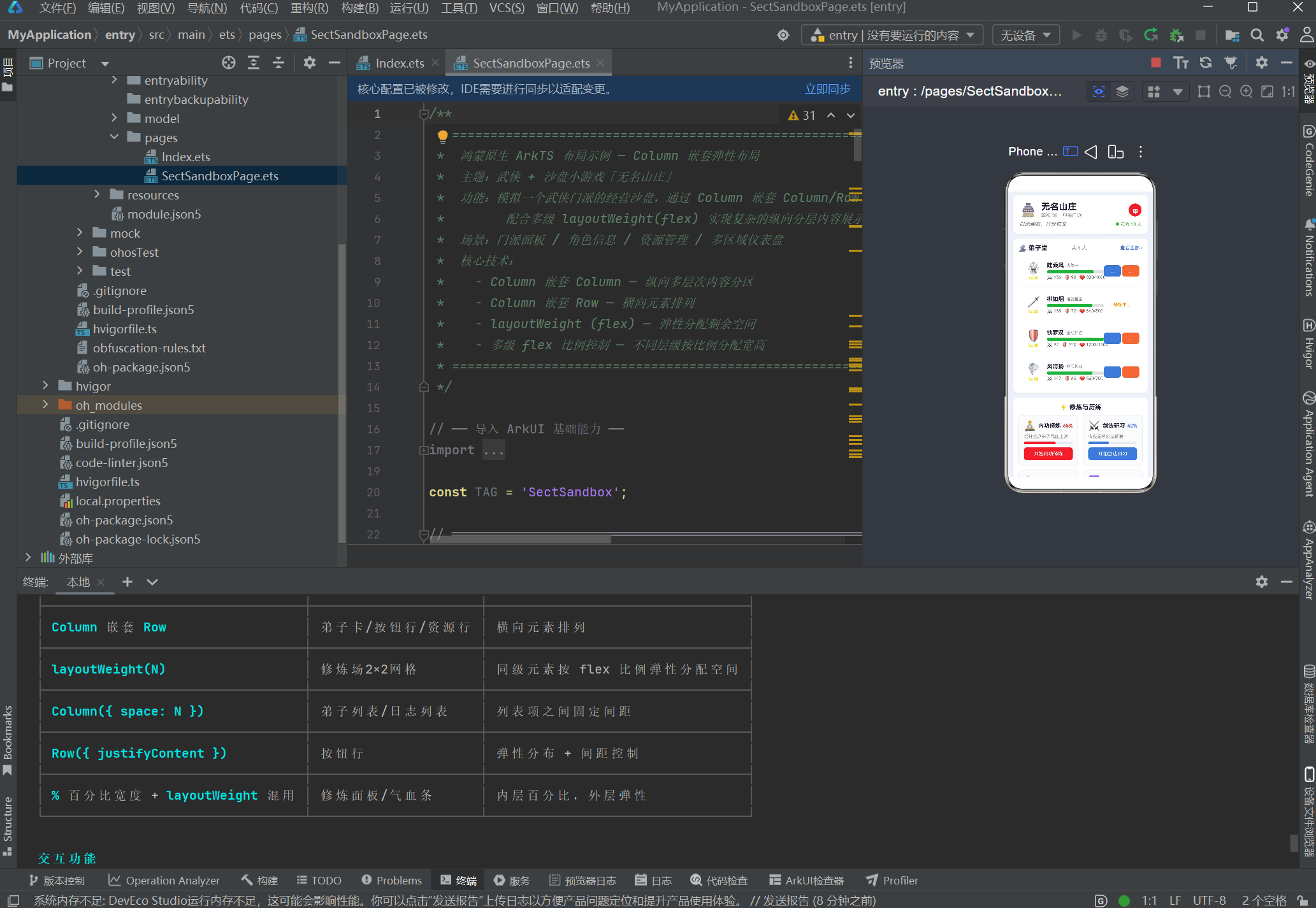
2.3 本项目的嵌套架构
本文的武侠沙盘页面,采用 4 级嵌套 架构:
第1级  Scroll                     ← 可滚动容器
        │
第2级  Column({space:12})         ← 最外层纵向容器(7 个区域垂直排列)
        │
        ├── 区域1  Column         ← 牌匾区(内部再嵌套)
        │           └── Column → Row(layoutWeight)
        │
        ├── 区域2  Column         ← 弟子堂
        │           └── Column → Row(flex标题栏) + Column({space})列表
        │
        ├── 区域3  Column         ← 修炼场 ★ 核心演示
        │           └── Column → Row(layoutWeight=1)×2
        │                           ├── ActionPanel(layoutWeight=1)
        │                           └── ActionPanel(layoutWeight=1)
        │
        ├── 区域4  Column         ← 门派资源
        │           └── Column → Row→ResourceBar×3(layoutWeight=1)
        │
        ├── 区域5  Column         ← 事件簿
        │
        ├── 区域6  Column         ← 沙盘行动
        │           └── Column → Row→Button×3(layoutWeight=1)
        │
        └── 区域7  Column         ← 布局说明
从第 2 级到第 3 级、第 3 级到第 4 级,每一层都在做同一件事:选择一个方向(纵或横),将内容分组排列。这就是嵌套布局的递归本质。
三、layoutWeight:鸿蒙的多级 flex 机制
如果说 Column/Row 嵌套定义了布局的"骨架",那么 layoutWeight(鸿蒙中的 flex 弹性分配机制)就定义了布局的"血肉比例"。
3.1 layoutWeight 的语义
layoutWeight 是 ArkUI 提供的一种剩余空间分配机制。它的语义非常接近 CSS Flexbox 中的 flex: <number>:
Row() {
  ChildA().layoutWeight(1)  // 占 1 份
  ChildB().layoutWeight(2)  // 占 2 份
  ChildC().layoutWeight(1)  // 占 1 份
}
// 总份数 = 1 + 2 + 1 = 4 份
// ChildA 宽度 = 容器宽度 × 1/4
// ChildB 宽度 = 容器宽度 × 2/4 = 容器宽度 × 1/2
// ChildC 宽度 = 容器宽度 × 1/4
在 Row 中,layoutWeight 控制宽度比例;在 Column 中,layoutWeight 控制高度比例。
3.2 layoutWeight vs 百分比宽度
两种方式都可以控制子组件尺寸:
// 方式 A:百分比宽度
Row() {
  ChildA().width('30%')
  ChildB().width('70%')
}

// 方式 B:layoutWeight(flex 比例)
Row() {
  ChildA().layoutWeight(3)  // 3 份
  ChildB().layoutWeight(7)  // 7 份
}
两者区别如下:
| 对比维度 | 百分比宽度 | layoutWeight |
|---|---|---|
| 语义 | “我占容器宽度的 X%” | “我与其他子组件按 X:Y 分配剩余空间” |
| 与 padding/margin 的关系 | 百分比基于容器,不受兄弟影响 | 扣除非弹性空间后按比例分配 |
| 动态增减 | 需要手动重新计算百分比 | 自动重新计算比例 |
| 多级嵌套 | 每层都要计算百分比 | 各层独立分配,互不干扰 |
| 代码可读性 | 直观看到最终尺寸 | 需要心算比例 |
3.3 多级 flex 分配原理
在多层嵌套中,layoutWeight 的分配是逐层独立的。每一层只负责分配自己那一层的剩余空间,不关心子层内部如何分配。
举例说明修炼场 2×2 网格的 flex 链路:
第 1 层分配(Row,宽度 100%):
  ├── ActionPanel A → layoutWeight(1) → 50% 宽度
  └── ActionPanel B → layoutWeight(1) → 50% 宽度

第 2 层分配(ActionPanel 内部):
  └── Column → width('100%')
        ├── Row → layoutWeight(1) 占据剩余高度
        ├── Row → 固定高度(进度条)
        └── Row → 固定高度(按钮)
每一层只处理自己的子组件,这种隔离性使得布局代码容易推理和维护。
3.4 项目中 layoutWeight 的典型用法
用法一:三等分(资源行)
Row() {
  ResourceBar({ resource: silver }) .layoutWeight(1)  // 1/3
  ResourceBar({ resource: fame })   .layoutWeight(1)  // 1/3
  ResourceBar({ resource: spirit }) .layoutWeight(1)  // 1/3
}
三个 layoutWeight(1) 使三个资源条各占 1/3 宽度。
用法二:不等分(弟子卡内部)
Row() {
  Column(头像)   .layoutWeight(2)  // 2/10 = 20%
  Column(信息)   .layoutWeight(5)  // 5/10 = 50%
  Column(操作)   .layoutWeight(3)  // 3/10 = 30%
}
头像、信息、操作按 2:5:3 的比例分配宽度。
用法三:按钮行均分
Row() {
  Button('发布悬赏') .layoutWeight(1)  // 1/3
  Button('外出历练') .layoutWeight(1)  // 1/3
  Button('扩建山庄') .layoutWeight(1)  // 1/3
}
三个按钮宽度相等,无需关心屏幕宽度。
四、完整示例代码逐层解析
4.1 数据模型
在着手布局之前,先定义清晰的数据模型。本示例包含四类数据:
/** 弟子信息 */
interface Disciple {
  name: string;
  title: string;       // 称号
  level: number;
  hp: number;
  maxHp: number;
  attack: number;
  defense: number;
  isBusy: boolean;     // 是否忙碌
  avatar: string;
}

/** 门派资源 */
interface SectResource {
  name: string;
  value: number;
  maxValue: number;
  unit: string;
  icon: string;
  color: string;
}

/** 修炼/动作项 */
interface ActionItem {
  name: string;
  desc: string;
  icon: string;
  progress: number;    // 0~100
  canAct: boolean;
  color: string;
}

/** 事件日志 */
interface EventLog {
  time: string;
  content: string;
  type: 'good' | 'bad' | 'info';
}
4.2 子组件一:DiscipleCard(弟子卡)
DiscipleCard 是 Column 嵌套 Row → 内部 Column 的典型案例。
从外到内的布局结构:
Row(水平:头像 | 信息 | 操作)
  ├── Column layoutWeight(2)        ← 头像区
  │     ├── Text(图标)
  │     └── Text(等级)
  │
  ├── Column layoutWeight(5)        ← 信息区
  │     ├── Row(姓名 + 称号)
  │     ├── Row(气血条)
  │     └── Row(攻击/防御/气血值)
  │
  └── Column layoutWeight(3)        ← 操作区
        └── Row(按钮行)
              ├── Button('传授')
              └── Button('指派')
完整代码:
@Component
struct DiscipleCard {
  private disciple: Disciple = {
    name: '', title: '', level: 1,
    hp: 100, maxHp: 100, attack: 10, defense: 10,
    isBusy: false, avatar: ''
  };

  build() {
    Row() {
      // ── ① 头像区:layoutWeight(2) ──
      Column() {
        Text(this.disciple.avatar).fontSize(28)
        Text(`Lv.${this.disciple.level}`)
          .fontSize(10).fontColor('#ffd700')
          .fontWeight(FontWeight.Bold).margin({ top: 2 })
      }
      .layoutWeight(2)          // ← flex: 2,占 2/10
      .alignItems(HorizontalAlign.Center)
      .justifyContent(FlexAlign.Center)

      // ── ② 信息区:layoutWeight(5) ──
      Column() {
        // 姓名行
        Row() {
          Text(this.disciple.name).fontSize(14).fontWeight(FontWeight.Bold)
          Text(this.disciple.title).fontSize(10).fontColor('#888').margin({ left: 6 })
        }
        .alignItems(VerticalAlign.Center).width('100%')

        // 气血进度条
        Row() {
          Row()
            .width(`${(this.disciple.hp / this.disciple.maxHp) * 100}%`)
            .height(8).backgroundColor('#4caf50').borderRadius(4)
        }
        .width('100%').height(8).backgroundColor('#e0e0e0').borderRadius(4)
        .margin({ top: 4 })

        // 属性数值
        Row() {
          Text(`⚔ ${this.disciple.attack}`).fontSize(11).fontColor('#666')
          Text(`🛡 ${this.disciple.defense}`).fontSize(11).fontColor('#666')
            .margin({ left: 8 })
          Text(`❤ ${this.disciple.hp}/${this.disciple.maxHp}`)
            .fontSize(11).fontColor('#666').margin({ left: 8 })
        }
        .width('100%').margin({ top: 3 })
      }
      .layoutWeight(5)          // ← flex: 5,占 5/10
      .alignItems(HorizontalAlign.Start)
      .justifyContent(FlexAlign.Center)
      .margin({ left: 4 })

      // ── ③ 操作区:layoutWeight(3) ──
      Column() {
        if (this.disciple.isBusy) {
          Text('修炼中...').fontSize(11).fontColor('#ff9800')
        } else {
          Row() {
            Button('传授').width('48%').height(28)
              .fontSize(11).backgroundColor('#3a7bd5')
              .borderRadius(6)
              .onClick(() => {
                promptAction.showToast({
                  message: `向 ${this.disciple.name} 传授武功...`,
                  duration: 1500
                });
              })
            Button('指派').width('48%').height(28)
              .fontSize(11).backgroundColor('#ff7043')
              .borderRadius(6)
              .onClick(() => {
                promptAction.showToast({
                  message: `${this.disciple.name} 前去历练!`,
                  duration: 1500
                });
              })
          }
          .width('100%')
          .justifyContent(FlexAlign.SpaceBetween)
        }
      }
      .layoutWeight(3)          // ← flex: 3,占 3/10
      .alignItems(HorizontalAlign.Center)
      .justifyContent(FlexAlign.Center)
    }
    .alignItems(VerticalAlign.Center)
    .width('100%').height(76)
    .padding({ left: 8, right: 8 })
    .backgroundColor('#ffffff').borderRadius(10)
    .shadow({ radius: 3, color: '#10000000', offsetX: 0, offsetY: 1 })
  }
}
布局要点总结:
- 最外层 Row 确定了水平三栏布局
- 内部三个 Column 各自管理自己的垂直内容
- layoutWeight(2:5:3) 实现弹性宽度分配
- 内部嵌套 Row(如按钮行)再次使用
layoutWeight或百分比宽度控制子元素 - 条件渲染(
if/else)根据isBusy状态展示内容或忙碌提示
4.3 子组件二:ActionPanel(修炼面板)
ActionPanel 展示了 Column 嵌套 Row → 内部再嵌套 Row 的多级布局结构:
Column(纵向:图标行 → 描述 → 进度条 → 按钮)
  ├── Row layoutWeight(1)         ← 图标 + 名称 + 百分比
  │     ├── Text(图标)
  │     ├── Text(名称)layoutWeight(1)
  │     └── Text(百分比)
  │
  ├── Text(描述)                  ← 固定高度
  │
  ├── Row(进度条)                 ← 固定高度
  │     └── Row(前景条,百分比宽度)
  │
  └── if (canAct) Button(操作按钮)← 固定高度
完整代码:
@Component
struct ActionPanel {
  private action: ActionItem = {
    name: '', desc: '', icon: '', progress: 0, canAct: false, color: '#3a7bd5'
  };

  build() {
    Column() {
      // ① 图标 + 名称(Row 弹性分布)
      Row() {
        Text(this.action.icon).fontSize(24)
        Text(this.action.name)
          .fontSize(14).fontWeight(FontWeight.Bold)
          .fontColor('#1a1a2e').margin({ left: 6 })
          .layoutWeight(1)                    // ← 占据剩余宽度

        Text(`${this.action.progress}%`)
          .fontSize(12).fontColor(this.action.color)
          .fontWeight(FontWeight.Bold)
      }
      .alignItems(VerticalAlign.Center)
      .width('100%')

      // ② 描述
      Text(this.action.desc)
        .fontSize(11).fontColor('#888').width('100%').margin({ top: 4 })

      // ③ 进度条(Row 嵌套,百分比宽度)
      Row() {
        Row()
          .width(`${this.action.progress}%`)
          .height(6).backgroundColor(this.action.color).borderRadius(3)
      }
      .width('100%').height(6).backgroundColor('#e8ecf0')
      .borderRadius(3).margin({ top: 6 })

      // ④ 按钮(条件渲染)
      if (this.action.canAct) {
        Button(`开始${this.action.name}`)
          .width('100%').height(32)
          .fontSize(12).backgroundColor(this.action.color)
          .borderRadius(8).margin({ top: 8 })
          .onClick(() => {
            promptAction.showToast({ message: `⏳ ${this.action.name} 开始...` });
          })
      }
    }
    .alignItems(HorizontalAlign.Start)
    .width('100%').padding(12)
    .backgroundColor('#fafbfc').borderRadius(10)
    .border({ width: 1, color: '#e8ecf0' })
  }
}
布局要点总结:
- Column 纵向排列:从上到下依次放置图标行、描述、进度条、按钮
- Row 内部 layoutWeight(1):使名称文字占满图标和百分比之间的空间
- 百分比宽度进度条:
width('65%')动态反映进度 - 条件渲染按钮:
canAct控制是否显示操作按钮
4.4 主页面:SectSandboxPage
主页面的核心是用 Column 做纵向分区,每个分区再嵌套 Column/Row。
第一层:Scroll → Column
@Entry
@Component
struct SectSandboxPage {
  // ── 数据源 ──
  private readonly disciples: Disciple[] = [ /* ... 4 名弟子 ... */ ];
  private readonly actionItems: ActionItem[] = [ /* ... 4 项 ... */ ];
  private readonly resources: SectResource[] = [ /* ... 3 项 ... */ ];
  private readonly logs: EventLog[] = [ /* ... 4 条 ... */ ];
  @State private morale: number = 82;
  @State private security: number = 65;

  build() {
    Scroll() {
      Column({ space: 12 }) {
        // ── 7 个区域(见下方详解)──
      }
      .width('100%')
      .padding({ left: 12, right: 12, top: 8, bottom: 20 })
    }
    .width('100%').height('100%')
    .backgroundColor('#eef2f7')
    .scrollBar(BarState.Off)
  }
}
区域 1:门派牌匾 — Column 嵌套 Row
Column() {
  Column() {
    // 图标 + 名称 + 等级(Row 弹性分布)
    Row() {
      Text('🏯').fontSize(32).width(44).height(44).textAlign(TextAlign.Center)

      // 名称列(layoutWeight 占满)
      Column() {
        Text('无名山庄').fontSize(22).fontWeight(FontWeight.Bold)
        Text(`等级 38 · 甲级门派`).fontSize(12).fontColor('#888').margin({ top: 2 })
      }
      .alignItems(HorizontalAlign.Start)
      .layoutWeight(1)                    // ← 弹性占满中间
      .margin({ left: 10 })

      // 品级徽章(固定)
      Text('甲').fontSize(14).fontWeight(FontWeight.Bold)
        .fontColor('#fff').backgroundColor('#e53935')
        .width(32).height(32).borderRadius(16).textAlign(TextAlign.Center)
        .lineHeight(32)
    }
    .alignItems(VerticalAlign.Center).width('100%')

    // 座右铭行
    Row() {
      Text('以武会友,行侠仗义').fontSize(13).fontColor('#666')
        .fontStyle(FontStyle.Italic).layoutWeight(1)
      Text('● 在线 18 人').fontSize(11).fontColor('#4caf50')
    }
    .width('100%').margin({ top: 6 })
  }
  .alignItems(HorizontalAlign.Start).width('100%').padding(16)
  .backgroundColor('#fff').borderRadius(12)
  .shadow({ radius: 6, color: '#1a000000', offsetX: 0, offsetY: 2 })
}
区域 ★ 3:修炼场 — 2×2 网格
这是整个页面最核心的嵌套弹性布局演示。实现 2×2 网格的关键是:
- 外层
Column纵向排列两行 - 每行是一个
Row(layoutWeight=1) - 每行内部两个
ActionPanel(layoutWeight=1)各占一半宽度 - 两行之间通过
margin({ top: 10 })保持间距
Column() {
  Text('⚡ 修炼与历练')
    .fontSize(16).fontWeight(FontWeight.Bold)
    .fontColor('#1a1a2e').margin({ bottom: 10 })

  // ── 第 1 行:Row 弹性均分 ──
  Row() {
    ActionPanel({ action: this.actionItems[0] })
      .layoutWeight(1)          // ← flex: 1,左半
      .margin({ right: 6 })

    ActionPanel({ action: this.actionItems[1] })
      .layoutWeight(1)          // ← flex: 1,右半
      .margin({ left: 6 })
  }
  .width('100%')
  .alignItems(VerticalAlign.Top)

  // ── 第 2 行:同上 ──
  Row() {
    ActionPanel({ action: this.actionItems[2] })
      .layoutWeight(1).margin({ right: 6 })

    ActionPanel({ action: this.actionItems[3] })
      .layoutWeight(1).margin({ left: 6 })
  }
  .width('100%')
  .alignItems(VerticalAlign.Top)
  .margin({ top: 10 })
}
为什么这是多级 flex 的最佳示例?
Column(第 2 级)        ← 管理所有面板的纵向排列
  ├── Row(第 3 级)      ← flex 分配这一行宽度
  │     ├── Panel 左      ← layoutWeight(1) = 50%
  │     └── Panel 右      ← layoutWeight(1) = 50%
  │
  └── Row(第 3 级)      ← flex 分配这一行宽度
        ├── Panel 左      ← layoutWeight(1) = 50%
        └── Panel 右      ← layoutWeight(1) = 50%
每一层只负责自己的分配,彼此独立。
区域 4:门派资源 — 横向三等分
Row() {
  ResourceBar({ resource: this.resources[0] }).layoutWeight(1).margin({ right: 6 })
  ResourceBar({ resource: this.resources[1] }).layoutWeight(1).margin({ left: 3, right: 3 })
  ResourceBar({ resource: this.resources[2] }).layoutWeight(1).margin({ left: 6 })
}
.width('100%')
三个 layoutWeight(1) 平均分配容器宽度,配合对称的 margin 值,实现三等分带间距的视觉效果。
区域 6:沙盘行动 — 按钮行弹性分布
// 第 1 行:三按钮等分
Row() {
  Button('📯 发布悬赏').layoutWeight(1).height(40).backgroundColor('#e53935')
    .borderRadius(8).margin({ right: 6 })
  Button('🏕️ 外出历练').layoutWeight(1).height(40).backgroundColor('#3a7bd5')
    .borderRadius(8).margin({ left: 3, right: 3 })
  Button('🏗️ 扩建山庄').layoutWeight(1).height(40).backgroundColor('#ff9800')
    .borderRadius(8).margin({ left: 6 })
}
.width('100%')

// 第 2 行:两按钮等分
Row() {
  Button('📊 查看财报').layoutWeight(1).height(36).backgroundColor('#607d8b')
    .borderRadius(8).margin({ right: 6 })
  Button('⚔️ 攻打山寨').layoutWeight(1).height(36).backgroundColor('#4caf50')
    .borderRadius(8).margin({ left: 6 })
}
.width('100%').margin({ top: 8 })
五、Column 嵌套的六种经典模式
通过以上代码剖析,我们可以总结出 Column 嵌套布局的六种经典模式。掌握这六种模式,就能组合出任意复杂界面。
模式 1:Column → Row(纵向分区,每行横向排列)
适用场景:仪表盘、卡片列表、表单
Column
  ├── Row(1行)
  ├── Row(2行)
  └── Row(3行)
代码模板:
Column({ space: 12 }) {
  Row() { /* 第 1 行内容 */ }.width('100%')
  Row() { /* 第 2 行内容 */ }.width('100%')
  Row() { /* 第 3 行内容 */ }.width('100%')
}
模式 2:Row → Column(横向分区,每列纵向排列)
适用场景:分栏详情页、双列菜单
Row
  ├── Column(左栏)
  └── Column(右栏)
代码模板:
Row() {
  Column() { /* 左栏内容 */ }.layoutWeight(1).margin({ right: 6 })
  Column() { /* 右栏内容 */ }.layoutWeight(1).margin({ left: 6 })
}
.width('100%')
模式 3:Column → Row → Column(嵌套三级)
适用场景:复杂条目(如本文的弟子卡)
Column(外层容器)
  └── Row(水平三栏)
        ├── Column(左栏:头像)
        │     ├── Text(等级)
        │     └── Text(图标)
        ├── Column(中栏:信息)
        │     ├── Row(姓名)
        │     ├── Row(血条)
        │     └── Row(属性)
        └── Column(右栏:操作)
              └── Row(按钮行)
模式 4:Column → Row × N(网格布局)
适用场景:功能菜单、仪表盘、2×N 卡片
Column
  ├── Row(第 1 行网格)
  │     ├── Card(layoutWeight=1)
  │     └── Card(layoutWeight=1)
  └── Row(第 2 行网格)
        ├── Card(layoutWeight=1)
        └── Card(layoutWeight=1)
代码模板:
Column() {
  // 第 1 行
  Row() {
    CardA().layoutWeight(1).margin({ right: 6 })
    CardB().layoutWeight(1).margin({ left: 6 })
  }
  .width('100%')
  .margin({ bottom: 10 })

  // 第 2 行
  Row() {
    CardC().layoutWeight(1).margin({ right: 6 })
    CardD().layoutWeight(1).margin({ left: 6 })
  }
  .width('100%')
}
模式 5:Column 套 Scroll 套 Column(可滚动复杂内容)
适用场景:长页面、设置页、文章内容
Scroll
  └── Column({space})
        ├── 区块 1
        ├── 区块 2
        ├── ...
        └── 区块 N
模式 6:混合列(Column 套 Row 套 Column 再套 Row)
适用场景:极度复杂的自定义组件
这种模式没有固定模板,核心原则是:需要纵向排列就套 Column,需要横向排列就套 Row,逐层递归直到原子组件。
六、性能考量与最佳实践
6.1 嵌套层数的限制
虽然 Column/Row 的嵌套在理论上没有硬性上限,但在实践中建议:
- 普通页面:嵌套不超过 5 层
- 复杂页面:嵌套不超过 8 层
- 超 8 层:应考虑拆分子组件或改用自定义布局
深层嵌套会导致:
- 布局计算链路变长,初次渲染变慢
- 调试难度增加(需要逐层排查布局异常)
- 代码可读性下降
6.2 子组件化拆分
当嵌套深度超过 4 层时,应将深层部分抽取为独立的 @Component。例如本文的实践:
DiscipleCard独立为子组件(内部 3 层嵌套)ActionPanel独立为子组件(内部 4 层嵌套)ResourceBar独立为子组件(内部 2 层嵌套)LogItem独立为子组件(内部 1 层嵌套)
每个子组件只在 main 页面中占一行,大幅降低了主代码的复杂度和嵌套深度。
6.3 layoutWeight 与固定尺寸的平衡
最佳实践:在弹性布局中,"固定"与"弹性"应分层使用。
Row(弹性层:layoutWeight 分配宽度比例)
  ├── Column(固定层:内部使用固定尺寸或百分比)
  │     ├── Text(固定高度 20vp)
  │     ├── Row(固定高度 8vp)
  │     └── Row(固定高度 16vp)
  └── Column(固定层:同理)
外层用 layoutWeight 分配宽高,内层用固定尺寸或百分比控制具体元素。这样弹性逻辑集中在外层,内部细节一一确定,易于调试。
6.4 避免冗余嵌套
有时候开发者为了"对齐"而增加不必要的嵌套层。以下情况可以简化:
// ❌ 冗余:Column 内只有一个子组件,层次多余
Column() {
  Row() { /* ... */ }
}

// ✅ 简洁:直接使用 Row
Row() { /* ... */ }
// ❌ 冗余:Row 内只有一个子组件
Row() {
  Column() { /* ... */ }
}

// ✅ 简洁:直接使用 Column
Column() { /* ... */ }
6.5 与 Grid 组件的选用
虽然 Column 嵌套 Row 可以实现网格效果,但对于规整的 N×M 网格(如图标矩阵、相册),鸿蒙的 Grid 组件是更优选择:
// 规整网格 → 使用 Grid
Grid() {
  ForEach(this.items, (item) => {
    GridItem() { Card({ data: item }) }
  })
}
.columnsTemplate('1fr 1fr')  // 两列等宽
.rowsTemplate('1fr 1fr')     // 两行等高
Column 嵌套 Row 更适合不规整的复杂布局(如本文的沙盘页面,每个面板高度不同、内容结构不同),而 Grid 更适合高度规整的重复网格。
七、布局调试技巧
7.1 使用 backgroundColor 可视化边界
在开发嵌套布局时,给每一层容器设置不同的背景色,可以直观看到每层的边界:
Column() {
  Row() {
    ChildA().layoutWeight(1)
    ChildB().layoutWeight(1)
  }
  .backgroundColor('#ffcccc')    // ← 红色:看清 Row 的范围
  .width('100%').height(80)
}
.backgroundColor('#cceeff')      // ← 蓝色:看清 Column 的范围
7.2 使用 border 替代 margin 验证
如果怀疑 margin 影响了布局,临时用 border 替代来观察容器的实际范围:
// 调试模式
ChildA()
  .border({ width: 1, color: '#f00' })  // 红色边框显示实际范围
  .margin({ right: 6 })
7.3 layoutWeight 调试口诀
Row 内 layoutWeight 控制宽度,Column 内 layoutWeight 控制高度。
同层 layoutWeight 相加为总份数,每份 = 剩余空间 ÷ 总份数。
如果 layoutWeight 没有按预期工作,检查:
- 父容器是否设置了明确的
width('100%')或height('100%') - 同层的所有子组件是否都设置了 layoutWeight
- 是否有固定宽度/高度的兄弟组件占用了空间
八、布局设计思路总结
8.1 从需求到布局的推导过程
以本文的沙盘页面为例,布局设计遵循以下步骤:
步骤 1:内容分组
将页面内容分为 7 个逻辑区域:牌匾、弟子、修炼、资源、事件、行动、说明。
步骤 2:确定主轴方向
每个区域的内容是纵向排列还是横向排列?
- 7 个区域之间:纵向(Column)
- 牌匾内部:横向(Row:图标+名称+徽章)
- 弟子列表:纵向(Column 列表)
- 修炼场:纵向 → 横向(网格)
- 资源行:横向(Row:三项并排)
- 行动区:纵向 → 横向(按钮行)
步骤 3:确定弹性比例
哪些部分需要弹性分配?分配比例是多少?
- 牌匾:图标固定宽度 + 名称 layoutWeight(1) + 徽章固定宽度
- 弟子卡:头像(2):信息(5):操作(3)
- 修炼场:每个面板 layoutWeight(1) 各占 50%
- 资源行:三项 layoutWeight(1) 各占 33%
- 按钮行:三项 layoutWeight(1) 各占 33%
步骤 4:确定间距
- 区域之间:12vp(Column space)
- 列表项之间:8vp(Column space)
- 行内元素之间:6vp margin
步骤 5:拆分子组件
嵌套超过 3 层的部分 → 抽取为独立 @Component。
8.2 布局设计的"三问"
在设计任何嵌套布局时,反复问自己三个问题:
- “这一层需要纵向排列还是横向排列?” → Column 或 Row
- “子组件的宽度/高度是固定的还是弹性的?” → 固定尺寸或 layoutWeight
- “这一层是否超过了 4 层嵌套?” → 考虑拆分子组件
这三个问题覆盖了 90% 的布局设计决策。
九、结语
核心要点回顾
- Column 嵌套 Row(和 Row 嵌套 Column) 是构建复杂纵向分层界面的基础
- layoutWeight 是鸿蒙的多级 flex 弹性分配机制,在 Row 中控制宽度比例,在 Column 中控制高度比例
- 嵌套的每一层只负责分配自己的子组件,这种隔离性使布局易于推理和维护
- 当嵌套超过 4 层时,拆分子组件,保持主代码的清晰度
- 六种经典嵌套模式可以组合出任意复杂布局
- 网格场景区分使用:不规整复杂布局用 Column+Row,规整重复网格用 Grid
最终建议
Column 嵌套弹性布局是鸿蒙 ArkTS 中最灵活、最通用的布局方式。它不仅适用于本文的武侠沙盘游戏场景,也适用于任何需要"复杂纵向分层内容"的应用——社交信息流、电商商品详情、数据分析面板、后台管理系统…… 掌握 Column/Row 嵌套 + layoutWeight,你就能驾驭任何布局需求。
最后,记住一句话:
Column 管纵向分区,Row 管横向排列,layoutWeight 管弹性比例。三者配合,万物皆可布局。

讨论HarmonyOS开发技术,专注于API与组件、DevEco Studio、测试、元服务和应用上架分发等。
更多推荐
 10
10 0
0- 0


 已为社区贡献16条内容

所有评论(0)