HarmonyOS ArkUI训练营入门-组件掌握系列-List 列表组件开发技巧-PC版本
概述
列表是移动应用中最常用的组件之一,用于展示大量数据集合。HarmonyOS ArkUI 提供的 List 组件功能强大,支持懒加载、滑动操作、分组展示等特性。本文将从组件基础、数据渲染、样式定制、交互处理、性能优化等多个维度,深入讲解 List 组件的开发技巧。
一、List 组件基础
1.1 组件定义与作用
List 组件用于展示数据列表,支持垂直和水平滚动,是构建列表页面、消息列表、商品列表等场景的核心组件。
@Entry
@Component
struct ListBasic {
  @State items: string[] = ['项目1', '项目2', '项目3', '项目4', '项目5'];

  build() {
    Column() {
      List() {
        ForEach(this.items, (item: string) => {
          ListItem() {
            Text(item)
              .fontSize(16)
              .padding(16)
          }
        })
      }
      .width('100%')
      .height('100%')
    }
  }
}
1.2 核心属性
| 属性 | 类型 | 说明 | 默认值 |
|---|---|---|---|
listDirection |
Axis |
滚动方向 | Axis.Vertical |
initialIndex |
number |
初始滚动位置 | 0 |
scroller |
Scroller |
滚动控制器 | - |
divider |
Divider |
分割线配置 | - |
edgeEffect |
EdgeEffect |
边缘效果 | EdgeEffect.Spring |
1.3 基础使用示例
@Entry
@Component
struct BasicList {
  @State fruits: string[] = ['苹果', '香蕉', '橘子', '葡萄', '西瓜', '草莓', '蓝莓', '芒果'];

  build() {
    Column() {
      Text('水果列表')
        .fontSize(20)
        .fontWeight(FontWeight.Bold)
        .margin({ top: 20, bottom: 16 })

      List() {
        ForEach(this.fruits, (fruit: string) => {
          ListItem() {
            Text(fruit)
              .fontSize(16)
              .padding(16)
              .width('100%')
          }
        })
      }
      .width('90%')
      .height(300)
      .backgroundColor('#FFFFFF')
      .borderRadius(8)
    }
    .padding(20)
    .width('100%')
    .height('100%')
    .backgroundColor('#F5F5F5')
  }
}
二、数据渲染
2.1 使用 ForEach 渲染列表
ForEach 是 ArkUI 框架提供的循环渲染组件,用于遍历数据数组:
@Entry
@Component
struct ForEachList {
  @State items: string[] = ['Item 1', 'Item 2', 'Item 3', 'Item 4', 'Item 5'];

  build() {
    Column() {
      List() {
        ForEach(this.items, (item: string) => {
          ListItem() {
            Text(item)
              .fontSize(16)
              .padding(16)
          }
        })
      }
      .width('100%')
      .height('100%')
    }
  }
}
2.2 使用自定义数据类
对于复杂数据,使用自定义类来管理数据结构:
class ItemData {
  id: number = 0;
  title: string = '';
  desc: string = '';
  icon: string = '';

  constructor(id: number, title: string, desc: string, icon: string) {
    this.id = id;
    this.title = title;
    this.desc = desc;
    this.icon = icon;
  }
}

@Entry
@Component
struct CustomDataList {
  @State listData: ItemData[] = [
    new ItemData(1, '标题1', '描述信息1', '📱'),
    new ItemData(2, '标题2', '描述信息2', '💻'),
    new ItemData(3, '标题3', '描述信息3', '🎨'),
    new ItemData(4, '标题4', '描述信息4', '🚀'),
    new ItemData(5, '标题5', '描述信息5', '⭐')
  ];

  build() {
    Column() {
      List() {
        ForEach(this.listData, (item: ItemData) => {
          ListItem() {
            Row() {
              Text(item.icon)
                .fontSize(24)
              Column() {
                Text(item.title)
                  .fontSize(16)
                  .fontWeight(FontWeight.Medium)
                Text(item.desc)
                  .fontSize(12)
                  .fontColor('#999999')
                  .margin({ top: 4 })
              }
              .margin({ left: 12 })
              .layoutWeight(1)
              .alignItems(HorizontalAlign.Start)
            }
            .padding(16)
          }
        })
      }
      .width('90%')
      .height(300)
    }
    .padding(20)
  }
}
2.3 动态数据更新
通过状态变量驱动列表更新:
@Entry
@Component
struct DynamicList {
  @State items: string[] = ['项目1', '项目2', '项目3'];
  @State newItem: string = '';

  addItem() {
    if (this.newItem.trim()) {
      this.items = [...this.items, this.newItem];
      this.newItem = '';
    }
  }

  removeItem(index: number) {
    const newItems: string[] = [];
    for (let i: number = 0; i < this.items.length; i++) {
      if (i !== index) {
        newItems.push(this.items[i]);
      }
    }
    this.items = newItems;
  }

  build() {
    Column() {
      Row() {
        TextInput({ placeholder: '输入新项目' })
          .layoutWeight(1)
          .height(40)
          .backgroundColor('#FFFFFF')
          .border({ width: 1, color: '#E5E5E5' })
          .onChange((value: string) => {
            this.newItem = value;
          })
        Button('添加')
          .width(60)
          .height(40)
          .backgroundColor('#0A59F7')
          .fontColor('#FFFFFF')
          .margin({ left: 8 })
          .onClick(() => {
            this.addItem();
          })
      }
      .width('90%')
      .margin({ bottom: 16 })

      List() {
        ForEach(this.items, (item: string, index: number) => {
          ListItem() {
            Row() {
              Text(item)
                .fontSize(16)
                .layoutWeight(1)
              Button('删除')
                .width(50)
                .height(30)
                .backgroundColor('#FF3B30')
                .fontColor('#FFFFFF')
                .fontSize(12)
                .onClick(() => {
                  this.removeItem(index);
                })
            }
            .padding(12)
          }
        })
      }
      .width('90%')
      .height(300)
    }
    .padding(20)
  }
}
三、样式定制
3.1 列表项样式
定制列表项的外观:
@Entry
@Component
struct StyledListItem {
  @State items: string[] = ['项目1', '项目2', '项目3', '项目4', '项目5'];

  build() {
    Column() {
      List() {
        ForEach(this.items, (item: string) => {
          ListItem() {
            Text(item)
              .fontSize(16)
              .fontColor('#333333')
              .padding(16)
              .width('100%')
              .backgroundColor('#FFFFFF')
          }
        })
      }
      .width('90%')
      .height(300)
      .backgroundColor('#F5F5F5')
    }
    .padding(20)
  }
}
3.2 分割线样式
通过 divider 属性定制分割线:
@Entry
@Component
struct DividerList {
  @State items: string[] = ['项目1', '项目2', '项目3', '项目4', '项目5'];

  build() {
    Column() {
      List() {
        ForEach(this.items, (item: string) => {
          ListItem() {
            Text(item)
              .fontSize(16)
              .padding(16)
          }
        })
      }
      .width('90%')
      .height(300)
      .divider({
        strokeWidth: 1,
        color: '#E5E5E5',
        startMargin: 16,
        endMargin: 16
      })
    }
    .padding(20)
  }
}
3.3 列表背景与圆角
设置列表的背景色和圆角:
@Entry
@Component
struct BackgroundList {
  @State items: string[] = ['项目1', '项目2', '项目3', '项目4', '项目5'];

  build() {
    Column() {
      List() {
        ForEach(this.items, (item: string) => {
          ListItem() {
            Text(item)
              .fontSize(16)
              .padding(16)
          }
        })
      }
      .width('90%')
      .height(300)
      .backgroundColor('#FFFFFF')
      .borderRadius(12)
      .shadow({ radius: 4, color: 'rgba(0, 0, 0, 0.1)' })
    }
    .padding(20)
  }
}
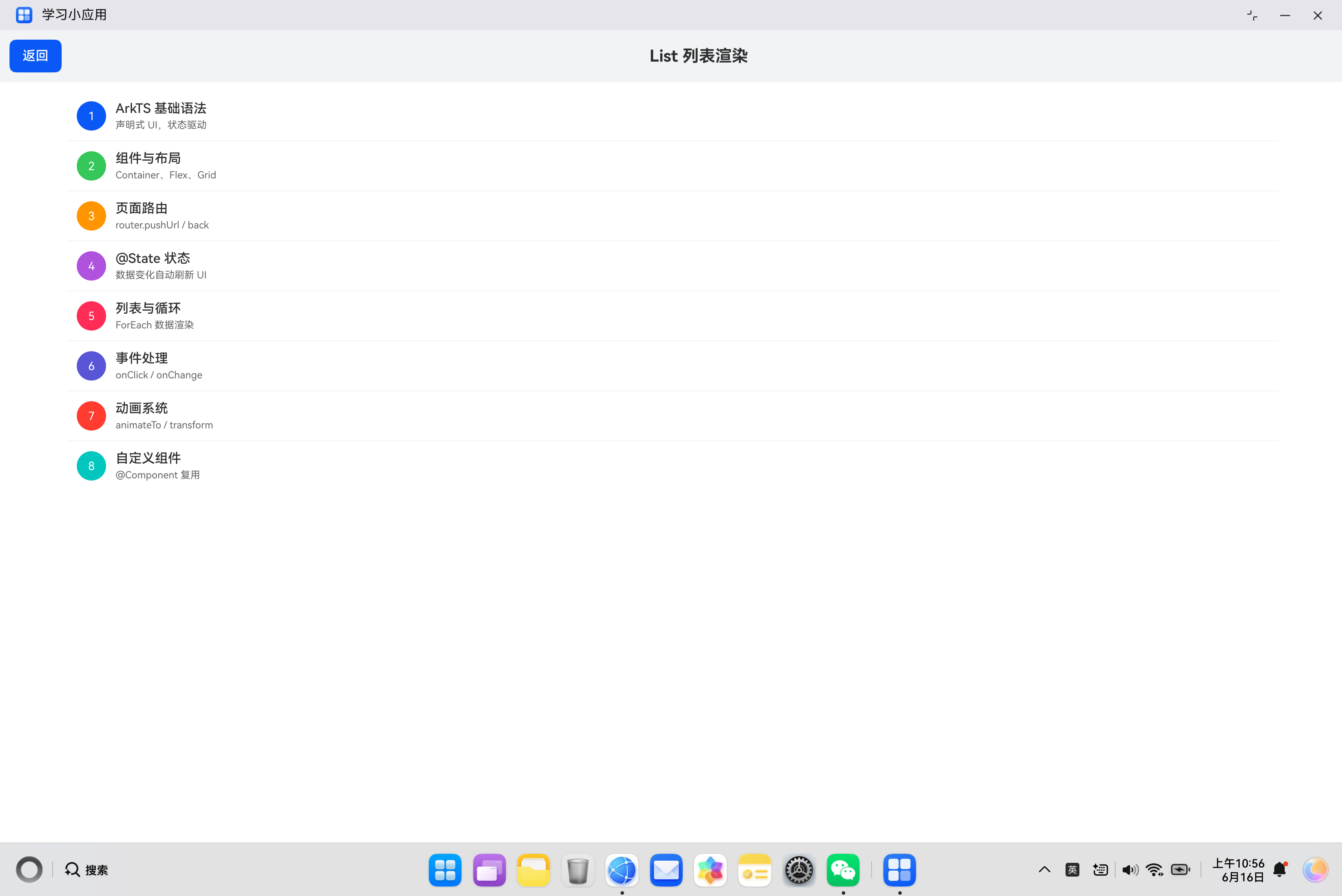
3.4 完整样式示例
@Entry
@Component
struct CompleteListStyle {
  @State listData: ItemData[] = [
    new ItemData(1, 'ArkTS 基础语法', '声明式 UI,状态驱动', '#0A59F7'),
    new ItemData(2, '组件与布局', 'Container、Flex、Grid', '#34C759'),
    new ItemData(3, '页面路由', 'router.pushUrl / back', '#FF9500'),
    new ItemData(4, '@State 状态', '数据变化自动刷新 UI', '#AF52DE'),
    new ItemData(5, '列表与循环', 'ForEach 数据渲染', '#FF2D55')
  ];

  build() {
    Column() {
      Text('学习目录')
        .fontSize(20)
        .fontWeight(FontWeight.Bold)
        .margin({ top: 20, bottom: 16 })

      List() {
        ForEach(this.listData, (item: ItemData) => {
          ListItem() {
            Row() {
              Text(String(item.id))
                .width(32)
                .height(32)
                .borderRadius(16)
                .backgroundColor(item.color)
                .fontColor('#FFFFFF')
                .textAlign(TextAlign.Center)
                .fontSize(14)
                .fontWeight(FontWeight.Bold)

              Column() {
                Text(item.title)
                  .fontSize(16)
                  .fontWeight(FontWeight.Medium)
                  .fontColor('#333333')
                Text(item.desc)
                  .fontSize(12)
                  .fontColor('#999999')
                  .margin({ top: 4 })
              }
              .layoutWeight(1)
              .margin({ left: 12 })
              .alignItems(HorizontalAlign.Start)

              Text('›')
                .fontSize(20)
                .fontColor('#CCCCCC')
            }
            .padding(16)
            .backgroundColor('#FFFFFF')
          }
        })
      }
      .width('90%')
      .height(300)
      .backgroundColor('#F5F5F5')
      .divider({
        strokeWidth: 1,
        color: '#E5E5E5',
        startMargin: 16,
        endMargin: 16
      })
    }
    .padding(20)
    .width('100%')
    .height('100%')
    .backgroundColor('#FFFFFF')
  }
}
四、交互处理
4.1 点击事件
通过 ListItem 的 onClick 事件处理点击:
@Entry
@Component
struct ClickableList {
  @State items: string[] = ['项目1', '项目2', '项目3', '项目4', '项目5'];
  @State selectedItem: string = '';

  build() {
    Column() {
      Text('选中:' + (this.selectedItem || '无'))
        .fontSize(14)
        .fontColor('#0A59F7')
        .margin({ bottom: 16 })

      List() {
        ForEach(this.items, (item: string) => {
          ListItem() {
            Text(item)
              .fontSize(16)
              .padding(16)
          }
          .onClick(() => {
            this.selectedItem = item;
          })
        })
      }
      .width('90%')
      .height(300)
    }
    .padding(20)
  }
}
4.2 选中状态
实现列表项的选中/未选中状态切换:
@Entry
@Component
struct SelectableList {
  @State items: string[] = ['项目1', '项目2', '项目3', '项目4', '项目5'];
  @State selectedIndex: number = -1;

  build() {
    Column() {
      List() {
        ForEach(this.items, (item: string, index: number) => {
          ListItem() {
            Row() {
              Text(item)
                .fontSize(16)
                .fontColor(this.selectedIndex === index ? '#0A59F7' : '#333333')
                .layoutWeight(1)
              if (this.selectedIndex === index) {
                Text('✓')
                  .fontSize(18)
                  .fontColor('#34C759')
              }
            }
            .padding(16)
            .backgroundColor(this.selectedIndex === index ? '#EAF4FF' : '#FFFFFF')
          }
          .onClick(() => {
            this.selectedIndex = index;
          })
        })
      }
      .width('90%')
      .height(300)
      .divider({ strokeWidth: 1, color: '#E5E5E5' })
    }
    .padding(20)
  }
}
4.3 滚动监听
通过 Scroller 监听滚动事件:
@Entry
@Component
struct ScrollableList {
  @State items: string[] = [];
  @State scrollPosition: string = '顶部';
  private scroller: Scroller = new Scroller();

  aboutToAppear() {
    for (let i: number = 0; i < 50; i++) {
      this.items.push('项目' + (i + 1));
    }
  }

  build() {
    Column() {
      Text('滚动位置:' + this.scrollPosition)
        .fontSize(14)
        .fontColor('#999999')
        .margin({ bottom: 16 })

      List({ scroller: this.scroller }) {
        ForEach(this.items, (item: string) => {
          ListItem() {
            Text(item)
              .fontSize(16)
              .padding(16)
          }
        })
      }
      .width('90%')
      .height(300)
      .onScroll((scrollOffset: number) => {
        if (scrollOffset < 100) {
          this.scrollPosition = '顶部';
        } else if (scrollOffset > 1000) {
          this.scrollPosition = '底部';
        } else {
          this.scrollPosition = '中间';
        }
      })
    }
    .padding(20)
  }
}
五、高级用法
5.1 分组列表
实现带分组的列表展示:
class GroupData {
  groupTitle: string = '';
  items: string[] = [];

  constructor(groupTitle: string, items: string[]) {
    this.groupTitle = groupTitle;
    this.items = items;
  }
}

@Entry
@Component
struct GroupedList {
  @State groups: GroupData[] = [
    new GroupData('水果', ['苹果', '香蕉', '橘子']),
    new GroupData('蔬菜', ['白菜', '胡萝卜', '西红柿']),
    new GroupData('肉类', ['猪肉', '牛肉', '鸡肉'])
  ];

  build() {
    Column() {
      List() {
        ForEach(this.groups, (group: GroupData) => {
          // 分组标题
          ListItem() {
            Text(group.groupTitle)
              .fontSize(14)
              .fontWeight(FontWeight.Bold)
              .fontColor('#666666')
              .padding(12)
              .backgroundColor('#F5F5F5')
          }

          // 分组内容
          ForEach(group.items, (item: string) => {
            ListItem() {
              Text(item)
                .fontSize(16)
                .padding(16)
            }
          })
        })
      }
      .width('90%')
      .height(300)
    }
    .padding(20)
  }
}
5.2 带图标的列表
创建包含图标的列表项:
@Entry
@Component
struct IconList {
  @State menuItems: { icon: string; title: string; desc: string }[] = [
    { icon: '📱', title: '手机', desc: '设备管理' },
    { icon: '📧', title: '邮件', desc: '查看邮件' },
    { icon: '📷', title: '相机', desc: '拍摄照片' },
    { icon: '🎵', title: '音乐', desc: '播放音乐' },
    { icon: '⚙️', title: '设置', desc: '系统设置' }
  ];

  build() {
    Column() {
      List() {
        ForEach(this.menuItems, (item) => {
          ListItem() {
            Row() {
              Text(item.icon)
                .fontSize(28)
              Column() {
                Text(item.title)
                  .fontSize(16)
                  .fontWeight(FontWeight.Medium)
                Text(item.desc)
                  .fontSize(12)
                  .fontColor('#999999')
                  .margin({ top: 4 })
              }
              .layoutWeight(1)
              .margin({ left: 12 })
              .alignItems(HorizontalAlign.Start)
              Text('›')
                .fontSize(20)
                .fontColor('#CCCCCC')
            }
            .padding(16)
          }
        })
      }
      .width('90%')
      .height(300)
      .divider({ strokeWidth: 1, color: '#E5E5E5', startMargin: 56 })
    }
    .padding(20)
  }
}
5.3 横向列表
创建横向滚动的列表:
@Entry
@Component
struct HorizontalList {
  @State items: string[] = ['项目1', '项目2', '项目3', '项目4', '项目5', '项目6', '项目7', '项目8'];

  build() {
    Column() {
      Text('横向列表')
        .fontSize(16)
        .margin({ bottom: 12 })

      List({ space: 12 }) {
        ForEach(this.items, (item: string) => {
          ListItem() {
            Text(item)
              .fontSize(14)
              .padding({ left: 20, right: 20, top: 12, bottom: 12 })
              .backgroundColor('#FFFFFF')
              .borderRadius(20)
          }
        })
      }
      .width('100%')
      .height(60)
      .listDirection(Axis.Horizontal)
      .padding({ left: 20, right: 20 })
    }
    .padding(20)
    .width('100%')
    .height('100%')
    .backgroundColor('#F5F5F5')
  }
}
5.4 列表加载更多
实现列表的加载更多功能:
@Entry
@Component
struct LoadMoreList {
  @State items: string[] = [];
  @State isLoading: boolean = false;
  @State hasMore: boolean = true;

  aboutToAppear() {
    this.loadData(0, 10);
  }

  loadData(start: number, count: number) {
    for (let i: number = start; i < start + count && i < 50; i++) {
      this.items.push('项目' + (i + 1));
    }
    this.hasMore = this.items.length < 50;
  }

  onReachEnd() {
    if (!this.isLoading && this.hasMore) {
      this.isLoading = true;
      setTimeout(() => {
        this.loadData(this.items.length, 10);
        this.isLoading = false;
      }, 1000);
    }
  }

  build() {
    Column() {
      List() {
        ForEach(this.items, (item: string) => {
          ListItem() {
            Text(item)
              .fontSize(16)
              .padding(16)
          }
        })

        // 加载更多提示
        if (this.isLoading) {
          ListItem() {
            Row() {
              Progress({ value: 0, total: 100, type: ProgressType.Eclipse })
                .width(20)
                .height(20)
              Text('加载中...')
                .fontSize(14)
                .fontColor('#999999')
                .margin({ left: 8 })
            }
            .padding(16)
            .justifyContent(FlexAlign.Center)
          }
        } else if (!this.hasMore) {
          ListItem() {
            Text('已加载全部')
              .fontSize(14)
              .fontColor('#999999')
              .padding(16)
              .textAlign(TextAlign.Center)
          }
        }
      }
      .width('90%')
      .height(300)
      .onReachEnd(() => {
        this.onReachEnd();
      })
    }
    .padding(20)
  }
}
六、实际案例:联系人列表
6.1 需求分析
构建一个联系人列表页面,包含:
- 联系人分组展示(按首字母)
- 联系人搜索功能
- 联系人点击跳转
- 列表项包含头像、姓名、电话
6.2 代码实现
import { router } from '@kit.ArkUI';

class Contact {
  id: number = 0;
  name: string = '';
  phone: string = '';
  avatar: string = '';

  constructor(id: number, name: string, phone: string, avatar: string) {
    this.id = id;
    this.name = name;
    this.phone = phone;
    this.avatar = avatar;
  }
}

class ContactGroup {
  letter: string = '';
  contacts: Contact[] = [];

  constructor(letter: string, contacts: Contact[]) {
    this.letter = letter;
    this.contacts = contacts;
  }
}

@Entry
@Component
struct ContactList {
  @State groups: ContactGroup[] = [
    new ContactGroup('A', [
      new Contact(1, '张三', '13800138000', '张'),
      new Contact(2, '李四', '13900139000', '李'),
      new Contact(3, '王五', '13700137000', '王')
    ]),
    new ContactGroup('B', [
      new Contact(4, '赵六', '13600136000', '赵'),
      new Contact(5, '钱七', '13500135000', '钱')
    ]),
    new ContactGroup('C', [
      new Contact(6, '孙八', '13400134000', '孙'),
      new Contact(7, '周九', '13300133000', '周')
    ])
  ];
  @State searchKeyword: string = '';
  @State filteredGroups: ContactGroup[] = [];

  onSearch() {
    if (!this.searchKeyword.trim()) {
      this.filteredGroups = this.groups;
      return;
    }

    this.filteredGroups = [];
    for (const group of this.groups) {
      const filteredContacts: Contact[] = [];
      for (const contact of group.contacts) {
        if (contact.name.includes(this.searchKeyword)) {
          filteredContacts.push(contact);
        }
      }
      if (filteredContacts.length > 0) {
        this.filteredGroups.push(new ContactGroup(group.letter, filteredContacts));
      }
    }
  }

  aboutToAppear() {
    this.filteredGroups = this.groups;
  }

  build() {
    Column() {
      Text('联系人')
        .fontSize(24)
        .fontWeight(FontWeight.Bold)
        .margin({ top: 20, bottom: 16 })

      // 搜索框
      TextInput({ placeholder: '搜索联系人' })
        .width('85%')
        .height(44)
        .backgroundColor('#FFFFFF')
        .border({ width: 1, color: '#E5E5E5', radius: 22 })
        .padding({ left: 20, right: 20 })
        .margin({ bottom: 16 })
        .onChange((value: string) => {
          this.searchKeyword = value;
          this.onSearch();
        })

      // 联系人列表
      List() {
        ForEach(this.filteredGroups, (group: ContactGroup) => {
          // 分组标题
          ListItem() {
            Text(group.letter)
              .fontSize(14)
              .fontWeight(FontWeight.Bold)
              .fontColor('#666666')
              .padding(12)
              .backgroundColor('#F5F5F5')
          }

          // 联系人列表项
          ForEach(group.contacts, (contact: Contact) => {
            ListItem() {
              Row() {
                // 头像
                Text(contact.avatar)
                  .width(44)
                  .height(44)
                  .borderRadius(22)
                  .backgroundColor('#0A59F7')
                  .fontColor('#FFFFFF')
                  .fontSize(18)
                  .fontWeight(FontWeight.Bold)
                  .textAlign(TextAlign.Center)

                // 信息
                Column() {
                  Text(contact.name)
                    .fontSize(16)
                    .fontWeight(FontWeight.Medium)
                  Text(contact.phone)
                    .fontSize(12)
                    .fontColor('#999999')
                    .margin({ top: 4 })
                }
                .layoutWeight(1)
                .margin({ left: 12 })
                .alignItems(HorizontalAlign.Start)

                // 箭头
                Text('›')
                  .fontSize(20)
                  .fontColor('#CCCCCC')
              }
              .padding(12)
            }
            .onClick(() => {
              console.info('点击联系人:' + contact.name);
            })
          })
        })
      }
      .width('85%')
      .layoutWeight(1)
      .divider({ strokeWidth: 1, color: '#E5E5E5', startMargin: 68 })
    }
    .width('100%')
    .height('100%')
    .backgroundColor('#FFFFFF')
  }
}
七、常见问题与解决方案
7.1 列表渲染异常
问题描述:列表项显示不完整或布局错乱。
解决方案:
- 确保每个
ListItem都有明确的尺寸约束 - 检查
ForEach的第三个参数(key)是否唯一 - 确认数据数组的结构正确
7.2 列表滚动不流畅
问题描述:列表滚动时有卡顿现象。
解决方案:
- 避免在列表项中使用复杂的嵌套布局
- 使用懒加载减少初始渲染量
- 避免在滚动时触发频繁的状态更新
7.3 列表项点击无响应
问题描述:点击列表项后,onClick 事件没有触发。
解决方案:
- 检查
ListItem是否有enabled属性设置为false - 确认列表项有足够的尺寸
- 检查是否有其他组件拦截了触摸事件
7.4 动态更新数据不生效
问题描述:更新数据后,列表没有刷新。
解决方案:
- 确保使用状态变量(
@State、@Observed等) - 检查是否正确更新了数组引用
- 确认
ForEach的数据源正确
八、性能优化建议
8.1 使用懒加载
对于大量数据,使用懒加载减少内存占用:
List() {
  ForEach(this.items, (item: string) => {
    ListItem() {
      // 只渲染可见的列表项
    }
  })
}
8.2 避免复杂布局
简化列表项的布局结构:
// 避免
ListItem() {
  Column() {
    Row() {
      // 多层嵌套
    }
  }
}

// 推荐
ListItem() {
  Row() {
    // 扁平化布局
  }
}
8.3 合理使用 key
为 ForEach 提供唯一的 key,提高渲染效率:
ForEach(this.items, (item: ItemData) => {
  ListItem() {
    // ...
  }
}, (item: ItemData) => item.id)
8.4 避免频繁状态更新
在滚动过程中,避免触发状态更新:
.onScroll((scrollOffset: number) => {
  // 避免频繁更新状态
  if (scrollOffset % 100 === 0) {
    // 更新状态
  }
})
九、总结
List 组件是 HarmonyOS ArkUI 中最常用的组件之一,掌握其使用方法对于构建高质量的用户界面至关重要。
核心要点:
- 使用
ForEach渲染列表数据 - 通过
ListItem定义列表项内容 - 使用
divider属性添加分割线 - 通过事件处理实现交互功能
- 注意性能优化,避免卡顿
希望本文能帮助你更好地理解和使用 List 组件,构建出优秀的 HarmonyOS 应用。
参考资料:

讨论HarmonyOS开发技术,专注于API与组件、DevEco Studio、测试、元服务和应用上架分发等。
更多推荐


 3
3 0
0- 0


 已为社区贡献40条内容

所有评论(0)