HarmonyOS ArkUI训练营入门-组件掌握系列-Grid 网格布局深度解析-PC版本
概述
网格布局是现代 UI 设计中常用的布局方式,能够将内容以行列形式整齐排列。HarmonyOS ArkUI 提供的 Grid 组件功能强大,支持灵活的列数配置、间距设置、自适应布局等特性。本文将从组件基础、属性配置、样式定制、响应式布局、实际应用等多个维度,深入解析 Grid 组件的使用方法。
一、Grid 组件基础
1.1 组件定义与作用
Grid 组件用于创建网格布局,将子组件排列成多行多列的网格结构。它是构建图片墙、商品列表、应用图标等场景的核心组件。
@Entry
@Component
struct GridBasic {
  build() {
    Column() {
      Grid() {
        ForEach([1, 2, 3, 4, 5, 6], (item: number) => {
          GridItem() {
            Text('格子' + item)
              .fontSize(16)
              .padding(16)
          }
        })
      }
      .columnsTemplate('1fr 1fr 1fr')
      .width('100%')
    }
    .padding(20)
  }
}
1.2 核心属性
| 属性 | 类型 | 说明 | 默认值 |
|---|---|---|---|
columnsTemplate |
string |
列模板 | - |
rowsTemplate |
string |
行模板 | - |
columnsGap |
Length |
列间距 | 0 |
rowsGap |
Length |
行间距 | 0 |
width |
Length |
网格宽度 | - |
height |
Length |
网格高度 | - |
layoutDirection |
LayoutDirection |
布局方向 | LayoutDirection.Ltr |
1.3 列模板语法
columnsTemplate 使用空格分隔的模板字符串,支持以下单位:
| 单位 | 说明 | 示例 |
|---|---|---|
fr |
剩余空间分配 | '1fr 1fr 1fr' |
px |
固定像素 | '100px 100px' |
% |
百分比 | '50% 50%' |
1.4 基础使用示例
@Entry
@Component
struct BasicGrid {
  build() {
    Column() {
      Text('基础网格布局')
        .fontSize(20)
        .fontWeight(FontWeight.Bold)
        .margin({ bottom: 16 })

      Grid() {
        ForEach([1, 2, 3, 4, 5, 6], (item: number) => {
          GridItem() {
            Text('格子' + item)
              .fontSize(14)
              .padding(16)
              .backgroundColor('#FFFFFF')
              .borderRadius(8)
              .width('100%')
              .textAlign(TextAlign.Center)
          }
        })
      }
      .columnsTemplate('1fr 1fr 1fr')
      .columnsGap(10)
      .rowsGap(10)
      .width('100%')
      .backgroundColor('#F5F5F5')
      .padding(10)
    }
    .padding(20)
    .width('100%')
    .height('100%')
    .backgroundColor('#FFFFFF')
  }
}
二、属性配置
2.1 列数配置
通过 columnsTemplate 配置列数和宽度:
@Entry
@Component
struct ColumnConfig {
  build() {
    Column() {
      // 2列等宽
      Grid() {
        ForEach([1, 2, 3, 4], (item: number) => {
          GridItem() {
            Text('格子' + item)
              .padding(16)
              .backgroundColor('#FFFFFF')
          }
        })
      }
      .columnsTemplate('1fr 1fr')
      .width('100%')
      .margin({ bottom: 16 })

      // 3列等宽
      Grid() {
        ForEach([1, 2, 3, 4, 5, 6], (item: number) => {
          GridItem() {
            Text('格子' + item)
              .padding(16)
              .backgroundColor('#FFFFFF')
          }
        })
      }
      .columnsTemplate('1fr 1fr 1fr')
      .width('100%')

      // 4列等宽
      Grid() {
        ForEach([1, 2, 3, 4, 5, 6, 7, 8], (item: number) => {
          GridItem() {
            Text('格子' + item)
              .padding(16)
              .backgroundColor('#FFFFFF')
          }
        })
      }
      .columnsTemplate('1fr 1fr 1fr 1fr')
      .width('100%')
      .margin({ top: 16 })
    }
    .padding(20)
  }
}
2.2 不等宽布局
创建不同宽度的列:
@Entry
@Component
struct UnequalGrid {
  build() {
    Column() {
      Grid() {
        ForEach([1, 2, 3, 4], (item: number) => {
          GridItem() {
            Text('格子' + item)
              .padding(16)
              .backgroundColor('#FFFFFF')
              .textAlign(TextAlign.Center)
          }
        })
      }
      .columnsTemplate('1fr 2fr')
      .columnsGap(10)
      .rowsGap(10)
      .width('100%')
    }
    .padding(20)
  }
}
2.3 固定宽度布局
使用固定像素宽度:
@Entry
@Component
struct FixedWidthGrid {
  build() {
    Column() {
      Grid() {
        ForEach([1, 2, 3, 4, 5, 6], (item: number) => {
          GridItem() {
            Text('格子' + item)
              .padding(16)
              .backgroundColor('#FFFFFF')
              .textAlign(TextAlign.Center)
          }
        })
      }
      .columnsTemplate('80px 80px 80px')
      .columnsGap(10)
      .rowsGap(10)
      .width('100%')
    }
    .padding(20)
  }
}
2.4 间距设置
通过 columnsGap 和 rowsGap 设置间距:
@Entry
@Component
struct GapGrid {
  build() {
    Column() {
      Grid() {
        ForEach([1, 2, 3, 4, 5, 6], (item: number) => {
          GridItem() {
            Text('格子' + item)
              .padding(16)
              .backgroundColor('#FFFFFF')
              .textAlign(TextAlign.Center)
          }
        })
      }
      .columnsTemplate('1fr 1fr 1fr')
      .columnsGap(16)
      .rowsGap(16)
      .width('100%')
    }
    .padding(20)
  }
}
三、样式定制
3.1 背景与边框
为网格添加背景色和边框:
@Entry
@Component
struct BackgroundGrid {
  build() {
    Column() {
      Grid() {
        ForEach([1, 2, 3, 4, 5, 6], (item: number) => {
          GridItem() {
            Text('格子' + item)
              .padding(16)
              .backgroundColor('#FFFFFF')
              .textAlign(TextAlign.Center)
          }
        })
      }
      .columnsTemplate('1fr 1fr 1fr')
      .columnsGap(10)
      .rowsGap(10)
      .width('100%')
      .backgroundColor('#F5F5F5')
      .border({ width: 1, color: '#E5E5E5', radius: 8 })
      .padding(10)
    }
    .padding(20)
  }
}
3.2 网格项样式
定制网格项的外观:
@Entry
@Component
struct StyledGridItem {
  build() {
    Column() {
      Grid() {
        ForEach([1, 2, 3, 4, 5, 6], (item: number) => {
          GridItem() {
            Text('格子' + item)
              .padding(16)
              .backgroundColor('#0A59F7')
              .fontColor('#FFFFFF')
              .fontSize(14)
              .fontWeight(FontWeight.Medium)
              .textAlign(TextAlign.Center)
              .borderRadius(8)
          }
        })
      }
      .columnsTemplate('1fr 1fr 1fr')
      .columnsGap(10)
      .rowsGap(10)
      .width('100%')
    }
    .padding(20)
  }
}
3.3 圆角与阴影
添加圆角和阴影效果:
@Entry
@Component
struct RoundedGrid {
  build() {
    Column() {
      Grid() {
        ForEach([1, 2, 3, 4, 5, 6], (item: number) => {
          GridItem() {
            Text('格子' + item)
              .padding(16)
              .backgroundColor('#FFFFFF')
              .textAlign(TextAlign.Center)
              .borderRadius(12)
              .shadow({ radius: 4, color: 'rgba(0, 0, 0, 0.1)' })
          }
        })
      }
      .columnsTemplate('1fr 1fr 1fr')
      .columnsGap(12)
      .rowsGap(12)
      .width('100%')
    }
    .padding(20)
  }
}
3.4 完整样式示例
@Entry
@Component
struct CompleteGridStyle {
  @State colors: string[] = ['#0A59F7', '#34C759', '#FF9500', '#AF52DE', '#FF2D55', '#5856D6'];

  build() {
    Column() {
      Text('多彩网格')
        .fontSize(20)
        .fontWeight(FontWeight.Bold)
        .margin({ bottom: 16 })

      Grid() {
        ForEach([1, 2, 3, 4, 5, 6], (item: number, index: number) => {
          GridItem() {
            Text('项目' + item)
              .padding(20)
              .backgroundColor(this.colors[index])
              .fontColor('#FFFFFF')
              .fontSize(16)
              .fontWeight(FontWeight.Medium)
              .textAlign(TextAlign.Center)
              .borderRadius(12)
          }
        })
      }
      .columnsTemplate('1fr 1fr')
      .columnsGap(12)
      .rowsGap(12)
      .width('100%')
      .backgroundColor('#F5F5F5')
      .padding(12)
      .borderRadius(12)
    }
    .padding(20)
    .width('100%')
    .height('100%')
    .backgroundColor('#FFFFFF')
  }
}
四、响应式布局
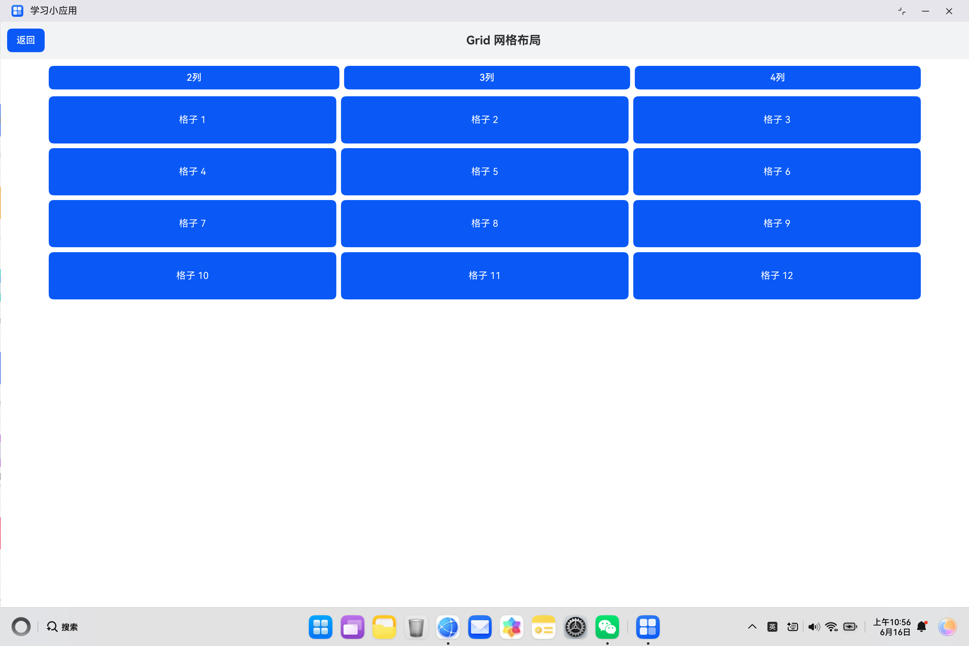
4.1 动态列数
根据状态变量动态调整列数:
@Entry
@Component
struct DynamicColumns {
  @State columns: string = '1fr 1fr 1fr';

  build() {
    Column() {
      Row() {
        Button('2列')
          .layoutWeight(1)
          .height(40)
          .onClick(() => {
            this.columns = '1fr 1fr';
          })
        Button('3列')
          .layoutWeight(1)
          .height(40)
          .margin({ left: 8 })
          .onClick(() => {
            this.columns = '1fr 1fr 1fr';
          })
        Button('4列')
          .layoutWeight(1)
          .height(40)
          .margin({ left: 8 })
          .onClick(() => {
            this.columns = '1fr 1fr 1fr 1fr';
          })
      }
      .width('100%')
      .margin({ bottom: 16 })

      Grid() {
        ForEach([1, 2, 3, 4, 5, 6, 7, 8, 9, 10, 11, 12], (item: number) => {
          GridItem() {
            Text('格子' + item)
              .padding(20)
              .backgroundColor('#0A59F7')
              .fontColor('#FFFFFF')
              .textAlign(TextAlign.Center)
              .borderRadius(8)
          }
        })
      }
      .columnsTemplate(this.columns)
      .columnsGap(8)
      .rowsGap(8)
      .width('100%')
    }
    .padding(20)
  }
}
4.2 结合媒体查询
根据屏幕尺寸调整布局:
@Entry
@Component
struct ResponsiveGrid {
  @State columns: string = '1fr 1fr';

  aboutToAppear() {
    const width: number = px2vp(windowWidth());
    if (width > 600) {
      this.columns = '1fr 1fr 1fr';
    }
    if (width > 800) {
      this.columns = '1fr 1fr 1fr 1fr';
    }
  }

  build() {
    Column() {
      Grid() {
        ForEach([1, 2, 3, 4, 5, 6, 7, 8], (item: number) => {
          GridItem() {
            Text('格子' + item)
              .padding(20)
              .backgroundColor('#FFFFFF')
              .textAlign(TextAlign.Center)
              .borderRadius(8)
          }
        })
      }
      .columnsTemplate(this.columns)
      .columnsGap(10)
      .rowsGap(10)
      .width('100%')
    }
    .padding(20)
  }
}
五、高级用法
5.1 带图标的网格
创建包含图标的网格布局:
@Entry
@Component
struct IconGrid {
  @State menuItems: { icon: string; title: string; color: string }[] = [
    { icon: '📱', title: '手机', color: '#0A59F7' },
    { icon: '📧', title: '邮件', color: '#34C759' },
    { icon: '📷', title: '相机', color: '#FF9500' },
    { icon: '🎵', title: '音乐', color: '#AF52DE' },
    { icon: '📁', title: '文件', color: '#FF2D55' },
    { icon: '⚙️', title: '设置', color: '#5856D6' }
  ];

  build() {
    Column() {
      Grid() {
        ForEach(this.menuItems, (item) => {
          GridItem() {
            Column() {
              Text(item.icon)
                .fontSize(32)
              Text(item.title)
                .fontSize(14)
                .fontColor('#333333')
                .margin({ top: 8 })
            }
            .padding(16)
            .backgroundColor('#FFFFFF')
            .borderRadius(12)
            .width('100%')
            .alignItems(HorizontalAlign.Center)
          }
        })
      }
      .columnsTemplate('1fr 1fr 1fr')
      .columnsGap(12)
      .rowsGap(12)
      .width('100%')
    }
    .padding(20)
  }
}
5.2 图片网格
创建图片墙效果:
@Entry
@Component
struct ImageGrid {
  @State images: string[] = [
    'https://example.com/img1.jpg',
    'https://example.com/img2.jpg',
    'https://example.com/img3.jpg',
    'https://example.com/img4.jpg',
    'https://example.com/img5.jpg',
    'https://example.com/img6.jpg'
  ];

  build() {
    Column() {
      Grid() {
        ForEach(this.images, (url: string) => {
          GridItem() {
            Image(url)
              .width('100%')
              .height(120)
              .objectFit(ImageFit.Cover)
              .borderRadius(8)
          }
        })
      }
      .columnsTemplate('1fr 1fr')
      .columnsGap(8)
      .rowsGap(8)
      .width('100%')
    }
    .padding(20)
  }
}
5.3 网格点击事件
为网格项添加点击事件:
@Entry
@Component
struct ClickableGrid {
  @State items: string[] = ['项目1', '项目2', '项目3', '项目4', '项目5', '项目6'];
  @State selectedItem: string = '';

  build() {
    Column() {
      Text('选中:' + (this.selectedItem || '无'))
        .fontSize(14)
        .fontColor('#0A59F7')
        .margin({ bottom: 16 })

      Grid() {
        ForEach(this.items, (item: string) => {
          GridItem() {
            Text(item)
              .padding(20)
              .backgroundColor(this.selectedItem === item ? '#0A59F7' : '#FFFFFF')
              .fontColor(this.selectedItem === item ? '#FFFFFF' : '#333333')
              .textAlign(TextAlign.Center)
              .borderRadius(8)
          }
          .onClick(() => {
            this.selectedItem = item;
          })
        })
      }
      .columnsTemplate('1fr 1fr 1fr')
      .columnsGap(10)
      .rowsGap(10)
      .width('100%')
    }
    .padding(20)
  }
}
5.4 嵌套网格
在网格中嵌套其他布局:
@Entry
@Component
struct NestedGrid {
  build() {
    Column() {
      Grid() {
        GridItem() {
          Column() {
            Text('标题')
              .fontSize(18)
              .fontWeight(FontWeight.Bold)
            Text('描述信息')
              .fontSize(14)
              .fontColor('#999999')
              .margin({ top: 4 })
          }
          .padding(16)
          .backgroundColor('#FFFFFF')
          .borderRadius(8)
        }
      }
      .columnsTemplate('1fr 1fr')
      .columnsGap(10)
      .rowsGap(10)
      .width('100%')
    }
    .padding(20)
  }
}
六、实际案例:应用商店首页
6.1 需求分析
构建一个应用商店首页,包含:
- 应用分类网格
- 热门应用列表
- 推荐应用网格
- 应用图标和名称展示
6.2 代码实现
import { router } from '@kit.ArkUI';

class AppInfo {
  id: number = 0;
  name: string = '';
  icon: string = '';
  rating: number = 0;
  downloads: string = '';

  constructor(id: number, name: string, icon: string, rating: number, downloads: string) {
    this.id = id;
    this.name = name;
    this.icon = icon;
    this.rating = rating;
    this.downloads = downloads;
  }
}

class Category {
  name: string = '';
  icon: string = '';
  color: string = '';

  constructor(name: string, icon: string, color: string) {
    this.name = name;
    this.icon = icon;
    this.color = color;
  }
}

@Entry
@Component
struct AppStore {
  @State categories: Category[] = [
    new Category('游戏', '🎮', '#FF3B30'),
    new Category('社交', '💬', '#0A59F7'),
    new Category('工具', '🔧', '#34C759'),
    new Category('娱乐', '🎵', '#FF9500'),
    new Category('购物', '🛒', '#AF52DE'),
    new Category('教育', '📚', '#5856D6')
  ];

  @State hotApps: AppInfo[] = [
    new AppInfo(1, '微信', '💬', 4.9, '10亿+'),
    new AppInfo(2, '抖音', '🎵', 4.8, '8亿+'),
    new AppInfo(3, '支付宝', '💰', 4.7, '7亿+'),
    new AppInfo(4, '淘宝', '🛒', 4.6, '6亿+')
  ];

  @State recommendApps: AppInfo[] = [
    new AppInfo(5, '王者荣耀', '🎮', 4.9, '2亿+'),
    new AppInfo(6, '小红书', '📕', 4.8, '1亿+'),
    new AppInfo(7, '美团', '🍔', 4.7, '5亿+'),
    new AppInfo(8, '高德地图', '🗺️', 4.6, '4亿+'),
    new AppInfo(9, '哔哩哔哩', '📺', 4.8, '3亿+'),
    new AppInfo(10, '酷狗音乐', '🎶', 4.5, '2亿+')
  ];

  build() {
    Column() {
      // 顶部标题
      Text('应用商店')
        .fontSize(28)
        .fontWeight(FontWeight.Bold)
        .margin({ top: 40, bottom: 24 })

      // 分类网格
      Column() {
        Text('分类')
          .fontSize(18)
          .fontWeight(FontWeight.Bold)
          .margin({ bottom: 12 })

        Grid() {
          ForEach(this.categories, (category: Category) => {
            GridItem() {
              Column() {
                Text(category.icon)
                  .fontSize(28)
                Text(category.name)
                  .fontSize(13)
                  .fontColor('#333333')
                  .margin({ top: 6 })
              }
              .padding({ top: 16, bottom: 16 })
              .backgroundColor('#FFFFFF')
              .borderRadius(12)
              .width('100%')
              .alignItems(HorizontalAlign.Center)
            }
          })
        }
        .columnsTemplate('1fr 1fr 1fr')
        .columnsGap(10)
        .rowsGap(10)
        .width('100%')
      }
      .margin({ bottom: 24 })

      // 热门应用
      Column() {
        Text('热门应用')
          .fontSize(18)
          .fontWeight(FontWeight.Bold)
          .margin({ bottom: 12 })

        List() {
          ForEach(this.hotApps, (app: AppInfo) => {
            ListItem() {
              Row() {
                Text(app.icon)
                  .fontSize(40)
                Column() {
                  Text(app.name)
                    .fontSize(16)
                    .fontWeight(FontWeight.Medium)
                  Text(app.downloads + '下载')
                    .fontSize(12)
                    .fontColor('#999999')
                    .margin({ top: 4 })
                }
                .layoutWeight(1)
                .margin({ left: 12 })
                .alignItems(HorizontalAlign.Start)
                Text(app.rating + '分')
                  .fontSize(14)
                  .fontColor('#FF9500')
              }
              .padding(12)
              .backgroundColor('#FFFFFF')
              .borderRadius(8)
            }
          })
        }
        .width('100%')
        .height(240)
        .divider({ strokeWidth: 1, color: '#F1F3F5' })
      }
      .margin({ bottom: 24 })

      // 推荐应用
      Column() {
        Text('推荐应用')
          .fontSize(18)
          .fontWeight(FontWeight.Bold)
          .margin({ bottom: 12 })

        Grid() {
          ForEach(this.recommendApps, (app: AppInfo) => {
            GridItem() {
              Column() {
                Text(app.icon)
                  .fontSize(36)
                Text(app.name)
                  .fontSize(14)
                  .fontColor('#333333')
                  .margin({ top: 8 })
                  .maxLines(1)
                  .textOverflow({ overflow: TextOverflow.Ellipsis })
              }
              .padding(12)
              .backgroundColor('#FFFFFF')
              .borderRadius(12)
              .width('100%')
              .alignItems(HorizontalAlign.Center)
            }
          })
        }
        .columnsTemplate('1fr 1fr 1fr')
        .columnsGap(10)
        .rowsGap(10)
        .width('100%')
      }
    }
    .width('100%')
    .height('100%')
    .backgroundColor('#F5F5F5')
    .padding({ left: 16, right: 16 })
  }
}
七、常见问题与解决方案
7.1 网格布局异常
问题描述:网格项显示不完整或布局错乱。
解决方案:
- 检查
columnsTemplate的语法是否正确 - 确保网格项有明确的尺寸约束
- 检查是否有其他样式覆盖
7.2 网格项间距异常
问题描述:列间距或行间距不符合预期。
解决方案:
- 检查
columnsGap和rowsGap的值 - 确认单位是否正确(px/vp/%)
- 检查父容器的 padding 是否影响
7.3 网格点击无响应
问题描述:点击网格项后,onClick 事件没有触发。
解决方案:
- 检查
GridItem是否有enabled属性设置为false - 确认网格项有足够的尺寸
- 检查是否有其他组件拦截了触摸事件
7.4 动态列数不生效
问题描述:更新 columnsTemplate 后,列数没有变化。
解决方案:
- 确保使用状态变量(
@State) - 检查模板字符串的格式是否正确
- 确认数据数组的长度足够
八、性能优化建议
8.1 避免复杂嵌套
简化网格项的布局结构:
// 避免
GridItem() {
  Column() {
    Row() {
      // 多层嵌套
    }
  }
}

// 推荐
GridItem() {
  Column() {
    // 扁平化布局
  }
}
8.2 合理设置列数
根据屏幕尺寸和内容选择合适的列数:
// 手机端
.columnsTemplate('1fr 1fr')

// 平板端
.columnsTemplate('1fr 1fr 1fr 1fr')
8.3 使用懒加载
对于大量数据,使用懒加载减少内存占用:
Grid() {
  ForEach(this.items, (item: string) => {
    GridItem() {
      // 只渲染可见的网格项
    }
  })
}
九、总结
Grid 组件是 HarmonyOS ArkUI 中功能强大的布局组件,掌握其使用方法对于构建高质量的用户界面至关重要。
核心要点:
- 通过
columnsTemplate配置列数和宽度 - 使用
columnsGap和rowsGap设置间距 - 通过
GridItem定义网格项内容 - 支持动态调整列数,实现响应式布局
- 注意性能优化,避免复杂嵌套
希望本文能帮助你更好地理解和使用 Grid 组件,构建出优秀的 HarmonyOS 应用。
参考资料:

讨论HarmonyOS开发技术,专注于API与组件、DevEco Studio、测试、元服务和应用上架分发等。
更多推荐


 7
7 0
0- 0


 已为社区贡献40条内容

所有评论(0)