HarmonyOS ArkUI训练营入门-组件掌握系列-Toggle Switch 开关组件-PC版本
·
概述
开关组件是移动应用中常用的交互元素,用于控制某个功能的开启或关闭状态。在 HarmonyOS ArkUI 中,Toggle 组件提供了多种类型的开关功能,包括 Switch(开关)、Checkbox(复选框)和 Radio(单选)。本文将重点讲解 Toggle 组件的 Switch 类型,从组件基础、属性配置、样式定制、交互处理、实际应用等多个维度深入讲解。
一、Toggle 组件基础
1.1 组件定义与作用
Toggle 组件用于创建可切换的开关控件,支持三种类型:
ToggleType.Switch:开关类型,用于二选一的状态切换ToggleType.Checkbox:复选框类型,用于多选场景ToggleType.Radio:单选类型,用于互斥选择场景
@Entry
@Component
struct ToggleBasic {
  @State isOn: boolean = false;

  build() {
    Column() {
      Toggle({ type: ToggleType.Switch, isOn: this.isOn })
        .onChange((isOn: boolean) => {
          this.isOn = isOn;
        })
    }
    .padding(20)
  }
}
1.2 构造函数
Toggle 的构造函数支持以下参数:
Toggle(options?: {
  type?: ToggleType;  // 开关类型
  isOn?: boolean;     // 是否开启
})
1.3 ToggleType 枚举值
| 类型 | 说明 | 适用场景 |
|---|---|---|
ToggleType.Switch |
开关样式 | Wi-Fi、蓝牙、通知等系统设置 |
ToggleType.Checkbox |
复选框样式 | 多选列表、表单勾选 |
ToggleType.Radio |
单选样式 | 性别选择、选项互斥 |
1.4 核心属性
| 属性 | 类型 | 说明 | 默认值 |
|---|---|---|---|
type |
ToggleType |
开关类型 | ToggleType.Switch |
isOn |
boolean |
是否开启 | false |
selectedColor |
ResourceColor |
开启状态颜色 | - |
switchPointColor |
ResourceColor |
开关圆点颜色 | - |
1.5 基础使用示例
@Entry
@Component
struct BasicToggle {
  @State wifiEnabled: boolean = true;

  build() {
    Column() {
      Text('Toggle Switch 基础使用')
        .fontSize(20)
        .fontWeight(FontWeight.Bold)
        .margin({ bottom: 20 })

      Row() {
        Text('Wi-Fi')
          .fontSize(16)
          .fontWeight(FontWeight.Medium)
          .layoutWeight(1)

        Toggle({ type: ToggleType.Switch, isOn: this.wifiEnabled })
          .onChange((isOn: boolean) => {
            this.wifiEnabled = isOn;
          })
      }
      .width('80%')
      .padding(12)
      .backgroundColor('#F5F5F5')
      .borderRadius(8)
    }
    .padding(20)
    .width('100%')
    .height('100%')
    .backgroundColor('#FFFFFF')
  }
}
二、Switch 类型详解
2.1 Switch 的特点
Switch 类型的 Toggle 具有以下特点:
| 特点 | 说明 |
|---|---|
| 状态互斥 | 只有开启和关闭两种状态 |
| 滑动切换 | 支持点击和滑动两种操作方式 |
| 视觉反馈 | 切换时有平滑的动画效果 |
| 适合二选一 | 用于控制功能的开启/关闭 |
2.2 Switch 的使用场景
| 场景 | 示例 |
|---|---|
| 系统设置 | Wi-Fi、蓝牙、飞行模式 |
| 应用设置 | 通知开关、深色模式 |
| 功能控制 | 自动播放、静音模式 |
| 权限管理 | 定位权限、通知权限 |
2.3 基础 Switch 示例
@Entry
@Component
struct SwitchExample {
  @State isEnabled: boolean = false;

  build() {
    Column() {
      Text('开关状态:' + (this.isEnabled ? '开启' : '关闭'))
        .fontSize(16)
        .fontColor(this.isEnabled ? '#34C759' : '#FF3B30')
        .margin({ bottom: 20 })

      Toggle({ type: ToggleType.Switch, isOn: this.isEnabled })
        .selectedColor('#0A59F7')
        .switchPointColor('#FFFFFF')
        .onChange((isOn: boolean) => {
          this.isEnabled = isOn;
        })
    }
    .padding(20)
    .justifyContent(FlexAlign.Center)
  }
}
三、属性配置
3.1 选中状态颜色
通过 selectedColor 属性设置开启状态的颜色:
@Entry
@Component
struct SelectedColor {
  @State isOn: boolean = false;

  build() {
    Column() {
      Toggle({ type: ToggleType.Switch, isOn: this.isOn })
        .selectedColor('#0A59F7')
        .onChange((isOn: boolean) => {
          this.isOn = isOn;
        })

      Toggle({ type: ToggleType.Switch, isOn: this.isOn })
        .selectedColor('#34C759')
        .margin({ top: 12 })
        .onChange((isOn: boolean) => {
          this.isOn = isOn;
        })

      Toggle({ type: ToggleType.Switch, isOn: this.isOn })
        .selectedColor('#FF9500')
        .margin({ top: 12 })
        .onChange((isOn: boolean) => {
          this.isOn = isOn;
        })
    }
    .padding(20)
  }
}
3.2 开关圆点颜色
通过 switchPointColor 属性设置圆点颜色:
@Entry
@Component
struct PointColor {
  @State isOn: boolean = false;

  build() {
    Column() {
      Toggle({ type: ToggleType.Switch, isOn: this.isOn })
        .selectedColor('#0A59F7')
        .switchPointColor('#FFFFFF')
        .onChange((isOn: boolean) => {
          this.isOn = isOn;
        })

      Toggle({ type: ToggleType.Switch, isOn: this.isOn })
        .selectedColor('#34C759')
        .switchPointColor('#FFCC00')
        .margin({ top: 12 })
        .onChange((isOn: boolean) => {
          this.isOn = isOn;
        })
    }
    .padding(20)
  }
}
3.3 尺寸调整
通过 width 和 height 属性调整开关尺寸:
@Entry
@Component
struct SizeAdjust {
  @State isOn: boolean = false;

  build() {
    Column() {
      Toggle({ type: ToggleType.Switch, isOn: this.isOn })
        .width(48)
        .height(28)
        .onChange((isOn: boolean) => {
          this.isOn = isOn;
        })

      Toggle({ type: ToggleType.Switch, isOn: this.isOn })
        .width(60)
        .height(36)
        .margin({ top: 12 })
        .onChange((isOn: boolean) => {
          this.isOn = isOn;
        })

      Toggle({ type: ToggleType.Switch, isOn: this.isOn })
        .width(72)
        .height(42)
        .margin({ top: 12 })
        .onChange((isOn: boolean) => {
          this.isOn = isOn;
        })
    }
    .padding(20)
  }
}
四、样式定制
4.1 自定义颜色主题
创建统一的颜色主题:
@Entry
@Component
struct CustomTheme {
  @State wifiEnabled: boolean = true;
  @State bluetoothEnabled: boolean = false;
  @State notificationsEnabled: boolean = true;

  build() {
    Column() {
      Text('自定义颜色主题')
        .fontSize(20)
        .fontWeight(FontWeight.Bold)
        .margin({ bottom: 20 })

      // 蓝色主题
      Row() {
        Text('Wi-Fi')
          .fontSize(16)
          .layoutWeight(1)
        Toggle({ type: ToggleType.Switch, isOn: this.wifiEnabled })
          .selectedColor('#0A59F7')
          .onChange((isOn: boolean) => {
            this.wifiEnabled = isOn;
          })
      }
      .width('80%')
      .padding(12)
      .backgroundColor('#F5F5F5')
      .borderRadius(8)
      .margin({ bottom: 12 })

      // 绿色主题
      Row() {
        Text('蓝牙')
          .fontSize(16)
          .layoutWeight(1)
        Toggle({ type: ToggleType.Switch, isOn: this.bluetoothEnabled })
          .selectedColor('#34C759')
          .onChange((isOn: boolean) => {
            this.bluetoothEnabled = isOn;
          })
      }
      .width('80%')
      .padding(12)
      .backgroundColor('#F5F5F5')
      .borderRadius(8)
      .margin({ bottom: 12 })

      // 橙色主题
      Row() {
        Text('通知')
          .fontSize(16)
          .layoutWeight(1)
        Toggle({ type: ToggleType.Switch, isOn: this.notificationsEnabled })
          .selectedColor('#FF9500')
          .onChange((isOn: boolean) => {
            this.notificationsEnabled = isOn;
          })
      }
      .width('80%')
      .padding(12)
      .backgroundColor('#F5F5F5')
      .borderRadius(8)
    }
    .padding(20)
  }
}
4.2 开关状态反馈
添加状态变化时的视觉反馈:
@Entry
@Component
struct StateFeedback {
  @State isEnabled: boolean = false;

  build() {
    Column() {
      Row() {
        Column() {
          Text('功能开关')
            .fontSize(16)
            .fontWeight(FontWeight.Medium)
          Text(this.isEnabled ? '功能已开启' : '功能已关闭')
            .fontSize(12)
            .fontColor(this.isEnabled ? '#34C759' : '#999999')
            .margin({ top: 4 })
        }
        .layoutWeight(1)
        .alignItems(HorizontalAlign.Start)

        Toggle({ type: ToggleType.Switch, isOn: this.isEnabled })
          .selectedColor('#0A59F7')
          .onChange((isOn: boolean) => {
            this.isEnabled = isOn;
          })
      }
      .width('85%')
      .padding(16)
      .backgroundColor(this.isEnabled ? '#E8F4FD' : '#F5F5F5')
      .borderRadius(8)
      .border({ width: this.isEnabled ? 1 : 0, color: '#0A59F7' })
    }
    .padding(20)
  }
}
4.3 完整样式示例
@Entry
@Component
struct CompleteStyle {
  @State isEnabled: boolean = true;

  build() {
    Column() {
      Text('完整样式示例')
        .fontSize(20)
        .fontWeight(FontWeight.Bold)
        .margin({ bottom: 20 })

      Row() {
        Column() {
          Text('高级设置')
            .fontSize(18)
            .fontWeight(FontWeight.Bold)
            .fontColor('#333333')
          Text('启用高级功能选项')
            .fontSize(14)
            .fontColor('#999999')
            .margin({ top: 4 })
        }
        .layoutWeight(1)
        .alignItems(HorizontalAlign.Start)

        Toggle({ type: ToggleType.Switch, isOn: this.isEnabled })
          .width(56)
          .height(32)
          .selectedColor('#0A59F7')
          .switchPointColor('#FFFFFF')
          .onChange((isOn: boolean) => {
            this.isEnabled = isOn;
          })
      }
      .width('90%')
      .padding(20)
      .backgroundColor('#FFFFFF')
      .borderRadius(12)
      .shadow({ radius: 4, color: 'rgba(0, 0, 0, 0.1)' })
    }
    .padding(20)
    .width('100%')
    .height('100%')
    .backgroundColor('#F5F5F5')
    .justifyContent(FlexAlign.Center)
  }
}
五、交互处理
5.1 状态变化事件
通过 onChange 事件监听开关状态变化:
@Entry
@Component
struct ChangeEvent {
  @State isOn: boolean = false;
  @State changeCount: number = 0;

  build() {
    Column() {
      Text('切换次数:' + this.changeCount)
        .fontSize(14)
        .fontColor('#666666')
        .margin({ bottom: 16 })

      Toggle({ type: ToggleType.Switch, isOn: this.isOn })
        .onChange((isOn: boolean) => {
          this.isOn = isOn;
          this.changeCount++;
          console.info('开关状态变为:' + isOn);
        })
    }
    .padding(20)
  }
}
5.2 条件联动
根据开关状态控制其他组件的显示:
@Entry
@Component
struct ConditionalLink {
  @State isEnabled: boolean = false;
  @State username: string = '';
  @State password: string = '';

  build() {
    Column() {
      Row() {
        Text('记住密码')
          .fontSize(16)
          .layoutWeight(1)
        Toggle({ type: ToggleType.Switch, isOn: this.isEnabled })
          .onChange((isOn: boolean) => {
            this.isEnabled = isOn;
          })
      }
      .width('80%')
      .padding(12)
      .backgroundColor('#F5F5F5')
      .borderRadius(8)
      .margin({ bottom: 20 })

      if (this.isEnabled) {
        Column() {
          TextInput({ placeholder: '用户名' })
            .width('80%')
            .height(40)
            .backgroundColor('#FFFFFF')
            .border({ width: 1, color: '#E5E5E5' })
            .margin({ bottom: 12 })
            .onChange((value: string) => {
              this.username = value;
            })

          TextInput({ placeholder: '密码', type: InputType.Password })
            .width('80%')
            .height(40)
            .backgroundColor('#FFFFFF')
            .border({ width: 1, color: '#E5E5E5' })
            .onChange((value: string) => {
              this.password = value;
            })
        }
      } else {
        Text('请开启"记住密码"选项')
          .fontSize(14)
          .fontColor('#999999')
      }
    }
    .padding(20)
  }
}
5.3 多个开关联动
实现多个开关之间的联动效果:
@Entry
@Component
struct MultiSwitchLink {
  @State masterSwitch: boolean = false;
  @State switch1: boolean = false;
  @State switch2: boolean = false;
  @State switch3: boolean = false;

  toggleMaster() {
    this.masterSwitch = !this.masterSwitch;
    this.switch1 = this.masterSwitch;
    this.switch2 = this.masterSwitch;
    this.switch3 = this.masterSwitch;
  }

  build() {
    Column() {
      // 总开关
      Row() {
        Text('全选')
          .fontSize(16)
          .fontWeight(FontWeight.Bold)
          .layoutWeight(1)
        Toggle({ type: ToggleType.Switch, isOn: this.masterSwitch })
          .selectedColor('#FF3B30')
          .onChange((isOn: boolean) => {
            this.toggleMaster();
          })
      }
      .width('80%')
      .padding(12)
      .backgroundColor('#FFF5F5')
      .borderRadius(8)
      .margin({ bottom: 12 })

      // 子开关
      Row() {
        Text('选项1')
          .fontSize(16)
          .layoutWeight(1)
        Toggle({ type: ToggleType.Switch, isOn: this.switch1 })
          .onChange((isOn: boolean) => {
            this.switch1 = isOn;
          })
      }
      .width('80%')
      .padding(12)
      .backgroundColor('#F5F5F5')
      .borderRadius(8)
      .margin({ bottom: 8 })

      Row() {
        Text('选项2')
          .fontSize(16)
          .layoutWeight(1)
        Toggle({ type: ToggleType.Switch, isOn: this.switch2 })
          .onChange((isOn: boolean) => {
            this.switch2 = isOn;
          })
      }
      .width('80%')
      .padding(12)
      .backgroundColor('#F5F5F5')
      .borderRadius(8)
      .margin({ bottom: 8 })

      Row() {
        Text('选项3')
          .fontSize(16)
          .layoutWeight(1)
        Toggle({ type: ToggleType.Switch, isOn: this.switch3 })
          .onChange((isOn: boolean) => {
            this.switch3 = isOn;
          })
      }
      .width('80%')
      .padding(12)
      .backgroundColor('#F5F5F5')
      .borderRadius(8)
    }
    .padding(20)
  }
}
六、高级用法
6.1 开关组管理
管理一组开关的状态:
@Entry
@Component
struct SwitchGroup {
  @State switches: { name: string; enabled: boolean; color: string }[] = [
    { name: 'Wi-Fi', enabled: true, color: '#0A59F7' },
    { name: '蓝牙', enabled: false, color: '#34C759' },
    { name: '飞行模式', enabled: false, color: '#FF9500' },
    { name: '热点', enabled: false, color: '#AF52DE' }
  ];

  toggleSwitch(index: number) {
    const newSwitches: { name: string; enabled: boolean; color: string }[] = [];
    for (let i = 0; i < this.switches.length; i++) {
      if (i === index) {
        newSwitches.push({
          name: this.switches[i].name,
          enabled: !this.switches[i].enabled,
          color: this.switches[i].color
        });
      } else {
        newSwitches.push(this.switches[i]);
      }
    }
    this.switches = newSwitches;
  }

  getEnabledCount(): number {
    let count: number = 0;
    for (let i = 0; i < this.switches.length; i++) {
      if (this.switches[i].enabled) {
        count++;
      }
    }
    return count;
  }

  build() {
    Column() {
      Text('开启数量:' + this.getEnabledCount() + '/' + this.switches.length)
        .fontSize(14)
        .fontColor('#0A59F7')
        .margin({ bottom: 16 })

      ForEach(this.switches, (item: { name: string; enabled: boolean; color: string }, index: number) => {
        Row() {
          Text(item.name)
            .fontSize(16)
            .layoutWeight(1)
          Toggle({ type: ToggleType.Switch, isOn: item.enabled })
            .selectedColor(item.color)
            .onChange((isOn: boolean) => {
              this.toggleSwitch(index);
            })
        }
        .width('80%')
        .padding(12)
        .backgroundColor(item.enabled ? '#F0F8FF' : '#F5F5F5')
        .borderRadius(8)
        .margin({ bottom: 8 })
      })
    }
    .padding(20)
  }
}
6.2 开关状态保存
将开关状态保存到本地存储:
@Entry
@Component
struct PersistedSwitch {
  @State isEnabled: boolean = false;

  aboutToAppear() {
    // 从本地存储读取状态
    // const saved = storage.get('switch_state');
    // if (saved !== undefined) {
    //   this.isEnabled = saved;
    // }
  }

  saveState(isOn: boolean) {
    this.isEnabled = isOn;
    // 保存到本地存储
    // storage.set('switch_state', isOn);
  }

  build() {
    Column() {
      Text('持久化开关')
        .fontSize(18)
        .fontWeight(FontWeight.Bold)
        .margin({ bottom: 16 })

      Row() {
        Text('记住设置')
          .fontSize(16)
          .layoutWeight(1)
        Toggle({ type: ToggleType.Switch, isOn: this.isEnabled })
          .onChange((isOn: boolean) => {
            this.saveState(isOn);
          })
      }
      .width('80%')
      .padding(12)
      .backgroundColor('#F5F5F5')
      .borderRadius(8)
    }
    .padding(20)
  }
}
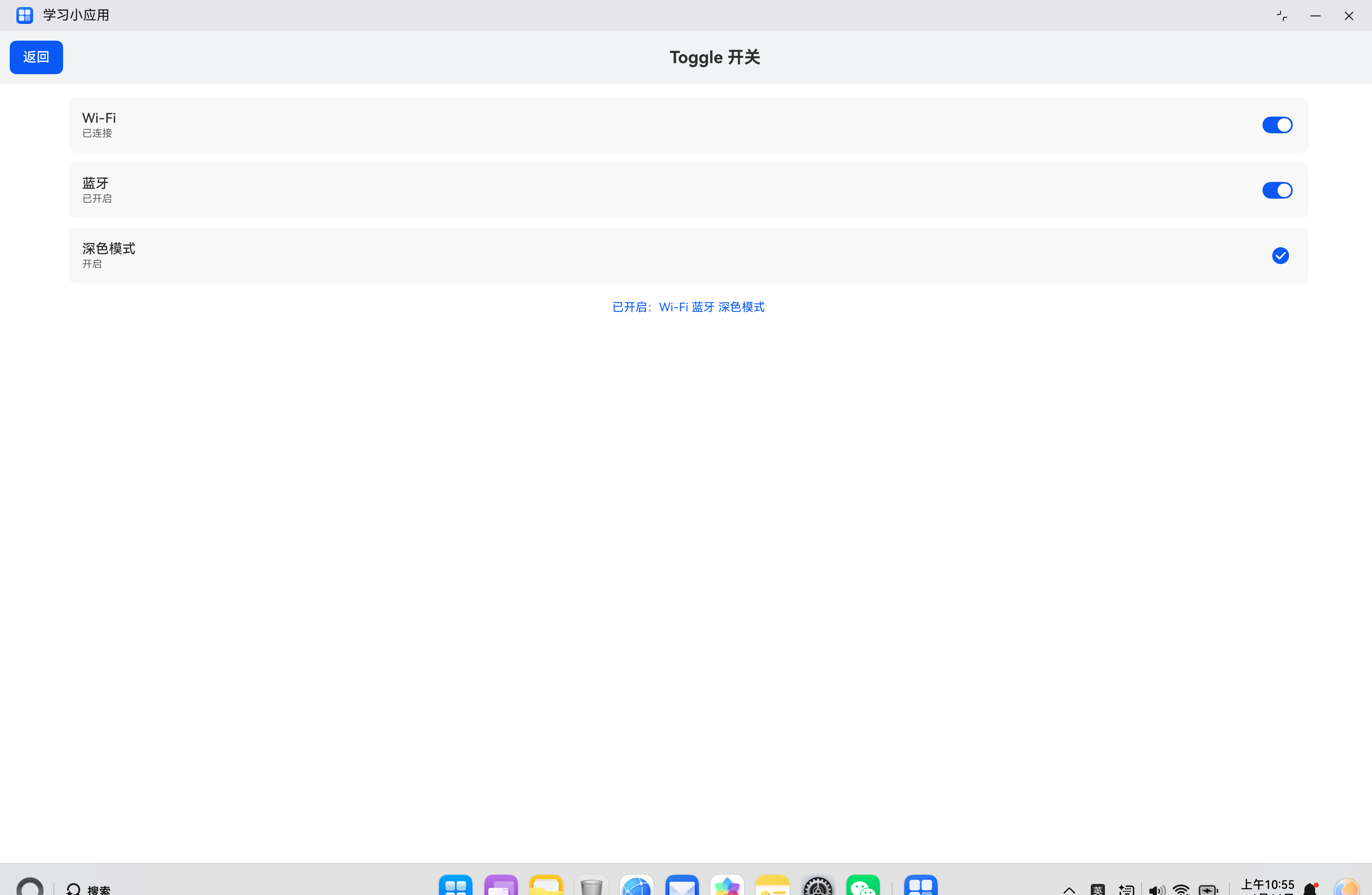
七、实际案例:系统设置页面
7.1 需求分析
构建一个系统设置页面,包含:
- Wi-Fi、蓝牙、深色模式等开关
- 开关状态反馈
- 已开启功能汇总
- 统一的视觉风格
7.2 代码实现
import { router } from '@kit.ArkUI';

@Entry
@Component
struct SettingsPage {
  @State wifiEnabled: boolean = true;
  @State bluetoothEnabled: boolean = false;
  @State darkModeEnabled: boolean = false;

  build() {
    Column() {
      // 顶部标题栏
      Row() {
        Button('返回')
          .onClick(() => {
            router.back();
          })
        Text('Toggle 开关')
          .fontSize(20)
          .fontWeight(FontWeight.Bold)
          .layoutWeight(1)
          .textAlign(TextAlign.Center)
      }
      .width('100%')
      .padding(12)
      .backgroundColor('#F1F3F5')

      // 设置项列表
      Column() {
        // Wi-Fi 设置
        Row() {
          Column() {
            Text('Wi-Fi')
              .fontSize(16)
              .fontWeight(FontWeight.Medium)
            Text(this.wifiEnabled ? '已连接' : '已关闭')
              .fontSize(12)
              .fontColor('#666666')
              .margin({ top: 2 })
          }
          .alignItems(HorizontalAlign.Start)
          .layoutWeight(1)

          Toggle({ type: ToggleType.Switch, isOn: this.wifiEnabled })
            .onChange((isOn: boolean) => {
              this.wifiEnabled = isOn;
            })
        }
        .width('90%')
        .padding(16)
        .backgroundColor('#F8F8F8')
        .borderRadius(8)
        .margin({ top: 16 })

        // 蓝牙设置
        Row() {
          Column() {
            Text('蓝牙')
              .fontSize(16)
              .fontWeight(FontWeight.Medium)
            Text(this.bluetoothEnabled ? '已开启' : '已关闭')
              .fontSize(12)
              .fontColor('#666666')
              .margin({ top: 2 })
          }
          .alignItems(HorizontalAlign.Start)
          .layoutWeight(1)

          Toggle({ type: ToggleType.Switch, isOn: this.bluetoothEnabled })
            .onChange((isOn: boolean) => {
              this.bluetoothEnabled = isOn;
            })
        }
        .width('90%')
        .padding(16)
        .backgroundColor('#F8F8F8')
        .borderRadius(8)
        .margin({ top: 12 })

        // 深色模式设置
        Row() {
          Column() {
            Text('深色模式')
              .fontSize(16)
              .fontWeight(FontWeight.Medium)
            Text(this.darkModeEnabled ? '开启' : '关闭')
              .fontSize(12)
              .fontColor('#666666')
              .margin({ top: 2 })
          }
          .alignItems(HorizontalAlign.Start)
          .layoutWeight(1)

          Toggle({ type: ToggleType.Checkbox, isOn: this.darkModeEnabled })
            .onChange((isOn: boolean) => {
              this.darkModeEnabled = isOn;
            })
        }
        .width('90%')
        .padding(16)
        .backgroundColor('#F8F8F8')
        .borderRadius(8)
        .margin({ top: 12 })

        // 已开启功能汇总
        Text('已开启:' +
          (this.wifiEnabled ? 'Wi-Fi ' : '') +
          (this.bluetoothEnabled ? '蓝牙 ' : '') +
          (this.darkModeEnabled ? '深色模式' : ''))
          .fontSize(14)
          .fontColor('#0A59F7')
          .margin({ top: 20 })
          .width('90%')
          .textAlign(TextAlign.Center)
      }
      .width('100%')
      .layoutWeight(1)
    }
    .width('100%')
    .height('100%')
    .backgroundColor('#FFFFFF')
  }
}
八、常见问题与解决方案
8.1 开关状态不更新
问题描述:点击开关后,状态没有变化。
解决方案:
- 检查
isOn是否绑定了状态变量 - 确认
onChange回调中更新了状态 - 检查状态变量是否使用了
@State装饰器
8.2 样式不生效
问题描述:设置的颜色或尺寸没有生效。
解决方案:
- 检查属性名称是否正确
- 确认属性值类型是否正确
- 检查是否有其他样式覆盖
8.3 开关联动异常
问题描述:多个开关联动时出现异常。
解决方案:
- 检查联动逻辑是否正确
- 确认状态更新方式是否正确
- 使用不可变数据模式更新数组
九、总结
Toggle 组件的 Switch 类型是 HarmonyOS ArkUI 中常用的开关控件,掌握其使用方法对于构建设置页面和功能控制界面至关重要。
核心要点:
- 通过
type: ToggleType.Switch指定开关类型 - 使用
isOn属性绑定状态变量 - 通过
onChange事件处理状态变化 - 可以自定义选中颜色和圆点颜色
- 支持尺寸调整和样式定制
希望本文能帮助你更好地理解和使用 Toggle Switch 组件,构建出优秀的 HarmonyOS 应用。
参考资料:

讨论HarmonyOS开发技术,专注于API与组件、DevEco Studio、测试、元服务和应用上架分发等。
更多推荐

 2
2 0
0- 0


 已为社区贡献19条内容

所有评论(0)