HarmonyOS ArkUI训练营入门-组件掌握系列-DatePicker 日期选择器-PC版本
·
概述
日期选择器是移动应用中常用的交互组件,用于让用户选择具体的日期。HarmonyOS ArkUI 提供的 DatePicker 组件功能强大,支持自定义日期范围、样式定制等特性。本文将从组件基础、属性配置、样式定制、交互处理、实际应用等多个维度,深入讲解 DatePicker 组件的使用方法。
一、DatePicker 组件基础
1.1 组件定义与作用
DatePicker 组件用于创建日期选择器,允许用户通过滚动选择年、月、日。它是构建预约、日程、表单等场景的核心组件。
@Entry
@Component
struct DatePickerBasic {
  @State selectedDate: Date = new Date();

  build() {
    Column() {
      DatePicker({
        selected: this.selectedDate
      })
        .onDateChange((value: Date) => {
          this.selectedDate = value;
        })
    }
    .padding(20)
  }
}
1.2 构造函数
DatePicker 的构造函数支持以下参数:
DatePicker(options?: {
  start?: Date;    // 开始日期
  end?: Date;      // 结束日期
  selected?: Date; // 默认选中日期
})
1.3 核心属性
| 属性 | 类型 | 说明 | 默认值 |
|---|---|---|---|
start |
Date |
可选日期范围的开始 | 1970-01-01 |
end |
Date |
可选日期范围的结束 | 2100-12-31 |
selected |
Date |
默认选中的日期 | 当前日期 |
1.4 核心事件
| 事件 | 说明 | 参数 |
|---|---|---|
onDateChange |
日期变化时触发 | value: Date - 选中的日期 |
1.5 基础使用示例
@Entry
@Component
struct BasicDatePicker {
  @State selectedDate: Date = new Date('2024-06-16');

  build() {
    Column() {
      Text('日期选择器基础使用')
        .fontSize(20)
        .fontWeight(FontWeight.Bold)
        .margin({ bottom: 20 })

      Text('当前选择:' +
        this.selectedDate.getFullYear() + '年' +
        (this.selectedDate.getMonth() + 1) + '月' +
        this.selectedDate.getDate() + '日')
        .fontSize(16)
        .margin({ bottom: 16 })

      DatePicker({
        start: new Date('2020-01-01'),
        end: new Date('2030-12-31'),
        selected: this.selectedDate
      })
        .width('90%')
        .height(200)
        .onDateChange((value: Date) => {
          this.selectedDate = value;
        })
    }
    .padding(20)
    .width('100%')
    .height('100%')
    .backgroundColor('#FFFFFF')
  }
}
二、属性配置
2.1 日期范围
通过 start 和 end 属性设置可选日期范围:
@Entry
@Component
struct DateRange {
  @State selectedDate: Date = new Date();

  build() {
    Column() {
      Text('日期范围限制')
        .fontSize(20)
        .fontWeight(FontWeight.Bold)
        .margin({ bottom: 20 })

      DatePicker({
        start: new Date('2024-01-01'),
        end: new Date('2024-12-31'),
        selected: this.selectedDate
      })
        .width('90%')
        .height(200)
        .onDateChange((value: Date) => {
          this.selectedDate = value;
        })
    }
    .padding(20)
  }
}
2.2 默认选中日期
通过 selected 属性设置默认选中的日期:
@Entry
@Component
struct DefaultDate {
  @State selectedDate: Date = new Date('2024-06-16');

  build() {
    Column() {
      Text('默认选中日期')
        .fontSize(20)
        .fontWeight(FontWeight.Bold)
        .margin({ bottom: 20 })

      DatePicker({
        selected: this.selectedDate
      })
        .width('90%')
        .height(200)
        .onDateChange((value: Date) => {
          this.selectedDate = value;
        })
    }
    .padding(20)
  }
}
2.3 尺寸调整
通过 width 和 height 属性调整日期选择器尺寸:
@Entry
@Component
struct SizeAdjust {
  @State selectedDate: Date = new Date();

  build() {
    Column() {
      Text('尺寸调整')
        .fontSize(20)
        .fontWeight(FontWeight.Bold)
        .margin({ bottom: 20 })

      DatePicker({
        selected: this.selectedDate
      })
        .width('80%')
        .height(180)
        .onDateChange((value: Date) => {
          this.selectedDate = value;
        })
    }
    .padding(20)
  }
}
三、样式定制
3.1 自定义颜色
为日期选择器添加自定义颜色:
@Entry
@Component
struct CustomColor {
  @State selectedDate: Date = new Date();

  build() {
    Column() {
      Text('自定义颜色')
        .fontSize(20)
        .fontWeight(FontWeight.Bold)
        .margin({ bottom: 20 })

      DatePicker({
        selected: this.selectedDate
      })
        .width('90%')
        .height(200)
        .backgroundColor('#F5F5F5')
        .onDateChange((value: Date) => {
          this.selectedDate = value;
        })
    }
    .padding(20)
  }
}
3.2 边框和圆角
添加边框和圆角效果:
@Entry
@Component
struct BorderDatePicker {
  @State selectedDate: Date = new Date();

  build() {
    Column() {
      Text('边框和圆角')
        .fontSize(20)
        .fontWeight(FontWeight.Bold)
        .margin({ bottom: 20 })

      DatePicker({
        selected: this.selectedDate
      })
        .width('90%')
        .height(200)
        .border({ width: 1, color: '#E5E5E5', radius: 8 })
        .onDateChange((value: Date) => {
          this.selectedDate = value;
        })
    }
    .padding(20)
  }
}
3.3 完整样式示例
@Entry
@Component
struct CompleteStyle {
  @State selectedDate: Date = new Date();

  build() {
    Column() {
      Text('完整样式示例')
        .fontSize(20)
        .fontWeight(FontWeight.Bold)
        .margin({ bottom: 20 })

      DatePicker({
        selected: this.selectedDate
      })
        .width('90%')
        .height(220)
        .backgroundColor('#FFFFFF')
        .border({ width: 1, color: '#E5E5E5', radius: 12 })
        .shadow({ radius: 4, color: 'rgba(0, 0, 0, 0.1)' })
        .onDateChange((value: Date) => {
          this.selectedDate = value;
        })
    }
    .padding(20)
    .width('100%')
    .height('100%')
    .backgroundColor('#F5F5F5')
    .justifyContent(FlexAlign.Center)
  }
}
四、交互处理
4.1 日期变化事件
通过 onDateChange 事件监听日期变化:
@Entry
@Component
struct DateChangeEvent {
  @State selectedDate: Date = new Date();
  @State changeCount: number = 0;

  build() {
    Column() {
      Text('选择次数:' + this.changeCount)
        .fontSize(14)
        .fontColor('#666666')
        .margin({ bottom: 16 })

      DatePicker({
        selected: this.selectedDate
      })
        .width('90%')
        .height(200)
        .onDateChange((value: Date) => {
          this.selectedDate = value;
          this.changeCount++;
          console.info('选中日期:' + value.toISOString());
        })
    }
    .padding(20)
  }
}
4.2 日期格式化
格式化显示选中的日期:
@Entry
@Component
struct DateFormat {
  @State selectedDate: Date = new Date();

  formatDate(date: Date): string {
    const year: number = date.getFullYear();
    const month: number = date.getMonth() + 1;
    const day: number = date.getDate();
    const weekDays: string[] = ['周日', '周一', '周二', '周三', '周四', '周五', '周六'];
    const weekDay: string = weekDays[date.getDay()];

    return year + '年' + month + '月' + day + '日 ' + weekDay;
  }

  build() {
    Column() {
      Text('当前选择:' + this.formatDate(this.selectedDate))
        .fontSize(16)
        .fontColor('#0A59F7')
        .margin({ bottom: 16 })

      DatePicker({
        selected: this.selectedDate
      })
        .width('90%')
        .height(200)
        .onDateChange((value: Date) => {
          this.selectedDate = value;
        })
    }
    .padding(20)
  }
}
4.3 日期验证
验证选中的日期:
@Entry
@Component
struct DateValidation {
  @State selectedDate: Date = new Date();
  @State isValid: boolean = true;
  @State message: string = '';

  validateDate(date: Date): boolean {
    const today: Date = new Date();
    today.setHours(0, 0, 0, 0);
    date.setHours(0, 0, 0, 0);

    if (date < today) {
      this.message = '请选择今天或之后的日期';
      return false;
    }
    this.message = '';
    return true;
  }

  build() {
    Column() {
      Text('日期验证')
        .fontSize(20)
        .fontWeight(FontWeight.Bold)
        .margin({ bottom: 20 })

      DatePicker({
        selected: this.selectedDate
      })
        .width('90%')
        .height(200)
        .onDateChange((value: Date) => {
          this.selectedDate = value;
          this.isValid = this.validateDate(value);
        })

      if (!this.isValid) {
        Text(this.message)
          .fontSize(14)
          .fontColor('#FF3B30')
          .margin({ top: 12 })
      }
    }
    .padding(20)
  }
}
五、高级用法
5.1 日期范围选择
实现日期范围选择功能:
@Entry
@Component
struct DateRangePicker {
  @State startDate: Date = new Date();
  @State endDate: Date = new Date();
  @State isSelectingStart: boolean = true;

  build() {
    Column() {
      Text('日期范围选择')
        .fontSize(20)
        .fontWeight(FontWeight.Bold)
        .margin({ bottom: 20 })

      Text('开始日期:' +
        this.startDate.getFullYear() + '-' +
        (this.startDate.getMonth() + 1) + '-' +
        this.startDate.getDate())
        .fontSize(14)
        .margin({ bottom: 8 })

      Text('结束日期:' +
        this.endDate.getFullYear() + '-' +
        (this.endDate.getMonth() + 1) + '-' +
        this.endDate.getDate())
        .fontSize(14)
        .margin({ bottom: 16 })

      Row() {
        Button('选择开始日期')
          .layoutWeight(1)
          .height(40)
          .backgroundColor(this.isSelectingStart ? '#0A59F7' : '#F1F3F5')
          .fontColor(this.isSelectingStart ? '#FFFFFF' : '#333333')
          .onClick(() => {
            this.isSelectingStart = true;
          })
        Button('选择结束日期')
          .layoutWeight(1)
          .height(40)
          .margin({ left: 8 })
          .backgroundColor(!this.isSelectingStart ? '#0A59F7' : '#F1F3F5')
          .fontColor(!this.isSelectingStart ? '#FFFFFF' : '#333333')
          .onClick(() => {
            this.isSelectingStart = false;
          })
      }
      .width('90%')
      .margin({ bottom: 16 })

      DatePicker({
        selected: this.isSelectingStart ? this.startDate : this.endDate
      })
        .width('90%')
        .height(200)
        .onDateChange((value: Date) => {
          if (this.isSelectingStart) {
            this.startDate = value;
          } else {
            this.endDate = value;
          }
        })
    }
    .padding(20)
  }
}
5.2 禁用日期
禁用某些日期:
@Entry
@Component
struct DisabledDates {
  @State selectedDate: Date = new Date();
  private disabledDates: string[] = ['2024-06-15', '2024-06-16', '2024-06-17'];

  build() {
    Column() {
      Text('禁用日期')
        .fontSize(20)
        .fontWeight(FontWeight.Bold)
        .margin({ bottom: 20 })

      DatePicker({
        selected: this.selectedDate
      })
        .width('90%')
        .height(200)
        .onDateChange((value: Date) => {
          const dateStr: string = value.getFullYear() + '-' +
            (value.getMonth() + 1) + '-' +
            value.getDate();

          if (!this.disabledDates.includes(dateStr)) {
            this.selectedDate = value;
          }
        })

      Text('禁用的日期:' + this.disabledDates.join(', '))
        .fontSize(12)
        .fontColor('#FF3B30')
        .margin({ top: 12 })
    }
    .padding(20)
  }
}
5.3 日期选择器封装
将日期选择器封装为独立组件:
@Component
struct DatePickerItem {
  @State selectedDate: Date = new Date();
  private label: string = '';

  build() {
    Column() {
      Text(this.label)
        .fontSize(14)
        .fontColor('#666666')
        .margin({ bottom: 8 })

      Text('' + this.selectedDate.getFullYear() + '-' +
        (this.selectedDate.getMonth() + 1) + '-' +
        this.selectedDate.getDate())
        .fontSize(16)
        .fontWeight(FontWeight.Medium)
        .margin({ bottom: 12 })

      DatePicker({
        selected: this.selectedDate
      })
        .width('100%')
        .height(180)
        .onDateChange((value: Date) => {
          this.selectedDate = value;
        })
    }
    .width('90%')
    .padding(16)
    .backgroundColor('#FFFFFF')
    .borderRadius(8)
  }
}

@Entry
@Component
struct DatePickerDemo {
  build() {
    Column() {
      Text('封装的日期选择器')
        .fontSize(20)
        .fontWeight(FontWeight.Bold)
        .margin({ bottom: 20 })

      DatePickerItem({ label: '选择日期' })
    }
    .padding(20)
    .width('100%')
    .height('100%')
    .backgroundColor('#F5F5F5')
  }
}
六、实际案例:预约日期选择
6.1 需求分析
构建一个预约日期选择页面,包含:
- 日期选择器
- 当前选中日期显示
- 日期范围限制(只能选择今天之后的日期)
- 格式化的日期显示
6.2 代码实现
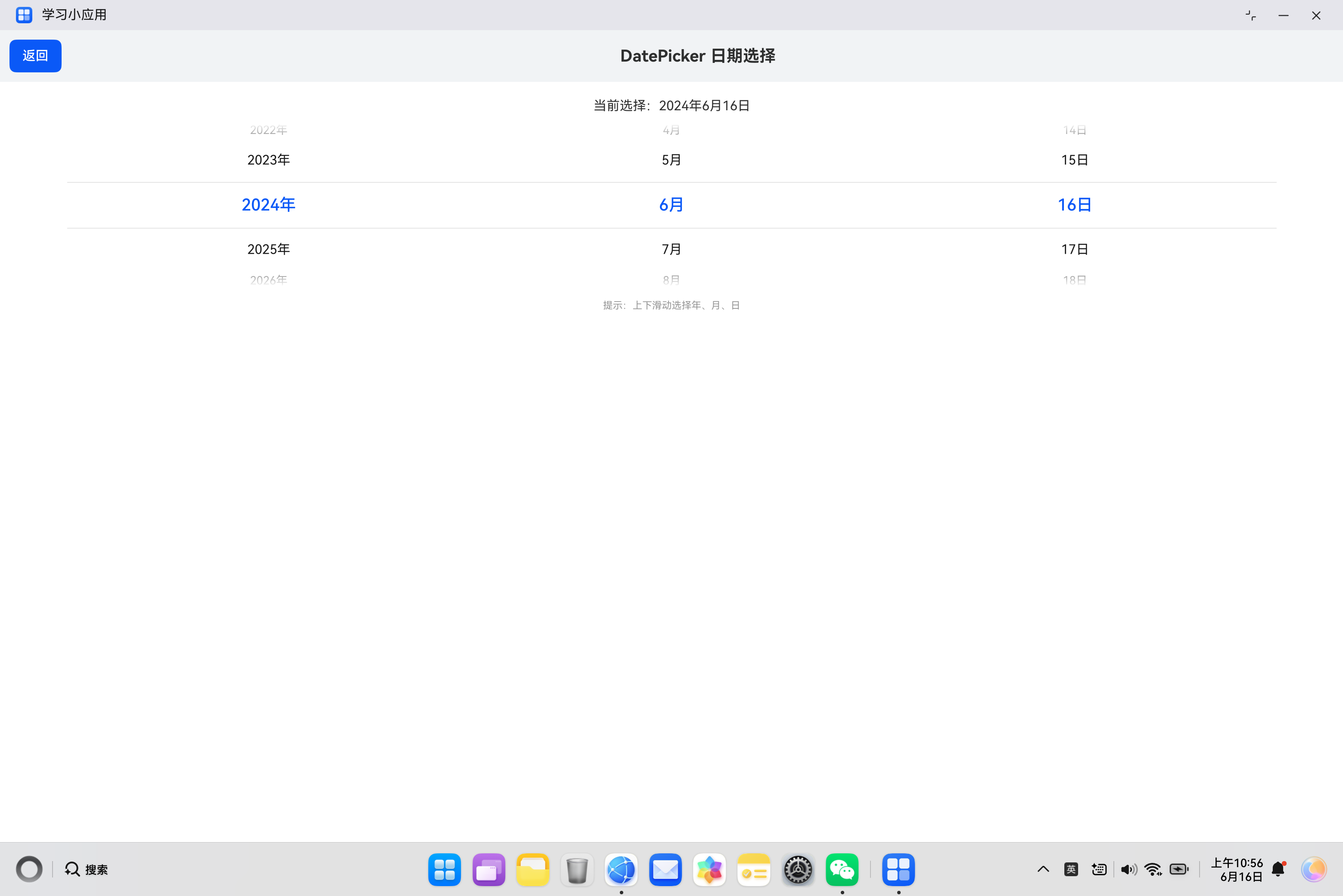
import { router } from '@kit.ArkUI';

@Entry
@Component
struct AppointmentDate {
  @State selectedDate: Date = new Date();

  formatDate(date: Date): string {
    const year: number = date.getFullYear();
    const month: number = date.getMonth() + 1;
    const day: number = date.getDate();
    const weekDays: string[] = ['周日', '周一', '周二', '周三', '周四', '周五', '周六'];
    const weekDay: string = weekDays[date.getDay()];

    return year + '年' + month + '月' + day + '日 ' + weekDay;
  }

  build() {
    Column() {
      // 顶部标题栏
      Row() {
        Button('返回')
          .onClick(() => {
            router.back();
          })
        Text('DatePicker 日期选择')
          .fontSize(20)
          .fontWeight(FontWeight.Bold)
          .layoutWeight(1)
          .textAlign(TextAlign.Center)
      }
      .width('100%')
      .padding(12)
      .backgroundColor('#F1F3F5')

      // 日期选择区域
      Column() {
        Text('当前选择:' + this.formatDate(this.selectedDate))
          .fontSize(16)
          .margin({ top: 20 })

        DatePicker({
          start: new Date(),
          end: new Date('2030-12-31'),
          selected: this.selectedDate
        })
          .width('90%')
          .height(200)
          .margin({ top: 12 })
          .onDateChange((value: Date) => {
            this.selectedDate = value;
          })

        Text('提示:上下滑动选择年、月、日')
          .fontSize(12)
          .fontColor('#999999')
          .margin({ top: 16 })
      }
      .width('100%')
      .layoutWeight(1)
    }
    .width('100%')
    .height('100%')
    .backgroundColor('#FFFFFF')
  }
}
七、常见问题与解决方案
7.1 日期显示异常
问题描述:日期选择器显示的日期不正确。
解决方案:
- 检查
selected属性的初始值 - 确认
start和end日期范围 - 使用
new Date()创建正确的日期对象
7.2 日期变化不触发
问题描述:滑动日期选择器后,onDateChange 事件没有触发。
解决方案:
- 检查是否绑定了
onDateChange事件 - 确认事件处理函数的参数类型正确
- 检查状态变量是否使用了
@State装饰器
7.3 样式不生效
问题描述:设置的颜色或尺寸没有生效。
解决方案:
- 检查属性名称是否正确
- 确认属性值类型是否正确
- 检查是否有其他样式覆盖
八、总结
DatePicker 组件是 HarmonyOS ArkUI 中常用的日期选择控件,掌握其使用方法对于构建表单和预约页面至关重要。
核心要点:
- 通过
start和end设置日期范围 - 使用
selected属性绑定选中日期 - 通过
onDateChange事件处理日期变化 - 支持尺寸调整和样式定制
- 可以封装为独立组件复用
希望本文能帮助你更好地理解和使用 DatePicker 组件,构建出优秀的 HarmonyOS 应用。
参考资料:

讨论HarmonyOS开发技术,专注于API与组件、DevEco Studio、测试、元服务和应用上架分发等。
更多推荐


 2
2 0
0- 0


 已为社区贡献19条内容

所有评论(0)