起床闹钟小应用 - HarmonyOS ArkUI 开发实战-PC版本
·
概述
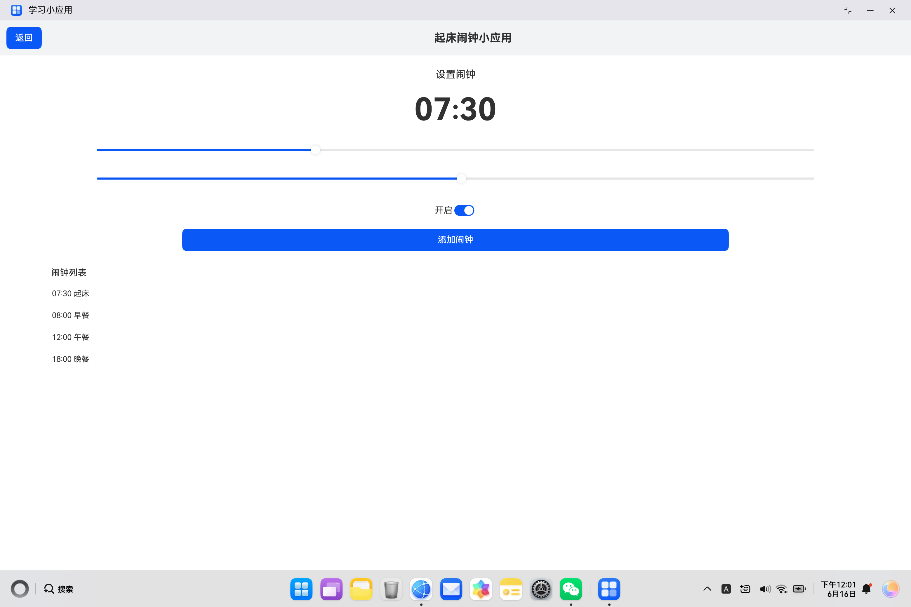
闹钟应用是移动设备中最基础也是最常用的应用之一,帮助用户管理时间、设置提醒。HarmonyOS ArkUI 提供了丰富的交互组件,如 Slider 滑块、Toggle 开关、DatePicker 日期选择器等,使得开发闹钟类应用变得简单直观。本文将从组件基础、属性配置、交互处理、状态管理、样式定制等多个维度,深入讲解如何使用 ArkTS 开发一个完整的起床闹钟小应用。
一、应用架构设计
1.1 功能需求分析
起床闹钟小应用需要实现以下核心功能:
| 功能模块 | 具体需求 | 实现方式 |
|---|---|---|
| 时间显示 | 显示当前设置的小时和分钟 | 状态变量绑定 |
| 时间调节 | 通过滑块调节小时和分钟 | Slider组件 |
| 闹钟开关 | 开启或关闭闹钟 | Toggle组件 |
| 闹钟添加 | 将当前时间添加到闹钟列表 | Button组件 |
| 闹钟列表 | 展示已设置的闹钟 | List组件 |
| 闹钟删除 | 删除不需要的闹钟 | Button组件 |
1.2 数据模型设计
在 ArkTS 中,我们需要使用类来定义闹钟数据模型:
// 闹钟数据模型
class AlarmItem_1 {
  hour_1: number = 0;        // 小时
  minute_1: number = 0;      // 分钟
  label_1: string = '';      // 闹钟标签
  isOn_1: boolean = true;    // 是否开启

  constructor(hour_1: number, minute_1: number, label_1: string, isOn_1: boolean) {
    this.hour_1 = hour_1;
    this.minute_1 = minute_1;
    this.label_1 = label_1;
    this.isOn_1 = isOn_1;
  }

  // 格式化时间显示
  formatTime_1(): string {
    let hourStr_1: string = String(this.hour_1).padStart(2, '0');
    let minuteStr_1: string = String(this.minute_1).padStart(2, '0');
    return hourStr_1 + ':' + minuteStr_1;
  }
}
1.3 组件结构设计
闹钟应用采用经典的垂直布局结构,整体架构如下:
Column (根容器)
├── Row (标题栏)
│   ├── Button (返回按钮)
│   └── Text (应用标题)
└── Column (内容区域)
    ├── Text (设置闹钟标题)
    ├── Row (时间显示区域)
    │   ├── Text (小时)
    │   ├── Text (冒号)
    │   └── Text (分钟)
    ├── Row (小时调节区域)
    │   ├── Text (小时标签)
    │   └── Slider (小时滑块)
    ├── Row (分钟调节区域)
    │   ├── Text (分钟标签)
    │   └── Slider (分钟滑块)
    ├── Row (开关区域)
    │   ├── Text (开启标签)
    │   └── Toggle (开关组件)
    ├── Button (添加闹钟按钮)
    ├── Text (闹钟列表标题)
    └── List (闹钟列表)
        └── ListItem (闹钟项)
            ├── Text (闹钟时间)
            └── Button (删除按钮)
二、Slider 滑块组件详解
2.1 组件基础
Slider 组件是用于滑动选择的交互组件,常用于数值调节、进度控制等场景。
@Entry
@Component
struct SliderBasic {
  @State value_1: number = 50;

  build() {
    Column() {
      Slider({
        value: this.value_1,
        min: 0,
        max: 100,
        step: 1
      })
        .width('80%')
        .onChange((value_1: number) => {
          this.value_1 = value_1;
        })

      Text('当前值: ' + String(this.value_1))
        .fontSize(14)
        .margin({ top: 12 })
    }
  }
}
2.2 构造函数参数
Slider 的构造函数支持以下参数:
Slider(options?: {
  value: number;           // 当前值
  min: number;             // 最小值
  max: number;             // 最大值
  step?: number;           // 步长
  style?: SliderStyle;     // 样式
})
2.3 属性说明
| 属性 | 类型 | 说明 | 默认值 |
|---|---|---|---|
value |
number |
当前滑块值 | 0 |
min |
number |
最小值 | 0 |
max |
number |
最大值 | 100 |
step |
number |
步长 | 1 |
style |
SliderStyle |
滑块样式 | OutSet |
blockColor |
ResourceColor |
滑块颜色 | - |
trackColor |
ResourceColor |
轨道颜色 | - |
selectedColor |
ResourceColor |
已选颜色 | - |
2.4 样式类型
SliderStyle 提供两种样式:
| 样式 | 说明 | 适用场景 |
|---|---|---|
OutSet |
滑块在轨道外 | 常规调节 |
InSet |
滑块在轨道内 | 精细调节 |
2.5 小时滑块实现
用于调节小时(0-23)的滑块:
@Entry
@Component
struct HourSliderDemo {
  @State hour_1: number = 7;

  build() {
    Column() {
      Text('小时调节')
        .fontSize(16)
        .fontWeight(FontWeight.Medium)
        .margin({ top: 20 })

      Row() {
        Text('时')
          .fontSize(14)
          .width(40)
        Slider({
          value: this.hour_1,
          min: 0,
          max: 23,
          step: 1,
          style: SliderStyle.OutSet
        })
          .width('70%')
          .blockColor('#0A59F7')
          .trackColor('#E8F0FE')
          .selectedColor('#0A59F7')
          .onChange((value_1: number) => {
            this.hour_1 = Math.floor(value_1);
          })
        Text(String(this.hour_1).padStart(2, '0'))
          .fontSize(14)
          .width(40)
          .textAlign(TextAlign.End)
      }
      .width('90%')
      .justifyContent(FlexAlign.Center)
    }
  }
}
2.6 分钟滑块实现
用于调节分钟(0-59)的滑块:
@Entry
@Component
struct MinuteSliderDemo {
  @State minute_1: number = 30;

  build() {
    Column() {
      Text('分钟调节')
        .fontSize(16)
        .fontWeight(FontWeight.Medium)
        .margin({ top: 20 })

      Row() {
        Text('分')
          .fontSize(14)
          .width(40)
        Slider({
          value: this.minute_1,
          min: 0,
          max: 59,
          step: 1,
          style: SliderStyle.OutSet
        })
          .width('70%')
          .blockColor('#0A59F7')
          .trackColor('#E8F0FE')
          .selectedColor('#0A59F7')
          .onChange((value_1: number) => {
            this.minute_1 = Math.floor(value_1);
          })
        Text(String(this.minute_1).padStart(2, '0'))
          .fontSize(14)
          .width(40)
          .textAlign(TextAlign.End)
      }
      .width('90%')
      .justifyContent(FlexAlign.Center)
    }
  }
}
三、Toggle 开关组件详解
3.1 组件基础
Toggle 组件是用于开关切换的交互组件,常用于设置开关、状态切换等场景。
@Entry
@Component
struct ToggleBasic {
  @State isOn_1: boolean = true;

  build() {
    Column() {
      Toggle({ type: ToggleType.Switch, isOn: this.isOn_1 })
        .onChange((isOn_1: boolean) => {
          this.isOn_1 = isOn_1;
        })

      Text(this.isOn_1 ? '开启' : '关闭')
        .fontSize(14)
        .margin({ top: 12 })
    }
  }
}
3.2 构造函数参数
Toggle 的构造函数支持以下参数:
Toggle(options: {
  type: ToggleType;        // 开关类型
  isOn?: boolean;          // 是否开启
})
3.3 ToggleType 类型
| 类型 | 说明 | 适用场景 |
|---|---|---|
Switch |
滑动开关 | 设置开关 |
Checkbox |
复选框 | 多选场景 |
Button |
按钮开关 | 单选场景 |
3.4 属性说明
| 属性 | 类型 | 说明 |
|---|---|---|
isOn |
boolean |
是否开启 |
type |
ToggleType |
开关类型 |
selectedColor |
ResourceColor |
选中颜色 |
onChange |
callback |
状态变化回调 |
3.5 闹钟开关实现
@Entry
@Component
struct AlarmToggleDemo {
  @State isOn_1: boolean = true;

  build() {
    Column() {
      Row() {
        Text('闹钟开关')
          .fontSize(16)
          .layoutWeight(1)
        Toggle({ type: ToggleType.Switch, isOn: this.isOn_1 })
          .selectedColor('#34C759')
          .onChange((isOn_1: boolean) => {
            this.isOn_1 = isOn_1;
          })
      }
      .width('90%')
      .padding(16)
      .backgroundColor('#FFFFFF')
      .borderRadius(8)

      Text(this.isOn_1 ? '闹钟已开启,将在设定时间响铃' : '闹钟已关闭')
        .fontSize(12)
        .fontColor('#999999')
        .margin({ top: 8 })
    }
  }
}
四、状态管理详解
4.1 状态变量设计
闹钟应用需要管理多个状态变量:
@Entry
@Component
struct AlarmApp {
  // 当前设置的时间
  @State hour_1: number = 7;
  @State minute_1: number = 30;

  // 闹钟开关状态
  @State isOn_1: boolean = true;

  // 闹钟列表
  @State alarms_1: AlarmItem_1[] = [
    new AlarmItem_1(7, 30, '起床', true),
    new AlarmItem_1(8, 0, '早餐', true),
    new AlarmItem_1(12, 0, '午餐', true),
    new AlarmItem_1(18, 0, '晚餐', true)
  ];
}
4.2 时间格式化
使用 padStart 方法确保两位数显示:
// 格式化时间显示
formatTime_1(hour_1: number, minute_1: number): string {
  let hourStr_1: string = String(hour_1).padStart(2, '0');
  let minuteStr_1: string = String(minute_1).padStart(2, '0');
  return hourStr_1 + ':' + minuteStr_1;
}

// 使用示例
Text(this.formatTime_1(this.hour_1, this.minute_1))
  .fontSize(48)
  .fontWeight(FontWeight.Bold)
4.3 添加闹钟逻辑
addAlarm_1() {
  // 创建新的闹钟项
  let newAlarm_1 = new AlarmItem_1(
    this.hour_1,
    this.minute_1,
    '新闹钟',
    this.isOn_1
  );

  // 添加到闹钟列表
  this.alarms_1 = this.alarms_1.concat([newAlarm_1]);
}
4.4 删除闹钟逻辑
deleteAlarm_1(index_1: number) {
  // 使用 filter 移除指定索引的闹钟
  this.alarms_1 = this.alarms_1.filter((_, i_1: number) => i_1 !== index_1);
}
五、UI布局实现
5.1 标题栏布局
Row() {
  Button('返回')
    .fontSize(14)
    .backgroundColor('#F1F3F5')
    .fontColor('#333333')
    .onClick(() => {
      router.back();
    })
  Text('起床闹钟小应用')
    .fontSize(20)
    .fontWeight(FontWeight.Bold)
    .layoutWeight(1)
    .textAlign(TextAlign.Center)
}
.width('100%')
.padding(12)
.backgroundColor('#F1F3F5')
5.2 时间显示区域
Row() {
  Text(String(this.hour_1).padStart(2, '0'))
    .fontSize(56)
    .fontWeight(FontWeight.Bold)
    .fontColor('#0A59F7')
  Text(':')
    .fontSize(48)
    .fontWeight(FontWeight.Bold)
    .margin({ left: 8, right: 8 })
  Text(String(this.minute_1).padStart(2, '0'))
    .fontSize(56)
    .fontWeight(FontWeight.Bold)
    .fontColor('#0A59F7')
}
.margin({ top: 20 })
.justifyContent(FlexAlign.Center)
5.3 滑块调节区域
// 小时调节
Row() {
  Text('时')
    .fontSize(14)
    .width(40)
  Slider({
    value: this.hour_1,
    min: 0,
    max: 23,
    step: 1
  })
    .width('60%')
    .blockColor('#0A59F7')
    .onChange((value_1: number) => {
      this.hour_1 = Math.floor(value_1);
    })
  Text(String(this.hour_1).padStart(2, '0'))
    .fontSize(14)
    .width(40)
    .textAlign(TextAlign.End)
}
.width('80%')
.margin({ top: 20 })
.justifyContent(FlexAlign.Center)

// 分钟调节
Row() {
  Text('分')
    .fontSize(14)
    .width(40)
  Slider({
    value: this.minute_1,
    min: 0,
    max: 59,
    step: 1
  })
    .width('60%')
    .blockColor('#0A59F7')
    .onChange((value_1: number) => {
      this.minute_1 = Math.floor(value_1);
    })
  Text(String(this.minute_1).padStart(2, '0'))
    .fontSize(14)
    .width(40)
    .textAlign(TextAlign.End)
}
.width('80%')
.margin({ top: 20 })
.justifyContent(FlexAlign.Center)
5.4 开关区域
Row() {
  Text('开启')
    .fontSize(16)
    .layoutWeight(1)
  Toggle({ type: ToggleType.Switch, isOn: this.isOn_1 })
    .selectedColor('#34C759')
    .onChange((isOn_1: boolean) => {
      this.isOn_1 = isOn_1;
    })
}
.width('80%')
.margin({ top: 20 })
5.5 添加按钮
Button('添加闹钟')
  .width('60%')
  .height(40)
  .margin({ top: 16 })
  .backgroundColor('#0A59F7')
  .onClick(() => {
    this.addAlarm_1();
  })
5.6 闹钟列表
List() {
  ForEach(this.alarms_1, (alarm_1: AlarmItem_1, index_1: number) => {
    ListItem() {
      Row() {
        Text(alarm_1.formatTime_1() + ' ' + alarm_1.label_1)
          .fontSize(14)
          .layoutWeight(1)
        Toggle({ type: ToggleType.Switch, isOn: alarm_1.isOn_1 })
          .selectedColor('#34C759')
          .onChange((isOn_1: boolean) => {
            this.alarms_1[index_1].isOn_1 = isOn_1;
          })
        Button('删除')
          .fontSize(12)
          .backgroundColor('#FF3B30')
          .fontColor('#FFFFFF')
          .margin({ left: 8 })
          .onClick(() => {
            this.deleteAlarm_1(index_1);
          })
      }
      .padding(12)
      .width('100%')
      .backgroundColor('#F8F8F8')
      .borderRadius(8)
    }
  })
}
.width('90%')
.margin({ top: 8 })
六、样式定制详解
6.1 颜色系统设计
| 颜色代码 | 用途 | 说明 |
|---|---|---|
| #0A59F7 | 主色调 | 时间数字、滑块颜色 |
| #34C759 | 开启色 | 开关开启状态 |
| #FF3B30 | 删除色 | 删除按钮 |
| #F1F3F5 | 背景色 | 标题栏背景 |
| #F8F8F8 | 卡片背景 | 闹钟项背景 |
| #E8F0FE | 轨道色 | 滑块轨道 |
6.2 字体大小层次
| 元素 | 字体大小 | 权重 |
|---|---|---|
| 时间数字 | 56px | Bold |
| 冒号 | 48px | Bold |
| 标题 | 20px | Bold |
| 标签 | 16px | Regular |
| 列表内容 | 14px | Regular |
| 小标签 | 12px | Regular |
6.3 Slider 样式定制
Slider({
  value: this.hour_1,
  min: 0,
  max: 23,
  step: 1,
  style: SliderStyle.OutSet
})
  .width('60%')
  .blockColor('#0A59F7')       // 滑块颜色
  .trackColor('#E8F0FE')       // 轨道颜色
  .selectedColor('#0A59F7')    // 已选部分颜色
6.4 Toggle 样式定制
Toggle({ type: ToggleType.Switch, isOn: this.isOn_1 })
  .selectedColor('#34C759')    // 选中颜色
  .width(50)                   // 宽度
  .height(30)                  // 高度
七、实际案例:完整闹钟应用
7.1 需求分析
构建一个完整的闹钟应用页面,包含:
- 当前时间显示
- 小时和分钟调节滑块
- 闹钟开关控制
- 添加闹钟功能
- 闹钟列表展示
- 闹钟开关和删除功能
7.2 完整代码实现
import { router } from '@kit.ArkUI';

class AlarmItem_1 {
  hour_1: number = 0;
  minute_1: number = 0;
  label_1: string = '';
  isOn_1: boolean = true;

  constructor(hour_1: number, minute_1: number, label_1: string, isOn_1: boolean) {
    this.hour_1 = hour_1;
    this.minute_1 = minute_1;
    this.label_1 = label_1;
    this.isOn_1 = isOn_1;
  }

  formatTime_1(): string {
    return String(this.hour_1).padStart(2, '0') + ':' + String(this.minute_1).padStart(2, '0');
  }
}

@Entry
@Component
struct AlarmApp {
  @State hour_1: number = 7;
  @State minute_1: number = 30;
  @State isOn_1: boolean = true;
  @State alarms_1: AlarmItem_1[] = [
    new AlarmItem_1(7, 30, '起床', true),
    new AlarmItem_1(8, 0, '早餐', true),
    new AlarmItem_1(12, 0, '午餐', true),
    new AlarmItem_1(18, 0, '晚餐', true)
  ];

  addAlarm_1() {
    let newAlarm_1 = new AlarmItem_1(this.hour_1, this.minute_1, '新闹钟', this.isOn_1);
    this.alarms_1 = this.alarms_1.concat([newAlarm_1]);
  }

  deleteAlarm_1(index_1: number) {
    this.alarms_1 = this.alarms_1.filter((_, i_1: number) => i_1 !== index_1);
  }

  build() {
    Column() {
      // 标题栏
      Row() {
        Button('返回')
          .onClick(() => router.back())
        Text('起床闹钟小应用')
          .fontSize(20)
          .fontWeight(FontWeight.Bold)
          .layoutWeight(1)
          .textAlign(TextAlign.Center)
      }
      .width('100%')
      .padding(12)
      .backgroundColor('#F1F3F5')

      Column() {
        Text('设置闹钟')
          .fontSize(16)
          .fontWeight(FontWeight.Medium)
          .margin({ top: 20 })

        // 时间显示
        Row() {
          Text(String(this.hour_1).padStart(2, '0'))
            .fontSize(56)
            .fontWeight(FontWeight.Bold)
            .fontColor('#0A59F7')
          Text(':')
            .fontSize(48)
            .fontWeight(FontWeight.Bold)
            .margin({ left: 8, right: 8 })
          Text(String(this.minute_1).padStart(2, '0'))
            .fontSize(56)
            .fontWeight(FontWeight.Bold)
            .fontColor('#0A59F7')
        }
        .margin({ top: 20 })

        // 小时调节
        Row() {
          Text('时')
            .fontSize(14)
            .width(40)
          Slider({ value: this.hour_1, min: 0, max: 23, step: 1 })
            .width('60%')
            .blockColor('#0A59F7')
            .onChange((value_1: number) => { this.hour_1 = Math.floor(value_1); })
          Text(String(this.hour_1).padStart(2, '0'))
            .fontSize(14)
            .width(40)
            .textAlign(TextAlign.End)
        }
        .width('80%')
        .margin({ top: 20 })

        // 分钟调节
        Row() {
          Text('分')
            .fontSize(14)
            .width(40)
          Slider({ value: this.minute_1, min: 0, max: 59, step: 1 })
            .width('60%')
            .blockColor('#0A59F7')
            .onChange((value_1: number) => { this.minute_1 = Math.floor(value_1); })
          Text(String(this.minute_1).padStart(2, '0'))
            .fontSize(14)
            .width(40)
            .textAlign(TextAlign.End)
        }
        .width('80%')
        .margin({ top: 20 })

        // 开关
        Row() {
          Text('开启')
            .fontSize(16)
            .layoutWeight(1)
          Toggle({ type: ToggleType.Switch, isOn: this.isOn_1 })
            .selectedColor('#34C759')
            .onChange((isOn_1: boolean) => { this.isOn_1 = isOn_1; })
        }
        .width('80%')
        .margin({ top: 20 })

        // 添加按钮
        Button('添加闹钟')
          .width('60%')
          .height(40)
          .margin({ top: 16 })
          .backgroundColor('#0A59F7')
          .onClick(() => { this.addAlarm_1(); })

        // 闹钟列表
        Text('闹钟列表')
          .fontSize(16)
          .fontWeight(FontWeight.Medium)
          .margin({ top: 24, left: 20 })
          .width('90%')

        List() {
          ForEach(this.alarms_1, (alarm_1: AlarmItem_1, index_1: number) => {
            ListItem() {
              Row() {
                Text(alarm_1.formatTime_1() + ' ' + alarm_1.label_1)
                  .fontSize(14)
                  .layoutWeight(1)
                Toggle({ type: ToggleType.Switch, isOn: alarm_1.isOn_1 })
                  .selectedColor('#34C759')
                  .onChange((isOn_1: boolean) => { this.alarms_1[index_1].isOn_1 = isOn_1; })
                Button('删除')
                  .fontSize(12)
                  .backgroundColor('#FF3B30')
                  .margin({ left: 8 })
                  .onClick(() => { this.deleteAlarm_1(index_1); })
              }
              .padding(12)
              .width('100%')
              .backgroundColor('#F8F8F8')
              .borderRadius(8)
            }
          })
        }
        .width('90%')
        .margin({ top: 8 })
      }
      .width('100%')
      .layoutWeight(1)
    }
    .width('100%')
    .height('100%')
    .backgroundColor('#FFFFFF')
  }
}
八、组件对比分析
8.1 Slider 与其他调节组件对比
| 组件 | 特点 | 适用场景 |
|---|---|---|
| Slider | 连续调节 | 数值范围选择 |
| TextInput | 精确输入 | 特定数值输入 |
| Stepper | 步进调节 | 固定步长调节 |
| DatePicker | 日期选择 | 时间日期选择 |
8.2 Toggle 与其他开关组件对比
| 组件 | 特点 | 适用场景 |
|---|---|---|
| Toggle(Switch) | 滑动开关 | 状态开关 |
| Toggle(Checkbox) | 复选框 | 多选场景 |
| Toggle(Button) | 按钮开关 | 单选场景 |
| Radio | 单选按钮 | 单选组 |
九、最佳实践
9.1 Slider 使用建议
| 场景 | 建议 |
|---|---|
| 时间调节 | min=0, max=23/59, step=1 |
| 音量调节 | min=0, max=100, step=1 |
| 亮度调节 | min=0, max=100, step=5 |
| 温度调节 | min=16, max=30, step=1 |
9.2 Toggle 使用建议
| 场景 | 建议 |
|---|---|
| 功能开关 | 使用 Switch 类型 |
| 多选列表 | 使用 Checkbox 类型 |
| 单选按钮 | 使用 Button 类型 |
9.3 常见问题解决
| 问题 | 原因 | 解决方案 |
|---|---|---|
| Slider值不更新 | onChange未正确绑定 | 添加onChange回调 |
| Toggle状态不变化 | isOn未正确绑定 | 使用状态变量 |
| 时间格式不对 | 未使用padStart | 使用padStart(2,‘0’) |
| 列表不刷新 | 数组未正确更新 | 使用concat/filter |
十、扩展功能设计
10.1 闹钟铃声选择
@State ringtones_1: string[] = ['默认铃声', '轻柔音乐', '经典闹钟', '自然声音'];
@State selectedRingtone_1: string = '默认铃声';

// 铃声选择器
Column() {
  Text('选择铃声')
    .fontSize(16)
    .fontWeight(FontWeight.Medium)

  List() {
    ForEach(this.ringtones_1, (ringtone_1: string) => {
      ListItem() {
        Row() {
          Text(ringtone_1)
            .fontSize(14)
            .layoutWeight(1)
          if (this.selectedRingtone_1 === ringtone_1) {
            Text('✓')
              .fontSize(16)
              .fontColor('#0A59F7')
          }
        }
        .padding(12)
        .onClick(() => {
          this.selectedRingtone_1 = ringtone_1;
        })
      }
    })
  }
}
10.2 重复设置
@State repeatDays_1: string[] = ['周一', '周二', '周三', '周四', '周五', '周六', '周日'];
@State selectedDays_1: string[] = ['周一', '周二', '周三', '周四', '周五'];

// 重复日期选择
Flex({ wrap: FlexWrap.Wrap }) {
  ForEach(this.repeatDays_1, (day_1: string) => {
    Button(day_1)
      .fontSize(12)
      .backgroundColor(this.selectedDays_1.includes(day_1) ? '#0A59F7' : '#F1F3F5')
      .fontColor(this.selectedDays_1.includes(day_1) ? '#FFFFFF' : '#333333')
      .margin({ right: 8 })
      .onClick(() => {
        if (this.selectedDays_1.includes(day_1)) {
          this.selectedDays_1 = this.selectedDays_1.filter((d_1: string) => d_1 !== day_1);
        } else {
          this.selectedDays_1 = this.selectedDays_1.concat([day_1]);
        }
      })
  })
}
十一、总结
本文详细讲解了如何使用 HarmonyOS ArkUI 开发一个完整的起床闹钟小应用,涵盖了从架构设计、组件使用、状态管理、UI布局到实际代码实现的完整流程。
核心技术要点:
- Slider组件:用于时间调节,支持范围设置和步长控制
- Toggle组件:用于开关控制,支持Switch、Checkbox、Button三种类型
- 状态管理:使用@State管理时间、开关状态和闹钟列表
- 数据模型:使用类定义闹钟数据结构
- 列表展示:使用List和ForEach实现动态闹钟列表
开发流程总结:
需求分析 → 数据模型设计 → 组件选择 → 状态管理 → UI布局 → 功能实现 → 测试验证
希望本文能帮助你更好地理解 HarmonyOS ArkUI 的开发方式,构建出优秀的闹钟类应用。
参考资料:

讨论HarmonyOS开发技术,专注于API与组件、DevEco Studio、测试、元服务和应用上架分发等。
更多推荐
 4
4 0
0- 0


 已为社区贡献8条内容

所有评论(0)