HarmonyOS ArkUI训练营入门-组件掌握系列-Stack 层叠布局组件详解-PC版本
·
概述
层叠布局是移动应用中实现复杂视觉效果的重要方式,如图片叠加文字、卡片叠加徽章、背景叠加前景等。HarmonyOS ArkUI 提供的 Stack 组件功能强大,支持多种对齐方式,能够轻松实现元素的层叠排列。本文将从组件基础、对齐方式、实际应用场景等多个维度,深入讲解 Stack 组件的使用方法。
一、Stack 组件基础
1.1 组件定义与作用
Stack 组件用于将多个子元素按照顺序层叠排列,后添加的元素会覆盖在先添加的元素之上。
@Entry
@Component
struct StackBasic {
  build() {
    Column() {
      Stack() {
        Text('底层')
          .width(200)
          .height(150)
          .backgroundColor('#E8F0FE')
        Text('顶层')
          .width(100)
          .height(80)
          .backgroundColor('#FFE4E1')
      }
      .width(200)
      .height(150)
    }
  }
}
1.2 构造函数参数
Stack 的构造函数支持以下参数:
Stack(options?: {
  alignContent?: Alignment;  // 子元素对齐方式
})
1.3 对齐方式
| 对齐方式 | 说明 |
|---|---|
Alignment.TopStart |
左上角 |
Alignment.Top |
顶部居中 |
Alignment.TopEnd |
右上角 |
Alignment.Start |
左侧居中 |
Alignment.Center |
居中 |
Alignment.End |
右侧居中 |
Alignment.BottomStart |
左下角 |
Alignment.Bottom |
底部居中 |
Alignment.BottomEnd |
右下角 |
二、对齐方式详解
2.1 九宫格对齐演示
通过 alignContent 属性设置子元素的对齐位置:
@Entry
@Component
struct AlignmentDemo {
  @State alignContent: Alignment = Alignment.Center;

  build() {
    Column() {
      Stack({ alignContent: this.alignContent }) {
        Text('底层')
          .width(200)
          .height(150)
          .backgroundColor('#E8F0FE')
          .fontColor('#0A59F7')
          .fontSize(16)
          .borderRadius(8)
          .textAlign(TextAlign.Center)

        Text('中层')
          .width(150)
          .height(100)
          .backgroundColor('#FFE4E1')
          .fontColor('#FF3B30')
          .fontSize(14)
          .borderRadius(8)
          .textAlign(TextAlign.Center)

        Text('顶层')
          .width(80)
          .height(60)
          .backgroundColor('#DCFCE7')
          .fontColor('#34C759')
          .fontSize(12)
          .borderRadius(8)
          .textAlign(TextAlign.Center)
      }
      .width(200)
      .height(150)
      .backgroundColor('#FFFFFF')
      .borderRadius(8)
    }
  }
}
2.2 对齐方式切换
实现动态切换对齐方式的演示:
@Entry
@Component
struct AlignmentSwitchDemo {
  @State alignContent: Alignment = Alignment.Center;

  build() {
    Column() {
      Stack({ alignContent: this.alignContent }) {
        Text('底层')
          .width(200)
          .height(150)
          .backgroundColor('#E8F0FE')
        Text('顶层')
          .width(80)
          .height(60)
          .backgroundColor('#0A59F7')
          .fontColor('#FFFFFF')
      }
      .width(200)
      .height(150)
      .margin({ bottom: 16 })

      Row() {
        Button('左上')
          .onClick(() => {
            this.alignContent = Alignment.TopStart;
          })
        Button('居中')
          .onClick(() => {
            this.alignContent = Alignment.Center;
          })
        Button('右下')
          .onClick(() => {
            this.alignContent = Alignment.BottomEnd;
          })
      }
    }
  }
}
三、实际应用场景
3.1 图片叠加文字
最常见的应用场景是在图片上叠加文字说明:
@Entry
@Component
struct ImageOverlayDemo {
  build() {
    Column() {
      Stack() {
        Image('https://trae-api-cn.mchost.guru/api/ide/v1/text_to_image?prompt=beautiful%20mountain%20landscape&image_size=landscape_16_9')
          .width('100%')
          .height(200)
          .borderRadius(8)
        Text('风景图片')
          .fontSize(20)
          .fontColor('#FFFFFF')
          .fontWeight(FontWeight.Bold)
          .backgroundColor('rgba(0,0,0,0.5)')
          .padding({ left: 12, right: 12, top: 6, bottom: 6 })
          .borderRadius(4)
      }
      .width('100%')
      .height(200)
    }
  }
}
3.2 卡片叠加徽章
在卡片上叠加状态徽章:
@Entry
@Component
struct BadgeOverlayDemo {
  build() {
    Column() {
      Stack() {
        Column() {
          Text('商品名称')
            .fontSize(16)
            .fontWeight(FontWeight.Bold)
          Text('商品描述')
            .fontSize(14)
            .fontColor('#666666')
        }
        .width(200)
        .height(100)
        .backgroundColor('#FFFFFF')
        .borderRadius(8)
        .padding(16)
        .alignItems(HorizontalAlign.Start)

        Text('新品')
          .fontSize(12)
          .fontColor('#FFFFFF')
          .backgroundColor('#FF3B30')
          .padding({ left: 8, right: 8, top: 4, bottom: 4 })
          .borderRadius(4)
      }
      .width(200)
      .height(100)
      .alignContent(Alignment.TopEnd)
    }
  }
}
3.3 通知消息叠加
在通知栏上叠加未读数量:
@Entry
@Component
struct NotificationDemo {
  build() {
    Column() {
      Stack() {
        Text('')
          .width('100%')
          .height(80)
          .backgroundColor('#0A59F7')
          .borderRadius(8)
        Row() {
          Text('🔔')
            .fontSize(24)
          Text('通知消息')
            .fontSize(16)
            .fontColor('#FFFFFF')
            .margin({ left: 12 })
          Blank()
          Text('新')
            .fontSize(12)
            .fontColor('#FFFFFF')
            .backgroundColor('#FF3B30')
            .borderRadius(10)
            .padding({ left: 8, right: 8, top: 2, bottom: 2 })
        }
        .width('100%')
        .padding(16)
      }
      .width('100%')
      .height(80)
    }
  }
}
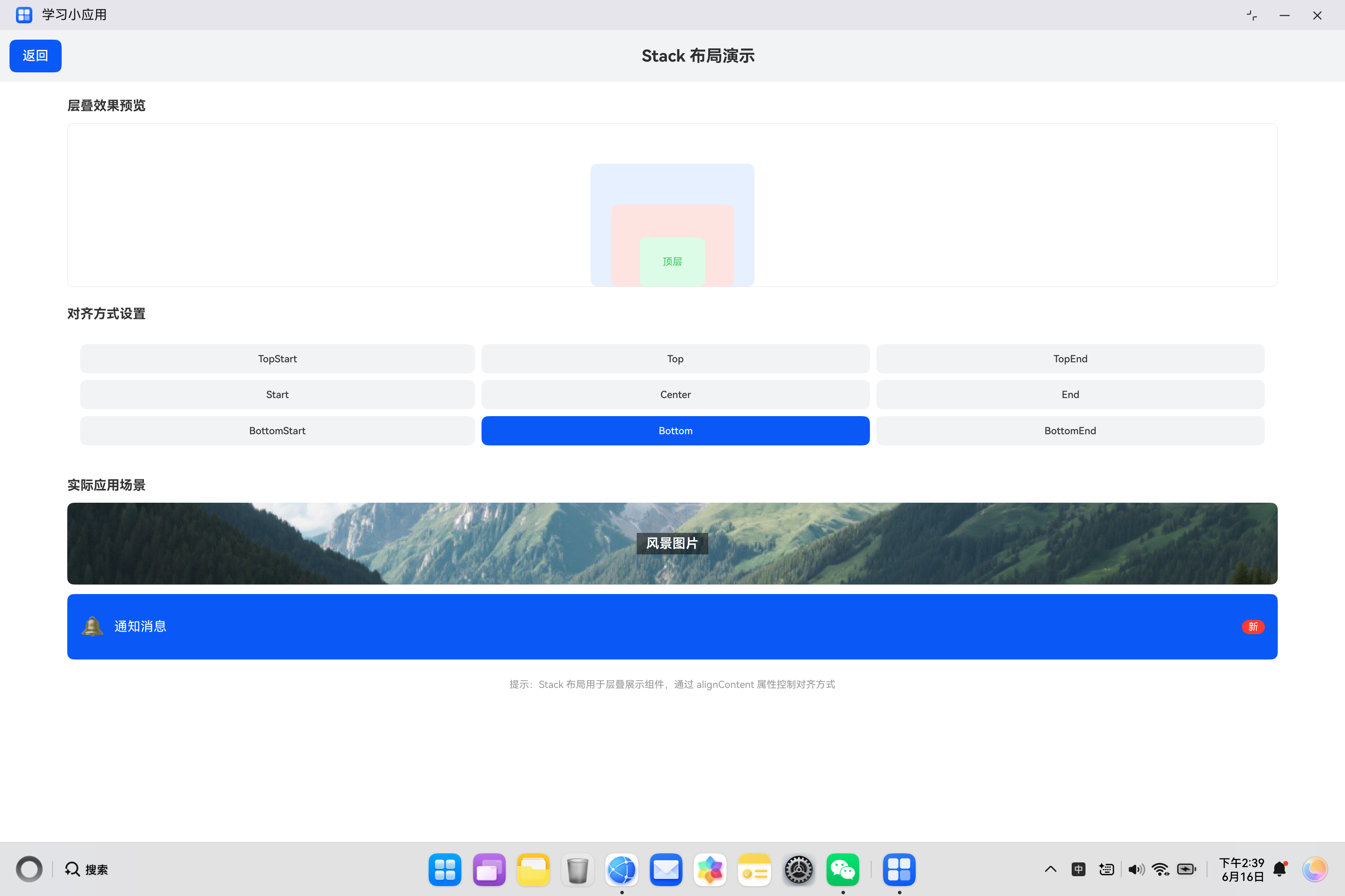
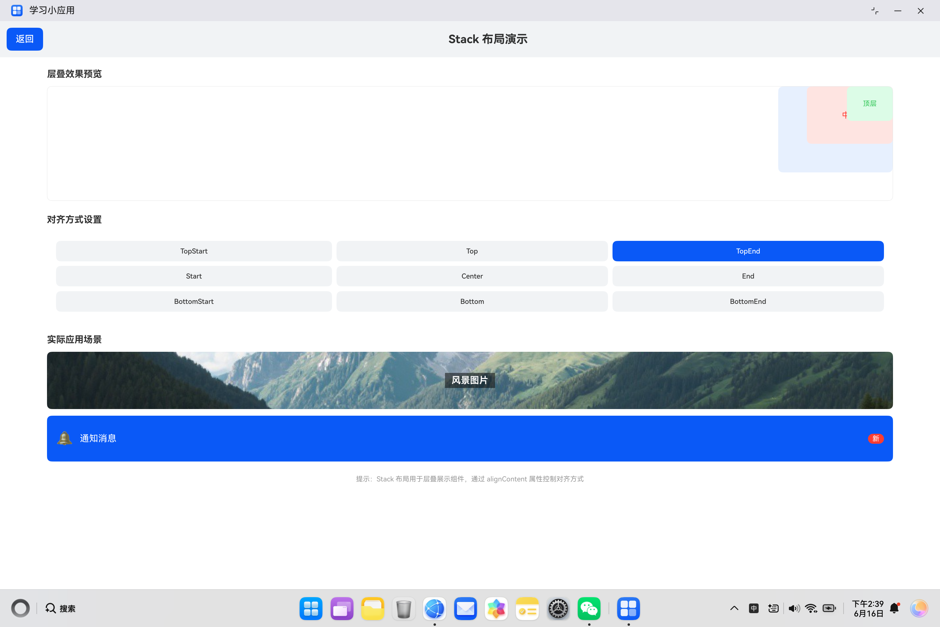
四、实际案例:层叠布局演示
4.1 需求分析
构建一个层叠布局演示页面,包含:
- 层叠效果预览区域
- 九宫格对齐方式切换
- 实际应用场景展示
4.2 代码实现
import { router } from '@kit.ArkUI';

@Entry
@Component
struct StackDemo {
  @State alignContent: Alignment = Alignment.Center;

  build() {
    Column() {
      Row() {
        Button('返回')
          .onClick(() => {
            router.back();
          })
        Text('Stack 布局演示')
          .fontSize(20)
          .fontWeight(FontWeight.Bold)
          .layoutWeight(1)
          .textAlign(TextAlign.Center)
      }
      .width('100%')
      .padding(12)
      .backgroundColor('#F1F3F5')

      Column() {
        Text('层叠效果预览')
          .fontSize(16)
          .fontWeight(FontWeight.Bold)
          .margin({ top: 20, bottom: 12 })
          .width('90%')

        Stack({ alignContent: this.alignContent }) {
          Text('底层')
            .width(200)
            .height(150)
            .backgroundColor('#E8F0FE')
            .fontColor('#0A59F7')
            .fontSize(16)
            .borderRadius(8)
            .textAlign(TextAlign.Center)

          Text('中层')
            .width(150)
            .height(100)
            .backgroundColor('#FFE4E1')
            .fontColor('#FF3B30')
            .fontSize(14)
            .borderRadius(8)
            .textAlign(TextAlign.Center)

          Text('顶层')
            .width(80)
            .height(60)
            .backgroundColor('#DCFCE7')
            .fontColor('#34C759')
            .fontSize(12)
            .borderRadius(8)
            .textAlign(TextAlign.Center)
        }
        .width('90%')
        .height(200)
        .backgroundColor('#FFFFFF')
        .borderRadius(8)
        .borderWidth(1)
        .borderColor('#E5E5E5')
        .alignItems(HorizontalAlign.Center)

        Text('对齐方式设置')
          .fontSize(16)
          .fontWeight(FontWeight.Bold)
          .margin({ top: 24, bottom: 12 })
          .width('90%')

        Column() {
          Row() {
            Button('TopStart')
              .layoutWeight(1)
              .height(36)
              .fontSize(12)
              .backgroundColor(this.alignContent === Alignment.TopStart ? '#0A59F7' : '#F1F3F5')
              .fontColor(this.alignContent === Alignment.TopStart ? '#FFFFFF' : '#333333')
              .onClick(() => {
                this.alignContent = Alignment.TopStart;
              })
            Button('Top')
              .layoutWeight(1)
              .height(36)
              .fontSize(12)
              .margin({ left: 8 })
              .backgroundColor(this.alignContent === Alignment.Top ? '#0A59F7' : '#F1F3F5')
              .fontColor(this.alignContent === Alignment.Top ? '#FFFFFF' : '#333333')
              .onClick(() => {
                this.alignContent = Alignment.Top;
              })
            Button('TopEnd')
              .layoutWeight(1)
              .height(36)
              .fontSize(12)
              .margin({ left: 8 })
              .backgroundColor(this.alignContent === Alignment.TopEnd ? '#0A59F7' : '#F1F3F5')
              .fontColor(this.alignContent === Alignment.TopEnd ? '#FFFFFF' : '#333333')
              .onClick(() => {
                this.alignContent = Alignment.TopEnd;
              })
          }
          .margin({ bottom: 8 })
          Row() {
            Button('Start')
              .layoutWeight(1)
              .height(36)
              .fontSize(12)
              .backgroundColor(this.alignContent === Alignment.Start ? '#0A59F7' : '#F1F3F5')
              .fontColor(this.alignContent === Alignment.Start ? '#FFFFFF' : '#333333')
              .onClick(() => {
                this.alignContent = Alignment.Start;
              })
            Button('Center')
              .layoutWeight(1)
              .height(36)
              .fontSize(12)
              .margin({ left: 8 })
              .backgroundColor(this.alignContent === Alignment.Center ? '#0A59F7' : '#F1F3F5')
              .fontColor(this.alignContent === Alignment.Center ? '#FFFFFF' : '#333333')
              .onClick(() => {
                this.alignContent = Alignment.Center;
              })
            Button('End')
              .layoutWeight(1)
              .height(36)
              .fontSize(12)
              .margin({ left: 8 })
              .backgroundColor(this.alignContent === Alignment.End ? '#0A59F7' : '#F1F3F5')
              .fontColor(this.alignContent === Alignment.End ? '#FFFFFF' : '#333333')
              .onClick(() => {
                this.alignContent = Alignment.End;
              })
          }
          .margin({ bottom: 8 })
          Row() {
            Button('BottomStart')
              .layoutWeight(1)
              .height(36)
              .fontSize(12)
              .backgroundColor(this.alignContent === Alignment.BottomStart ? '#0A59F7' : '#F1F3F5')
              .fontColor(this.alignContent === Alignment.BottomStart ? '#FFFFFF' : '#333333')
              .onClick(() => {
                this.alignContent = Alignment.BottomStart;
              })
            Button('Bottom')
              .layoutWeight(1)
              .height(36)
              .fontSize(12)
              .margin({ left: 8 })
              .backgroundColor(this.alignContent === Alignment.Bottom ? '#0A59F7' : '#F1F3F5')
              .fontColor(this.alignContent === Alignment.Bottom ? '#FFFFFF' : '#333333')
              .onClick(() => {
                this.alignContent = Alignment.Bottom;
              })
            Button('BottomEnd')
              .layoutWeight(1)
              .height(36)
              .fontSize(12)
              .margin({ left: 8 })
              .backgroundColor(this.alignContent === Alignment.BottomEnd ? '#0A59F7' : '#F1F3F5')
              .fontColor(this.alignContent === Alignment.BottomEnd ? '#FFFFFF' : '#333333')
              .onClick(() => {
                this.alignContent = Alignment.BottomEnd;
              })
          }
        }
        .width('90%')
        .backgroundColor('#FFFFFF')
        .padding(16)
        .borderRadius(8)

        Text('实际应用场景')
          .fontSize(16)
          .fontWeight(FontWeight.Bold)
          .margin({ top: 24, bottom: 12 })
          .width('90%')

        Column() {
          Stack() {
            Image('https://trae-api-cn.mchost.guru/api/ide/v1/text_to_image?prompt=beautiful%20mountain%20landscape&image_size=landscape_16_9')
              .width('100%')
              .height(100)
              .borderRadius(8)
            Text('风景图片')
              .fontSize(16)
              .fontColor('#FFFFFF')
              .fontWeight(FontWeight.Bold)
              .backgroundColor('rgba(0,0,0,0.5)')
              .padding({ left: 12, right: 12, top: 4, bottom: 4 })
          }
          .width('100%')

          Stack() {
            Text('')
              .width('100%')
              .height(80)
              .backgroundColor('#0A59F7')
              .borderRadius(8)
            Row() {
              Text('🔔')
                .fontSize(24)
              Text('通知消息')
                .fontSize(16)
                .fontColor('#FFFFFF')
                .margin({ left: 12 })
              Blank()
              Text('新')
                .fontSize(12)
                .fontColor('#FFFFFF')
                .backgroundColor('#FF3B30')
                .borderRadius(10)
                .padding({ left: 8, right: 8, top: 2, bottom: 2 })
            }
            .width('100%')
            .padding(16)
          }
          .width('100%')
          .margin({ top: 12 })
        }
        .width('90%')

        Text('提示:Stack 布局用于层叠展示组件,通过 alignContent 属性控制对齐方式')
          .fontSize(12)
          .fontColor('#999999')
          .margin({ top: 24 })
          .width('90%')
          .textAlign(TextAlign.Center)
      }
      .width('100%')
      .layoutWeight(1)
    }
    .width('100%')
    .height('100%')
    .backgroundColor('#FFFFFF')
  }
}
五、Stack 使用场景总结
5.1 常见应用场景
| 场景 | 说明 |
|---|---|
| 图片叠加文字 | 图片上显示标题或说明 |
| 卡片叠加徽章 | 显示状态或标签 |
| 通知叠加数量 | 显示未读消息数 |
| 播放器叠加控件 | 视频播放器控制层 |
| 地图叠加标记 | 地图上的位置标记 |
5.2 与其他布局对比
| 特性 | Stack | Flex |
|---|---|---|
| 排列方式 | 层叠排列 | 平铺排列 |
| 对齐控制 | alignContent | justifyContent + alignItems |
| 适用场景 | 覆盖效果 | 平行排列 |
六、最佳实践
6.1 使用建议
| 建议 | 说明 |
|---|---|
| 控制层级数量 | 避免过多层叠影响性能 |
| 合理设置对齐 | 根据需求选择对齐方式 |
| 使用透明背景 | 底层元素可设置透明 |
6.2 常见问题
| 问题 | 解决方案 |
|---|---|
| 元素不显示 | 检查层级顺序和大小 |
| 对齐不正确 | 检查 alignContent 设置 |
| 覆盖顺序错误 | 调整子元素添加顺序 |
七、总结
Stack 组件是实现层叠效果的核心组件,掌握其使用方法对于构建复杂视觉效果至关重要。
核心要点:
- 子元素按添加顺序层叠排列
- 使用
alignContent设置对齐方式 - 支持9种对齐位置
- 适合图片叠加文字、徽章等场景
- 后添加的元素覆盖在前面的元素之上
希望本文能帮助你更好地理解和使用 Stack 组件,构建出优秀的 HarmonyOS 应用。
参考资料:

讨论HarmonyOS开发技术,专注于API与组件、DevEco Studio、测试、元服务和应用上架分发等。
更多推荐
 3
3 0
0- 0


 已为社区贡献20条内容

所有评论(0)