HarmonyOS ArkUI训练营入门-组件掌握系列-Navigation 导航组件详解-PC版本
·
概述
导航栏是移动应用中最重要的界面元素之一,提供页面标题、返回按钮和工具栏等核心功能。HarmonyOS ArkUI 提供的 Navigation 组件功能强大,支持自定义标题、工具栏和导航模式等特性。本文将从组件基础、属性设置、工具栏配置、实际应用等多个维度,深入讲解 Navigation 组件的使用方法。
一、Navigation 组件基础
1.1 组件定义与作用
Navigation 组件提供标准的导航栏容器,包含标题栏、内容区域和工具栏三个部分。
@Entry
@Component
struct NavigationBasic {
  build() {
    Navigation() {
      Column() {
        Text('页面内容')
          .fontSize(16)
      }
    }
    .title('页面标题')
    .titleMode(NavigationTitleMode.Standard)
  }
}
1.2 基础属性
| 属性 | 类型 | 说明 | 默认值 |
|---|---|---|---|
title |
string |
导航栏标题 | - |
titleMode |
NavigationTitleMode |
标题模式 | Standard |
toolBar |
object |
工具栏配置 | - |
hideTitleBar |
boolean |
隐藏标题栏 | false |
hideToolBar |
boolean |
隐藏工具栏 | false |
1.3 标题模式
| 模式 | 说明 |
|---|---|
NavigationTitleMode.Standard |
标准模式,标题居中 |
NavigationTitleMode.Mini |
小模式,标题靠左 |
二、标题设置
2.1 标题内容设置
通过 title 属性设置导航栏标题:
@Entry
@Component
struct TitleDemo {
  @State title: string = '页面标题';

  build() {
    Navigation() {
      Column() {
        TextInput({ placeholder: '输入标题', text: this.title })
          .width('80%')
          .onChange((value: string) => {
            this.title = value;
          })
      }
    }
    .title(this.title)
    .titleMode(NavigationTitleMode.Standard)
  }
}
2.2 标题模式切换
通过 titleMode 属性切换标题显示模式:
@Entry
@Component
struct TitleModeDemo {
  @State titleMode: NavigationTitleMode = NavigationTitleMode.Standard;

  build() {
    Navigation() {
      Column() {
        Row() {
          Button('Standard')
            .onClick(() => {
              this.titleMode = NavigationTitleMode.Standard;
            })
          Button('Mini')
            .onClick(() => {
              this.titleMode = NavigationTitleMode.Mini;
            })
        }
      }
    }
    .title('标题模式演示')
    .titleMode(this.titleMode)
  }
}
2.3 隐藏标题栏
通过 hideTitleBar 属性隐藏标题栏:
@Entry
@Component
struct HideTitleDemo {
  @State hideTitle: boolean = false;

  build() {
    Navigation() {
      Column() {
        Row() {
          Text('隐藏标题栏')
            .layoutWeight(1)
          Toggle({ type: ToggleType.Switch, isOn: this.hideTitle })
            .onChange((isOn: boolean) => {
              this.hideTitle = isOn;
            })
        }
      }
    }
    .title('标题栏演示')
    .hideTitleBar(this.hideTitle)
  }
}
三、工具栏配置
3.1 工具栏基础设置
通过 toolBar 属性设置底部工具栏:
@Entry
@Component
struct ToolBarDemo {
  build() {
    Navigation() {
      Column() {
        Text('页面内容')
          .fontSize(16)
      }
    }
    .title('工具栏演示')
    .toolBar({ builder: this.ToolBarBuilder })
  }

  @Builder
  ToolBarBuilder() {
    Row() {
      Button('保存')
        .fontSize(14)
        .fontColor('#0A59F7')
      Button('取消')
        .fontSize(14)
        .fontColor('#999999')
        .margin({ left: 16 })
    }
    .padding({ right: 16 })
  }
}
3.2 隐藏工具栏
通过 hideToolBar 属性隐藏工具栏:
@Entry
@Component
struct HideToolBarDemo {
  @State hideToolBar: boolean = false;

  build() {
    Navigation() {
      Column() {
        Row() {
          Text('隐藏工具栏')
            .layoutWeight(1)
          Toggle({ type: ToggleType.Switch, isOn: this.hideToolBar })
            .onChange((isOn: boolean) => {
              this.hideToolBar = isOn;
            })
        }
      }
    }
    .title('工具栏演示')
    .toolBar({ builder: this.ToolBarBuilder })
    .hideToolBar(this.hideToolBar)
  }

  @Builder
  ToolBarBuilder() {
    Row() {
      Button('保存')
        .fontSize(14)
        .fontColor('#0A59F7')
    }
  }
}
四、返回事件处理
4.1 返回按钮事件
通过 onBack 事件处理返回按钮点击:
import { router } from '@kit.ArkUI';

@Entry
@Component
struct BackEventDemo {
  build() {
    Navigation() {
      Column() {
        Text('点击返回按钮返回上一页')
          .fontSize(16)
      }
    }
    .title('返回事件演示')
    .onBack(() => {
      router.back();
    })
  }
}
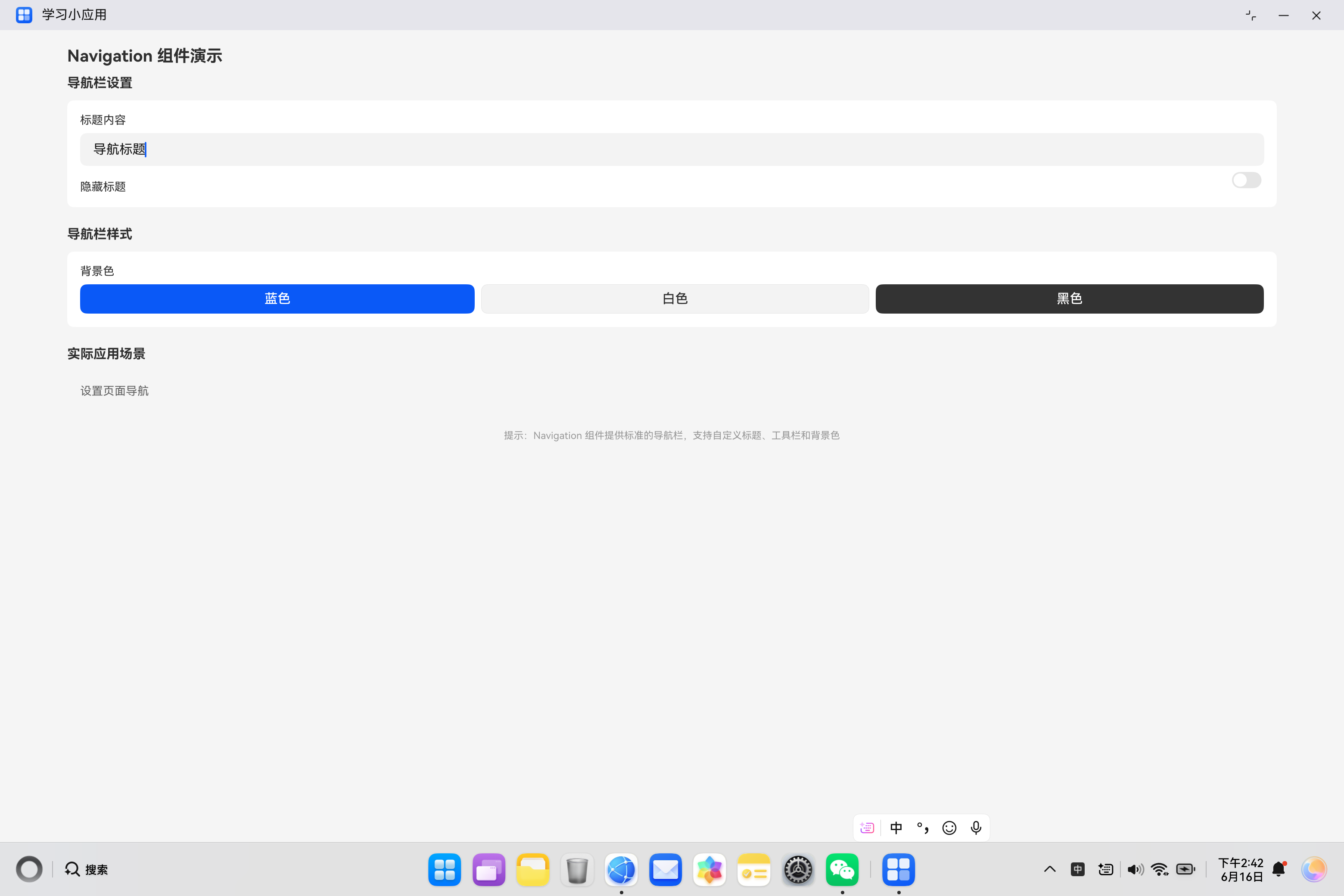
五、实际案例:导航组件演示
5.1 需求分析
构建一个导航组件演示页面,包含:
- 标题内容设置
- 标题模式切换
- 工具栏显示控制
- 返回按钮功能
5.2 代码实现
import { router } from '@kit.ArkUI';

@Entry
@Component
struct NavigationDemo {
  @State title: string = '导航标题';
  @State hideTitle: boolean = false;
  @State hideToolBar: boolean = false;

  build() {
    Column() {
      Navigation() {
        Column() {
          Text('Navigation 组件演示')
            .fontSize(20)
            .fontWeight(FontWeight.Bold)
            .margin({ top: 20, bottom: 12 })
            .width('90%')

          Column() {
            Text('导航栏设置')
              .fontSize(16)
              .fontWeight(FontWeight.Bold)
              .margin({ bottom: 12 })
              .width('100%')

            Column() {
              Row() {
                Text('标题内容')
                  .fontSize(14)
                  .layoutWeight(1)
              }
              TextInput({ placeholder: '输入标题', text: this.title })
                .width('100%')
                .height(40)
                .margin({ top: 8 })
                .onChange((value: string) => {
                  this.title = value;
                })

              Row() {
                Text('隐藏标题')
                  .fontSize(14)
                  .layoutWeight(1)
                  .margin({ top: 16 })
                Toggle({ type: ToggleType.Switch, isOn: this.hideTitle })
                  .onChange((isOn: boolean) => {
                    this.hideTitle = isOn;
                  })
              }

              Row() {
                Text('隐藏工具栏')
                  .fontSize(14)
                  .layoutWeight(1)
                  .margin({ top: 16 })
                Toggle({ type: ToggleType.Switch, isOn: this.hideToolBar })
                  .onChange((isOn: boolean) => {
                    this.hideToolBar = isOn;
                  })
              }
            }
            .width('100%')
            .backgroundColor('#FFFFFF')
            .padding(16)
            .borderRadius(8)

            Text('导航栏样式')
              .fontSize(16)
              .fontWeight(FontWeight.Bold)
              .margin({ top: 24, bottom: 12 })
              .width('100%')

            Column() {
              Row() {
                Text('背景色')
                  .fontSize(14)
                  .layoutWeight(1)
              }
              Row() {
                Button('蓝色')
                  .layoutWeight(1)
                  .height(36)
                  .backgroundColor('#0A59F7')
                  .fontColor('#FFFFFF')
                Button('白色')
                  .layoutWeight(1)
                  .height(36)
                  .margin({ left: 8 })
                  .backgroundColor('#FFFFFF')
                  .fontColor('#333333')
                  .borderWidth(1)
                  .borderColor('#E5E5E5')
                Button('黑色')
                  .layoutWeight(1)
                  .height(36)
                  .margin({ left: 8 })
                  .backgroundColor('#333333')
                  .fontColor('#FFFFFF')
              }
              .margin({ top: 8 })
            }
            .width('100%')
            .backgroundColor('#FFFFFF')
            .padding(16)
            .borderRadius(8)

            Text('实际应用场景')
              .fontSize(16)
              .fontWeight(FontWeight.Bold)
              .margin({ top: 24, bottom: 12 })
              .width('100%')

            Column() {
              Text('设置页面导航')
                .fontSize(14)
                .fontColor('#666666')
                .backgroundColor('#F5F5F5')
                .padding(16)
                .borderRadius(8)
                .width('100%')
            }

            Text('提示:Navigation 组件提供标准的导航栏,支持自定义标题、工具栏和背景色')
              .fontSize(12)
              .fontColor('#999999')
              .margin({ top: 24 })
              .width('100%')
              .textAlign(TextAlign.Center)
          }
          .width('90%')
        }
        .width('100%')
        .layoutWeight(1)
      }
      .title(this.hideTitle ? '' : this.title)
      .titleMode(NavigationTitleMode.Mini)
      .toolBar(this.hideToolBar ? null : { builder: this.ToolBarBuilder })
      .onBack(() => {
        router.back();
      })
    }
    .width('100%')
    .height('100%')
    .backgroundColor('#FFFFFF')
  }

  @Builder
  ToolBarBuilder() {
    Row() {
      Button('保存')
        .fontSize(14)
        .fontColor('#0A59F7')
      Button('取消')
        .fontSize(14)
        .fontColor('#999999')
        .margin({ left: 16 })
    }
    .padding({ right: 16 })
  }
}
六、Navigation 使用场景总结
6.1 常见应用场景
| 场景 | 说明 |
|---|---|
| 设置页面 | 提供返回和保存功能 |
| 详情页面 | 展示内容并提供操作 |
| 表单页面 | 提供提交和取消功能 |
| 列表页面 | 提供筛选和搜索功能 |
6.2 与自定义标题栏对比
| 特性 | Navigation | 自定义标题栏 |
|---|---|---|
| 标准样式 | 统一标准 | 自由定制 |
| 开发效率 | 快速实现 | 需要自定义 |
| 功能完整 | 内置返回等 | 需手动实现 |
七、最佳实践
7.1 使用建议
| 建议 | 说明 |
|---|---|
| 统一标题模式 | 应用内保持一致 |
| 合理使用工具栏 | 不要过多按钮 |
| 处理返回事件 | 提供正确的返回逻辑 |
7.2 常见问题
| 问题 | 解决方案 |
|---|---|
| 标题不显示 | 检查 hideTitleBar 设置 |
| 工具栏不显示 | 检查 hideToolBar 和 toolBar |
| 返回不生效 | 检查 onBack 事件绑定 |
八、总结
Navigation 组件是构建标准导航栏的核心组件,掌握其使用方法对于构建规范的应用界面至关重要。
核心要点:
- 使用
title设置导航栏标题 - 使用
titleMode设置标题显示模式 - 使用
toolBar配置底部工具栏 - 使用
onBack处理返回事件 - 支持隐藏标题栏和工具栏
希望本文能帮助你更好地理解和使用 Navigation 组件,构建出优秀的 HarmonyOS 应用。
参考资料:

讨论HarmonyOS开发技术,专注于API与组件、DevEco Studio、测试、元服务和应用上架分发等。
更多推荐

 6
6 0
0- 0


 已为社区贡献20条内容

所有评论(0)