HarmonyOS ArkUI训练营入门-组件掌握系列-Blank 空白填充组件详解-PC版本
·
概述
空白填充是 Flex 布局中实现内容两端对齐的重要技巧,能够在子元素之间自动填充剩余空间。HarmonyOS ArkUI 提供的 Blank 组件功能简洁,能够自动占据父容器中剩余的空间,实现灵活的布局效果。本文将从组件基础、使用场景、实际应用等多个维度,深入讲解 Blank 组件的使用方法。
一、Blank 组件基础
1.1 组件定义与作用
Blank 组件用于在 Flex 布局中填充剩余空间,使其他子元素能够按照期望的方式排列。
@Entry
@Component
struct BlankBasic {
  build() {
    Column() {
      Row() {
        Text('左侧')
          .fontSize(16)
        Blank()
        Text('右侧')
          .fontSize(16)
      }
      .width('100%')
      .height(50)
      .backgroundColor('#F5F5F5')
      .padding(16)
    }
  }
}
1.2 工作原理
Blank 组件的工作原理:
- 在 Flex 容器中,
Blank会自动占据剩余空间 - 其他子元素会按照设置的布局方式排列
- 常用于实现两端对齐、中间留空的效果
1.3 基础属性
| 属性 | 类型 | 说明 | 默认值 |
|---|---|---|---|
min |
number |
最小宽度 | 0 |
color |
string |
背景颜色 | 透明 |
二、使用场景详解
2.1 两端对齐
最常见的使用场景是实现两端对齐:
@Entry
@Component
struct SpaceBetweenDemo {
  build() {
    Column() {
      Text('无 Blank 填充')
        .fontSize(14)
        .fontColor('#666666')
        .margin({ bottom: 8 })

      Row() {
        Text('左侧')
          .fontSize(14)
          .fontColor('#333333')
        Text('右侧')
          .fontSize(14)
          .fontColor('#333333')
      }
      .width('100%')
      .height(50)
      .backgroundColor('#F5F5F5')
      .borderRadius(8)
      .padding({ left: 16, right: 16 })
      .alignItems(VerticalAlign.Center)
      .margin({ bottom: 16 })

      Text('有 Blank 填充')
        .fontSize(14)
        .fontColor('#666666')
        .margin({ bottom: 8 })

      Row() {
        Text('左侧')
          .fontSize(14)
          .fontColor('#333333')
        Blank()
        Text('右侧')
          .fontSize(14)
          .fontColor('#333333')
      }
      .width('100%')
      .height(50)
      .backgroundColor('#F5F5F5')
      .borderRadius(8)
      .padding({ left: 16, right: 16 })
      .alignItems(VerticalAlign.Center)
    }
  }
}
2.2 列表项布局
在列表项中使用 Blank 实现内容两端对齐:
@Entry
@Component
struct ListItemDemo {
  build() {
    Column() {
      Row() {
        Text('消息通知')
          .fontSize(16)
          .fontColor('#333333')
        Blank()
        Text('未读(5)')
          .fontSize(12)
          .fontColor('#FF3B30')
          .backgroundColor('#FFE4E1')
          .padding({ left: 8, right: 8, top: 2, bottom: 2 })
          .borderRadius(10)
      }
      .width('100%')
      .height(50)
      .backgroundColor('#FFFFFF')
      .padding({ left: 16, right: 16 })
      .alignItems(VerticalAlign.Center)
      .borderRadius(8)

      Row() {
        Text('系统设置')
          .fontSize(16)
          .fontColor('#333333')
        Blank()
        Text('>')
          .fontSize(16)
          .fontColor('#CCCCCC')
      }
      .width('100%')
      .height(50)
      .backgroundColor('#FFFFFF')
      .padding({ left: 16, right: 16 })
      .alignItems(VerticalAlign.Center)
      .borderRadius(8)
      .margin({ top: 8 })

      Row() {
        Text('关于我们')
          .fontSize(16)
          .fontColor('#333333')
        Blank()
        Text('1.0.0')
          .fontSize(12)
          .fontColor('#999999')
      }
      .width('100%')
      .height(50)
      .backgroundColor('#FFFFFF')
      .padding({ left: 16, right: 16 })
      .alignItems(VerticalAlign.Center)
      .borderRadius(8)
      .margin({ top: 8 })
    }
    .backgroundColor('#F5F5F5')
    .padding(16)
  }
}
2.3 动态演示
实现动态切换 Blank 效果:
@Entry
@Component
struct DynamicBlankDemo {
  @State hasBlank: boolean = true;

  build() {
    Column() {
      Row() {
        Text('启用 Blank')
          .fontSize(14)
          .layoutWeight(1)
        Toggle({ type: ToggleType.Switch, isOn: this.hasBlank })
          .onChange((isOn: boolean) => {
            this.hasBlank = isOn;
          })
      }
      .margin({ bottom: 16 })

      Row() {
        Text('项目名称')
          .fontSize(14)
          .fontColor('#333333')
        if (this.hasBlank) {
          Blank()
        }
        Text('详情 >')
          .fontSize(14)
          .fontColor('#0A59F7')
      }
      .width('100%')
      .height(50)
      .backgroundColor('#E8F0FE')
      .borderRadius(8)
      .padding({ left: 16, right: 16 })
      .alignItems(VerticalAlign.Center)
    }
  }
}
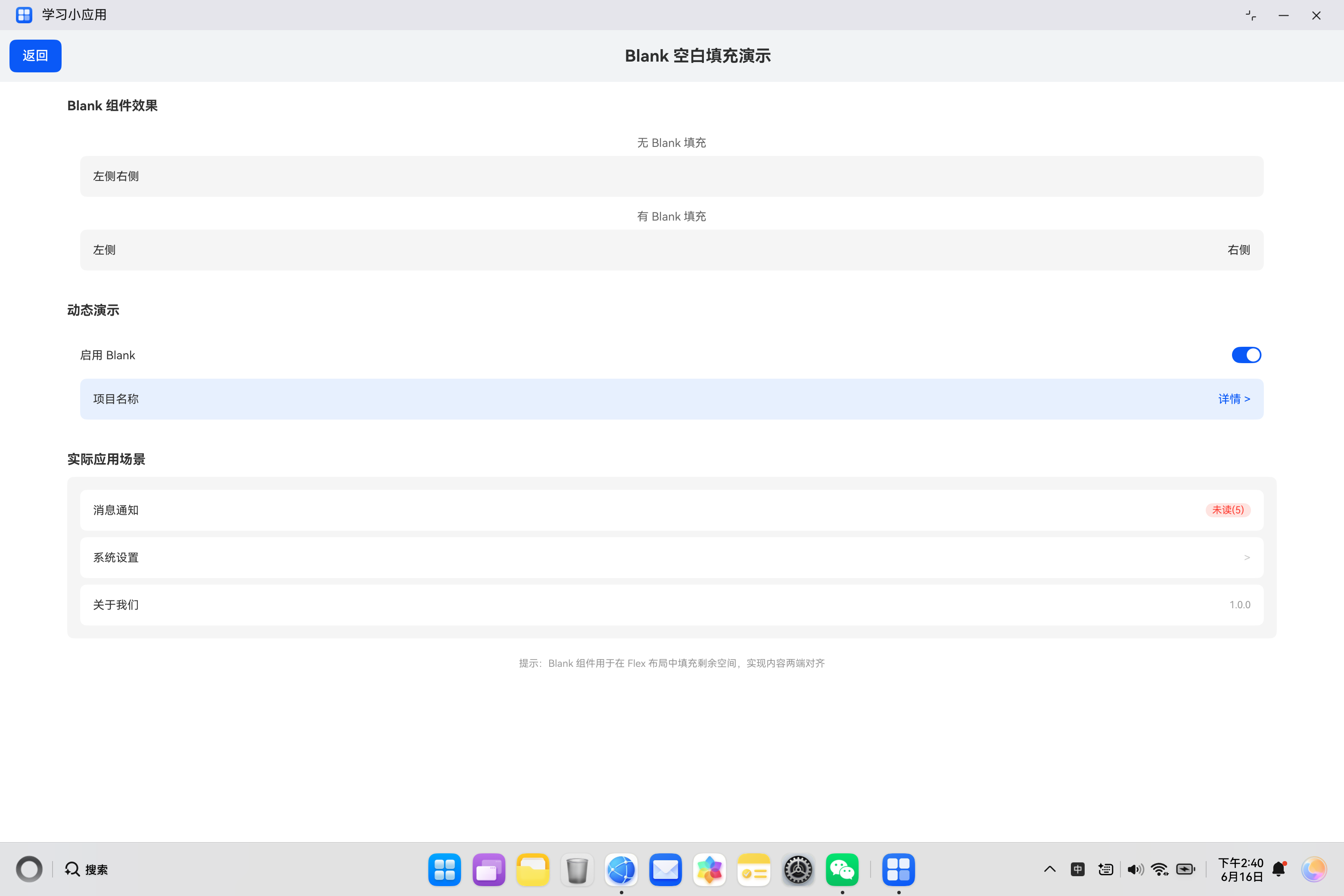
三、实际案例:空白填充演示
3.1 需求分析
构建一个空白填充演示页面,包含:
- Blank 效果对比展示
- 动态切换演示
- 实际应用场景展示
3.2 代码实现
import { router } from '@kit.ArkUI';

@Entry
@Component
struct BlankDemo {
  @State hasBlank: boolean = true;

  build() {
    Column() {
      Row() {
        Button('返回')
          .onClick(() => {
            router.back();
          })
        Text('Blank 空白填充演示')
          .fontSize(20)
          .fontWeight(FontWeight.Bold)
          .layoutWeight(1)
          .textAlign(TextAlign.Center)
      }
      .width('100%')
      .padding(12)
      .backgroundColor('#F1F3F5')

      Column() {
        Text('Blank 组件效果')
          .fontSize(16)
          .fontWeight(FontWeight.Bold)
          .margin({ top: 20, bottom: 12 })
          .width('90%')

        Column() {
          Text('无 Blank 填充')
            .fontSize(14)
            .fontColor('#666666')
            .margin({ bottom: 8 })

          Row() {
            Text('左侧')
              .fontSize(14)
              .fontColor('#333333')
            Text('右侧')
              .fontSize(14)
              .fontColor('#333333')
          }
          .width('100%')
          .height(50)
          .backgroundColor('#F5F5F5')
          .borderRadius(8)
          .padding({ left: 16, right: 16 })
          .alignItems(VerticalAlign.Center)

          Text('有 Blank 填充')
            .fontSize(14)
            .fontColor('#666666')
            .margin({ top: 16, bottom: 8 })

          Row() {
            Text('左侧')
              .fontSize(14)
              .fontColor('#333333')
            Blank()
            Text('右侧')
              .fontSize(14)
              .fontColor('#333333')
          }
          .width('100%')
          .height(50)
          .backgroundColor('#F5F5F5')
          .borderRadius(8)
          .padding({ left: 16, right: 16 })
          .alignItems(VerticalAlign.Center)
        }
        .width('90%')
        .backgroundColor('#FFFFFF')
        .padding(16)
        .borderRadius(8)

        Text('动态演示')
          .fontSize(16)
          .fontWeight(FontWeight.Bold)
          .margin({ top: 24, bottom: 12 })
          .width('90%')

        Column() {
          Row() {
            Text('启用 Blank')
              .fontSize(14)
              .layoutWeight(1)
            Toggle({ type: ToggleType.Switch, isOn: this.hasBlank })
              .onChange((isOn: boolean) => {
                this.hasBlank = isOn;
              })
          }

          Row() {
            Text('项目名称')
              .fontSize(14)
              .fontColor('#333333')
            if (this.hasBlank) {
              Blank()
            }
            Text('详情 >')
              .fontSize(14)
              .fontColor('#0A59F7')
          }
          .width('100%')
          .height(50)
          .backgroundColor('#E8F0FE')
          .borderRadius(8)
          .padding({ left: 16, right: 16 })
          .alignItems(VerticalAlign.Center)
          .margin({ top: 12 })
        }
        .width('90%')
        .backgroundColor('#FFFFFF')
        .padding(16)
        .borderRadius(8)

        Text('实际应用场景')
          .fontSize(16)
          .fontWeight(FontWeight.Bold)
          .margin({ top: 24, bottom: 12 })
          .width('90%')

        Column() {
          Row() {
            Text('消息通知')
              .fontSize(14)
              .fontColor('#333333')
            Blank()
            Text('未读(5)')
              .fontSize(12)
              .fontColor('#FF3B30')
              .backgroundColor('#FFE4E1')
              .padding({ left: 8, right: 8, top: 2, bottom: 2 })
              .borderRadius(10)
          }
          .width('100%')
          .height(50)
          .backgroundColor('#FFFFFF')
          .padding({ left: 16, right: 16 })
          .alignItems(VerticalAlign.Center)
          .borderRadius(8)

          Row() {
            Text('系统设置')
              .fontSize(14)
              .fontColor('#333333')
            Blank()
            Text('>')
              .fontSize(14)
              .fontColor('#CCCCCC')
          }
          .width('100%')
          .height(50)
          .backgroundColor('#FFFFFF')
          .padding({ left: 16, right: 16 })
          .alignItems(VerticalAlign.Center)
          .borderRadius(8)
          .margin({ top: 8 })

          Row() {
            Text('关于我们')
              .fontSize(14)
              .fontColor('#333333')
            Blank()
            Text('1.0.0')
              .fontSize(12)
              .fontColor('#999999')
          }
          .width('100%')
          .height(50)
          .backgroundColor('#FFFFFF')
          .padding({ left: 16, right: 16 })
          .alignItems(VerticalAlign.Center)
          .borderRadius(8)
          .margin({ top: 8 })
        }
        .width('90%')
        .backgroundColor('#F5F5F5')
        .padding(16)
        .borderRadius(8)

        Text('提示:Blank 组件用于在 Flex 布局中填充剩余空间,实现内容两端对齐')
          .fontSize(12)
          .fontColor('#999999')
          .margin({ top: 24 })
          .width('90%')
          .textAlign(TextAlign.Center)
      }
      .width('100%')
      .layoutWeight(1)
    }
    .width('100%')
    .height('100%')
    .backgroundColor('#FFFFFF')
  }
}
四、Blank 与其他方式对比
4.1 与 justifyContent 对比
| 方式 | 说明 |
|---|---|
Blank |
在特定位置填充空间 |
justifyContent: SpaceBetween |
整体两端对齐 |
4.2 使用场景对比
| 场景 | 推荐方式 |
|---|---|
| 单行两端对齐 | Blank |
| 多元素均匀分布 | justifyContent |
| 特定位置留空 | Blank |
五、最佳实践
5.1 使用建议
| 建议 | 说明 |
|---|---|
| 配合 Flex 使用 | 在 Row/Column/Flex 中使用 |
| 合理放置位置 | 根据需求放置在正确位置 |
| 避免过度使用 | 简单场景可使用 justifyContent |
5.2 常见问题
| 问题 | 解决方案 |
|---|---|
| 填充不生效 | 检查父容器是否为 Flex |
| 空间分配异常 | 检查其他子元素的宽度设置 |
| 多个 Blank 冲突 | 避免使用多个 Blank |
六、总结
Blank 组件是实现 Flex 布局中空间填充的重要组件,掌握其使用方法对于构建灵活布局至关重要。
核心要点:
Blank自动占据 Flex 容器中的剩余空间- 常用于实现两端对齐效果
- 在 Row/Column/Flex 中使用
- 可以设置最小宽度和背景颜色
- 与 justifyContent 配合使用
希望本文能帮助你更好地理解和使用 Blank 组件,构建出优秀的 HarmonyOS 应用。
参考资料:

讨论HarmonyOS开发技术,专注于API与组件、DevEco Studio、测试、元服务和应用上架分发等。
更多推荐
 4
4 0
0- 0


 已为社区贡献20条内容

所有评论(0)