【HarmonyOS 6】“人物“页面的UI布局拆解
今天我们来分析一下人物页的布局。
一、页面预览
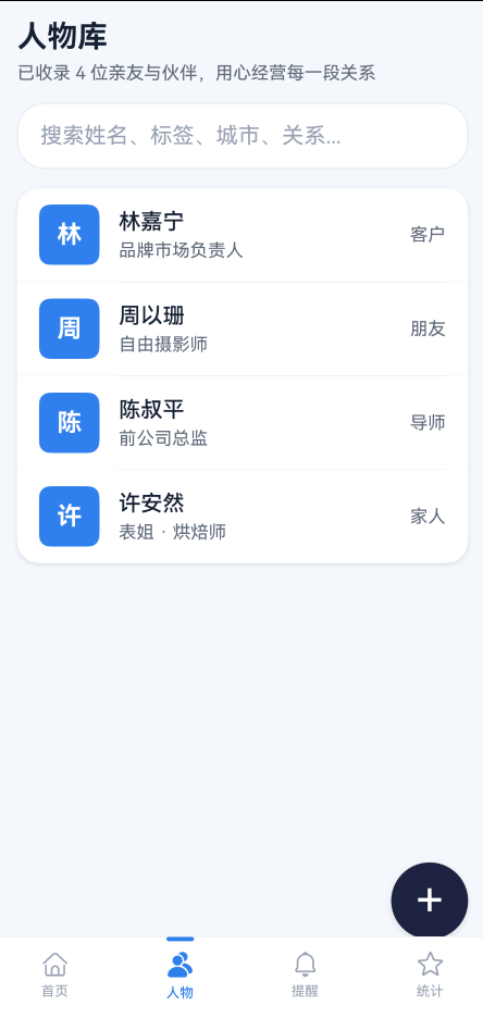
@Component
export struct ContactListView {
  @Prop contacts: ContactProfile[] = [];
  @State searchQuery: string = '';
  onContactClick?: (contact: ContactProfile) => void;

  build() {
    Column({ space: 14 }) {
      Row() { Text('人物库')  Blank() }
      TextInput({ placeholder: '搜索姓名、标签、城市、关系...' })
      Column() {
        ForEach(this.getFilteredContacts(), (item: ContactProfile, index: number) => {
          Column() {
            Row({ space: 14 }) { 头像  姓名/职称  关系 }
            Divider()
          }
        }, ...)
      }
      .borderRadius(16)
      .clip(true)
      .shadow(...)
    }
    .width('100%')
  }
}
和"首页"一样,外层是 Column({ space: 14 }),间距统一管理。但这个页面没有 Scroll——因为 ContactListView 是被嵌入到 Index.ets 的 Scroll 里面的,滚动由外层统一处理。
二、标题区
Row() {
  Column({ space: 6 }) {
    Text('人物库')
      .fontSize(22)
      .fontWeight(FontWeight.Bold)
      .fontColor(Theme.getTextPrimary(this.currentMode))
    Text('已收录 ' + this.contacts.length.toString() + ' 位亲友与伙伴,用心经营每一段关系')
      .fontSize(13)
      .fontColor(Theme.getTextSecondary(this.currentMode))
  }
  .alignItems(HorizontalAlign.Start)
  Blank()
}
.width('100%')
三、搜索栏:圆角 TextInput
TextInput({ placeholder: '搜索姓名、标签、城市、关系...', text: this.searchQuery })
  .width('100%')
  .height(48)
  .fontSize(14)
  .fontColor(Theme.getTextPrimary(this.currentMode))
  .placeholderColor(Theme.getTextMuted(this.currentMode))
  .backgroundColor(Theme.getSurface(this.currentMode))
  .borderRadius(20)
  .padding({ left: 16, right: 16 })
  .border({ width: 1, color: Theme.getBorder(this.currentMode) })
  .onChange((value: string) => {
    this.searchQuery = value;
  })
3.1 高度 48 + 圆角 20
.height(48)
.borderRadius(20)
48vp 的高度比默认的 TextInput 更高,手指点击更容易命中。borderRadius(20) 接近高度的一半,形成胶囊形状,和整页的圆润风格一致。
3.2 placeholder 提示搜索范围
placeholder: '搜索姓名、标签、城市、关系...'
placeholder 不只写了"搜索",还列出了可搜索的字段。这比单纯写"搜索…“更友好——用户不需要猜"能不能搜城市”。
3.3 描边而非填充
.border({ width: 1, color: Theme.getBorder(this.currentMode) })
搜索栏用的是 1vp 描边,而不是填充背景色。Theme.getBorder() 在亮色模式下是 #E5EAF5,非常浅的蓝灰色。描边比填充更轻盈,不会让搜索栏在页面中太突出——毕竟搜索是辅助功能,列表才是主角。
3.4 实时搜索:onChange 而不是 onSubmit
.onChange((value: string) => {
  this.searchQuery = value;
})
搜索是实时的——每输入一个字符,列表就会立即过滤。不需要按回车或点搜索按钮。
四、搜索过滤逻辑
搜索栏背后是一个 getFilteredContacts() 方法:
private getFilteredContacts(): ContactProfile[] {
  const query = this.searchQuery.trim().toLowerCase();
  if (!query) {
    return this.contacts;
  }
  return this.contacts.filter(contact => {
    const matchName = contact.name.toLowerCase().includes(query);
    const matchRelation = contact.relation.toLowerCase().includes(query);
    const matchTags = contact.tags && contact.tags.some(tag => tag.toLowerCase().includes(query));
    const matchCity = contact.city && contact.city.toLowerCase().includes(query);
    return matchName || matchRelation || matchTags || matchCity;
  });
}
4.1 四个维度匹配
搜索覆盖了四个字段:姓名、关系、标签、城市。用户输入"咖啡",会匹配到标签里有"爱咖啡"的人物;输入"深圳",会匹配到城市是深圳的人物。
4.2 toLowerCase 容错
const query = this.searchQuery.trim().toLowerCase();
输入和匹配都转成小写,用户不需要关心大小写。trim() 去掉首尾空格,避免误匹配。
4.3 空查询直接返回全部
if (!query) {
  return this.contacts;
}
搜索栏为空时,不做任何过滤,直接返回完整列表。这是最常见的做法,也是最符合用户预期的。
五、列表容器
Column() {
  ForEach(this.getFilteredContacts(), (item: ContactProfile, index: number) => {
    // 列表项 + Divider
  }, ...)
}
.width('100%')
.borderRadius(16)
.clip(true)
.shadow({ radius: 12, color: Theme.getShadow(this.currentMode), offsetX: 0, offsetY: 4 })
5.1 为什么要 clip(true)
.clip(true)
这是整页最关键的一个属性。列表容器设了 borderRadius(16),但列表项本身没有圆角。如果不加 .clip(true),第一个和最后一个列表项的直角会超出容器的圆角范围,看起来就像"圆角容器里装了方角内容"。
.clip(true) 让超出圆角范围的内容被裁剪掉,视觉上就是"所有列表项被包在一个圆角卡片里"。
5.2 阴影加在容器上,不是每个列表项
.shadow({ radius: 12, color: Theme.getShadow(this.currentMode), offsetX: 0, offsetY: 4 })
阴影只加在列表容器上,每个列表项本身没有阴影。这样整个列表看起来是一个统一的"卡片",而不是一堆散落的小卡片。
5.3 不用 List 组件,用 Column + ForEach
人物列表用的是 Column + ForEach,而不是 List + ListItem。
原因是这个列表的数据量很小(几个人物),不需要 List 的懒加载能力。Column + ForEach 更简单,也更容易控制分隔线的样式。
六、列表项:左图右文 + 右侧关系标签
这是"人物"页的核心组件。每个列表项的结构:
Column() {
  Row({ space: 14 }) {
    // 头像
    Column() {
      Text(item.name.substring(0, 1))
        .fontSize(18)
        .fontWeight(FontWeight.Bold)
        .fontColor('#FFFFFF')
    }
    .width(44)
    .height(44)
    .backgroundColor(Theme.primary)
    .borderRadius(8)
    .justifyContent(FlexAlign.Center)

    // 中间:姓名 + 职称
    Column({ space: 4 }) {
      Text(item.name)
        .fontSize(16)
        .fontWeight(FontWeight.Medium)
        .fontColor(Theme.getTextPrimary(this.currentMode))

      if (item.title && item.title !== '待完善' && item.title !== '新建人物档案') {
        Text(item.title)
          .fontSize(13)
          .fontColor(Theme.getTextSecondary(this.currentMode))
      }
    }
    .layoutWeight(1)
    .alignItems(HorizontalAlign.Start)

    // 右侧:关系
    Text(item.relation)
      .fontSize(13)
      .fontColor(Theme.getTextSecondary(this.currentMode))
  }
  .width('100%')
  .padding({ top: 12, bottom: 12, left: 16, right: 16 })
  .backgroundColor(Theme.getSurface(this.currentMode))

  // 分隔线
  if (index < this.getFilteredContacts().length - 1) {
    Divider()
      .color(Theme.getBorder(this.currentMode))
      .strokeWidth(0.5)
      .margin({ left: 74, right: 16 })
  }
}
.onClick(() => {
  if (this.onContactClick) {
    this.onContactClick(item);
  }
})
接下来逐层拆开。
七、头像:44×44 圆角方块
Column() {
  Text(item.name.substring(0, 1))
    .fontSize(18)
    .fontWeight(FontWeight.Bold)
    .fontColor('#FFFFFF')
}
.width(44)
.height(44)
.backgroundColor(Theme.primary)
.borderRadius(8)
.justifyContent(FlexAlign.Center)
7.1 不是圆形,是圆角方块
.borderRadius(8)
44vp 的宽高配 8vp 的圆角,形成的是圆角方块,不是正圆。这和"首页"优先人物卡片的 52×52 正圆头像(borderRadius(26))形成区分——列表里的头像是紧凑的,用方块更节省空间;首页的头像是醒目的,用圆形更突出。
7.2 统一蓝色背景
.backgroundColor(Theme.primary)
所有列表项的头像背景色都是 Theme.primary(#2F80ED),没有按人物区分颜色。这是有意为之——列表项的信息密度已经够高(姓名 + 职称 + 关系),如果头像颜色再各不相同,视觉上会太杂。统一蓝色让列表更整齐。
7.3 文字头像:substring(0, 1)
Text(item.name.substring(0, 1))
和"首页"一样,取姓名首字作为头像内容。18 号加粗白色字,在蓝色背景上非常清晰。
八、中间信息:姓名 + 条件职称
Column({ space: 4 }) {
  Text(item.name)
    .fontSize(16)
    .fontWeight(FontWeight.Medium)
    .fontColor(Theme.getTextPrimary(this.currentMode))

  if (item.title && item.title !== '待完善' && item.title !== '新建人物档案') {
    Text(item.title)
      .fontSize(13)
      .fontColor(Theme.getTextSecondary(this.currentMode))
  }
}
.layoutWeight(1)
.alignItems(HorizontalAlign.Start)
8.1 条件渲染职称
if (item.title && item.title !== '待完善' && item.title !== '新建人物档案')
职称不是必填的。新建人物时,title 可能是 '待完善' 或 '新建人物档案'——这些占位文字不应该显示在列表里。条件渲染过滤掉了这些无意义的文字,让列表项更干净。
8.2 layoutWeight(1) 弹性填充
.layoutWeight(1)
中间信息区域用 layoutWeight(1) 填满剩余宽度,把右侧的关系标签推到最右边。无论姓名多长,关系标签始终右对齐。
8.3 space: 4 的紧凑间距
Column({ space: 4 })
姓名和职称之间只有 4vp 的间距。这是整页最小的间距值,因为列表项的高度需要控制——如果间距太大,列表会变长,需要更多滚动。
九、右侧关系标签
Text(item.relation)
  .fontSize(13)
  .fontColor(Theme.getTextSecondary(this.currentMode))
关系标签是最简单的纯文字,没有背景、没有圆角、没有描边。13 号字 + textSecondary 灰色,视觉上退到最远处。
十、FAB 按钮:悬浮在右下角
FAB(Floating Action Button)不在 ContactListView 组件里,而是在 Index.ets 中条件渲染的:
if (this.currentTab === 1 && !this.selectedContact) {
  Row() {
    Blank()
    Button('+')
      .width(56)
      .height(56)
      .borderRadius(28)
      .fontSize(36)
      .fontWeight(FontWeight.Regular)
      .fontColor('#FFFFFF')
      .backgroundColor(Theme.getFab(this.currentMode))
      .shadow({ radius: 12, color: Theme.getShadow(this.currentMode), offsetX: 0, offsetY: 6 })
      .onClick(() => {
        this.showCreatePanel = true;
      })
  }
  .width('100%')
  .padding({ left: 18, right: 18 })
  .margin({ bottom: 58 })
}
10.1 条件渲染:只在人物 Tab 显示
if (this.currentTab === 1 && !this.selectedContact)
FAB 只在两个条件同时满足时显示:
- 当前是人物 Tab(
currentTab === 1) - 没有选中任何人物(
!this.selectedContact),即没有打开详情页
当用户点进人物详情时,FAB 会自动隐藏,因为详情页不需要"新增人物"的操作。
10.2 56×56 正圆
.width(56)
.height(56)
.borderRadius(28)
56vp 是 Material Design 推荐的 FAB 尺寸。borderRadius(28) 是宽度的一半,形成正圆。
10.3 Row + Blank() 右对齐
Row() {
  Blank()
  Button('+')
}
Blank() 把按钮推到最右边。配合 padding({ left: 18, right: 18 }),按钮距离右边缘 18vp,和页面左右边距对齐。
10.4 暗色模式下的 FAB 配色
static getFab(mode: number): string {
  return mode === ConfigurationConstant.ColorMode.COLOR_MODE_DARK ? Theme.primary : Theme.fab;
}
亮色模式下 FAB 用 Theme.fab(#1C2240 深蓝),暗色模式下用 Theme.primary(#2F80ED 亮蓝)。
这是一个有意思的设计选择:亮色模式下 FAB 是深色的,和浅色页面形成强对比;暗色模式下 FAB 是亮色的,和深色页面形成强对比。无论哪种模式,FAB 都是最醒目的元素。
十一、点击跳转详情
.onClick(() => {
  if (this.onContactClick) {
    this.onContactClick(item);
  }
})
列表项的点击事件通过回调函数 onContactClick 传递给父组件。在 Index.ets 中:
ContactListView({
  contacts: this.contacts,
  onContactClick: (contact: ContactProfile) => {
    this.selectedContact = contact;
  }
})
点击后设置 selectedContact,触发 ContactDetailView 的渲染。这种"子组件通知父组件"的模式,在鸿蒙组件化开发中非常常见——子组件只负责 UI,状态管理交给父组件。

讨论HarmonyOS开发技术,专注于API与组件、DevEco Studio、测试、元服务和应用上架分发等。
更多推荐
 50
50 0
0- 0


 已为社区贡献8条内容

所有评论(0)