零基础学 ArkUI 自定义组件(专题六):从 @Builder 到构建自己的组件库
·
🧩 零基础学 ArkUI 自定义组件(专题六):从 @Builder 到构建自己的组件库
博主说: 当你的 App 需要 10 个长得一样的输入框、20 个风格统一的卡片、5 个不同颜色的按钮时——「复制粘贴改颜色」就成了效率杀手。自定义组件就是解决这个问题的终极方案。今天一篇讲清楚 ArkUI 组件复用的全部技巧。
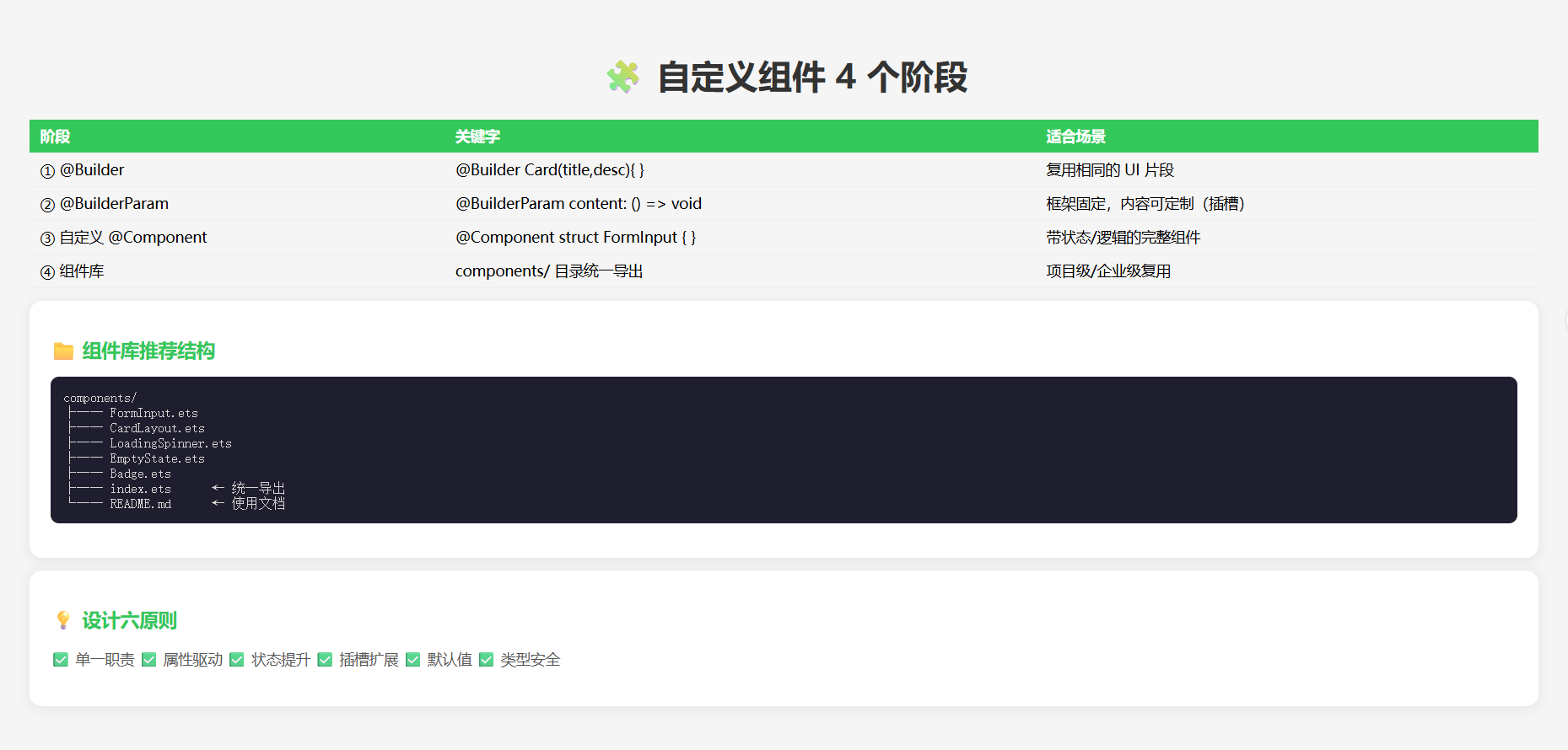
📊 4 种复用层级的演进
@Builder 函数       → 复用 UI 片段
@BuilderParam 插槽   → 让调用方自定义片段内部
自定义 @Component   → 完整的可复用组件单元
组件库(多文件)     → 项目级/企业级组件资产
⚙️ 运行环境
| 项目 | 要求 |
|---|---|
| DevEco Studio | 5.0.3.800+ |
| HarmonyOS SDK | API 12+ |
🛠️ 从 @Builder 到组件库 — 4 个演进阶段
🎯 阶段 1:@Builder — UI 片段复用
场景: 多个列表项有相同的卡片样式。
@Entry
@Component
struct Demo_Builder {
  @State items: { title: string; desc: string }[] = [
    { title: '标题1', desc: '描述文字1' },
    { title: '标题2', desc: '描述文字2' },
    { title: '标题3', desc: '描述文字3' },
  ];

  // @Builder 和 @BuilderParam 相关功能,封装可复用的 UI 片段
  @Builder
  Card(title: string, desc: string) {
    Column() {
      Text(title)
        .fontSize(18).fontWeight(FontWeight.Bold)
      Text(desc)
        .fontSize(14).fontColor('#888')
        .margin({ top: 4 })
    }
    .width('90%')
    .padding(16)
    .backgroundColor('#FFF')
    .borderRadius(12)
    .shadow({ radius: 4, color: '#20000000', offsetY: 2 })
  }

  build() {
    Column() {
      Text('@Builder 复用的卡片列表').fontSize(20).fontWeight(FontWeight.Bold).margin(16)

      ForEach(this.items, (item) => {
        this.Card(item.title, item.desc) // 👈 调用 @Builder
      })
    }
    .width('100%')
  }
}
🎯 阶段 2:@BuilderParam — 插槽模式(自定义内容)
场景: 卡片框架固定,但中间的内容区域由调用方决定。
@Component
struct CardFrame {
  // @BuilderParam 定义插槽
  @BuilderParam content: () => void = this.defaultContent;

  @Builder
  defaultContent() {
    Text('默认内容').fontSize(14).fontColor('#999')
  }

  build() {
    Column() {
      Text('卡片标题').fontSize(18).fontWeight(FontWeight.Bold)
      Divider().margin({ top: 8, bottom: 8 })
      this.content() // 👈 渲染插槽
    }
    .width('90%')
    .padding(16)
    .backgroundColor('#FFF')
    .borderRadius(12)
    .shadow({ radius: 4, color: '#20000000', offsetY: 2 })
  }
}

@Entry
@Component
struct Demo_BuilderParam {
  @Builder
  customContent() {
    Row() {
      Circle().width(40).height(40).fill('#007AFF')
      Column() {
        Text('自定义内容').fontSize(16).fontWeight(FontWeight.Bold)
        Text('由调用方传入').fontSize(13).fontColor('#888')
      }.margin({ left: 12 })
    }
  }

  build() {
    Column() {
      Text('@BuilderParam 插槽示例').fontSize(20).fontWeight(FontWeight.Bold).margin(16)

      // 使用默认内容
      CardFrame()

      // 传入自定义内容
      CardFrame({ content: this.customContent })
    }
    .width('100%')
  }
}
🎯 阶段 3:自定义 @Component — 完整组件单元
场景: 一个带标签、必填校验、错误提示的完整输入框组件。
// 1. 定义组件的对外接口
@Component
struct FormInput {
  // 对外暴露的属性
  private label: string = '';
  private placeholder: string = '';
  private required: boolean = false;

  // 对外暴露的状态(调用方能读取)
  @Link value: string;

  // 对内状态
  @State hasError: boolean = false;
  @State errorMsg: string = '';

  // 对外暴露的方法
  validate(): boolean {
    if (this.required && !this.value.trim()) {
      this.hasError = true;
      this.errorMsg = `${this.label}不能为空`;
      return false;
    }
    this.hasError = false;
    this.errorMsg = '';
    return true;
  }

  build() {
    Column() {
      Row() {
        Text(this.label).fontSize(15).fontWeight(FontWeight.Bold)
        if (this.required) {
          Text(' *').fontSize(15).fontColor('#FF3B30') // 必填标识
        }
      }
      .width('100%')

      TextInput({ placeholder: this.placeholder, text: this.value })
        .width('100%').height(44)
        .backgroundColor(this.hasError ? '#FFF0F0' : '#F8F8F8')
        .borderRadius(8)
        .borderColor(this.hasError ? '#FF3B30' : 'transparent')
        .borderWidth(1)
        .padding({ left: 12 })
        .onChange((val: string) => {
          this.value = val;
          if (this.hasError) {
            this.validate(); // 重新校验
          }
        })

      if (this.hasError) {
        Text(this.errorMsg)
          .fontSize(12).fontColor('#FF3B30')
          .width('100%').margin({ top: 4 })
      }
    }
    .width('100%')
  }
}

// 2. 使用自定义组件
@Entry
@Component
struct Demo_CustomComponent {
  @State username: string = '';
  @State password: string = '';
  @State email: string = '';

  build() {
    Column() {
      Text('自定义 FormInput 组件').fontSize(20).fontWeight(FontWeight.Bold).margin(16)

      FormInput({
        label: '用户名',
        placeholder: '请输入用户名',
        required: true,
        value: this.username
      }).margin({ bottom: 16 })

      FormInput({
        label: '密码',
        placeholder: '请输入密码',
        required: true,
        value: this.password
      }).margin({ bottom: 16 })

      FormInput({
        label: '邮箱',
        placeholder: '选填',
        required: false,
        value: this.email
      }).margin({ bottom: 24 })

      Button('提交')
        .width('100%').height(48)
        .backgroundColor('#007AFF').fontColor('#fff')
        .borderRadius(8)
        .onClick(() => {
          // 调用自定义组件的 validate 方法需要 ref
          // 这里简化处理
          if (!this.username.trim() || !this.password.trim()) {
            AlertDialog.show({ message: '请填写必填项' });
          } else {
            AlertDialog.show({ message: '提交成功!' });
          }
        })
    }
    .width('90%').padding(16)
  }
}
🎯 阶段 4:组件库 — 企业级复用
目录结构:
components/
├── FormInput.ets          ← 带校验的输入框
├── CardLayout.ets         ← 卡片容器
├── LoadingSpinner.ets     ← 加载动画
├── EmptyState.ets         ← 空状态占位
├── ConfirmDialog.ets      ← 确认弹窗
├── Badge.ets              ← 角标
├── index.ets              ← 统一导出
└── README.md              ← 使用文档
// components/index.ets — 统一导出
export { FormInput } from './FormInput';
export { CardLayout } from './CardLayout';
export { LoadingSpinner } from './LoadingSpinner';
export { EmptyState } from './EmptyState';
export { ConfirmDialog } from './ConfirmDialog';

// 使用时只需一行导入
// import { FormInput, CardLayout } from '../components';
📊 组件设计规范
| 设计原则 | 说明 | 示例 |
|---|---|---|
| 单一职责 | 一个组件只做一件事 | FormInput 只管输入校验 |
| 属性驱动 | 通过属性控制行为 | required: boolean |
| 状态提升 | 数据由父组件管理 | 用 @Link 而非 @State |
| 插槽扩展 | @BuilderParam 让调用方自定义内容 | CardFrame 的 content 插槽 |
| 默认值 | 所有属性都有合理默认值 | required: false |
| 类型安全 | 用 interface 定义属性类型 | interface FormInputProps |
⚠️ 避坑指南
| 坑 | 原因 | 正确做法 |
|---|---|---|
@Builder 中不能用 this.xxx 调其他 @Builder |
作用域限制 | 在 @Component 外定义纯函数 @Builder |
| 自定义组件属性变了但 UI 不刷新 | 忘了加 @Prop/@Link/@State |
根据数据流向选对装饰器 |
| @BuilderParam 不渲染 | 忘了在 build 中调用 this.content() |
必须显式调用 |
| 组件太臃肿 | 一个文件塞了太多逻辑 | 拆分成多个小组件 |
| 循环引用 | 组件 A 引用组件 B,B 引用 A | 用 export 解耦,避免交叉引用 |
🔥 最佳实践
- 命名规范:组件文件名大写驼峰
FormInput.ets - 单一职责:每个组件只做一件事,功能复杂就拆分
- 默认值:所有属性都给默认值,让调用方最省事
- 文档注释:每个属性和方法都要写 JSDoc 注释
- Demo 页面:开发时配套 Demo 页面展示所有使用方式
- 版本管理:组件库用独立版本号,通过 oh-package.json5 发布
🚀 扩展挑战
- 主题系统:用
@Styles定义主题变量,组件自动响应主题切换 - 单元测试:用
@ohos/hypium为每个组件写单元测试 - Storybook:搭建组件预览页面,像 Storybook 一样展示所有状态
- 按需加载:通过动态
import()实现组件懒加载
官方文档: HarmonyOS 应用开发文档
- 开发者社区: 华为开发者论坛
- 欢迎加入开源鸿蒙跨平台社区: https://openharmonycrossplatform.csdn.net/

讨论HarmonyOS开发技术,专注于API与组件、DevEco Studio、测试、元服务和应用上架分发等。
更多推荐

 4
4 0
0- 0


 已为社区贡献53条内容

所有评论(0)