arkUI布局
·
1. Column 垂直布局
Column全量核心属性精讲
• space:统一设置子组件间距,官方推荐写法,替代手动margin,界面更规整
• justifyContent:主轴(垂直)对齐,包含居顶、居中、居底、均分对齐
• alignItems:交叉轴(水平)对齐,包含左对齐、居中、右对齐
• width/height:布局容器尺寸,铺满屏幕是页面布局基础
• backgroundColor:布局背景色,用于区分页面模块
@Entry
@Component
struct ColuPerson{
build() {
Column({space:30}){ //最外层的垂直布局容器,内部子组件从上到下排列,且相邻子组件之间自动保持 30vp 的间距。
Row({space:25}){ //水平布局容器,用于横向并排显示内容,子元素间距为 25vp。
Text('首页').fontSize(25)
Text('课程').fontSize(25)
Text('消息').fontSize(25)
Text('我的').fontSize(25)
}
.width('100%')
.height('15%')
.justifyContent(FlexAlign.Center) //水平方向上让这四个文字均匀居中分布。
.backgroundColor(0x00FFFF)
Text('个人信息中心')
.fontSize(40)
.fontWeight(FontWeight.Bolder)
.margin(10)
Column({space:20}) //嵌套在外层 Column 中的另一个垂直布局容器,专门用来承载个人的详细信息,子项间距为 20vp。
Text('姓名:张三').fontSize(24)
Text('专业:计算机应用技术').fontSize(24)
Text('年级:2025级').fontSize(24)
Text('学号:208325464').fontSize(24)
}
.width('100%')
.layoutWeight(1)
.justifyContent(FlexAlign.Center) //主轴(垂直方向)居中对齐,使得所有内容在页面中上下居中显示。
.alignItems(HorizontalAlign.Center) //交叉轴(水平方向)居中对齐,使得所有子组件左右居中。
.backgroundColor(Color.White)
}
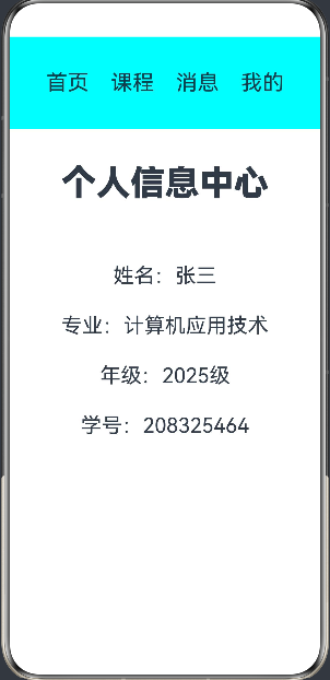 总结:这段代码通过外层 Column 控制整体上下布局和居中,利用 Row 实现了顶部的横向导航菜单,最后再用一个内层 Column 将个人信息条目整齐地纵向罗列出来,是一个典型的表单/信息展示页结构。
2.Row 水平布局
Row布局核心规则:子组件从左至右依次排列,主轴为水平方向,交叉轴为垂直方向。
核心属性:space横向间距、justifyContent主轴水平对齐、alignItems交叉轴垂直对齐。
@Entry
@Component
struct RowCol{
  build() {
    Column({space:30}) {  //最外层的垂直布局容器,子组件从上到下排列,相邻子组件之间自动保持 30vp 的间距。
      Row({space:25}){  //水平布局容器,包含四个文本,元素间横向间距为 25vp。
        Text('首页').fontSize(25)
        Text('课程').fontSize(25)
        Text('消息').fontSize(25)
        Text('我的').fontSize(25)
      }
      .width('100%')
      .height('15%')
      .justifyContent(FlexAlign.Center)  //主轴(水平方向)居中对齐,让这四个导航文字均匀分布在中间。
      .background(0x00f5f5)

      Row({space:15}){
        Button('左一').width(80).height(55).fontSize(22)
        Button('右一').width(80).height(55).fontSize(22)
      }
      .width('100%')
      .justifyContent(FlexAlign.Start)  //将这一行里的两个按钮靠左侧(起点)对齐排列。

      Row({space:15}){
        Button('左二').width(80).height(55).fontSize(22)
        Button('右二').width(80).height(55).fontSize(22)
      }
      .width('100%')
      .justifyContent(FlexAlign.Center)  //将这一行里的两个按钮在水平方向上居中显示。

      Row({space:15}){
        Button('左三').width(80).height(55).fontSize(22)
        Button('右三').width(80).height(55).fontSize(22)
      }
      .width('100%')
      .justifyContent(FlexAlign.End) //将这一行里的两个按钮靠右侧(终点)对齐排列。
    }
    .height('100%')
    .width('100%')
    .backgroundColor('0x00dada')
    .padding(20)
  }
}
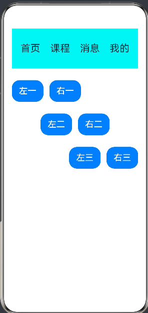
总结:这段代码是一个非常直观的 Flex 布局教学示例。它通过一个垂直的 Column 作为骨架,利用顶部的 Row 搭建导航,并在下方连续使用三个带有不同 justifyContent 属性的 Row,清晰地展示了前端开发中最常用的三种水平对齐方式(Start、Center、End)。
3.Stack层叠布局
Stack核心规则:子组件默认居中叠加渲染,后编写的组件覆盖先编写的组件,无固定横竖排列。
核心场景:海报banner、图片文字叠加、头像角标、悬浮按钮、页面水印、弹窗提示。
@Entry
@Component
struct StackUp {
  build() {
    Column({ space: 50 }) {  //最外层的垂直布局容器,子元素从上到下排列,且相邻元素之间保持 50vp 的间距。
      Text('这是我的个人主页')
        .fontSize(35)
        .fontWeight(FontWeight.Bolder)
      Row({ space: 25 }) {  //水平布局容器,内部元素横向排列,间距为 25vp。
        Stack() {  //堆叠容器。它的特性是子组件按照代码顺序依次入栈,后写的组件会覆盖在前一个组件之上。
          Text()
            .width(180)
            .height(180)
            .backgroundColor(0x9ff7d7)
            .borderRadius(30)
          Text('你好')
            .fontSize(40)
            .fontColor(Color.Red)
            .width(120)
            .height(120)
            .backgroundColor(0xfad344)
            .borderRadius(30)
            .padding({ left: 15, right: 0, top: 0, bottom: 0 })
        }
        .height(200)
        .width('50%')

        Text('欢迎来到鸿蒙开发')
          .fontSize(35)
          .fontWeight(FontWeight.Bolder)
          .height(200)
          .width('45%')
          .fontColor(Color.White)
      }
      .height(300)
      .width('100%')
      .backgroundColor(0x000000)
      .padding(20)
    }
    .justifyContent(FlexAlign.Center)  //主轴(垂直方向)居中对齐,使内容在屏幕上下居中。
    .alignItems(HorizontalAlign.Center)  //交叉轴(水平方向)居中对齐,使内容在屏幕左右居中。
    .width('100%')
    .height('100%')
  }
}
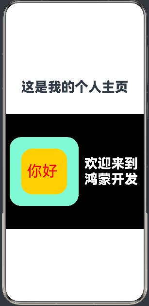
总结:这段代码是一个非常经典的视觉排版示例。它利用外层 Column 实现了页面的绝对居中,用黑色的 Row 划分出了左右分栏结构,并巧妙地使用了 Stack 容器将两个不同颜色、尺寸的色块和文字叠加在一起,形成了一种类似卡片或头像徽章的层次感效果。
4.Flex弹性布局
Flex核心优势:自适应屏幕宽度,子组件超出自动换行,适配不同尺寸设备。
核心属性:wrap: FlexWrap.Wrap(自动换行)、space统一间距、justifyContent对齐方式。
@Entry
@Component
struct flex{
  build() {
    Column({space:30}){  //最外层的垂直布局容器,内部子元素从上到下排列,且相邻元素之间自动保持 30vp 的间距。
      Text("功能中心")
        .fontSize(28)
        .fontWeight(FontWeight.Bolder)
        .width('100%')
        .textAlign(TextAlign.Center)
      Flex({wrap:FlexWrap. Wrap}){  //弹性布局容器。它的核心特性是当一行放不下所有子组件时,会自动进行换行处理。这里非常适合做宫格菜单。
        Button("课程学习").width(140).height(60).fontSize(20).margin(10)
        Button("实训作业").width(140).height(60).fontSize(20).margin(10)
        Button("资料下载").width(140).height(60).fontSize(20).margin(10)
        Button("在线答疑").width(140).height(60).fontSize(20).margin(10)
//每个按钮宽 140vp,高 60vp,并且四周留有 10vp 的外边距(margin)。当屏幕宽度变窄时,这些按钮会自动折行显示
      }
      .width('100%')
      .padding(15)
      Row() { //水平布局容器。
        Column() {  //垂直布局容器,将“开始”和“学习”两个白色大字上下排列。
          Text('开始').fontSize(50).fontColor(Color.White)
          Text('学习').fontSize(50).fontColor(Color.White)
        }

        Stack() {  //将内层的黄底红字作为一个整体,叠加在一个 170x170 的浅绿色圆角矩形之上。这种双层 Stack 的设计形成了一个类似“大底座上放着小铭牌”的视觉层次感。
          Stack(){  //包含一个写着“vip”的红色文字,外部包裹了一个 110x110 的黄色圆角矩形底板。
            Text('vip').fontSize(60).fontColor(Color.Red)
          }
          .width(110)
          .height(110)
          .backgroundColor('#ffd300')
          .borderRadius(32)
        }
        .width(170)
        .height(170)
        .backgroundColor('#86f8c9')
        .borderRadius(36)
      }
      .width('100%')
      .height(260)
      .backgroundColor(Color.Red)
      .margin({top:50})
      .justifyContent(FlexAlign.SpaceAround) //主轴(水平方向)均匀分布,使得左右两侧的内容平分空间,且边缘留有相等的空白。
      .alignItems(VerticalAlign.Center)  //交叉轴(垂直方向)居中对齐。
    }
  }
}
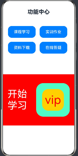
总结:这段代码是一个非常实用的业务页面雏形。上半部分利用 Flex 容器的自动换行能力,轻松实现了响应式的功能菜单;下半部分则通过 Row 分配左右空间,并结合 Stack 嵌套做出了具有设计感的 VIP 卡片效果。
5.相对布局
@Entry
@Component
struct  RelativeDemo{
  build() {
    RelativeContainer() {  //最外层的相对布局容器。它的核心特性是子组件不按照默认的堆叠排列,而是根据各自设置的 .alignRules() 来确定在页面中的绝对或相对位置。
      Text('相对布局页面设计')
        .fontSize(40)
        .fontWeight(FontWeight.Bolder)
        .id('title') //关键属性。在相对布局中,每个需要被其他组件引用的子组件都必须有唯一的 ID。
        .alignRules({  //设置了垂直方向(top)和水平方向(left)都锚定'__container__'(即 RelativeContainer 父容器本身),并对齐到左上角。
          top: { anchor: '_container__', align: VerticalAlign.Top },
          left: { anchor: '_container__', 'align': HorizontalAlign.Start }
        })
        .margin(15)
        .backgroundColor(Color.Red)
      Button('基础按钮')
        .width(100)
        .height(40)
        .id('buttonid')
        .alignRules({
          top: { anchor: 'title', align: VerticalAlign.Bottom },
          middle: { anchor: 'title', align: HorizontalAlign.Center }
        })
        .margin(20)

//锚点:以 'title' 为基准。
对齐规则:垂直方向的顶部(top)紧贴 title 的底部(Bottom);水平方向自身中心(middle)与 title 的中心(Center)对齐。
效果:这个按钮完美地悬挂在标题的正下方,且水平居中。

      Text('这个组件依赖于button')
        .fontSize(26)
        .fontColor(Color.Red)
        .id('textid')
        .alignRules({
          top:{anchor:'buttonid',align:VerticalAlign.Bottom},
          middle:{anchor:'buttonid',align:HorizontalAlign.Center}
        })
        .margin({top:30})

//锚点:以 'buttonid' 为基准。
对齐规则:位于按钮的正下方,且水平居中对齐。
效果:通过 .margin({top:30}) 额外增加了 30vp 的间距,使其与上方按钮拉开距离。

      Button('基础按钮1')
        . width(150)
        . height(80)
        . fontSize(25)
        . id('buttonid1')
        . alignRules({
          top:{anchor:'textid',align:VerticalAlign.Bottom},
          right:{anchor:'textid',align:HorizontalAlign.Center}
        })
        . margin(20)

//锚点:以 'textid' 为基准。
对齐规则:位于提示文本的正下方,但其水平方向的右边缘(right)对齐到了提示文本的水平中心点(Center)。
效果:这个按钮会向左偏移,呈现出一半在文本左边、一半在文本右边的视觉效果。

      Button('基础按钮2')
        . width(150)
        . height(80)
        . fontSize(25)
        . id('buttonid2')
        . alignRules({
          top:{anchor:'buttonid1',align:VerticalAlign.Top},
          left:{anchor:'buttonid1',align:HorizontalAlign.End}
        })
        . margin({left:40})

//锚点:以 'buttonid1' 为基准。
对齐规则:垂直方向的顶部(Top)与 buttonid1 的顶部平齐;水平方向的左边缘(left)紧贴 buttonid1 的右边缘(End)。
效果:两个按钮在同一水平线上横向并排。配合 .margin({left:40}),两者之间保留了 40vp 的间隔。
      Image($r('app.media.first'))
        .width('97%')
        .id('image1')
        .alignRules({
            top:{anchor:'buttonid1',align:VerticalAlign.Bottom},
            left:{anchor:'buttonid1',align:HorizontalAlign.Start}
        })
        .margin({top:30})

//锚点:同样以 'buttonid1' 为基准。
对齐规于 buttonid1 的正下方,并且左边缘(Start)与 buttonid1 的左边缘对齐。
效果:图片宽度设为 97%,紧挨着按钮1的左下角显示。

    }
    .width('100%')
    .height('100%')
    .backgroundColor(Color.Gray)
  }
}
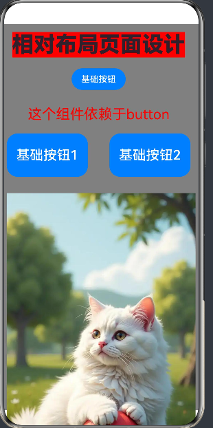
总结:这段代码非常清晰地展示了 RelativeContainer 的核心逻辑——像搭积木一样,通过给组件打上 id 标签,然后让后面的组件去“认领”前面的组件作为参照物,从而构建出极其灵活的复杂界面。

讨论HarmonyOS开发技术,专注于API与组件、DevEco Studio、测试、元服务和应用上架分发等。
更多推荐


 3
3 0
0- 0


 已为社区贡献5条内容

所有评论(0)